How to Make a Tiny House Feel Bigger: 20 Pro Tips
How to make a tiny house feel bigger comes down to strategic design choices that maximize perceived space without adding square footage. The most effective approach combines visual expansion tricks, smart layout planning, and light manipulation to create an airy, open atmosphere even in the smallest footprint.
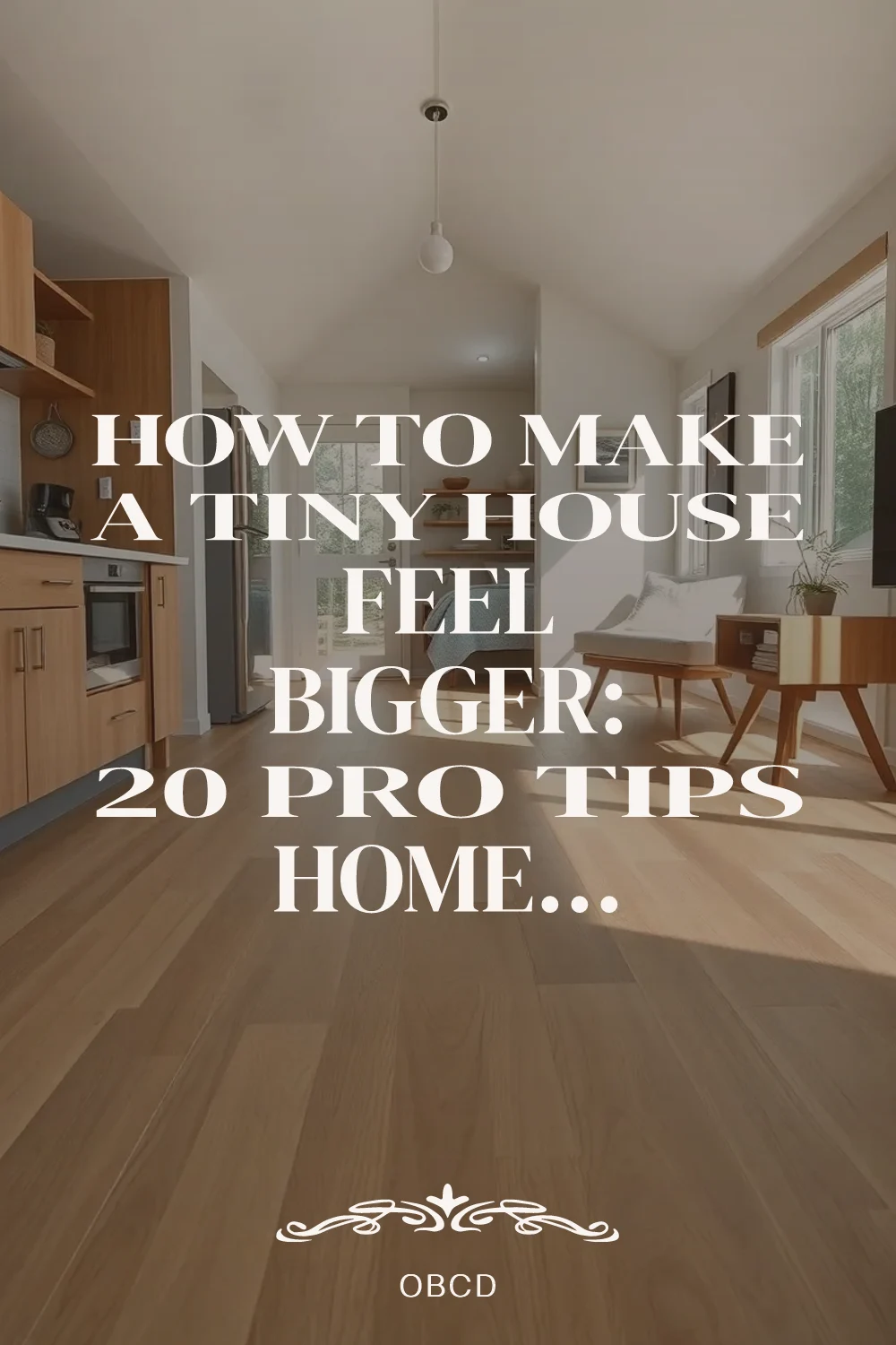
Professional tiny house designers use proven strategies like continuous light flooring, monochromatic color schemes, and strategic mirror placement to make a small space look bigger than it really is. From built-in furniture that disappears into walls to glass doors that double your living area, these twenty pro tips show you exactly how to make your tiny home feel spacious and comfortable.
Quick FAQ
What colors make tiny houses feel bigger?
Light, reflective colors like white, cream, and soft gray maximize light reflection and create continuity. Monochromatic schemes eliminate visual breaks that make spaces feel smaller.
Do high ceilings make tiny houses feel bigger?
Yes, vaulted or raised ceilings draw the eye upward and create volume perception. Even lofts with 4-5 feet of clearance feel expansive when properly lit and accessed.
How do you arrange furniture to make a tiny house feel bigger?
Float furniture away from walls, use see-through pieces like glass or open frames, and choose legged furniture that shows floor underneath. Keep traffic paths clear and unobstructed.
Where should mirrors go in a tiny house?
Place mirrors opposite windows to double natural light, use full-wall mirrors to create depth illusion, and position them to reflect views rather than blank walls. Avoid clustering small mirrors.
What flooring makes tiny houses feel bigger?
Continuous light-colored flooring throughout creates seamless flow. Wide-plank hardwood, large-format tile, or polished concrete all eliminate grout lines and seams that break up visual space.
As an Amazon Associate I earn from qualifying purchases.
Table of Contents
- 1. Continuous Light Flooring Throughout
- 2. Floor-to-Ceiling Mirrors on Key Walls
- 3. Monochromatic Color Scheme with One Accent
- 4. Eliminate Visual Clutter with Hidden Storage
- 5. Raise Ceilings with Vaulted or Cathedral Design
- 6. Large Windows Without Visual Breaks
- 7. Floating Furniture and Legged Pieces
- 8. Multi-Functional Built-Ins Instead of Freestanding
- 9. Glass and Open-Frame Furniture
- 10. Vertical Emphasis with Floor-to-Ceiling Elements
- 11. Single Large Rug Instead of Multiple Small Ones
- 12. Minimal Window Treatments or None
- 13. Reflective Surfaces to Bounce Light
- 14. Open Storage with Consistent Organization
- 15. Sightlines to Outdoors from Multiple Vantage Points
- 16. Low-Profile Furniture to Preserve Vertical Space
- 17. Strategic Lighting Layer Without Visual Clutter
- 18. Built-Ins That Match Wall Color
- 19. Decluttered Surfaces with Minimal Accessories
- 20. Indoor-Outdoor Connection Through Large Glass Doors
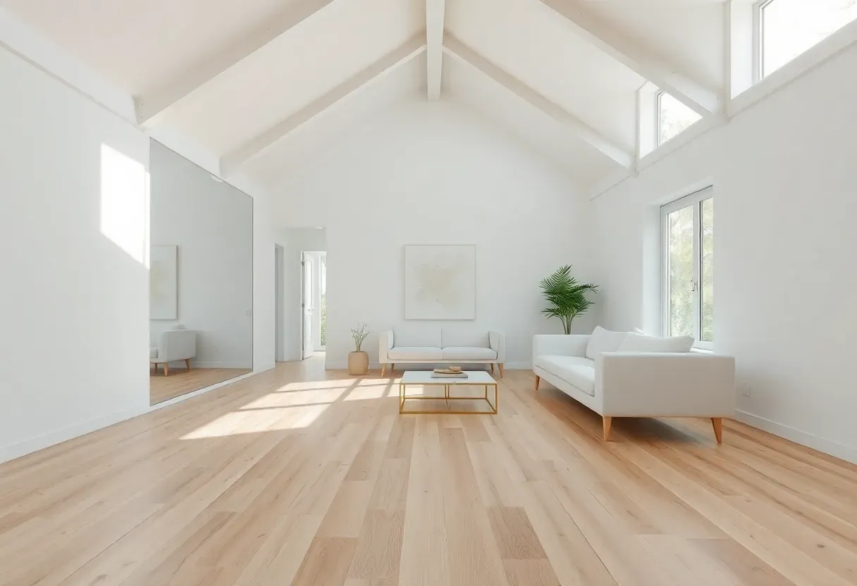
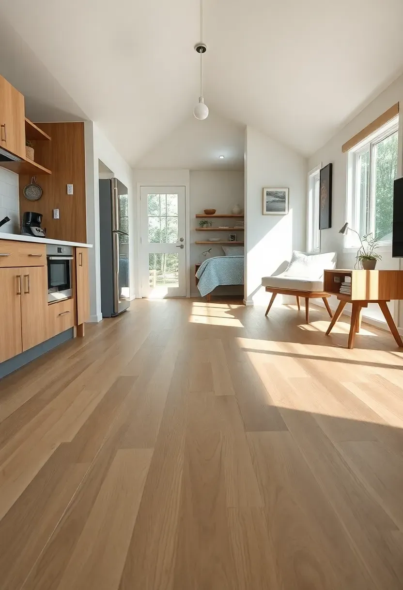
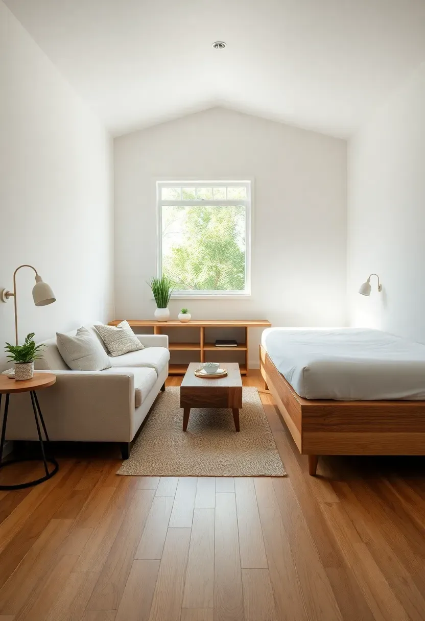
1. Continuous Light Flooring Throughout
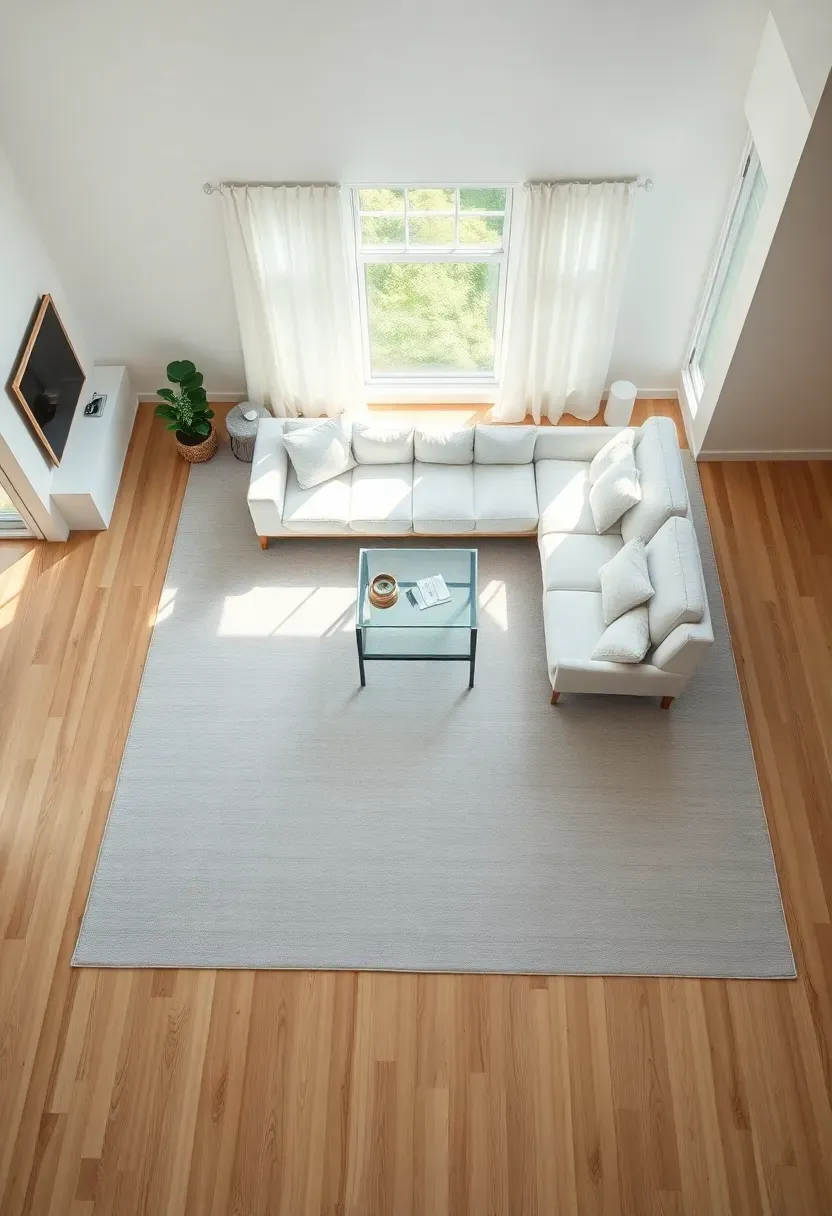
Running the same flooring material from entry through kitchen, living, and sleeping areas creates seamless visual flow that makes the entire space feel larger. The continuous surface eliminates visual breaks that chop up rooms into smaller boxes, while light-colored materials reflect more light and make surfaces recede. Choose wide-plank flooring (6-8 inches) rather than narrow strips to minimize seams, and run planks lengthwise toward the longest dimension of your space to draw the eye through the full footprint.
Tips
- If/Then: If replacing flooring isn't possible, use continuous light-colored rugs that create the illusion of seamless surface
- Run flooring in the direction of your longest wall to maximize perceived length
- Avoid patterned tiles or multiple floor transitions—keep it one material throughout
Best for: All tiny houses—this is the single most impactful visual expansion strategy
What this gives you: Seamless visual flow that eliminates room boundaries and makes your tiny house feel like one continuous, expansive space.
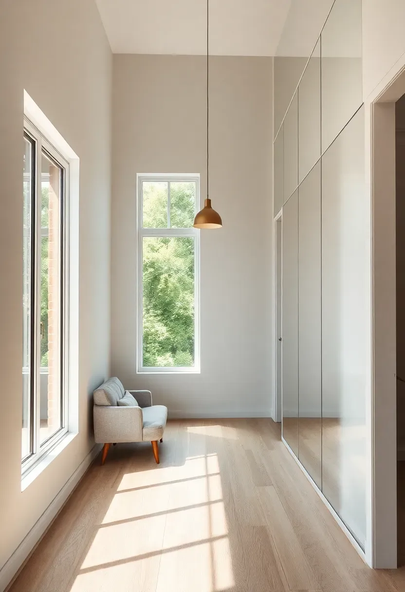
2. Floor-to-Ceiling Mirrors on Key Walls
Strategically placed full-wall mirrors double perceived space by reflecting entire rooms and bouncing natural light deeper into interiors. Position mirrors opposite windows to capture and multiply outdoor views, or place them at the end of long sightlines to create depth illusion that suggests space continues beyond the mirror surface. Frameless mirrors with polished edges create seamless reflections, while mirrors extending from floor to ceiling eliminate the visual ceiling line and make rooms feel taller.
Recommended
Items for this idea
Tips
- Do/Don't: Do use one large mirror—don't cluster multiple small mirrors which create visual clutter
- Install mirrors opposite windows, not adjacent, to maximize natural light reflection
- Choose frameless designs or ultra-thin frames to maintain seamless illusion
Placement note: Position on walls perpendicular to windows rather than parallel for maximum light multiplication.
What this gives you: Doubled perceived space and amplified natural light that makes your tiny house feel significantly larger and brighter.
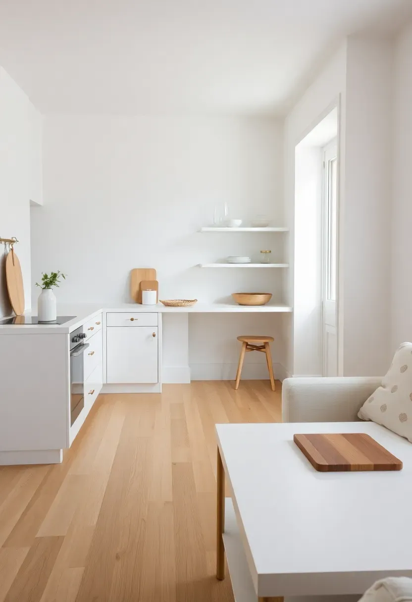
3. Monochromatic Color Scheme with One Accent
A monochromatic palette using varying shades of one color eliminates visual noise and creates seamless continuity that expands perceived space. White-on-white schemes are most effective, but cream, soft gray, or light neutral tones all work when carried consistently across walls, ceilings, floors, and major furniture pieces. Add one accent color in small doses—throw pillows, artwork, or a single statement piece—to prevent monotony without breaking the expansive monochromatic flow.
Tips
- Pro/Con/Fix: Monochromatic can feel sterile—fix with texture variation (knit throw, wood grain, woven rug) in same color family
- Use matte finishes rather than glossy to avoid cold, clinical feel
- Carry your base color onto at least 80% of visible surfaces for maximum expansion effect
Best for: Tiny houses under 200 square feet where every visual element impacts perceived space
What this gives you: Seamless visual continuity that eliminates room boundaries and makes your tiny house feel significantly larger.
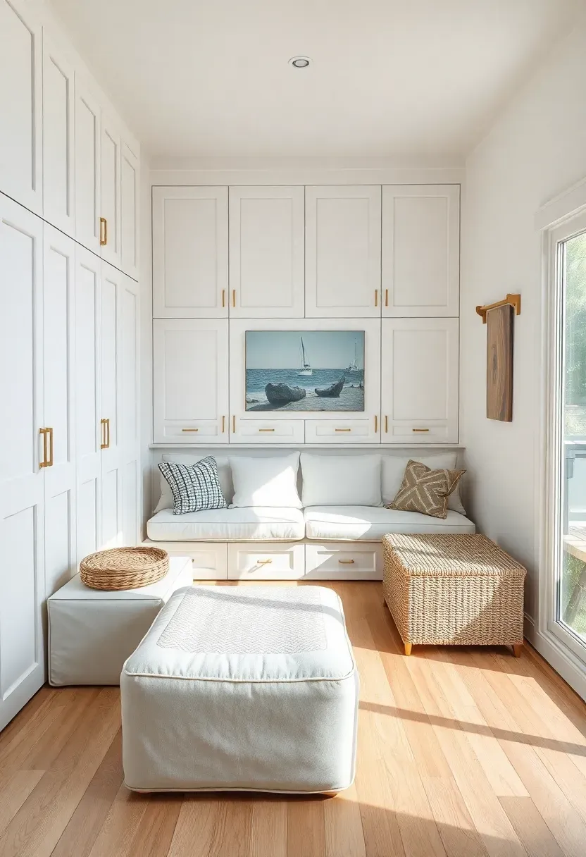
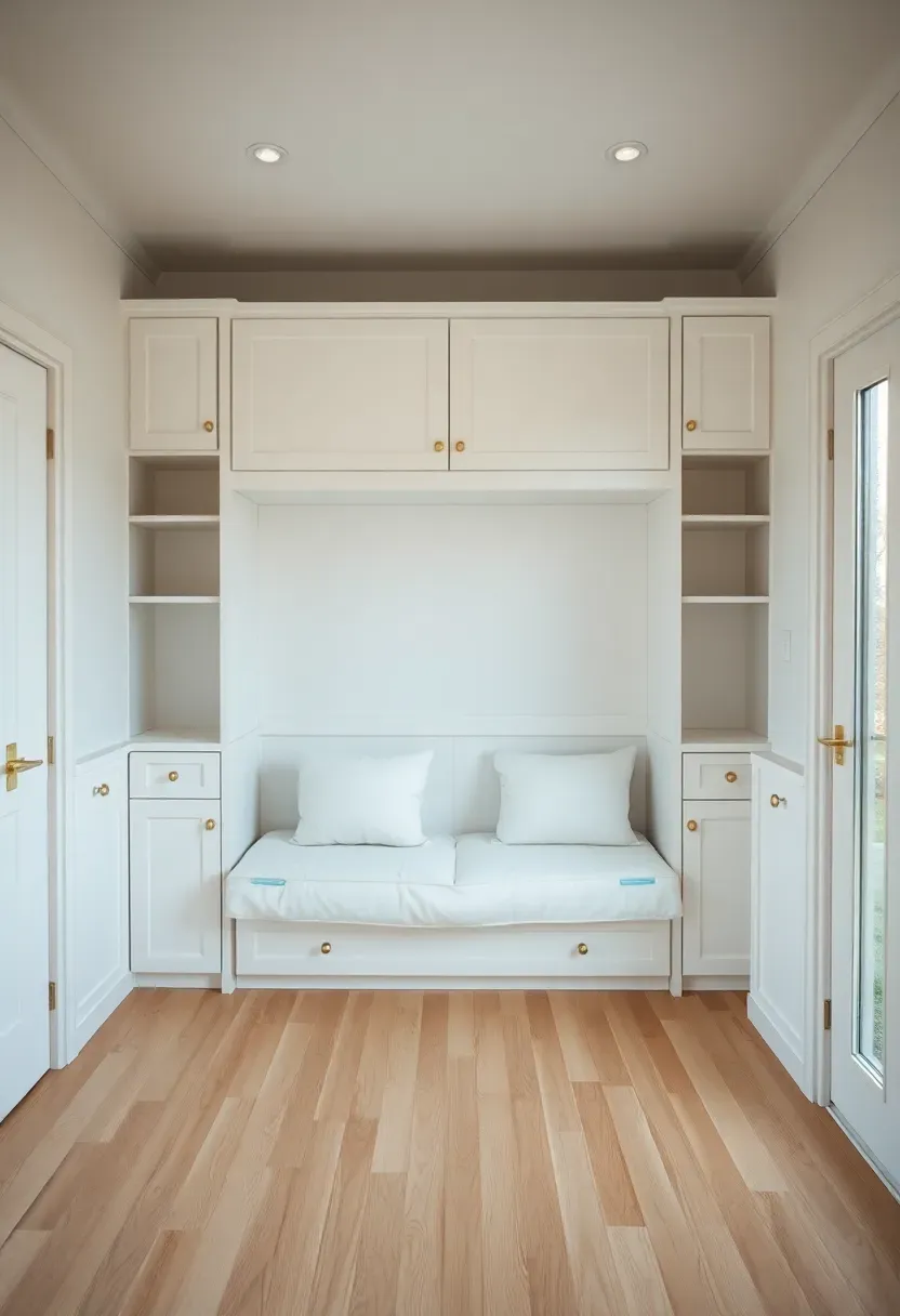
4. Eliminate Visual Clutter with Hidden Storage
Visual clutter from scattered belongings shrinks perceived space more than actual lack of square footage. Hidden storage built into walls, under furniture, and inside multi-functional pieces keeps surfaces clear and maintains open sightlines that make spaces feel larger. Design floor-to-ceiling storage that covers entire walls, use ottomans and benches with interior storage, and choose beds with under-bed drawers to hide 80% of your belongings while maintaining a clean, expansive appearance.
Recommended
Items for this idea
Tips
- Use push-latch door hardware rather than pulls/knobs to maintain seamless surface appearance
- If/Then: If building storage isn't possible, use consistent matching bins and baskets to hide clutter on open shelves
- Design storage to cover entire walls floor-to-ceiling for maximum visual impact
Budget/Time: High investment but permanent impact—worth prioritizing in build phase
What this gives you: Clutter-free surfaces and clear sightlines that maximize perceived space while storing all your belongings.
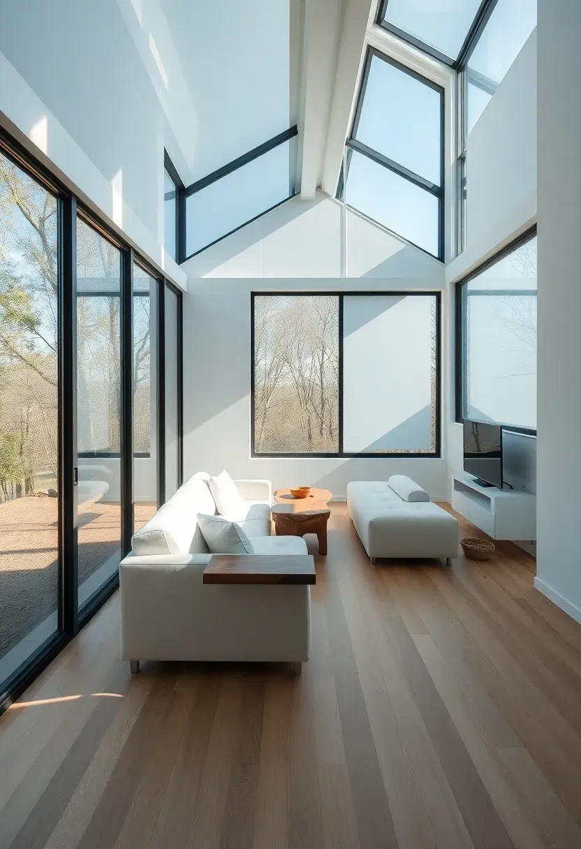
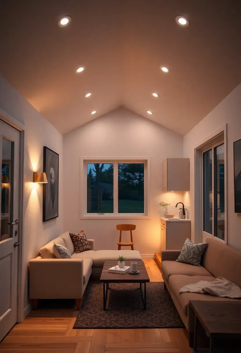
5. Raise Ceilings with Vaulted or Cathedral Design
Vaulted, cathedral, or raised ceilings draw the eye upward and create volume perception that makes tiny houses feel significantly larger even when floor area remains small. Even 4-5 feet of additional height at the peak creates dramatic expansion, while clerestory windows below vaulted portions bring in additional light that further enhances spaciousness. Exposed beams in vaulted ceilings add architectural interest without reducing perceived height, while white-painted vaulted ceilings feel taller than wood-toned ones.
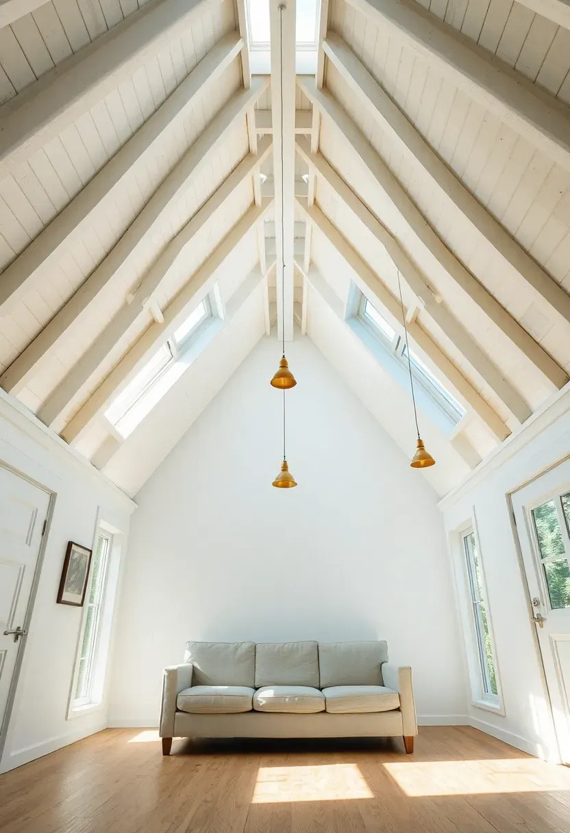
Tips
- Paint vaulted ceilings white rather than leaving natural wood to maximize height perception
- Add pendant lights at varying heights to emphasize vertical space
- Install clerestory windows where vault meets wall to bring in additional light
Best for: Tiny houses with loft access—vaulted main areas make lower lofts feel less cramped
What this gives you: Dramatic vertical expansion that makes your tiny house feel grand rather than cramped despite minimal floor area.
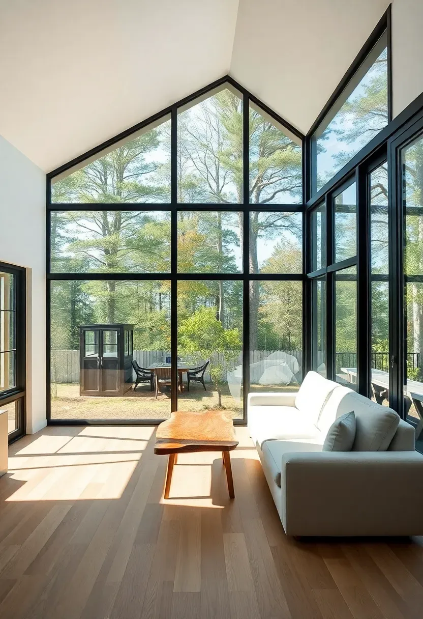
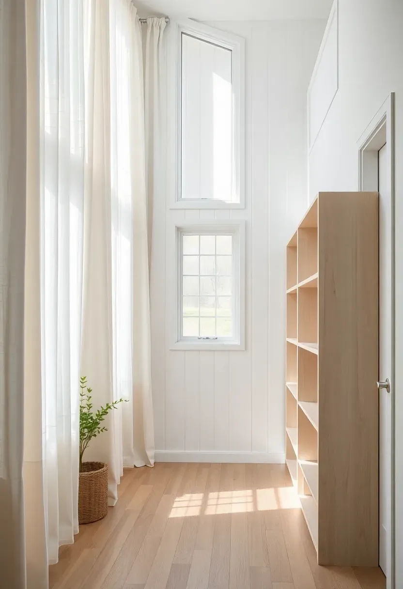
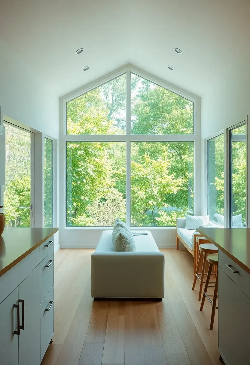
6. Large Windows Without Visual Breaks
Large expanses of glass eliminate the boundary between interior and exterior, making tiny houses feel like they extend into the outdoors. Floor-to-ceiling windows, corner windows without framing, and glass doors create seamless connections to outside spaces while flooding interiors with natural light that expands perceived volume. Position windows to capture views and maximize daylight, avoiding multiple small windows that chop up walls with visual breaks.
Recommended
Items for this idea
Tips
- If/Then: If floor-to-ceiling isn't possible, install windows as large as your budget allows and position them 18 inches from floor
- Use corner windows that eliminate framing at the corner for maximum transparency
- Avoid window treatments entirely or use minimal sheer panels that don't block views
Avoid if: Your tiny house is in an urban setting with no views—focus instead on skylights and light wells
What this gives you: Eliminated interior-exterior boundaries that make your tiny house feel like it extends into the outdoors.
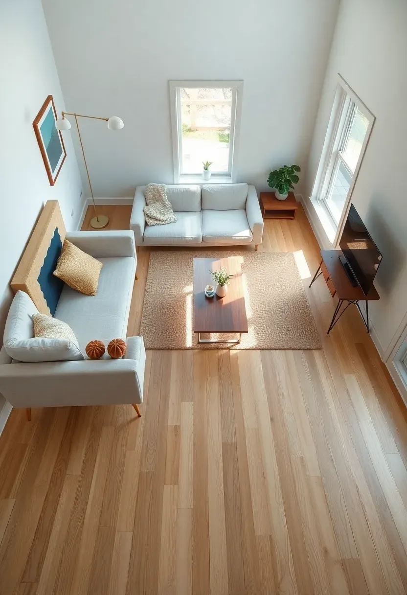
7. Floating Furniture and Legged Pieces
Furniture that floats away from walls or shows legs underneath creates visible floor space that makes rooms feel larger. Choose sofas, chairs, and tables raised on legs rather than boxy pieces that sit directly on the floor, and float seating arrangements toward the center of rooms rather than pushing everything against walls. The visible floor underneath furniture tricks the eye into seeing more square footage, while floating arrangements create circulation paths that feel spacious rather than constricted.
Tips
- Do/Don't: Do choose raised furniture on legs—don't use boxy pieces that sit directly on floor
- Float your main seating piece at least 12 inches from the wall to show floor behind it
- Choose tapered or hairpin legs rather than block legs for lighter visual weight
Budget/Time: No cost impact—this is about furniture selection, not construction
What this gives you: Visible floor space that tricks the eye into perceiving more square footage than actually exists.
8. Multi-Functional Built-Ins Instead of Freestanding
Built-in furniture eliminates the visual weight of freestanding pieces while serving multiple functions, reducing the total number of furniture pieces needed and creating seamless integration with walls. Design built-ins that match wall color so they recede rather than stand out, and incorporate multiple functions into each piece—a murphy bed with integrated sofa, storage stairs that double as seating, or a dining table that folds into the wall when not in use. Fewer pieces means more open space and less visual clutter.
Recommended
Items for this idea
Tips
- Paint built-ins the same color as walls to make them recede rather than stand out
- Design each built-in to serve at least 2-3 functions to reduce total furniture count
- Use push-latch hardware rather than visible pulls for seamless wall integration
Best for: Tiny houses under 200 square feet where every piece must earn its space
What this gives you: Fewer visual elements and seamless wall integration that maximizes perceived space while providing all needed functions.
9. Glass and Open-Frame Furniture
Transparent furniture materials like glass, acrylic, and open metal frames allow sightlines to pass through pieces rather than stopping at them, maintaining visual continuity that makes spaces feel larger. Glass coffee tables, acrylic dining chairs, and wire-frame shelving units preserve floor visibility and maintain the sense of open space even when furniture occupies physical area. Avoid solid wood furniture that blocks views and creates visual barriers.
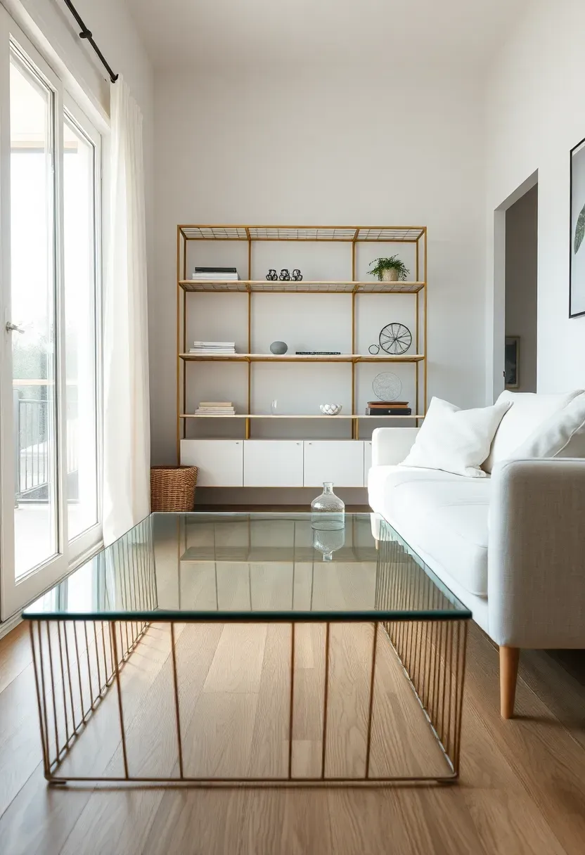
Tips
- Choose glass tops for dining and coffee tables to maintain floor visibility
- If/Then: If glass feels too modern, choose open-frame wood or metal furniture that preserves sightlines
- Avoid solid case goods—opt for open shelving instead of closed cabinets where possible
Budget/Time: Moderate—glass furniture costs more but delivers significant space expansion
What this gives you: Transparent furniture that preserves sightlines and maintains open feeling even in furnished spaces.
10. Vertical Emphasis with Floor-to-Ceiling Elements
Draw the eye upward with vertical elements like floor-to-ceiling curtains, tall bookcases, or vertical artwork to emphasize height rather than focusing on limited floor area. Floor-to-ceiling curtains hung well above window frames create tall windows illusion, while vertical stripe wallpaper or shiplap installed vertically reinforces height perception. Vertical emphasis redirects attention from horizontal constraints to vertical volume, making spaces feel larger.
Recommended
Items for this idea
Tips
- Hang curtains 4-6 inches above window frames and let them pool slightly on floor for maximum height
- Install shiplap or board-and-batten vertically rather than horizontally to emphasize height
- Choose tall, narrow artwork and mirrors rather than wide horizontal pieces
Budget/Time: Low—curtains and vertical wall treatments are inexpensive and high-impact
What this gives you: Emphasized vertical space that draws attention away from limited floor area and makes your tiny house feel taller.
11. Single Large Rug Instead of Multiple Small Ones
One large rug that covers most of the floor creates continuous surface that makes spaces feel larger, while multiple small rugs chop up floors into smaller zones. Choose a rug size that allows at least the front legs of all furniture in a seating arrangement to sit on it, and position rugs to define zones without creating islands of flooring that make spaces feel broken up. Light-colored rugs maintain the seamless light flooring effect.
Tips
- Do/Don't: Do use one large rug—don't use multiple small rugs that break up floor space
- Size rugs so front furniture legs sit on rug and back legs remain on floor
- Leave 6-12 inches of bare floor around rug edges to maintain floor continuity
Placement note: In open tiny houses, use rugs to subtly define zones without creating hard boundaries.
What this gives you: Unified floor surface that makes your tiny house feel like one continuous, expansive space.
12. Minimal Window Treatments or None
Eliminate or minimize window treatments to maximize glass area and maintain the seamless connection to outdoors that expands perceived space. If privacy or light control requires treatments, choose simple roller shades or sheer panels that can disappear completely when not in use. Avoid heavy drapes, valances, or layered treatments that reduce window size and add visual clutter around glass.
Recommended
Items for this idea
Tips
- If/Then: If privacy is needed, use solar shades that disappear when rolled up, not curtains that stack
- Forgo valances and decorative treatments entirely—let windows be the statement
- Choose motorized shades that hide completely in valance when retracted
Best for: Tiny houses in private settings—urban tiny houses may need some privacy treatments
What this gives you: Maximum glass area and seamless outdoor connection that makes your tiny house feel significantly larger.
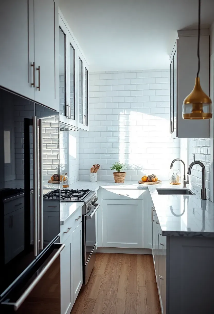
13. Reflective Surfaces to Bounce Light
Glossy surfaces, metallic accents, and mirrored elements bounce light around interiors, amplifying natural and artificial light to create brightness that expands perceived space. Incorporate glass table tops, metallic light fixtures, mirrored cabinet inserts, and glossy tile backsplashes to reflect light deeper into spaces. Even small reflective elements add up to significantly brighter, more expansive-feeling interiors.
Tips
- Install glass cabinet doors rather than solid to reflect light and add depth
- Choose metallic light fixtures in brass, copper, or chrome to bounce light
- Use glossy rather than matte tile for backsplashes to maximize light reflection
Best for: Tiny houses with limited natural light—reflective surfaces compensate for smaller windows
What this gives you: Amplified natural light that brightens interiors and makes your tiny house feel larger and more open.
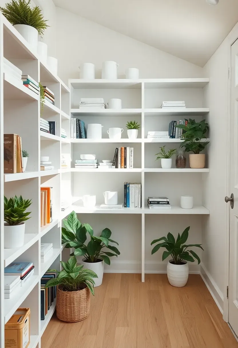
14. Open Storage with Consistent Organization
When closed storage isn't possible, open shelves organized with consistent styling feel intentional rather than cluttered. Use matching storage containers, arrange items with consistent spacing, and limit displayed objects to a curated collection that feels purposeful. Consistent organization turns storage into decor while maintaining accessibility, avoiding the messy appearance that makes small spaces feel cramped.
Recommended
Items for this idea
Tips
- Use matching storage containers in one color for cohesive appearance
- If/Then: If complete consistency isn't possible, group items by color or material for visual organization
- Leave 20% of each shelf empty to maintain breathing room and prevent cluttered appearance
Budget/Time: Low—this is about organization, not construction
What this gives you: Storage that feels like intentional decor rather than clutter, maintaining open feeling while providing accessibility.
15. Sightlines to Outdoors from Multiple Vantage Points
Position windows and glass doors so outdoor views are visible from multiple seating and standing positions throughout your tiny house. When you can see outside from the kitchen, living area, and sleeping nook, each zone feels connected to expansive outdoor space rather than enclosed in a small box. Arrange furniture to face windows rather than walls, maximizing the connection to exterior views.
Tips
- Arrange all primary seating to face windows rather than walls
- Install windows on multiple walls to capture views from various positions
- Position your bed so you see outdoors immediately upon waking
Placement note: Prioritize outdoor-facing windows for frequently used zones like kitchen and main seating.
What this gives you: Continuous connection to outdoor views that makes your tiny house feel like part of a larger landscape.
16. Low-Profile Furniture to Preserve Vertical Space
Low-profile furniture with reduced height maintains generous vertical clearance above seating and surfaces, preserving the sense of volume and spaciousness. Choose sofas with seat heights around 15 inches rather than standard 18 inches, select low coffee tables and console tables, and opt for platform beds rather than tall bed frames. Lower furniture leaves more vertical space empty, maintaining the feeling of airiness and volume.
Recommended
Items for this idea
Tips
- If/Then: If standard-height furniture must be used, visually lower it with oversized floor cushions nearby
- Choose sofas and chairs with exposed legs rather than skirts to maintain visible floor space
- Select platform beds rather than beds with box springs and tall frames
Budget/Time: Moderate—custom low-profile furniture may cost more than standard pieces
What this gives you: Preserved vertical space that maintains airiness and volume in your tiny house.
17. Strategic Lighting Layer Without Visual Clutter
Layer lighting with recessed ceiling lights, wall sconces, and integrated under-cabinet lighting to illuminate spaces without adding visual clutter from multiple floor and table lamps. Recessed lighting disappears when off, wall-mounted fixtures preserve floor space, and integrated lighting creates ambient brightness that expands perceived space. Avoid multiple table lamps that accumulate on surfaces and create visual noise.
Tips
- Install recessed lights on dimmers to control brightness without switching between multiple lamps
- Use wall sconces rather than table lamps to preserve surface space
- Avoid visible cords—integrate lighting into cabinetry and architecture
Best for: All tiny houses—recessed lighting should be planned during construction phase
What this gives you: Layered illumination without visual clutter that maintains open feeling while providing flexible lighting.
18. Built-Ins That Match Wall Color
Paint built-in cabinets, shelves, and storage walls the same color as surrounding walls so they recede visually rather than standing out as separate elements. White built-ins on white walls, cream cabinets on cream walls—this matching strategy makes storage disappear, leaving the impression of continuous wall surface rather than furniture filling space. The result is significantly more open-feeling rooms with all the functionality of abundant storage.
Recommended
Items for this idea
Tips
- Do/Don't: Do match built-ins to wall color—don't create contrast with different stain or paint colors
- Use minimal or hidden hardware to maintain seamless wall appearance
- Paint interior cabinet backs the same color for additional depth camouflage
Budget/Time: Low cost impact—paint color doesn't affect budget, only planning
What this gives you: Storage that visually disappears, leaving the impression of open wall space rather than furniture-filled rooms.
19. Decluttered Surfaces with Minimal Accessories
Keep horizontal surfaces—countertops, tables, shelves—80% clear to maintain the visual spaciousness that comes from uncluttered surfaces. Limit accessories to a few intentional pieces rather than accumulated collections, and choose larger statement pieces rather than multiple small objects that create visual noise. Clear surfaces feel expansive even in small footprint, while cluttered surfaces shrink perceived space regardless of actual size.
Tips
- If/Then: If you can't bear minimal surfaces, rotate accessories seasonally rather than displaying everything at once
- Follow the one-item-per-surface rule for maximum spaciousness
- Choose larger statement pieces rather than collections of small objects
Best for: Tiny house dwellers who struggle with accumulation—regular editing sessions maintain spaciousness
What this gives you: Visually expansive surfaces that make your tiny house feel significantly larger regardless of actual size.
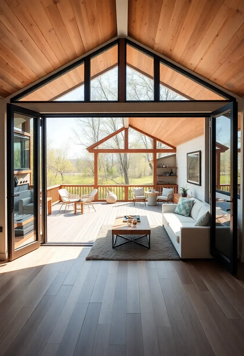
20. Indoor-Outdoor Connection Through Large Glass Doors
Install large sliding or bifold glass doors that completely open to connect your tiny house interior with exterior deck or patio space. When open, these doors eliminate the boundary between inside and outside, effectively doubling your living space. When closed, floor-to-ceiling glass maintains visual connection to outdoors and floods interiors with light. This strategy is particularly powerful for tiny houses under 200 square feet.
Recommended
Items for this idea
Tips
- Continue the same flooring material from interior to exterior for seamless flow
- Choose bifold doors that fold completely to side rather than sliding doors with stacking panels
- Design exterior deck as continuation of interior living space with coordinated furniture
Best for: Tiny houses on foundations—wheel houses can use this but face weight and size constraints
What this gives you: Effectively doubled living space through seamless indoor-outdoor connection that makes your tiny house feel twice as large.
Learning how to make a tiny house feel bigger comes down to controlling perception through strategic design choices rather than actually adding square footage. These twenty visual expansion tricks work together to maximize vertical volume, maintain seamless sightlines, amplify natural light, and eliminate visual clutter -- all of which make a small space look bigger than it really is. We found the most effective approach combines three to five of these strategies rather than attempting all twenty, with priority given to continuous light flooring, large mirrors, monochromatic color schemes, and built-in hidden storage for maximum impact with minimum effort.
About the author
OBCD
CGI visualization and interior design content. We create detailed 3D renders and curate practical design ideas for every room in your home.