15 Architectural Concrete Ideas That Transform Urban Public Spaces
Architectural concrete ideas can reshape how cities feel at street level -- making public spaces more resilient, legible, and comfortable by defining how people move, pause, and gather. From textured plaza paving and sculptural seating to facade fins and waterfront steps, concrete urban design turns infrastructure into everyday civic care.
These 15 architectural concrete ideas focus on the public realm with tactile surfaces, durable finishes, and smart details that bring a calmer rhythm to streets, parks, and plazas. Whether you are planning a pocket park, a transit shelter, or a bridge promenade, these concrete public space ideas offer practical direction and lasting design.
Quick FAQ
How does architectural concrete in urban environments improve comfort?
It handles heat, weather, and heavy use while staying visually calm. The mass reads as stable, which makes public spaces feel safer and more intentional.
Which architectural concrete finishes work best for plazas?
Broomed, bush-hammered, and fine exposed aggregate surfaces stay slip-resistant and readable. They catch light in a way that keeps large spaces legible without signage.
Should I avoid dark architectural concrete for city spaces?
Yes, very dark mixes can feel hot and heavy in tight areas. Mid-tone grays with warm aggregate stay cool and keep the area visually open.
Why do architectural concrete edges matter for accessibility?
Rounded or chamfered edges reduce trips and feel better at touch points. They also guide wheels and canes more safely along routes.
What architectural concrete details reduce maintenance in urban areas?
Matte sealers, drip grooves, and tight joints reduce staining and water streaks. Simple profiles also make repairs faster and more consistent.
As an Amazon Associate I earn from qualifying purchases.
Table of Contents
- 1. Textured Concrete Plaza Paving That Guides Pedestrian Flow
- 2. Sculptural Concrete Bench Islands for Public Seating
- 3. Slim transit shelter canopies
- 4. Underpass light-bouncing wall panels
- 5. Terraced Concrete Park Retaining Walls
- 6. Waterfront steps for flood seating
- 7. Shadow-casting facade fins
- 8. Slope-ready stair and ramp links
- 9. Bike hub plinths
- 10. Concrete Pocket-Park Planters With Seating Edges
- 11. Neighborhood amphitheater steps
- 12. Roadside sound-buffer walls
- 13. Wayfinding markers and light bases
- 14. Playground blocks and balance beams
- 15. Bridge-deck promenade edges
1. Textured Concrete Plaza Paving That Guides Pedestrian Flow
Architectural concrete paving can steer pedestrian flow by giving the plaza a readable texture and subtle direction. A bush-hammered finish catches morning light and keeps the surface grippy without visual noise. Use tonal bands to mark sitting zones and crossings so people move intuitively. The surface feels calm but purposeful.
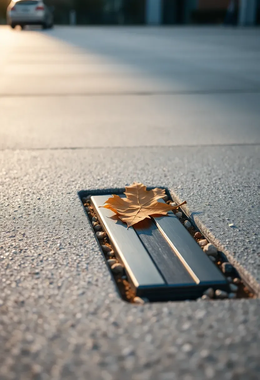
Micro-shadowing reduces glare at noon and helps the public realm feel cooler underfoot. Choose a matte sealer; avoid glossy coatings that highlight every footprint. Tight joints and a slight crown move water toward drains after summer showers. The texture also muffles rolling luggage and skate wheels, which keeps the plaza more comfortable.
Tips
- Do: Align joint lines with the main walking axis and sight lines.
- Don’t: Use glossy sealers in high-traffic zones.
Best for: Large squares and transit-adjacent plazas.
What this gives you: A legible plaza surface that guides people without extra signage.
We picked a few things that go well with this idea: Arcadia Fiberclay Outdoor Garden Bench Gray (★4.7), Furinno Tioman Hardwood Flower Box Brown (★4.5) and Furinno Tioman Hardwood Flowerbox With Bench (★4.5). As an Amazon Associate we earn from qualifying purchases.
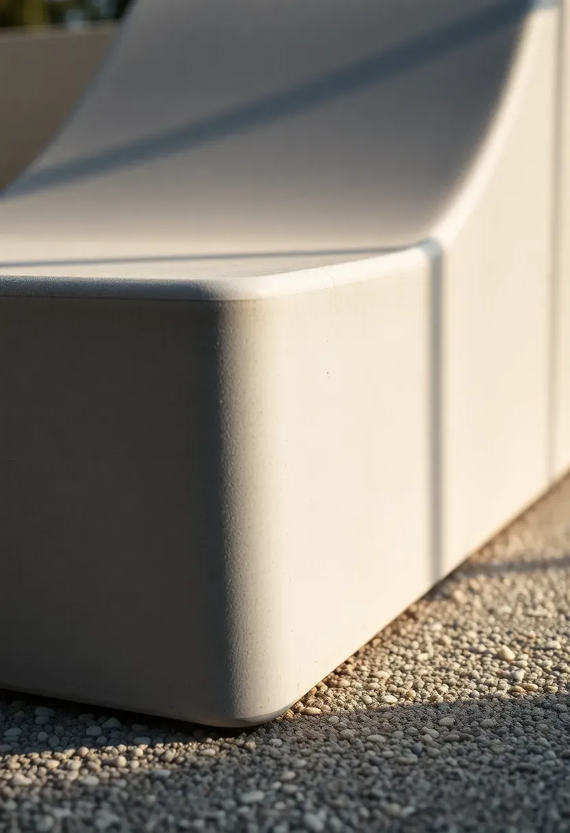
2. Sculptural Concrete Bench Islands for Public Seating
Architectural concrete seating can anchor the public realm by creating islands that people naturally orbit. Rounded edges and gentle curves invite short pauses without feeling monumental. Place the islands off the desire line so circulation stays open. A low planter in the middle adds shade and keeps the composition soft.
Placement note: Offset islands 3 to 5 feet from the main path so people can pass behind seats.
Keep seat heights near standard chair height so visitors feel secure. Avoid deep charcoal mixes in full sun; mid-tone grays reduce heat and feel lighter. A small backrest or leaning rail improves comfort without clutter. The sculptural form reads like street furniture and becomes a meeting point.
Tips
- If: The plaza is windy, then add a low planter to break drafts.
- If: The bench faces a view, then curve the seat to widen sight lines.
- If: Crowds are heavy, then mix perch and lounge heights.
What this gives you: Durable seating that organizes open space and invites pause.
We picked a few things that go well with this idea: Round Reusable Concrete Stepping Stone Molds 6-Pack (★5.0), Round DIY Concrete Stepping Stone Molds 6-Pack (★4.6) and Round Plastic Cement Stepping Stone Molds 8-Pack (★3.8). As an Amazon Associate we earn from qualifying purchases.
3. Slim transit shelter canopies
Architectural concrete canopies give a transit corridor a calm, permanent edge without bulky steel frames. A thin slab reads precise and helps a stop feel cared for. Keep side panels clear so visibility stays open for riders. The mass also dampens traffic vibration at the curb.
Why it works: A slim edge creates visual lightness while still feeling sturdy at street level.
GFRC panels can achieve thin profiles without sacrificing durability. Avoid heavy brackets that make the canopy look temporary; concealed plates keep the line clean. A warm gray mix hides soot and brake dust better than bright white. Add a drip groove so water does not streak the face or splash waiting riders.
Tips
- Pro: Thin edges feel modern and reduce visual weight.
- Con: Very thin slabs can read fragile if poorly detailed.
- Fix: Add crisp reveals and concealed supports for confidence.
Budget/Time: Moderate cost, fast assembly with prefabricated panels.
What this gives you: A transit stop that feels safe, clear, and permanent.
We picked a few things that go well with this idea: Arcadia Fiberclay Outdoor Garden Bench Gray (★4.7), Modway Brion Concrete Dining Table Stool Set and Oasbira Aluminum Outdoor Patio Sectional Set Gray (★4.6). As an Amazon Associate we earn from qualifying purchases.
4. Underpass light-bouncing wall panels
Architectural concrete wall panels can turn a dark underpass into a brighter corridor with better underpass safety. Fluted or ribbed surfaces scatter light and make the walls feel more dimensional. A lighter mix keeps the space from feeling cavernous. The texture also hides grime between cleanings.
Recommended
Items for this idea
Common mistake: Glossy panels create glare bands that feel harsh and unsafe.
Use linear lighting at the top edge to wash the surface evenly. Avoid deep grooves that trap litter; shallow ribs stay clean and readable. A continuous handrail adds comfort without cluttering the wall. The corridor feels civic and well maintained instead of leftover infrastructure.
Tips
- Micro-hack: Run ribs parallel to travel to elongate the tunnel.
- Micro-hack: Use warm-white LEDs to soften the mood.
- Micro-hack: Place fixtures in a continuous line, not spots.
- Micro-hack: Seal with a matte finish to cut streaking.
What this gives you: A brighter, safer underpass that feels intentional.
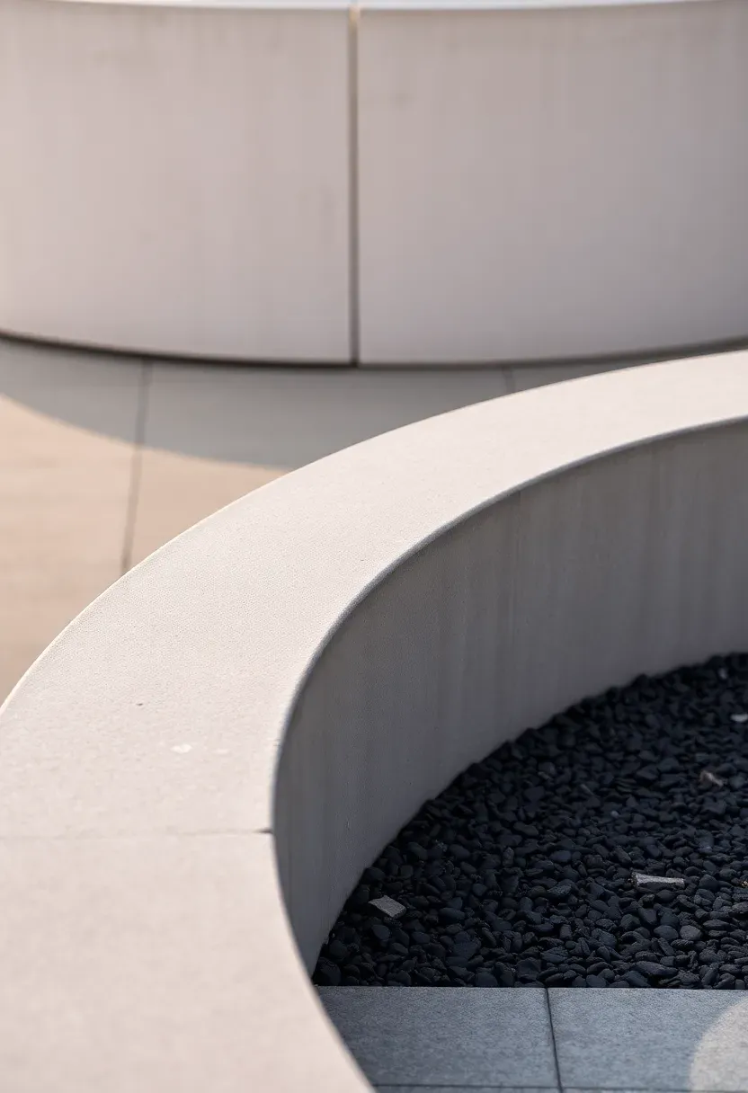
5. Terraced Concrete Park Retaining Walls
Architectural concrete retaining walls can organize slopes into terraces that support stormwater management and everyday use. Board-formed texture adds warmth and connects the structure to nearby trees. The steps create flat zones for seating, play, and planting. The site reads as designed rather than leftover. A low seat edge on one tier invites casual viewing.
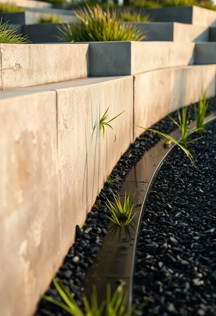
Include gravel beds and weep holes so water drains quietly through the tiers. Avoid tall, fortress-like walls; smaller steps feel more welcoming and easier to climb. A thin cap detail softens the top edge for sitting and reduces chipping. The terraces invite lingering while still doing serious slope work. Small planting pockets between tiers soften edges and cool.
Tips
- Do: Keep terrace heights low and frequent.
- Don’t: Stack more than two tiers without a landing.
Best for: Hillside parks and schoolyards.
What this gives you: A sloped site that becomes usable, social ground.
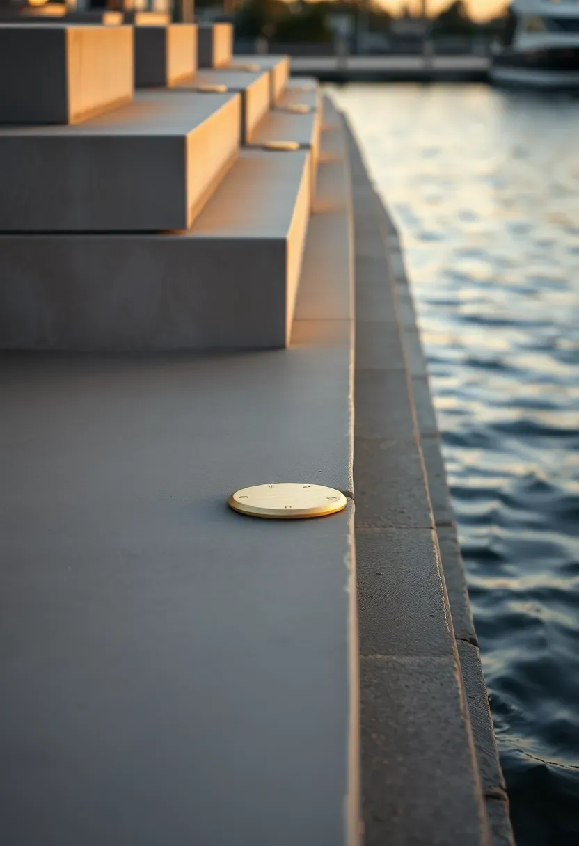
6. Waterfront steps for flood seating
Architectural concrete steps can turn a hard edge into flood resilience and casual seating. Broad treads invite people to sit, watch the water, and gather for events. The mass resists wave impact and debris during storms. A simple geometry stays easy to maintain.
Recommended
Items for this idea
Placement note: Lift the first tread just above typical high water to reduce daily splash.
Avoid sharp nosings that chip under salt exposure; chamfered edges wear better. A brushed finish keeps the steps safe when wet without looking rough. Consider a small brass tide marker as a quiet civic detail rather than signage. The edge feels welcoming even when water levels shift.
Tips
- If: The site is tidal, then use dense, low-permeability mixes.
- If: Crowds gather, then widen treads beyond standard seating.
- If: Sun exposure is high, then choose a lighter gray tone.
What this gives you: A waterfront edge that is social, durable, and resilient.
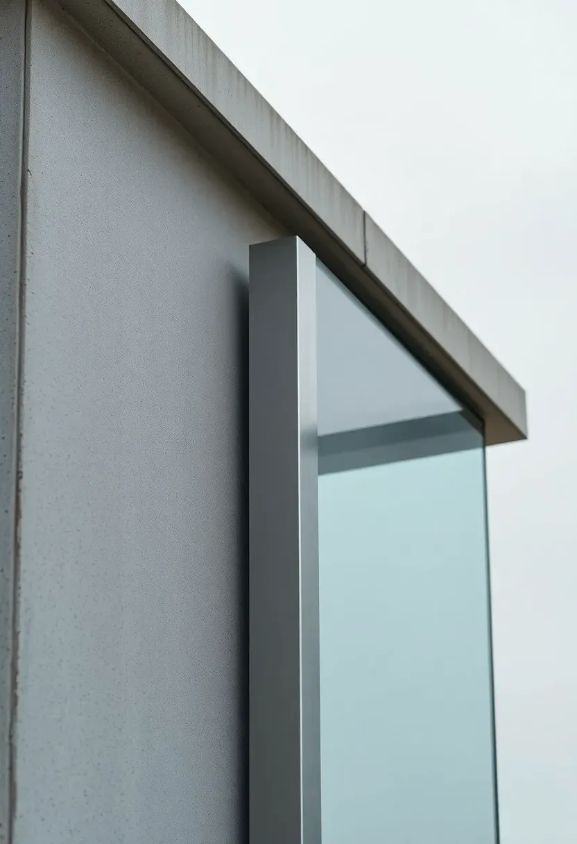
7. Shadow-casting facade fins
Architectural concrete facade fins can shape microclimate and give long buildings a human rhythm. Slim verticals cast shifting shadows that cool sidewalks and reduce glare. A fine exposed aggregate surface adds texture without heavy ornament. The street feels more alive throughout the day.
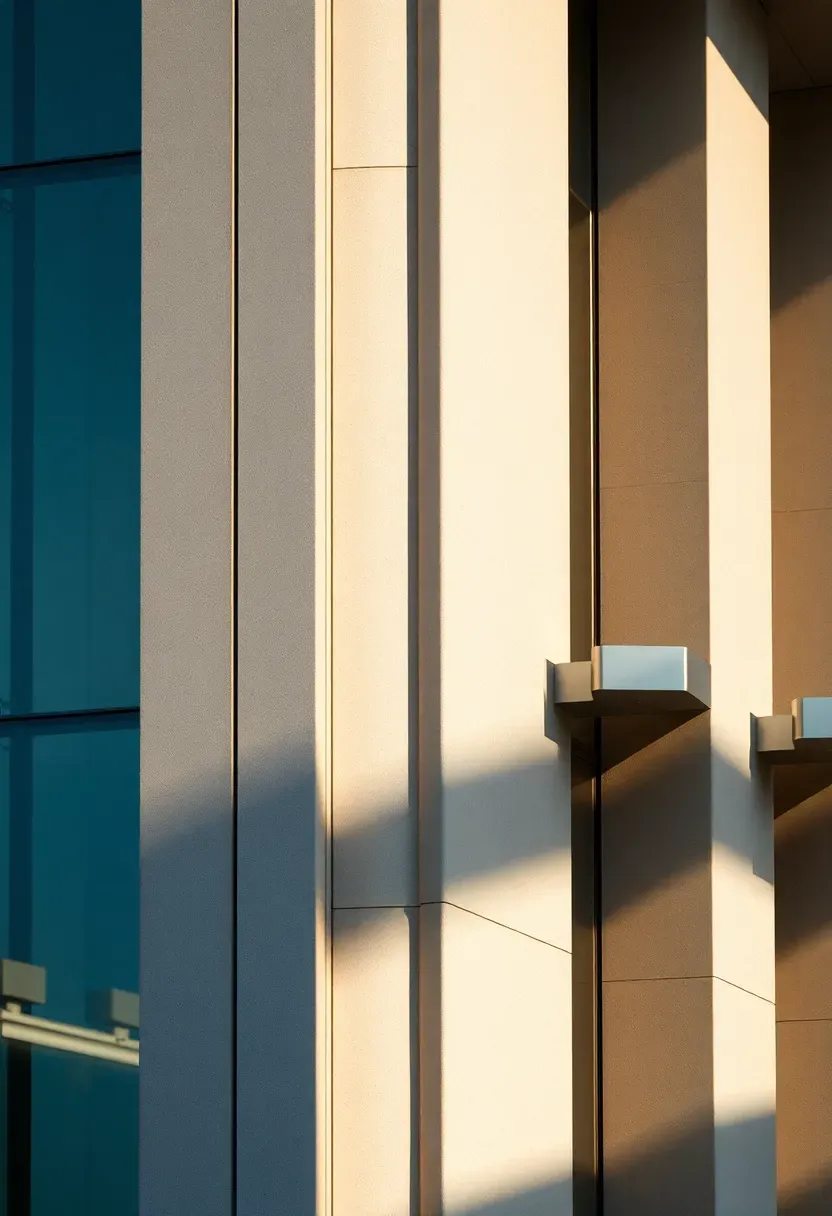
Why it works: The fins read as structure and shade, so the facade feels calmer and cooler.
Avoid overly deep fins that darken interiors; a slim depth keeps daylight balanced. Align fins with window mullions so the pattern feels deliberate. A lighter mix reduces heat gain and softens the mass at pedestrian eye level. The facade stays expressive without shouting.
Tips
- Pro: Shadow bands add texture without extra materials.
- Con: Deep fins can block winter light.
- Fix: Use adjustable spacing on the sunniest elevations.
Avoid if: Interior daylight is already limited.
What this gives you: A cooler sidewalk and a more human-scaled facade.
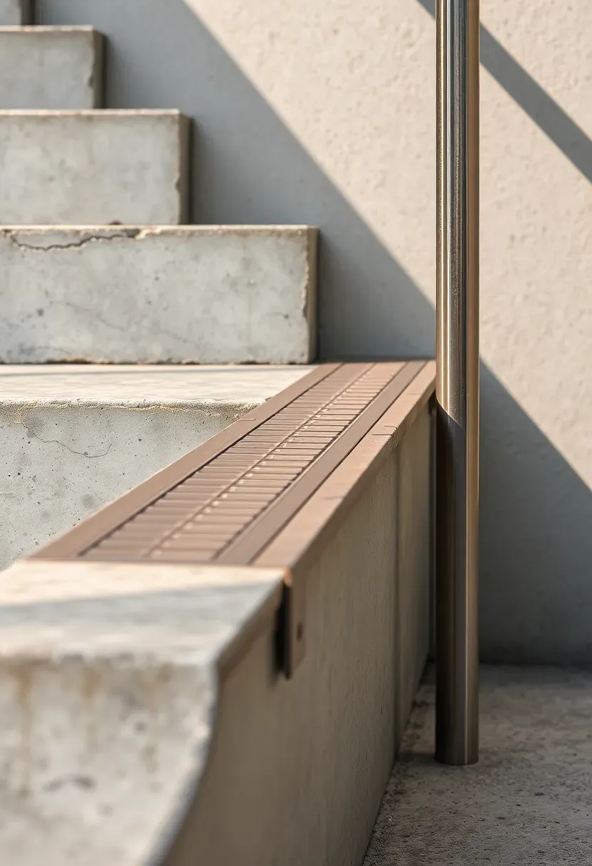
8. Slope-ready stair and ramp links
Architectural concrete stairs and ramps can stitch steep blocks together while supporting universal accessibility. A shared alignment makes the route feel equal for everyone. Tactile strips and steady handrails build confidence on long climbs. The surface reads like a civic connector, not leftover infrastructure. A continuous handrail supports night use and reduces hesitation on long climbs.
Recommended
Items for this idea
Common mistake: Separating ramps too far from stairs makes the accessible route feel secondary.
Avoid steep grades that turn the ramp into a struggle; add landings for rest. A brushed finish balances grip with comfort on hands, knees, and wheels. Keep the riser height consistent so the climb feels more predictable. The link becomes a daily shortcut instead of a chore.
Tips
- Micro-hack: Add a low light strip at step edges for dusk.
- Micro-hack: Use contrasting tactile strips at landings.
What this gives you: An accessible connector people choose to use.
9. Bike hub plinths
Architectural concrete plinths can define a mobility hub while keeping bike parking tidy. A raised base makes racks visible and separates them from walking zones. The mass anchors fixtures and discourages theft. The space feels organized instead of cluttered. A low lighting strip at the edge improves visibility at night, especially in darker winter.
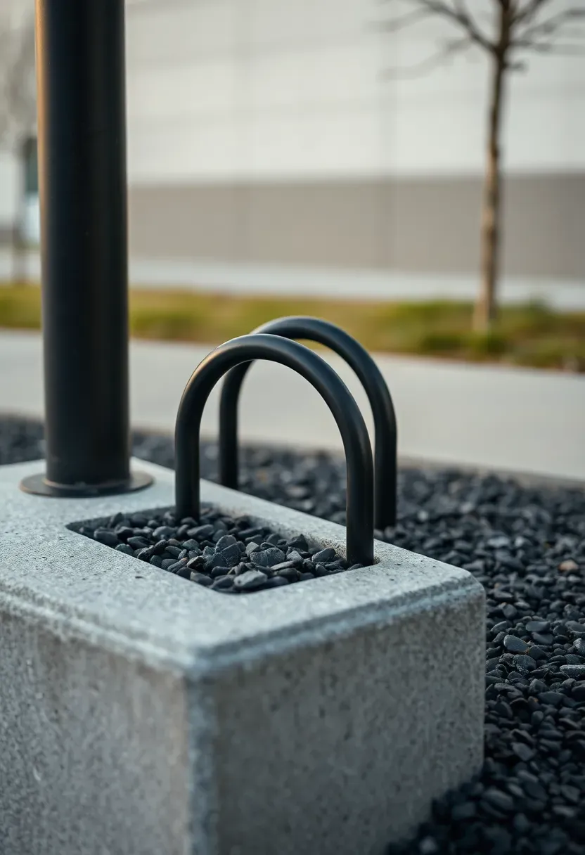
Chamfered edges reduce chipping and keep the base comfortable to step on. Avoid deep curbs that catch pedals; a low reveal looks clean and is easier to navigate. A matte sealer hides tire scuffs better than glossy coatings. The hub reads as deliberate street infrastructure.
Tips
- Do: Keep rack spacing generous for handlebars.
- Do: Place the plinth close to the curb for clear flow.
- Don’t: Use bright white concrete near heavy traffic.
Best for: Station forecourts and campus entries.
What this gives you: A bike zone that feels secure and orderly.
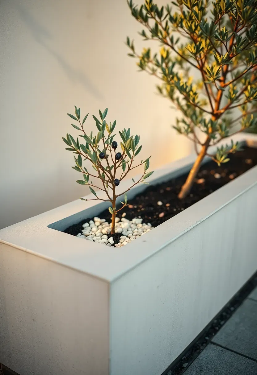
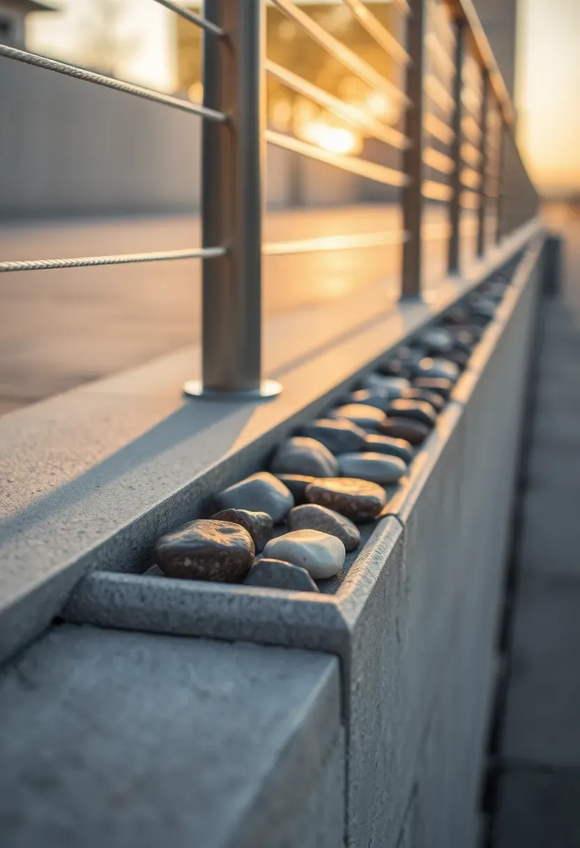
10. Concrete Pocket-Park Planters With Seating Edges
Architectural concrete planters can turn tiny leftovers into green infrastructure with seating. Thick edges become casual benches without extra furniture. A single tree adds shade and keeps the space legible. The mass keeps soil clean and contained.
Recommended
Items for this idea
Placement note: Line planters along the perimeter to keep the center open.
Avoid razor-sharp corners; softened edges are more comfortable and reduce chips. A smooth top surface keeps clothing from snagging and is easier to clean. Permeable concrete pavers nearby help the planting breathe and handle runoff. The pocket park reads as intentional rather than leftover urban space.
Tips
- If: Seating is the goal, then keep the edge near chair height.
- If: The site is small, then use one tree and low understory.
- If: Foot traffic is high, then add a darker base band.
- If: Drainage is tricky, then add a gravel drip line.
What this gives you: A small green pause point that still feels civic.
11. Neighborhood amphitheater steps
Architectural concrete amphitheater steps can frame community gathering without fences or walls. Wide treads let people sit, lounge, and watch events comfortably. The tiers define a focus area while keeping the edges open. The material handles heavy use and seasonal shifts.
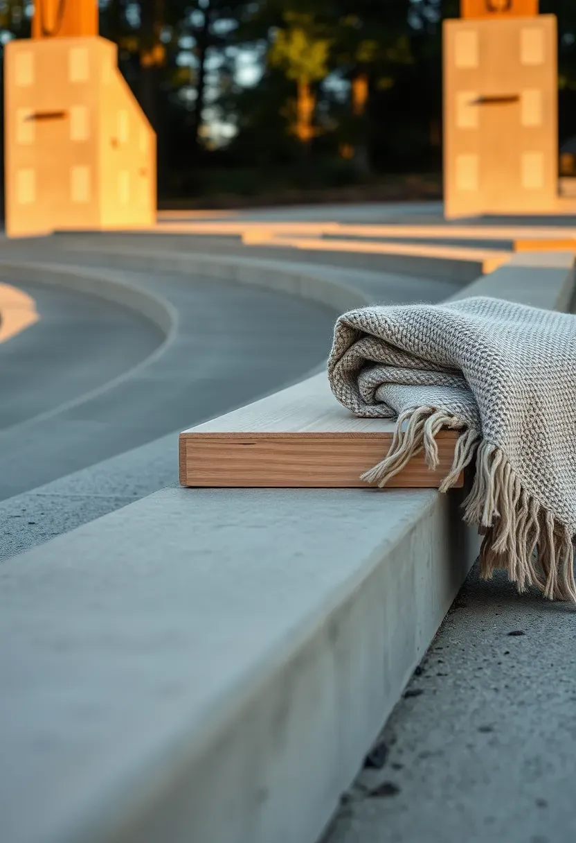
Why it works: The bowl shape creates a natural focus without shutting out the street.
Avoid tight risers that make sitting uncomfortable; generous treads read as seating, not stairs. A warm aggregate mix keeps the steps from feeling cold after sunset. Discreet lighting under the tread edge supports evening use without glare. The space works for performances and daily hangouts.
Tips
- Pro: Wide treads make the steps feel lounge-ready.
- Con: Deep bowls can trap sound and feel loud.
- Fix: Add planting or soft surfaces at the perimeter.
Best for: Schoolyards and neighborhood parks.
What this gives you: A durable outdoor room for daily and special events.
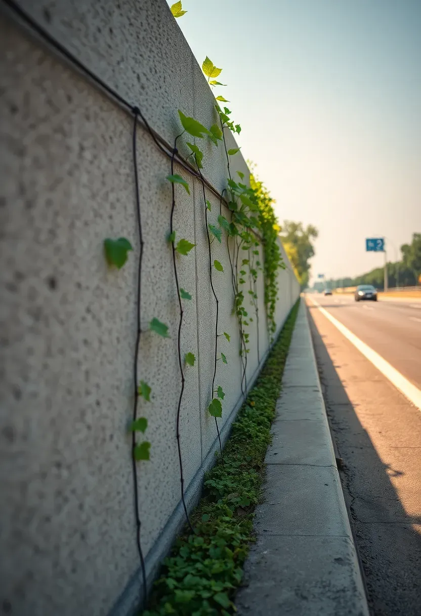
12. Roadside sound-buffer walls
Architectural concrete sound walls can reduce sound attenuation issues while still looking civic. A patterned surface breaks up scale and avoids a blank highway barrier. Planting at the base softens the edge and keeps the street feeling lived-in. The wall becomes part of the everyday streetscape. A shallow reveal line at the base keeps scuffs from reading as stains.
Recommended
Items for this idea
Common mistake: Deep relief patterns trap litter and make maintenance harder.
Avoid shiny sealers that highlight streaks from rain and road spray. A matte finish hides grime and keeps the wall even. Keep the top line level so the skyline feels calm from a distance. The result is a quieter edge that still feels welcoming.
Tips
- Micro-hack: Use shallow texture to scatter sound without debris.
- Micro-hack: Set the wall back to allow a planting strip.
What this gives you: A calmer street edge that still feels designed.
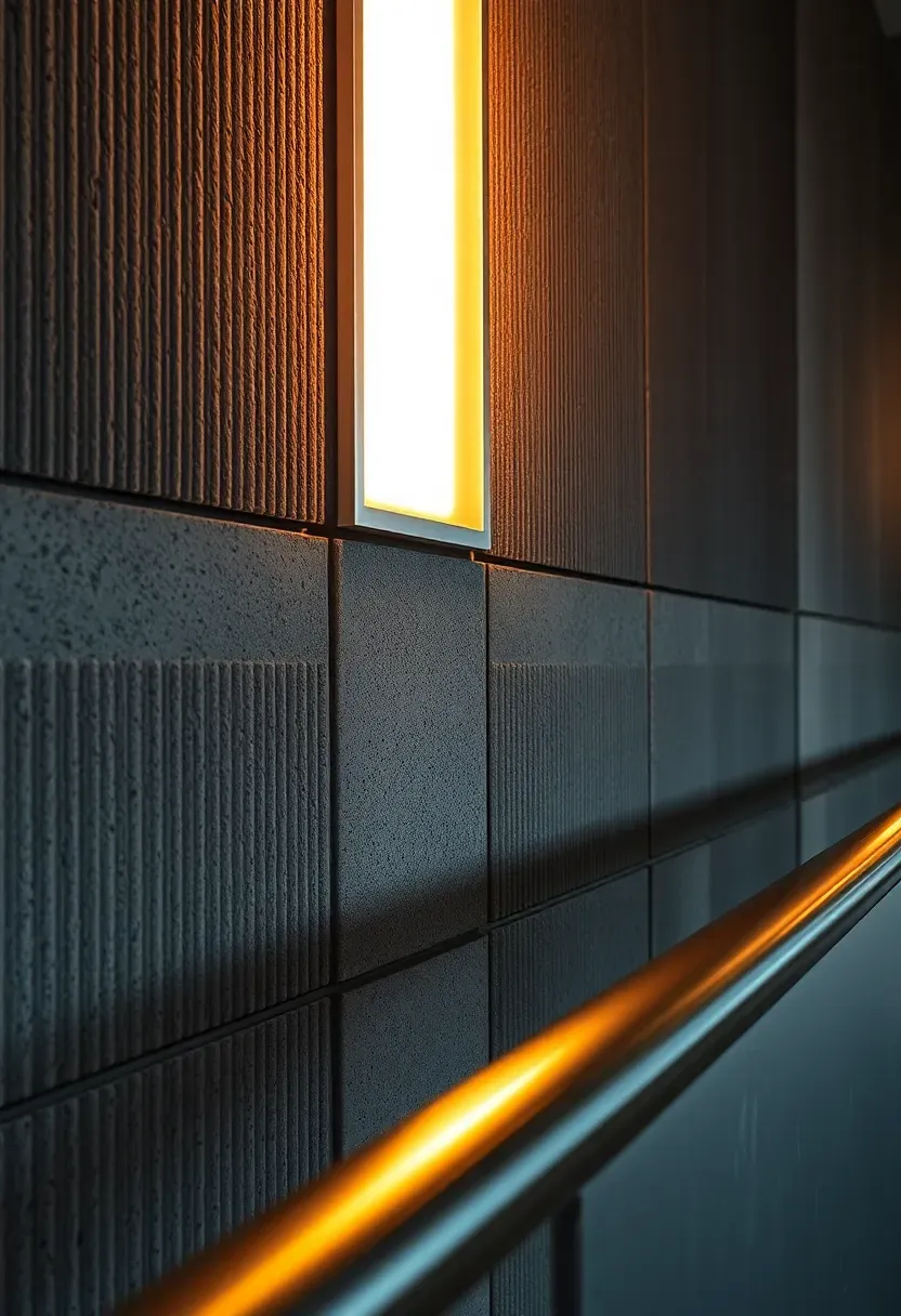
13. Wayfinding markers and light bases
Architectural concrete wayfinding markers guide people without visual clutter. A clean block or beacon reads clearly at decision points and supports intuitive wayfinding. Paired with soft lighting, it becomes a calm night anchor. The material stays sturdy and low maintenance.
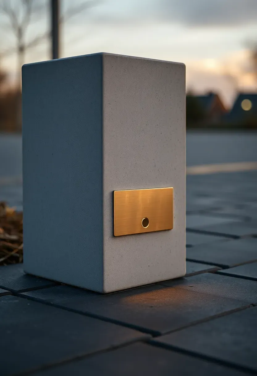
A crisp chamfer catches light during the day and keeps the form legible. Avoid oversized blocks that feel like barriers; a slimmer profile reads as guidance, not obstruction. Use a warm light base to reduce glare and keep the beacon gentle. The marker fits dense streets without adding noise. Subtle texture changes point toward the next marker. Keep finishes consistent with nearby paving for a cohesive wayfinding language.
Tips
- Do: Repeat height and spacing for consistent cues.
- Don’t: Over-label the marker if placement already guides.
Budget/Time: Low cost per unit, fast install in phases.
What this gives you: Quiet guidance that makes navigation feel effortless.
14. Playground blocks and balance beams
Architectural concrete play elements create durable forms with strong play value. Low blocks and beams invite climbing and balancing without complex equipment. Rounded edges keep the pieces friendly and safe. The simple geometry invites kids to invent their own games together. The material stands up to weather and constant use.
Recommended
Items for this idea
Placement note: Keep clear fall zones and line them with soft surfacing.
Avoid dark mixes that overheat in summer; lighter tones stay comfortable. A textured top improves grip and invites sitting during breaks. Arrange elements like stepping stones so kids can choose easy or challenging routes. The playground reads as sculptural and inclusive.
Tips
- If: Ages vary, then keep most pieces under knee height.
- If: Sun is harsh, then add shade trees or sails.
- If: Space is tight, then use fewer, larger blocks.
What this gives you: Simple, durable play forms that invite exploration.
15. Bridge-deck promenade edges
Architectural concrete edge beams can make a river crossing feel safe and generous. A wide coping gives people a place to lean and look out. The mass blocks wind without blocking views. A low wind screen adds comfort without blocking views from deck. The edge becomes a civic balcony.
Why it works: A consistent edge profile creates rhythm along the span.
Avoid narrow copings that make people feel exposed. A chamfered top is comfortable to touch and reduces chipping from bikes and maintenance carts. Subtle lighting under the coping improves night visibility without glare. The promenade feels intentional and welcoming at all hours.
Tips
- Pro: Wide coping encourages pause and lingering.
- Con: Heavy rails can block river views.
- Fix: Use slim cable rails with a solid base.
Best for: Pedestrian bridges and waterfront crossings.
What this gives you: A bridge edge that feels secure and scenic.
These architectural concrete ideas show that texture, proportion, and light are powerful civic tools for urban design. From plaza paving and sculptural seating to facade fins and bridge edges, concrete public space ideas work best with durable finishes, clear profiles, and warm-toned mixes. With thoughtful execution, architectural concrete transforms everyday infrastructure into welcoming urban spaces that people genuinely enjoy using.
About the author
OBCD
CGI visualization and interior design content. We create detailed 3D renders and curate practical design ideas for every room in your home.