Mid-Century Modern Kitchen Ideas: 21 Timeless Designs
Mid-century modern kitchen ideas blend the clean lines of 1950s and 1960s design with today's functional requirements, creating a space that feels both nostalgic and fresh. This aesthetic emphasizes flat-panel cabinetry, warm wood tones, geometric patterns, and statement lighting that transforms cooking into a stylish experience — and many of these ideas work beautifully in rental apartments without permanent changes.
Whether you're updating a post-war ranch home or infusing retro character into a rental apartment, mid-century modern design offers timeless appeal through natural materials, organic curves, and restrained ornamentation. The style balances form and function — leggy furniture exposes floor space for an airy feel, while materials like walnut, teak, and brass add warmth without clutter.
This guide covers 21 mid-century modern kitchen design ideas including cabinetry, lighting, layouts, and signature details, with practical tips for adapting these elements to your space and budget — even on a renter's timeline.
Quick FAQ
What defines mid-century modern kitchen style?
Flat-panel cabinets, tapered legs, warm wood tones, geometric backsplashes, and statement lighting with brass or enameled finishes. The style emerged from 1940s–1960s design emphasizing function, natural materials, and minimal ornamentation.
Are mid-century modern kitchens expensive to build?
Costs vary widely. Walnut cabinetry and vintage reproductions run premium, but you can achieve the look with flat-panel thermofoil doors, walnut-veneer accents, and affordable geometric tile. Prioritize cabinet door style and lighting over solid wood everywhere.
How do I modernize a mid-century kitchen without losing character?
Keep original flat-panel cabinets or cabinet fronts if possible—refinish rather than replace. Update appliances with panel-ready versions, swap dated countertops for quartz or walnut, refresh lighting with reproductions, and add a geometric backsplash.
What colors work best in mid-century kitchens?
Warm neutrals (cream, taupe, olive green) as base with accent colors like mustard yellow, burnt orange, or teal in small doses. Wood tones—walnut, teak, oak—anchor the palette. Avoid stark white; opt for off-white or warm gray.
Can mid-century modern work in small kitchens?
Yes—leggy cabinets and furniture create visual lightness, and light colors reflect space. Use upper glass-front cabinets to expand perceived volume, opt for open shelving on one wall, and choose a compact island with tapered legs to maintain flow.
What flooring complements mid-century kitchen design?
Medium-toned hardwood (white or red oak) with a matte finish, checkerboard linoleum in muted colors, or large-format terrazzo. For budgets, luxury vinyl plank convincingly mimics oak; avoid dark stains or high-gloss finishes.
As an Amazon Associate I earn from qualifying purchases.
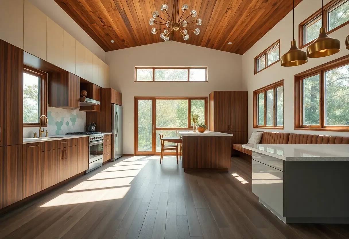
1. Flat-Panel Walnut Cabinets with Tapered Legs
Flat-panel walnut cabinetry defines mid-century modern kitchens with its clean horizontal lines, absence of ornamentation, and rich warm tones that anchor the space. Elevating lower cabinets on tapered legs—a signature detail—exposes flooring to visually expand the room while creating that iconic "floating" furniture feel. Pair with upper cabinets flush to the ceiling for vertical integration, and opt for hardware-free integrated pulls or minimal concave brass pulls to maintain streamlined surfaces.
Flat-panel walnut lower cabinets with tapered brass legs and cream upper cabinets in a mid-century modern kitchen
Mid-century modern kitchen ideas blend the clean lines of 1950s and 1960s design with today's functional requirements, creating a space that feels both nostalgic and fresh. This aesthetic emphasizes flat-panel cabinetry, warm wood tones, geometric patterns, and statement lighting that transforms cooking into a stylish experience — and many of these ideas work beautifully in rental apartments without permanent changes.. Flat-panel walnut lower cabinets with tapered brass legs and cream upper cabi
Prompt: Nature documentary captured on Hasselblad X2D 100C with XCD 90V lens at f/4, ISO 64, 1/125s shutter, tilt-shift for perfect plane of focus. Hyper-realistic 3/4 view of a mid-century modern kitchen with flat-panel walnut lower cabinets on tapered brass legs, cream-painted upper cabinets to ceiling, warm white oak flooring, minimal brass concave pulls, large window with simple white trim. Materials: walnut veneer, matte lacquer finish, brushed brass. Professional studio lighting: warm diffused morning light from large window left (5000K with 1/4 CTO warming gel), white reflector right for shadow fill, producing warm golden tones on walnut, soft gradient shadows, visible room context—white walls, subway tile backsplash in cream, no clutter. Timeless 1960s architectural mood, shallow depth of field with sharp cabinet details foreground, rule-of-thirds composition.
Tips
- Choose walnut-veneer cabinets over solid walnut to reduce cost while maintaining authentic appearance
- Space tapered legs 12–18 inches apart—too few looks spindly, too many blocks floor visibility
- Match leg finish to hardware (brass with brass) for cohesion, or opt for matte black legs for contrast
What this gives you: A visually light foundation with warmth and storage that feels like furniture rather than built-ins.
We picked a few things that go well with this idea: Modern Cabinet (★4.3), Walnut Wood Grain Contact Paper Peel (★4.5) and Walnut Wood Grain Contact Paper Countertops (★4.5). As an Amazon Associate we earn from qualifying purchases.
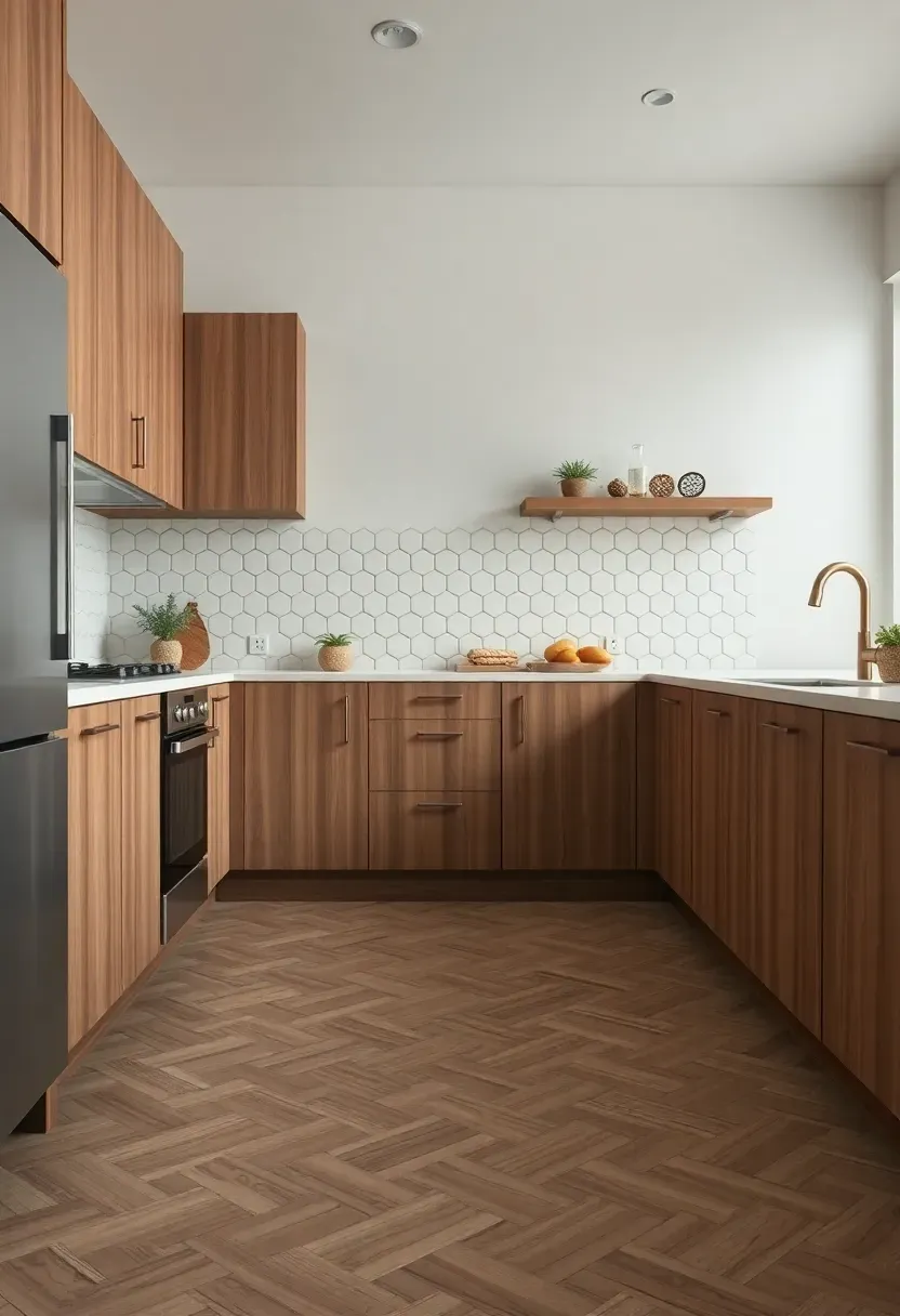
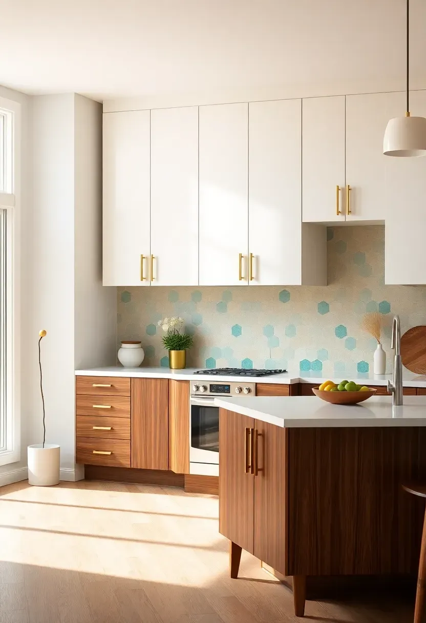
2. Geometric Hexagonal Backsplash in Cream and Teal
Geometric tile backsplashes provide the signature mid-century pop of pattern and color without overwhelming the space—hexagons, diamonds, and arabesques in muted two-tone combinations feel retro yet refined. A cream-and-teal hexagonal backsplash adds visual interest against walnut cabinetry while keeping the palette cohesive; the geometric shape draws the eye, yet the restrained colors prevent it from feeling chaotic. Run full-height from countertop to upper cabinets or stop at a 4-inch trim line for a lighter feel, and pair with matte grout in a matching tone to let the pattern shine without harsh lines.
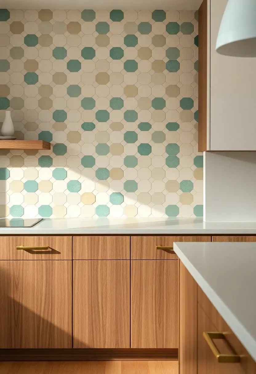
Cream and teal hexagonal tile backsplash with walnut cabinets and brass pulls in a retro kitchen
Mid-century modern kitchen ideas blend the clean lines of 1950s and 1960s design with today's functional requirements, creating a space that feels both nostalgic and fresh. This aesthetic emphasizes flat-panel cabinetry, warm wood tones, geometric patterns, and statement lighting that transforms cooking into a stylish experience — and many of these ideas work beautifully in rental apartments without permanent changes.. Cream and teal hexagonal tile backsplash with walnut cabinets and brass pulls
Prompt: Nature documentary captured on Hasselblad X2D 100C with XCD 90V lens at f/4, ISO 64, 1/125s shutter. Hyper-realistic detail shot of mid-century modern kitchen backsplash featuring cream and muted teal hexagonal tile (3-inch tiles) in geometric pattern, walnut lower cabinets visible below, Caesarstone quartz countertop in warm white, brass concave cabinet pulls, warm white oak floor. Materials: matte ceramic tile, walnut veneer, quartz, brushed brass. Professional studio lighting: soft diffused side light from left mimicking window (5500K with 1/8 CTO), white reflector right, producing creamy whites with soft teal contrast, crisp tile edges with subtle shadow depth, visible texture on grout lines. Architectural Digest detail shot mood, shallow depth of field with sharp tile details foreground.
Tips
- Do: use 2–3 inch hex tiles for authenticity—larger hexagons feel more modern than mid-century
- Don't: pair bright teal with stark white—opt for cream/off-white tile for warmer retro feel
- If budget allows, run tile full-height to ceiling behind range for focal point; otherwise, limit to sink and range areas
Placement note: Full-height installation behind the cooktop creates maximum impact without committing to all walls.
What this gives you: A focal point with retro graphic energy that feels curated rather than kitschy.
We picked a few things that go well with this idea: Modern Gold Lights (★4.7), Modern Brushed Lights (★4.6) and Modern Gold Lights (★4.6). As an Amazon Associate we earn from qualifying purchases.
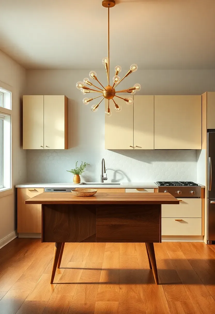
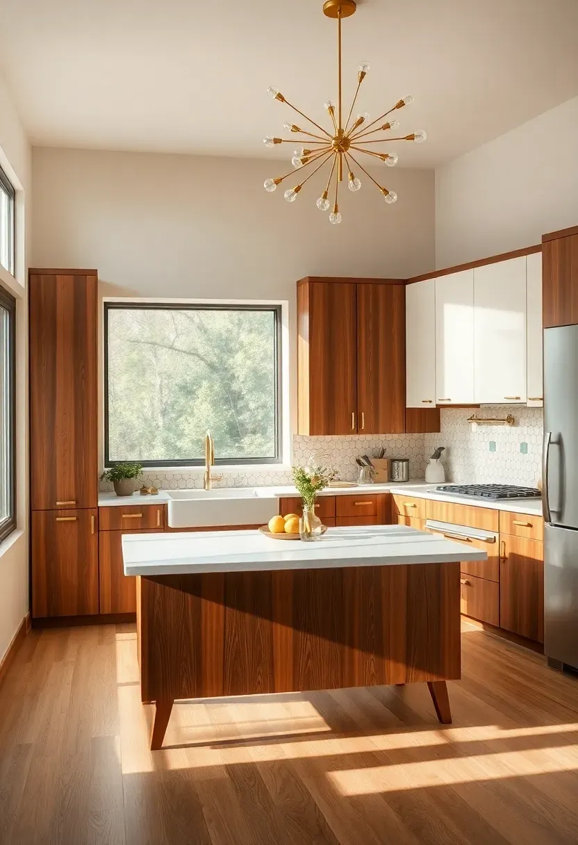
3. Sputnik Chandelier with Brass Finish Over Island
Nothing says mid-century like a sputnik chandelier—its radiating arms and exposed bulbs create sculptural presence while providing even downward light over an island or dining area. A brass-finished sputnik adds warmth and ties into cabinet hardware, faucets, and shelf brackets for cohesion. Position the fixture 30–36 inches above the island surface for ideal clearance, and choose arms with articulated bulbs or glass globes for authenticity. Sputniks work especially well in kitchens with high ceilings, where their verticality draws the eye upward and balances the horizontal lines of flat-panel cabinetry.
Brass sputnik chandelier with radiating arms hanging over a walnut mid-century modern kitchen island
Mid-century modern kitchen ideas blend the clean lines of 1950s and 1960s design with today's functional requirements, creating a space that feels both nostalgic and fresh. This aesthetic emphasizes flat-panel cabinetry, warm wood tones, geometric patterns, and statement lighting that transforms cooking into a stylish experience — and many of these ideas work beautifully in rental apartments without permanent changes.. Brass sputnik chandelier with radiating arms hanging over a walnut mid-centur
Prompt: Nature documentary captured on Hasselblad X2D 100C with XCD 90V lens at f/4, ISO 64, 1/125s shutter. Hyper-realistic 3/4 view of mid-century modern kitchen with walnut island with tapered legs, brass sputnik chandelier with 8 radiating arms and exposed globe bulbs hanging 30 inches above island, cream upper cabinets to ceiling, white oak flooring, large window with simple trim. Materials: walnut veneer, brushed brass, satin nickel hardware, warm oak. Professional studio lighting: warm ambient light from sputnik bulbs (2700K), soft diffused window light from left (5000K with 1/4 CTO), producing golden brass highlights, soft shadows under island, visible room context—white walls, cream hexagonal backsplash, no clutter. 1960s modernist mood, shallow depth of field with sharp island and chandelier foreground, rule-of-thirds composition.
Tips
- Opt for 6–10 arms for scale—too few looks sparse, too many overwhelms smaller islands
- Choose LED globe bulbs with visible filaments for authentic look with modern efficiency
- Dimmers are essential—sputniks can feel harsh at full brightness in multi-use spaces
What this gives you: Sculptural lighting that doubles as art while providing functional task illumination.
We picked a few things that go well with this idea: Vamos Tile Glossy Dolomite White Backsplash (★4.4), Large Hexagon Peel Stick Tile, Glossy (32-Piece) (★5.0) and VViViD Sheets Peel Stick White Gloss (★4.3). As an Amazon Associate we earn from qualifying purchases.
4. Light Oak Flooring with Herringbone Pattern
Light oak flooring with a herringbone pattern infuses mid-century kitchens with subtle movement and warmth while maintaining the airy feel characteristic of the era. Unlike dark stains that can feel heavy, natural or lightly whitewashed oak reflects light and visually expands the space, while the herringbone layout adds geometric interest without competing with other patterns. Herringbone also feels more refined than standard parallel planks—especially when paired with matching walnut cabinetry and cream walls for a tonal, layered look. Opt for a matte or satin finish to avoid the plasticky gloss of retro linoleum, and choose wider planks (5–7 inches) for a contemporary update.
Light oak herringbone pattern flooring in a mid-century modern kitchen with walnut lower cabinets
Mid-century modern kitchen ideas blend the clean lines of 1950s and 1960s design with today's functional requirements, creating a space that feels both nostalgic and fresh. This aesthetic emphasizes flat-panel cabinetry, warm wood tones, geometric patterns, and statement lighting that transforms cooking into a stylish experience — and many of these ideas work beautifully in rental apartments without permanent changes.. Light oak herringbone pattern flooring in a mid-century modern kitchen with w
Recommended
Items for this idea
Tips
- White oak is more durable than red oak for kitchens—better resistance to dents and moisture
- Herringbone requires 15–20% more material and labor—budget accordingly or consider chevron for similar effect at lower cost
- Matte finish shows scratches less than satin, but requires more frequent cleaning
Budget/Time: Herringbone installation runs $8–14/sq ft. vs. $4–8 for standard parallel layout—factor in 3–5 extra days.
What this gives you: A foundation with subtle geometric movement that feels refined yet casual enough for everyday living.
5. Floating Lower Cabinets with Exposed Legs
Floating lower cabinets—mounted on wall-mounted cleats with visible tapered legs—create the signature mid-century furniture-like aesthetic that makes kitchens feel more like living spaces. By exposing 4–6 inches of flooring beneath cabinets, you gain visual lightness, easier cleaning, and the ability to run continuous flooring throughout without awkward transitions. This approach works best with flat-panel doors in walnut or cream-painted finishes; avoid raised panels or ornate details that clash with the streamlined look. Pair with integrated appliance panels to maintain the floating effect across refrigerator and dishwasher fronts.
Floating walnut lower cabinets on tapered brass legs exposing white oak flooring beneath in a mid-century kitchen
Mid-century modern kitchen ideas blend the clean lines of 1950s and 1960s design with today's functional requirements, creating a space that feels both nostalgic and fresh. This aesthetic emphasizes flat-panel cabinetry, warm wood tones, geometric patterns, and statement lighting that transforms cooking into a stylish experience — and many of these ideas work beautifully in rental apartments without permanent changes.. Floating walnut lower cabinets on tapered brass legs exposing white oak floor
Recommended
Items for this idea
Tips
- Support legs every 24–30 inches for structural integrity—walnut is heavy, especially with countertops
- Run flooring slightly beneath cabinets before install to accommodate settling and minor adjustments
- Choose adjustable leg levelers (hidden inside leg profile) to compensate for uneven floors
What this gives you: A kitchen that feels like furnished space rather than utilitarian built-ins.
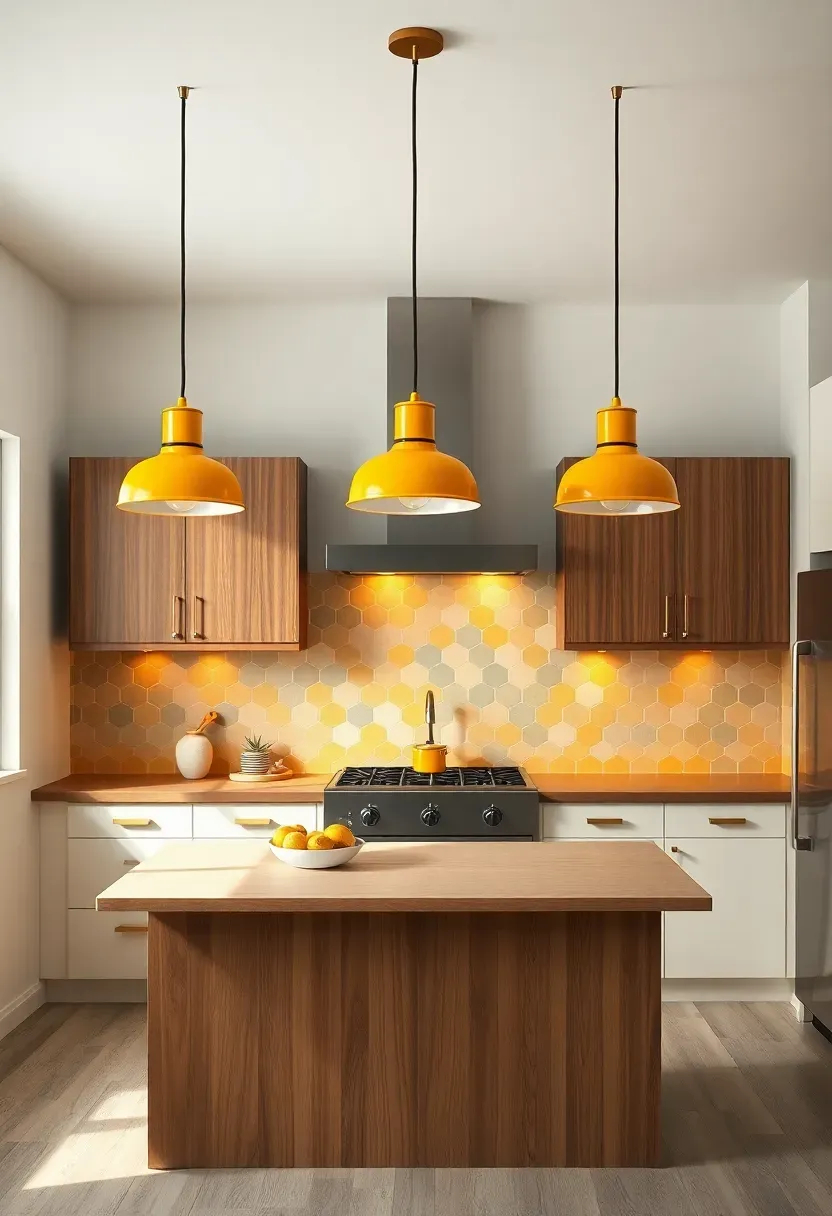
6. Vintage-Inspired Enamel Pendant Lights in Mustard
Enamel pendant lights with dome shades in colors like mustard yellow, mint green, or coral add authentic mid-century character while providing focused task lighting over sinks, islands, and prep areas. These fixtures—inspired by 1950s factory and school lighting—feature glossy enameled exteriors and white enameled interiors that reflect light downward efficiently. Hang pendants in groups of three over islands for symmetry, or mix two colors (mustard and cream) for playful contrast. The glossy finish adds sheen that complements matte cabinetry, and the suspension cords in fabric-wrapped options feel more authentic than metal chains.
Three mustard yellow enamel dome pendant lights hanging over a walnut island in a mid-century modern kitchen
Mid-century modern kitchen ideas blend the clean lines of 1950s and 1960s design with today's functional requirements, creating a space that feels both nostalgic and fresh. This aesthetic emphasizes flat-panel cabinetry, warm wood tones, geometric patterns, and statement lighting that transforms cooking into a stylish experience — and many of these ideas work beautifully in rental apartments without permanent changes.. Three mustard yellow enamel dome pendant lights hanging over a walnut island
Recommended
Items for this idea
Tips
- Space pendants 24–30 inches apart for even coverage—closer for smaller islands, further for larger
- Choose 12–14 inch shade diameter for standard islands; scale down to 10 inches for breakfast bars
- Mixing two colors (two mustard + one cream) creates intentional asymmetry without chaos
Best for: Kitchens with neutral cabinetry—colorful pendants prevent cream or walnut tones from feeling monotonous.
What this gives you: Authentic retro lighting that provides task illumination while doubling as colorful accents.
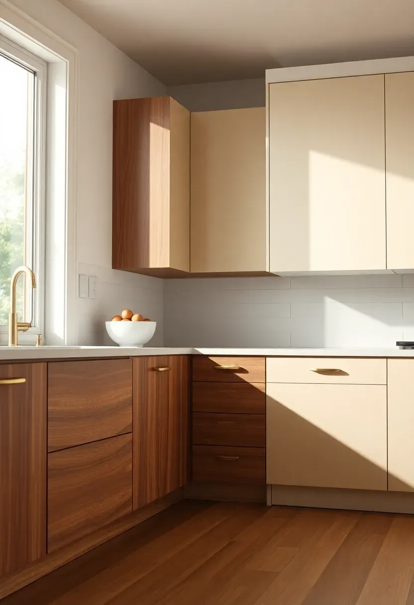
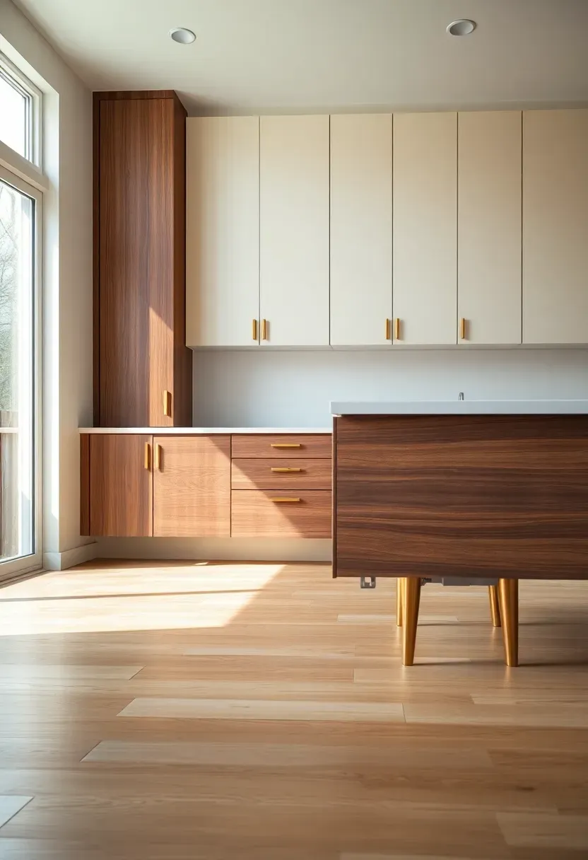
7. Creamy Painted Upper Cabinets with Walnut Lower Cabinets
Combining painted upper cabinets in cream or off-white with walnut lower cabinets creates the classic mid-century two-tone palette that feels warm without heaviness. The light upper cabinets visually recede, making ceilings feel higher and walls brighter, while walnut lower cabinets anchor the space with richness and prevent the room from feeling too washed out. This approach works especially well in kitchens with limited natural light—cream uppers reflect available light, while walnut lowers hide scuffs and spills better than painted finishes. Choose a satin or semi-gloss sheen for uppers (easier cleaning) and matte for lowers (more authentic to the era).
Two-tone mid-century modern kitchen with cream upper cabinets and walnut lower cabinets on white oak flooring
Mid-century modern kitchen ideas blend the clean lines of 1950s and 1960s design with today's functional requirements, creating a space that feels both nostalgic and fresh. This aesthetic emphasizes flat-panel cabinetry, warm wood tones, geometric patterns, and statement lighting that transforms cooking into a stylish experience — and many of these ideas work beautifully in rental apartments without permanent changes.. Two-tone mid-century modern kitchen with cream upper cabinets and walnut lowe
Recommended
Items for this idea
Tips
- Match cabinet trim and crown molding to upper cabinet color for seamless integration
- If budget allows, use walnut-veneer lowers and painted MDF uppers—solid walnut everywhere is cost-prohibitive
- Avoid stark white—opt for cream with yellow undertone (SW Creamy or BM Navajo White) for warmth
What this gives you: A balanced palette that feels spacious yet warm, with practical stain resistance on lower cabinets.
8. Integrated Appliance Panels for Seamless Look
Integrated appliance panels—cabinet fronts that cover refrigerators, dishwashers, and sometimes microwaves—create the seamless, unbroken horizontal lines that mid-century modern kitchens are known for. By hiding the visual bulk of appliances behind matching cabinetry, you maintain clean sightlines and let materials, colors, and forms take center stage rather than stainless steel or black boxes. This approach is especially impactful on the refrigerator wall, where a full-height panel from floor to ceiling in walnut or cream creates architectural presence. When selecting appliances, prioritize panel-ready models with flush mounting and integrated handles—or opt for handleless designs with push-to-open mechanisms for ultimate streamlining.
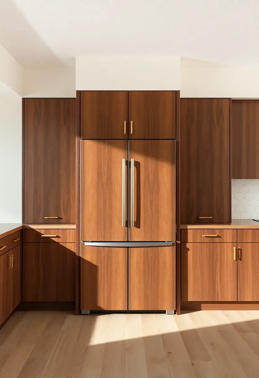
Full-height walnut panel covering a panel-ready refrigerator seamlessly integrated into mid-century modern cabinetry
Mid-century modern kitchen ideas blend the clean lines of 1950s and 1960s design with today's functional requirements, creating a space that feels both nostalgic and fresh. This aesthetic emphasizes flat-panel cabinetry, warm wood tones, geometric patterns, and statement lighting that transforms cooking into a stylish experience — and many of these ideas work beautifully in rental apartments without permanent changes.. Full-height walnut panel covering a panel-ready refrigerator seamlessly integ
Recommended
Items for this idea
Tips
- Panel-ready refrigerators cost $500–1500 more than standard—budget accordingly or consider vinyl wrap kits
- Ensure cabinet panels have proper ventilation cutouts for refrigerator condenser coils
- Match door overlay style—full-overlay panels look more modern than partial overlay
Budget/Time: Panel-ready fridge + custom panels runs $3500–6000 vs. $1500–2500 for standard stainless—factor in 2–3 weeks lead time for custom panels.
What this gives you: Uninterrupted horizontal lines that prioritize materials over appliances for authentic mid-century continuity.
9. U-Shaped Layout with Peninsula Breakfast Bar
The U-shaped kitchen with a peninsula—counters on three walls plus a partial fourth wall extension for seating—optimizes mid-century modern homes' typical footprint while maintaining the era's emphasis on efficient work triangles. This layout keeps everything within reach (sink, range, refrigerator form an efficient triangle) while the peninsula provides casual dining without requiring a separate island. Peninsulas work especially well in narrower kitchens where an island would obstruct flow; the peninsula's open side faces into adjoining dining or living areas, facilitating conversation and maintaining sightlines. Finish the peninsula with a 12–14 inch overhang for comfortable seating and tapered legs matching lower cabinets for cohesion.
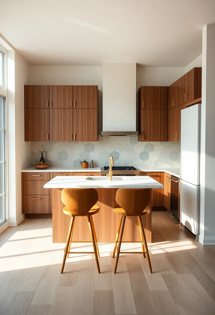
U-shaped mid-century modern kitchen with walnut cabinets, peninsula breakfast bar, and walnut bar stools with tapered legs
Mid-century modern kitchen ideas blend the clean lines of 1950s and 1960s design with today's functional requirements, creating a space that feels both nostalgic and fresh. This aesthetic emphasizes flat-panel cabinetry, warm wood tones, geometric patterns, and statement lighting that transforms cooking into a stylish experience — and many of these ideas work beautifully in rental apartments without permanent changes.. U-shaped mid-century modern kitchen with walnut cabinets, peninsula breakfast
Recommended
Items for this idea
Tips
- Minimum aisle width between peninsula and opposing counter: 42 inches for comfort, 36 inches for tight spaces
- Peninsula width: 30–36 inches for adequate prep space; 24 inches feels cramped with seating
- Include electrical outlets on peninsula sides for small appliances—required by code in most jurisdictions
What this gives you: Maximum efficiency in a compact footprint with casual dining integration.
10. Terrazzo Flooring with Chip Pattern in Warm Tones
Terrazzo flooring—a composite of chips of marble, granite, glass, or quartz set in cement or epoxy resin—brings authentic mid-century character underfoot while offering durability and visual interest. Unlike plain tile or hardwood, terrazzo adds subtle pattern without competing with backsplashes or cabinetry, and its warm-toned chip palettes (cream, beige, brown, rust) feel more era-appropriate than modern white-and-gray terrazzo. Terrazzo works particularly well in open-plan kitchens where flooring flows into dining areas—the continuous surface unifies spaces without transitions. Choose cement-based terrazzo for authenticity with matte finish and minor imperfections, or epoxy-based for seamless, stain-resistant perfection.
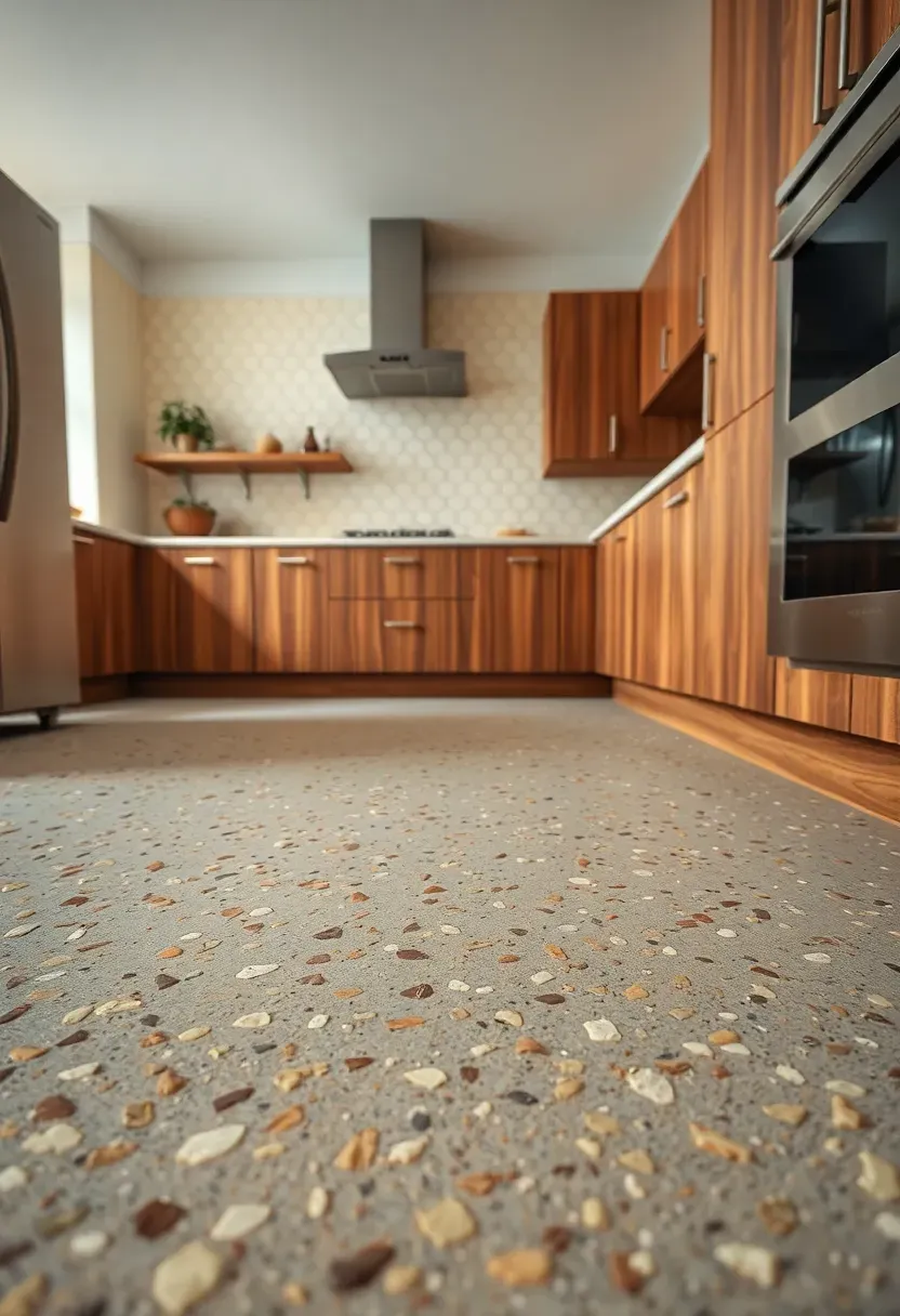
Warm-toned terrazzo flooring with cream, beige, and rust chips beneath walnut cabinets in a retro kitchen
Mid-century modern kitchen ideas blend the clean lines of 1950s and 1960s design with today's functional requirements, creating a space that feels both nostalgic and fresh. This aesthetic emphasizes flat-panel cabinetry, warm wood tones, geometric patterns, and statement lighting that transforms cooking into a stylish experience — and many of these ideas work beautifully in rental apartments without permanent changes.. Warm-toned terrazzo flooring with cream, beige, and rust chips beneath walnut
Recommended
Items for this idea
Tips
- Sealing is critical—cement terrazzo requires penetrating sealer applied every 2–3 years
- Epoxy terrazzo costs 20–30% more but eliminates staining and resealing needs
- For budgets, luxury vinyl tile convincingly mimics terrazzo at $3–6/sq ft. installed
Budget/Time: Cement terrazzo: $10–20/sq ft. installed; epoxy: $15–30/sq ft.; factor in 3–5 days cure time before cabinetry install.
What this gives you: Authentic retro character underfoot with unmatched durability and seamless open-plan flow.
11. Open Shelving with Brass Brackets and Wood Boards
Open shelving—whether replacing upper cabinets entirely or mixed with closed storage—infuses mid-century kitchens with casual character while displaying dishware, glassware, and cookbooks as decor. Brass shelf brackets add warmth and tie into hardware and lighting, while wood shelves in walnut or oak echo cabinetry tones for cohesion. Open shelves feel lighter visually than upper cabinets, making them ideal for smaller kitchens or windows-facing walls where solid cabinetry would block light. Limit open shelving to one wall or section to balance display and concealed storage, and style with purpose—group items in odd numbers, mix textures (ceramic, wood, glass), and edit regularly to avoid cluttered visual noise.
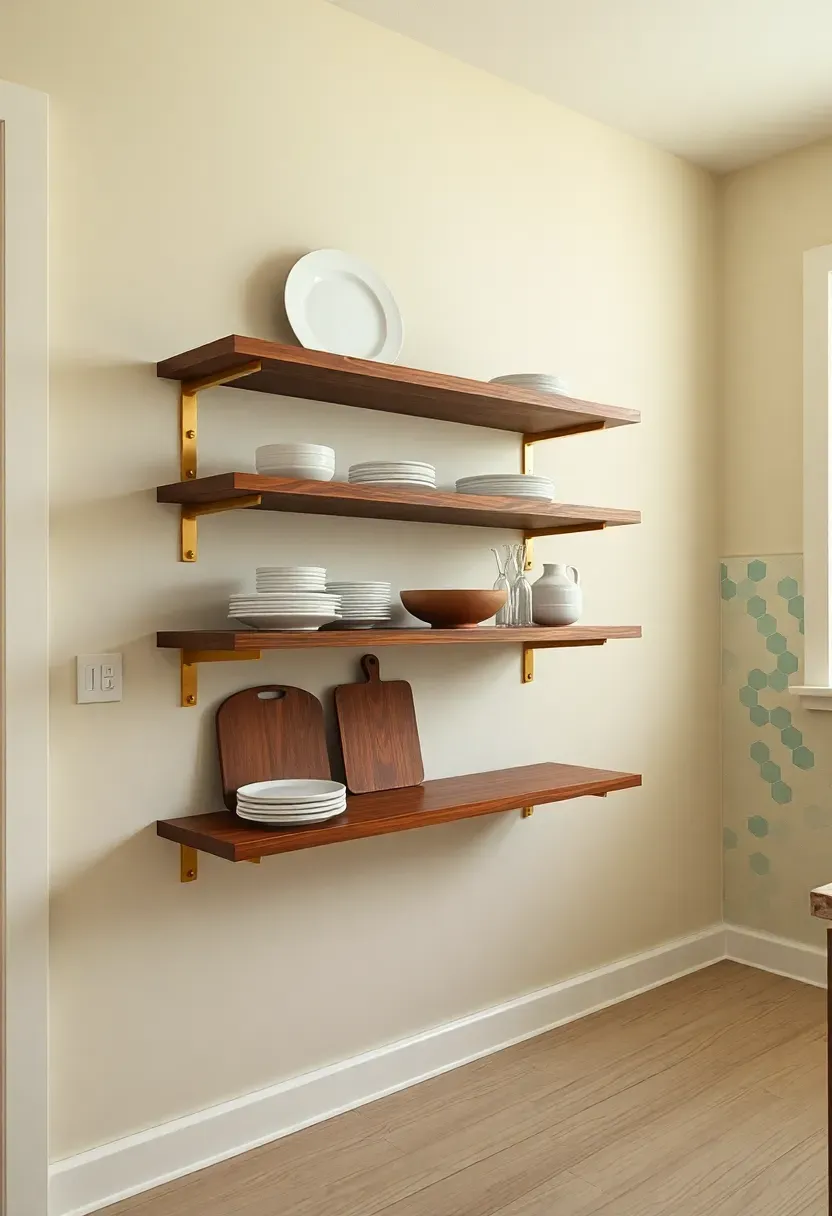
Walnut open shelves on brass L-brackets styled with ceramic plates and glassware in a mid-century modern kitchen
Mid-century modern kitchen ideas blend the clean lines of 1950s and 1960s design with today's functional requirements, creating a space that feels both nostalgic and fresh. This aesthetic emphasizes flat-panel cabinetry, warm wood tones, geometric patterns, and statement lighting that transforms cooking into a stylish experience — and many of these ideas work beautifully in rental apartments without permanent changes.. Walnut open shelves on brass L-brackets styled with ceramic plates and glassw
Recommended
Items for this idea
Tips
- Shelf depth: 10–12 inches for plates and bowls; 14+ inches for cookbooks and small appliances
- Space brackets 24–30 inches apart for adequate support, especially with heavy dishware
- Style with restraint—leave 20–30% empty space per shelf for visual breathing room
Avoid if: You cook with lots of grease or spices—open shelves near the range will require frequent cleaning.
What this gives you: Visual lightness and display opportunities that make kitchens feel curated rather than purely functional.
12. Boomerang-Pattern Laminate Countertops in Retro Colors
Boomerang-pattern laminate countertops—with their signature squiggly repeat in colors like pink, turquoise, mint, or mustard—are the epitome of 1950s kitsch and character. While not for every taste, boomerang laminate adds playful retro energy that feels authentic in period homes or as an accent on a single surface (like an island or peninsula). Modern high-pressure laminates (like Formica's 180fx line) offer improved durability and realistic stone-like patterns beyond retro graphics, but for authentic mid-century charm, the original boomerang design is unmatched. Pair with simple flat-panel cabinetry and neutral walls to let the pattern shine without competing with other elements.
Boomerang-pattern laminate countertop in pink and cream on walnut lower cabinets — retro 1950s kitchen style
Mid-century modern kitchen ideas blend the clean lines of 1950s and 1960s design with today's functional requirements, creating a space that feels both nostalgic and fresh. This aesthetic emphasizes flat-panel cabinetry, warm wood tones, geometric patterns, and statement lighting that transforms cooking into a stylish experience — and many of these ideas work beautifully in rental apartments without permanent changes.. Boomerang-pattern laminate countertop in pink and cream on walnut lower cabin
Recommended
Items for this idea
Tips
- Use boomerang laminate on island or peninsula only—too much pattern on all counters feels overwhelming
- Modern laminate brands: Formica, Wilsonart, and Arborite all offer retro collections
- Coordinate backsplash color with one laminate tone for cohesion—cream subway tile pairs with any retro palette
What this gives you: Unapologetic retro character that celebrates mid-century whimsy.
13. Glass-Front Upper Cabinets with Mullion Grid Pattern
Glass-front upper cabinets with mullion grids—the dividers between glass panels—add architectural detail and display opportunities while breaking up expanses of solid cabinetry. Mid-century kitchens typically feature simple two-over-two or three-over-three grids in brass or matte black finishes, with clear or seeded glass that reveals dishware and glassware without full exposure. Glass cabinets feel lighter than solid doors, making them ideal for walls opposite windows or where upper cabinets might feel oppressive. Position glass fronts on upper cabinets only—lower glass doors feel too formal for the casual mid-century aesthetic—and light interiors (painted or light wood) to make displayed items pop.
Glass-front upper cabinets with brass mullion grid showing ceramic plates inside mid-century modern kitchen
Mid-century modern kitchen ideas blend the clean lines of 1950s and 1960s design with today's functional requirements, creating a space that feels both nostalgic and fresh. This aesthetic emphasizes flat-panel cabinetry, warm wood tones, geometric patterns, and statement lighting that transforms cooking into a stylish experience — and many of these ideas work beautifully in rental apartments without permanent changes.. Glass-front upper cabinets with brass mullion grid showing ceramic plates ins
Recommended
Items for this idea
Tips
- Limit glass fronts to one wall or section—mixed with solid doors, they feel intentional; everywhere, they feel busy
- Choose seeded or reeded glass over clear for patina and reduced visibility of cluttered interiors
- Light cabinet interiors (white or cream) make displayed items stand out; dark interiors absorb light
What this gives you: Visual lightness and display opportunities that add detail without heaviness.
14. Tiled Countertops in Classic White with Gray Grout
Tiled countertops—typically 4x4 or 6x6 inch ceramic tiles in white or cream with gray grout—offer authentic mid-century character and budget-friendly warmth compared to stone surfaces. While less common today due to grout maintenance concerns, tiled counters were ubiquitous in 1950s–1960s kitchens and add textural contrast to smooth cabinetry and backsplashes. The irregular surface and grout lines create subtle pattern, and tile's heat resistance makes it practical around ranges. Choose matte finish tiles for authenticity (glossy feels more utilitarian), and pair with medium-gray grout (not white, which shows dirt; not black, which feels harsh). Seal grout annually to prevent staining.
Classic white ceramic tile countertop with gray grout and walnut cabinets in a mid-century modern kitchen
Mid-century modern kitchen ideas blend the clean lines of 1950s and 1960s design with today's functional requirements, creating a space that feels both nostalgic and fresh. This aesthetic emphasizes flat-panel cabinetry, warm wood tones, geometric patterns, and statement lighting that transforms cooking into a stylish experience — and many of these ideas work beautifully in rental apartments without permanent changes.. Classic white ceramic tile countertop with gray grout and walnut cabinets in
Recommended
Items for this idea
Tips
- Epoxy grout is stain-resistant and requires no sealing—worth the extra cost for kitchens
- Tile countertops cost $5–10/sq ft. installed vs. $50–150 for stone—significant budget savings
- Avoid using tile behind sinks—water exposure increases grout maintenance; opt for solid surface there
Budget/Time: Tiled countertops run $5–10/sq ft. installed (1–2 days) vs. $50–150/sq ft. for stone—huge savings for retro authenticity.
What this gives you: Authentic mid-century character with significant cost savings and textural warmth.
15. Breakfast Nook with Banquette and Tapered-Leg Table
A breakfast nook with built-in banquette seating and a tapered-leg table creates casual dining space infused with mid-century furniture character—perfect for period homes or as an alternative to a formal dining room. Banquettes maximize seating in compact footprints while offering cozy, built-in comfort, and tapered-leg tables echo cabinet and furniture details for cohesion. Upholster the banquette in durable fabrics with retro patterns (geometrics, small-scale florals) or solid textures (linen, velvet) in mustard, olive, or terracotta. Add a pendant light or sputnik chandelier overhead for task lighting, and consider open shelving or a built-in sideboard for dish storage adjacent to the nook.
Mid-century modern breakfast nook with mustard banquette, round walnut table on tapered brass legs, and sputnik chandelier
Mid-century modern kitchen ideas blend the clean lines of 1950s and 1960s design with today's functional requirements, creating a space that feels both nostalgic and fresh. This aesthetic emphasizes flat-panel cabinetry, warm wood tones, geometric patterns, and statement lighting that transforms cooking into a stylish experience — and many of these ideas work beautifully in rental apartments without permanent changes.. Mid-century modern breakfast nook with mustard banquette, round walnut table
Recommended
Items for this idea
Tips
- Banquette seat height: 18–19 inches for comfort with standard dining table height (30 inches)
- Include storage beneath banquette seat—hinged tops or pullout drawers maximize utility
- Allow 24 inches per person for comfortable seating; round tables maximize capacity in tight spaces
What this gives you: Casual dining character with furniture-like presence that complements mid-century cabinetry.
16. Double Wall Ovens with Horizontal Grain Wood Panel
Double wall ovens flanked by full-height cabinetry and topped with a horizontal grain wood panel bridge create architectural presence reminiscent of mid-century modern built-ins. This configuration—wall ovens set into tall cabinets rather than beneath a range—optimizes vertical space and positions ovens at ergonomic height (no bending to access). The horizontal wood panel connecting upper cabinets above ovens adds detail and conceals rangehood ventilation or can serve as a display shelf. Choose walnut or oak panels with horizontal grain to echo lower cabinetry, and opt for flush-mounted ovens with integrated handles for seamless integration.
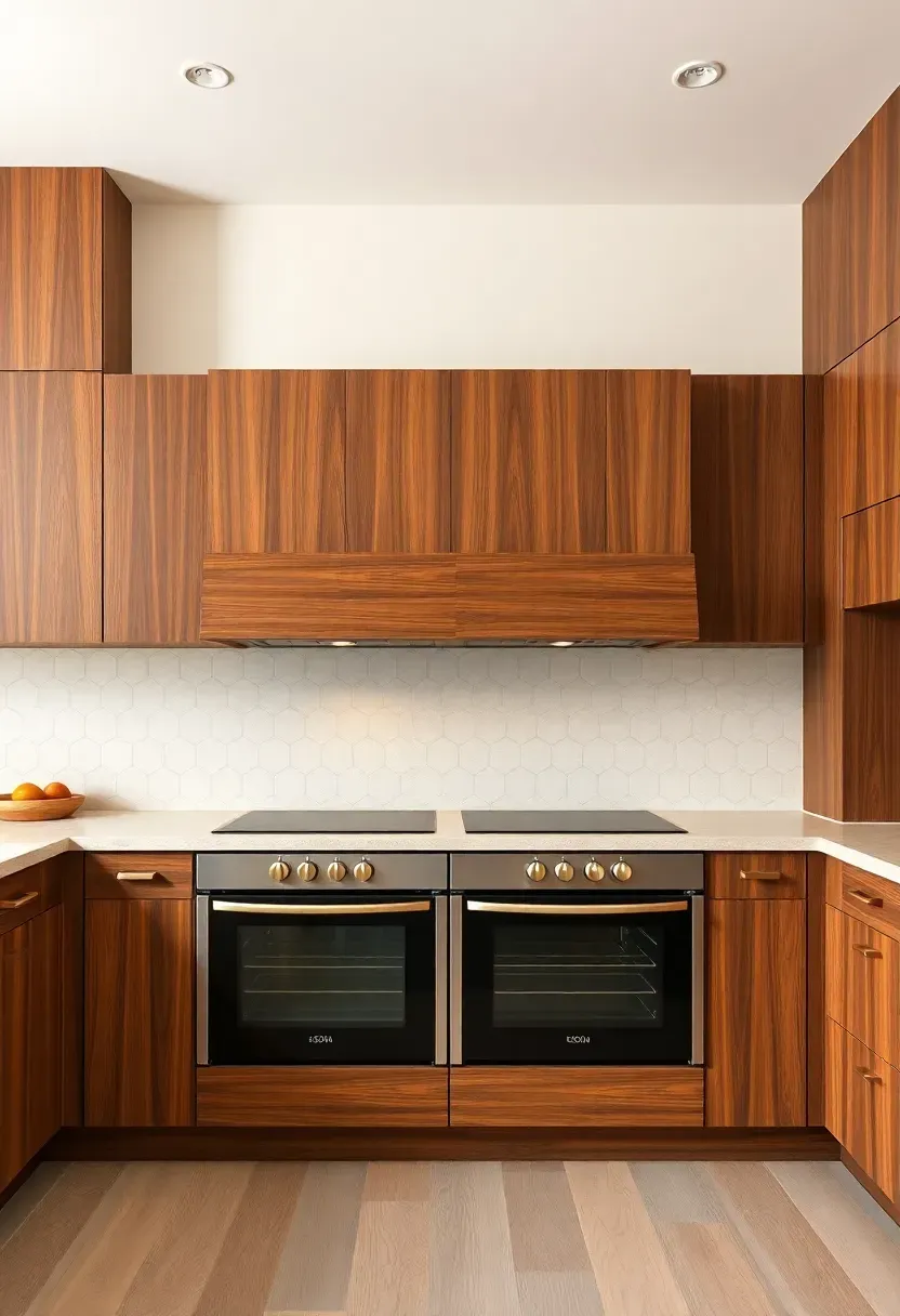
Double wall ovens set into walnut cabinets with horizontal grain wood panel bridge in a mid-century modern kitchen
Mid-century modern kitchen ideas blend the clean lines of 1950s and 1960s design with today's functional requirements, creating a space that feels both nostalgic and fresh. This aesthetic emphasizes flat-panel cabinetry, warm wood tones, geometric patterns, and statement lighting that transforms cooking into a stylish experience — and many of these ideas work beautifully in rental apartments without permanent changes.. Double wall ovens set into walnut cabinets with horizontal grain wood panel b
Recommended
Items for this idea
Tips
- Standard double ovens require 51–54 inches of wall width including cabinet fillers
- Horizontal grain panel depth: 12–14 inches for adequate ventilation clearance and display potential
- Install electrical outlets inside adjacent cabinets for small appliances—keeps counters clear
Best for: Bakers and frequent entertainers—double ovens allow simultaneous baking at different temperatures.
What this gives you: Architectural presence with practical multi-task cooking capacity.
17. Slide-In Range with Knob Controls and Backsplash Guard
A slide-in range with front-facing knob controls and an integrated backsplash guard offers a streamlined alternative to freestanding ranges while maintaining mid-century character. Slide-in ranges sit flush between cabinets (no side gaps like freestanding models), creating continuous countertop lines, and front-mounted controls are accessible without reaching over hot surfaces. The integrated backsplash guard—typically stainless steel or matching the range finish—protects walls from splatters while reducing the need for full-height backsplashes behind the range. Choose a range with brass or matte black knobs to tie into hardware, and opt for a front-control model rather than side-control for authentic mid-century placement.
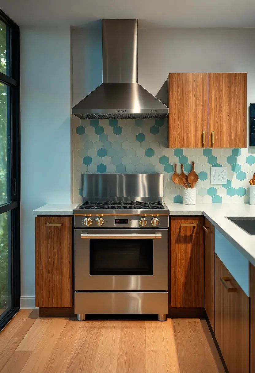
Stainless steel slide-in range with brass knob controls flanked by walnut cabinets in a mid-century modern kitchen
Mid-century modern kitchen ideas blend the clean lines of 1950s and 1960s design with today's functional requirements, creating a space that feels both nostalgic and fresh. This aesthetic emphasizes flat-panel cabinetry, warm wood tones, geometric patterns, and statement lighting that transforms cooking into a stylish experience — and many of these ideas work beautifully in rental apartments without permanent changes.. Stainless steel slide-in range with brass knob controls flanked by walnut cab
Recommended
Items for this idea
Tips
- Slide-in ranges cost $200–500 more than freestanding but offer cleaner aesthetics
- Ensure countertop depth matches range depth—standard is 30 inches; deep ranges require custom counters
- Knob finishes: brass, matte black, or chrome—match to cabinet pulls for cohesion
What this gives you: Streamlined cooking zone with accessible controls and minimal backsplash requirements.
18. Pastel Accent Colors on Lower Cabinet Drawers Only
Painting lower cabinet drawer fronts in pastel colors—mint green, butter yellow, soft coral—while keeping doors and upper cabinets neutral adds playful mid-century accent without overwhelming the space. This approach, seen in many 1950s–1960s kitchens, uses color strategically: drawer fronts are visually recessive compared to doors, so pastel accents read as subtle pops rather than dominating features. Limit pastel to one or two colors (not a rainbow), and choose tones that coordinate with backsplash or pendant lights for cohesion. Pair with walnut or cream cabinetry to prevent the look from feeling too youthful or themed.
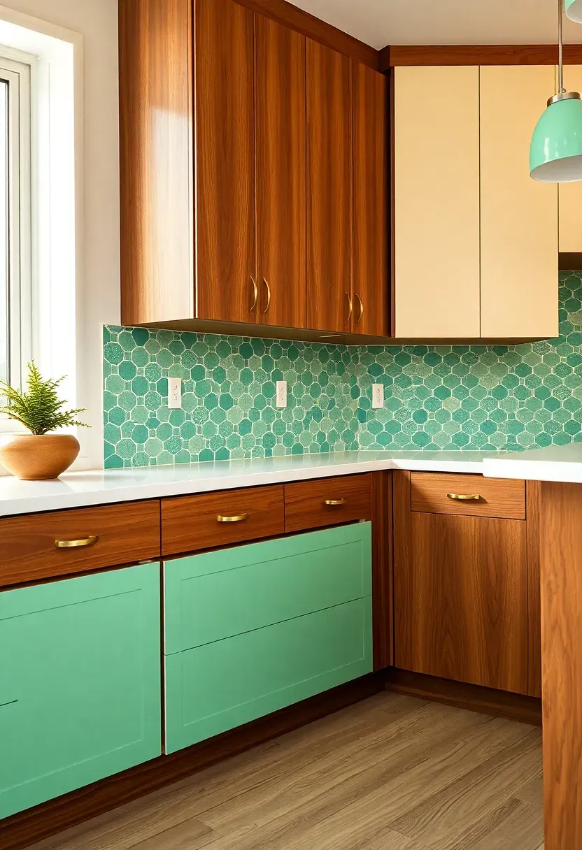
Walnut kitchen cabinets with mint green painted drawer fronts and brass pulls — pastel accent in retro style
Mid-century modern kitchen ideas blend the clean lines of 1950s and 1960s design with today's functional requirements, creating a space that feels both nostalgic and fresh. This aesthetic emphasizes flat-panel cabinetry, warm wood tones, geometric patterns, and statement lighting that transforms cooking into a stylish experience — and many of these ideas work beautifully in rental apartments without permanent changes.. Walnut kitchen cabinets with mint green painted drawer fronts and brass pulls
Recommended
Items for this idea
Tips
- Satin finish is ideal for drawer fronts—less glare than gloss, easier to clean than matte
- Match pastel tone to another element (backsplash accent, pendant light, rug) for intentional feel
- Limit to one bank of drawers or one wall—every drawer in pastel feels overdone
What this gives you: Playful retro accent that feels intentional and editable rather than permanently themed.
19. Drawer Pulls in Brushed Brass with Concave Shapes
Hardware—specifically drawer pulls in brushed brass with concave or cup-shaped profiles—provides the finishing touch that ties mid-century kitchens together. Brushed brass adds warmth without the yellowing of polished brass, and concave shapes feel more ergonomic and era-appropriate than flat bars or knobs. Coordinate pulls across cabinets, drawers, and sometimes appliance panels for cohesion, and choose a size proportional to cabinet scale (4–6 inches for drawers, 3–4 inches for doors). For authenticity, opt for integrated pulls (routed into drawer fronts) or minimal exposed hardware—avoid oversized or ornate pulls that clash with streamlined cabinetry.
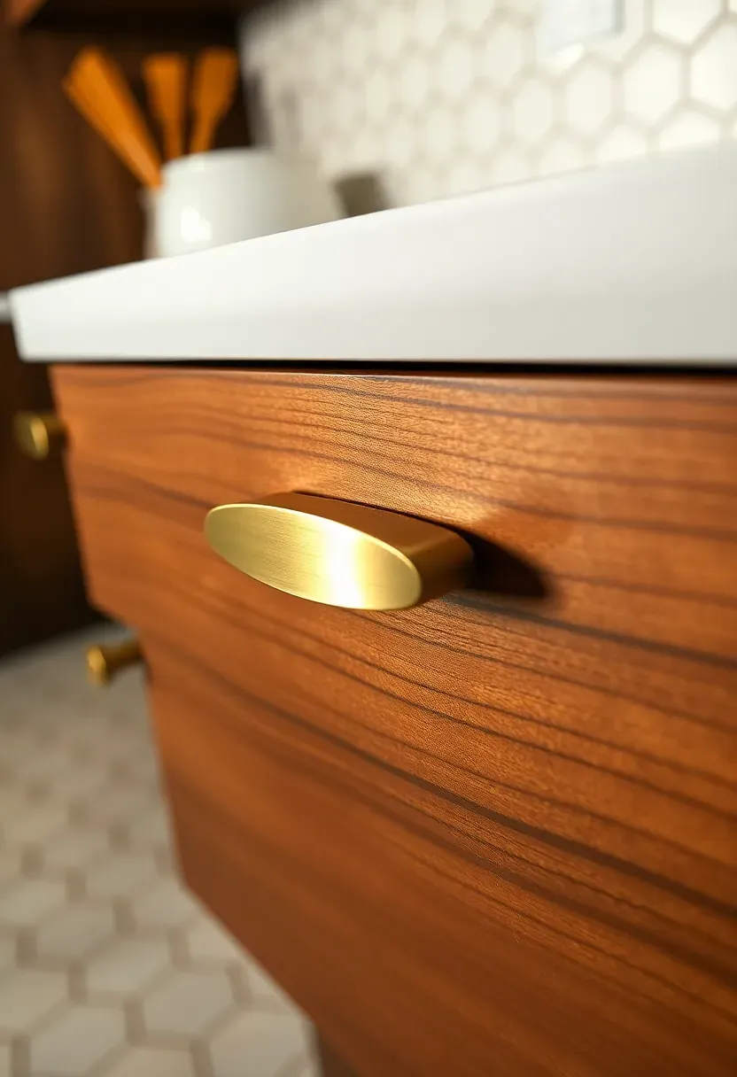
Brushed brass concave cup-shaped drawer pulls on flat-panel walnut cabinet fronts in a mid-century modern kitchen
Mid-century modern kitchen ideas blend the clean lines of 1950s and 1960s design with today's functional requirements, creating a space that feels both nostalgic and fresh. This aesthetic emphasizes flat-panel cabinetry, warm wood tones, geometric patterns, and statement lighting that transforms cooking into a stylish experience — and many of these ideas work beautifully in rental apartments without permanent changes.. Brushed brass concave cup-shaped drawer pulls on flat-panel walnut cabinet fr
Recommended
Items for this idea
Tips
- Living finish brass develops patina over time—embrace it or choose lacquered brass for consistency
- Center pulls on drawers; position door pulls 2–3 inches from top/bottom edges for comfort
- Match hardware finish across all elements—cabinet pulls, faucet, shelf brackets, lighting
What this gives you: Cohesive warmth and authentic detailing that elevates flat-panel cabinetry.
20. Large Windows with Simple Frame and Sill Detail
Large windows with simple trim and minimal sill details bring natural light and mid-century transparency to kitchens while maintaining the era's emphasis on indoor-outdoor connection. Unlike ornate molding or divided-lite windows, mid-century kitchens feature large single-pane or double-pane windows with simple casings—often just flat stock in white or wood-toned finishes—that maximize glass area and minimize visual weight. Deep sills (8–12 inches) provide display space for plants, ceramics, or cookbooks, while operable casements or awning windows offer ventilation. Position windows over sinks or prep areas for views and light while working.
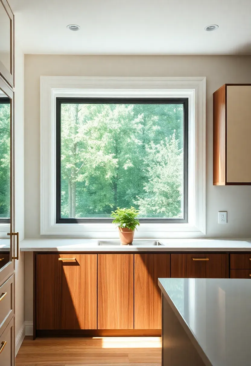
Large simple-framed window with deep sill and herb plant above a mid-century modern kitchen sink and walnut cabinets
Mid-century modern kitchen ideas blend the clean lines of 1950s and 1960s design with today's functional requirements, creating a space that feels both nostalgic and fresh. This aesthetic emphasizes flat-panel cabinetry, warm wood tones, geometric patterns, and statement lighting that transforms cooking into a stylish experience — and many of these ideas work beautifully in rental apartments without permanent changes.. Large simple-framed window with deep sill and herb plant above a mid-century
Recommended
Items for this idea
Tips
- Minimum sill depth for functional display: 8 inches; 12+ inches for small pots or containers
- Operable windows are ideal over sinks for ventilation while cooking
- Consider solar control glass on west-facing windows to reduce heat gain while maintaining views
Best for: Kitchens with garden or yard views—windows frame nature as living art.
What this gives you: Natural light and visual connection to outdoors that feels expansive and alive.
21. Mixing Wood Tones—Walnut Cabinets with Teak Island
Mid-century modern design embraces mixing wood tones—walnut lower cabinets with a teak or oak island, for example—to create visual layering and warmth without feeling monotonous. This approach, common in 1950s–1960s interiors, relies on warm undertones (red, yellow) to tie different woods together; avoid mixing warm woods with cool-toned ash or maple. The key is balance: use the dominant wood tone on 60–70% of cabinetry (perimeter cabinets) and the secondary tone on 30–40% (island, peninsula, or open shelving). Pull both tones together with shared hardware finish, backsplash color, or flooring.
Walnut perimeter cabinets paired with a teak island on tapered legs — mixed warm wood tones in a mid-century kitchen
Mid-century modern kitchen ideas blend the clean lines of 1950s and 1960s design with today's functional requirements, creating a space that feels both nostalgic and fresh. This aesthetic emphasizes flat-panel cabinetry, warm wood tones, geometric patterns, and statement lighting that transforms cooking into a stylish experience — and many of these ideas work beautifully in rental apartments without permanent changes.. Walnut perimeter cabinets paired with a teak island on tapered legs — mixed w
Recommended
Items for this idea
Tips
- Limit wood tones to two—three different woods (walnut, teak, oak) can feel chaotic
- Match undertones: both woods should have warm (red/yellow) or cool (gray/neutral) bases
- Unify with shared elements—hardware finish, backsplash accent, flooring, or wall color
What this gives you: Visual layering and authentic mid-century warmth that feels curated rather than uniform.
Mid-century modern kitchen design balances retro character with contemporary function through clean lines, warm materials, and restrained ornamentation. Whether you're drawn to walnut flat-panel cabinets, geometric backsplashes, brass sputnik lighting, or pastel accents, the key is selecting elements that reflect mid-century principles—natural materials, geometric patterns, leggy furniture-like cabinetry—while adapting them to your space, budget, and lifestyle. Focus on one or two signature details (like a statement backsplash or vintage-inspired lighting) and build around them with neutral foundations for a kitchen that feels timeless yet fresh, nostalgic yet livable.