25 Beautiful Fall Kitchen Ideas That Elevate Everyday Cooking
The best fall kitchen ideas transform the heart of your home into a warm gathering space through intentional color choices, natural materials, and atmospheric lighting that celebrates autumn's rich palette without sacrificing functionality. Whether you rent or own, the most successful fall kitchens balance seasonal character with everyday practicality—introducing autumnal hues that feel sophisticated rather than temporary, layering natural materials that provide lasting comfort beyond the season, and maintaining workflow efficiency while creating visual warmth. Many of these approaches require no drilling or permanent changes, making them ideal fall kitchen ideas for renters looking to add seasonal warmth without risk to their deposit.
Designing a cozy fall kitchen means understanding how materials respond to changing light conditions—warm wood tones catch morning sun beautifully, brass fixtures reflect golden hour illumination, and matte surfaces soften harsh overhead lighting. Color palettes shift toward earth tones and autumn kitchen decor that complements seasonal ingredients and cozy gatherings while maintaining the fresh, clean feeling essential to food preparation spaces. The goal is creating a kitchen that feels warm and inviting regardless of outdoor weather, a culinary sanctuary that celebrates fall through sophisticated material choices rather than overt decoration.
Quick FAQ
What colors work best for a fall kitchen?
Rich earth tones grounded in neutrals create warmth without overwhelming the space. Warm gray, cream with yellow undertones, soft terracotta, or sage green paired with brass hardware and natural wood establish autumnal character while maintaining kitchen brightness and cleanliness.
How do I add fall warmth without renovation?
Focus on replaceable elements: swap textiles for autumnal hues, introduce warm-toned lighting through warm LED bulbs, add natural textures with woven bowls or wooden cutting boards, and display seasonal botanicals in appropriate vessels. These changes provide immediate impact without permanent commitment.
Should fall kitchens use light or dark cabinetry?
Light cabinetry with warm undertones makes spaces feel larger and brighter while accommodating fall colors through accents. Dark cabinetry creates dramatic warmth but requires careful lighting—choose warm wood tones or painted colors with warm gray undertones rather than cool blues or stark whites.
What materials bring autumn warmth to kitchens?
Natural materials like light oak, walnut, and stone add warmth through texture and color. Warm wood cabinetry, stone countertops in honey or cream tones, and brass or copper fixtures introduce seasonal comfort while remaining appropriate to kitchen environments and daily use.
How can lighting create fall atmosphere in kitchens?
Warm-toned bulbs around 2700K-3000K create golden ambient glow essential to fall kitchens. Layered lighting—pendant lights over islands, under-cabinet task lighting, and ambient overhead fixtures—provides flexibility for bright food prep and cozy dinner preparation, while warm finishes soften illumination.
What's the most impactful fall kitchen update?
Swap cold overhead lighting for warm-toned bulbs, introduce brass or copper hardware on cabinets and faucets, and add a few natural wood cutting boards or bowls. These three changes immediately establish autumnal warmth while requiring minimal investment or permanent changes.
As an Amazon Associate I earn from qualifying purchases.
Table of Contents
- 1. Warm Monochromatic Gray Palette
- 2. Natural Light Oak Cabinetry System
- 3. Warm White with Brass Accents
- 4. Terracotta and Cream Harmony
- 5. Walnut with Light Neutral Backdrop
- 6. Sage Green with Warm Wood Tones
- 7. Two-Tone Upper and Lower Cabinetry
- 8. Matte Black Hardware with Warm Backdrop
- 9. Open Shelving with Natural Display
- 10. Large Format Tile with Warm Undertones
- 11. Stone Countertop with Warm Veining
- 12. Butcher Block Island with Neutral Perimeter
- 13. Copper Pendant Lighting Cluster
- 14. Warm Backsplash with Neutral Cabinets
- 15. Integrated Appliances with Warm Panels
- 16. Breakfast Nook with Cozy Textiles
- 17. Natural Stone Flooring with Warm Grout
- 18. Layered Lighting with Warm Fixtures
- 19. Built-in Pantry with Glass Doors
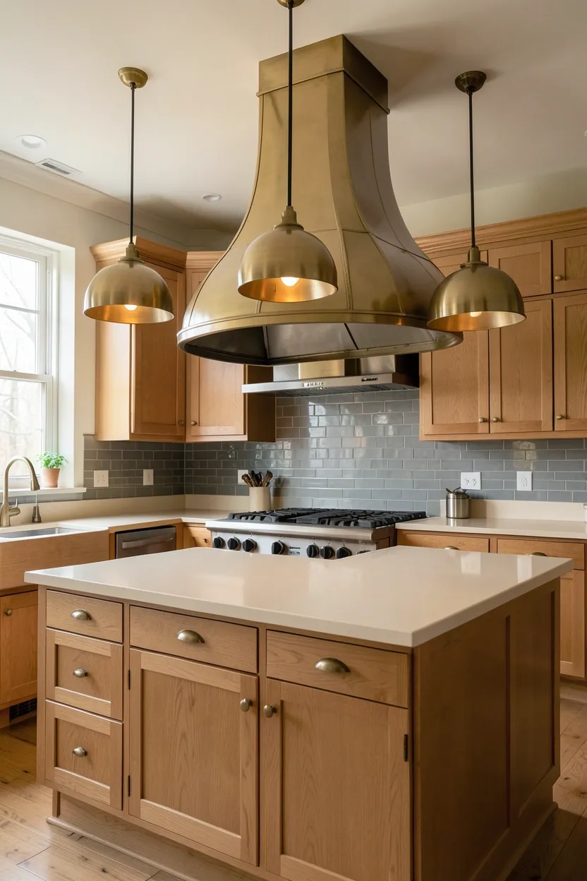
- 20. Range Hood as Focal Point
- 21. Window Treatment in Warm Neutrals
- 22. Mix of Metal Finishes Intentionally
- 23. Display Open Storage with Warm Baskets
- 24. Textured Neutral Walls with Warm Accents
- 25. Central Island with Autumn Centerpiece
1. Warm Monochromatic Gray Palette for Fall Kitchen Walls
A monochromatic approach using warm grays creates sophisticated cohesion that feels intentionally seasonal rather than generically modern. Select gray with warm yellow or pink undertones and layer it across kitchen surfaces at different values—pale warm gray on walls, medium warm gray on cabinetry, and charcoal accents on hardware or trim. This creates visual rhythm and depth without introducing multiple competing colors. The power of monochromatic gray lies in material variation: smooth lacquer against painted wood, honed stone beside brushed brass, all interpreting the same warm gray through different textures. This approach particularly suits modern kitchens where restraint reads as elegance while allowing fall warmth to emerge through subtle undertones rather than overt color.
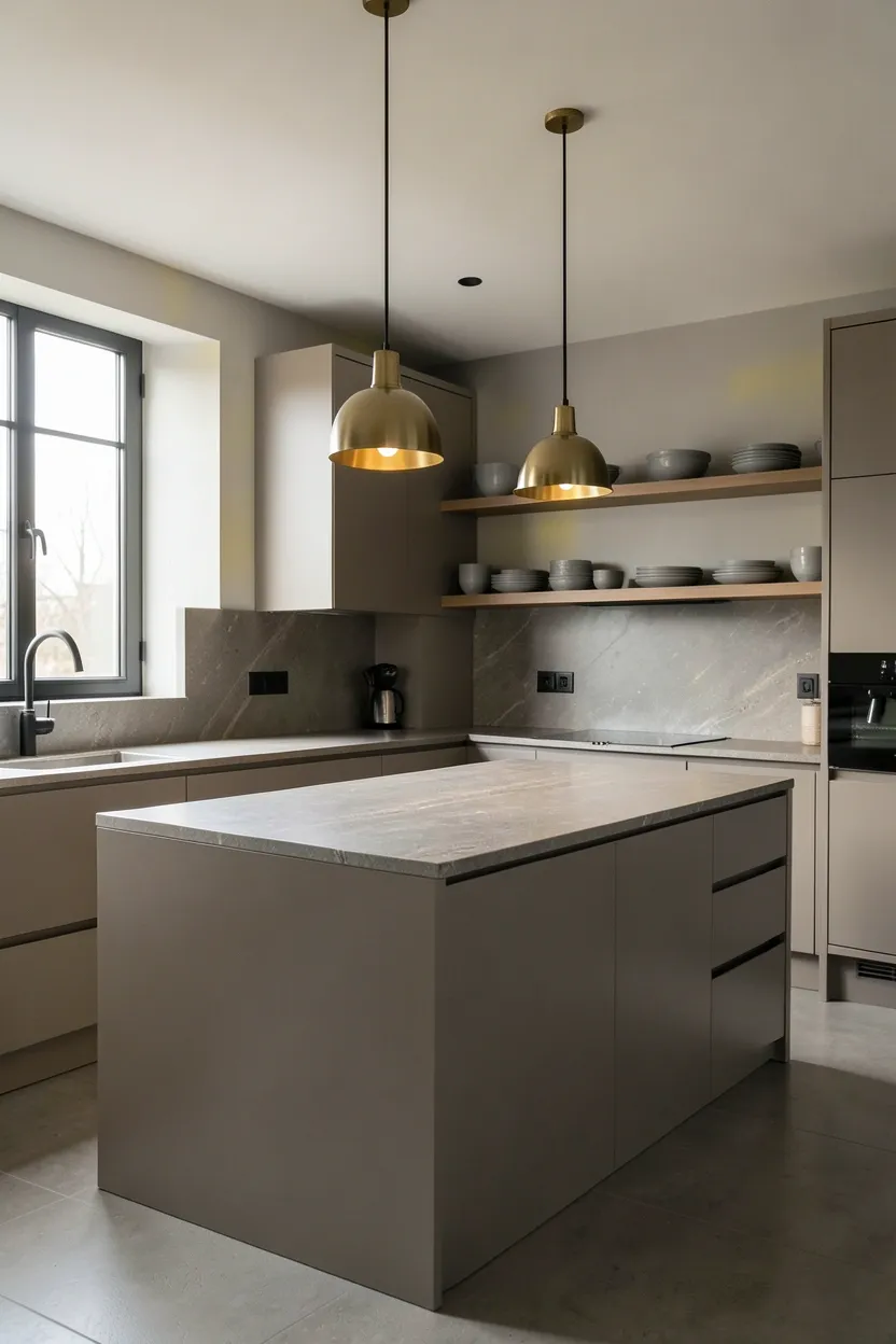
Tips
- Choose warm gray with yellow or pink undertones rather than cool blue-gray for authentic autumnal feeling
- Vary material textures significantly since color variation is limited—mix lacquer, matte, honed, and brushed surfaces
- Introduce brass or copper hardware for warm metallic accent that prevents the palette from feeling too cool
What this gives you: Sophisticated autumnal warmth through intentional monochromatic restraint and material variation
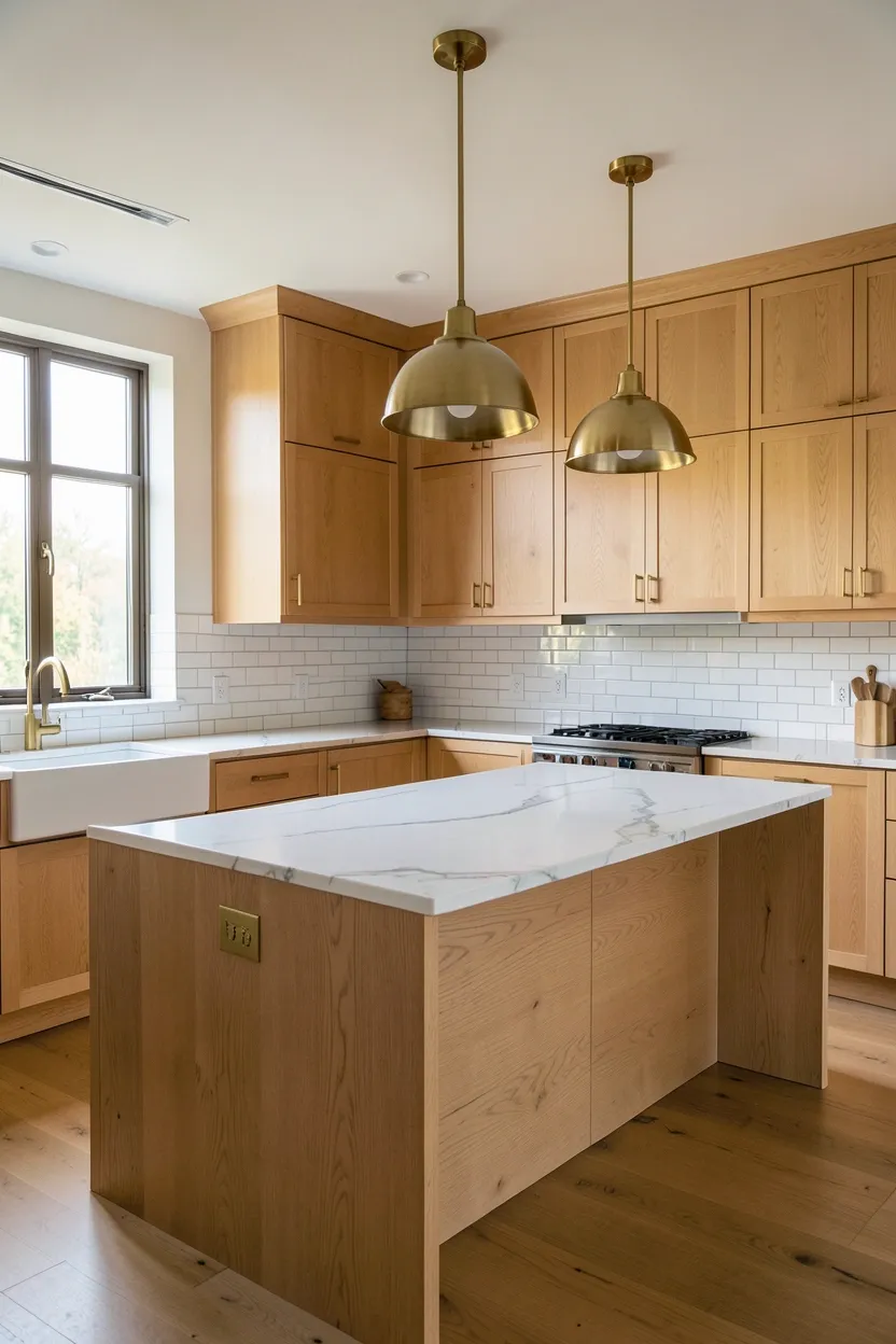
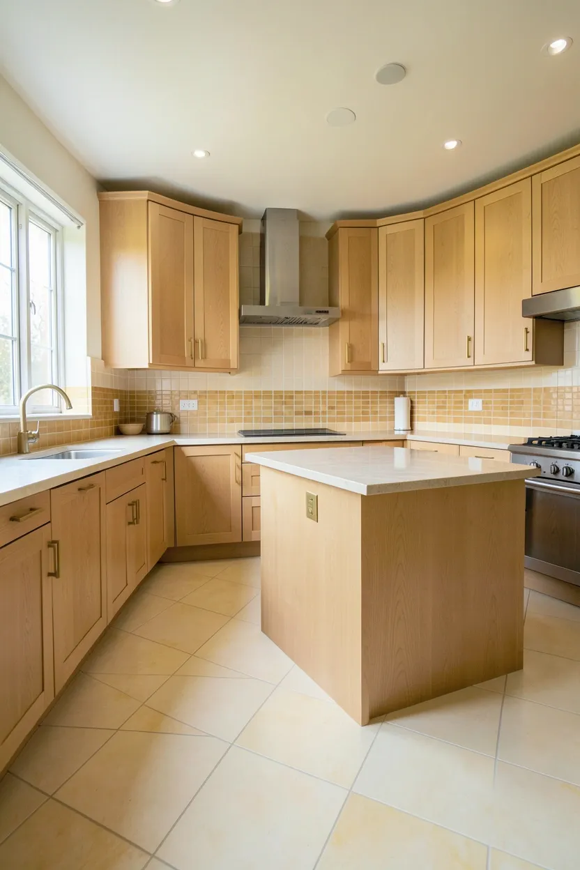
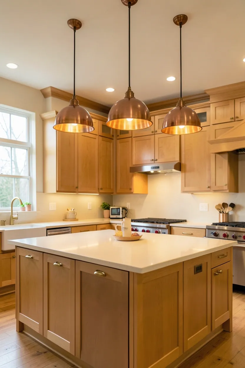
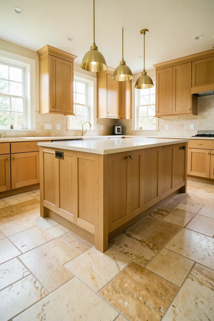
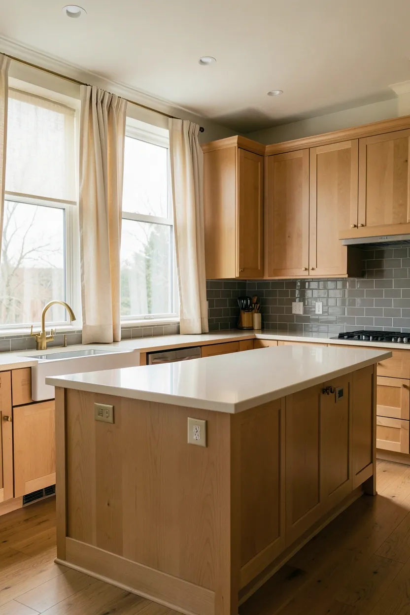
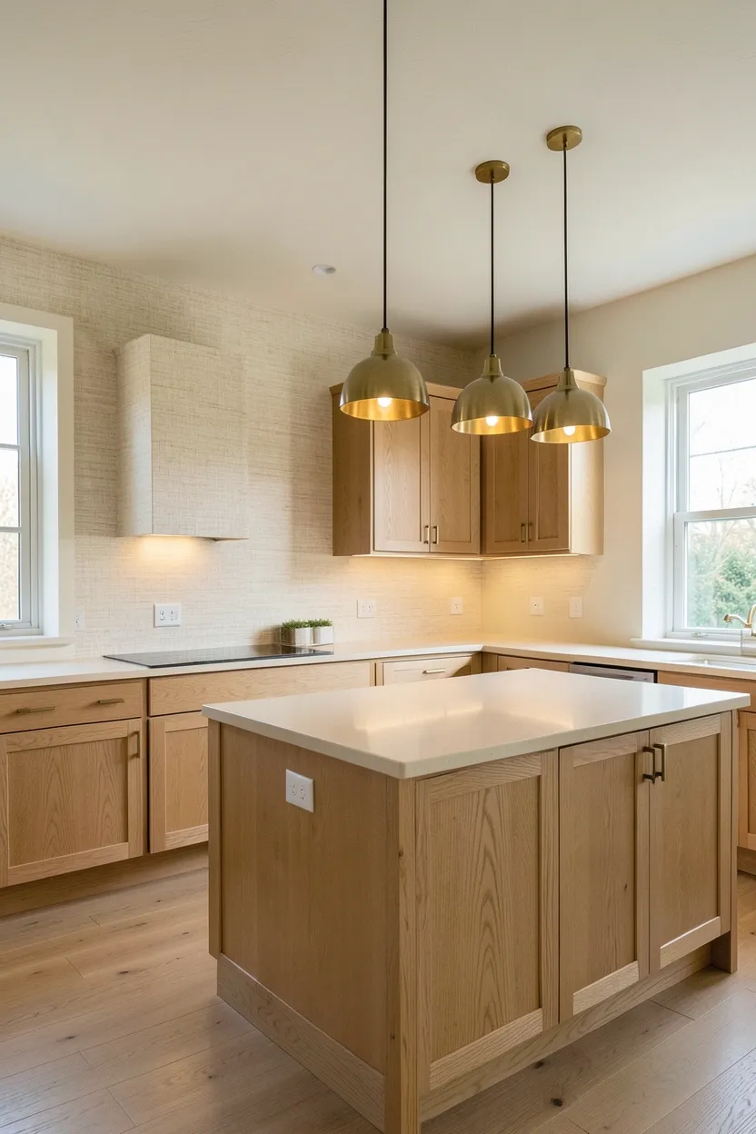
2. Natural Light Oak Cabinetry System
Light oak cabinetry provides inherent autumnal warmth through its natural grain patterns and amber-hued tones while maintaining kitchen brightness and spaciousness. The oak's warm golden undertones complement fall's color palette naturally, creating a backdrop that feels seasonal without introducing artificial colors. Light oak works exceptionally well when paired with neutral countertops in white or cream marble, brass hardware that echoes wood's warmth, and simple cabinet hardware that allows the grain to take center stage. The overall feeling is one of natural sophistication—fall warmth emerges from material authenticity rather than seasonal decoration, making the kitchen feel connected to autumn's organic rhythms.
Recommended
Items for this idea
Tips
- Choose light oak with visible grain patterns rather than heavily stained or bleached wood for natural warmth
- Pair oak with neutral countertops—white marble, cream quartz, or warm gray concrete—for brightness
- Use brass or antique brass hardware rather than chrome to complement oak's warm undertones
Best for: Kitchens with good natural light where oak's warmth will be enhanced by daylight
What this gives you: Authentic autumnal warmth through natural wood grain and amber undertones
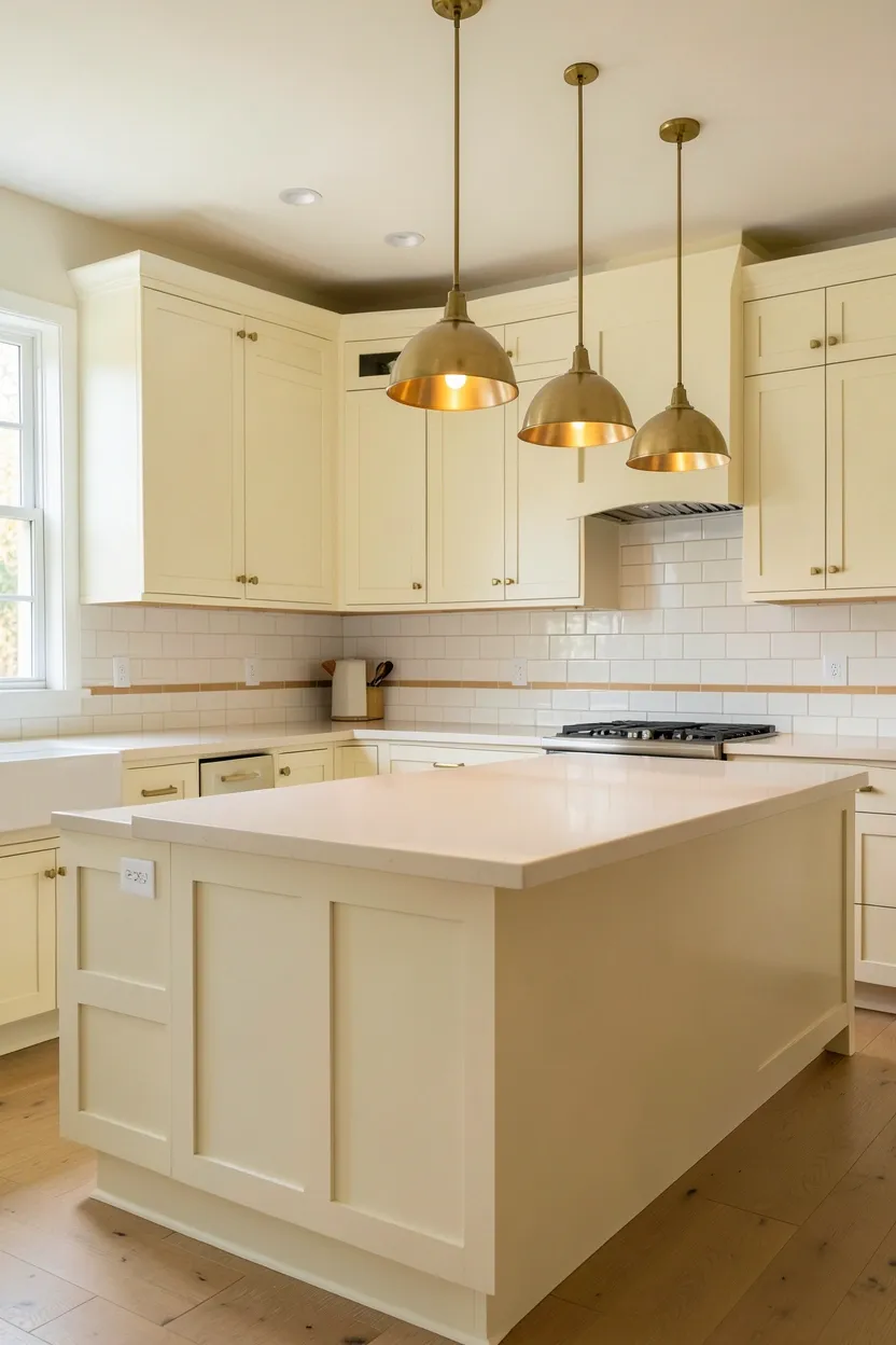
3. Warm White with Brass Accents
Warm white cabinetry paired with brass hardware creates bright, fresh spaces while introducing autumnal warmth through metallic accents rather than wall color. Choose white with subtle cream or yellow undertones rather than stark pure white—this warm white maintains kitchen freshness while preventing the space from feeling clinical or cold. Brass hardware, pendant lights, and faucet provide golden warmth that catches and reflects light beautifully, creating focal points of autumnal character without overwhelming the bright white surfaces. The combination feels crisp yet warm, making the kitchen feel spacious while celebrating fall through sophisticated material contrast rather than overt color application.
Tips
- Choose warm white with cream or yellow undertones rather than cool blue-white for authentic fall warmth
- Use brass consistently across all fixtures—hardware, pendant lights, faucets—for cohesive warmth
- Maintain ample natural light to prevent warm white from feeling too yellow or dated
What this gives you: Bright spaciousness with autumnal warmth through brass metallic accents
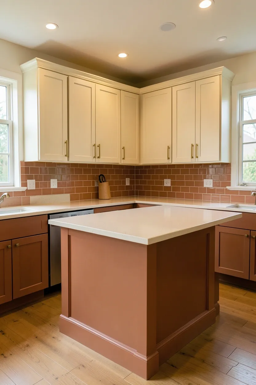
4. Terracotta and Cream Harmony
The terracotta and cream pairing creates quintessential autumn warmth while maintaining kitchen brightness and functionality. Terracotta—whether in painted cabinetry, tiled backsplash, or flooring—provides rich earthy warmth, while cream countertops or upper cabinets offer necessary contrast that prevents the space from feeling heavy or monotonous. This combination works exceptionally well when terracotta is used as an accent rather than dominant surface: cream upper cabinets with terracotta lower cabinets, or cream walls with a terracotta tile backsplash as focal point. The warmth feels authentically autumnal rather than seasonally decorated, while cream ensures the kitchen remains light and airy despite rich earth tones.
Recommended
Items for this idea
Tips
- Use terracotta as an accent rather than dominant surface for sophisticated fall warmth
- Maintain cream as the dominant color on upper cabinets and countertops for brightness
- Introduce brass or copper hardware to complement both warm tones
Best for: Kitchens with good natural light where cream surfaces will reflect brightness
What this gives you: Authentic autumnal earthiness balanced by bright cream freshness
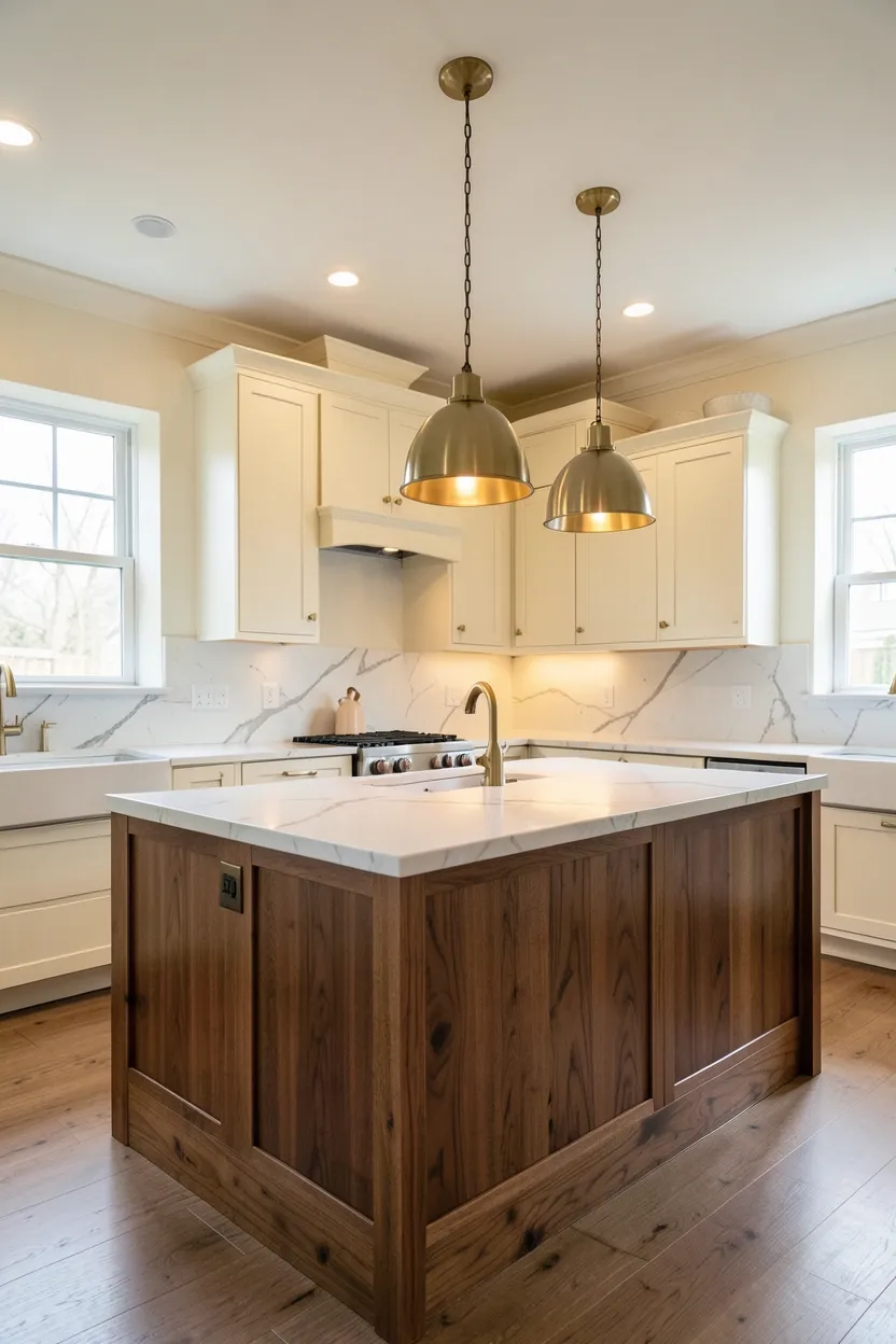
5. Walnut with Light Neutral Backdrop
Walnut cabinetry paired with light neutral surroundings creates dramatic autumnal warmth through rich brown tones while preventing the space from feeling dark or enclosed. Walnut's deep amber and chocolate undertones provide sophisticated fall character, especially when used selectively: walnut island or lower cabinets against cream upper cabinets and white walls. This creates visual hierarchy where walnut becomes a dramatic focal point rather than overwhelming the space. The key to successful walnut integration is ensuring ample lighting—both natural and artificial—to highlight wood's rich grain patterns and prevent shadow accumulation. The result is a kitchen that feels warm and substantial while maintaining brightness through strategic light neutral backdrops.
Tips
- Use walnut selectively—as island or lower cabinets—rather than throughout for sophisticated focal impact
- Ensure excellent lighting with multiple sources to highlight walnut's rich grain and prevent darkness
- Pair walnut with light neutral backdrops—cream, warm white, or light gray—for contrast and brightness
Avoid if: Your kitchen has limited natural light where walnut might feel too dark or heavy
What this gives you: Dramatic autumnal warmth through rich walnut focal points
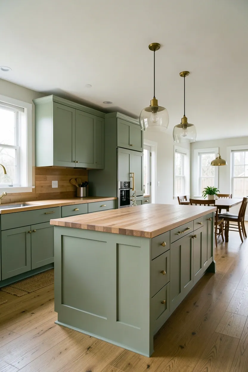
6. Sage Green with Warm Wood Tones
Sage green cabinetry paired with warm wood creates a sophisticated autumnal palette that feels connected to nature while maintaining kitchen freshness. Sage's muted green undertones reference falling foliage and harvest season without introducing the bright primary colors that can feel temporary or decorative. The green works exceptionally well when paired with warm wood countertops, oak floors, or walnut accents—natural materials that echo sage's organic character. Brass or copper hardware provides complementary warm metallic accents that prevent the palette from feeling too cool. This combination creates a kitchen that feels both seasonal and timeless, celebrating autumn through natural color harmony rather than overt decoration.
Recommended
Items for this idea
Tips
- Choose muted sage green rather than bright or saturated greens for sophisticated autumnal character
- Pair sage with warm wood tones—butcher block, oak, or walnut—for natural material harmony
- Use brass or copper hardware for warm metallic accents that prevent the palette from feeling cool
What this gives you: Natural autumnal connection through sage green and warm wood harmony
7. Two-Tone Upper and Lower Cabinetry
Two-tone cabinetry using different colors for upper and lower cabinets creates visual interest and sophistication while introducing fall warmth through strategic color placement. The approach pairs light upper cabinets with darker lower cabinets—or vice versa—to establish visual hierarchy and prevent monolithic cabinetry from feeling overwhelming. For fall kitchens, consider cream upper cabinets with warm gray or terracotta lower cabinets, or light oak uppers with walnut lowers. This creates separation that makes the kitchen feel dynamic while maintaining a cohesive autumnal palette. The key is choosing colors that share warm undertones so the two-tone effect reads as intentional design rather than mismatched renovation.
Tips
- Ensure both cabinet colors share warm undertones for cohesive two-tone appearance
- Keep upper cabinets lighter than lower cabinets for visual balance that prevents space from feeling heavy
- Maintain consistent hardware material and finish across both cabinet colors
What this gives you: Visual sophistication through intentional two-tone color separation
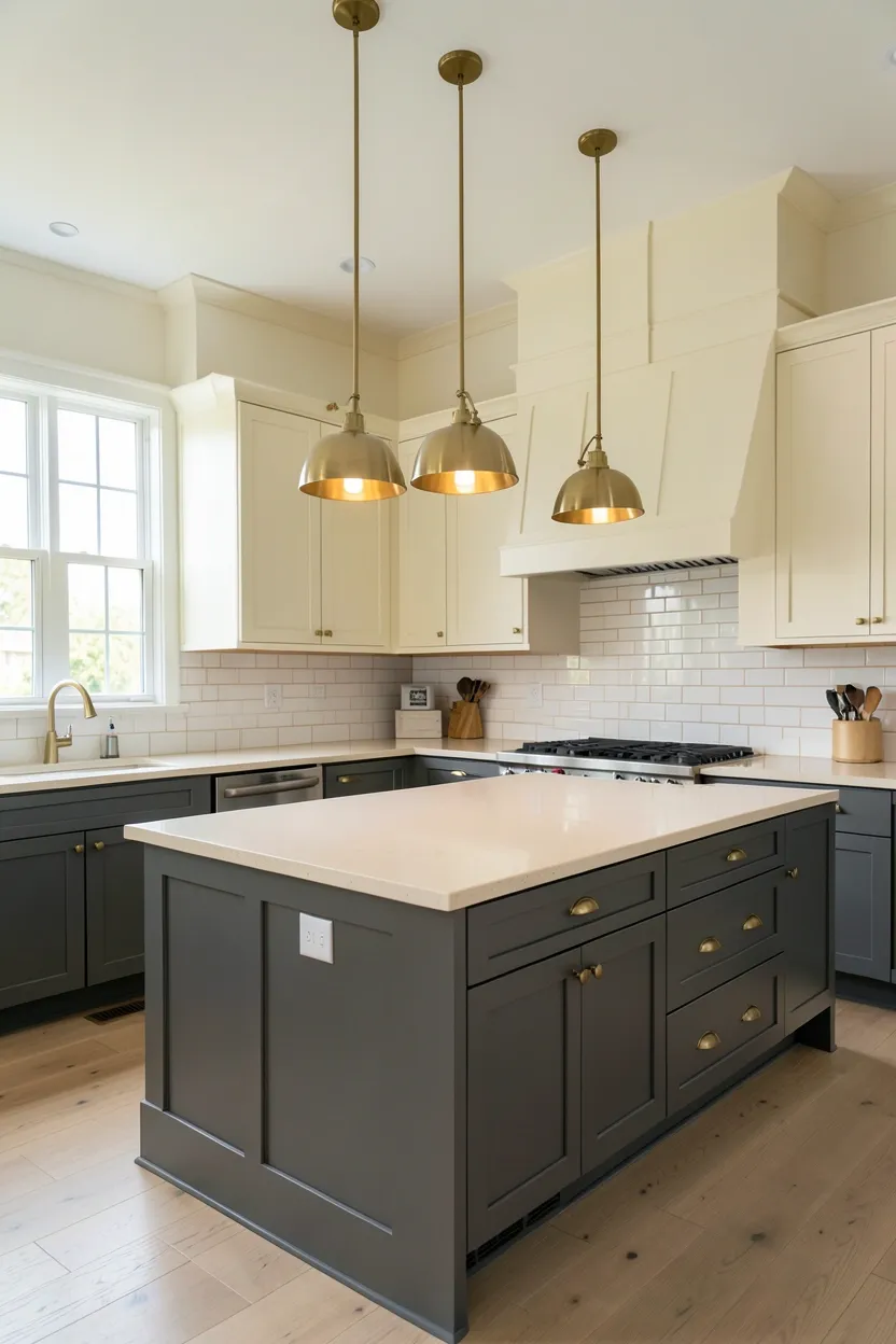
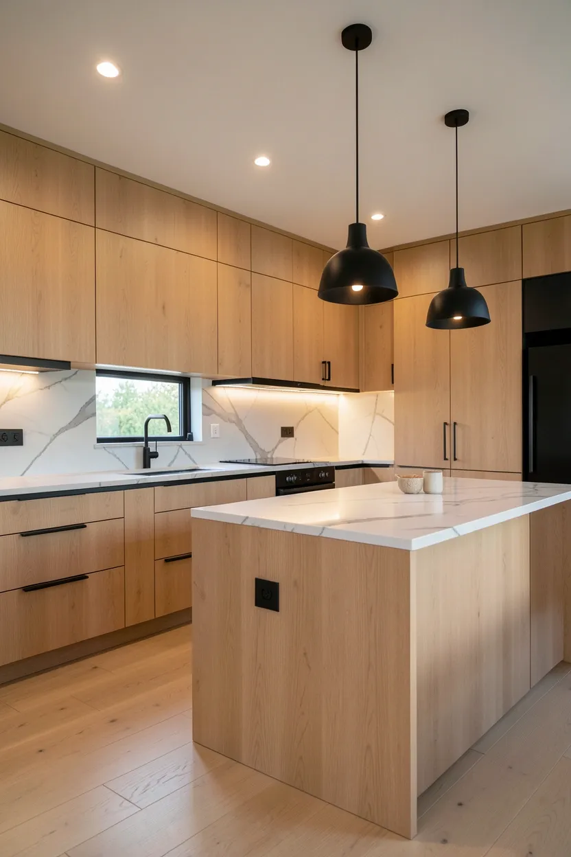
8. Matte Black Hardware with Warm Backdrop
Matte black hardware provides sophisticated contrast against warm autumnal kitchen palettes while adding contemporary edge that prevents spaces from feeling overly traditional or dated. Think matte black cabinet pulls, faucets, and pendant light fixtures against warm neutral cabinets, light oak wood, or terracotta backsplashes. The contrast between warm earth tones and matte black creates visual tension and sophistication, making the kitchen feel intentionally designed rather than generically decorated. Matte finish rather than glossy is essential—glossy black creates harsh reflections that can feel commercial, while matte absorbs light softly and reads as luxurious. This combination works particularly well in modern kitchens where black's clean lines complement minimalist aesthetic.
Recommended
Items for this idea
Tips
- Choose matte finish rather than glossy for sophisticated appearance that absorbs rather than reflects harshly
- Keep matte black hardware consistent across all fixtures for cohesive intentional appearance
- Use warm neutrals—warm gray, cream, terracotta, or light oak—as backdrop for sophisticated contrast
Avoid if: Your kitchen has limited natural light where matte black might absorb too much light
What this gives you: Sophisticated contrast adding contemporary edge to warm autumnal palettes
9. Open Shelving with Natural Display — a Renter-Friendly Fall Kitchen Update
Open shelving adds practical storage while introducing visual warmth through natural materials and intentional display that feels appropriate to fall design. Install floating wooden shelves in light oak or walnut above the countertop or range, then fill them thoughtfully with ceramic dishes in warm neutrals, wooden cutting boards, and copper or brass utensils. The combination of visible wood shelves and displayed items adds layered warmth without introducing additional colors that might overwhelm the space. Practical items become decorative when arranged intentionally—stacked ceramic bowls, leaning cutting boards, grouped copper pots—creating a kitchen that feels both functional and curated. This approach works particularly well when shelving materials complement other kitchen wood tones.
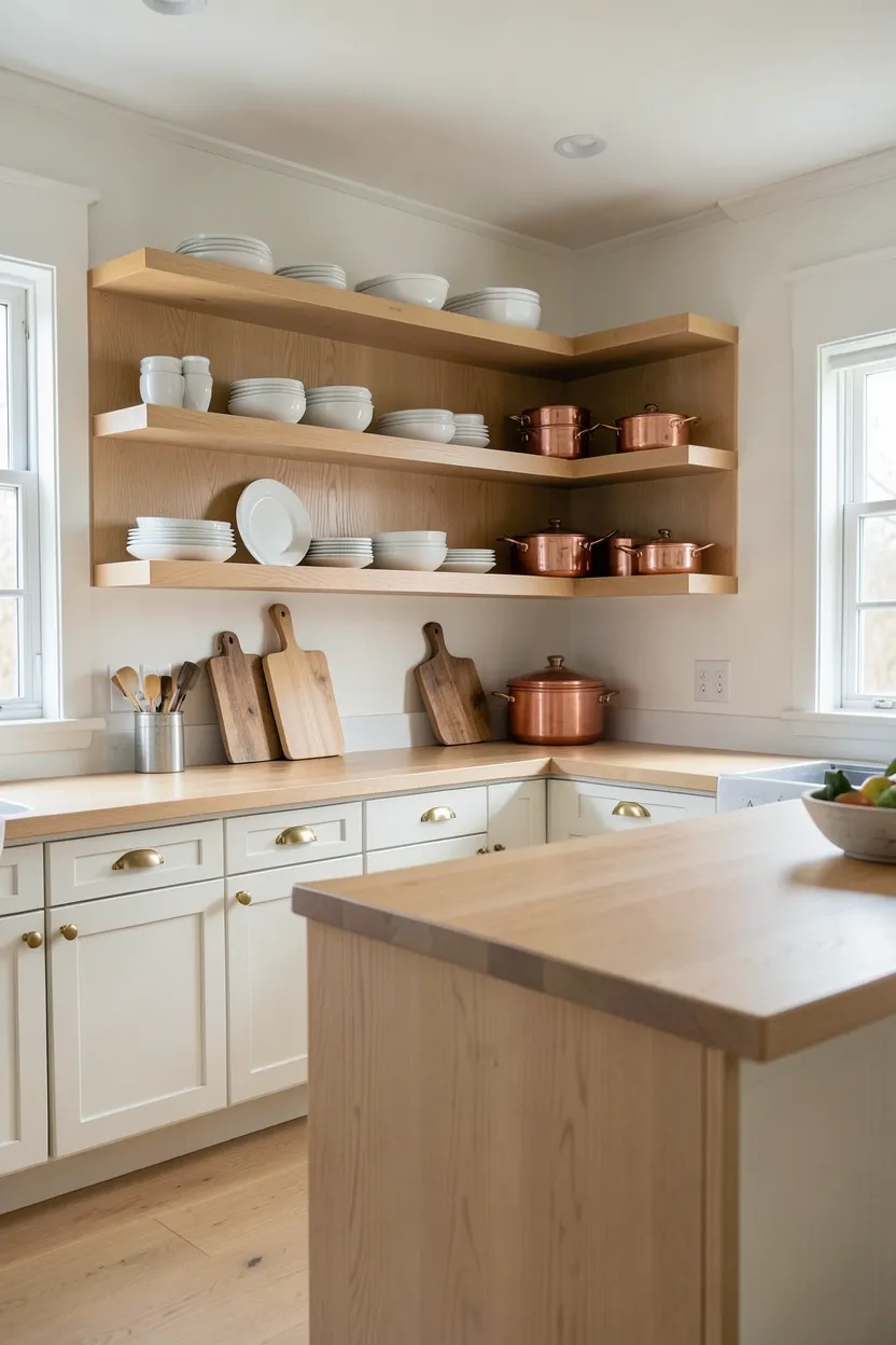
Tips
- Choose shelving wood that matches or complements other kitchen wood tones for cohesive appearance
- Display items intentionally in groups rather than scattered—group ceramics, stack boards, cluster pots
- Maintain organized appearance by ensuring displayed items are neatly arranged and dusted regularly
Rental note: Open shelving can be installed with removable wall brackets, making it ideal for rental kitchens
What this gives you: Practical storage with visual warmth through natural material display
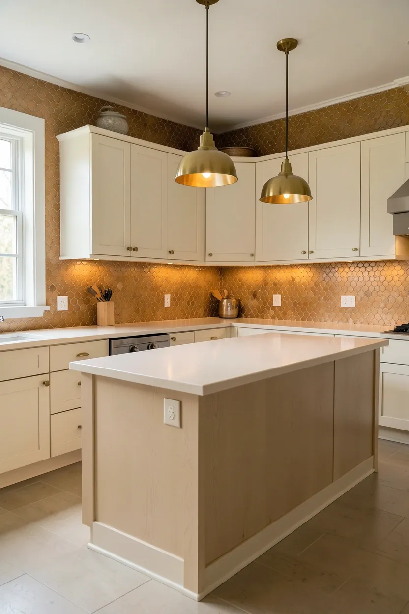
10. Large Format Tile with Warm Undertones
Large format tiles in warm neutrals create seamless surfaces that make kitchens feel expansive while providing subtle autumnal warmth. Choose tiles 24x24 inches or larger in warm neutrals—warm gray, cream with yellow undertones, or soft beige—that reflect light continuously across floors or backsplashes. The reduced grout lines create visual continuity that makes spaces feel larger and more serene, an important quality when introducing rich autumnal colors that might otherwise feel visually heavy. Large format tiles work particularly well when paired with smaller accent tiles in contrasting warm tones used sparingly as backsplash borders or feature areas for deliberate focal points without overwhelming the space.
Recommended
Items for this idea
Tips
- Choose tiles with warm undertones rather than cool grays—creamy whites, warm beiges, honey-infused neutrals
- Use unsanded grout in tones that blend with tile surface for seamless visual continuity
- Consider large format tiles for both floor and backsplash for dramatic visual continuity
What this gives you: Expansive seamless surfaces with subtle autumnal warmth
11. Stone Countertop with Warm Veining
A stone countertop featuring warm veining creates sophisticated visual interest while introducing autumnal warmth through natural color variation. Choose stones like marble with gold or cream veining, travertine with honey undertones, or quartz with warm gray and amber patterns. The natural variations in stone create organic movement that makes the kitchen feel rich and substantial without need for decorative elements. Stone's warmth complements other autumnal design elements like wood cabinetry or brass hardware, creating a cohesive material palette that celebrates natural materials. The countertop's permanence contrasts beautifully with replaceable seasonal accents like dish towels or small appliances.
Tips
- Choose stone with warm undertones—honey travertine, gold-veined marble, or warm gray quartz—for autumnal warmth
- Consider honed or matte finish rather than high polish for sophisticated appearance that shows natural character
- Ensure stone colors complement rather than contrast against cabinetry and hardware
Budget/Time: Higher investment—natural stone costs $80-150 per square foot installed
What this gives you: Sophisticated natural focal point with permanent autumnal warmth
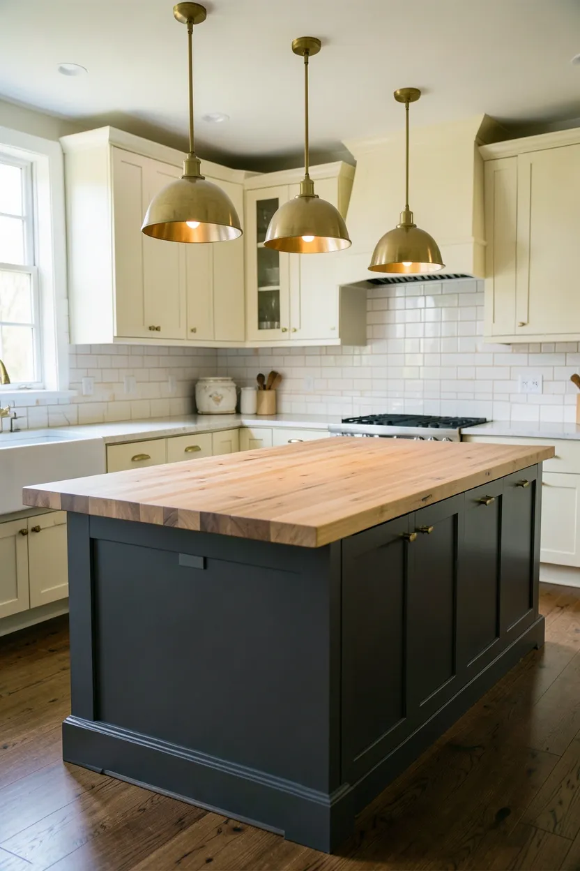
12. Butcher Block Island with Neutral Perimeter
A butcher block island paired with neutral perimeter cabinetry creates perfect balance of warmth and coolness essential to fall kitchen design. The island's warm wood—light oak, maple, or walnut—provides autumnal character through natural grain and color, while neutral perimeter cabinets in cream, warm white, or light gray offer contrast that prevents the space from feeling overwhelmingly warm. This functional separation allows the island to become a warm focal point for food prep and gathering while maintaining brightness around the room's perimeter. The butcher block's warmth feels authentic rather than seasonal, making the kitchen feel connected to harvest traditions.
Recommended
Items for this idea
Tips
- Choose butcher block wood with visible grain patterns—light oak or maple—for natural warmth
- Maintain neutral perimeter cabinets in cream, warm white, or light gray for contrast with warm island
- Seal butcher block regularly with food-safe oil to protect against moisture and maintain appearance
What this gives you: Warm focal point balanced by bright neutral perimeter
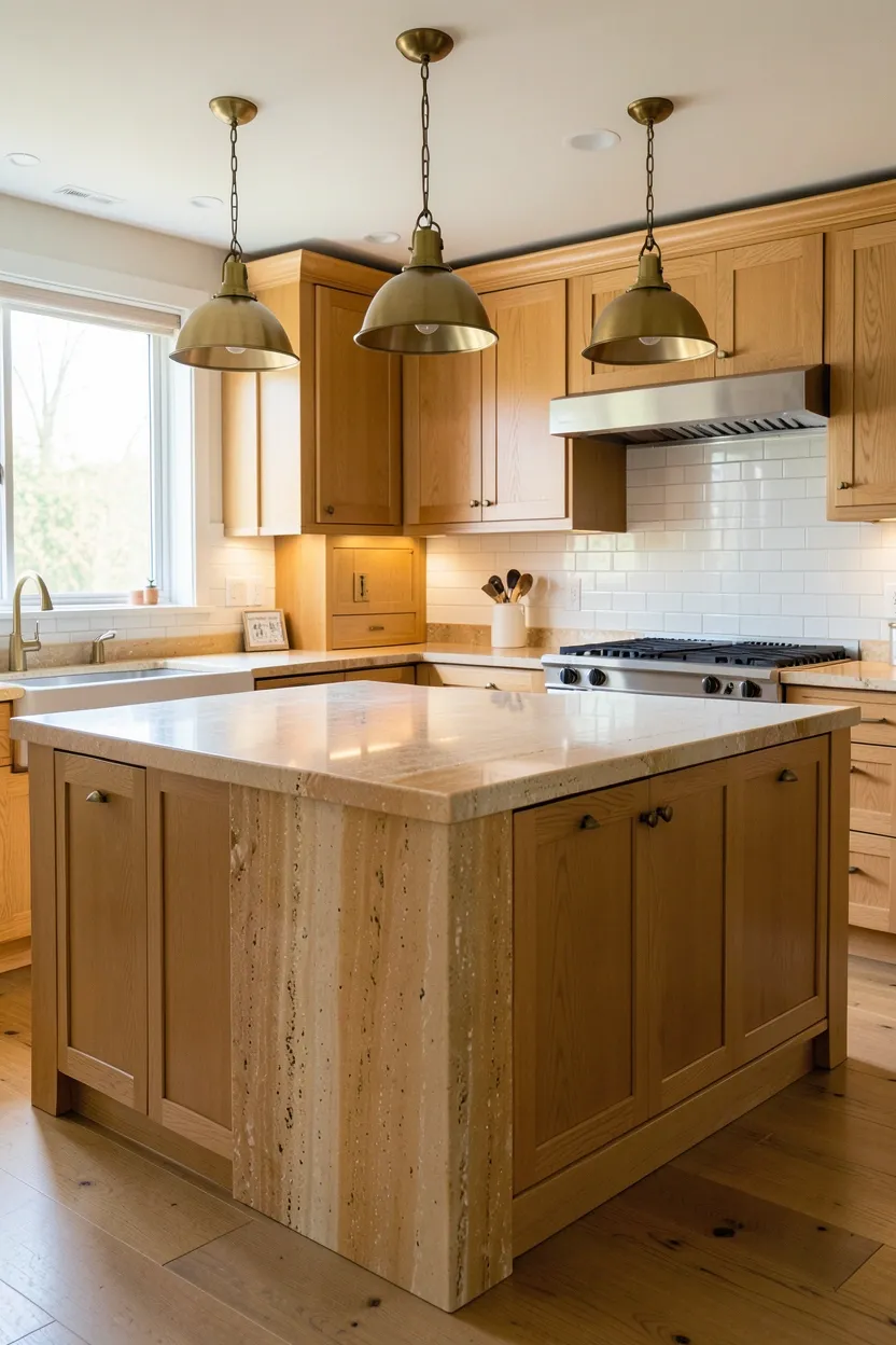
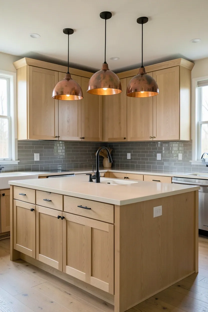
13. Copper Pendant Lighting Cluster
Copper pendant lights provide metallic warmth that beautifully complements autumnal kitchen palettes while adding sophisticated focal points above islands or dining areas. Unlike chrome's cool blue tones or nickel's cool grays, copper's reddish-gold undertones echo warmth of fall colors—burnt orange, terracotta, warm brown—creating a cohesive material palette. Copper works particularly well when grouped in clusters of two or three pendants rather than single fixtures, creating dramatic vertical presence while casting warm golden illumination across workspaces. The warm metallic glow reflects ambient light, making the kitchen feel brighter and more inviting while providing consistent color thread that ties together varied materials.
Tips
- Choose unlacquered copper if you appreciate patina development, or lacquered for consistent appearance
- Group pendants in clusters of two or three for dramatic focal impact over islands
- Ensure pendant shades allow warm light to diffuse freely—glass, perforated metal, or open designs
What this gives you: Metallic warmth that beautifully complements autumnal color palettes
14. Warm Backsplash with Neutral Cabinets
A warm-toned backsplash paired with neutral cabinetry creates visual focal point while introducing autumnal warmth without overwhelming the space. Choose backsplash materials in warm hues—terracotta tiles, honey-colored mosaic, or warm gray subway tile—and pair them with neutral cabinets in cream, warm white, or light gray. The backsplash becomes a dramatic backdrop that provides autumnal character while neutral cabinetry maintains kitchen brightness and spaciousness. This approach works particularly well when the backsplash extends from countertop to upper cabinets, creating a continuous warm surface that draws the eye upward and makes ceilings feel higher.
Recommended
Items for this idea
Tips
- Extend backsplash from countertop to ceiling for dramatic full-height impact
- Choose warm backsplash materials—terracotta, honey mosaic, or warm gray subway—for autumnal character
- Maintain neutral cabinets in cream, warm white, or light gray for contrast with warm backsplash
What this gives you: Dramatic autumnal focal point through warm backsplash contrast
15. Integrated Appliances with Warm Panels
Integrated appliances with warm paneling creates seamless sophistication while allowing cabinetry materials to take center stage for autumnal warmth. Refrigerators, dishwashers, and other appliances are hidden behind panels that match cabinetry—light oak, cream, or warm gray—creating continuous visual surfaces without the disruption of stainless steel or black appliances. The seamless integration makes the kitchen feel larger and more sophisticated while allowing warm cabinetry materials to provide the dominant visual character. This approach works particularly well in modern kitchens where clean lines and minimal visual disruption create intentional, composed spaces that celebrate material warmth.
Tips
- Choose paneling that exactly matches cabinetry material and finish for seamless integration
- Ensure integrated appliances are properly ventilated and accessible despite concealed appearance
- Consider paneling only major appliances like refrigerator and dishwasher for sophisticated impact
Budget/Time: Higher investment—integrated appliances cost 20-40% more than standard models
What this gives you: Seamless sophistication allowing warm materials to dominate visually
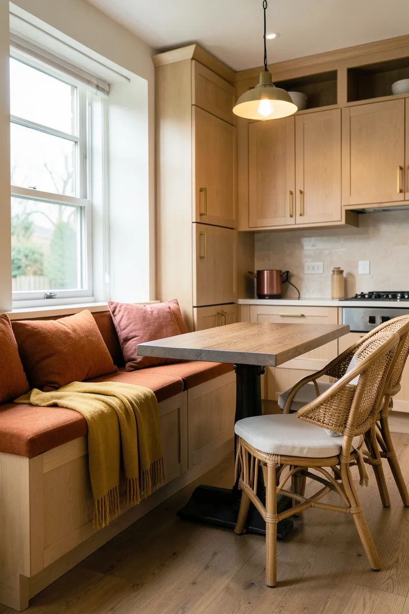
16. Breakfast Nook with Cozy Textiles
A breakfast nook featuring cozy textiles creates a warm gathering space within the kitchen that celebrates fall comfort through layered fabrics. Think bench seating with cushions in warm autumnal fabrics—burnt orange wool, mustard yellow velvet, or terracotta linen—paired with throw blankets and pillows in coordinating tones. The nook becomes a cozy destination for morning coffee or casual dining while introducing autumnal character through textiles that can be changed seasonally. Natural materials like a wooden table or rattan chairs complement the fabric warmth, creating a complete cozy corner. This approach works particularly well in kitchens with adjacent space where a dedicated dining area can function as both eating spot and decorative focal point.
Recommended
Items for this idea
Tips
- Choose textiles in autumnal warm tones—burnt orange, mustard yellow, terracotta, or burgundy
- Mix natural materials like wood and rattan with fabric textures for layered warmth
- Ensure textiles are washable and durable for kitchen environment
Best for: Kitchens with adjacent space for a dedicated cozy gathering area
What this gives you: Cozy autumnal comfort through layered textile warmth
17. Natural Stone Flooring with Warm Grout
Natural stone flooring paired with warm grout creates sophisticated foundation while introducing autumnal warmth through material authenticity. Choose stone with warm undertones—warm slate, honey limestone, or travertine—and install it with grout in coordinating warm tones rather than cool white or gray. The natural variations in stone color and pattern create visual interest without need for additional decoration, making the kitchen feel grounded and substantial. Stone's organic warmth complements other autumnal design elements like wood cabinetry or brass hardware, creating a cohesive material palette that celebrates natural materials from floor to ceiling.
Tips
- Choose stone with warm undertones—honey limestone, warm travertine, or amber-veined slate
- Use warm-toned grout that coordinates with stone rather than cool white or gray for seamless appearance
- Seal stone thoroughly and regularly to protect against kitchen spills and maintain natural appearance
Budget/Time: Significant investment—natural stone flooring costs $8-20 per square foot installed
What this gives you: Sophisticated foundation with natural autumnal warmth
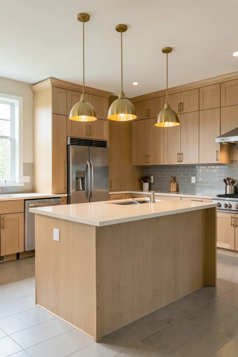
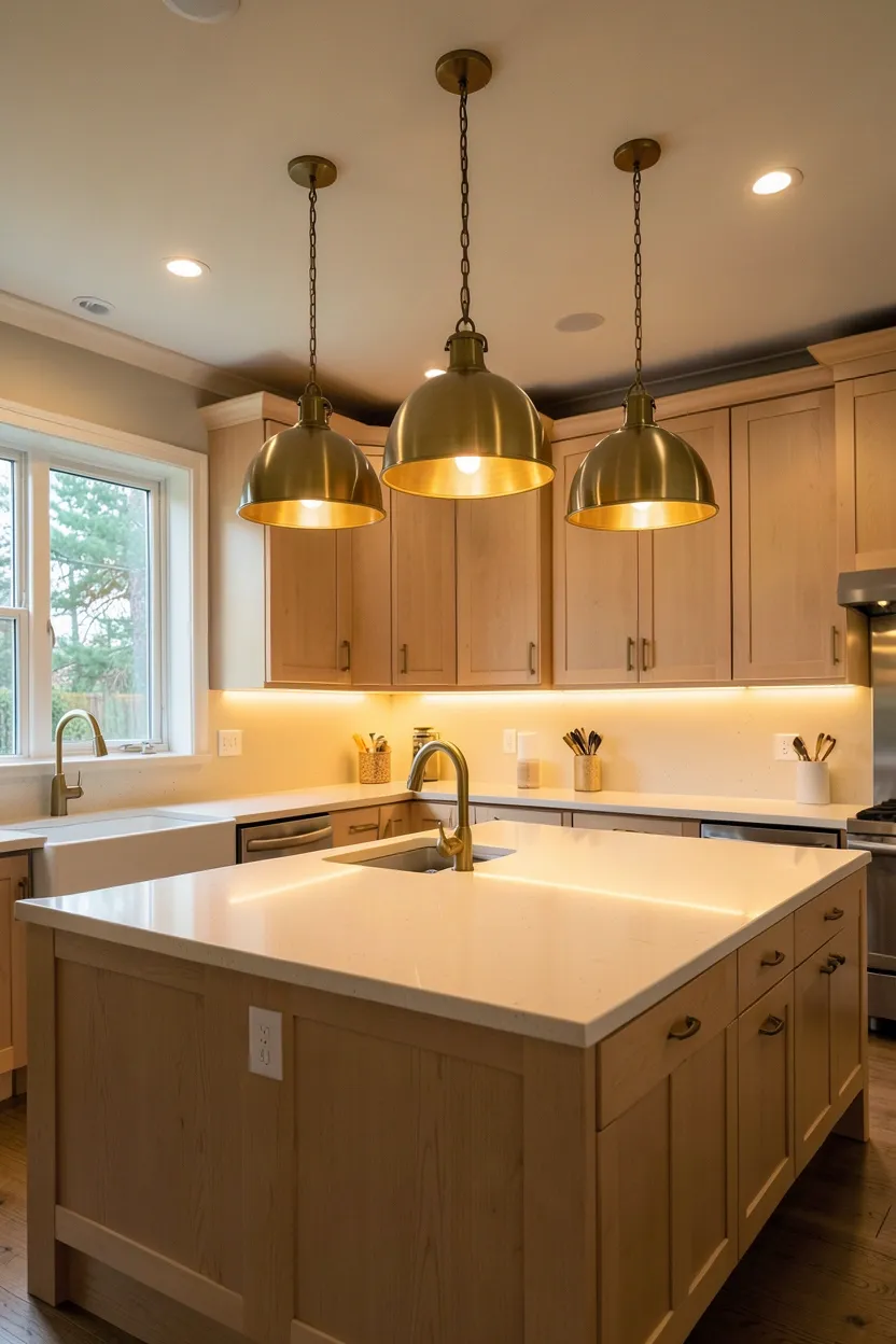
18. Layered Lighting with Warm Fixtures for Cozy Fall Kitchen Ambiance
Layered lighting creates essential fall warmth in kitchens while providing flexibility for different tasks and moods. The most successful fall kitchens incorporate multiple light sources at varying heights: pendant lights over islands for task illumination, under-cabinet lighting for countertop work, and ambient overhead fixtures for general illumination. All fixtures should use warm-toned bulbs around 2700K-3000K and feature warm finishes like brass, copper, or warm glass. The layered approach provides flexibility—bright focused light for food prep during mornings, soft ambient glow for intimate evening cooking—while maintaining consistent warm color temperature throughout the space.
Recommended
Items for this idea
Tips
- Choose bulbs between 2700K-3000K for warm golden ambient glow
- Install dimmers on all lighting circuits for flexibility between bright tasks and cozy ambiance
- Layer lighting at varying heights—pendants overhead, under-cabinet for tasks, ambient for general
What this gives you: Flexible atmospheric warmth transforming kitchen character through layered illumination
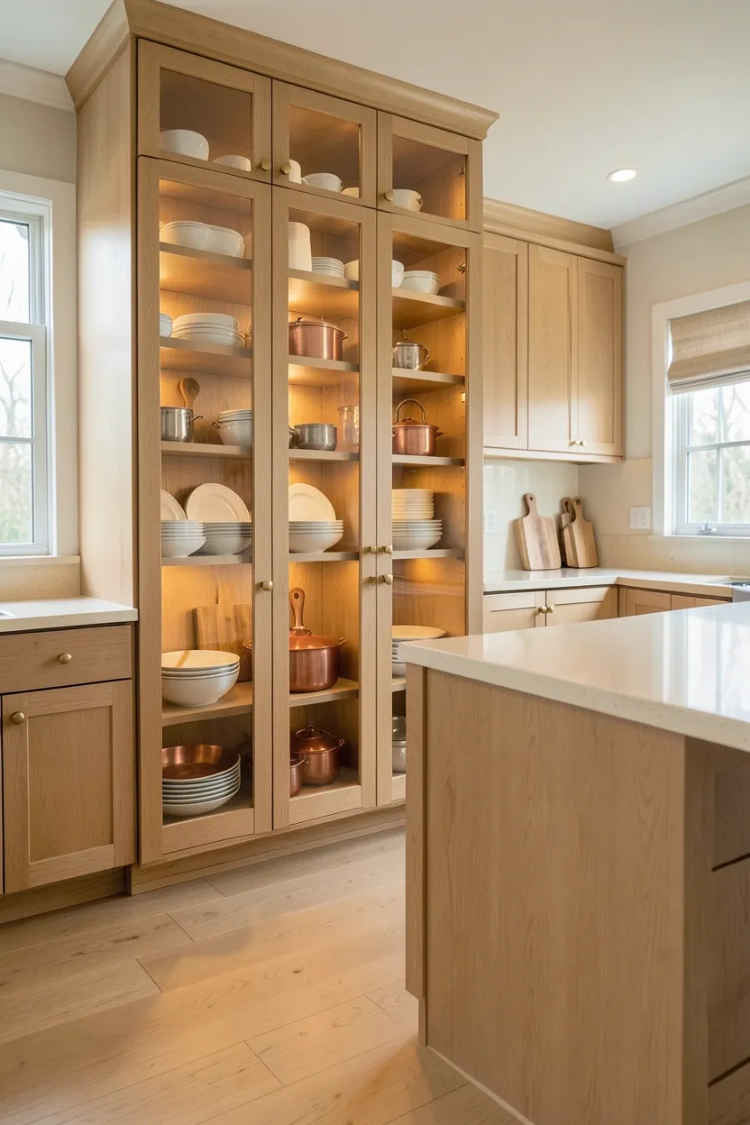
19. Built-in Pantry with Glass Doors
A built-in pantry with glass doors adds sophisticated storage while creating visual interest through displayed items that feel appropriate to fall design. The glass-fronted pantry allows frequently used items—ceramic dishes, wooden serving bowls, copper pots—to become decorative elements while remaining accessible. Choose warm wood for the pantry frame—light oak or walnut—to complement other kitchen materials, and select glass with subtle warm tint rather than clear for additional autumnal character. The pantry becomes both functional storage and decorative focal point, displaying organized collections that add warmth without clutter. This approach works particularly well in kitchens with adjacent wall space for built-in cabinetry.
Tips
- Choose pantry wood that matches or complements other kitchen cabinetry for cohesive appearance
- Organize pantry contents attractively—group similar items, stack dishes neatly, display pieces intentionally
- Consider glass with subtle warm tint rather than clear for additional autumnal character
Budget/Time: Significant investment—built-in pantry costs $3,000-8,000 depending on size and finishes
What this gives you: Sophisticated storage with visual interest through displayed warmth
20. Range Hood as Focal Point
A statement range hood creates dramatic focal point while introducing autumnal warmth through material choice and design. Instead of standard stainless steel, choose hoods in materials that complement fall palettes: brass or copper metal, wood paneling in light oak or walnut, or painted hoods in warm gray or terracotta. The hood becomes sculptural element above the range, drawing the eye upward and creating vertical interest. This approach works particularly well when the hood material complements other kitchen elements—matching brass hardware, coordinating with wood cabinetry, or echoing backsplash colors—for cohesive design that celebrates intentional material choices.
Recommended
Items for this idea
Tips
- Choose hood material that complements other kitchen elements—matching hardware, cabinetry, or backsplash
- Consider oversized or dramatic hood design for stronger focal impact above range
- Ensure hood provides adequate ventilation despite decorative appearance
What this gives you: Dramatic focal point celebrating intentional material warmth
21. Window Treatment in Warm Neutrals — Easy Renter-Friendly Fall Kitchen Decor
Window treatments in warm neutrals create soft autumnal atmosphere while controlling light and maintaining kitchen brightness. Choose curtains or shades in warm materials—linen in cream, wool in warm gray, or cotton in terracotta—and hang them to frame windows without blocking light completely. The warm textiles add softness and warmth to hard kitchen surfaces while providing privacy and light control. This approach works particularly well when window treatments complement other kitchen materials—coordinating with backsplash colors, echoing cabinet undertones, or matching textile accents in breakfast nooks.
Tips
- Choose warm neutral window treatments—cream linen, warm gray wool, or terracotta cotton
- Hang curtains to frame windows rather than cover them completely for maintained brightness
- Ensure materials are washable or durable for kitchen environment
Rental note: Window treatments can be installed with tension rods, making them ideal for rental kitchens
What this gives you: Soft autumnal warmth through window treatment textiles
22. Mix of Metal Finishes Intentionally
Intentionally mixing metal finishes—brass, copper, and matte black—creates sophisticated depth while introducing multiple warm metallic accents that complement fall palettes. The key is mixing intentionally rather than randomly: perhaps brass for cabinet hardware and pendant lights, copper for accent pieces or pot display, and matte black for faucet and lighting fixtures. Each metal should appear multiple times throughout the space for cohesive appearance. The mixed metals create visual interest and prevent the kitchen from feeling too matched or predictable while maintaining autumnal warmth through warm metallic tones.
Recommended
Items for this idea
Tips
- Repeat each metal finish multiple times throughout the space for intentional appearance
- Focus on warm metals—brass, copper, bronze—for autumnal character over cool chrome or nickel
- Limit mixed finishes to two or three metals for sophisticated rather than chaotic appearance
What this gives you: Sophisticated visual depth through intentionally mixed warm metals
23. Display Open Storage with Warm Baskets
Open storage displays featuring natural baskets add practical organization while introducing textural warmth that feels appropriate to fall design. Install open shelves or use existing cabinetry to display woven baskets in natural materials—rattan, seagrass, or bamboo—in warm neutral tones. Fill baskets with practical items neatly organized: dish towels, small appliances, or pantry staples. The combination of visible basket texture and organized contents adds layered warmth without introducing additional colors. This approach works particularly well for pantry organization or displaying frequently used items that remain accessible while contributing to kitchen warmth.
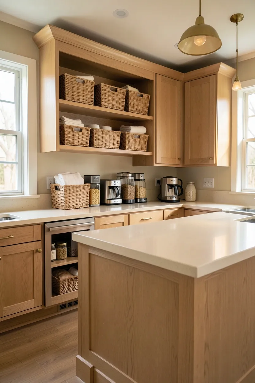
Tips
- Choose baskets in natural materials—rattan, seagrass, or bamboo—in warm neutral tones
- Organize basket contents neatly for attractive appearance that feels intentional rather than cluttered
- Group baskets by size or function for organized visual harmony
What this gives you: Practical organization with textural warmth through natural baskets
24. Textured Neutral Walls with Warm Accents
Textured neutral walls create subtle sophistication while providing perfect backdrop for autumnal accents without competing color. Choose wall treatments in neutral tones—warm cream, soft gray, or pale beige—with interesting texture rather than flat paint: grasscloth for natural fiber texture, linen wallpaper for subtle variation, or board and batten for architectural interest. The textured surface adds visual depth without introducing competing colors, allowing warm accents like brass hardware, wood cabinetry, or autumnal textiles to take center stage. This approach works particularly well when applied to focal walls rather than entire kitchen for sophisticated backdrop impact.
Recommended
Items for this idea
Tips
- Apply textured treatment to focal wall rather than entire kitchen for sophisticated impact
- Choose textures in tone-on-tone neutrals—grasscloth, linen, or architectural paneling
- Ensure wall texture complements rather than competes with cabinetry and other materials
What this gives you: Sophisticated depth through neutral texture providing autumnal backdrop
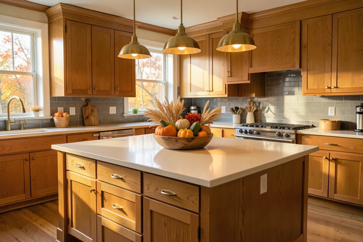
25. Central Island with Autumn Centerpiece
A central kitchen island featuring seasonal centerpiece creates functional workspace while introducing autumnal warmth through intentional display. The island serves as the kitchen's heart—food prep area, gathering spot, and visual focal point—so styling it with autumn elements makes the entire space feel seasonal. Think a wooden bowl overflowing with gourds and mini pumpkins, a ceramic vessel holding dried wheat and ornamental grasses, or a copper tray with autumnal botanicals. The centerpiece sits atop the island, creating a warm welcome while maintaining functional workspace around its perimeter. This approach works particularly well when the centerpiece materials complement other kitchen colors.
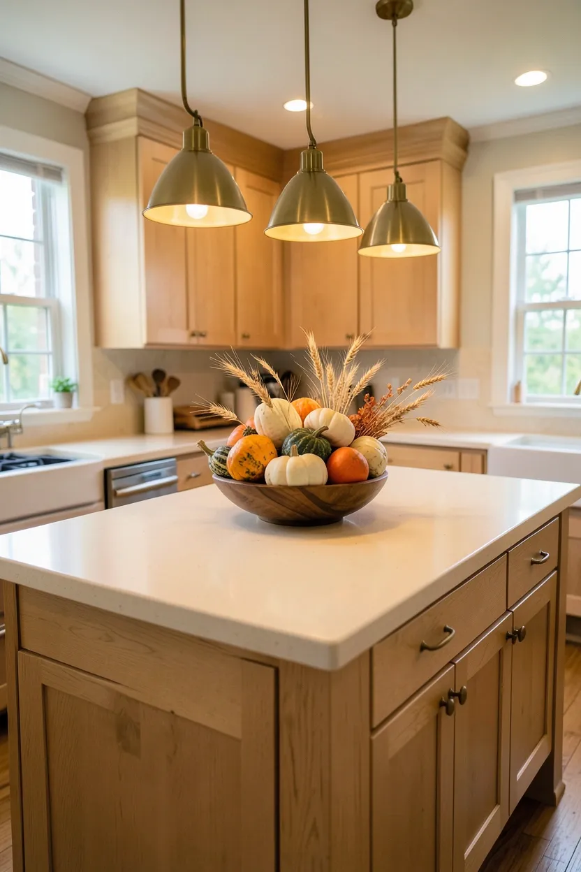
Tips
- Choose centerpiece vessels in natural materials—wood, ceramic, or copper—for authentic warmth
- Arrange autumn elements in odd numbers for visual balance—three gourds, five pumpkins, seven wheat stalks
- Ensure centerpiece doesn't interfere with functional island workspace
What this gives you: Seasonal focal point celebrating autumn through intentional island display
Creating a fall kitchen that balances seasonal warmth with everyday functionality requires thoughtful material choices, intentional color palettes, and layered lighting that transforms the space from purely functional to warmly inviting. The most successful autumn kitchen decor celebrates fall through sophisticated material authenticity—natural wood with visible grain, stone with warm veining, brass or copper hardware with golden undertones—rather than temporary decoration or overt color application. Whether choosing light oak cabinetry for inherent warmth, incorporating brass fixtures for metallic glow, or introducing autumnal centerpieces on the island, each of these fall kitchen ideas works for renters and homeowners alike: many require no permanent changes, just intentional styling and replaceable accents. The goal is creating a kitchen that feels warm and substantial regardless of outdoor weather, a culinary sanctuary that celebrates fall through intentional design choices that honor both budget and lease constraints.
About the author
OBCD
CGI visualization and interior design content. We create detailed 3D renders and curate practical design ideas for every room in your home.