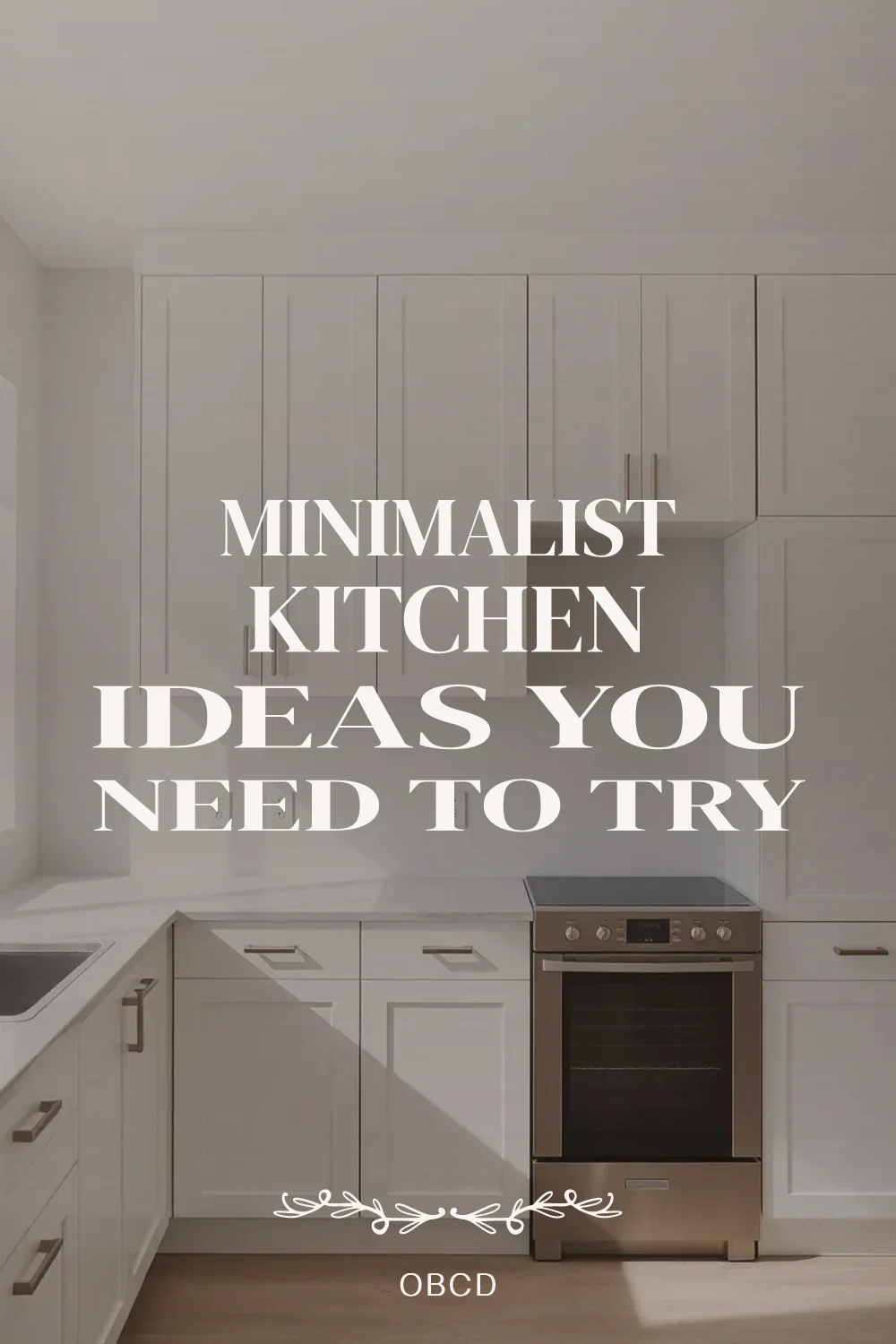
23 Minimalist Kitchen Ideas That Create Calm, Modern Spaces
These minimalist kitchen ideas show how clean lines, smart storage, and neutral palettes turn any cooking space into a calm, modern retreat. Whether you rent a small apartment or own a home, each idea focuses on eliminating visual clutter while maximizing function through thoughtful material choices and intentional design.
From handleless cabinets and hidden appliances to decluttered countertop strategies, these minimalist kitchen design concepts work at every budget. You do not need a full renovation to bring modern minimalist kitchen style into your space -- many of these upgrades are renter friendly and reversible.
Quick FAQ
What makes minimalist kitchen design work in small spaces?
Minimalist kitchens excel in small spaces because they reduce visual clutter and use light colors to make rooms feel larger. Flat-panel cabinets and integrated appliances create seamless surfaces that expand the perceived space.
How do you add warmth to minimalist kitchen design?
Introduce natural materials like light oak or walnut, use 3000K lighting for warmth, and incorporate textured elements such as linen or matte stone. Layering these materials keeps the minimalist aesthetic while creating coziness.
Which colors work best for minimalist kitchen design?
White, cream, soft gray, and natural wood tones form the foundation of minimalist kitchens. The key is limiting the palette to three main colors and using subtle variations rather than bold contrasts.
Should minimalist kitchen design include open shelving?
Open shelving can work if kept edited and intentional. Limit shelves to one wall, use matching dishware, and display only items you use daily to maintain the minimalist philosophy.
Why invest in minimalist kitchen design for a modern home?
Minimalist kitchens increase home value through timeless appeal, reduce daily visual stress, and improve functionality by eliminating unnecessary elements. They also adapt easily to changing trends because of their simplicity.
How do you maintain minimalist kitchen design with daily use?
Designate specific places for every item, use drawer dividers and pullouts, and implement a "one in, one out" rule for tools and appliances. Built-in storage solutions keep counters clear automatically.
As an Amazon Associate I earn from qualifying purchases.
Table of Contents
- 1. Flat-panel upper cabinets with full-height design
- 2. Integrated appliances for seamless surfaces
- 3. Light oak floating shelves with hidden brackets
- 4. Matte white countertops with eased edges
- 5. Single-material waterfall island
- 6. Handleless cabinetry with push-to-open mechanisms
- 7. Frameless glass cabinet inserts
- 8. Continuous backsplash in honed stone
- 9. Layered LED lighting at 3000K
- 10. Concealed range hood with cabinet surround
- 11. Floor-to-ceiling pantry with pocket doors
- 12. Minimalist faucet in matte finish
- 13. Single-slab kitchen island
- 14. Hidden charging station in drawer
- 15. Seamless flooring in large-format tiles
- 16. Pullout trash and recycling center
- 17. Built-in niche for everyday essentials
- 18. Under-cabinet lighting with hidden channels
- 19. Minimalist bar stool selection
- 20. Clean-lined window treatment
- 21. Accent-free neutral palette
- 22. Smart storage corners
- 23. Decluttered countertop strategy
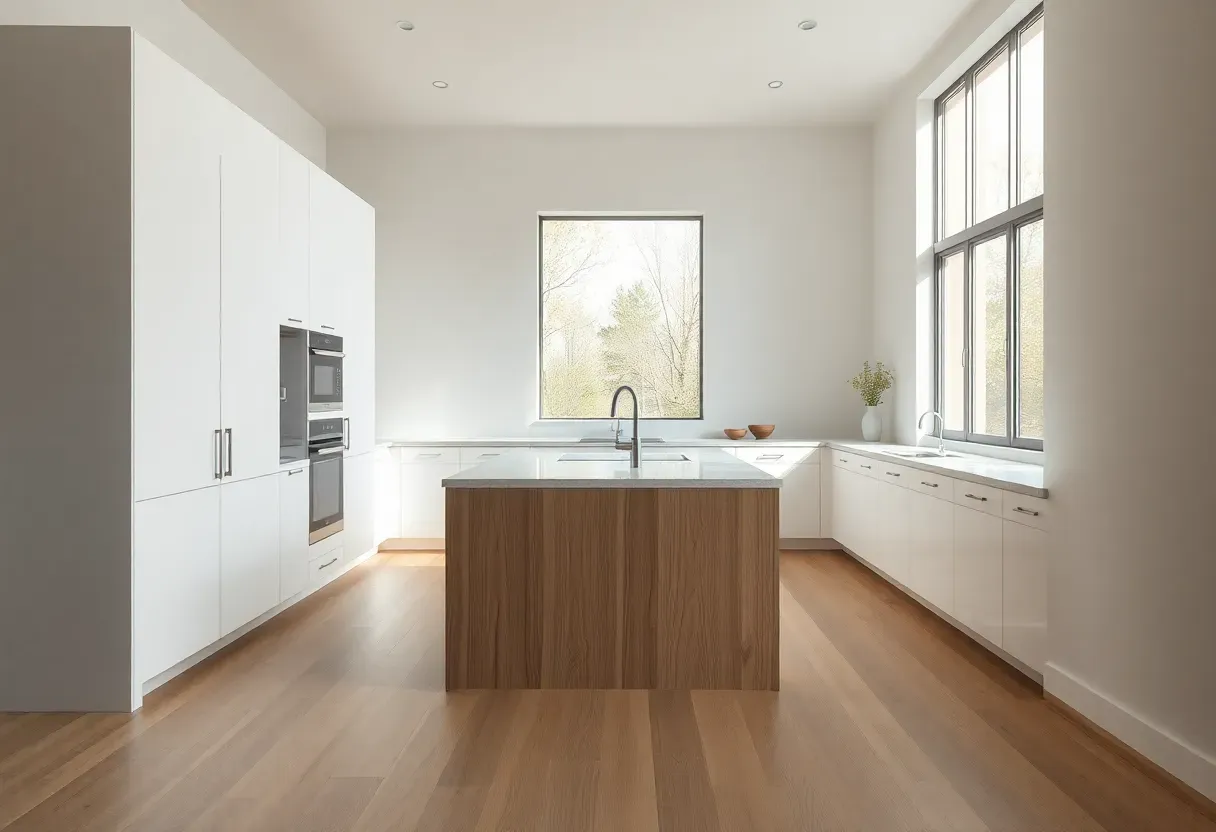
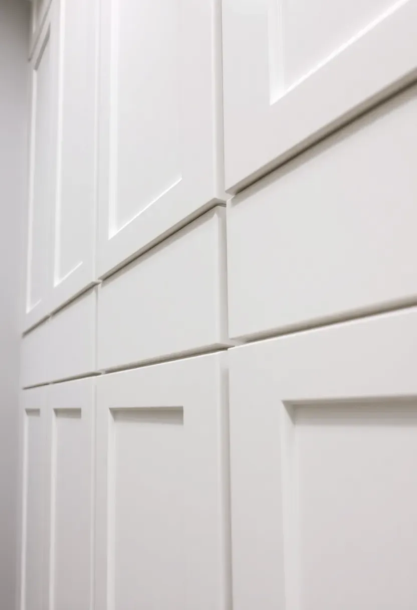
1. Flat-panel upper cabinets with full-height design
Flat-panel upper cabinets that extend to the ceiling create a clean, uninterrupted look that defines minimalist kitchen design. The absence of molding or trim lines draws the eye upward, making ceilings feel higher while eliminating dust-trapping gaps. Choose full-height doors in 42-inch or 48-inch versions for a truly seamless appearance. The lack of decorative details allows the materials and finishes to take center stage, creating a refined atmosphere.
The continuous surface creates visual calm while maximizing storage capacity in the upper zone. If standard ceiling-height cabinets leave an awkward gap, upgrade to full-height versions and eliminate the soffit entirely. Pair with lower cabinets of the same finish for a monolithic look. The 42-inch height provides ample storage for everyday items while keeping the kitchen feeling open and uncluttered.
Tips
- Do use soft-close hinges for doors that stay aligned over time.
- Don't mix cabinet door styles in the same sightline.
- Do choose a satin finish that hides fingerprints better than gloss.
What this gives you: A clean, architectural look that maximizes storage while maintaining visual calm.
We picked a few things that go well with this idea: SpaceAid Bamboo Drawer Dividers (4-Pack) (★4.5), Bamboo Drawer Organizer Set (5-Piece) (★4.7) and Criusia Clear Acrylic Drawer Organizer (6-Piece) (★4.8). As an Amazon Associate we earn from qualifying purchases.
2. Integrated appliances for seamless surfaces
Integrated appliances disguise refrigerators, dishwashers, and ovens behind cabinet panels that match your kitchen joinery. This approach eliminates visual breaks in the cabinetry and creates the ultra-clean surfaces that define minimalist kitchen design. Panel-ready appliances feature unfinished fronts designed to accept custom door panels, making them disappear into the surrounding cabinetry.
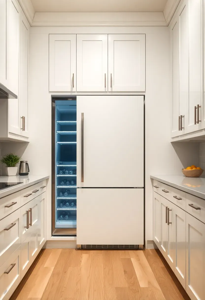
The result is a kitchen that reads as furniture rather than a collection of machines. Instead of a protruding refrigerator breaking your cabinet run, the appliance becomes part of the composition. If budget constraints prevent full integration, start with the refrigerator and dishwasher as the most visible appliances. Use counter-depth models to maintain the cleanest profile.
Tips
- Plan for proper ventilation around panel-ready appliances.
- Keep ventilation gaps at 1/8 inch for a tight finish.
- Use felt pads on adjacent cabinets to prevent vibration noise.
Budget/Time: Higher cost with panel-ready appliance premium plus custom panel fabrication.
What this gives you: Uninterrupted cabinetry lines that create visual serenity.
We picked a few things that go well with this idea: DAYBETTER Under Cabinet LED Lights (6-Pack) (★4.3), Govee Warm White LED Strip (16ft) (★4.6) and Gritin Motion Sensor Under Cabinet Lights (2-Pack) (★4.6). As an Amazon Associate we earn from qualifying purchases.
3. Light oak floating shelves with hidden brackets
Floating shelves in light oak introduce natural warmth while maintaining the clean surfaces essential to minimalist kitchen design. The lack of visible supports creates a weightless, modern appearance that keeps walls feeling open. Choose shelves that are at least 1.5 inches thick to prevent sagging and maintain a substantial, quality feel. Mount them 16 to 18 inches above the counter for comfortable access while keeping proportions balanced.
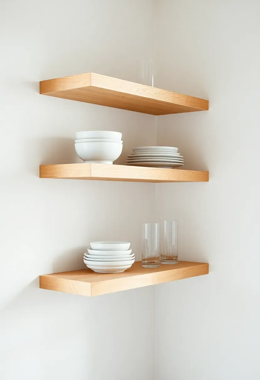
Limit styling to items you use daily, keeping the display edited and intentional. Unlike open cabinets that can feel busy, floating shelves create focal points without overwhelming the space. If the room feels too cold with all-white surfaces, the natural grain of oak adds warmth without introducing color that might conflict with your neutral palette. For more warm minimalist ideas, see 17 Warm Minimalist Kitchen Ideas to Create a Cozy Space.
Tips
- Do keep shelves under 36 inches long to prevent sagging.
- Don't overload with mixed colors—edit to one tone family.
- Do space shelves 12 to 15 inches apart vertically.
What this gives you: Organic warmth that maintains clean, modern lines.
We picked a few things that go well with this idea: Nathan James Arlo Backless Counter Stool (★4.5), Plank+Beam Smythe Wood Counter Stool (Set of 2) (★4.4) and Christopher Knight Boucle Counter Stools (Set of 2) (★4.1). As an Amazon Associate we earn from qualifying purchases.
4. Matte white countertops with eased edges
Matte white countertops in quartz or porcelain provide a calm, reflective surface that brightens the entire kitchen while staying true to minimalist principles. The matte finish eliminates glare and feels softer to the touch than glossy alternatives, creating a more premium, understated effect. Choose an eased edge rather than elaborate profiles—the simple 45-degree angle maintains clean lines while being comfortable for leaning.
Recommended
Items for this idea
Common mistake: Choosing glossy countertops that show every fingerprint and feel cold to the touch.
Upgrade to a honed or matte finish for a surface that feels sophisticated and practical. The lack of shine makes the kitchen feel more residential and less commercial. If pure white feels too stark, consider a very subtle warm white or ivory with minimal veining. For more all-white inspiration, check out our timeless white kitchen ideas. Matte surfaces hide scratches better than polished alternatives and develop a patina that feels lived-in rather than worn.
Tips
- Test samples under your kitchen lighting before committing.
- Use trivets for hot pans even on heat-resistant materials.
- Wipe spills promptly—matte stone can show water spots temporarily.
Best for: Kitchens that receive abundant natural light and benefit from reflective surfaces.
What this gives you: A bright, calm foundation that makes the entire space feel expansive.
5. Single-material waterfall island
A waterfall island that wraps the countertop material down both sides creates a dramatic focal point while maintaining minimalist restraint through material continuity. The continuous surface eliminates visual breaks and creates a sculptural, furniture-like quality in the center of the room. Choose a single material—quartz, concrete, or solid surface—and run it vertically with no horizontal seams for the cleanest appearance.
Why it works: The waterfall treatment turns the island into an architectural object rather than just a workspace.
The vertical faces create additional display or work space while protecting the island ends from bumps and scratches. If budget is a concern, consider waterfalling only the visible side rather than both. The waterfall effect works particularly well with materials that have subtle movement—too much pattern can overwhelm the minimalist aesthetic. Keep the island styling minimal to let the form speak for itself.
Tips
- Pro: Waterfall edges protect island ends from chair damage.
- Con: Requires more material and increases cost significantly.
- Fix: Waterfall only the visible side to manage budget.
Budget/Time: Higher cost due to additional material and complex installation.
What this gives you: A striking architectural centerpiece that feels refined and intentional.
6. Handleless cabinetry with push-to-open mechanisms
Handleless cabinetry represents the ultimate expression of minimalist kitchen design, creating completely uninterrupted surfaces that feel sleek and modern. Push-to-open mechanisms use electric or spring-loaded catches that release with gentle pressure, eliminating the need for protruding hardware. The result is cabinetry that reads as architectural planes rather than furniture, creating visual calm throughout the kitchen.
Recommended
Items for this idea
The absence of hardware also makes cleaning easier—no catches to collect dirt or grease. If you find push-to-open mechanisms unreliable, consider integrated J-pulls or finger grooves routed into the door top edge. These provide grip without breaking the cabinet plane. For lower cabinets, a continuous horizontal pull integrated into the door base maintains the handleless look while offering reliable operation.
Tips
- Test push mechanisms before full commitment—some require more force.
- Use soft-close versions to prevent doors from swinging too far.
- Ensure adequate clearance for finger access at door edges.
Avoid if: You prefer the tactile feedback and ease of traditional pulls.
What this gives you: The cleanest possible cabinetry surfaces for maximum visual calm.
7. Frameless glass cabinet inserts
Frameless glass cabinet inserts add visual depth to minimalist kitchen design by creating a break in solid cabinetry without introducing clutter. The glass reflects light and makes the space feel larger while providing a place to display curated items. Choose acid-etched or frosted glass for a softer effect that contents remain visible but not distracting, or opt for clear glass with meticulous interior organization.
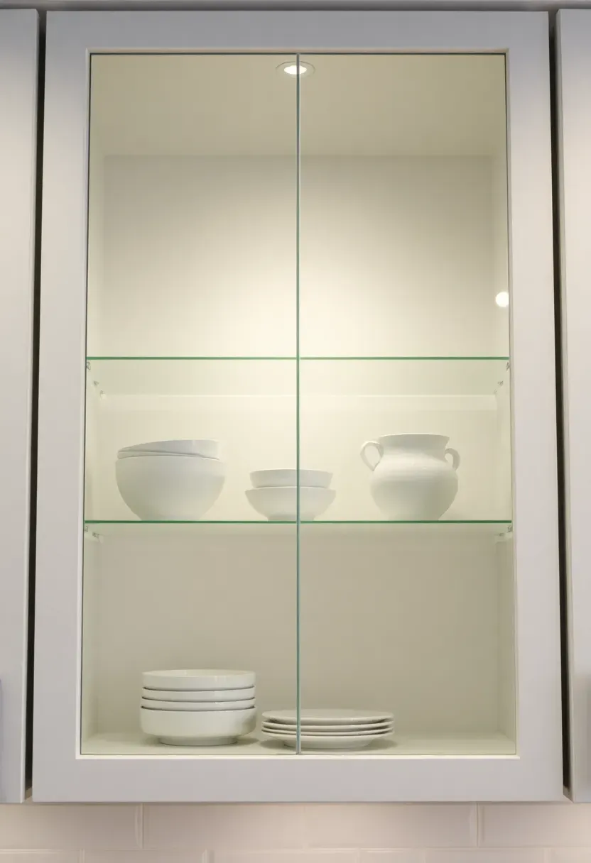
Placement note: Limit glass inserts to one cabinet run or a select few doors to maintain the minimalist aesthetic.
Too much glass can make the kitchen feel busy rather than calm. Position glass-front cabinets away from direct sunlight to reduce glare and interior fading. Install interior LED lighting on a separate switch to transform the glass cabinets into ambient feature lighting in the evening. Keep interior styling monochromatic and edited to maintain the minimalist philosophy even within display spaces.
Tips
- Do use glass only on upper cabinets—lower cabinets feel too busy.
- Don't mix glass types in the same kitchen.
- Do add adjustable glass shelves for flexible display.
What this gives you: Visual lightness and a place for intentional display without clutter.
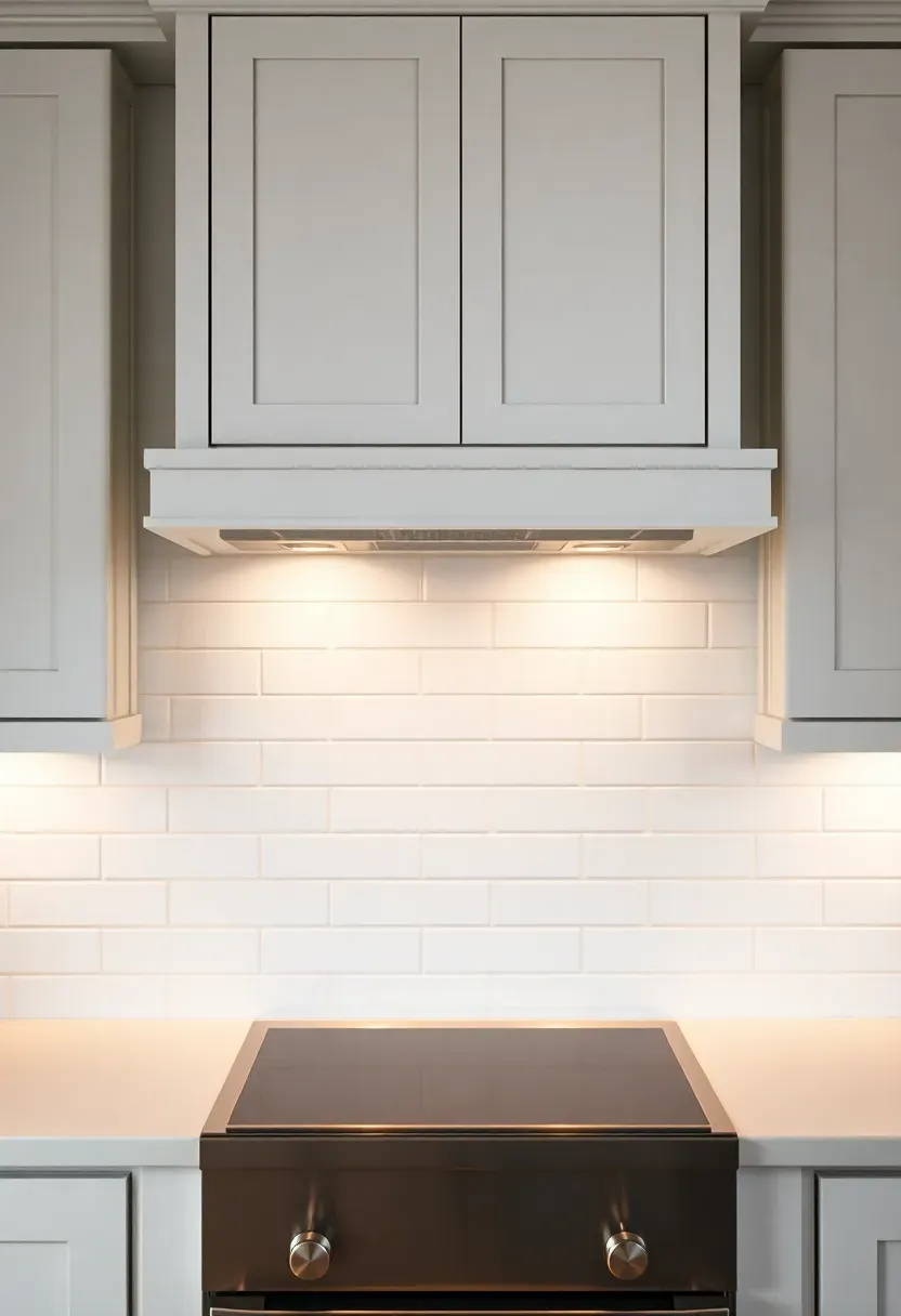
8. Continuous backsplash in honed stone
A continuous backsplash that runs from countertop to upper cabinets creates a seamless, calm surface that defines minimalist kitchen design. Unlike tile backsplashes with grout lines, a single slab of stone, quartz, or solid surface eliminates visual interruption and creates a monolithic feel. Choose a honed or matte finish to reduce glare and create softness in the space.
Recommended
Items for this idea
The continuous surface makes the kitchen feel larger and more cohesive because the eye travels uninterrupted. If stone slab costs are prohibitive, large-format porcelain tiles (12x24 or larger) with minimal grout joints provide a similar effect at lower cost. Choose a grout color that matches the tile as closely as possible to minimize the grid pattern. The backsplash material can either match the countertop for complete continuity or provide subtle contrast while staying within the neutral palette.
Tips
- Extend the backsplash all the way to upper cabinets.
- Use a solid surface for curved backsplashes around windows.
- Consider a thinner 1cm slab for backsplashes to manage cost.
Budget/Time: Higher cost for stone slab, moderate for large-format tile.
What this gives you: Visual calm through the elimination of grout lines and pattern.
9. Layered LED lighting at 3000K
Layered LED lighting transforms minimalist kitchen design by adding depth and dimension without visual clutter. A combination of recessed ceiling lights, under-cabinet strips, and accent fixtures creates flexibility for different tasks and moods. Choose 3000K LED bulbs for warmth that still feels clean—avoid cooler 4000K temperatures that can make minimalist kitchens feel clinical and sterile.
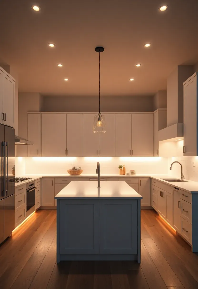
Why it works: Layered lighting creates visual interest without adding physical objects to the space.
Install each layer on separate switches so you can control the mood independently. Under-cabinet lighting should be mounted in a channel so the diode dots are hidden, creating a clean wash of light across the countertop. Recessed lights should be placed 24 to 30 inches apart for even coverage without hotspots. A single statement pendant or trio over the island can provide visual interest while keeping the overall minimalist feel.
Tips
- Pro: 3000K lighting makes white cabinets feel warmer and more welcoming.
- Con: Cool 4000K lighting can make spaces feel clinical.
- Fix: Always specify 3000K for residential warmth.
What this gives you: A kitchen that feels inviting day and night while maintaining clean lines.
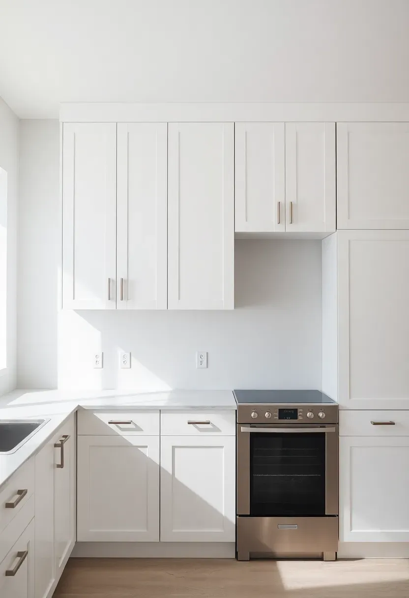
10. Concealed range hood with cabinet surround
A concealed range hood hidden within a cabinet enclosure maintains the clean lines of minimalist kitchen design while providing necessary ventilation. Instead of a prominent stainless steel hood breaking the cabinetry run, the appliance disappears behind a matching cabinet front. The enclosure extends to the ceiling, creating a continuous vertical surface that draws the eye upward.
Recommended
Items for this idea
Common mistake: Using an underpowered insert that cannot keep up with cooking demands.
Choose a high-CFM insert rated for your cooktop size and cooking style, even though it will be hidden. The cabinet front should be removable for filter access and cleaning. If possible, specify an insert with the exhaust routed out through the roof rather than the wall for the quietest operation. Position the cabinet enclosure symmetrically relative to the cooktop for the most intentional appearance.
Tips
- Choose an insert rated for at least 600 CFM for gas cooktops.
- Plan for easy filter access through a removable front.
- Consider remote mounting to further reduce noise.
What this gives you: Uninterrupted cabinetry with fully functional ventilation.
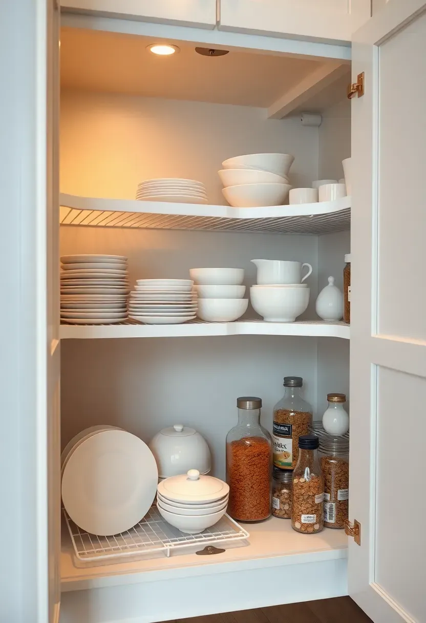
11. Floor-to-ceiling pantry with pocket doors
A floor-to-ceiling pantry with pocket doors maximizes storage while keeping the minimalist kitchen design visually calm. The pocket doors slide into the wall rather than swinging out, eliminating clearance issues and maintaining clean sightlines when closed. Full-height storage uses vertical space efficiently while keeping everyday items accessible yet out of view.
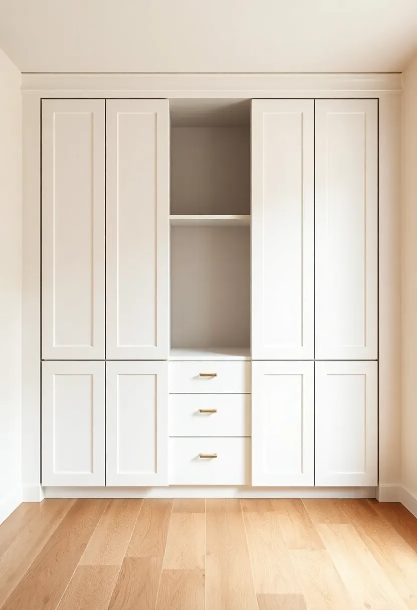
The pocket door approach is particularly valuable in smaller kitchens where swing doors would encroach on workspace. If you love minimal design blended with Japanese calm, our japandi kitchen ideas explore a similar storage philosophy. If structural constraints prevent pocket doors, a bifold door with a flush surface provides a similar space-saving benefit. Inside, plan adjustable shelving at 12-inch intervals and include dedicated zones for different categories—baking, spices, small appliances—to maintain organization.
Tips
- If you need more storage, then extend the pantry width by 6 inches.
- If doors stick, then check track alignment annually.
- If the interior feels dark, then add motion-activated LED strips.
What this gives you: Maximum storage with minimal visual impact.
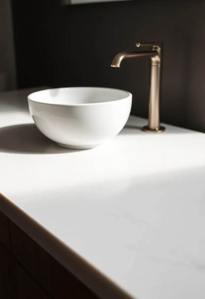
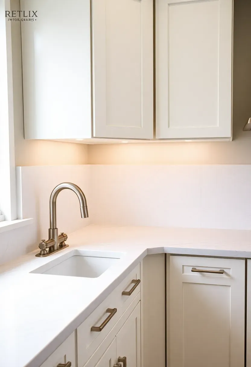
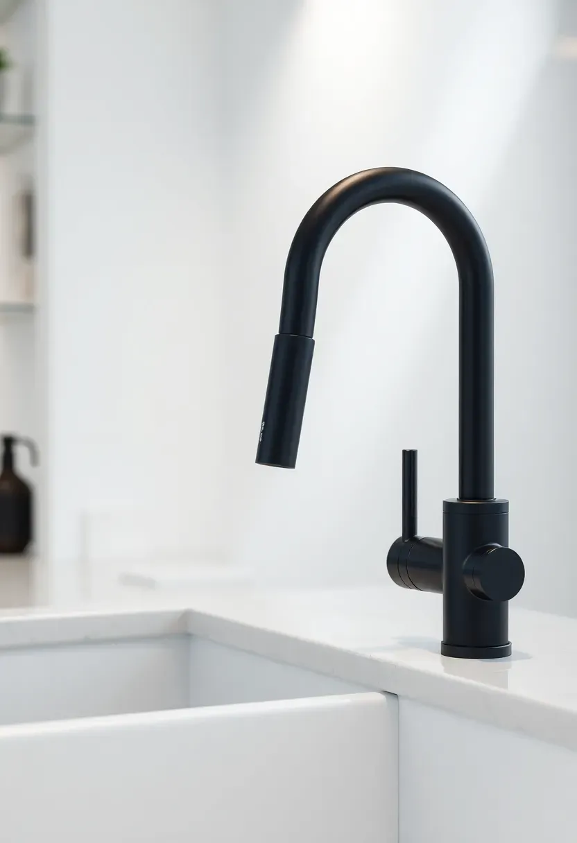
12. Minimalist faucet in matte finish
A minimalist faucet with clean lines and a matte finish provides necessary functionality without becoming a visual distraction in minimalist kitchen design. Choose a pull-down or pull-out model with a simple, cylindrical shape that lacks unnecessary ornamentation. Matte black, brushed nickel, or white finishes blend better than chrome, which can feel too commercial and reflective.
Recommended
Items for this idea
The faucet should have a tall spout for pot-filling clearance but maintain a slender profile to avoid overwhelming the sink area. A single-handle design is cleaner than two-handle configurations. Consider a magnetic docking system for the pull-down spray to ensure it returns to a precise position, maintaining the clean silhouette. The minimalist faucet philosophy extends to choosing a sink that undermounts cleanly below the countertop for a seamless transition.
Tips
- Do match the faucet finish to other metal elements in the kitchen.
- Don't choose a faucet with unnecessary decorative elements.
- Do test the sprainer return action—magnetic docks work best.
What this gives you: Functional hardware that recedes visually rather than dominating.
13. Single-slab kitchen island
A single-slab kitchen island eliminates the visual clutter of multiple pieces by creating one continuous, monolithic element. The island becomes a sculptural object rather than assembled furniture, which aligns perfectly with minimalist kitchen design principles. Choose a countertop material that can be fabricated in one piece without seams—quartz, concrete, or solid surface work well.
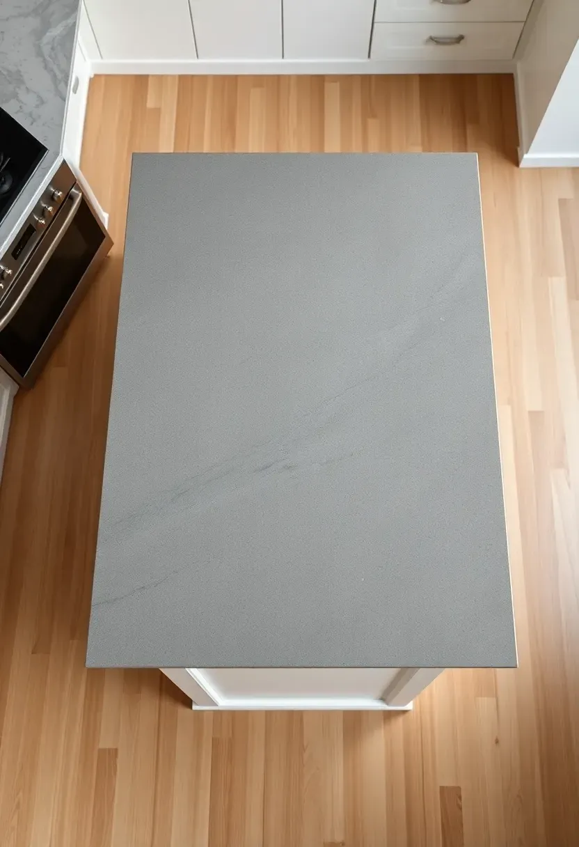
Why it works: The absence of seams creates visual calm and makes the island feel custom and substantial.
If your island requires dimensions larger than available slab sizes, place seams strategically at cooktop or sink cutouts where they are less visible. A single-slab approach works particularly well when the island base is also continuous—full-height cabinets or panels rather than exposed legs. Keep the island rectangular with simple edge profiles for the most minimalist effect.
Tips
- Pro: Fewer seams mean fewer places for dirt and water to collect.
- Con: Single large slabs are more expensive and harder to source.
- Fix: Consider book-matching two slabs for a symmetrical seam.
Budget/Time: Higher cost for large slabs plus specialized fabrication.
What this gives you: An architectural centerpiece that feels calm and substantial.
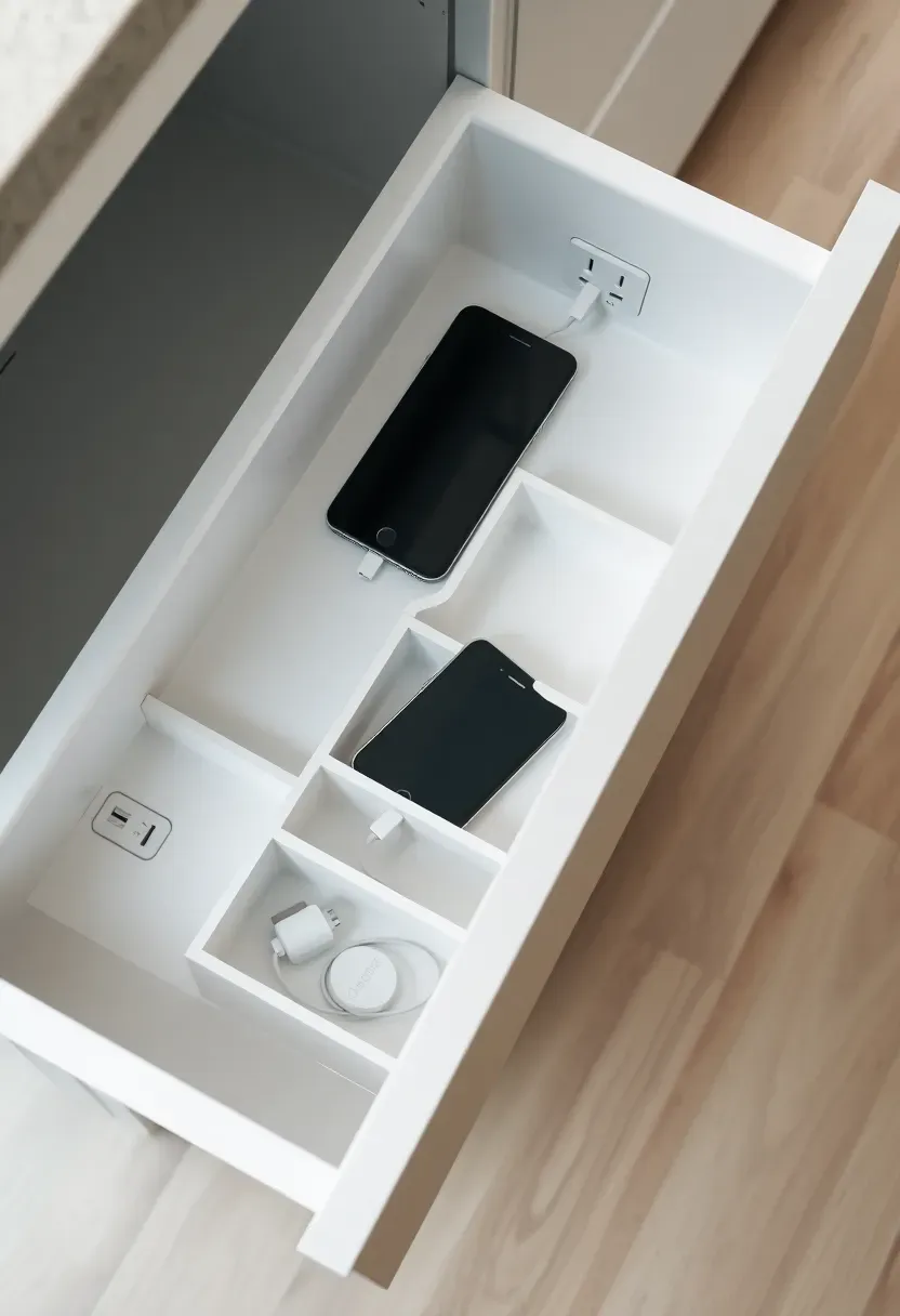
14. Hidden charging station in drawer
A hidden charging station built into a drawer keeps devices powered without countertop clutter, supporting minimalist kitchen design by keeping small electronics out of sight. The drawer contains built-in outlets or USB ports and is sized to accommodate phones, tablets, and other small devices. A notch in the back of the drawer allows cords to pass through to a power source below while keeping the devices organized inside.
Recommended
Items for this idea
Placement note: Position the charging drawer near where devices are used most—often an island or near a desk area.
Include dividers to keep devices upright and separated, preventing scratching and making it easy to grab the right device. If you prefer not to cut into the cabinet back, use a power strip mounted inside the cabinet below with cords passing through a small gap at the rear of the drawer. The charging station eliminates the visual clutter of multiple chargers and cables while keeping devices accessible.
Tips
- Do include both standard outlets and USB ports for flexibility.
- Don't forget ventilation—chargers generate heat.
- Do use a drawer with soft-close for the best user experience.
What this gives you: Device charging without the visual noise of cables and counters.
15. Seamless flooring in large-format tiles
Large-format tiles or continuous flooring create a seamless foundation that supports minimalist kitchen design by reducing visual fragmentation. Tiles measuring 24x24 inches or larger minimize grout lines, creating a calmer, more continuous surface. Porcelain planks that measure 8x32 inches or larger can create a wood-look floor with minimal joints. For the ultimate minimalist approach, consider polished concrete or continuous flooring that extends from room to room without transition strips.
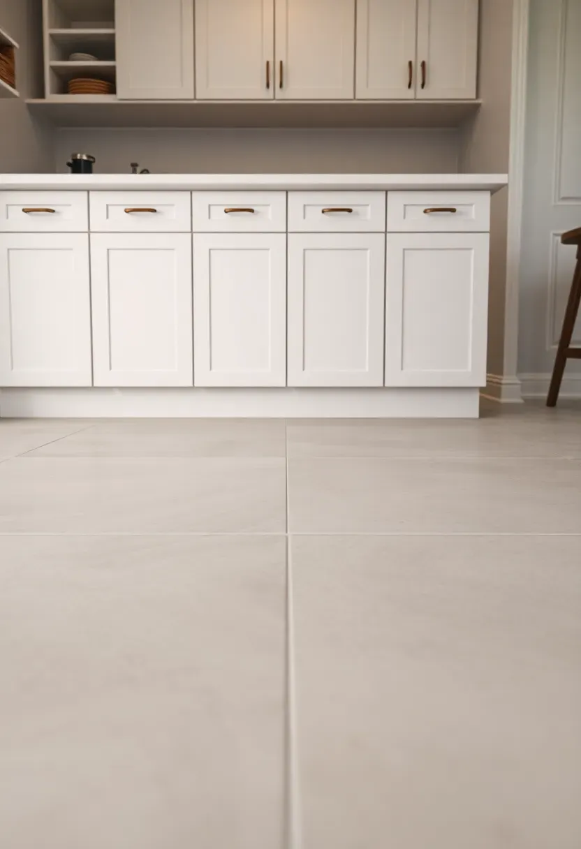
Why it works: Fewer grout lines mean less visual noise and a more spacious feel.
Choose a grout color that matches the tile as closely as possible, and use epoxy grout for stain resistance and consistent color. Large-format tiles require a very flat subfloor—budget for leveling work if your existing floor has significant variations. If you select wood-look porcelain planks, run them in the longest direction of the room to maximize the sense of length. Continuous flooring that extends into adjacent spaces creates flow and makes the kitchen feel larger.
Tips
- Pro: Large tiles make small spaces feel significantly bigger.
- Con: Require perfectly flat subfloors for proper installation.
- Fix: Budget for self-leveling compound if needed.
What this gives you: A calm, expansive foundation that enhances the minimalist aesthetic.
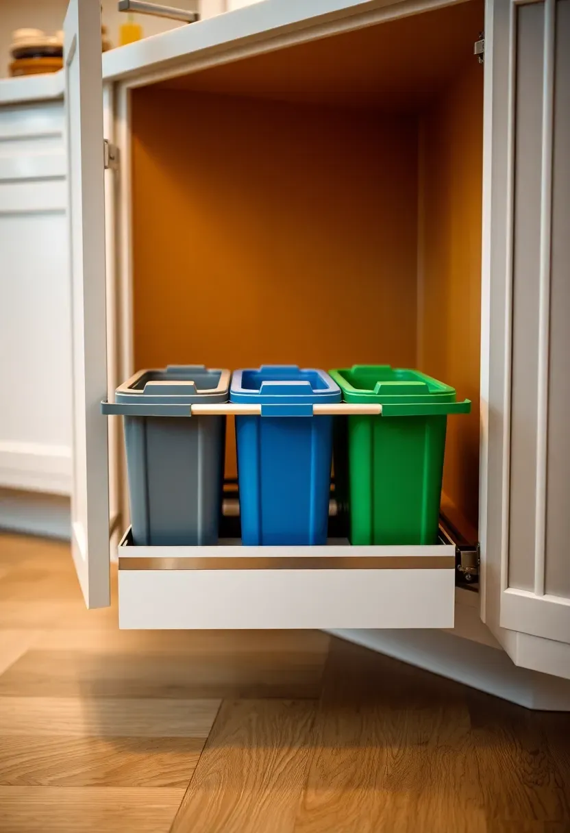
16. Pullout trash and recycling center
A pullout trash and recycling center keeps waste management out of sight while supporting the clean surfaces essential to minimalist kitchen design. The unit mounts inside a cabinet and features multiple bins for trash, recycling, and compost that slide out on a smooth runner system. When closed, the cabinet front maintains the continuous cabinetry line with no indication of what lies behind.
Recommended
Items for this idea
Common mistake: Placing the trash pullout too far from the prep zone, which makes kitchen workflow inefficient.
Position the waste center in the cabinet nearest the main prep area or sink for the most convenient access. Choose a model with soft-close slides to prevent the unit from slamming. Full-extension slides allow the bins to come completely out of the cabinet for easy emptying and cleaning. If cabinet space is limited, a vertical pullout model stacks bins one above the other rather than side-by-side, using a narrower cabinet footprint.
Tips
- Do allow at least 15 inches of cabinet width for side-by-side bins.
- Don't forget ventilation for compost to prevent odors.
- Do choose bins with removable handles for easier cleaning.
What this gives you: Waste management that disappears behind cabinet doors.
17. Built-in niche for everyday essentials
A built-in niche recessed into the backsplash or wall provides a designated home for everyday essentials like olive oil, salt, and frequently used spices. Unlike open shelves that can feel cluttered, a niche creates an intentional, architectural element for display while keeping items contained. The niche depth should be 3 to 4 inches—enough to hold bottles and jars without protruding excessively into the workspace.
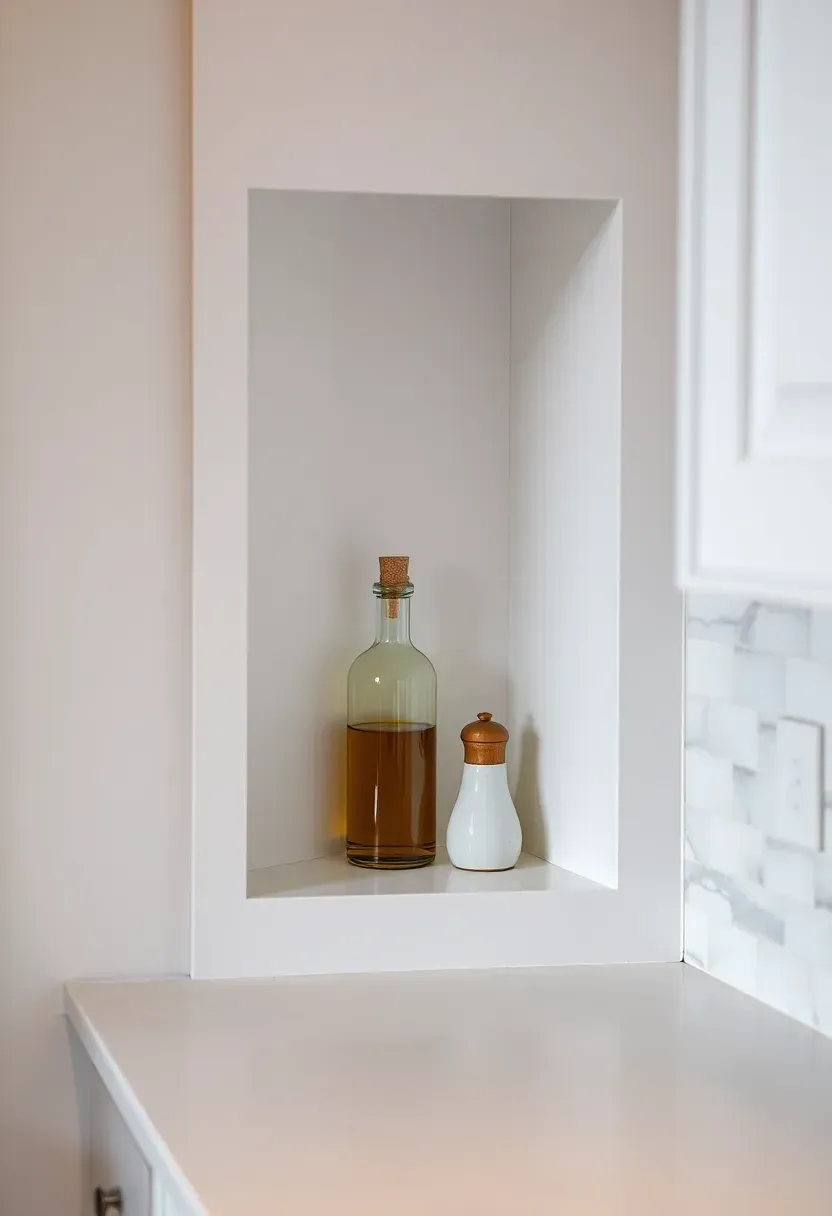
Why it works: The niche creates a designated home that prevents items from migrating across the counter.
Position the niche between the upper cabinets and the countertop for easy access, and finish the interior in the same material as the backsplash for continuity. If you prefer the flexibility of changing the niche contents, avoid permanent shelving and use the bottom surface as a simple platform. Add small LED strip lighting at the top of the niche to transform everyday items into a subtle display feature.
Tips
- Pro: Keeps essential items accessible without counter clutter.
- Con: Cannot be easily relocated if placed poorly.
- Fix: Position carefully during the planning phase.
Rental note: Use a floating shelf or removable mounting system for a semi-permanent solution.
What this gives you: A designated home for daily items that maintains clean counters.
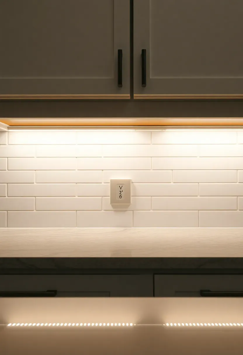
18. Under-cabinet lighting with hidden channels
Under-cabinet lighting mounted in hidden channels provides focused task lighting while eliminating the visual clutter of exposed fixtures. The LED strips are concealed behind a small lip or channel, so only the light is visible rather than the hardware. This approach creates a clean wash of light across the countertop without seeing the fixture itself, perfectly aligned with minimalist kitchen design principles.
Recommended
Items for this idea
Common mistake: Using tape-on LED strips that show diode dots and look cheap.
Invest in a channel system with a diffuser that spreads the light evenly and hides individual LEDs. Position the lighting toward the back of the cabinet rather than at the very front—this prevents glare and creates a more even wash across the work surface. Choose 3000K LEDs to maintain warmth, and install on a dimmer switch for flexibility between bright task lighting and soft ambient glow.
Tips
- Do use a channel with a frosted diffuser for smooth light.
- Don't mount at the very front edge where it creates glare.
- Do install on a dimmer for maximum flexibility.
What this gives you: Beautiful task lighting with zero visual clutter.
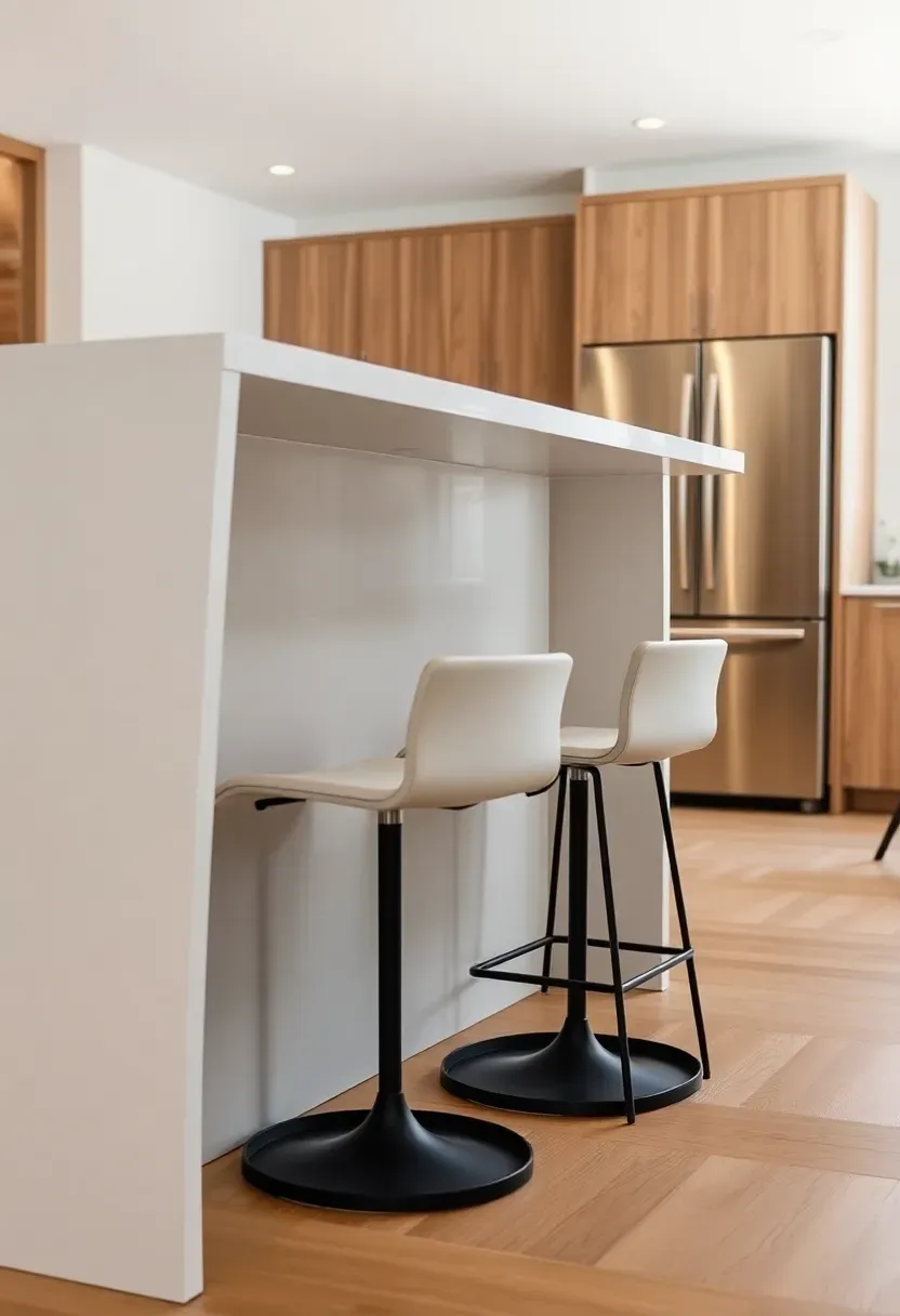
19. Minimalist bar stool selection
Choosing minimalist bar stools prevents the island from becoming visually cluttered while still providing seating. Look for stools with clean lines, simple shapes, and minimal ornamentation—cylindrical forms, thin profiles, and lack of busy details keep the overall kitchen feeling calm. Consider backless designs or stools with low backs that don't obstruct sightlines across the space.
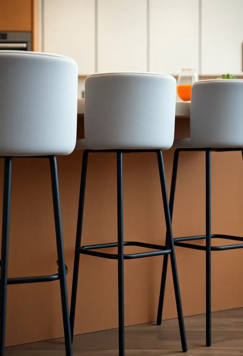
Why it works: Simple stools recede visually rather than becoming a focal point.
Choose stools that can be pushed completely under the overhang when not in use, further reducing visual presence. Materials like leather or upholstered seats in neutral tones add warmth without introducing new colors. Avoid stools with swivel mechanisms or adjustable heights that add visual complexity. The goal is seating that feels like a natural extension of the island rather than separate furniture pieces.
Tips
- Do allow 12 inches of overhang for comfortable seating.
- Don't choose stools with high backs that block views.
- Do test the seat height—28 to 30 inches works for most islands.
Avoid if: You need heavy-duty support or prefer more substantial seating.
What this gives you: Seating that doesn't compromise the minimalist aesthetic.
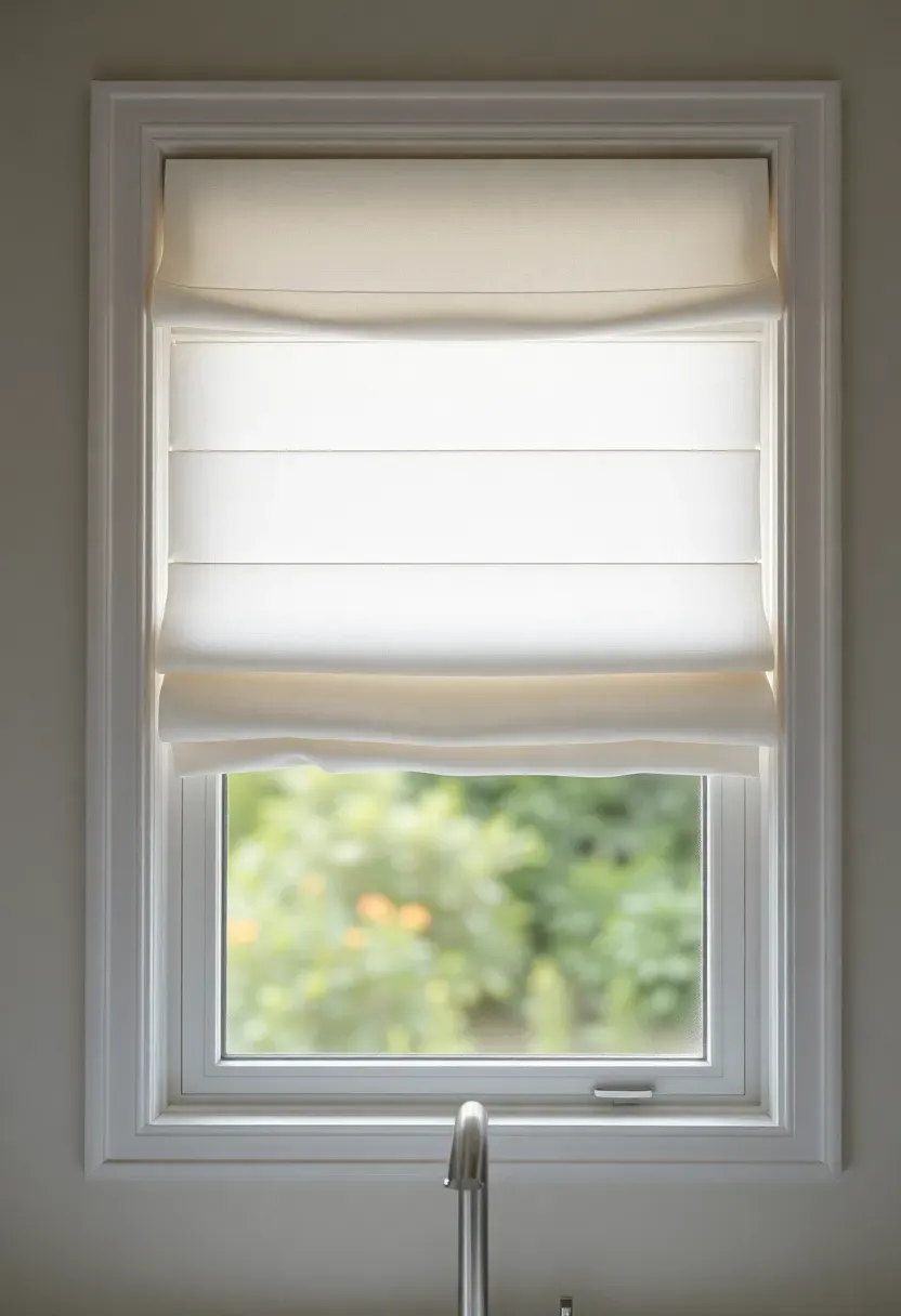
20. Clean-lined window treatment
Window treatments in a minimalist kitchen should filter light and provide privacy without adding visual complexity. Roman shades in a simple flat design, roller shades in a neutral fabric, or plantation shutters with clean louvers all work well. Avoid elaborate drapery, valances, or layered treatments that create visual noise. The goal is a treatment that feels architectural rather than decorative.
Recommended
Items for this idea
Placement note: Mount shades inside the window frame whenever possible for a cleaner, more built-in appearance.
Choose a fabric color that matches the walls or cabinetry for the most seamless look—white with white walls, or gray with gray cabinets. If you prefer some contrast, keep it subtle and stay within the neutral palette. Consider solar shades if glare is an issue—they preserve the view while filtering light and can be nearly invisible when chosen in a dark color.
Tips
- Do choose cordless options for a cleaner look and safety.
- Don't use patterns that compete with the minimalist aesthetic.
- Do consider motorization for hard-to-reach windows.
What this gives you: Light control and privacy without visual clutter.
21. Accent-free neutral palette
An accent-free neutral palette creates the serene, cohesive environment that defines minimalist kitchen design. Limit the color scheme to two or three neutral tones—white, cream, gray, or natural wood—and avoid accent colors that create focal points or visual breaks. The absence of bold colors allows materials, textures, and light to become the main sources of interest rather than paint or finishes.
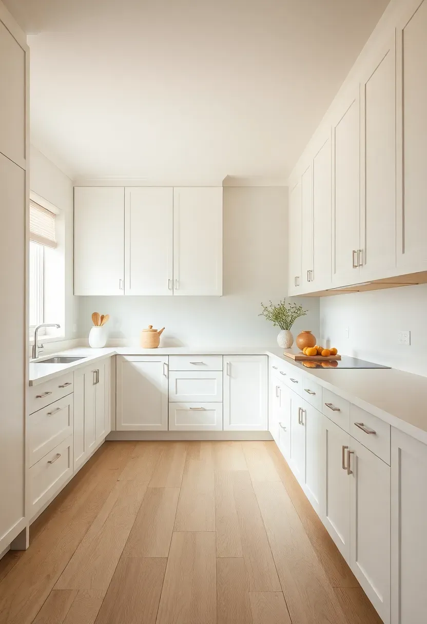
Why it works: A limited palette creates visual calm and makes the space feel larger.
If the kitchen feels too monochromatic, introduce subtle variation through texture rather than color—linen, wool, wood grain, and stone provide interest without adding hue. The neutral palette also makes the kitchen more flexible over time, as it won't clash with changing trends or adjacent rooms. For white kitchens, consider slightly different whites for cabinets, walls, and trim to create depth without introducing color.
Tips
- Pro: Neutral palettes never go out of style and maximize resale value.
- Con: Can feel cold without texture and warmth from materials.
- Fix: Layer natural materials like wood and linen for warmth.
What this gives you: A timeless, serene environment that feels sophisticated rather than plain.
22. Smart storage corners
Corner spaces often become dead zones in kitchens, but smart storage solutions transform these areas into functional assets while maintaining minimalist kitchen design. Options include lazy Susans, pullout corner shelves, or diagonal drawers that make use of otherwise inaccessible space. The key is choosing mechanisms that keep items contained and organized rather than creating catch-all spaces.
Recommended
Items for this idea
Common mistake: Using the corner as a multi-purpose catch-all that becomes cluttered and disorganized.
Assign each corner storage zone a single purpose—baking supplies, small appliances, or pantry items—to prevent random accumulation. Lazy Susans work best for items that can stand independently, while pullout shelves better accommodate stacked items. Diagonal drawers provide the most accessible storage but require custom cabinetry. Whatever system you choose, ensure the hardware is robust enough to handle the weight when fully loaded.
Tips
- Do assign a single category to each corner space.
- Don't overload mechanisms—check weight ratings.
- Do test the mechanism before final installation.
Best for: Kitchens with limited storage where every cubic inch matters.
What this gives you: Maximum use of corner space while maintaining organization.
23. Decluttered countertop strategy
A decluttered countertop strategy is the foundation of minimalist kitchen design, ensuring that horizontal surfaces remain calm and functional. The approach involves designating specific homes for every item, using drawer dividers and appliance garages to keep things accessible but out of sight, and establishing a "clear counters" rule for daily maintenance. Countertops should host only items that are used daily and cannot be easily stored elsewhere.
Why it works: Clear counters make the kitchen feel larger, easier to clean, and more calming to use.
Start by inventorying every item currently on your countertops and assigning each a designated storage location. Items used less than daily should have a home inside cabinets or drawers. Consider an appliance garage for small appliances that you prefer to keep accessible—this keeps them contained rather than scattered. Establish a daily routine of returning items to their designated homes after use, and the clear counters will maintain themselves with minimal effort.
Tips
- Do keep only absolute daily essentials on the counter.
- Don't let appliances accumulate—even one or two is too many.
- Do use drawer dividers to keep tools organized and accessible.
What this gives you: A calm, functional workspace that's easy to maintain.
These minimalist kitchen ideas prove that less truly is more when it comes to creating modern homes that feel calm, functional, and timeless. Focus on full-height cabinetry, integrated appliances, continuous surfaces, and hidden storage to eliminate visual noise. Layer neutral materials with subtle textures—white oak, honed stone, linen, and matte finishes—for warmth without clutter. Smart storage solutions like pullout organizers, appliance garages, and designated niches keep counters clear while maintaining accessibility. The result is a kitchen that supports daily life with serene efficiency rather than visual overwhelm. If you want to extend this clean aesthetic into an open floor plan, explore our open kitchen design ideas for seamless living spaces.
About the author
OBCD
CGI visualization and interior design content. We create detailed 3D renders and curate practical design ideas for every room in your home.