How to Decorate a Living Room Wall: 13 Steps to a Stunning Feature
Your living room wall is the largest canvas in your home — and most people leave it almost entirely blank. A well-decorated feature wall doesn't require a designer, an unlimited budget, or a single hole in the wrong place. These 13 steps take you from a bare wall to a layered, gallery-quality arrangement that looks intentional from the moment you walk through the door.
Table of Contents
- What You'll Need
- Step 1: Measure the Wall and Find Its Center
- Step 2: Define Your Style and Palette
- Step 3: Choose and Curate Your Art
- Step 4: Test Placement Before You Commit
- Step 5: Create Paper Templates
- Step 6: Install Picture Hooks with Precision
- Step 7: Hang Your First Anchor Piece
- Step 8: Build the Gallery Around the Anchor
- Step 9: Mount a Floating Shelf for Depth
- Step 10: Style the Shelf with Intention
- Step 11: Add a Lighting Layer
- Step 12: Step Back and Edit
- Step 13: Add the Final Details
What You'll Need
- Measuring tape and a pencil
- Spirit level (or a level app on your phone)
- Painter's tape and kraft paper or newspaper for templates
- Picture hooks or wall anchors appropriate for your wall type
- Cordless drill and drill bits
- 5-9 art prints or photographs in varying sizes (A2, A3, A4)
- Frames in one or two complementary finishes (walnut wood, black metal, brass)
- One floating shelf (light oak or white, 60-90 cm wide)
- 2-3 shelf objects: a ceramic vase, a small plant, an art book stack
- One floor lamp or wall sconce for accent lighting (warm 2700K bulb)
- Command strips as a backup for lighter frames
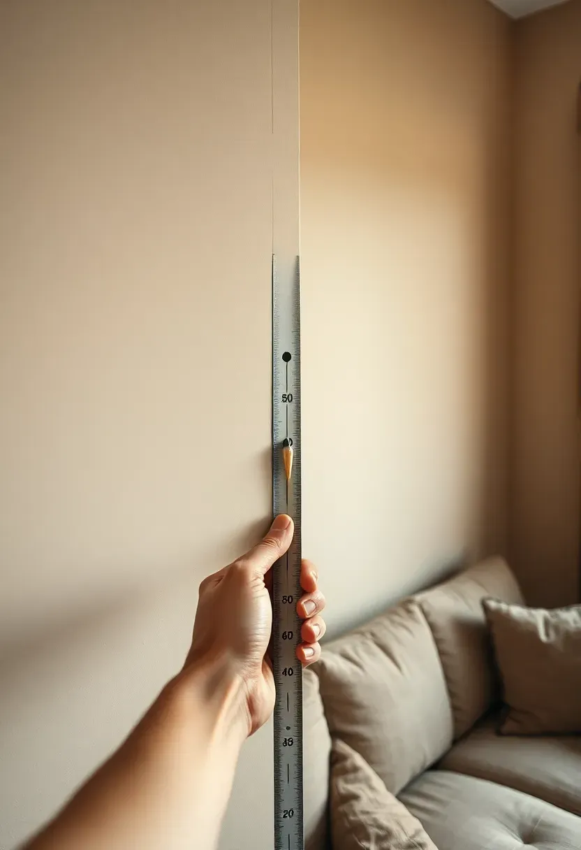
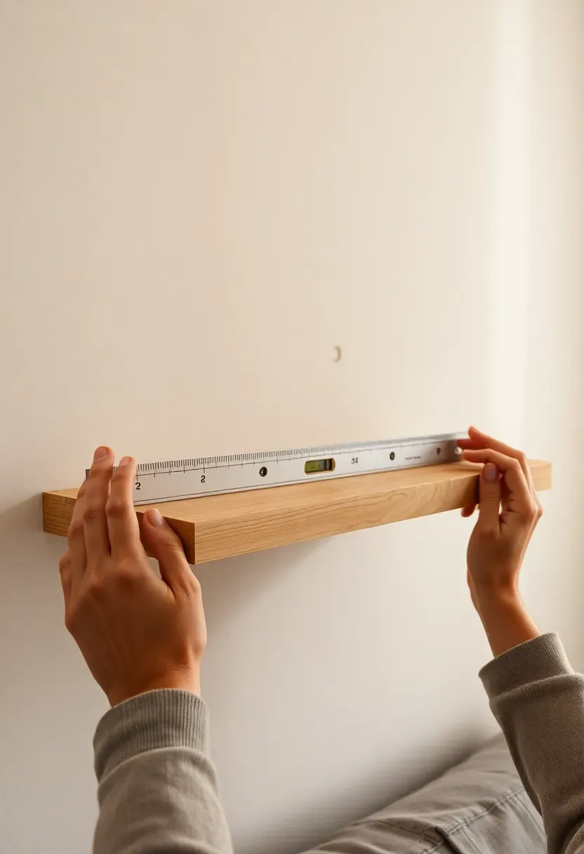
Step 1: Measure the Wall and Find Its Center
This is where every successful wall arrangement begins. Get the numbers right here and every step that follows is easier.
Measure the full width of the wall and mark its horizontal center with a light pencil dot at approximately eye level (around 145-155 cm from the floor). Then measure the width of your sofa or the main furniture piece below the wall — your arrangement should be 50-75% of that width to stay visually anchored to the furniture beneath it. Write these numbers down. You're not guessing from this point; you're placing everything against a measured reference.
Do: use a spirit level to draw a faint horizontal guide line across the center — it keeps the whole arrangement from tilting Don't: skip the center-finding step and start hanging from one edge — asymmetric galleries almost always drift too far to one side Pro tip: the visual center of a wall sits slightly higher than the mathematical center — trust 150 cm as your eye-level anchor point
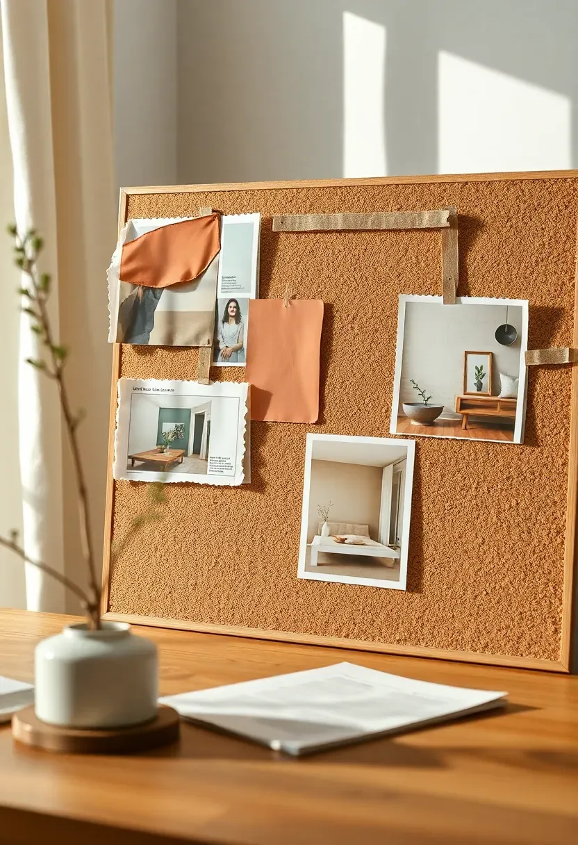
Step 2: Define Your Style and Palette
Most people buy art they like in isolation and wonder why it doesn't work together on the wall. Style comes before shopping — always.
Collect 8-12 images of rooms you're drawn to and look for the pattern: is the recurring palette warm and earthy (cream, terracotta, sage)? Cool and graphic (white, black, charcoal)? Romantic and textural (blush, walnut, linen)? Identify your palette — two or three colors that will run through every frame, every shelf object, every accent — and write it on a sticky note. Every purchase from this point forward gets checked against that palette. This one step prevents the "I love it alone but it doesn't work in the room" trap.
Do: pull a color directly from your sofa or rug as one of your palette anchors — it ties the wall to the room instantly Don't: try to match frames exactly to wall color — a slight contrast (walnut on greige, black on warm white) gives frames the visual weight they need Pro tip: warm palettes (cream, terracotta, amber, sage) almost always work in living rooms because they read as welcoming under both daylight and lamp light

Recommended
Items for this idea
Step 3: Choose and Curate Your Art
This is where the real transformation happens. The art you choose sets the mood for the entire wall — and the entire room.
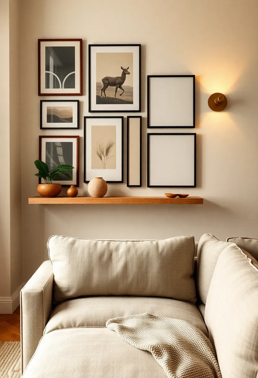
Aim for 5-9 pieces in a mix of sizes: one or two large anchor prints (A2 or larger), two or three medium prints (A3), and two or three smaller pieces (A4 or 20×20 cm). Mix subjects deliberately: one abstract, one botanical or organic shape, one with a figure or landscape, one purely typographic or minimal. Lay every candidate print flat on your floor or dining table before ordering frames — the combination needs to feel cohesive as a group, not just individually pleasing. Limit yourself to two frame finishes maximum: walnut and black, or brass and black, or all walnut. More than two finishes creates visual noise.
Do: include at least one piece that references a color from your sofa, rug, or cushions — it stitches the wall into the room Don't: use all the same size prints — identical sizes produce a grid, not a gallery, and grids read as corporate rather than curated Pro tip: black-and-white photography in warm walnut frames is one of the easiest combinations to make look expensive and considered
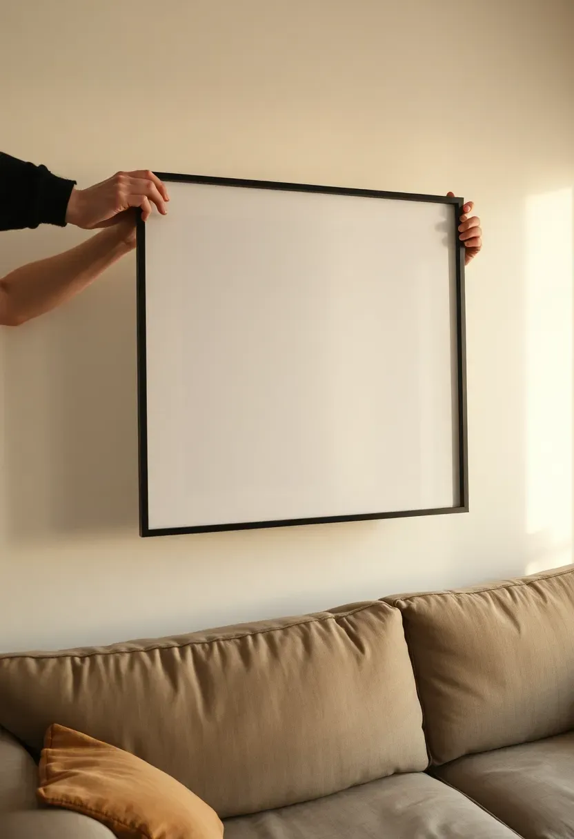
Step 4: Test Placement Before You Commit
Don't rush this step — it makes the biggest visual difference. Every hole you avoid drilling is a wall patch you don't have to make.
Take each framed print and hold it against the wall at the intended position. Step back three meters and assess: Does the size feel right for the space? Does it sit comfortably above the furniture below, leaving 15-20 cm of breathing room between the bottom frame and the sofa back? Is the color and subject landing as expected in this light? Take photos on your phone from the sofa position — you'll catch asymmetries and proportion problems that your eye misses when you're standing right beside the wall. This five-minute check saves hours of patching and rehanging.
Do: photograph each test position from sitting height on the sofa — that's your actual viewing angle 90% of the time Don't: commit to placement based on what looks right while standing directly in front of the wall — perspective shifts dramatically from a seated distance Pro tip: hold two or three frames up simultaneously (lean one, hold one) to test how they'll interact with each other before measuring anything
Recommended
Items for this idea
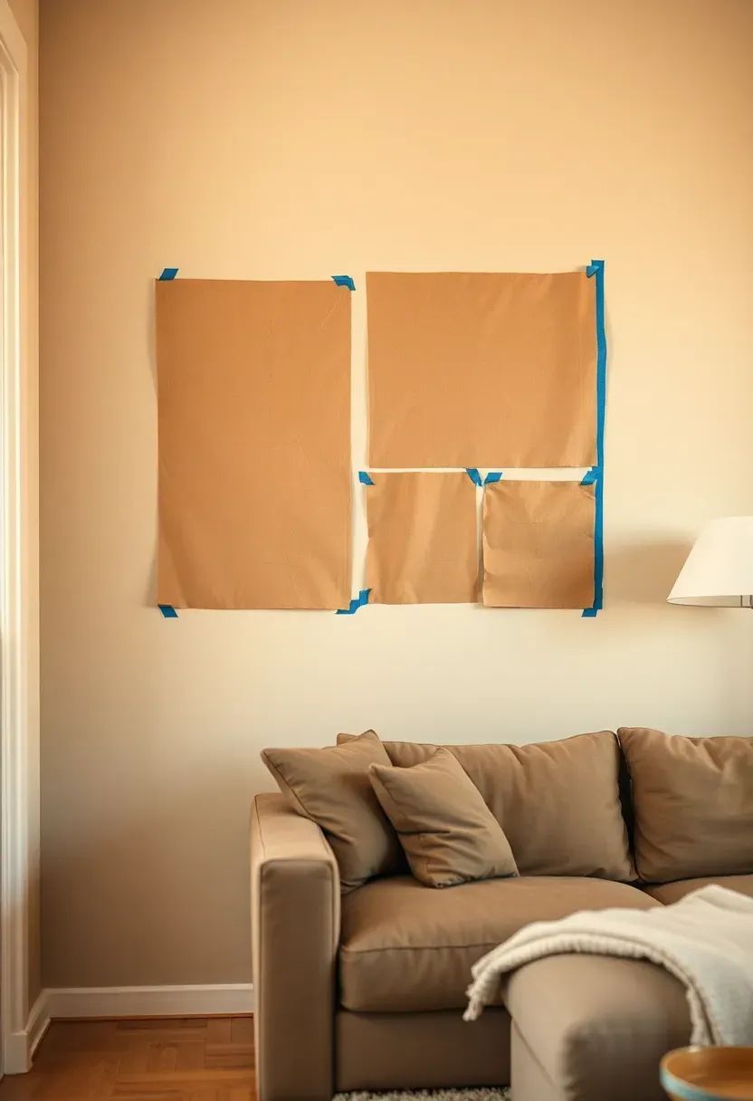
Step 5: Create Paper Templates
Most people skip this — and it shows. Paper templates are the single most effective technique professionals use for getting gallery walls right on the first attempt.
Trace each frame onto kraft paper or newspaper and cut out the exact shape. Mark the hook point on each template (measure from the top of the frame to where the wire rests at the center). Tape the templates to your wall using painter's tape, starting with your largest anchor piece and working outward. Live with the arrangement on paper for a day. Walk past it. Sit on the sofa and look at it. Sleep on it. You'll adjust spacing, shift the cluster left or right, and reposition at least two pieces — and all of this happens without a single nail hole in the wrong place.
Do: mark the hook or keyhole position on each template before sticking it up — it becomes your drill guide Don't: rush past this step on a weekend afternoon when you're excited — templates save real time and real wall damage Pro tip: number each template on the back and take a photo of the final layout before removing them — you'll reference it constantly while hanging
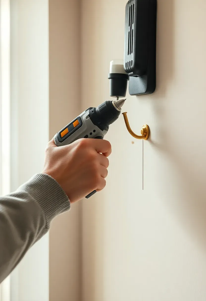
Step 6: Install Picture Hooks with Precision
Get this right and the rest falls into place. The quality of your hanging hardware determines whether your gallery stays level for years or starts tilting within weeks.
Use the hook marks from your paper templates as exact drill guides. For standard plaster walls, a picture hook with a hardened pin at 45 degrees holds up to 20 kg and leaves minimal damage. For heavier mirrors or shelves, use wall plugs and screws driven into studs where possible. Drill at the angle your template marked, set the hook, and use your spirit level to confirm the horizontal before moving to the next one. Don't overtighten screws in plaster — they crack the surrounding surface. Snug is correct; firm is enough.
Do: check for pipes and cables with a stud finder or phone app before drilling anywhere Don't: assume all walls are the same depth — plasterboard on metal studs needs shorter fixings than solid brick behind plaster Pro tip: a thin strip of painter's tape over the drill mark prevents plaster from crumbling outward when you drill into it
Recommended
Items for this idea
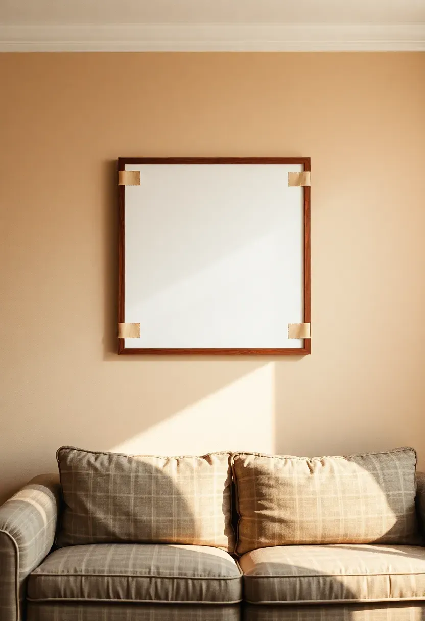
Step 7: Hang Your First Anchor Piece
This is the foundation everything else builds on. The anchor piece sets the visual center of gravity — get it precisely positioned and the gallery almost builds itself around it.
Hang your largest or most visually dominant piece first, centered on your wall center mark at eye level (approximately 150 cm to the vertical center of the frame). Double-check with a level. Step back to the sofa and confirm it feels centered above the furniture below. If it does, this is your fixed reference point. Every other piece in the gallery is measured and positioned relative to this one. Don't hang anything else until this first piece is exactly where you want it — moving the anchor later forces you to re-measure everything else.
Do: use two hooks per large frame rather than one — it prevents rotation and keeps the print level long-term Don't: move past this step until the anchor sits level and centered — a tilted reference point cascades errors throughout the rest of the gallery Pro tip: the top of the anchor frame typically sits 170-180 cm from the floor — this gives the print a position that reads well from standing and seated distances
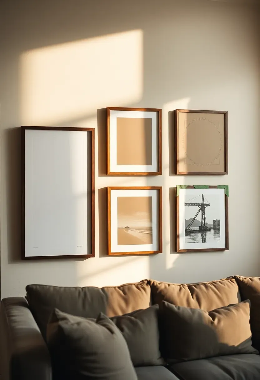
Step 8: Build the Gallery Around the Anchor
With the anchor in place, you're adding satellites. Work outward from the center in pairs — left and right — rather than filling one side completely before starting the other.
Maintain a consistent gap between frames: 5-8 cm is the standard for a cohesive gallery feel; gaps larger than 10 cm start to feel disconnected, gaps smaller than 4 cm feel cramped. Alternate frame sizes as you move outward — a large anchor flanked by medium pieces, then smaller accents at the edges. Step back after hanging each pair. Your eye will catch any piece that pulls too far from the visual center or sits at the wrong angle. The gallery is finished when every piece feels like it belongs — not when every hook from the template is filled.
Do: stand at the far wall opposite and check the arrangement from maximum distance — mistakes that are invisible up close become obvious from here Don't: maintain rigid mathematical spacing — a 5 cm gap between two small prints and a 7 cm gap between a large and a small one both read as "correct" to the eye Pro tip: if one print consistently looks wrong in every position, pull it — a gallery with 7 pieces that all belong beats a gallery of 9 where one fights the rest
Recommended
Items for this idea
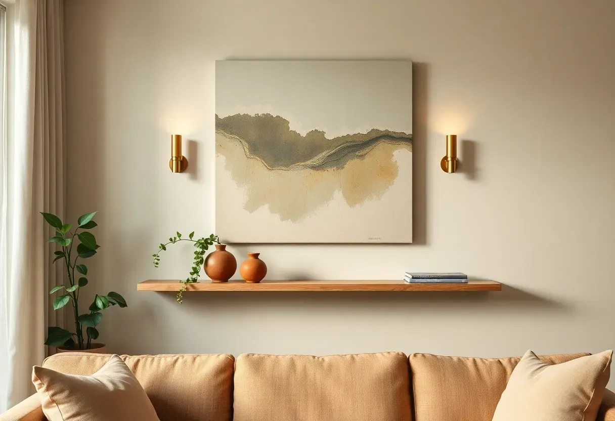
Step 9: Mount a Floating Shelf for Depth
A floating shelf beneath or beside your gallery wall adds a critical third dimension — objects in front of the flat wall art create depth that transforms the arrangement from decoration to installation.
Position the shelf 15-20 cm below the lowest frame in your gallery cluster, centered on the wall arrangement above it. Use a spirit level to confirm it's perfectly horizontal before drilling. For a 60-90 cm shelf holding ceramics and small objects, two wall plugs driven into studs provide more than adequate support. The shelf shouldn't be wider than the gallery cluster above it — ideally 60-80% of the total gallery width keeps the proportions balanced. A shelf that extends beyond the frames creates a visual imbalance that's hard to style around.
Do: hold the shelf against the wall and check from the sofa before drilling — the height relationship to the gallery above is critical Don't: install the shelf at the same level as the lowest frame — it needs breathing room between shelf surface and the artwork above it Pro tip: a shelf in a slightly lighter tone than the wall (pale oak on warm white) catches light and appears to float rather than being attached
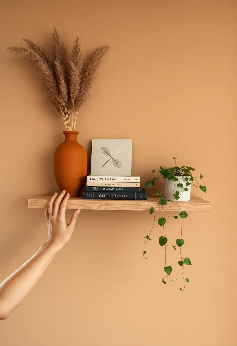
Step 10: Style the Shelf with Intention
An unstyled shelf undercuts the whole arrangement above it. A well-styled shelf makes the gallery look curated rather than simply hung.
Use the rule of three: one tall object (a vase with dried stems or a sculptural ceramic), one mid-height horizontal element (a small art book stack, spines facing inward to show their edges rather than their titles), and one trailing or organic element (a small pothos, a trailing string of pearls, a piece of driftwood). Leave at least one-third of the shelf surface empty — negative space signals intentional styling, not a storage problem. Color-match at least one shelf object to a tone in your gallery prints above. That echo is what makes the whole wall read as designed.
Do: angle objects slightly toward each other rather than standing them all parallel — it creates an implicit relationship between them Don't: fill every centimeter of the shelf — overcrowding makes a display shelf look like a bathroom counter Pro tip: a small framed print leaning against the wall on the shelf (rather than hung) adds an informal layer that makes the whole arrangement feel lived-in
Recommended
Items for this idea
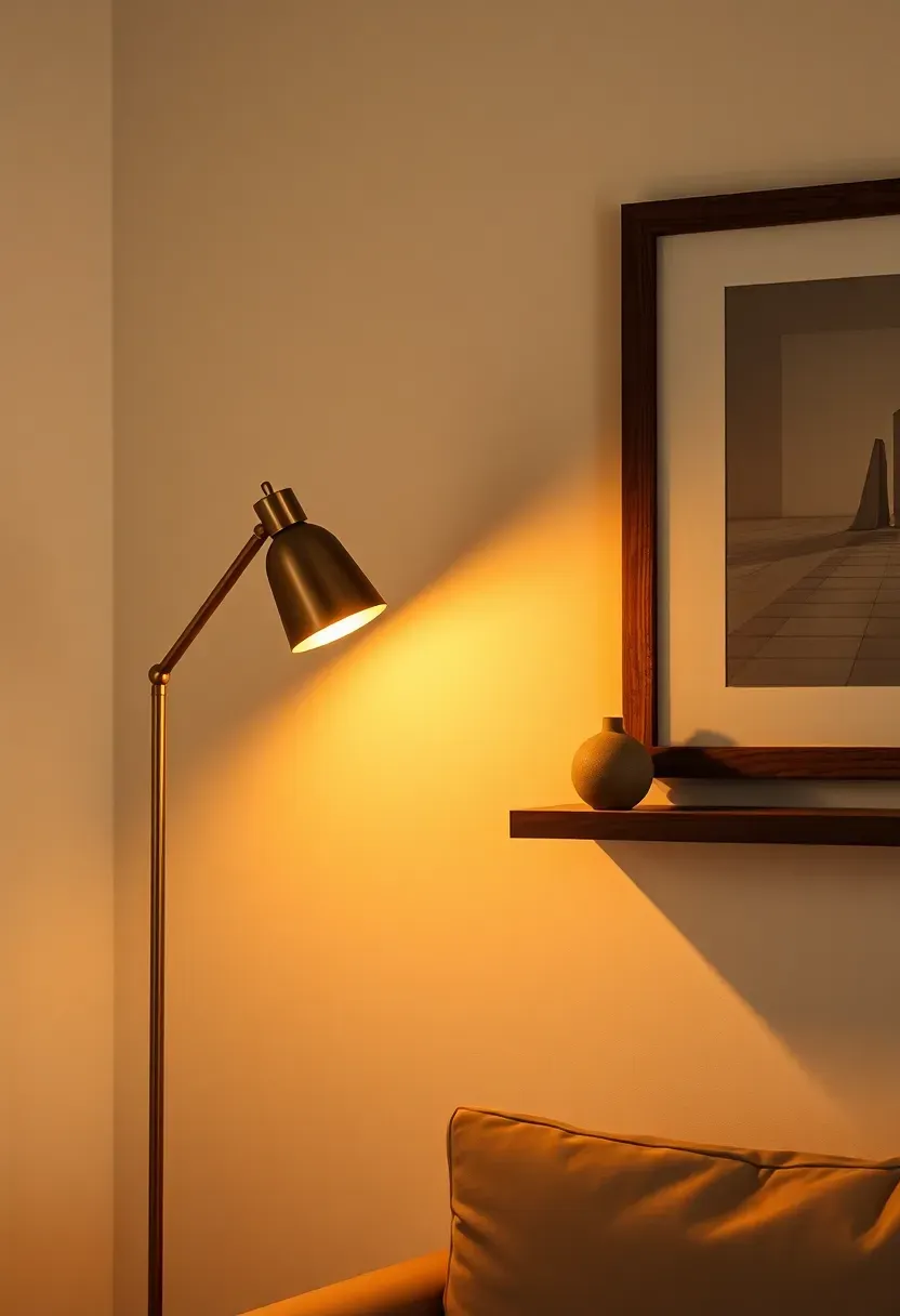
Step 11: Add a Lighting Layer
A wall arrangement that looks good in daylight must also look good at 8pm. Lighting is what takes a gallery wall from flat to dramatic.
A slim floor lamp with a directional head positioned to one side of the wall arrangement — not directly below it — creates an ambient wash that throws the frames into gentle relief. Alternatively, a pair of plug-in picture lights mounted directly to the frames themselves give a focused, museum-style glow that draws the eye deliberately to the art. In both cases, use warm white bulbs rated 2700K — anything cooler reads clinical and makes the wall feel like an office. If your wall arrangement sits above a console table, a small lamp placed on the table surface adds a third light layer at low level, creating depth that artificial overhead lighting can never produce.
Do: test your wall arrangement at night, with lamps on, before calling it finished — many arrangements that look great by day feel flat and cold in the evening Don't: light from directly above (downlights) — it creates harsh shadows inside frames and flattens the whole arrangement Pro tip: a lamp with a dimmer switch lets you shift the room from energetic (75% brightness) to intimate (30%) without changing a single element on the wall
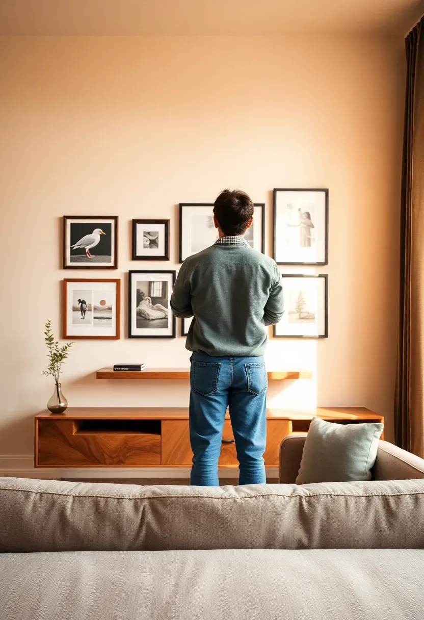
Step 12: Step Back and Edit
The wall is hung. Now do the thing most decorators rush past: look at it for a long time without touching it.
Sit on the sofa. Look at the wall for five full minutes. Look from the room entrance. Look from the kitchen doorway if you can see it from there. Photograph it on your phone and flip the image horizontally — your eye spots imbalances in a mirror image that it ignores in the original orientation. Ask yourself: Is any frame pulling your eye disproportionately? Is there one piece that feels out of place in subject or tone? Is the shelf styling competing with the gallery above it, or supporting it? Be honest. Removing one frame that doesn't belong improves the arrangement; leaving it in undermines everything else.
Do: live with the wall for 48 hours before making any edits — your initial reaction to a new arrangement is always slightly off Don't: add more pieces to fill perceived "gaps" — the negative wall space between frames is not empty, it's breathing room Pro tip: photograph the wall on your phone and compare it to your original inspiration images — that's the clearest measure of whether you've achieved what you set out to create
Recommended
Items for this idea
Step 13: Add the Final Details
This is where "decorated" becomes "designed." The finishing touches are what separate a wall that looks complete from one that looks like a work in progress.
Add a scent: a reed diffuser or a single candle on the shelf or console below the wall ties the sensory experience to the visual one. Add one textile: a throw draped over the sofa arm directly below the wall creates a foreground layer that frames the whole arrangement from the seated perspective. Check that every frame wire is centered on its hook (it will drift during hanging) and every frame is level one final time. Clean the glass on each framed print with a lint-free cloth — fingerprints from the hanging process catch the light and are far more visible than you'd expect. Then sit back down, look at what you've built, and stop adding things.
Do: take a final photograph from both standing and seated distances to document the finished result — you'll want it for reference when styling other rooms Don't: introduce a new accent color at this stage — everything added now must be drawn from the palette you chose in Step 2 Pro tip: a single stem in the shelf vase (not a full bouquet) finishes the arrangement with organic softness without competing with the art above it
FAQ
Should the gallery wall be centered on the sofa or centered on the wall? Center it on the sofa, not the wall — unless the two happen to align. The furniture below the gallery is the visual anchor for anyone in the room. A gallery centered on the wall but offset from the sofa beneath it will always feel slightly off, even if you can't immediately identify why. Measure the sofa width, find its center, and use that as your vertical axis.
Can renters create a gallery wall without losing their deposit? Yes. Command strips rated for picture hanging (look for the specific picture-hanging variety, not the all-purpose strips) hold reliably on most painted walls up to 2-4 kg per strip. For a full gallery, you'll typically need 2-3 strips per frame. Remove them slowly and at a low angle when leaving. Alternatively, lean a collection of prints against the wall using a long floating shelf as the support surface — no fixings at all, fully renter-safe, and a distinct aesthetic in its own right.
What's the difference between a gallery wall and a feature wall — which should I create? A gallery wall is a curated arrangement of framed art. A feature wall is a broader term that includes paint, wallpaper, paneling, and art together. For most living rooms, a gallery wall with a floating shelf and accent lighting functions as a feature wall — the combination of three-dimensional layers makes it read as architectural rather than decorative. If you want the full feature wall effect without structural changes, the gallery-plus-shelf-plus-lighting combination from these steps is the most impactful approach.
Is 13 steps too many for a weekend project? Not if you sequence it across the weekend. Steps 1-5 (measuring, style-setting, choosing art, testing, and making templates) take 2-3 hours and are best done Saturday morning. Steps 6-9 (drilling, hanging, shelf installation) take another 2-3 hours. Styling and lighting (Steps 10-11) take 30-60 minutes. Steps 12-13 are ongoing and require no tools at all. The reason the process has 13 steps is that most gallery wall disasters come from collapsing these phases together — buying art before defining a palette, drilling before making templates, adding accessories before editing.
How much should I expect to spend on a living room feature wall? The range is wide. Prints from independent artists on Etsy or design marketplaces run $15-80 each. Frames from IKEA (Ribba, Hovsta) are $10-30 each. A floating shelf runs $30-80. A floor lamp, $50-150. A realistic budget for a 7-frame gallery with a shelf and lamp is $200-400. The highest-cost item is usually frames, not prints — and mixing one or two higher-quality walnut frames with IKEA frames (painted the same color) is virtually undetectable in the finished arrangement.
The best living room wall is the one you made deliberately. Pick up the measuring tape this weekend — the wall has been waiting long enough.
Pinterest cover for How to Decorate a Living Room Wall: 13 Steps to a Stunning Feature
About the author
OBCD
CGI visualization and interior design content. We create detailed 3D renders and curate practical design ideas for every room in your home.