How to Decorate a Blank Wall: 11 Steps to Transform Any Space
Your blank wall isn't a problem — it's an opportunity. Most people freeze when facing an empty expanse because the possibilities feel overwhelming. But great wall styling is less about inspiration and more about sequence: make the right decisions in the right order, and the wall practically decorates itself. These 11 steps take you from bare plaster to a finished focal point that looks intentional, layered, and entirely your own.
Table of Contents
- What You'll Need
- Step 1: Assess Your Wall and Room Context
- Step 2: Choose a Decorating Approach
- Step 3: Pick Your Anchor Piece
- Step 4: Build a Color and Tone Framework
- Step 5: Map the Layout Before Hanging Anything
- Step 6: Prepare Your Wall Surface
- Step 7: Hang the Anchor Piece First
- Step 8: Add Surrounding Elements
- Step 9: Layer in Three-Dimensional Objects
- Step 10: Introduce Wall-Level Lighting
- Step 11: Edit and Refine Until It Feels Right
What You'll Need
- Measuring tape and a level
- Painter's tape (for mapping layouts on the wall)
- Picture-hanging hardware: nails, D-rings, sawtooth hangers, or adhesive strips for renters
- Hammer and stud finder (or adhesive alternatives)
- Anchor piece: large artwork, mirror, or tapestry
- Two to five supporting pieces: smaller prints, framed photos, wall-mounted shelves, or sconces
- One to three three-dimensional elements: wall-mounted planters, ceramic objects, or a small shelf with objects
- Warm-white LED bulbs or a plug-in picture light
Step 1: Assess Your Wall and Room Context
This is the foundation everything else builds on.
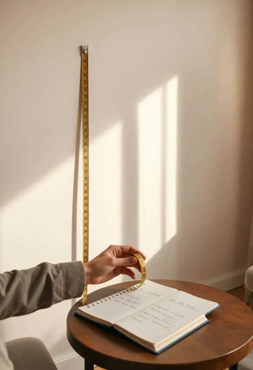
Before touching a single piece of art, spend five minutes studying the wall and the room it belongs to. Measure the wall's width and height. Note where windows, doors, and furniture sit in relation to it — a wall above a sofa has different constraints than an empty hallway wall or a dining room focal wall. Consider what the room already communicates: a warm, layered living room calls for one approach; a spare, modern bedroom calls for another.
Do: photograph the wall and open the image on your phone — you can sketch or mock-up ideas directly over it using apps like Canvas or even just your camera's markup tool Don't: shop for art before you know your wall's exact dimensions; buying blind leads to pieces that feel too small or awkwardly placed Pro tip: note which direction light enters the room and at what time of day — this will influence whether you choose reflective surfaces like mirrors or matte-finish art
Step 2: Choose a Decorating Approach
Most people skip this — and it shows.
Committing to an approach before collecting pieces is the single decision that separates a cohesive wall from a random one. The main approaches are: a single large statement piece (a painting, mirror, or woven textile); a gallery wall of mixed frames and art; a shelf-based display with objects and art combined; a wall of texture (paneling, wallpaper, limewash paint); or a mixed-media wall blending flat art with three-dimensional objects. Each has a different cost range, skill level, and visual weight.
Do: choose one primary approach and treat everything else as supporting detail — walls that try to do everything at once feel unsettled Don't: mix a gallery wall with a feature wall treatment like paneling on the same surface unless you have a clear plan for where one ends and the other begins Pro tip: if you're renting or indecisive about permanence, the shelf-and-object approach gives you maximum flexibility — you can rearrange without new nail holes
Recommended
Items for this idea
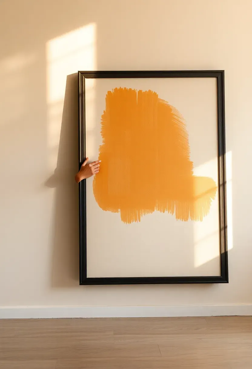
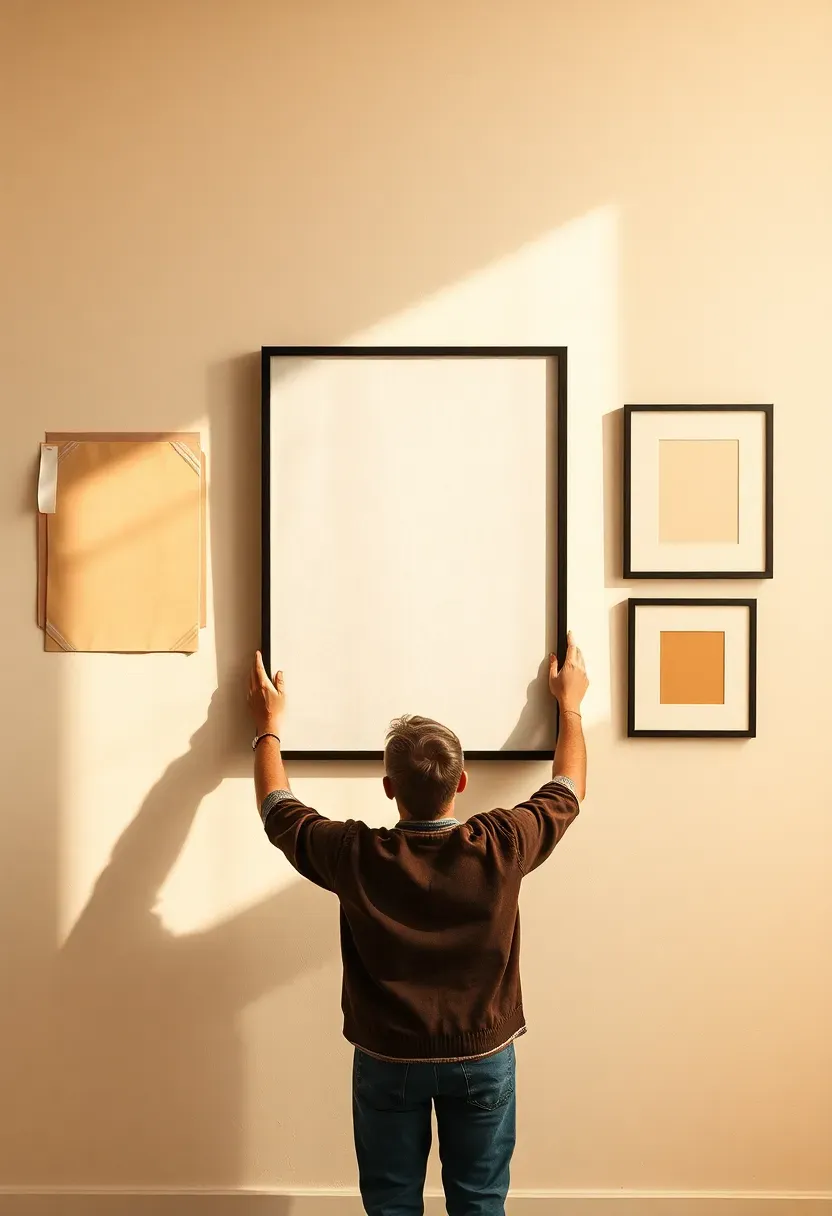
Step 3: Pick Your Anchor Piece
Get this right and the rest falls into place.
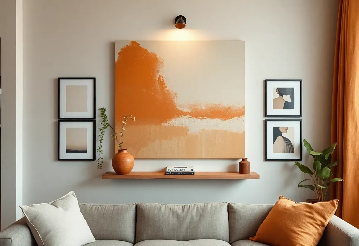
Every wall needs one piece that establishes scale, tone, and visual weight — everything else orbits around it. For a sofa wall, the anchor should be roughly two-thirds the width of the furniture below it. For a standalone feature wall, the anchor can be bolder — a piece that commands the full center of the wall and draws the eye from across the room. Choose something you genuinely respond to: this piece sets the emotional register of the entire wall. It can be a large canvas print, an oversized mirror, a vintage textile, a dramatic photograph, or a statement-scale clock.
Do: err toward larger rather than smaller — undersized art is the most common wall decorating mistake, and a piece that feels big in the shop will often look small on the wall Don't: choose an anchor piece based on color alone; scale, subject matter, and texture matter just as much in a real room context Pro tip: if budget is a constraint, a simple large mirror does the work of an anchor piece and adds light and depth that art cannot
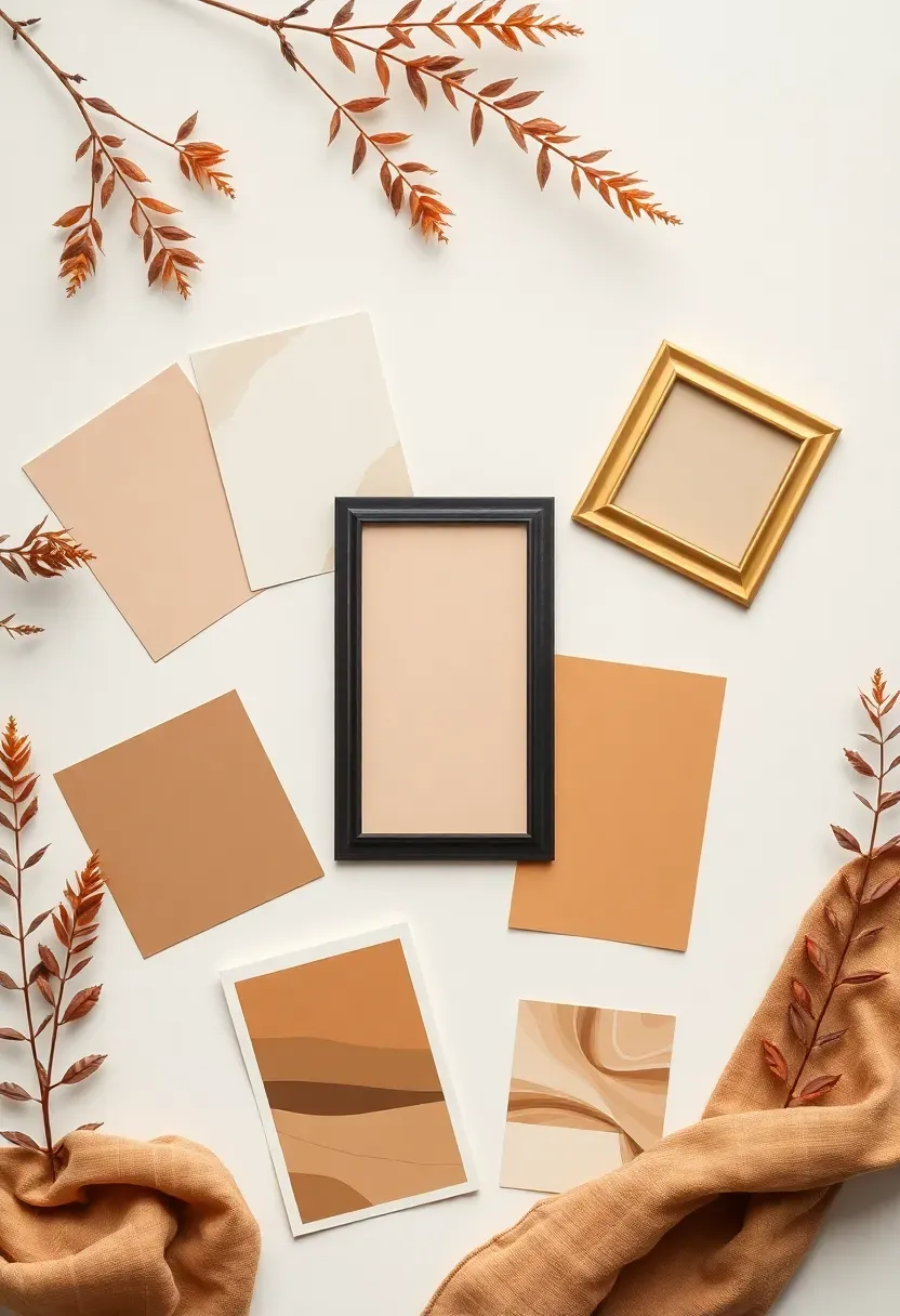
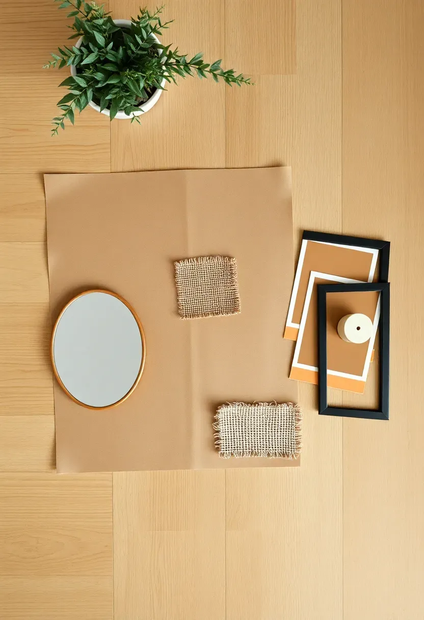
Step 4: Build a Color and Tone Framework
Don't rush this step — it makes the biggest visual difference.
A wall that looks cohesive isn't necessarily one where every piece shares the same color. It's one where the tones relate: they pull from the same temperature (warm or cool), the same saturation level (muted or vibrant), or the same narrow palette of two to three colors. Pull a color thread from your existing room — a sofa tone, a rug color, a cushion accent — and let it appear at least twice on the wall. Frame finishes should also be considered here: mixing black and natural wood reads as curated; mixing gold, chrome, and black reads as unresolved.
Do: test frame finishes next to your anchor piece before committing — a warm gold frame on a cool-toned print can create unexpected discord Don't: introduce a completely new color on the wall that appears nowhere else in the room; it will read as an accident rather than an accent Pro tip: a consistent mat color across all framed pieces (bright white or warm cream) unifies wildly different artworks into a coherent collection
Recommended
Items for this idea
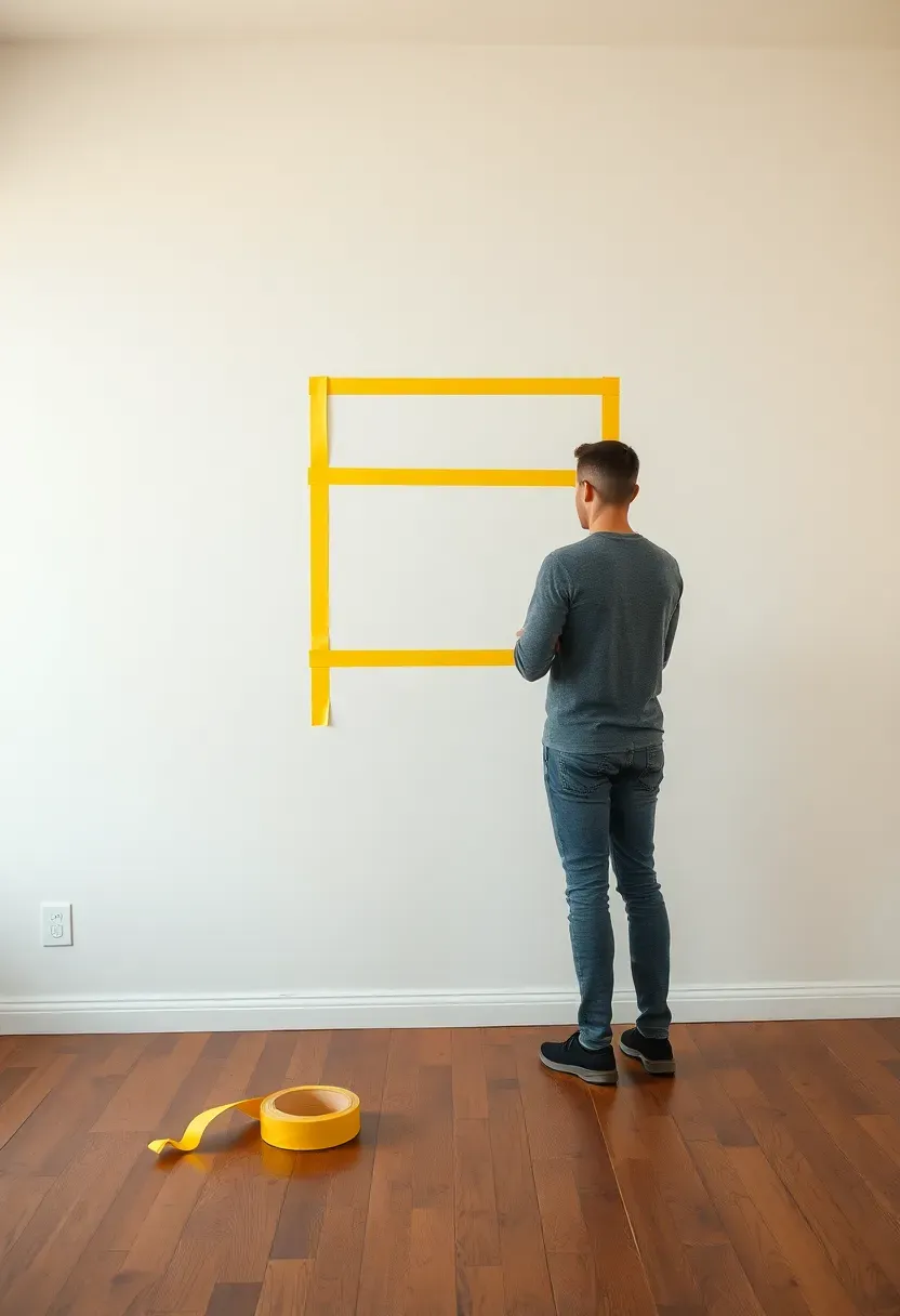
Step 5: Map the Layout Before Hanging Anything
This is where the real transformation happens.
Cut paper templates to the exact size of each frame or object and tape them to the wall before you make a single nail hole. Stand back at normal viewing distance and live with the arrangement for at least an hour — ideally overnight. Shift pieces, swap positions, try the anchor high versus eye level. For gallery walls, the standard is to maintain consistent spacing between frames: 2 to 3 inches between pieces for a tight, intentional look; 4 to 6 inches for something more relaxed and airy. The overall arrangement should have a visual center of gravity — usually at eye level, around 57 to 60 inches from the floor.
Do: photograph each iteration of your paper layout; it's easy to forget what you liked about an earlier version once you've moved pieces around Don't: eyeball spacing — uneven gaps between frames are immediately obvious and make even beautiful art look haphazard Pro tip: if your arrangement includes both horizontal and vertical pieces, create a rough outer boundary for the arrangement and keep all pieces within it; this gives the collection its shape
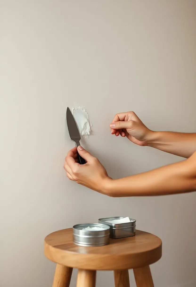
Step 6: Prepare Your Wall Surface
A detail most decorators overlook until it's too late.
Before anything goes up permanently, address the wall itself. Fill any old nail holes with lightweight spackle and sand smooth once dry. If the wall color is looking dingy or dated, now is the moment to repaint — it's infinitely easier before art is in place. Consider whether the wall color you have actually serves the pieces you're planning to hang: a warm greige or deep tone behind framed art gives the collection more presence than a stark bright white. If you're a renter, locate the studs with a stud finder and note their positions; heavy pieces must hit studs or use proper drywall anchors regardless of what adhesive packaging claims.
Do: wipe the wall surface with a slightly damp cloth before hanging anything — dust and grease reduce adhesive strip effectiveness dramatically Don't: skip the spackle step if you're removing old holes; mismatched textures catch light and are visible even under a fresh coat of paint Pro tip: a single coat of matte paint in a deeper shade behind a gallery wall creates a subtle "frame within the frame" effect that makes the entire arrangement pop
Recommended
Items for this idea
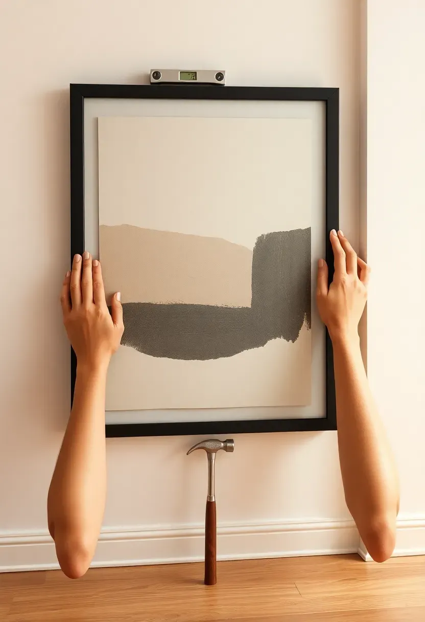
Step 7: Hang the Anchor Piece First
Work from the center out, never from an edge.
Remove your paper templates and hang the anchor piece at exactly the position you confirmed in step 5. Use a level. If the piece is heavy, locate the stud or use a drywall anchor rated above the piece's weight — never trust a single nail for anything over 15 pounds. For art above a sofa, the bottom edge of the piece should sit 6 to 8 inches above the sofa back — close enough to feel connected, far enough to allow visual breathing room. Step back and confirm it's level and positioned exactly where your template was. Everything added after this builds around a fixed point.
Do: have a second person hold the piece while you step back to assess position before marking and nailing — it saves multiple holes Don't: hang the anchor piece first thing on a Monday if you won't have time to evaluate it in evening light; morning and evening light can make the same position feel completely different Pro tip: a small piece of painter's tape over the nail hole location acts as a guide mark while you're holding the frame in position
Step 8: Add Surrounding Elements
Build outward from the anchor with deliberate rhythm.
With the anchor fixed, place the remaining flat elements around it following your paper template layout. Work from largest to smallest: large supporting pieces first, then medium, then small. Maintain the consistent spacing you mapped in step 5. If you're building a gallery wall, stand back every two pieces and reassess — paper templates don't account for the visual weight of actual art, and you may need to adjust. The arrangement should feel like it has a clear visual path: the eye should enter, travel comfortably through the pieces, and rest at the anchor without confusion.
Do: step back at least 10 feet (across the room) after each addition — pieces that feel balanced up close can look uneven at normal viewing distance Don't: fill every gap; intentional negative space within a gallery wall creates breathing room and makes the arrangement feel curated rather than crowded Pro tip: if two pieces feel disconnected from each other, try moving them closer together — proximity creates relationship even between visually different objects
Recommended
Items for this idea
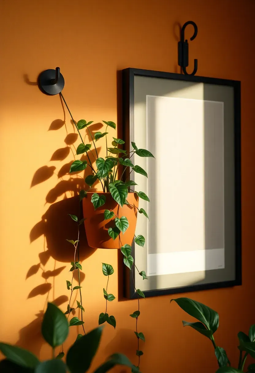
Step 9: Layer in Three-Dimensional Objects
This is what elevates a flat wall into something that genuinely holds attention.
Flat art, even beautiful flat art, stays visually on the surface. Three-dimensional wall elements — mounted planters, ceramic wall sculptures, small floating shelves with objects, woven baskets, or a wall-mounted sconce — create shadow and depth that make the eye read the wall as a composed space rather than a collection of pictures. Choose one or two three-dimensional elements maximum and position them where they interact with the flat pieces: a trailing plant next to a framed print, a small shelf below a larger painting with a few curated objects on it, a ceramic piece anchoring one corner of a gallery arrangement.
Do: treat your three-dimensional objects as you would accessories in a room — choose things with varying height, texture, and mass to create visual contrast Don't: add too many dimensional elements; more than two or three on one wall creates competition for attention and dilutes the impact of each Pro tip: a wall-mounted air plant holder or ceramic propagation vessel adds organic life to the wall at minimal cost and with no nail holes if you use adhesive mounting
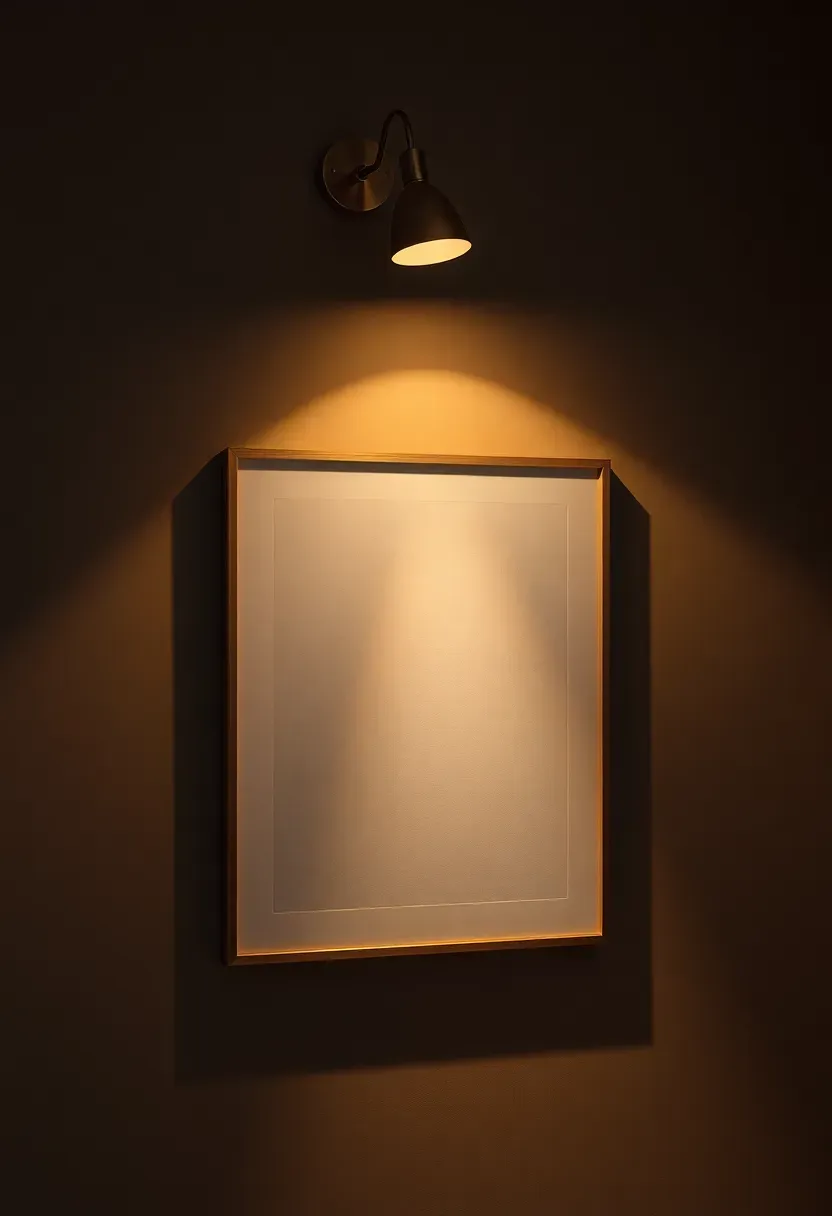
Step 10: Introduce Wall-Level Lighting
The layer that transforms a decorated wall into a designed one.
A wall lit purely by ambient room light looks flat and forgettable after dark. Directing a warm light source at your wall arrangement shifts it from background to feature. The options are: a plug-in picture light mounted above the anchor piece; a clip-on spotlight on a nearby shelf; a pair of plug-in wall sconces flanking the arrangement; or a track light on the ceiling pointed at the wall. In every case, use bulbs rated 2700K for warmth — cooler light temperatures wash out warm-toned art and flatten texture. Even one directional light source pointing at the wall will make everything look more intentional in the evening.
Do: plug in your chosen light source before committing to the final wall position; seeing the arrangement lit after dark may cause you to shift a piece or two Don't: use a cool-white or daylight-spectrum bulb on a warm art wall — it creates an institutional feel that works against everything else you've done Pro tip: a simple plug-in picture light costs $25 to $60 and is the single highest-ROI addition you can make to a decorated wall
Recommended
Items for this idea
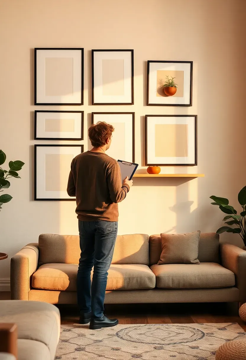
Step 11: Edit and Refine Until It Feels Right
The difference between a decorated wall and a great one is in the final pass.
Once everything is in place, take 24 hours before declaring it finished. The first day you hang things, your eye is too close to the decisions you've just made. Return the next day and look at the wall from the doorway, from across the room, and in different light conditions — morning, afternoon, and evening. Ask yourself which piece you'd remove if you had to: if a piece doesn't improve the arrangement, it's not pulling its weight. Swap one thing, step back, and evaluate. This editing process is not failure — it's exactly how designers work.
Do: remove any piece that creates visual noise rather than visual interest, even if you like it in isolation; a wall's job is to work as a whole Don't: keep a piece just because it was expensive or because you've committed to the nail hole; sunk cost thinking is the enemy of a well-decorated wall Pro tip: photograph the finished wall and view it on your phone screen — the slightly abstracted perspective of a photograph reveals imbalances that your eyes in the room will rationalize away
FAQ
Is it possible to decorate a blank wall without making nail holes? Yes — adhesive strips like Command Strips handle frames up to 16 pounds cleanly, and removable adhesive hooks work for lighter decorative objects. For larger pieces, leaning art against the wall is a valid and increasingly popular styling approach. Floating shelves with adhesive mounting hardware can also hold considerable weight without drilling, provided you follow weight limits carefully.
What size art should I hang on a large blank wall? A single piece should generally be 60 to 75 percent of the wall's width — much larger than most people intuitively choose. If the wall is above furniture like a sofa or bed, the art should be roughly two-thirds the width of the furniture beneath it. When in doubt, go larger: undersized art is the most common wall decorating mistake, and it makes both the art and the wall look diminished.
Should gallery wall frames all match, or can I mix them? Both approaches work — consistency and intentional mixing each create a different effect. Matching frames (same finish, same or coordinated sizes) produce a clean, modern, gallery-like result. Mixed frames in two complementary finishes — such as black and natural wood, or brass and antique white — read as curated and personal. What doesn't work is accidental mixing: five different finishes chosen randomly. Have a plan.
Can I decorate a rented apartment's blank walls without losing my deposit? Absolutely. Command Strips and removable adhesive picture rails handle most art and frames without drilling. Leaning art and objects against walls is on-trend and deposit-safe. Peel-and-stick wallpaper panels and removable paint (applied with rollers over a base sheet) create feature walls without permanent damage. Focus on furniture, shelving, and floor-level layers to add visual weight when the wall itself is off limits.
What's the best way to hang a gallery wall without it looking messy? Consistent spacing is the key: 2 to 3 inches between pieces for a structured look, 4 to 6 for something more relaxed. Use paper templates taped to the wall before making any holes. Keep the arrangement within a defined outer boundary — rectangle, arch, or asymmetric but clearly intentional shape — and maintain at least one repeated element throughout (same mat color, same frame finish, or same art style) to unify the collection.
Eleven steps is a commitment, but you don't need to complete them all in one weekend. Start with steps one through three — assess, choose your approach, and find your anchor piece — and the rest will follow in its own time. A blank wall transformed by intention is one of the most satisfying things you can do for a room, and for your sense of home.
Pinterest cover for How to Decorate a Blank Wall: 11 Steps to Transform Any Space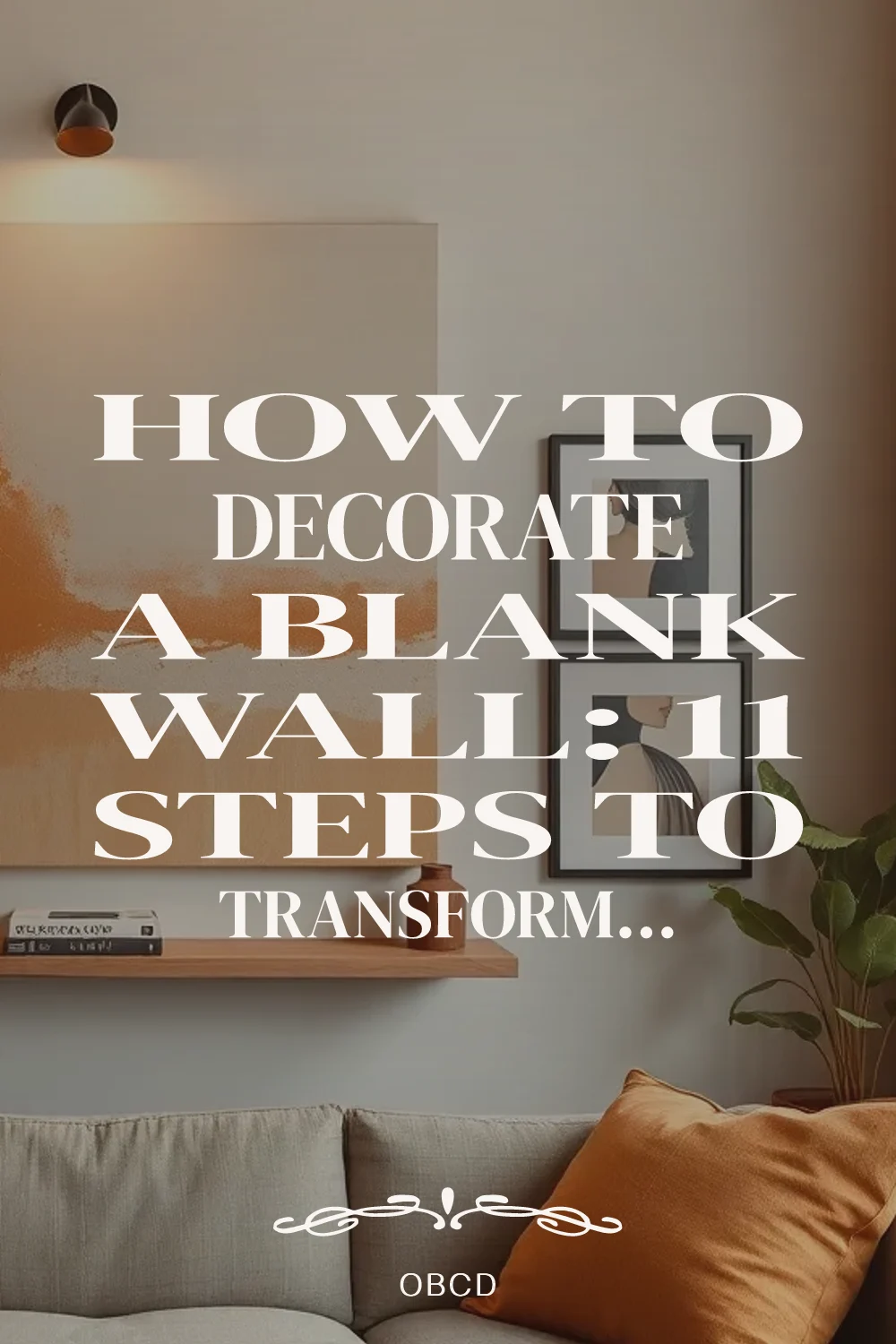
About the author
OBCD
CGI visualization and interior design content. We create detailed 3D renders and curate practical design ideas for every room in your home.