How to Decorate a Wall in 2026: 17 Steps to a Gallery-Worthy Display
Your walls are the largest canvas in your home — and most people leave them almost entirely blank. A gallery-worthy wall display doesn't happen by accident or by nailing frames wherever they fit. This 17-step guide takes you from bare plaster to a finished, cohesive composition that reflects your style, survives every arrangement change, and looks like it was styled by a professional.
Table of Contents
- What You'll Need
- Step 1: Define the Wall's Role
- Step 2: Choose Your Layout Style
- Step 3: Audit What You Already Own
- Step 4: Decide on a Color Palette
- Step 5: Select Your Art and Objects
- Step 6: Mix Frame Styles Intentionally
- Step 7: Map the Composition on Paper
- Step 8: Mock It Up on the Floor
- Step 9: Create Paper Templates
- Step 10: Find Your Anchor Point
- Step 11: Transfer Templates to the Wall
- Step 12: Hang the Anchor Piece First
- Step 13: Build Outward from the Center
- Step 14: Add Depth with 3D Objects
- Step 15: Dial in the Lighting
- Step 16: Step Back and Edit
- Step 17: Photograph and Refine
What You'll Need
- Measuring tape and a level
- Kraft paper or newspaper for templates
- Pencil and scissors
- Painter's tape (for mapping on the wall)
- Picture hooks, nails, or adhesive strips (Command strips for renters)
- Hammer and drill (or strong adhesive strips for rentals)
- Frames in 2-3 sizes, with or without mats
- Art prints, photos, or original artwork
- 1-2 mirrors to add light and depth
- 1-2 three-dimensional objects (wall-mounted shelf, ceramic, macramé, sconce)
- Warm-white bulbs 2700K for any wall lighting
- A phone camera for composition checks
Step 1: Define the Wall's Role
This is the foundation everything else builds on.
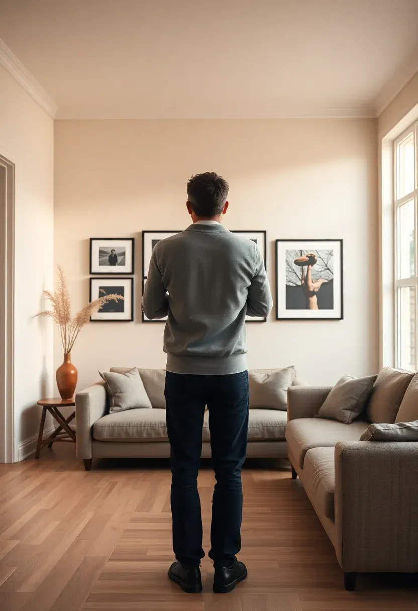
Before selecting a single frame, decide what this wall needs to accomplish. Is it the focal point guests see when they walk in? A backdrop for daily life that sets the mood of the room? A personal archive of meaningful images? The role shapes every decision that follows — a focal point calls for a bold single statement or a large symmetrical arrangement, while a layered personal archive works better as an organic, evolving grid. Write the purpose down. It becomes your filter for every object you consider adding.
Do: walk the room at different times of day and note where your eye naturally lands — that's usually where the wall display will have the most impact Don't: start buying frames and art before you've defined what the wall is for — you'll end up with beautiful objects that don't work together Pro tip: the wall behind a sofa, bed, or dining table is almost always the right choice — furniture anchors it and gives the display an automatic scale reference
Step 2: Choose Your Layout Style
Get this right and the rest falls into place.
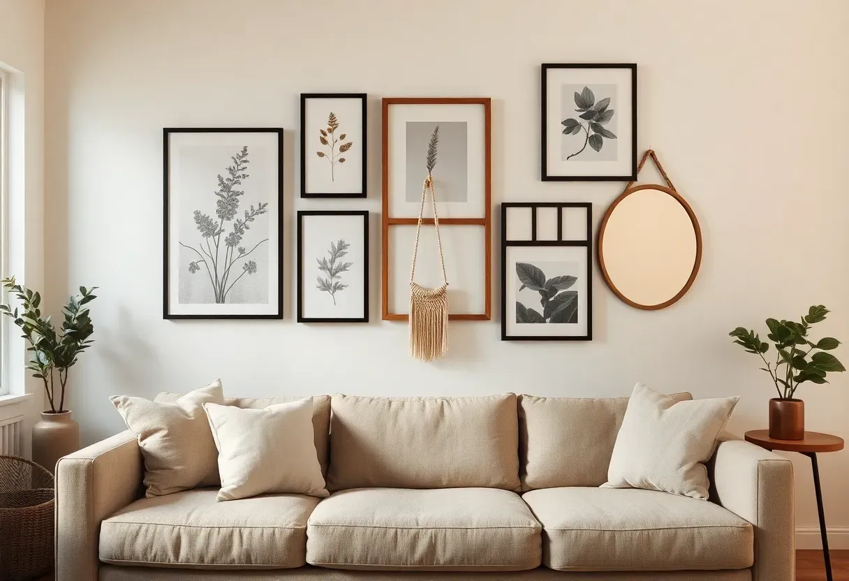
There are four main approaches: the grid (evenly spaced frames in aligned rows and columns — clean, modern, satisfying), the salon wall (frames at varying heights and sizes, densely packed — maximalist, warm, collected-over-time), the linear row (a single horizontal line of frames at one consistent height — graphic, architectural), and the organic cluster (an irregular grouping that expands and contracts — relaxed, personal, evolving). The layout should echo the room's overall aesthetic. Scandi-minimal rooms suit grids; warm bohemian rooms suit salon walls; contemporary rooms suit linear rows.
Do: look at 10-15 reference images of your chosen layout style before committing — it trains your eye for proportions Don't: mix grid and salon in the same display without a very deliberate reason — the result usually looks unresolved Pro tip: an organic cluster gives you the most flexibility to add and change pieces over time without redoing the whole arrangement
Recommended
Items for this idea
Step 3: Audit What You Already Own
Most people skip this — and it shows.
Before buying anything, gather every frame, print, photo, mirror, and wall object in your home onto the floor or a large table. You almost always have more usable material than you realize — framed pieces stored in closets, prints rolled in tubes, mirrors propped in corners. An audit also reveals what you're missing: if everything you own is the same size, you need variety in scale; if all frames are identical, you may want to introduce a second style. Approach this with curiosity, not obligation — an old frame with mismatched content can be re-matted or repurposed entirely.
Do: photograph what you lay out — it's much easier to make composition decisions from a photo than from life Don't: dismiss items just because they don't immediately seem "gallery-worthy" — a plain frame with new art inside becomes something else Pro tip: a piece you've lived with for years carries emotional resonance a new print never will; give owned pieces priority in the composition
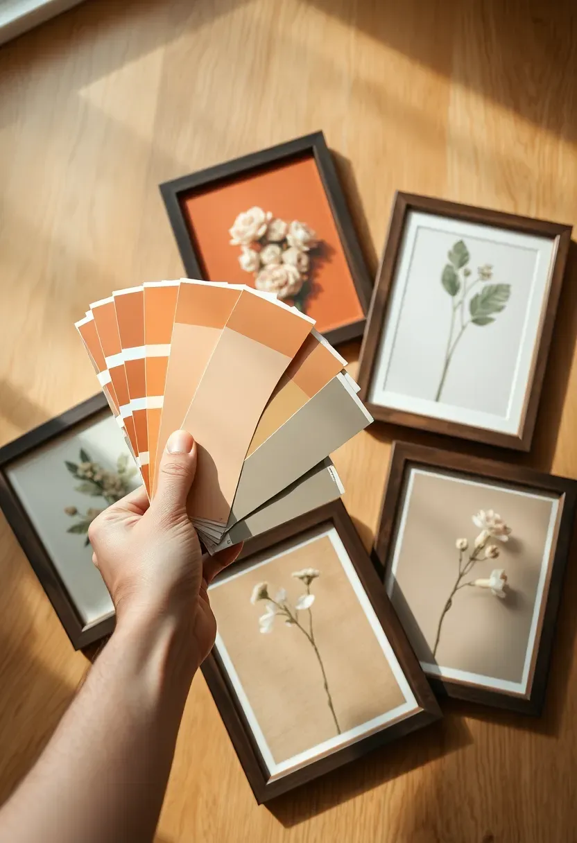
Step 4: Decide on a Color Palette
This is where the real transformation happens.
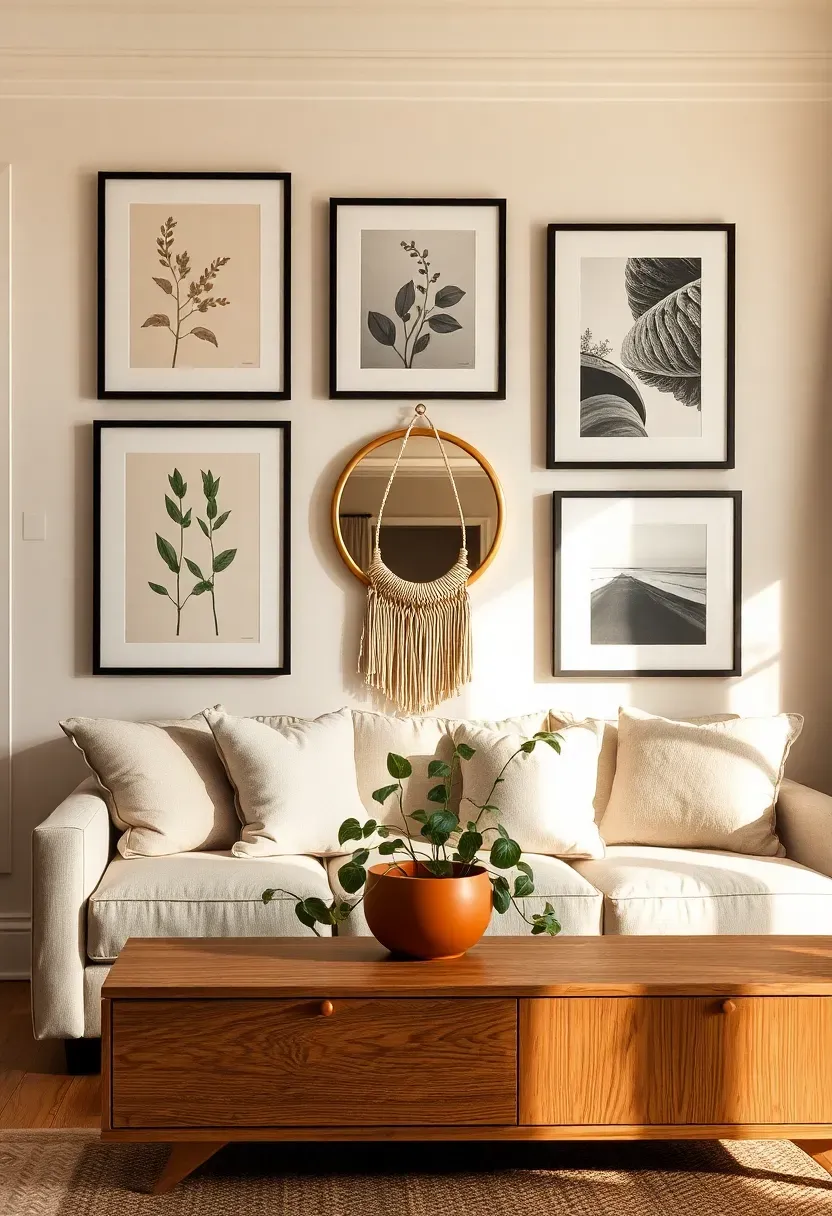
A gallery wall looks intentional when the pieces share a color story — even if the subjects are completely different. Choose 2-3 colors that recur across prints, mats, and frames. Warm neutrals (cream, sand, terracotta, warm grey) unify most collections without fighting for attention. Black-and-white photography can anchor an otherwise colorful group. A single repeating color — even just a terracotta accent that appears in 3 of 8 pieces — pulls everything into visual conversation. Write the palette down or save swatches before you buy any new art.
Do: hold candidate prints next to each other in natural light — colors that look compatible on screen often clash in person Don't: try to match every piece exactly — harmony, not uniformity, is the goal Pro tip: mat color is a powerful palette tool; remat existing frames in a consistent cream or warm white and a mismatched collection becomes a cohesive set instantly
Recommended
Items for this idea
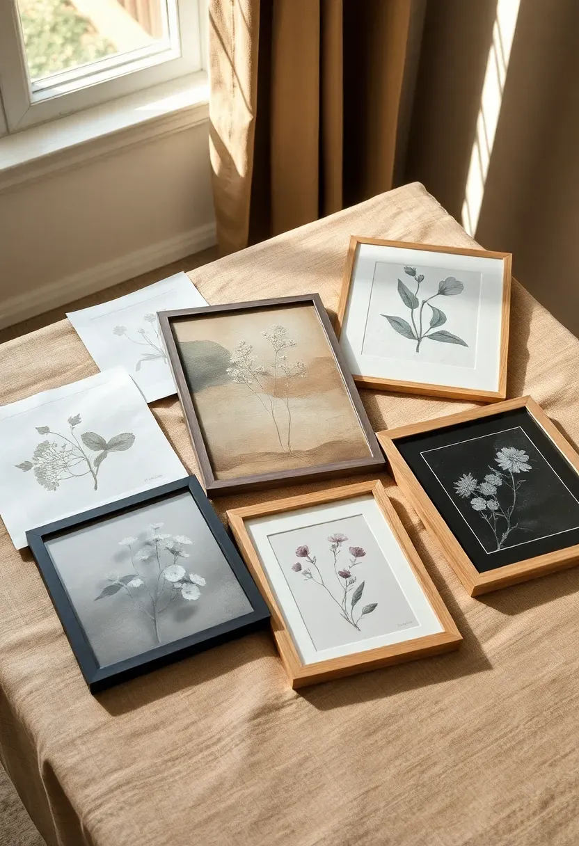
Step 5: Select Your Art and Objects
Don't rush this step — it makes the biggest visual difference.
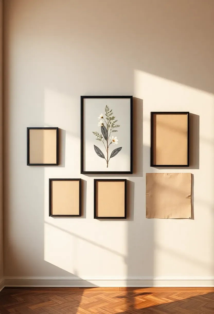
Aim for variety in three dimensions: subject (not all botanical, not all abstract — vary the visual vocabulary), scale (at least three sizes — anchor pieces, mid-size fillers, and small details), and medium (mixing photographs, prints, paintings, and objects prevents the wall from feeling like a catalogue). For a 17-piece display you might use: 1 anchor print (large), 4 medium prints, 6 smaller prints or photos, 2 mirrors, 2 3D objects, 2 text or quote pieces. The exact mix matters less than achieving variety in all three dimensions.
Do: give each piece a reason for inclusion — "it fills space" is not a reason; "the color echo makes the composition work" is Don't: use more than 2 pieces with text — text competes with images for attention and a wall full of quotes reads as a mood board, not a display Pro tip: a mirror at any scale adds light, creates depth, and reflects the room back — always include at least one
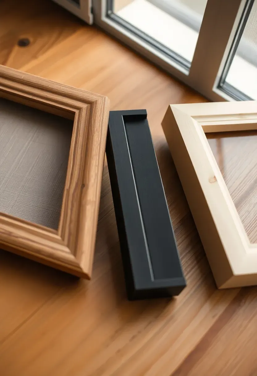
Step 6: Mix Frame Styles Intentionally
This is the step most first-timers get wrong.
Matching frames look rigidly uniform; random mismatched frames look chaotic. The sweet spot is a cohesive mix: choose 2-3 frame styles that share one common element. For example — matte black metal frames, dark walnut wood frames, and antique brass metal frames all work together because they share a dark, warm tone even though their materials differ. Or: raw oak, bleached wood, and cream-painted frames share a light, natural tone. The unifying element can be tone, material family, or profile width — as long as one connector runs through the set.
Do: lay all frames side by side on the floor before buying more — gaps in the mix become obvious when you see them together Don't: introduce a fourth frame style just to fill a gap in the composition — add another piece in one of your existing three styles instead Pro tip: painting mismatched thrift-store frames the same color is the fastest way to unify a collection that doesn't quite work
Recommended
Items for this idea
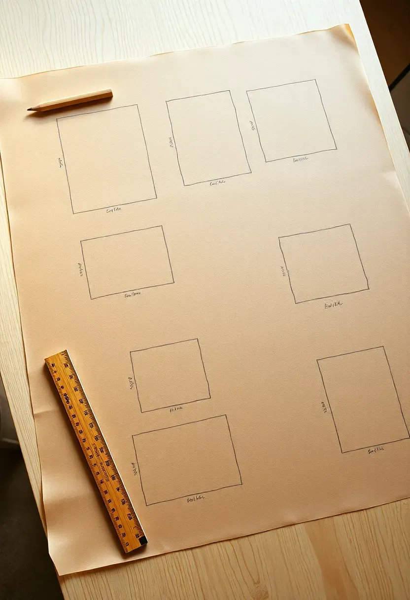
Step 7: Map the Composition on Paper
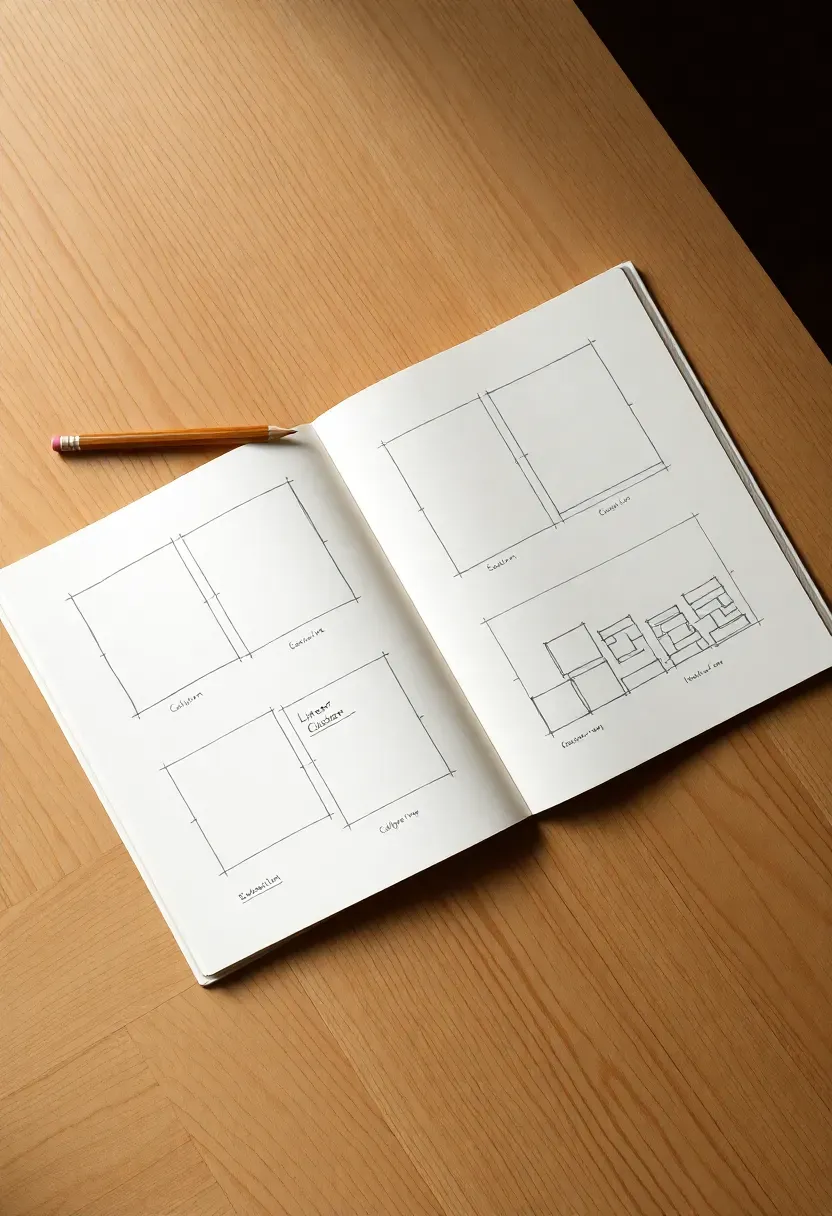
Don't touch the wall until you've done this.
On kraft paper or squared notebook paper, draw the wall to scale and sketch rectangles representing each piece. This is not about artistic skill — it's about working out spacing and balance before you make any holes. Equal spacing throughout (5–8 cm between pieces) looks grid-like and formal. Slightly varied spacing (5 cm here, 8 cm there) feels more organic. Aim for visual balance: not symmetry necessarily, but a roughly equal distribution of large and small pieces across the composition so no corner feels heavy or sparse.
Do: cut actual-scale paper rectangles and rearrange them physically on the sketch to test alternatives quickly Don't: commit to the first arrangement you draw — spend 20 minutes trying at least 3 variations before deciding Pro tip: photograph each arrangement with your phone before moving to the next — you'll want to compare and you won't remember the details
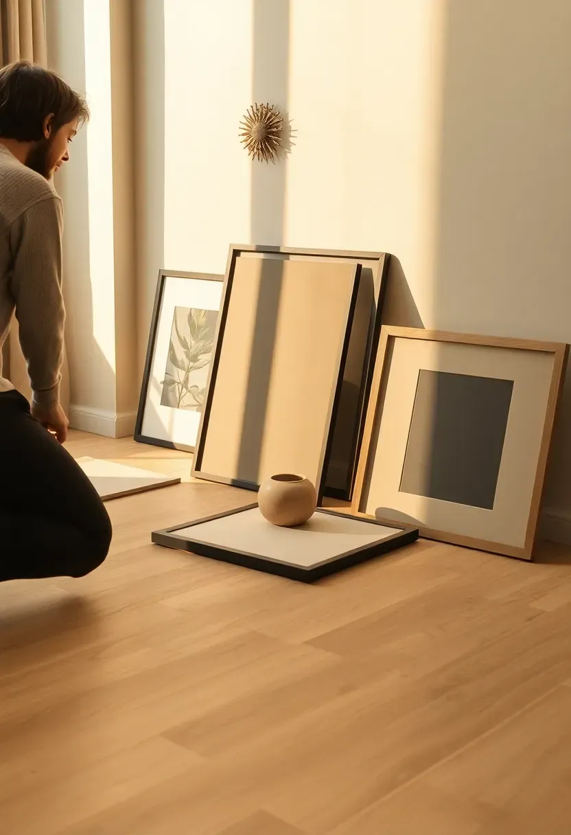
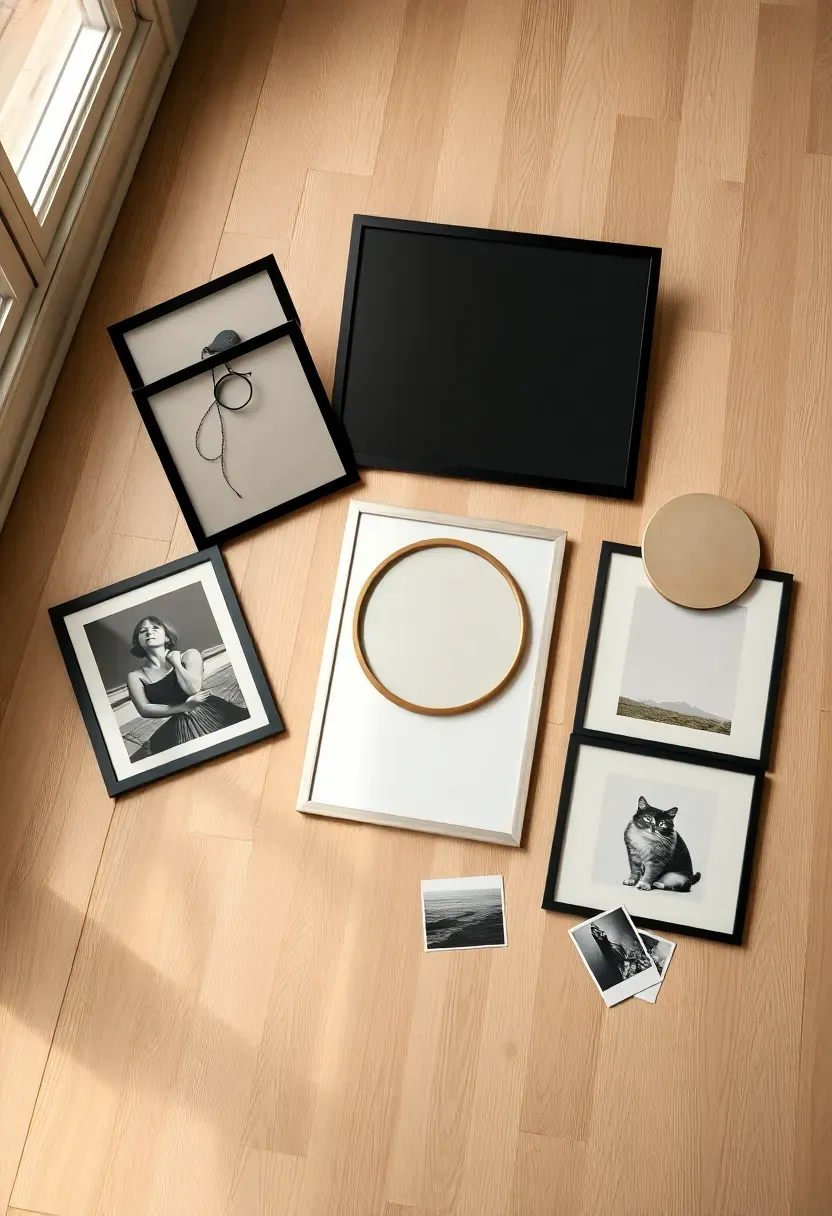
Step 8: Mock It Up on the Floor
Seeing the arrangement in three dimensions changes everything.
Lay all pieces on the floor in the exact arrangement from your paper sketch. Stand above and photograph it. Then walk around it and look at it from different angles. The floor test almost always reveals something the paper sketch missed: a frame that looks fine on paper dwarfs its neighbor in reality; two similar-colored pieces that worked separately look redundant side by side. Spend time moving things until the floor arrangement satisfies you. This is the cheapest and most reversible iteration stage — don't shortcut it.
Do: include any 3D objects (wall shelves, ceramic pieces) in the floor mock-up, even if they're just placeholders Don't: move to the wall until the floor arrangement feels genuinely good — every problem you solve on the floor is one you don't have to solve with plaster filler Pro tip: photograph the final floor arrangement from standing height — this approximates the wall view and becomes your installation reference
Recommended
Items for this idea
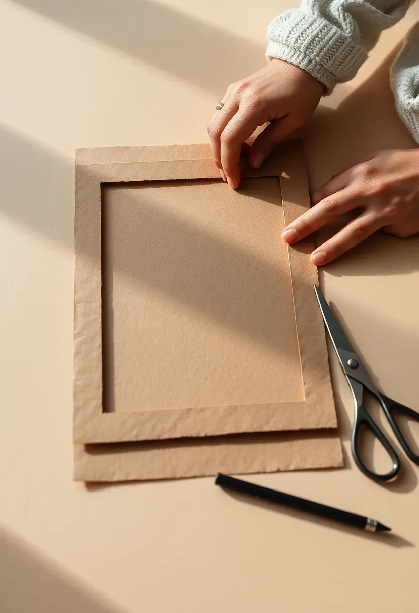
Step 9: Create Paper Templates
The difference between a clean install and a wall full of wrong holes.
Trace each frame onto kraft paper or newspaper and cut it out. Write the piece name and hanging mechanism on each template — "large botanical, D-ring, hook 4 cm from top." For pieces with wire hangers, mark the hanging point on the template: hold the wire taut and mark where it sits at picture-hanging height. This template maps the exact spot the nail needs to go, not just the frame outline. Accurate templates mean your first hole is the right hole — especially important when working with plaster that crumbles or walls that resist patching.
Do: label every template clearly on the front — you'll be working fast at the wall and can't afford confusion Don't: skip templates even for small pieces — small frames with slightly off nails are just as visible as large ones Pro tip: on the back of each template, write the final position from your floor mock-up (e.g. "top left, second row") so you can reconstruct the arrangement on the wall without re-sorting
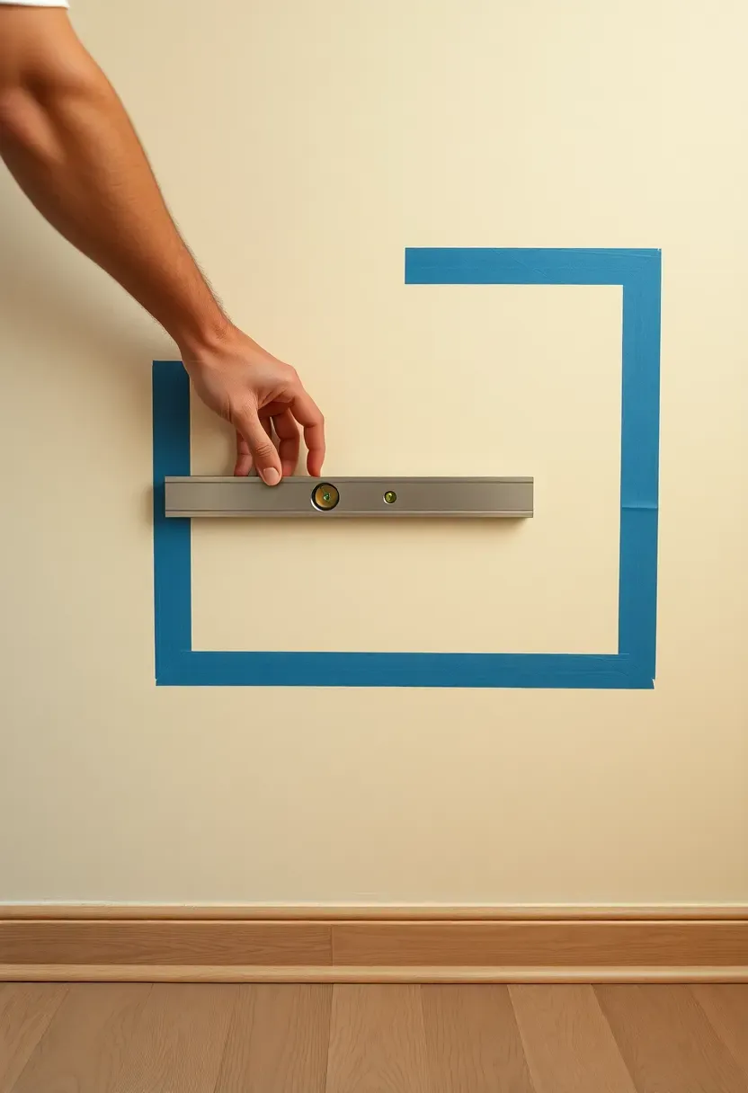
Step 10: Find Your Anchor Point
This is where your composition takes its first physical form.
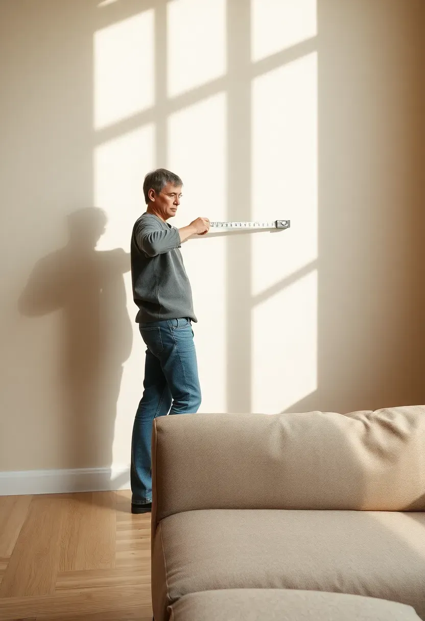
Every great gallery wall has an anchor — usually the largest piece, or the piece with the most visual weight. Establish where this anchor sits on the wall and work outward from it. For a wall above a sofa: the centre of the display should sit 57 cm (22 inches) from the floor as a standard eye-level reference — though you can adjust 5–10 cm for rooms with higher ceilings. Mark the anchor's center with a light pencil dot and use painter's tape to outline the intended total footprint of the display. Standing back at this point reveals whether the scale is right for the wall before a single nail goes in.
Do: use painter's tape to define the outer edges of the full display — it's the best preview of scale you can get without hanging anything Don't: start in a corner or edge — anchor to the wall's optical center relative to the furniture beneath it Pro tip: the 57 cm / 22-inch rule applies to the center of the entire arrangement, not the center of the anchor piece alone
Recommended
Items for this idea
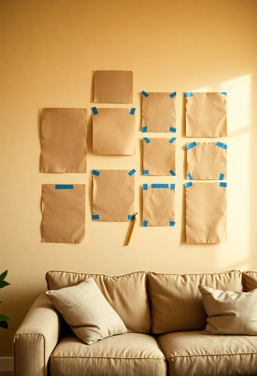
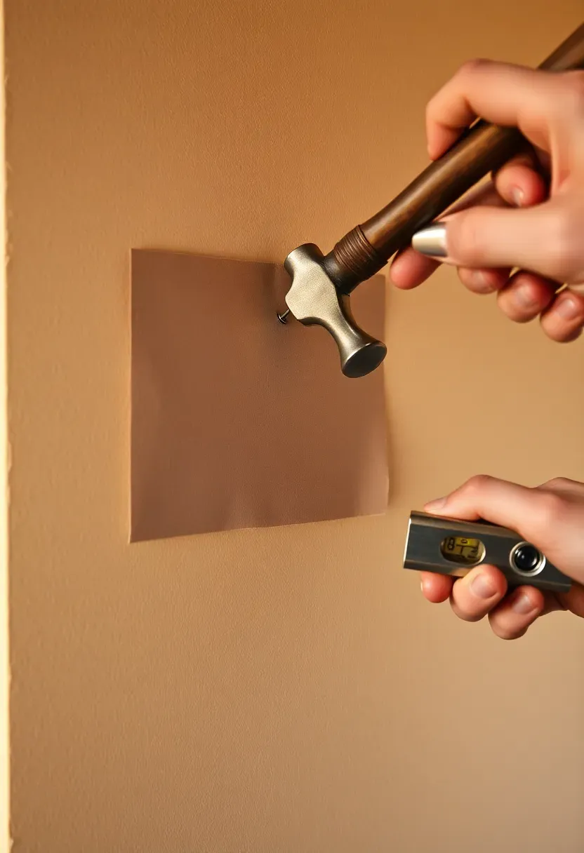
Step 11: Transfer Templates to the Wall
The most satisfying step before anything goes up permanently.
Using painter's tape, apply all paper templates to the wall in the arrangement you finalized on the floor. Step back. This is the moment to see the full composition at real scale for the first time. Check spacing — does it feel too open or too dense? Check visual weight — do all the large pieces cluster on one side? Check the boundary — does it feel proportionate to the wall, not too small and floating, not so large it crowds the ceiling and floor? Make adjustments now with tape instead of nails.
Do: live with the templates on the wall for an hour — walk past them, look at them from the room entrance, see how you feel Don't: rush to the nails the moment the templates are up — the template stage is your last free iteration Pro tip: if a piece feels wrong in its templated position, try rotating the template 90° or moving it to a different location — sometimes a piece belongs in the arrangement but not where you originally placed it
Step 12: Hang the Anchor Piece First
This locks the composition and every other piece aligns to it.
With templates still up, drive the nail for the anchor piece through the template itself — the template marks the exact nail position, so you don't need to measure again. Remove the template, hang the piece, and step back. Use a level to confirm it's straight. The anchor piece sets the visual key of the whole wall. If it hangs wrong — slightly tilted, or 5 cm too high — adjust now rather than after surrounding pieces complicate the fix. Getting the anchor perfectly positioned is worth 10 minutes of careful adjustment.
Do: use two nails for frames wider than 40 cm — a single hook allows wiggle room that shows in photos Don't: remove all templates to hang the anchor — keep the surrounding templates up so you can see the anchor in context immediately Pro tip: a small dab of toothpaste on the frame's hanging hardware, pressed to the wall, creates a precise marking for the nail — cleaner than measuring twice
Recommended
Items for this idea
Step 13: Build Outward from the Center
The anchor is in. Now the composition grows.
Work outward from the anchor piece, adding frames in the order that maintains visual balance as you go. Alternate sides: hang one piece to the left of the anchor, then one to the right, then one above, then one below. This keeps the composition balanced throughout installation and lets you step back after each addition to assess the overall arrangement. Remove each paper template as you hang the piece it represents. If the arrangement feels off as it builds — a gap that's too large, two similar pieces too close — stop and adjust before continuing.
Do: step back after every 2-3 additions to assess the whole wall, not just the piece you just hung Don't: hang all pieces on one side before doing the other — you lose the ability to make balancing corrections Pro tip: a rubber wedge from the hardware store slipped under the bottom of a frame prevents it from tipping forward — invisible and very effective
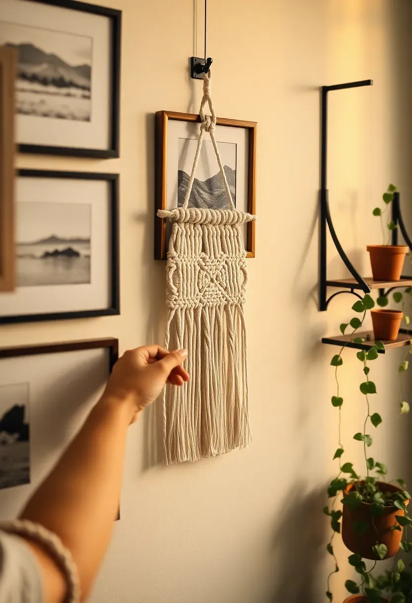
Step 14: Add Depth with 3D Objects
Flat art on a flat wall is good. Art plus dimension is great.
Three-dimensional elements — a wall-mounted shelf holding a small plant or ceramic, a macramé hanging, a sculptural metal piece, a mounted antler, a small mirror with dimensional frame — break the visual plane and give the display life that a flat grid of frames alone cannot achieve. Position 3D elements where they create height variation or punctuate a visual pause in the arrangement. They work best as accents — two or three in a 17-piece display — rather than scattered throughout. The contrast between flat and dimensional is what makes them effective.
Do: choose 3D elements that share at least one color or material with the framed pieces around them Don't: use 3D objects so large or dominant that they overwhelm the framed art — they should complement, not compete Pro tip: a small wall-mounted bracket shelf with a trailing plant is the single most effective 3D addition — it introduces organic softness that no framed print can replicate
Recommended
Items for this idea
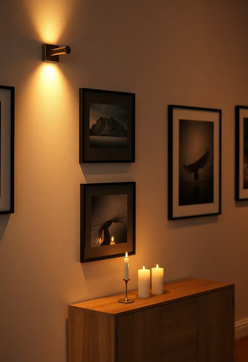
Step 15: Dial in the Lighting
Lighting transforms a wall display from visible to beautiful.
Most gallery walls are lit by whatever ambient light falls on them — which is almost never enough after dark. Dedicated lighting changes everything. A pair of adjustable picture lights (mounted on the wall or on the top of large frames) direct warm light exactly onto the art. A floor lamp positioned beside the display creates side-light that reveals texture in prints and casts interesting shadows from 3D elements. Wall sconces flanking the display add architectural weight. Whatever you use, stay at 2700K. Cooler light makes artwork look flat and washes out warm tones that make the display feel alive.
Do: test the display lighting after dark before finalizing — wall art looks completely different in evening light than afternoon light Don't: use spotlights aimed directly at shiny glass frames — the glare obliterates the art and looks harsh Pro tip: a plug-in picture light on a smart plug can be set to come on at dusk automatically — your wall display greets you every evening exactly as intended
Step 16: Step Back and Edit
The most underrated step in the whole process.
With everything hung and lit, walk to the opposite end of the room and look at the wall as you would as a visitor seeing it for the first time. What pulls your eye? Is there a cluster of small pieces that feels busy? A large gap that reads as accidental rather than intentional? A frame that seemed essential on the floor but feels redundant on the wall? Remove anything that isn't contributing. An edited gallery wall with 14 precisely right pieces is more powerful than an exhaustive display of 20 where 6 shouldn't be there.
Do: photograph the wall and look at the image on your phone — the camera's framing removes context clutter and shows you the wall as composition Don't: keep a piece just because you went to the effort of hanging it — sunk cost is not an aesthetic argument Pro tip: squinting at the wall blurs fine detail and reveals only mass and distribution — use this trick to spot imbalances instantly
Recommended
Items for this idea
Step 17: Photograph and Refine
A gallery wall is never truly finished — it evolves.
Take a proper photograph of the completed display: natural light from the side, camera at mid-wall height, no flash. This image becomes your reference when you add or swap pieces, and it's the document of what you built. Post it somewhere you can see it fresh — sometimes viewing your own work on social media or shared with a friend reveals something you stopped seeing because you're too close to it. Note one or two small refinements to address within the next week: a frame that needs re-leveling, a piece that might be replaced when you find something better. The wall is done — and it's alive.
Do: share the photograph with someone whose taste you respect and ask for one honest reaction — their eye is fresh in a way yours can't be Don't: declare the wall permanently finished — the best gallery walls evolve as your life and taste do Pro tip: keep a "swap file" — a folder or album of art you're considering for future additions — so when you want to refresh one piece you already have candidates ready
FAQ
Is it possible to create a gallery wall without making holes in the plaster? Yes — adhesive picture-hanging strips (like Command strips) hold frames up to 5 kg with no nails required. They're ideal for renters and for testing arrangements before committing permanently. The key is to follow the weight limits precisely and press them firmly for the full 30 seconds the instructions specify.
What's the best gallery wall layout for a small wall? A linear row — 3 to 5 pieces at the same height — works beautifully on narrow walls. It reads as deliberate rather than constrained, and a single horizontal line of art actually draws the eye across the wall, making it feel wider. Avoid dense salon-style arrangements on small walls — they tend to overwhelm.
Should all frames be the same size in a gallery wall? No — and in fact, uniformity of size is one of the most common mistakes. A mix of three sizes (one large anchor, several medium, a few small details) creates visual rhythm. If all frames are the same size, the eye has nowhere to travel and the display reads as repetitive rather than curated.
Can I mix black-and-white photos with color prints? Absolutely. The key is to treat the black-and-white pieces as a color in themselves — they bring neutral contrast that can anchor more colorful prints around them. Group black-and-white pieces in clusters of two or three rather than scattering them individually, which tends to look random.
How do I update a gallery wall without redoing everything? Swap one piece at a time rather than taking everything down. Remove a piece that no longer feels right, hang a new one in the same spot, and assess. Most adjustments only affect 1-3 pieces at a time. This incremental approach keeps the wall evolving without the upheaval of a full reinstall.
The best gallery wall you'll ever have is the one you actually start. Pick up a measuring tape and walk to the wall right now — the rest follows from there.
Pinterest cover for How to Decorate a Wall in 2026: 17 Steps to a Gallery-Worthy Display
About the author
OBCD
CGI visualization and interior design content. We create detailed 3D renders and curate practical design ideas for every room in your home.