How to Decorate Shelves Like a Stylist: 13 Simple Steps
Why do some shelves look like a boutique and others like a storage unit — even when both hold the same number of objects? The answer is never the objects themselves. It's the system behind them: the layering, the breathing room, the deliberate contrast of texture and height. These 13 steps unpack exactly how professional stylists think about shelves, so you can replicate the result in your own home — no design degree required.
Table of Contents
- What You'll Need
- Step 1: Clear Everything Off and Start Fresh
- Step 2: Audit What You Own
- Step 3: Establish a Color Palette
- Step 4: Gather the Right Proportions of Objects
- Step 5: Start with Books as Your Foundation
- Step 6: Add Height with Tall Objects
- Step 7: Layer in Art and Frames
- Step 8: Introduce Organic Elements
- Step 9: Style Mid-Level Objects with Intention
- Step 10: Use Negative Space Deliberately
- Step 11: Vary the Depth of Objects
- Step 12: Step Back and Edit Ruthlessly
- Step 13: Add the Finishing Sensory Layer
What You'll Need
- All existing shelf objects (cleared off and audited)
- Books in 2-3 color-compatible spine tones
- 1-2 tall objects: a vase, a sculptural lamp, a tall ceramic
- 2-3 medium objects: smaller vases, ceramics, a candle in a holder
- 1-2 small framed prints or postcards for leaning
- 1-2 trailing or low plants (pothos, string of pearls, or small succulent)
- A small basket or lidded box for visual rest and hidden storage
- A tray (to group small objects and add a boundary)
- Acrylic or brass bookends (optional)
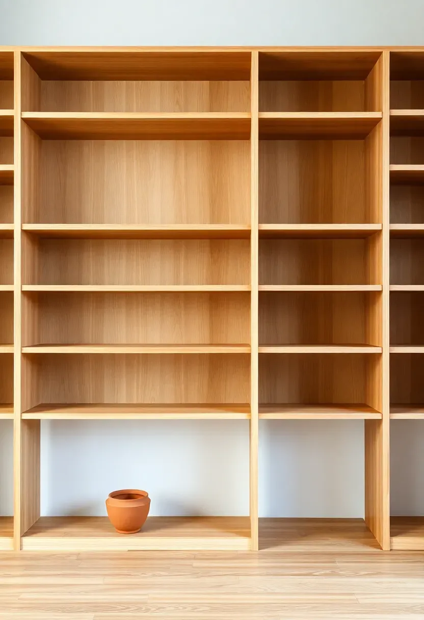
Step 1: Clear Everything Off and Start Fresh
This is the foundation everything else builds on. You cannot style a shelf well if you're working around things that are already there.
Remove every single object. Yes, every one. Place them on a table or floor where you can see them together. Wipe down the shelf surfaces. Now look at the shelves as architecture — notice the shelf heights, the depth, the number of sections. A shelf with all equal-height bays will be styled differently from one with a tall open section beside a row of smaller cubbies. Understanding the structure you're working with is step one — it dictates how you'll distribute weight, height, and density across the layout.
Do: photograph the empty shelves — you'll reference this image later to understand what spatial relationships you've created Don't: put anything back until you've completed Step 2 — the urge to fill the emptiness too quickly produces exactly the cluttered result you're trying to avoid Pro tip: if any shelf is adjustable, now is the time to raise or lower it to better suit the objects you plan to place on it
Step 2: Audit What You Own
Most people skip this — and it shows. Styling with the wrong objects is worse than styling with fewer objects.
Pick up every item that lived on those shelves and ask one question: does this earn its place? "Earning a place" means one of two things — the object is visually interesting (interesting form, texture, or color) or it carries genuine personal meaning. Objects that fail both tests are storage, not styling. Create two piles: Keep and Remove. Be more ruthless than feels comfortable. Most shelves are improved by removing 30-40% of what was on them. The objects that remain should each have a reason to be visible. Everything else goes in a cupboard or a donation box.
Do: consider an object's silhouette, not just its surface — a matte terracotta pot with a clean curve will look considered at any distance; a novelty mug printed with a logo will not Don't: keep an object on the shelf simply because it was a gift or it cost money — neither reason makes it visually worth displaying Pro tip: objects that fail the Keep criteria but hold sentimental value belong in a drawer or a box, not on display where they dilute your styling
Recommended
Items for this idea
Step 3: Establish a Color Palette
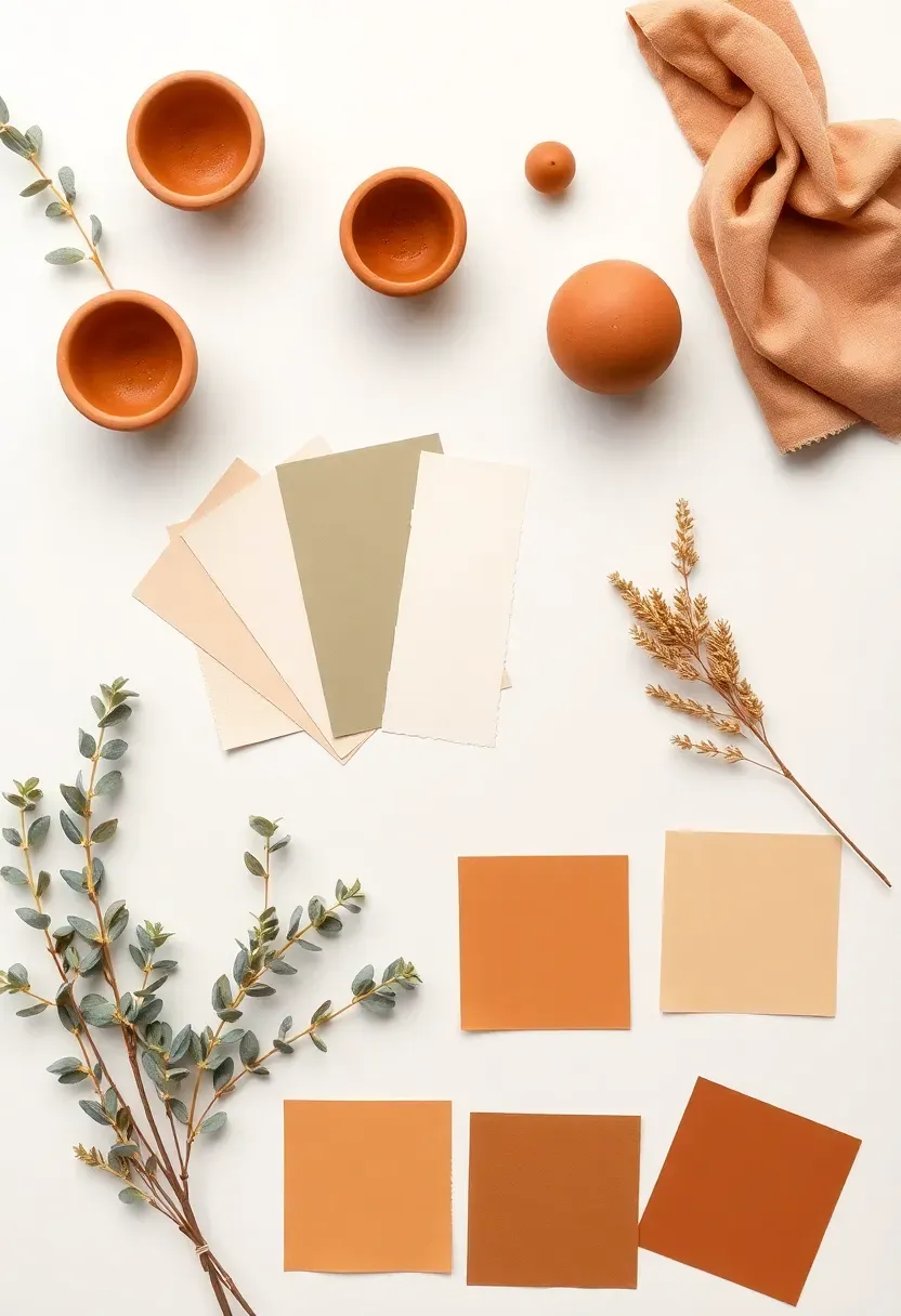
Get this right and the rest falls into place. A shelf styled in two or three tones always reads as intentional; a shelf with eight different colors always reads as chaotic — even if the individual objects are beautiful.
Select two anchor colors and one neutral. For a warm living room, that might be cream (neutral), terracotta (warm anchor), and sage green (cool anchor). For a more graphic look: warm white (neutral), black (anchor), and warm wood (anchor). Now check your Keep pile from Step 2 against this palette. Objects that fall outside it — a bright cobalt vase, a neon-spined book — either get edited out or moved to a different shelf. Every object you place from this point forward must belong to your palette. This single constraint is what separates styled shelves from accidental ones.
Do: pull the palette from existing room elements — sofa color, rug tones, wall paint — so the shelf reads as part of the room, not separate from it Don't: use more than three colors — each additional tone fragments the visual field and demands more mental processing from anyone looking at the shelf Pro tip: warm neutrals (cream, linen, warm white) are the best shelf backgrounds because they let textured objects read clearly without competing color noise
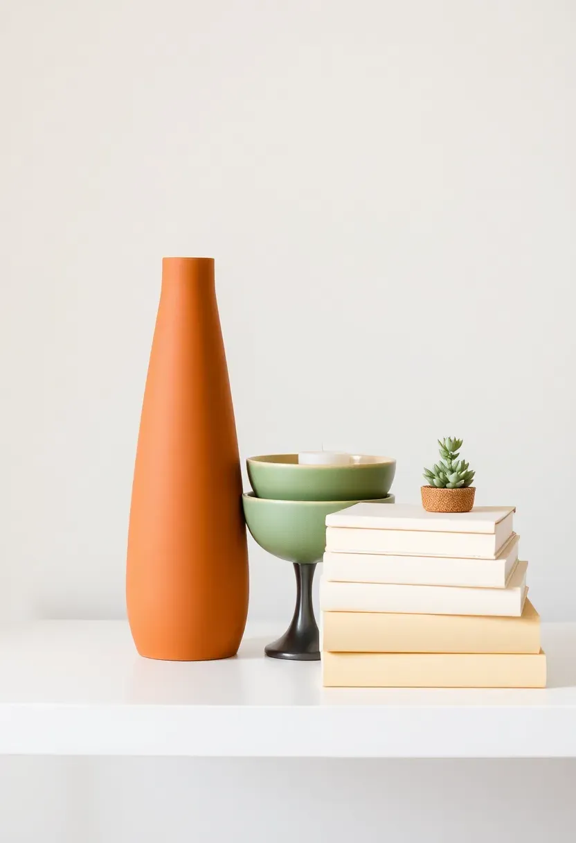
Step 4: Gather the Right Proportions of Objects
Don't rush this step — it makes the biggest visual difference. The ratio of tall to medium to small objects determines whether a shelf looks dynamic or flat.
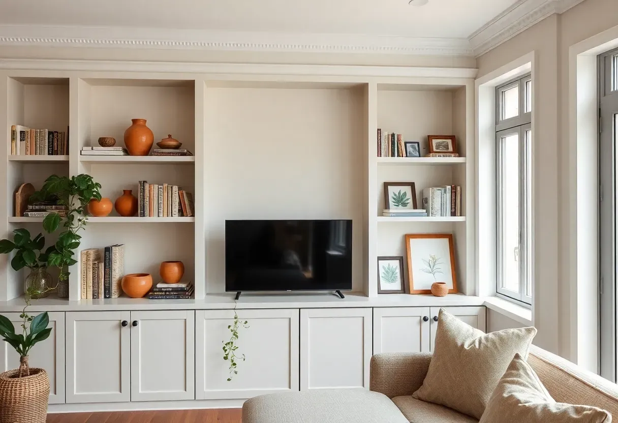
A well-proportioned shelf has roughly: one tall object (30-45 cm height) per shelf section, one or two medium objects (15-25 cm), and two or three small or horizontal elements (books, trays, small ceramics). Think of it as a skyline: tall peaks, medium plateaus, and low foreground elements. If every object is the same height, the eye travels across the shelf in a flat line and registers nothing interesting. If you have too many tall objects, the shelf feels crowded at the top and empty at the base. Group objects into these three height categories before you begin placing — it makes the styling process intuitive rather than reactive.
Do: measure your tallest object and your shortest — aim for a height ratio of at least 3:1 across a single shelf section Don't: mix more than two tall objects in the same shelf section without a clear height difference between them — near-equal heights create a fence-line effect Pro tip: a stack of 2-3 books lying horizontally creates an instant mid-height platform — place a small object on top to gain a fourth visual height level from just two items

Recommended
Items for this idea
Step 5: Start with Books as Your Foundation
Books are the most underrated styling tool on a shelf. They provide horizontal weight, variable height, and a natural backdrop for objects placed in front of them.
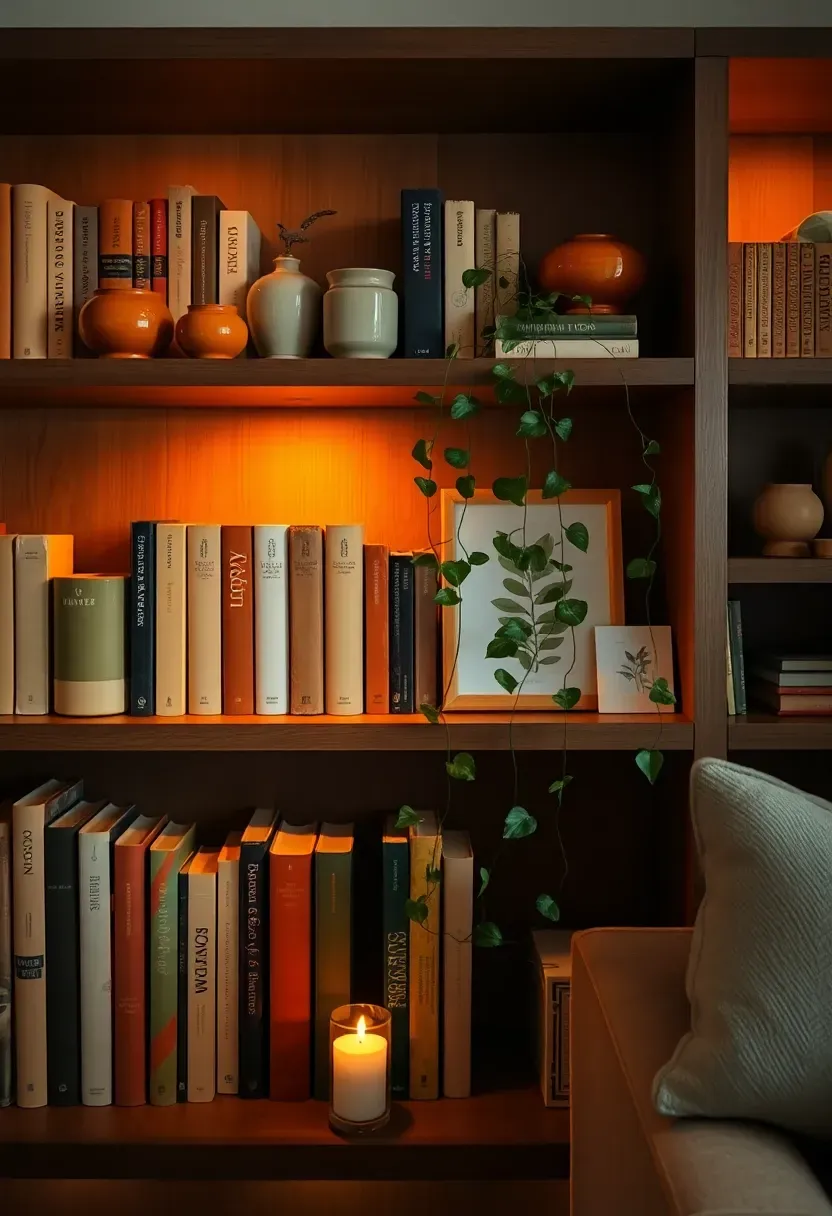
Begin each shelf section by placing your books first — before any decorative object. Arrange them in two ways: some standing upright (spines facing outward, grouped by spine color rather than title or genre), and some stacked horizontally in piles of 2-4 with the most visually interesting cover or spine on top. Turn some spines inward to show just the cream or cream-beige page edges — it instantly reduces color noise and adds a gallery-like restraint. Leave deliberate gaps between book groups: these gaps are where your decorative objects will live. Books without gaps produce a wall of spines; books with intentional gaps produce a shelf with rhythm.
Do: group books by spine color — all creams together, all dark spines together — rather than alphabetically or by genre Don't: mix vertical and horizontal stacks randomly — group your horizontal stacks as platforms (2-4 books, one pile) and keep vertical runs consistent within a section Pro tip: removing dust jackets from hardcovers often reveals a plain linen or cloth spine in cream, black, or grey — far more stylish and shelf-friendly than the printed jacket
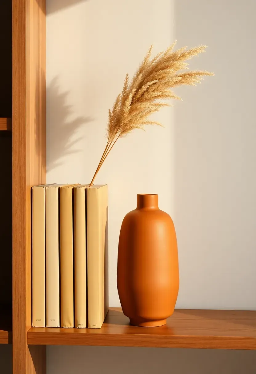
Step 6: Add Height with Tall Objects
A shelf without a tall anchor element reads as timid. Height creates drama, draws the eye upward, and makes a display feel confident rather than cautious.
Place your tallest object — a vase, a sculptural ceramic, a small plant in a tall vessel, a candle lantern — first in each shelf section. Position it off-center (at the left or right third rather than the center). This single placement defines the visual peak of the section and sets the composition in motion. In sections with more vertical space, dried stems in a tall vase add height without bulk — pampas, eucalyptus, or simple dried grasses read beautifully against a neutral wall. The tall element doesn't need to be expensive; it needs to have a clear, clean silhouette.
Do: position the tall element at the left or right third of the shelf section — centered tall objects feel static; off-center creates movement Don't: use multiple same-height tall objects side by side — they compete rather than complement each other Pro tip: a stack of books plus a medium vase on top can function as a composite tall element — it creates more visual interest than a single tall object because it introduces two textures and a height break
Recommended
Items for this idea
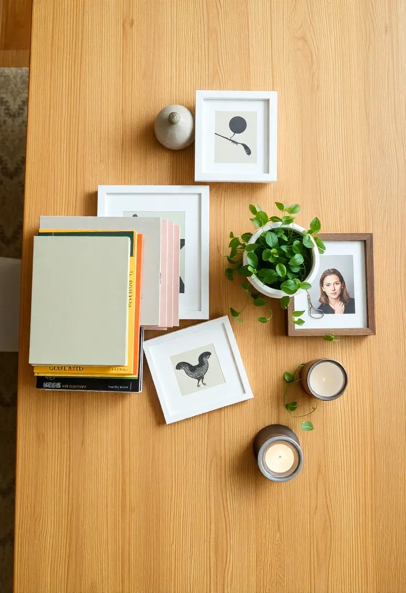
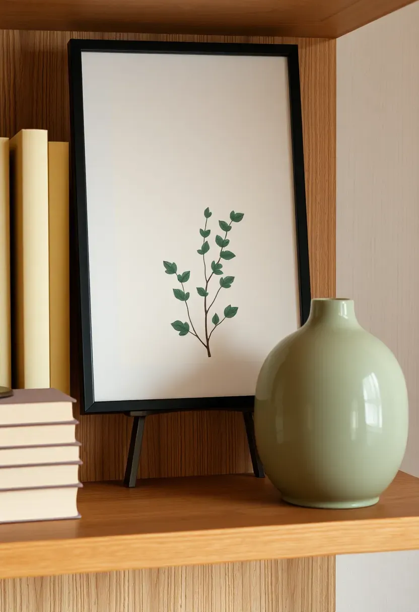
Step 7: Layer in Art and Frames
This is where the real transformation happens. Art on a shelf — leaning rather than hung — is one of the most powerful styling moves available, and almost no one uses it.
A small framed print (15×20 cm or A5 size) leaned casually against the back wall of a shelf section adds color, subject matter, and a sense that the shelf has been considered like a room within a room. Use prints that pick up a tone from your palette — a botanical illustration in sage, an abstract with a terracotta stroke, a black-and-white photograph in a walnut frame. The leaned frame also creates an immediate foreground-background relationship: objects in front of the frame appear to exist on a stage. This spatial depth is exactly what separates a styled shelf from a filled one. One leaned print per shelf section is enough; two in the same section only works if one is significantly smaller.
Do: lean prints slightly forward from the shelf back rather than pressing them flush — the slight forward tilt catches light and makes them feel casual and intentional simultaneously Don't: hang frames on the shelf back wall — leaning is the technique, not mounting Pro tip: a postcard or an unframed art print propped against a book spine (rather than a framed piece) reads as more relaxed and effortlessly styled — particularly effective on lower shelf sections
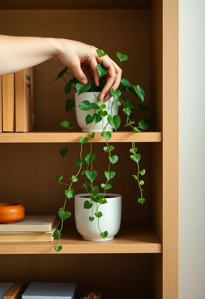
Step 8: Introduce Organic Elements
Without organic elements, shelves look like showrooms. With them, they look lived in. The difference is entirely the presence of something that grows, breathes, or was once alive.
Plants are the most effective organic element: a trailing pothos with tendrils spilling over the shelf edge, a small succulent in a textured ceramic pot, a short eucalyptus branch in water, or a sprig of dried lavender in a bud vase. Place trailing plants on mid or lower shelves where the trailing effect reads clearly. Place upright plants (a small sansevieria, a radiator plant) where vertical structure supports the composition. Dried stems in tall vases count as organic elements too — they provide texture and movement without requiring care. The organic element should feel like the shelf belongs to someone who lives there, not someone staging it for sale.
Do: choose plants with interesting leaf shapes or trailing habits — a philodendron, pothos, or string of pearls adds far more visual interest than a generic spider plant Don't: overcrowd a section with multiple plant types — one organic element per shelf section is the maximum; two reads as a garden center Pro tip: dried elements (pampas, cotton stems, preserved eucalyptus) look just as good as live plants and require zero maintenance — a practical option for high shelves that get less attention
Recommended
Items for this idea
Step 9: Style Mid-Level Objects with Intention
Mid-level objects — ceramics, candles, small bowls, sculptural pieces — are the supporting cast. They fill the visual space between the tall anchor objects and the low horizontal books. The error here is treating them as fillers rather than participants.
Group mid-level objects in odd numbers: one, three, or five per section. A single mid-height ceramic beside a stack of books has presence. Three ceramics of slightly different heights in the same palette read as a considered collection. Place them on a tray to create a boundary — a tray signals "this is a group" and elevates ordinary objects to a deliberate still life. Vary the surfaces within the group: one matte, one slightly glazed, one rough-textured. Surface variety makes a single-palette grouping look richer without adding more color.
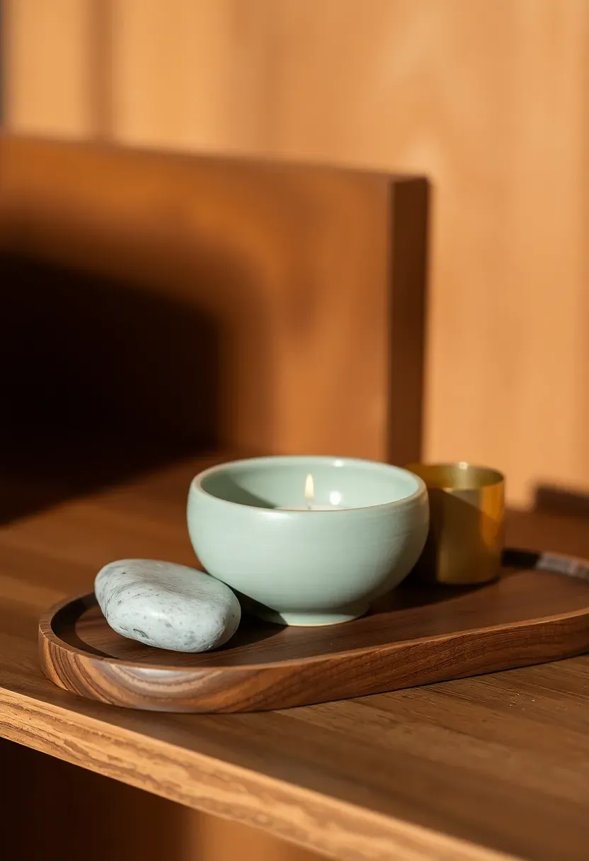
Do: use a small tray or a flat stone as a base for groupings — it unifies objects that differ in shape and height into a single visual unit Don't: distribute mid-level objects evenly across every shelf section — concentrate them in two or three areas and leave other sections sparser Pro tip: a small candle in a holder counts as a mid-level object and adds the bonus of ambient light — even unlit, a candle suggests warmth
Step 10: Use Negative Space Deliberately
Most people fill every available shelf surface. Professional stylists leave sections deliberately bare — and those empty sections are as important as the styled ones.
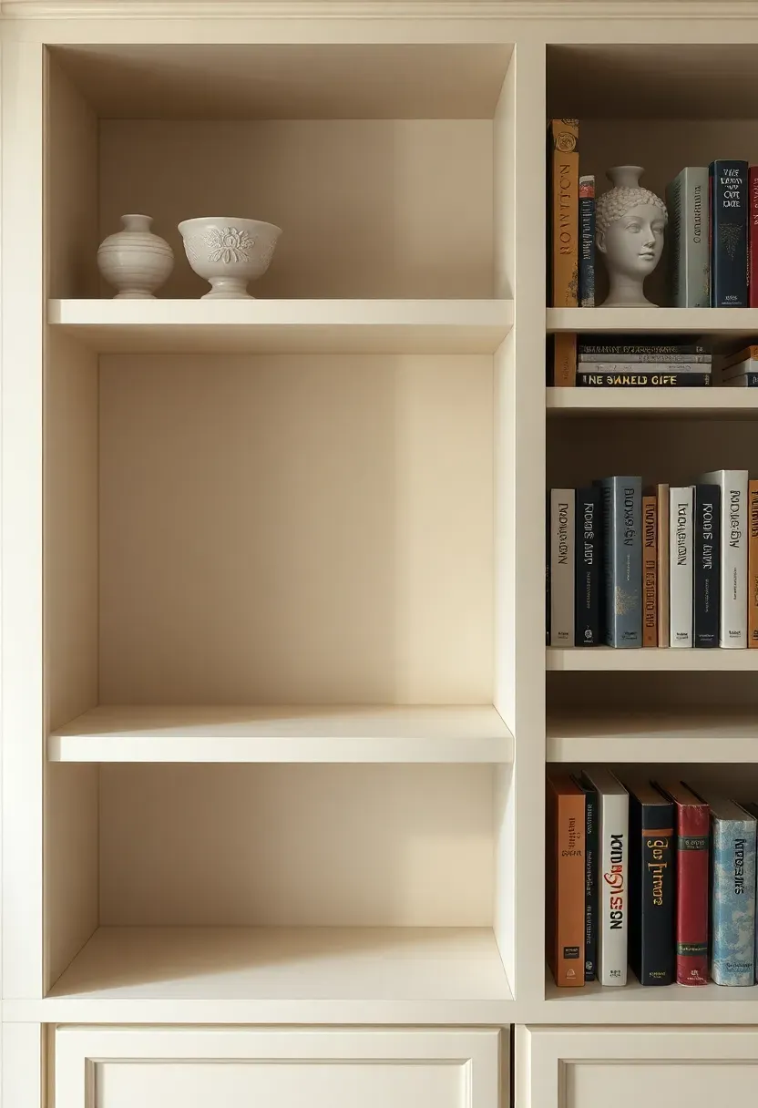
Negative space on a shelf does two things: it gives the eye a place to rest, and it makes the styled sections feel intentional rather than crowded. Aim for at least one-third of your total shelf surface to be empty or nearly empty. This might mean one entire shelf section left clear. It might mean the right third of each shelf section holding nothing. The placement of negative space matters: empty sections on the upper shelves feel airy; empty sections at eye level create dramatic contrast with the richly styled sections beside them. Empty space is not a styling failure — it's the visual equivalent of the pause in music.
Do: photograph the shelves at this stage and identify any section where your eye stops uncomfortably — that stopping is usually a sign of too much density Don't: fill negative space with objects that "might work" — the space is a design choice, not a gap to solve Pro tip: if a shelf section holds a single beautiful object with empty space on either side, that object will command more attention than it would surrounded by ten other pieces
Recommended
Items for this idea
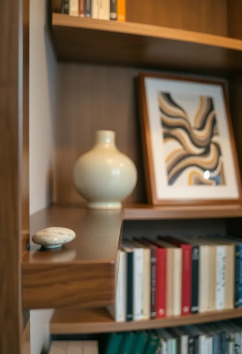
Step 11: Vary the Depth of Objects
A flat shelf styling — where everything is pushed to the same depth — looks two-dimensional regardless of what's on it. Varying depth creates the illusion of three-dimensional space and makes a shelf photograph like a professional interior.
Pull some objects to the very front edge of the shelf — especially small, low objects like stones, candle holders, or tiny vases. Push taller objects toward the back. Lean framed prints flush against the back wall. Place a small plant at mid-depth. The result is a spatial composition with a foreground, middle ground, and background layer — the same principle used in professional photography staging. Depth variation also means objects partially obscure each other, and partial concealment is one of the most powerful tools in styling: a vase 80% visible behind a book stack looks more intriguing than the same vase in full view in open space.
Do: check your shelves from directly in front and from a low angle — the depth layering should be visible from both perspectives Don't: push everything to the back of the shelf "for safety" — objects at the shelf edge feel confident and deliberate Pro tip: one object hanging very slightly over the shelf edge (a trailing plant tendril, a small stone balanced at the lip) draws the eye downward and makes the whole shelf feel more dynamic
Step 12: Step Back and Edit Ruthlessly
The shelf looks styled. Now do the one thing that separates a good result from a great one: step back to the other side of the room and spend five minutes looking without touching.
Stand three meters away. Photograph it on your phone. Flip the image horizontally and look at the mirror version — asymmetry and imbalance become obvious in a flipped image that your eye normalizes in the original. Ask: Is there one object pulling disproportionate attention? Is any section too dense? Is the palette still coherent across all sections, or has a rogue color crept in? Then remove. Remove the object that's the wrong tone. Remove the shelf section that's too full. Remove the second plant that you convinced yourself was necessary. Subtraction at this stage almost always improves the result. The instinct to add more is the enemy of a well-styled shelf.
Do: photograph from both eye level and sitting height — the same shelf reads very differently from a sofa position Don't: make edits immediately after you notice something — write down three things you want to change, then make all the edits at once Pro tip: if you cannot decide whether an object belongs, remove it for 24 hours — if you don't miss it, it doesn't belong
Recommended
Items for this idea
Step 13: Add the Finishing Sensory Layer
A shelf that looks finished can still feel incomplete. The final layer isn't visual — it's sensory. It's the detail that makes the shelf feel like a space that's inhabited rather than arranged.
Light a candle that's already on the shelf. Photograph the shelf in the evening with the room lamps on — the warm light will catch the ceramics differently and reveal whether the palette works by night as well as by day. If you have a reed diffuser or a scented candle that fits within your palette (earthy amber, warm cedar, soft linen), add it at this point rather than as a placeholder object earlier. The scent in the room ties the visual experience to a second sense in a way that makes the space feel complete in a way photographs cannot capture. Then stop adjusting. Declare it finished. Come back in a week and make one small change — that rhythm of small edits over time is how stylists keep a shelf feeling fresh indefinitely.
Do: photograph the finished shelf in natural daylight and in evening lamp light — the best shelf styling looks rich in both Don't: continue editing daily — a shelf styled once and left alone for a week develops a settled, lived-in quality that constant adjusting prevents Pro tip: change one small object per season — swap dried summer grasses for winter eucalyptus, add a citrus-colored element in spring — and the shelf stays current without requiring a full re-styling
FAQ
Should every shelf section be styled differently, or should there be a repeating pattern? Vary the styling approach per section but maintain a consistent palette and object language. For example, every section might include at least one ceramic and one plant element, but no two sections should have the same tall-object-plus-books arrangement. Visual repetition at the palette level creates coherence; repetition at the arrangement level creates monotony.
Is it possible to style shelves on a tight budget without buying new objects? Absolutely. The most common transformation comes from removing half of what's there, turning some book spines inward, and rearranging the remaining objects with the height and depth principles in these steps — all before spending a single dollar. If you want to add one thing, a trailing pothos in a basic ceramic pot costs under $15 and transforms a shelf section more effectively than most decorative objects at five times the price.
Can I style shelves in a rental property if I can't make changes to the unit? The shelf itself doesn't need modification. The styling sits on top of what exists. Renters have the same access to all 13 steps — the only difference is that wall-mounted shelves are already fixed. The constraints (shelf height, number of sections, depth) just become the parameters you work within. Freestanding bookcases can be added to any rental without landlord approval.
What's the difference between a styled shelf and a shelf that just looks cluttered? The single biggest difference is palette coherence. A shelf holding 20 objects in three tones always reads as styled; a shelf holding 12 objects in seven different colors always reads as cluttered — regardless of the number of items. The second difference is negative space: a styled shelf has deliberate empty areas; a cluttered shelf uses every available surface. If your shelf currently feels cluttered, removing 30-40% of the objects and committing to a three-tone palette will produce the biggest visible change of anything you could do.
How often should shelf styling be refreshed? A full re-style every 6-12 months keeps a shelf from becoming invisible (our brains stop registering things we see every day). Between full re-styles, one small seasonal swap — a new plant, a different candle, a replaced print — every 6-8 weeks maintains the sense that the shelf is alive rather than static.
Start with Step 1 this afternoon: clear the shelf entirely and look at what you're actually working with. Everything else follows from there.
Pinterest cover for How to Decorate Shelves Like a Stylist: 13 Simple Steps
About the author
OBCD
CGI visualization and interior design content. We create detailed 3D renders and curate practical design ideas for every room in your home.