How to Decorate Floating Shelves: 15 Steps to a Beautiful Display
Most floating shelves end up as visual clutter — too many objects competing, no sense of rhythm, nothing that makes you want to stop and look. But a well-decorated shelf is one of the most powerful styling tools in a home. These 15 steps give you a clear, repeatable framework for building displays that feel curated rather than accumulated — starting from blank shelf to beautiful in a single afternoon.
Table of Contents
- What You'll Need
- Step 1: Clear and Clean Your Shelves
- Step 2: Define a Color Palette
- Step 3: Audit Your Existing Objects
- Step 4: Identify Your Anchor Pieces
- Step 5: Choose One Trailing or Organic Element
- Step 6: Gather a Book Stack
- Step 7: Add a Small Framed Print
- Step 8: Place Your Anchor Piece First
- Step 9: Build in Triads
- Step 10: Vary Heights Deliberately
- Step 11: Leave Strategic Empty Space
- Step 12: Rotate Seasonal Accents
- Step 13: Step Back and Photograph
- Step 14: Edit Ruthlessly
- Step 15: Lock in the Final Arrangement
What You'll Need
- Soft cloth and mild cleaner for shelf surfaces
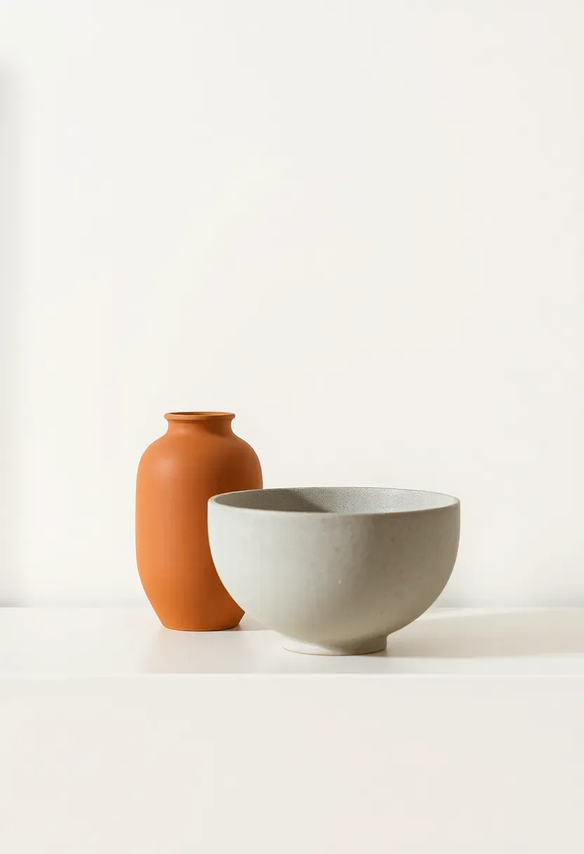
- 1-2 anchor objects (a sculptural vase, a ceramic bowl, or a small statue — 20-35 cm tall)
- 1 trailing plant or a stem in a slim bud vase (pothos, ivy, or eucalyptus)
- 3-5 books to stack horizontally (spines turned inward or coordinated by color)
- 1 small framed art print or photograph (13×18 cm to A4)
- 2-4 supporting objects in your palette (small ceramics, a candle, a stone, a woven basket)
- A phone or camera for evaluation photographs
- Optional: a small LED puck light or battery-powered strip light for under-shelf glow
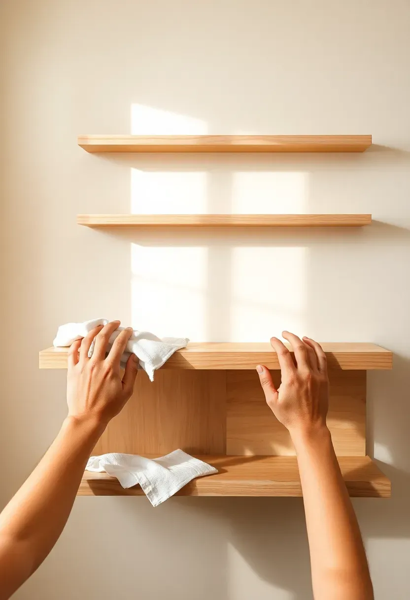
Step 1: Clear and Clean Your Shelves
This is the foundation everything else builds on. Starting from zero — a genuinely empty, clean shelf — changes how you see the space and forces intentional decisions rather than incremental rearranging.
Remove everything. Every object, every forgotten pen, every piece of paper that migrated there from a table. Wipe the shelf surface with a damp cloth. Look at the bare shelf against the wall and consider: what is this shelf's job? Purely decorative? Partly functional storage? A mix? A shelf that needs to hold a router, two chargers, and a stack of magazines needs a different approach than one that is purely for display. Getting clear on this before placing a single object saves enormous time and prevents the "why does this never look right" problem most people encounter.
Do: take a photograph of the empty shelf in its space before you begin — it helps you see proportions clearly when you step back later Don't: start rearranging the objects you already have without editing them first — most shelves look cluttered because too many objects remained from a previous arrangement Pro tip: tape a strip of painter's tape along the wall 5 cm above the shelf to give yourself a visual ceiling line — it helps you see when objects are too tall for the space
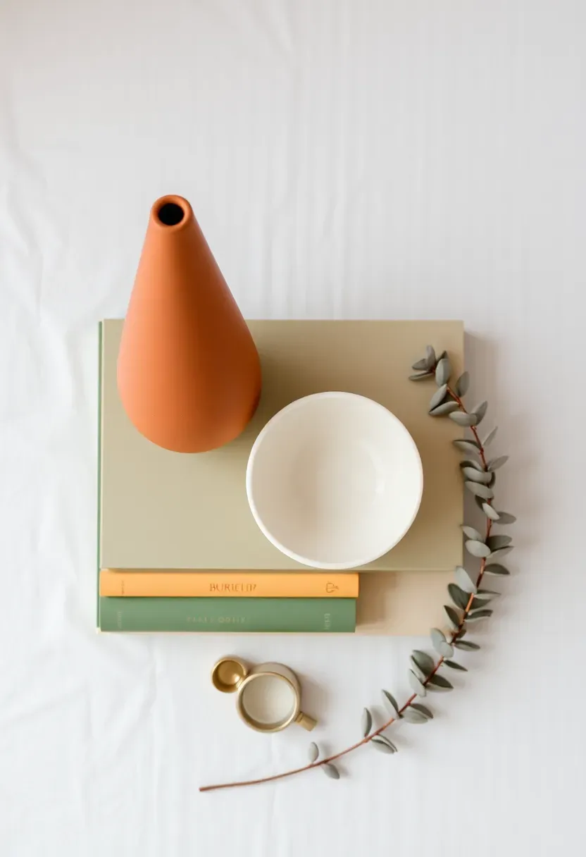
Step 2: Define a Color Palette
Most people skip this — and it shows. A shelf that works visually is almost always built around a clear, limited palette. A shelf that looks like a flea market usually contains 6 or more unrelated colors.
Choose three tones maximum: one dominant neutral (the shelf surface or wall color does this work naturally), one mid-tone that appears in at least three objects, and one accent color used sparingly in one or two pieces only. For warm-neutral homes: cream, terracotta, and sage. For cooler modern spaces: white, charcoal, and brass. For a rustic tone: warm white, dark walnut, and dusty olive. Write the palette down. Every object you place on the shelf from this point forward must contain at least one of these three tones — or it doesn't belong there. This sounds restrictive. It is. That restriction is what makes the shelf look designed.
Do: pull your palette directly from the room — the sofa color, the rug, the curtains — so the shelf feels embedded in the space rather than decorating on top of it Don't: try to include every color you like — the shelf is a composition, not a collection Pro tip: a monochromatic shelf (all tones within the same color family) is almost foolproof — it reads as sophisticated and is very difficult to accidentally ruin
Recommended
Items for this idea
Step 3: Audit Your Existing Objects
With your palette in hand, go through every object you'd previously placed on these shelves — or the objects you were planning to use — and sort them into two groups: palette-compatible and everything else.
Be merciless. A beautiful object in the wrong color is still the wrong object for this shelf. The items that don't match the palette don't get placed on this shelf — they go to a different room, get stored, or get donated. This is not about being precious: it is about editing with clarity. A shelf with seven objects that belong together looks dramatically better than a shelf with fifteen objects where nine belong and six don't. The objects you remove are not wasted — they're available for the next shelf, the next room, the next iteration.
Do: hold each object next to your palette reference (a paint swatch, a fabric sample, a photograph) to genuinely check the color match — eye memory is unreliable Don't: keep objects because they have sentimental value if they clash with the palette — find them a spot elsewhere in the home where they can be displayed properly Pro tip: objects that are primarily white, cream, or natural wood almost always pass the palette test — neutrals work in virtually every scheme
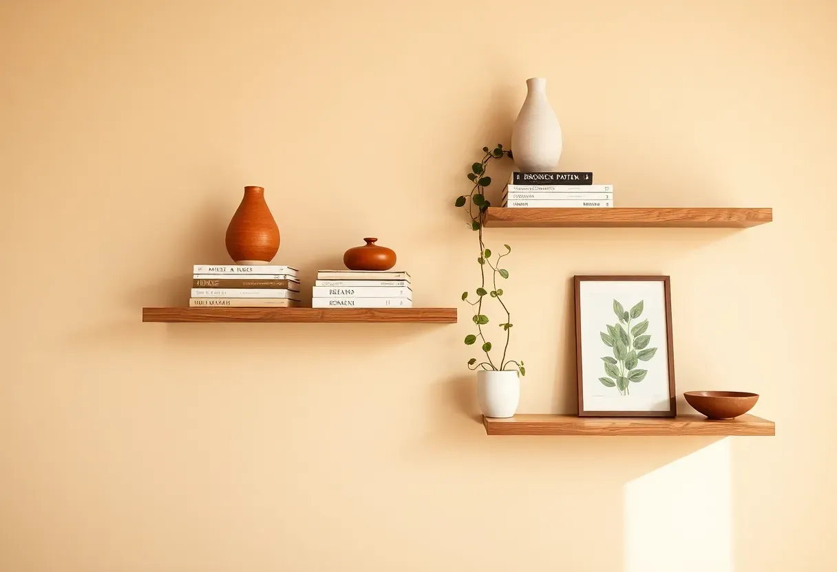
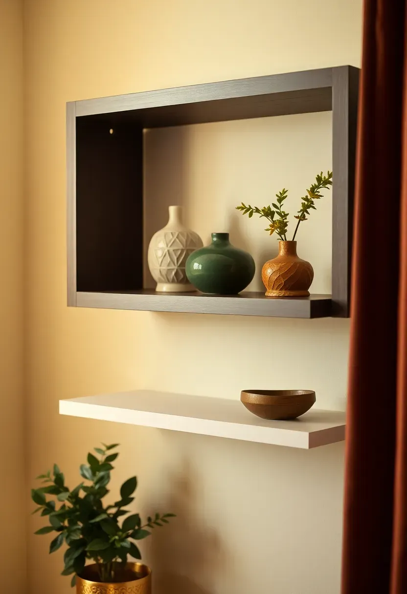
Step 4: Identify Your Anchor Pieces
Get this right and the rest falls into place. An anchor piece is the tallest, most visually dominant object on the shelf — the piece your eye goes to first and returns to when scanning the arrangement.
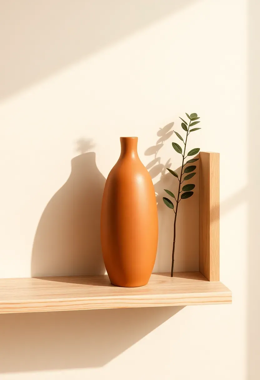
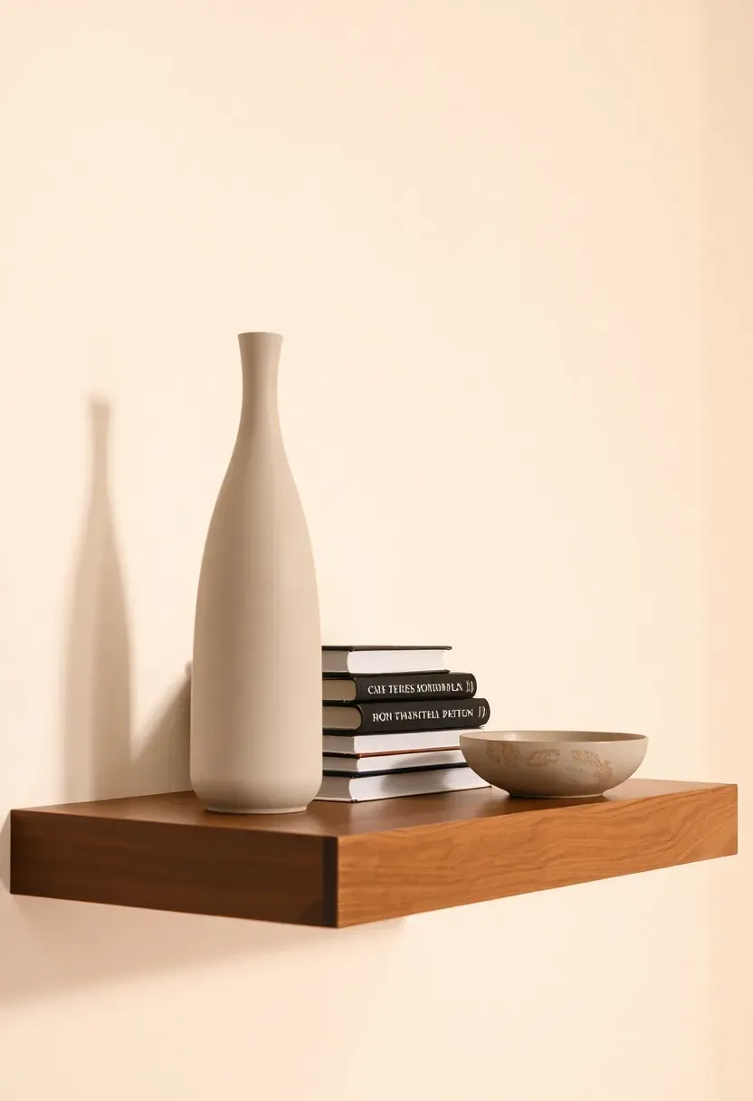
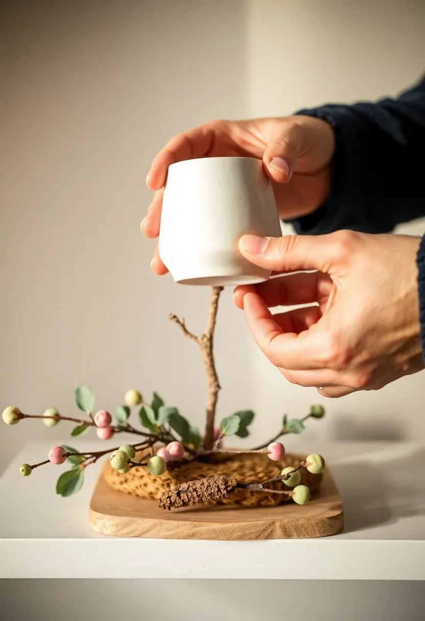
Each shelf should have one anchor piece, placed either slightly off-center or at one end. Anchor pieces are typically 20-35 cm tall: a sculptural vase, a ceramic jug, a tall candleholder, a small statue, a stack of books topped with a small object. What makes something an anchor is scale relative to the other shelf objects — it should be noticeably taller or more visually substantial than everything beside it. If you have two objects of similar height, one will fight the other and the shelf will feel unsettled. Decide: which one is the anchor? The other one moves to a different shelf position or a different shelf entirely.
Do: choose an anchor with an interesting silhouette — the negative space around a curved vase or a sculptural form is as important as the object itself Don't: use an anchor piece that is too small for the shelf — a 12 cm vase on a 90 cm shelf looks lost; scale up or supplement with a stack beneath it Pro tip: a tall vase with a single stem or dried branch reads as more elegant than a full bouquet — the stem creates a vertical line that extends the shelf display upward without adding visual weight
Recommended
Items for this idea
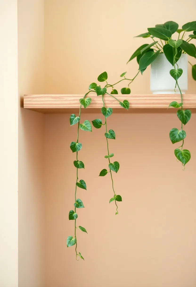
Step 5: Choose One Trailing or Organic Element
A shelf without any organic, living, or natural element tends to feel static — visually complete but somehow lifeless. One trailing plant, a single stem, or an organic natural form gives the arrangement movement and breath.
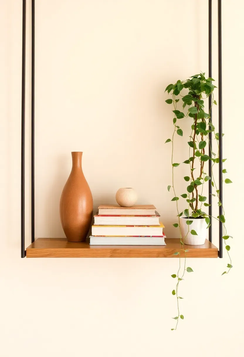
A trailing pothos in a small ceramic pot is the default choice for good reason: it grows in any light, trails naturally without maintenance, and reads as lush even when small. But the organic element doesn't have to be a plant: a dried eucalyptus branch in a slim vase, a curl of driftwood, a cluster of dried cotton stems, or a small bowl of smooth river stones all introduce the same natural energy without requiring watering. The key is that the organic element responds to the palette — a green trailing pothos works in warm-neutral spaces; dried pampas in a cream vase works in earth-tone arrangements; a single dark basalt stone works in minimal modern ones.
Do: place the trailing element near the end or edge of the shelf so its trailing stems fall into open air rather than across other objects Don't: use too many plants — one per shelf is typically enough; two begins to look like a windowsill rather than a display Pro tip: if natural light is low, opt for dried botanicals or a realistic faux trailing plant over a struggling live one — a wilting plant undercuts the entire arrangement
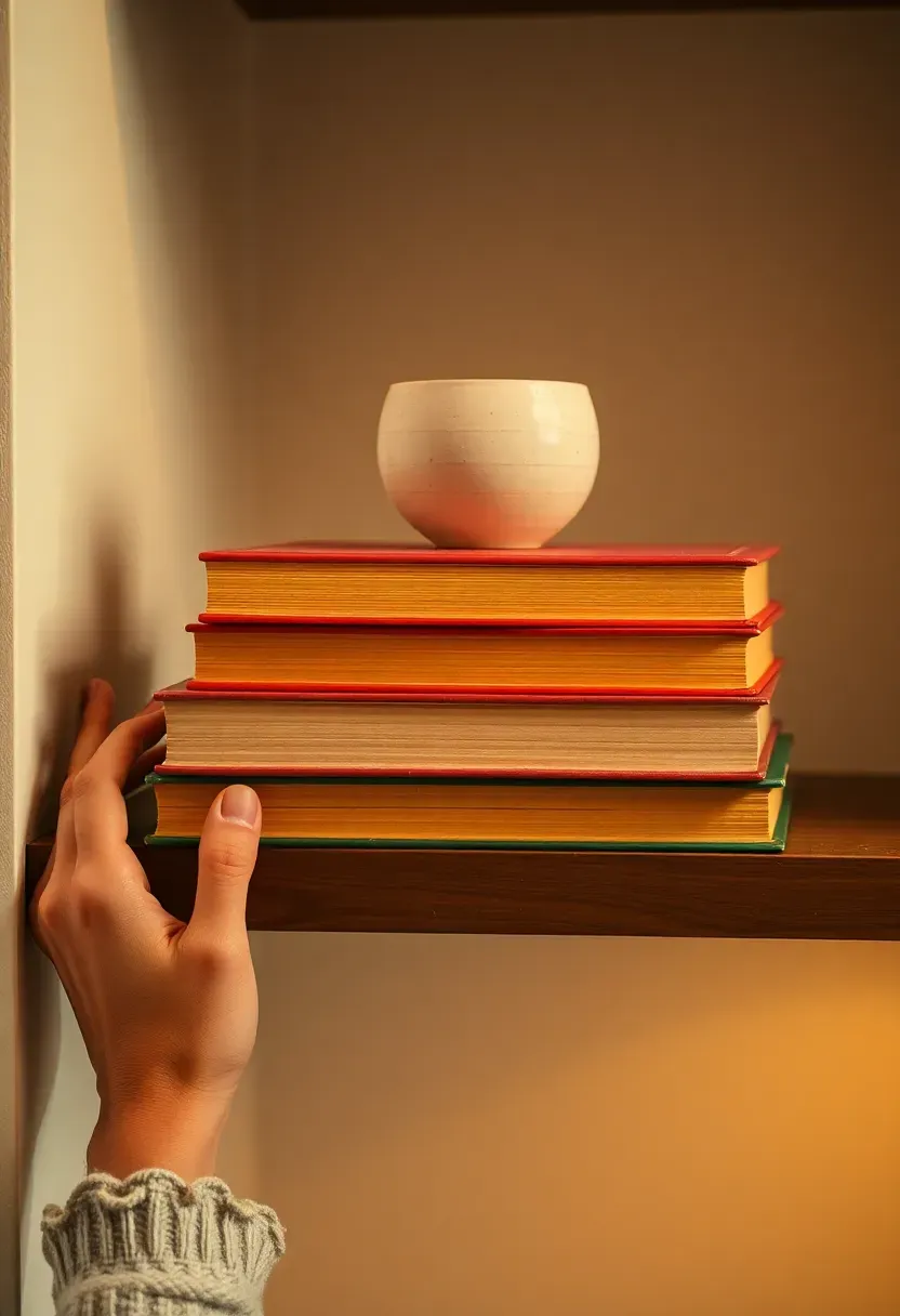
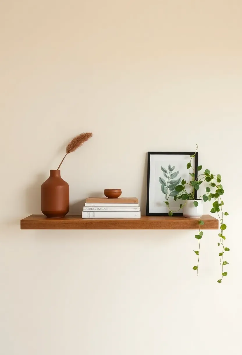
Step 6: Gather a Book Stack
Books do more styling work per square centimeter than almost any other shelf object. A horizontal stack of 3-5 books creates a plinth that elevates other objects, varies the height of the arrangement, and adds intellectual texture to the display.
Choose books where the spine color or page-edge tone falls within your palette. If a beloved book has a clashing cover, turn it spine-inward so only the page edges show — this is a standard professional styling trick. A 3-book stack topped with a small object (a smooth ceramic, a stone, a small figurine) creates a resting moment in the arrangement that the eye finds satisfying. Avoid stacking more than 5-6 books in a single pile — taller stacks become unstable and look precarious rather than considered.
Do: mix horizontal stacks with one or two upright books — vertical spines add rhythm and break the uniformity of a shelf where everything lies flat Don't: choose books purely for their covers without considering the total color they add to the shelf — three identical blue-grey spines on an earth-tone shelf will read as a mistake Pro tip: coffee table books with textured cloth covers (linen, fabric-bound) photograph better than glossy jacketed books and hold up better to handling
Recommended
Items for this idea
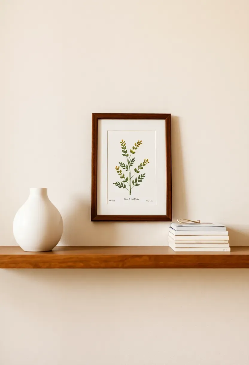
Step 7: Add a Small Framed Print
A leaning print on a shelf adds a visual layer that feels personal and intentional without requiring you to put another hole in the wall. It also creates depth — a two-dimensional object in front of a flat wall, behind three-dimensional objects.
Choose a print that references at least one color from your palette: a botanical in sage and cream, an abstract in terracotta and sand, a black-and-white photograph in a warm walnut frame. The print should lean casually against the wall rather than standing rigidly — prop it against the wall or a taller object beside it. A leaning print positioned behind or beside a group of objects creates a layered, gallery-quality depth that hanging the print on the wall above the shelf doesn't produce. Keep the frame narrow (2-3 cm maximum width) so it adds to the arrangement without dominating it.
Do: overlap the frame slightly with a small object in front of it — a small vase or a stone partially in front of the frame creates a sense of depth that photographs beautifully Don't: use a frame that is too large for the shelf width — a leaning print should be roughly 15-25% of the shelf's total length Pro tip: a print with a wide white mat inside the frame reads as more gallery-quality than one where the image fills the frame edge-to-edge — the white space is not wasted, it's elevating
Step 8: Place Your Anchor Piece First
With your objects audited and selected, now begin the actual arrangement — and always start with the anchor. Everything else positions itself in relation to this first placement.
Set the anchor piece at the left or right third of the shelf rather than the center. Centered anchors create symmetry, which can look formal and static. Off-center anchors create visual tension that the eye resolves by moving across the shelf — that movement is what makes an arrangement feel dynamic rather than simply placed. Step back immediately after setting the anchor and confirm: Does it feel too close to the wall edge? Is it proportionally right for the shelf length? Does it feel visually heavy enough to hold its position, or does it seem to drift? Adjust now, before building around it.
Do: leave at least 10 cm of clear shelf space beside the anchor before placing the next object — the gap gives the anchor room to breathe Don't: center the anchor unless you're deliberately creating a symmetrical arrangement (which requires identical mirrored objects on both sides — a more demanding composition to pull off) Pro tip: the anchor works best at the left third if you read left-to-right — the eye enters from the left, encounters the dominant piece, then moves across the rest of the shelf in a natural rhythm
Recommended
Items for this idea
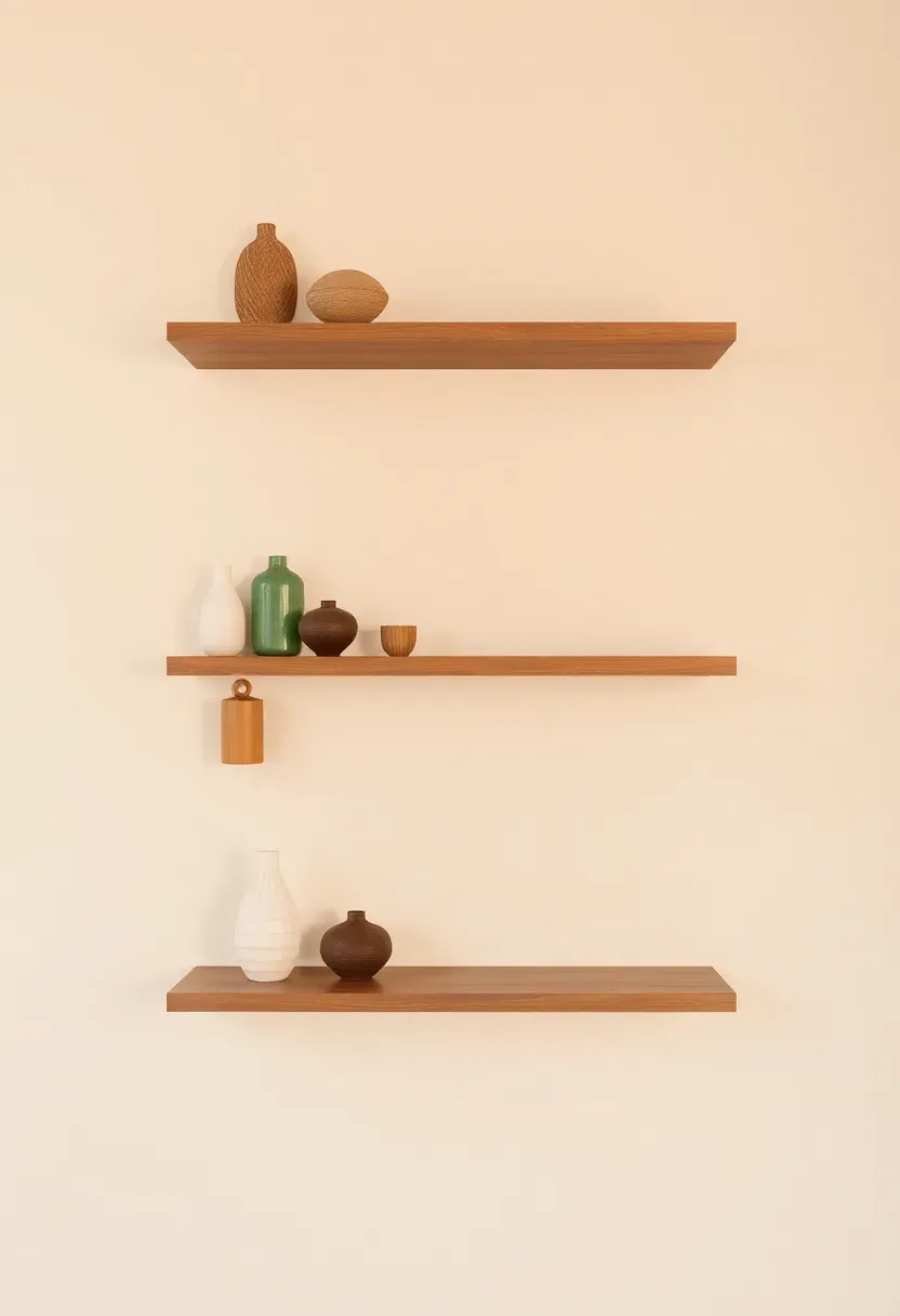
Step 9: Build in Triads
Don't rush this step — it makes the biggest visual difference in whether a shelf reads as designed or accidental. Triads — groups of three objects placed in close proximity — are the core structural unit of professional shelf styling.
A triad consists of three objects at varying heights, within your palette, positioned close enough that they read as a group rather than isolated pieces. The tallest object anchors the triad vertically; the mid-height object creates the transition; the smallest object closes the group. Within the triad, overlap slightly — let a book stack touch the base of a vase, let a small ceramic sit in front of a framed print. This overlapping is what creates depth. Between triads, leave a clear section of empty shelf: a 15-20 cm gap that separates one group from the next and gives each triad its own breathing room.
Do: ensure each triad contains the three height levels: tall, medium, and low — all-same-height groupings look accidental rather than composed Don't: create more than two or three triads on a single shelf — four or more groups lose the breathing room between them and the shelf begins to look crowded Pro tip: the most satisfying triad composition is not a straight line but a triangle — the tallest at back-center or back-left, and the two smaller pieces at the front, slightly apart from each other
Step 10: Vary Heights Deliberately
A shelf where everything sits at the same height is one of the most common styling mistakes. The eye reads horizontal uniformity as a storage shelf, not a display — and no amount of beautiful objects will overcome a flat silhouette.
Map the heights across your shelf before placing anything permanently. A satisfying shelf profile looks like a loose mountain range: rising in one area, descending in another, with flat stretches between the peaks. The tallest object (your anchor) creates one peak. A book stack creates a secondary plateau. Low objects — a small bowl, a stone, a candle — create the valleys. The transition from tall to low to medium and back creates visual rhythm that keeps the eye moving across the shelf rather than jumping from object to isolated object.
Do: use book stacks as flexible height tools — adding or removing a book from a stack raises or lowers the height of whatever sits on top of it Don't: cluster all the tall objects at one end and all the low objects at the other — this creates a ramp profile that feels like objects sliding off the shelf rather than a composed arrangement Pro tip: the most satisfying height rhythm for a 90 cm shelf is high-low-medium from left to right — it mimics the natural rhythm of a resting eye
Recommended
Items for this idea
Step 11: Leave Strategic Empty Space
This is where most people add one object too many — and undo all the work the previous steps built. Negative space on a shelf is not empty space: it is visual breathing room that makes every object beside it read as deliberate.
Aim to leave 30-40% of your shelf surface uncovered. A 90 cm shelf should have roughly 25-35 cm of unoccupied surface, distributed either as one clear section or as gaps between object groups. Empty space performs several functions simultaneously: it gives each object room to register as an individual form, it signals that the shelf was styled rather than filled, and it creates a visual pause that makes the arrangement feel calm rather than anxious. If you run out of space before running out of objects, the solution is to remove objects — not to find more shelf.
Do: treat empty shelf space as a material, the same way you treat a vase or a plant — it has visual weight and contributes to the composition Don't: fill gaps with small objects to "balance" the arrangement — those filler objects almost always make the shelf worse Pro tip: a single object placed with 20 cm of empty space on either side reads as intentionally placed art; the same object surrounded by other objects reads as one of many — use empty space to elevate your best pieces
Step 12: Rotate Seasonal Accents
A shelf styled once and never touched again gradually begins to feel like a still life rather than a living space. One of the smallest changes that keeps a shelf feeling fresh is seasonal rotation of one or two accent objects.
Identify one or two objects in your arrangement that can be seasonally swapped without disturbing the overall composition. These are typically: a single stem or cutting (spring blossom, autumn branch, winter pine sprig), a small ceramic (a pumpkin in October, a shell in summer, a pine cone in winter), or a candle scent (citrus in spring, amber in winter). The swap takes five minutes and costs almost nothing, but it re-engages your eye with the shelf — you notice it again after it had faded into background. Build a small rotating stock of seasonal accents and store them in a labeled box in a cupboard so they're immediately available when the season shifts.
Do: keep the seasonal accent small — the rotation should be subtle, not a full restyle Don't: introduce a new palette color with the seasonal swap — the accent should work within the existing color framework, not disrupt it Pro tip: a single cut branch from your garden or a local park (budding in spring, stripped in autumn) is free, seasonal, and more interesting than most purchased decorative accessories
Recommended
Items for this idea
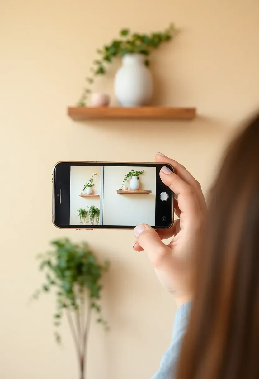
Step 13: Step Back and Photograph
Your eye adapts to an arrangement while you're building it and stops seeing it clearly. A photograph short-circuits that adaptation and shows you what a fresh eye actually sees.
Step back from the shelf until you are at least two meters away. Take three photographs: one from standing height directly in front, one from slightly left, one from slightly right. Then flip each image horizontally on your phone — a mirrored image bypasses the brain's familiarity adaptation and lets you see the arrangement as if for the first time. Look for: any object that seems to float disconnected from the group around it; any gap that looks like a mistake rather than breathing room; any height profile that reads as flat or as objects sliding off the edge. What looks right in the photograph is what will look right in the room; what looks wrong in the photograph will look wrong to every visitor who glances at the shelf.
Do: photograph the shelf in the light it will usually be seen in — afternoon light, or evening lamp light — not just in the brightest possible conditions Don't: only photograph from directly in front — the three-quarter angle reveals depth relationships and layering that a straight-on shot misses Pro tip: compare your photograph with the palette and composition of a shelf you admire from an interior design account or a design book — visual comparison is faster and more honest than any written checklist
Step 14: Edit Ruthlessly
Looking at your photographs, identify the one or two objects that the shelf would actually look better without. Every styled shelf reaches a point where the instinct is to keep adding — and the correct move is to start subtracting.
An object earns its place on a shelf if removing it would make the arrangement worse. If you remove it and the shelf improves, the object doesn't belong. Apply this test object by object to anything you feel uncertain about. Common editing targets: the fourth object in a triad that makes it a quadruplet instead of a trio; the second trailing plant that creates competition rather than accent; the object that matches the palette but adds nothing to the height rhythm; the sentimental piece that clashes with everything else. Remove these objects. Hold them in your hand for a moment. Then put them somewhere else in the home where they can be displayed properly, rather than forcing them onto a shelf that doesn't need them.
Do: do the editing exercise before calling the shelf finished, not after you've already moved on — the final edit is often the most important step Don't: edit by moving objects around endlessly in search of a position that works — if an object doesn't belong, moving it 10 cm to the left won't fix it Pro tip: if you genuinely can't decide whether to keep or remove an object, remove it for a week — if you don't miss it on the shelf, you have your answer
Recommended
Items for this idea
Step 15: Lock in the Final Arrangement
The shelf is complete. Now do one final review before considering it done — and establish a simple rule for maintaining it so it stays that way.
Walk through the room and look at the shelf from every angle you'd naturally encounter it: from the sofa, from the room entrance, from the kitchen pass-through if it's visible from there. Does it hold up from all directions? Does it feel like a designed element of the room or like an object placed in the room? If it feels genuinely integrated — like it belongs there, like it always looked this way — the shelf is finished. Take a final photograph from each position and save them as your reference. When objects inevitably get moved during cleaning or when guests pick things up and put them back differently, you have the photograph to reset the arrangement exactly as it was.
Do: establish one simple maintenance rule — after cleaning the shelf, replace every object in the position shown in your reference photograph Don't: let the shelf drift incrementally over weeks as objects get added, moved, or borrowed — small drift accumulates into the cluttered version you started with Pro tip: a shelf that takes 90 seconds to reset from a reference photograph will stay beautiful indefinitely; one that requires a full re-styling every few months signals that the arrangement is too complex to maintain
FAQ
Should every shelf in a room have the same styling approach? Not necessarily. In a room with three or more floating shelves on the same wall, the most compelling approach is a family of arrangements — same palette, same object types, but varied compositions on each shelf. Identical arrangements on every shelf read as rigid. Completely different arrangements on every shelf look chaotic. The connecting thread is the palette and the object vocabulary; the variation is in the specific heights, groupings, and empty-space placement on each individual shelf.
Is it okay to mix styled sections with actual storage on the same shelf? Yes, if the storage is handled visually. Books stacked horizontally and topped with an object function as both storage and display. A small woven basket holds loose items while adding texture and organic form. A lidded ceramic container stores small clutter while functioning as a display piece. The rule is that functional storage items must earn their visual place by contributing to the palette and composition — not just be placed there because they need somewhere to live.
Can I decorate rental shelves if I can't repaint the wall color behind them? Absolutely. The wall color behind a shelf matters less than the object palette on the shelf. If the wall is a color you find difficult (very warm beige, cool grey, or a bold accent), work with it: pull one of the wall tones into your shelf palette as a dominant neutral. A warm beige wall becomes the backdrop for a shelf palette of cream, terracotta, and olive — the wall recedes and the objects become the focus. If the wall color genuinely clashes with everything, a removable wallpaper panel or a length of fabric pinned or taped behind the shelf creates a new background for the display without making permanent changes.
What's the best plant for a shelf with low natural light? Pothos (Epipremnum aureum) is the most forgiving trailing plant for low-light shelves — it grows in almost any conditions, trails attractively, and signals neglect slowly enough that you can catch and recover it. ZZ plants (Zamioculcas zamiifolia) work well as a non-trailing option if you want a structured, upright plant on the shelf. For very low light with no window nearby, a realistic faux trailing plant is a legitimate choice — at shelf height and in ambient light, a quality faux pothos is visually indistinguishable from a live one.
How often should I restyle my shelves? A full restyle every 6-12 months keeps shelves feeling fresh without becoming a chore. Between full restyles, a seasonal swap of one or two accent objects (Step 12) every 3 months is typically sufficient. The sign that a full restyle is overdue is when your eye stops registering the shelf entirely — when it becomes background that you no longer consciously see. At that point, clearing everything off and rebuilding from the palette-first process takes about 2-3 hours and consistently produces a result that feels new even in a familiar room.
A shelf that looks effortlessly curated is almost always the result of deliberate editing rather than inspired placement. Start with Step 1 this weekend — clear everything off and see what you're actually working with. Everything after that is just making good decisions one object at a time.
Pinterest cover for How to Decorate Floating Shelves: 15 Steps to a Beautiful Display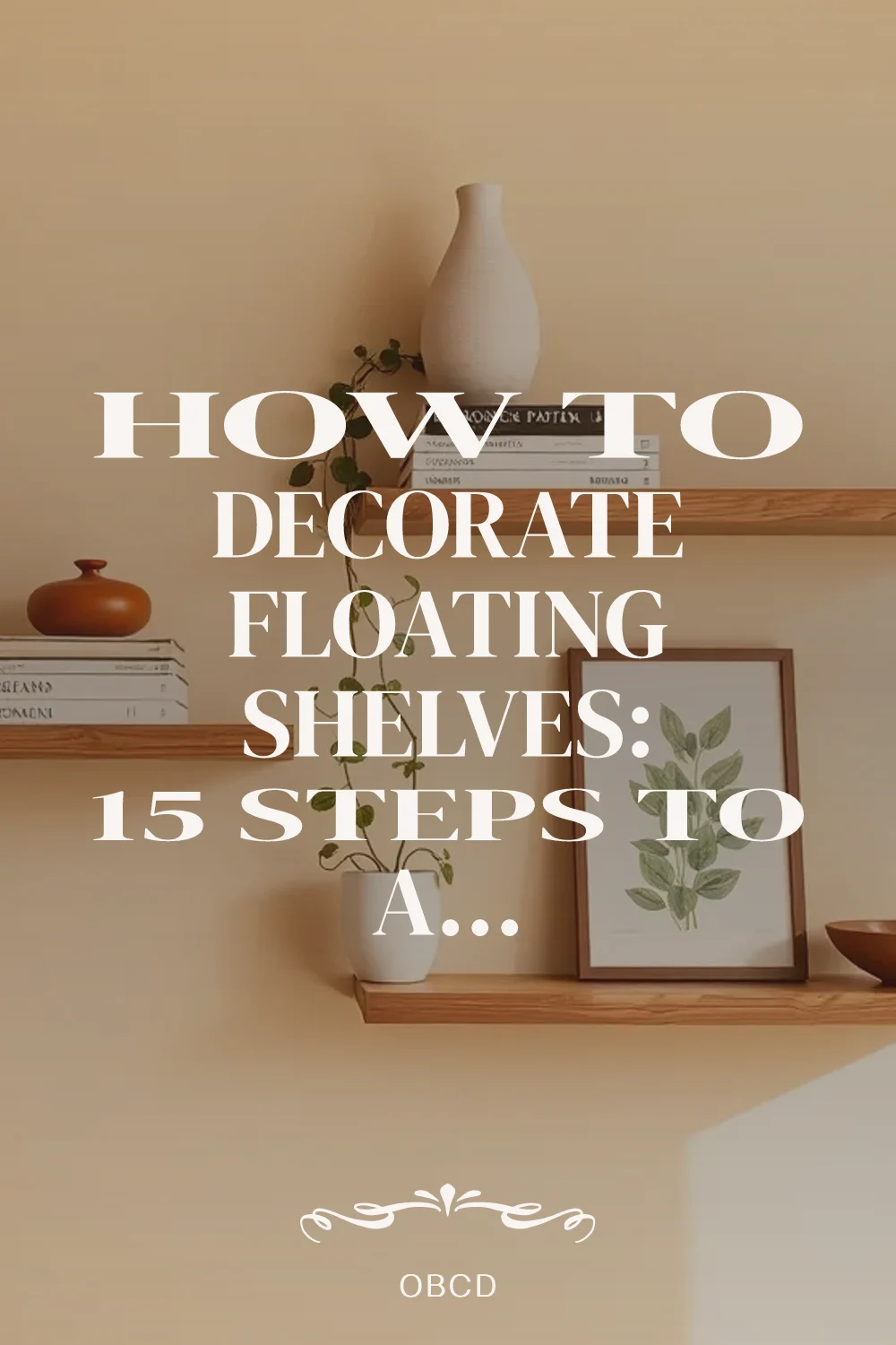
About the author
OBCD
CGI visualization and interior design content. We create detailed 3D renders and curate practical design ideas for every room in your home.