How to Decorate Open Shelves in 2026: 11 Steps to a Curated Look
Open shelves look effortless in design magazines and chaotic in most real homes. The difference is almost never budget — it's method. These 11 steps give you a repeatable system for styling shelves that look considered, cohesive, and genuinely yours. By the end, your shelves will do what the best ones always do: make the room feel more complete, not more cluttered.
Table of Contents
- What You'll Need
- Step 1: Clear Every Shelf Completely
- Step 2: Define Your Color Palette
- Step 3: Audit and Edit Your Objects
- Step 4: Group Items in Odd Numbers
- Step 5: Vary Height Deliberately
- Step 6: Layer Depth with Books and Ceramics
- Step 7: Introduce One Organic Element per Shelf
- Step 8: Add Texture Through Material Mix
- Step 9: Place Art Strategically
- Step 10: Leave Negative Space
- Step 11: Step Back and Edit Again
What You'll Need
- All current shelf objects (cleared to the floor first)
- 3-5 art books with aesthetically pleasing spines or covers
- 2-4 ceramic vessels in varying heights (vases, bowls, pitchers)
- 1-2 small trailing or potted plants (pothos, trailing string of pearls, a small fiddle leaf)
- One woven or rattan basket for concealed storage
- A small framed print or artwork piece (A5 or A4 size)
- A candle or sculptural object for warmth
- Painter's tape and sticky notes for labeling shelf zones
- A phone for photographing each iteration
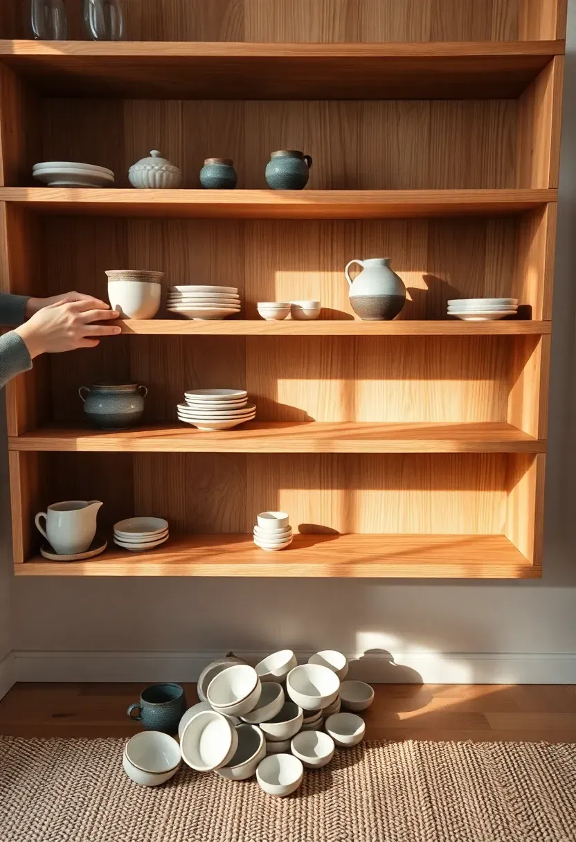
Step 1: Clear Every Shelf Completely
Most people skip this — and it shows. You cannot style over existing clutter. You can only relocate it.
Remove every single object from every shelf. Place everything on the floor or a nearby surface so you can see the full inventory at once. Then look at the bare shelves. Notice the grain of the wood or the color of the surface. Notice how the empty space already has proportion, rhythm, and light. That emptiness is not a problem to fill — it's the canvas you're working with. Everything that goes back on these shelves must earn its place. The objects that don't earn their place get reassigned to a drawer, a basket, or a donation box.
Do: photograph the bare shelves before adding anything — you'll reference this "reset" photo when the arrangement starts to drift Don't: start placing objects back until all of Steps 2 and 3 are complete — patience here saves significant rework Pro tip: dust the shelves while they're empty, including the back wall — clean surfaces make a more significant visual difference than any styling choice
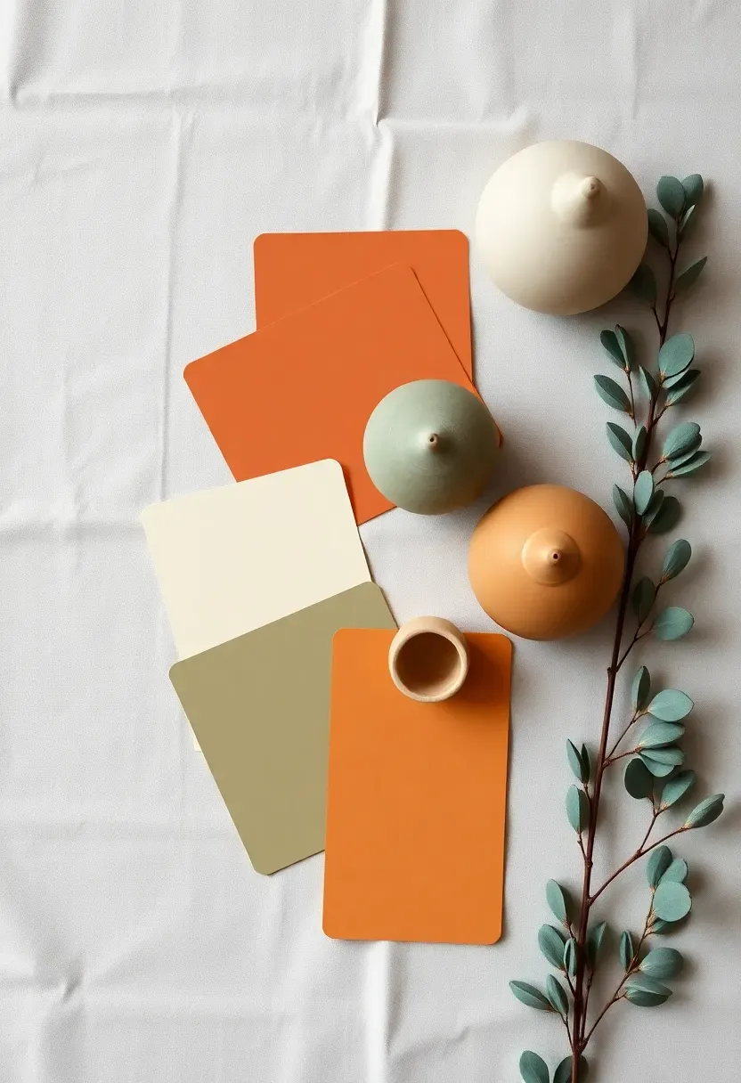
Step 2: Define Your Color Palette
A curated shelf isn't a collection of things you love — it's a collection of things that speak the same visual language.
Choose two to three colors that will anchor your entire arrangement. Pull these directly from your room: a tone from the sofa, a hue in the rug, the wall color itself. For 2026, the most versatile shelf palettes are warm neutral-forward — cream and terracotta, sand and sage, ivory and warm charcoal. Limit your objects to this palette strictly. A shelf with five beautiful ceramics in five different color families reads as a collection; a shelf with five ceramics within the same two-tone palette reads as design. Write your palette on a sticky note and use it to filter every object that goes back on the shelf.
Do: include at least one very dark and one very light object within your palette — contrast creates visual interest without breaking cohesion Don't: default to all-white or all-neutral — a single warm accent color (terracotta, sage, amber) is what stops the arrangement from looking sterile Pro tip: pull one color from an artwork or print you love and build the shelf palette around it — the shelf and the art then amplify each other naturally
Recommended
Items for this idea
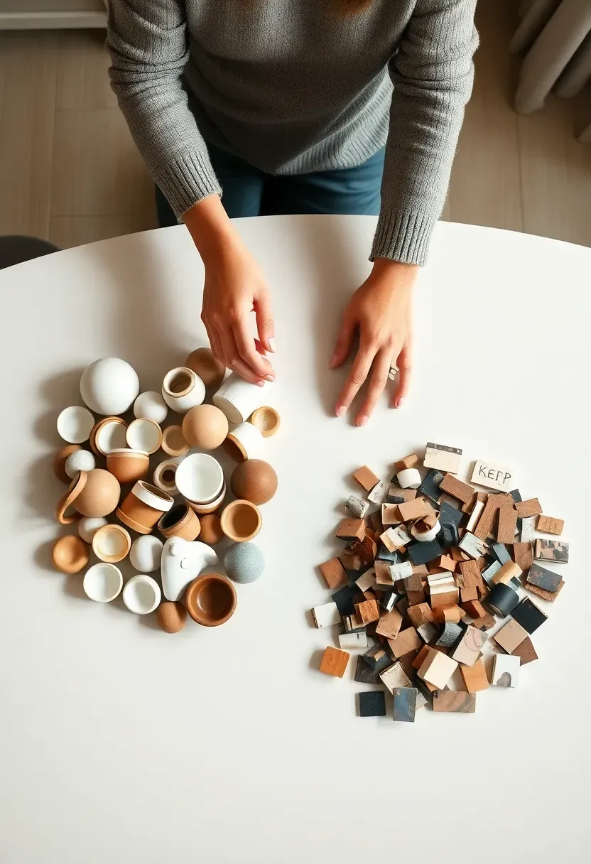
Step 3: Audit and Edit Your Objects
Get this right and the rest falls into place. More objects is almost always the wrong answer for open shelves — the edit is where the curation happens.
Lay every removed item out and apply three filters. First: does it fit your palette from Step 2? Objects that don't belong get set aside permanently. Second: is it beautiful or functional — or does it have to be both? Objects that are purely functional without visual appeal belong in closed storage. Third: do you have more than one of it? Two similar-height ceramic vases on the same shelf create visual repetition with nowhere to rest the eye. Keep the better one, rehome the other. You should end this step with roughly 50-60% fewer objects than you started with. That sounds drastic. It is. And it's exactly right.
Do: keep objects that have a personal story — they give the shelf soul that purely "styled" arrangements always lack Don't: add new objects to compensate for items you've removed — work with what passes the edit, then reassess Pro tip: natural textures (wood, ceramic, rattan, linen, stone) almost always survive the edit; synthetic or shiny objects in non-palette colors almost always don't
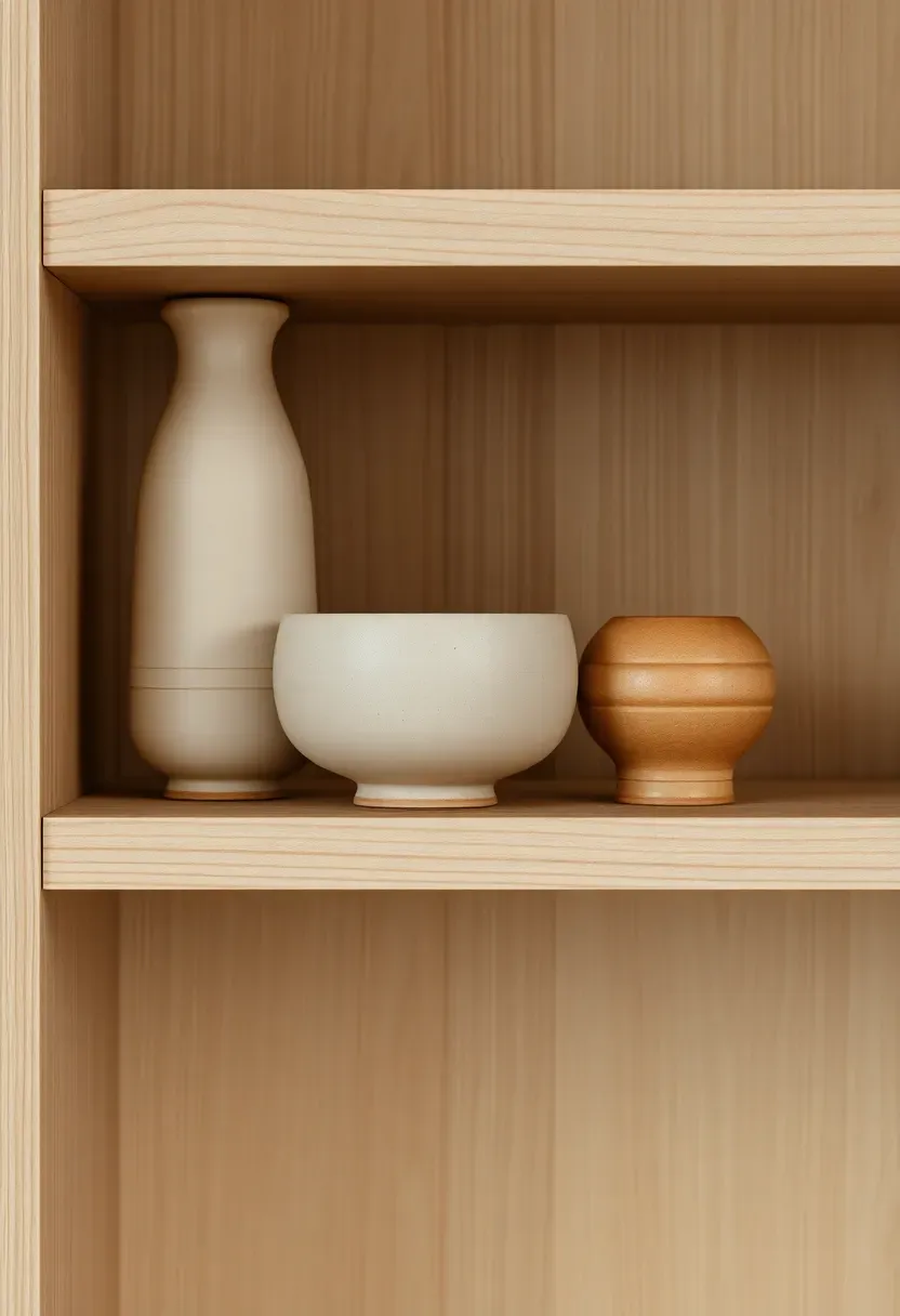
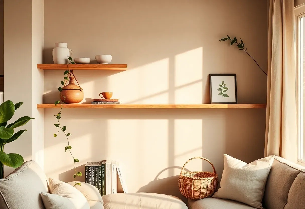
Step 4: Group Items in Odd Numbers
This is the foundation everything else builds on. Odd-numbered groupings — three or five objects together — create natural movement for the eye. Even numbers produce static pairs that read as symmetry rather than arrangement.
Divide your edited objects into groupings of three before placing anything. Each grouping should include one tall object, one medium, and one lower or horizontal element. A tall vase, a medium ceramic bowl, and a small sculptural object. A stacked pair of books, a candle, and a trailing plant. The visual logic of three gives the eye a beginning, a middle, and a resolution within each cluster — it's the same reason a three-act story is more satisfying than a two-act one. Apply this grouping principle to each shelf zone, and the whole arrangement develops coherence without requiring precise measurement.
Do: physically place all three objects in a grouping before committing to position — the relationship between them only becomes clear when they're together Don't: treat each object as a solo installation — isolated items on a shelf always look forgotten rather than placed Pro tip: if you genuinely love a single statement piece, frame it with negative space on both sides rather than flanking it with smaller items — isolation reads as intentional; crowding reads as indecision
Recommended
Items for this idea
Step 5: Vary Height Deliberately
Don't rush this step — it makes the biggest visual difference of any single decision in shelf styling. Height variation creates rhythm; identical heights create a lineup.
Within each grouping on a shelf, ensure the heights move: tall on the outside, medium in the middle, low at the front creates a staircase effect that draws the eye across the shelf naturally. Between shelves, vary which zone carries the tall objects — if the tallest piece on the top shelf sits on the left, the tallest piece on the middle shelf should anchor the right or center. This alternating tall-point across shelves creates a zigzag rhythm when you step back and view the whole unit. Art books laid flat and used as a base platform for a ceramic can raise any object 3-5 cm, effectively adding an intermediate height tier without any additional objects.
Do: step back two to three meters after placing objects on each shelf to assess the overall height rhythm before moving to the next Don't: arrange tallest-to-shortest left to right on every shelf — that's not styling, it's organizing, and it reads as a storage system rather than a display Pro tip: a slight overhang of a trailing plant or a leaning print beyond the shelf edge adds vertical movement downward — it keeps the arrangement from feeling like a series of horizontal bands
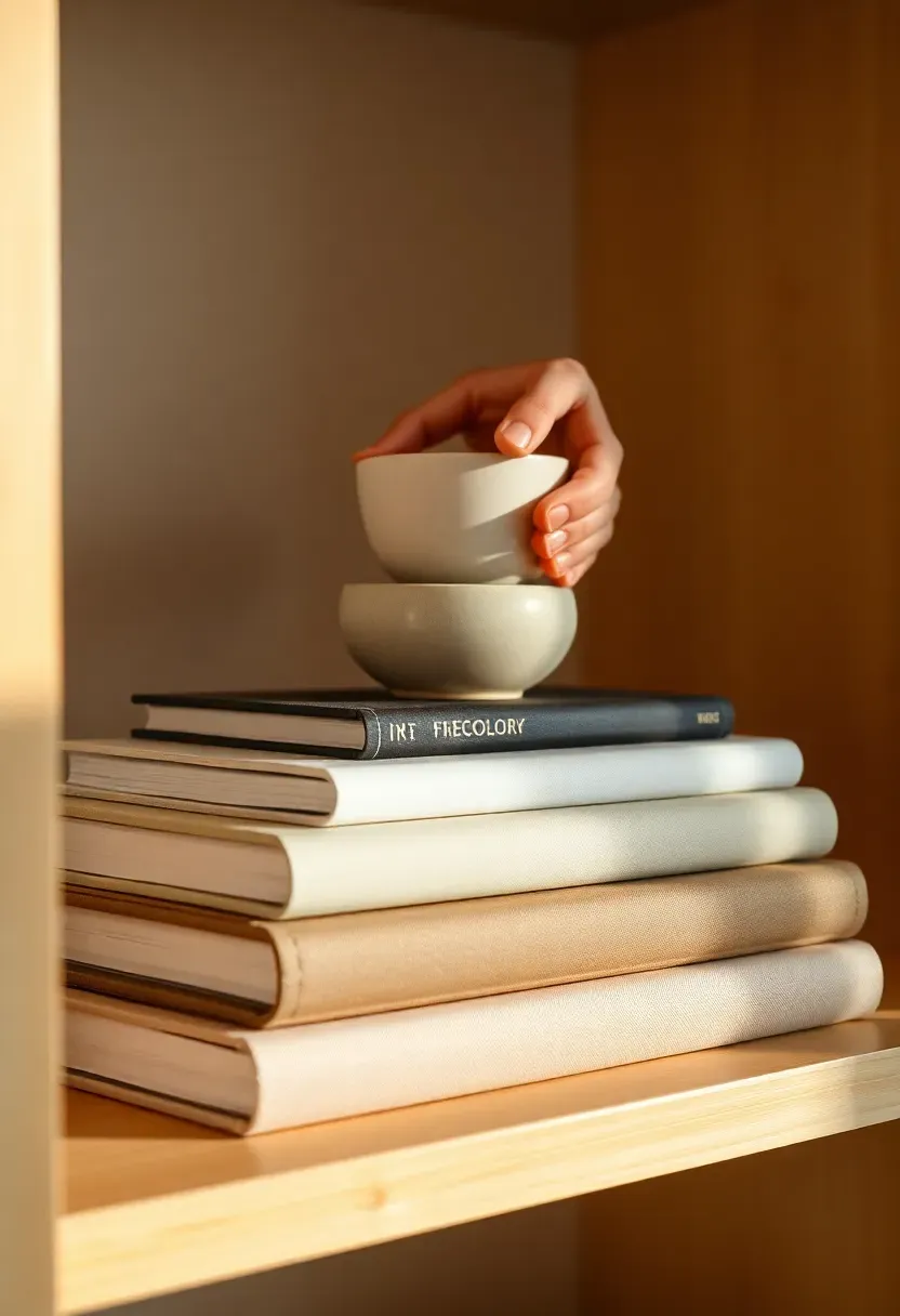
Step 6: Layer Depth with Books and Ceramics
Flat styling — all objects lined up at the same distance from the back of the shelf — produces a display that looks like a store inventory. Depth layering is what makes a shelf look designed.
Place art books flat, either stacked horizontally or stood upright at the back of a shelf section to act as a visual backdrop. Position ceramics in front of them at the mid-shelf depth. A small plant or sculpture at the very front edge, slightly overhanging, creates a third layer. Three distinct depth zones on each shelf — back, middle, front — transform the shelf from a surface into a miniature environment. When photographed or viewed from across the room, depth layering creates shadow and dimension that no amount of beautiful objects on a flat plane can replicate.
Do: face book spines outward for type-based shelves, or turn spines inward (showing only the page edges) for a calmer, more texture-focused effect Don't: use every book you own — three to five books per shelf section is the functional maximum; more creates a visual wall that stops the eye rather than guiding it Pro tip: a single art book with a beautiful cover photograph, propped slightly open and leaning against the back wall, acts as a framed image without requiring a frame
Recommended
Items for this idea
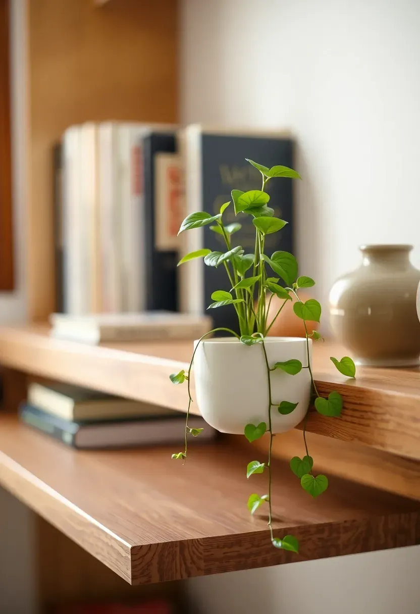
Step 7: Introduce One Organic Element per Shelf
This is where the real transformation happens. A single plant or organic element does more to make a shelf feel alive than any decorative object you can buy.
Assign one living or organic element to each shelf — not one per grouping, one per shelf. A small pothos in a ceramic pot, a trailing string of pearls at the shelf edge, a bundle of dried pampas or eucalyptus in a narrow vase, a piece of smooth river stone. The organic element is the one thing on the shelf that breaks the geometric logic of everything else — its soft curves or natural asymmetry provide relief from the clean lines of books and ceramic vessels. It also creates a consistent visual thread across the whole unit when viewed from a distance: one green or natural element per level, spaced down the shelving from top to bottom.
Do: choose trailing plants (pothos, trailing fig, string of pearls) for shelves above eye level — they cascade downward and connect the shelf to the room below Don't: cluster all plants on one shelf and leave others plant-free — the distribution is what creates rhythm across the whole unit Pro tip: dried botanicals (pampas, cotton stems, dried thistle) require zero maintenance and hold their look for months — ideal for shelves in lower-humidity spaces or for those who find plant care impractical
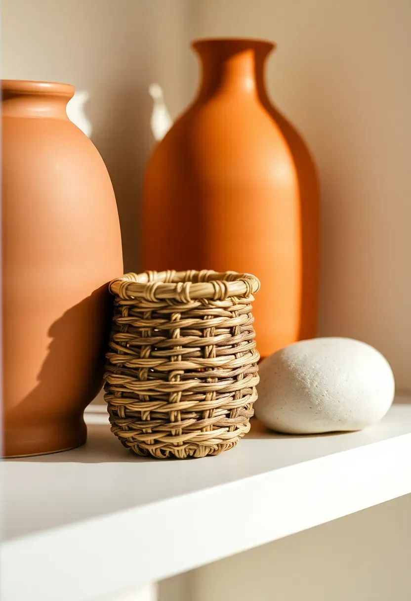
Step 8: Add Texture Through Material Mix
A shelf styled entirely in one material — all ceramics, all glass, all wood — reads as monochromatic even when the colors vary. Texture contrast is what gives the arrangement tactile richness.
Aim for at least three different material families across each shelf: one matte ceramic, one natural fiber (rattan, woven basket, jute-wrapped pot), one reflective or smooth surface (glass, polished stone, lacquered wood). These don't all need to be separate objects — a ceramic pot on a woven coaster achieves two textures in one grouping. The contrast between rough and smooth, matte and gloss, woven and thrown creates visual interest that holds attention in a way that matched materials never do. When you photograph the shelf, texture is what makes a flat image look dimensional — it's the element professional stylists prioritize above almost everything else.
Do: introduce one metallic texture — a brass candle holder, a gold-rimmed ceramic, a slim copper vase — as a warmth accent that catches light Don't: overuse glass or reflective objects — they pick up clutter reflections from the room and visually compete with the display Pro tip: the most underused shelf texture in 2026 is unglazed raw clay — a simple matte terracotta object beside a smooth white ceramic creates contrast that reads as both contemporary and warm
Recommended
Items for this idea
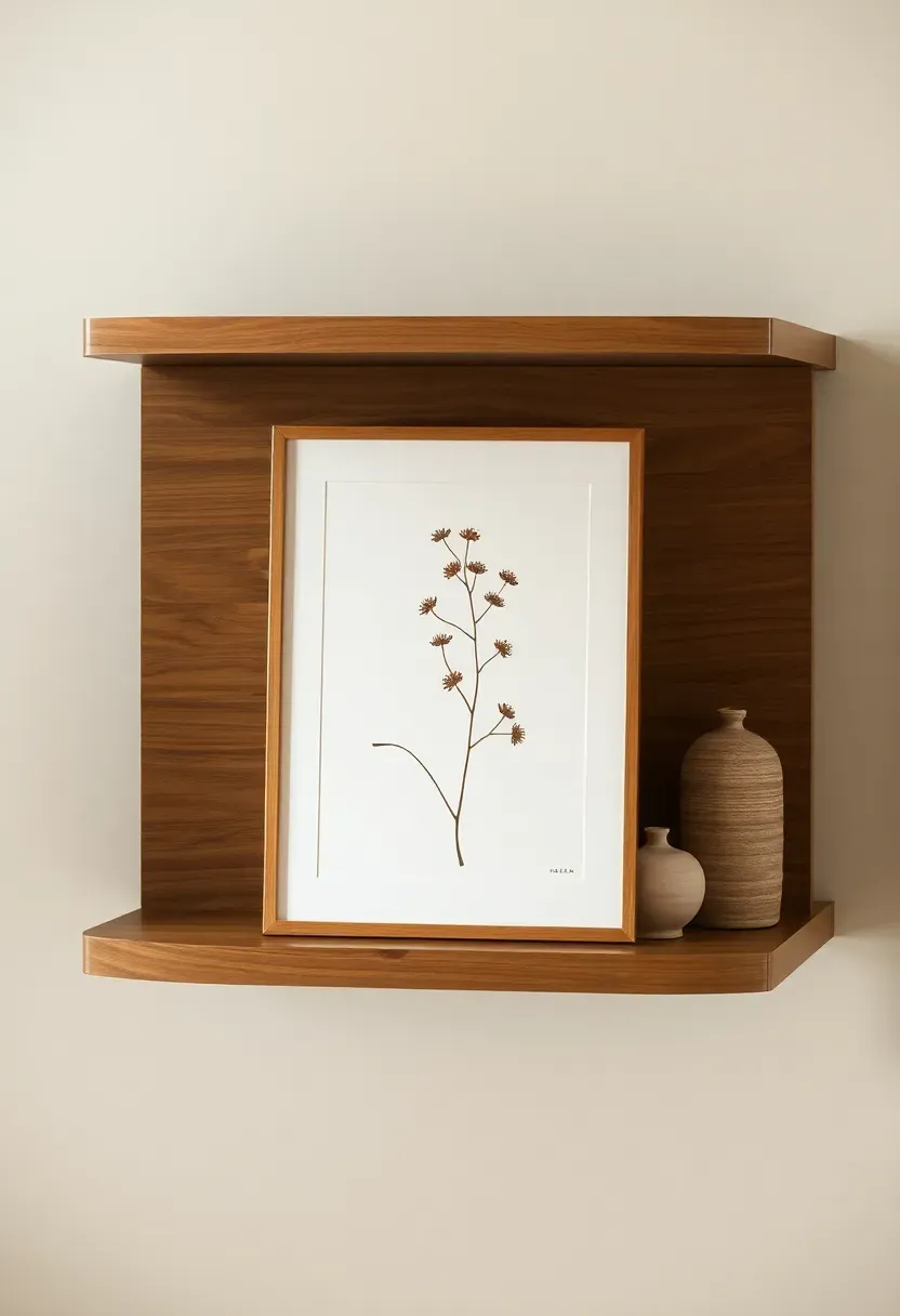
Step 9: Place Art Strategically
A leaning print on a shelf does something a hung print cannot: it creates an informal, layered quality that makes the shelf feel styled rather than decorated.
Choose one or two small prints (A5 or A4, framed or unframed) and lean them against the back wall of a shelf section rather than hanging them above. The leaning position immediately signals intention — it looks like a choice, not a placeholder. Position the print slightly to one side of center within its shelf section, so it overlaps with the object grouping beside it. The overlap is key: it creates visual connectivity between the flat artwork and the three-dimensional objects. If you lean a print in the center of an empty shelf zone, it reads as furniture; if it overlaps a grouping, it reads as design. Use prints that echo a color from your palette — a botanical with sage green, an abstract with terracotta, a portrait with warm cream tones.
Do: mix one hung print directly above the shelves with one or two leaning prints on the shelves — the combination of fixed and informal feels effortlessly layered Don't: prop a print that is too large for the shelf — it should be significantly smaller than the shelf section, with space on both sides Pro tip: a print without a frame, leaned against the back wall, has a studio-casual quality that frames can't replicate — try it before defaulting to everything framed
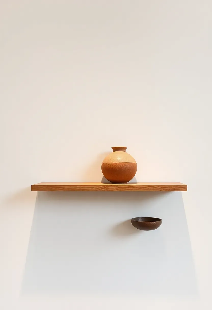
Step 10: Leave Negative Space
Most people treat empty shelf space as a problem to solve. Professional stylists treat it as a design element.
Aim to leave 30-40% of each shelf's linear length as empty space — deliberately, not accidentally. The empty zone gives the eye a place to rest between groupings and prevents the arrangement from reading as storage. On a 90 cm shelf, this means two groupings of objects with a clear 25-30 cm gap between them. The gap is not wasted space: it frames both groupings, making each one read more clearly. Shelves that are filled completely suggest functionality; shelves with breathing room suggest intention. As you're adding objects, the moment a shelf starts to feel crowded is the moment to stop — regardless of how many objects remain on your editing table.
Do: resist filling the empty zone even when you think the shelf looks unfinished — give it 24 hours before reassessing Don't: treat the negative space as a waiting area for objects you're not sure about — if you placed it there as a temporary placeholder, remove it Pro tip: the most visually confident shelves in 2026 design are often the sparsest — three considered objects on a shelf with 60% empty space reads as more "designed" than seven objects filling the same surface
Recommended
Items for this idea
Step 11: Step Back and Edit Again
The arrangement is in place. Now comes the most important step — the one that determines whether it reads as curated or assembled.
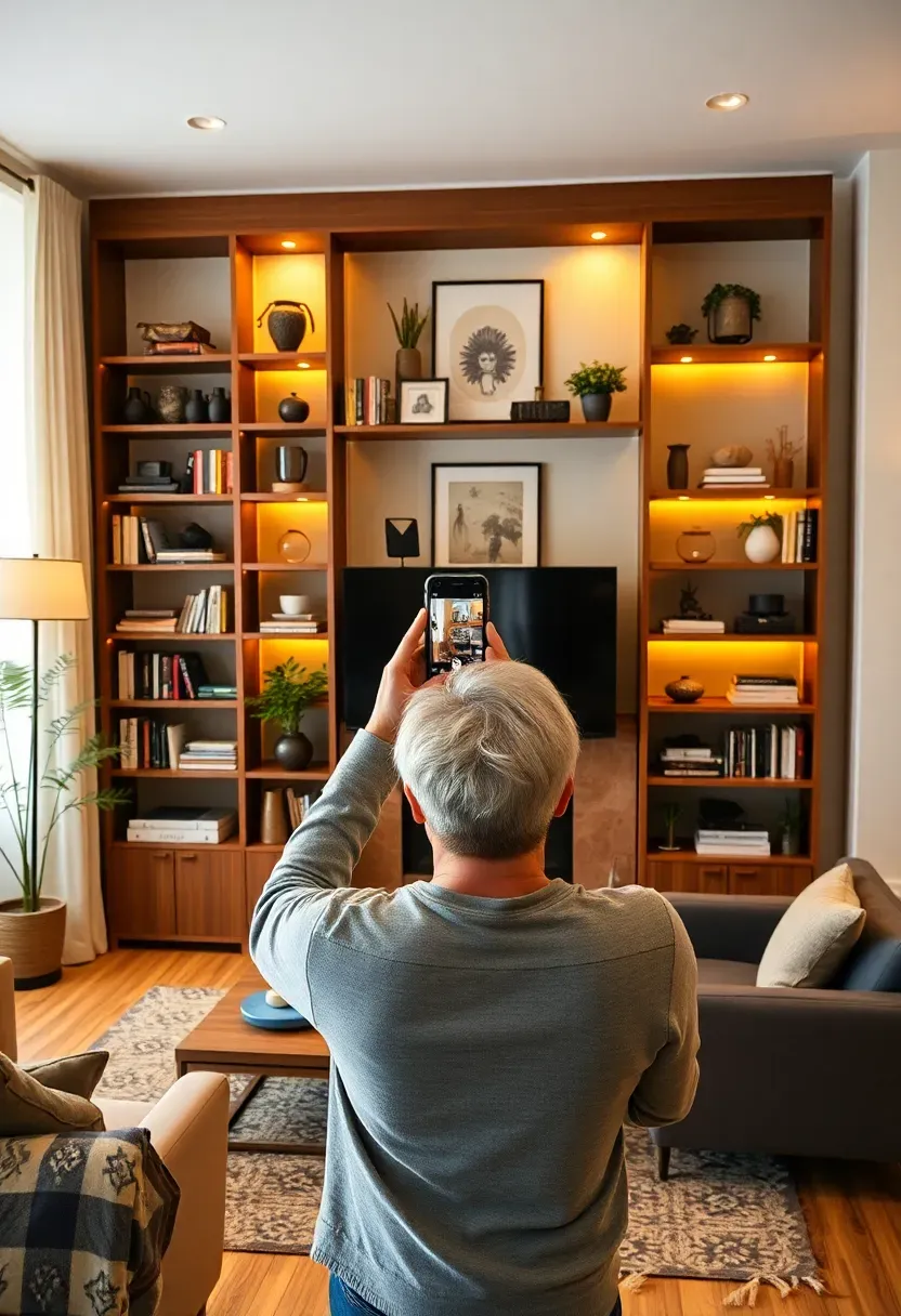
Move to the farthest point in the room from the shelves and look at the whole unit as a single composition. You're assessing three things: visual weight balance (does one shelf feel significantly heavier than the others?), color distribution (are all the bold colors clustered in one zone or spread across the unit?), and height rhythm (does the eye move upward or downward across the shelves in a natural path?). Take a phone photograph. Then flip the image horizontally. Imbalances that your eye overlooks in the forward orientation jump out immediately in the mirror image. Adjust based on what you see, not what you feel — this is the moment for honest visual assessment rather than attachment to individual objects.
Do: photograph the shelves from two distances: close (1 meter) and far (3-4 meters) — they reveal completely different problems Don't: make more than two or three adjustments after the first edit — diminishing returns set in quickly, and you'll lose the freshness of your original eye Pro tip: share the photograph with someone who hasn't seen the shelves in progress — a fresh eye notices the one thing that's off faster than any amount of self-review
FAQ
Should open shelves in the kitchen be styled differently from living room shelves? Yes. Kitchen shelves need to balance function with display, so the rule shifts: 60% functional (everyday dishes, glasses, containers) and 40% decorative. In the living room, you can flip that ratio or go fully decorative. The same styling principles apply — odd numbers, height variation, texture mix — but in the kitchen, the functional objects themselves become part of the composition. A stack of white ceramic bowls is both useful and beautiful. Style those as you would any ceramic grouping.
Can I style open shelves on a budget without buying new objects? Absolutely. Start by editing down to 30% of what's currently on the shelves — the curated, restrained look costs nothing. Then introduce texture through objects you already own: wrap a plain pot in a piece of cut burlap, stack books you have, repurpose a glass jar as a vase. The purchase that delivers the highest styling return at the lowest cost is a small plant ($5-15) and one interesting ceramic vessel from a thrift store ($3-10). Those two objects transform a shelf more effectively than any purpose-bought decorative piece.
Is it okay to display collections on open shelves or does that always look cluttered? Collections work beautifully on open shelves when they share a visual logic. A collection of white ceramics in varied shapes and sizes reads as curated because the cohesion comes from material and color. A collection of vintage cameras reads as intentional because the subject matter creates narrative. What fails is a collection of objects that share only personal meaning — the shelf viewer doesn't have access to the story, so what registers visually is inconsistency. If you want to display a meaningful collection, give it one dedicated shelf zone with breathing space on both sides.
How often should I restyle my open shelves? Restyling with the seasons — four times a year — keeps the arrangement feeling fresh without becoming a constant project. Each season change only requires adjusting two or three objects: swap dried pampas for fresh eucalyptus in spring, introduce a small pumpkin or amber glass in autumn. The underlying structure (palette, groupings, height rhythm) stays constant; the seasonal swaps provide variation within that structure. If you find yourself wanting to restyle more frequently, it's often a sign that the foundational palette or edit isn't quite right — go back to Step 2.
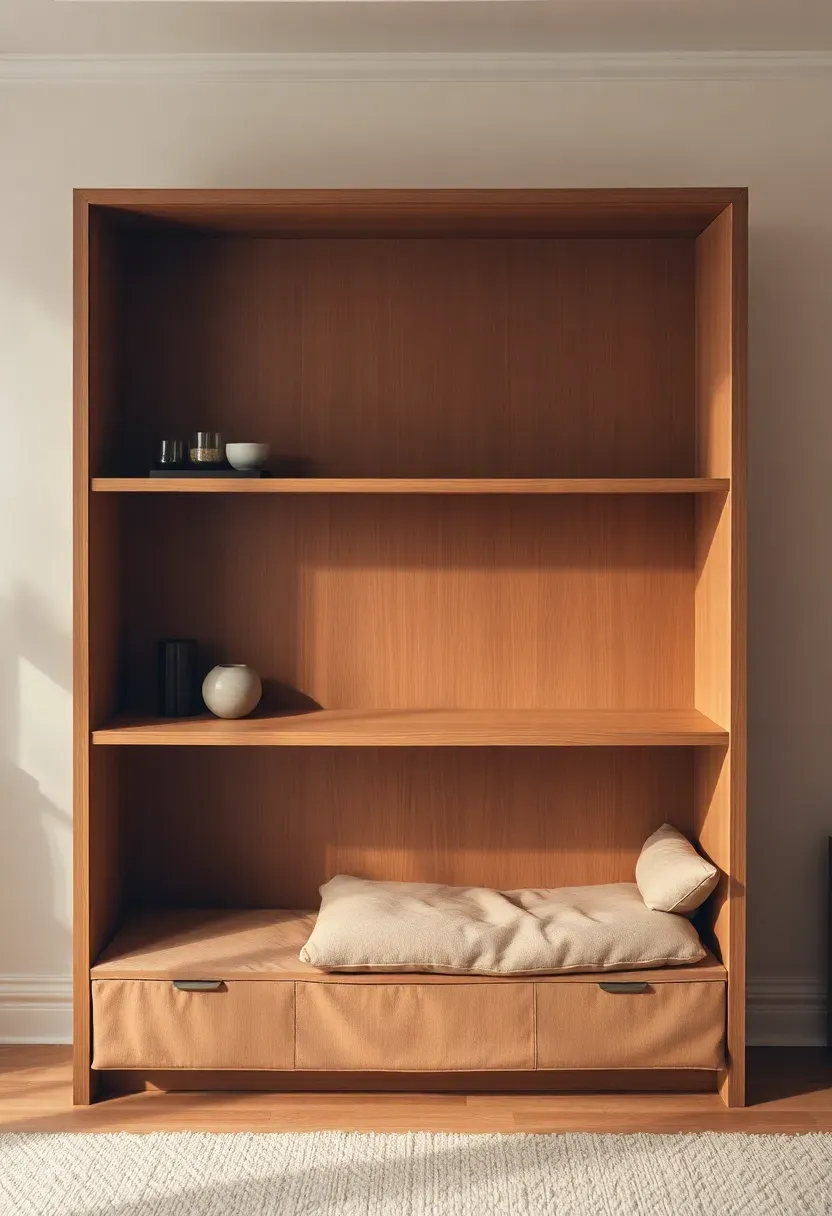
What's the best shelf arrangement for a rental apartment where I can't put holes in the wall? Freestanding shelf units (ladder shelves, cube units, bookcases) follow exactly the same styling rules as wall-mounted floating shelves. The only difference is that a freestanding unit has visible sides, so the arrangement needs to look complete from an angle as well as from directly in front. For renters who do have floating shelves already installed, Command strips hold lightweight decorative objects and small prints reliably. Avoid anything over 2 kg per strip, and never use them for glass, ceramics, or anything fragile.
You already own most of what you need. Clear one shelf this evening, apply Steps 2 and 3 to what comes off it, and put back only what passes the edit — that single shelf will show you exactly what the whole unit can become.
Pinterest cover for How to Decorate Open Shelves in 2026: 11 Steps to a Curated Look
About the author
OBCD
CGI visualization and interior design content. We create detailed 3D renders and curate practical design ideas for every room in your home.