25 Kitchen Decor Ideas for 2026
Walk into the kitchen and it hits you immediately — the particular light, the smell, the feeling that this room is either working for you or quietly against you. We spend more time in our kitchens than we realize, which is exactly why the smallest decor decisions carry so much weight. In 2026, the trend conversation has moved away from sterile perfection toward something more human: layered textures, considered color, and objects that tell a story. Whether you're starting from scratch or refreshing a tired space, there's a version of this that works for your budget and your life.
In this article I've gathered 25 decor ideas drawn from the sharpest design directions of 2026 — from bold color moves and material pairings to subtle accessory choices that shift a room's entire feeling.
Table of Contents
- Warm Terracotta Accents
- Fluted Ceramic Vessels as Display
- Unlacquered Brass Hardware
- Arched Alcove Shelving
- Deep Olive Green Cabinetry
- Rattan and Woven Drawer Fronts
- Zellige Tile Backsplash
- Warm-Toned Pendant Clusters
- Butcher Block Counter Sections
- Two-Tone Cabinet Color Blocking
- Statement Range Hood
- Open Timber Shelving with Curated Objects
- Linen Tea Towels as Textile Color
- Japandi-Inspired Minimalism
- Botanical Prints and Framed Kitchen Art
- Handmade Ceramics on Open Display
- Terrazzo Accents on Counters or Floors
- Warm White Instead of Bright White
- Curved Cabinet Door Details
- Herb Garden on the Window Sill
- Wabi-Sabi Imperfect Finishes
- Matte Black Fixture Upgrades
- Cane and Glass Cabinet Doors
- Textured Plaster Walls or Limewash Paint
- Seasonal Styling with a Fruit Bowl Focal Point
1. Warm Terracotta Accents
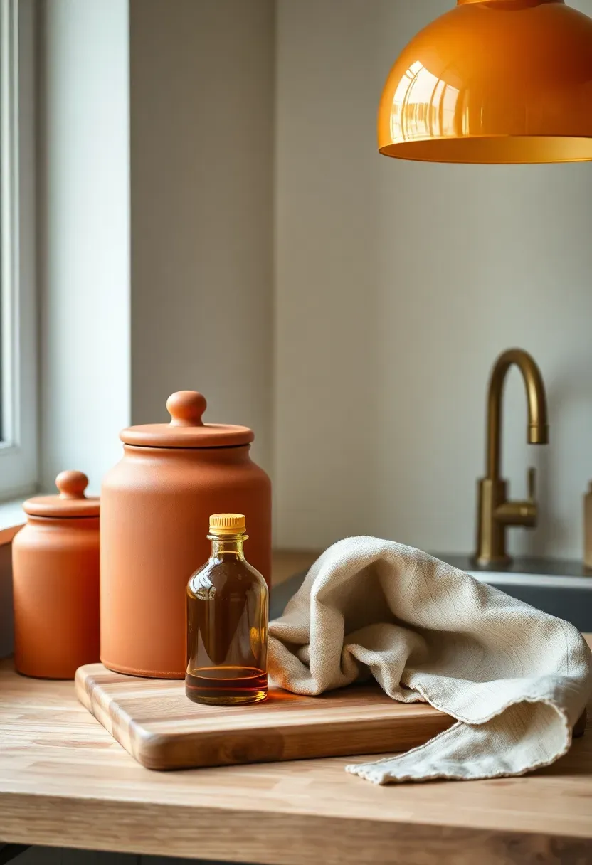
Terracotta is no longer just a tile color for bathrooms — it's the accent shade quietly ruling kitchen decor in 2026. The earthen orange-red sits perfectly against cream cabinetry, warm wood tones, and matte olive green. You don't need a renovation to bring it in: a set of terracotta canisters, a ceramic oil pourer, or even a large terracotta pot with fresh herbs on the windowsill pulls the palette together with almost no effort. The color reads as both grounded and warm, which makes it especially effective in north-facing kitchens that struggle with cold, flat light.
Tips / Practical Recommendations
- Start with one or two terracotta ceramic pieces before committing to a larger purchase
- Layer with cream linens and raw wood for a cohesive earthy palette
- Avoid mixing with bright chrome — opt for aged brass or matte black fixtures instead
We picked a few things that go well with this idea: Stylentdecor Richmond Unlacquered Brass Pulls (6-inch) (★5.0), QOGRISUN Unlacquered Brass Cabinet Pulls (5-Pack) (★4.5) and khtumeware Unlacquered Brass Cabinet Pulls (10-Pack) (★4.8). As an Amazon Associate we earn from qualifying purchases.
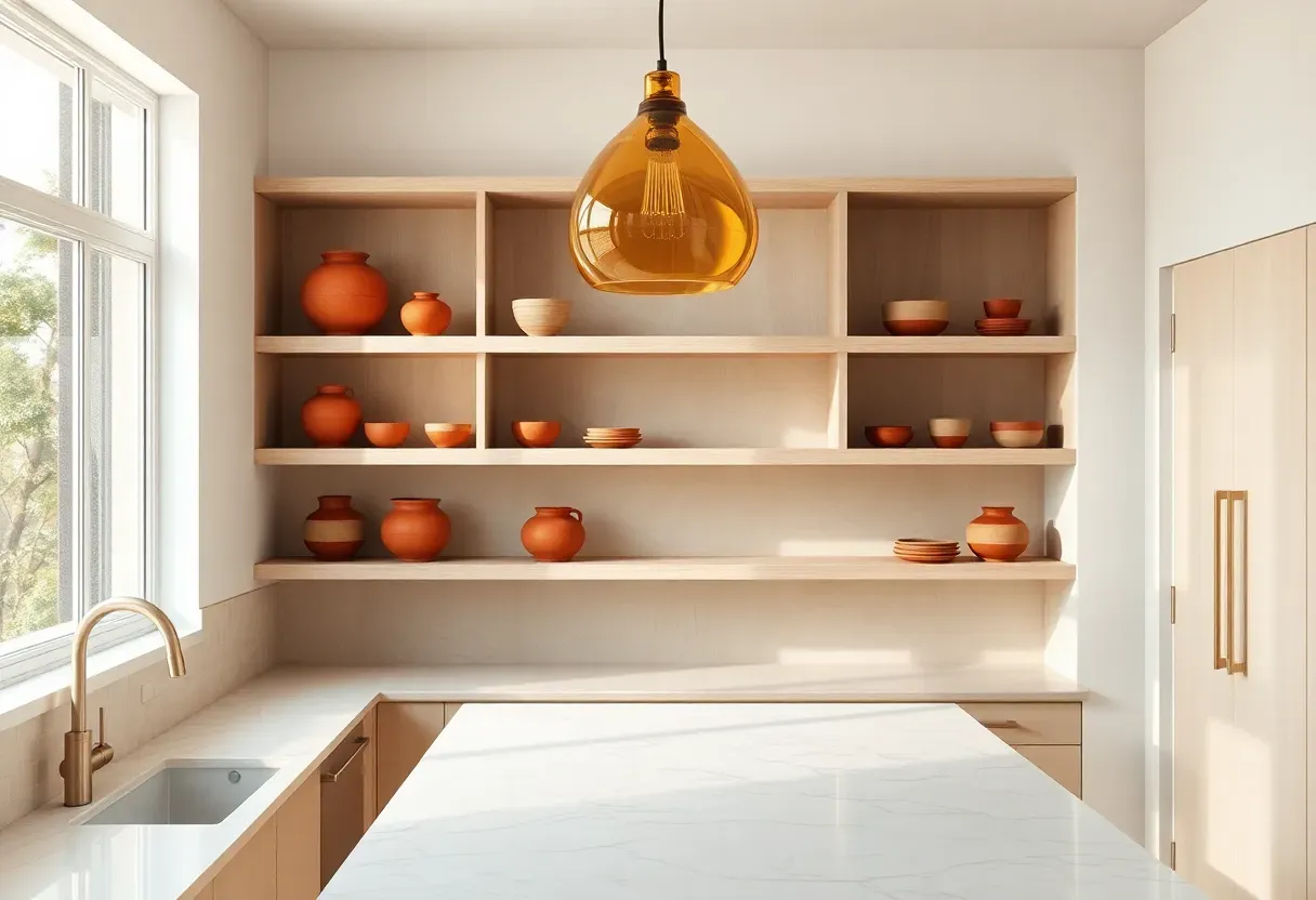
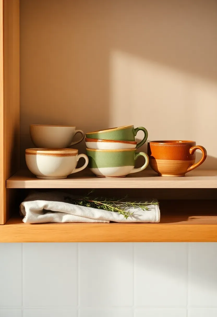
2. Fluted Ceramic Vessels as Display
The Core Issue
Most kitchen shelves become clutter magnets — random mugs, forgotten gadgets, and a spice jar that doesn't belong. The result looks busy and unintentional, which makes even an expensive kitchen feel chaotic.
The Solution
Commit to a deliberately curated approach where fluted ceramic vessels serve as the primary display objects. Fluting — vertical grooves in the surface — catches light beautifully and adds architectural interest without complexity. A trio of fluted vases or vessels in tonal neutrals (cream, stone, terracotta) on open shelving acts as purposeful art. Fill one with dried stems, leave one empty, and use one for kitchen utensils. Three objects, one visual story.
Pros and Cons
Pros: Sculptural impact without significant cost, easy to restyle seasonally, ties beautifully into 2026's textured material trend.
Cons: Requires restraint — adding too many competing objects around them defeats the purpose.
We picked a few things that go well with this idea: Creative Co-Op Stoneware Bowl Reactive Glaze (★4.6), Creative Co-Op Stoneware Berry Bowl with Handles (★4.7) and Creative Co-Op Stoneware Flower Bowls Multicolor (★4.8). As an Amazon Associate we earn from qualifying purchases.
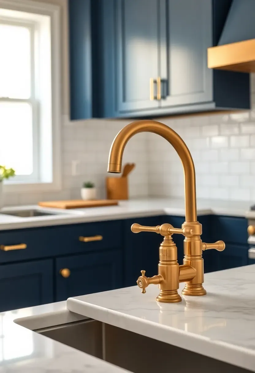
3. Unlacquered Brass Hardware
How to Swap Out, Not Start Over
Replacing hardware is the fastest, most affordable kitchen refresh available. And in 2026, unlacquered brass is the finish that designers keep reaching for.
Step 1: Inventory Your Current Hardware
Count every cabinet pull, hinge, and knob. Note the hole spacing (typically 96mm or 128mm center-to-center) before ordering anything.
Step 2: Choose Unlacquered Over Lacquered
Unlacquered brass develops a living patina over months of use — it ages to a warmer, slightly darker tone that actually improves with handling. Lacquered brass stays static and can chip.
Step 3: Update the Faucet Last
Once cabinet hardware is swapped, see how the space feels. Often the faucet swap is the one that tips a kitchen from "refreshed" to "transformed."
What to Watch Out For
- Don't mix unlacquered brass with polished chrome — the tones clash noticeably
- Allow three to six months for patina to develop naturally; don't force it with chemicals
- Pair with warm paint tones — unlacquered brass fights cold gray or stark white
We picked a few things that go well with this idea: vensovo 4-Inch Terracotta Plant Pots (6-Pack) (★4.6), Barnyard Designs Windowsill Herb Planter Set (Set/3) (★4.5) and PERFNIQUE Farmhouse Windowsill Herb Planter Set (★4.6). As an Amazon Associate we earn from qualifying purchases.
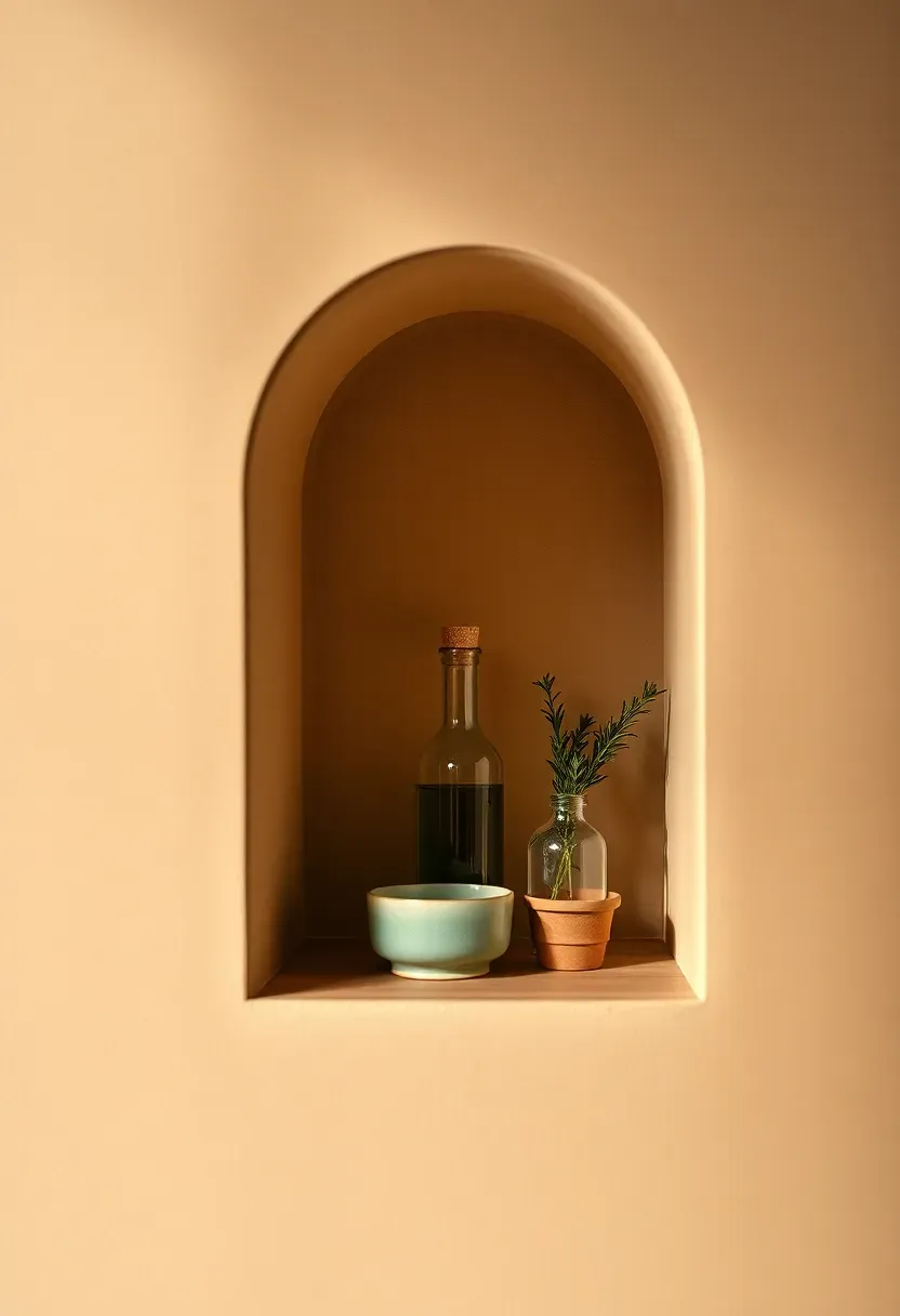
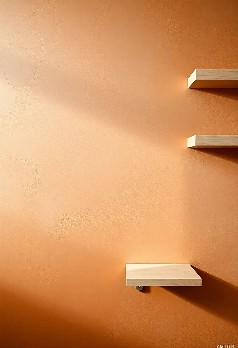
4. Arched Alcove Shelving
According to 2026 design trends, the arch is the decade's defining architectural detail — and kitchens are one of the most effective places to use it. An arched alcove carved into or built against a wall instantly transforms dead space into a focal point. You don't need structural changes: a simple timber-framed arch with a recessed shelf and warm-toned plaster or paint behind it creates the illusion of depth and craftsmanship at minimal cost. Display three to five carefully chosen objects inside — small ceramics, a single plant, olive oil in a beautiful bottle — and the effect reads as custom renovation.
Tips / Practical Recommendations
- Use a warmer paint or plaster color inside the arch than on the surrounding wall to create depth
- Light the interior with a small recessed LED puck for evening drama
- Keep displayed items odd-numbered — groups of three or five feel more organic than pairs
Recommended
Items for this idea
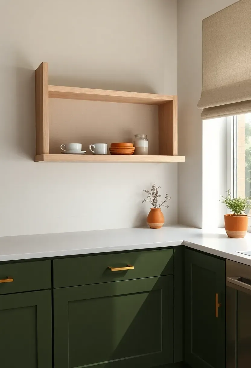
5. Deep Olive Green Cabinetry
Imagine opening the kitchen door to a wall of deep, dusty olive green — not the bright army shade, but the sophisticated, almost-gray version that appears in European country kitchens and upscale London terraces alike. This color absorbs light rather than reflecting it, which means it flatters every time of day without the clinical brightness of white. In 2026, it's become the first serious challenger to navy as the go-to rich cabinet color. Pair the lowers in olive with natural-toned or cream upper cabinets to keep the space from feeling too heavy, and watch how brass or aged copper hardware activates the whole composition.
Tips / Practical Recommendations
- Test paint samples across multiple days — olive green shifts dramatically from morning to evening light
- The best pairings are warm-toned stone countertops (not cold gray quartz)
- Limewash paint in olive creates additional depth compared to standard emulsion
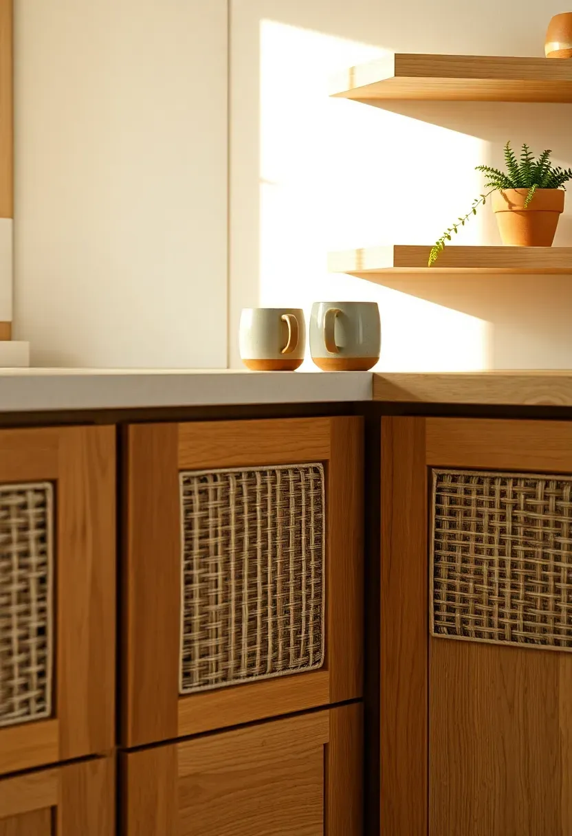
6. Rattan and Woven Drawer Fronts
Is it possible to make cabinetry feel handmade without commissioning custom furniture? Rattan drawer fronts are the answer. Replacing flat MDF panels with rattan or wicker-inset frames adds instant texture, warmth, and a sense of craft. The material breathes visually — the open weave lightens the visual weight of a bank of lower cabinets and hints at what's stored inside. In 2026, the strongest execution pairs rattan lower drawer fronts with solid painted upper cabinets in cream or warm off-white, using the contrast between solid and woven to create quiet visual rhythm.
Tips / Practical Recommendations
- Natural rattan fades in direct sunlight — consider for north or east-facing walls
- Seal rattan with a matte furniture wax to repel kitchen splashes without changing the texture
- Combine with open shelf styling above to keep the boho-natural vibe cohesive
Recommended
Items for this idea
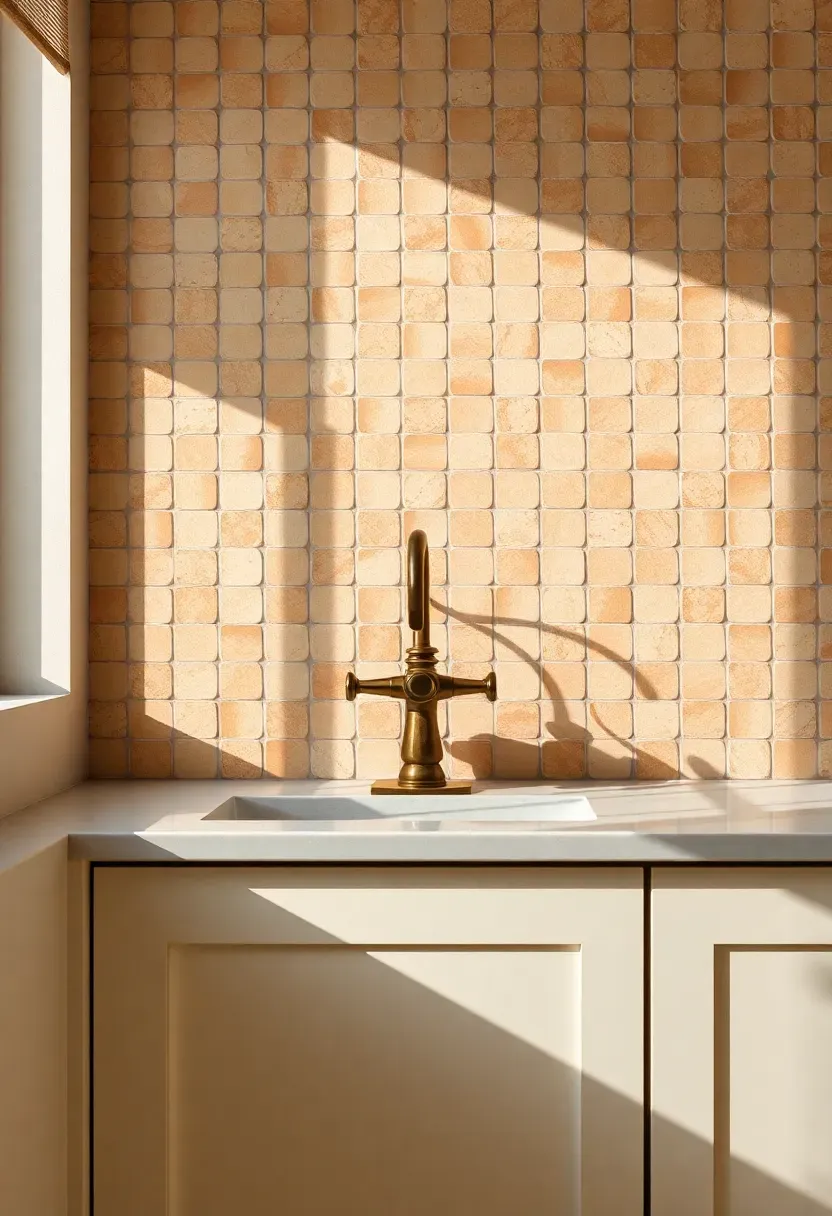
7. Zellige Tile Backsplash
Comparing: Zellige vs. Subway Tile
Introduction: Both are rectangular, both are ceramic — so why does zellige cost four times more and feel fundamentally different? The distinction matters when you're spending real money on a backsplash.
Zellige
Hand-pressed Moroccan terracotta tiles with a naturally uneven glaze that creates irregular light reflection. Each tile is slightly different in thickness and finish, which means the installed surface shimmers and shifts as light moves across the room.
Subway Tile
Machine-made, uniform, flat. Installed in a grid, it reads as clean and reliable. The predictability is its strength and its limitation.
What to Choose
Choose Zellige if: you want the backsplash to be a genuine focal point and you're willing to budget for installation time (uneven tiles require more skill to set level).
Choose Subway if: you want a timeless backdrop that recedes rather than dominates, or you're working with a tight budget.
Recommendation
In 2026, zellige in ivory, warm cream, or dusty sage brings irreplaceable character to a kitchen that subway tile simply cannot replicate. If budget allows, it's the one splurge that designers consistently endorse.
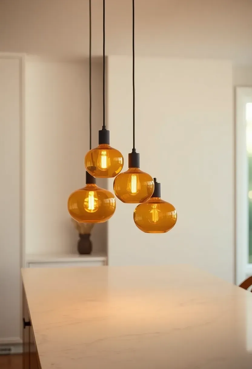
8. Warm-Toned Pendant Clusters
Should you choose one large pendant or a cluster of smaller ones? For 2026 kitchen decor, the cluster wins — specifically three pendants hung at slightly different heights over an island or peninsula. The layered arrangement creates visual interest and more evenly distributed light than a single source. The key specification is color temperature: 2700K gives that golden-hour warmth that makes food look beautiful and people look relaxed. Amber, smoked, or ribbed glass shades amplify the warm tones while adding texture at eye level. Avoid clear glass pendants — they expose the bulb too harshly and compete with the fixtures rather than complementing them.
Tips / Practical Recommendations
- Hang pendant bottoms 70–80cm above the countertop surface for task lighting that doesn't blind
- Use dimmers on island pendant circuits — cooking light and dinner party light need different intensity
- Odd numbers (three or five) feel more dynamic than even groupings
Recommended
Items for this idea
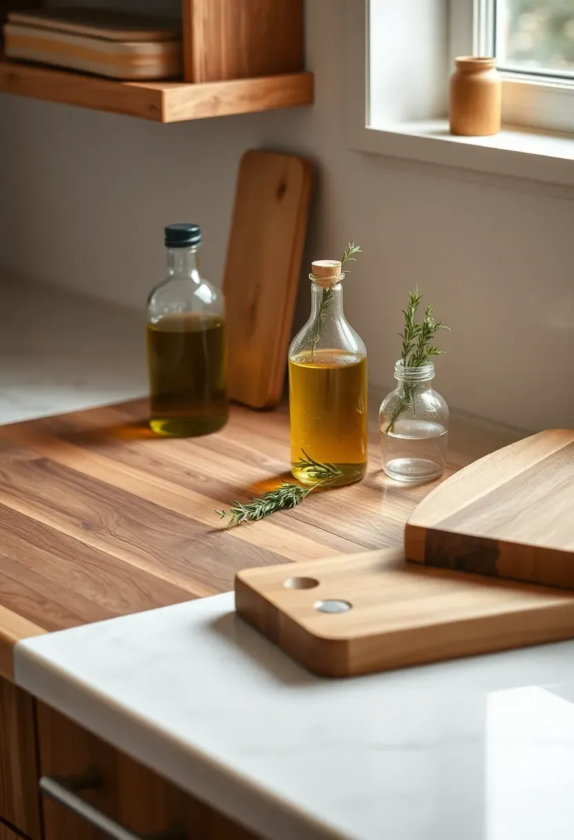
9. Butcher Block Counter Sections
Why do we still decorate kitchens with a single uniform countertop material when mixing has always been more interesting? Butcher block sections — typically walnut, maple, or white oak — used as a counter insert alongside stone or quartz surfaces bring warmth, texture, and functionality in one move. The wood section becomes the prep area by default: it's gentler on knife edges, self-healing with occasional oiling, and visually anchors the organic decor approach that defines 2026 kitchen styling. Position it near the sink or as the island surface, and let the contrast between wood and stone do the visual work.
Tips / Practical Recommendations
- Oil butcher block monthly with food-safe mineral oil to prevent cracking and warping
- Avoid placing directly next to a heat source — sustained heat dries and splits end-grain wood faster
- The warm honey tone of new maple deepens beautifully to amber over one to two years of use
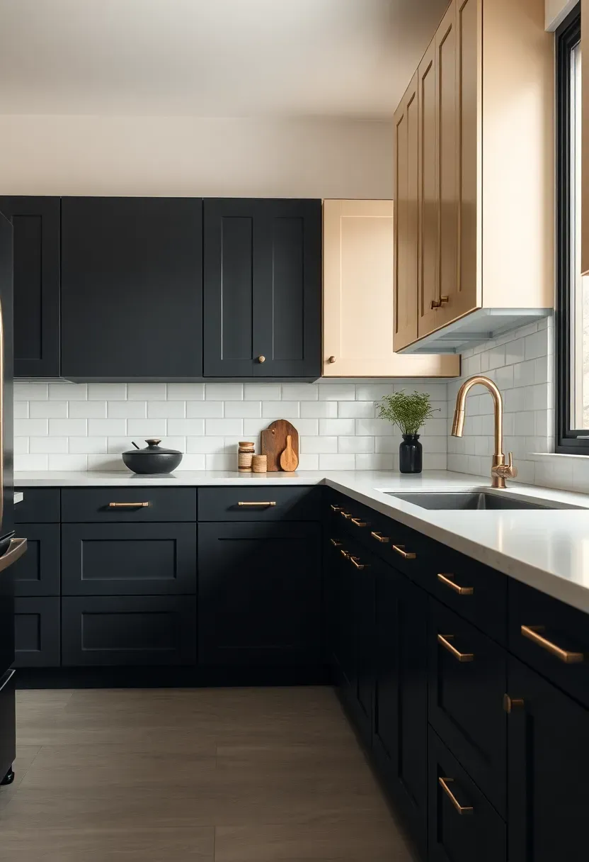
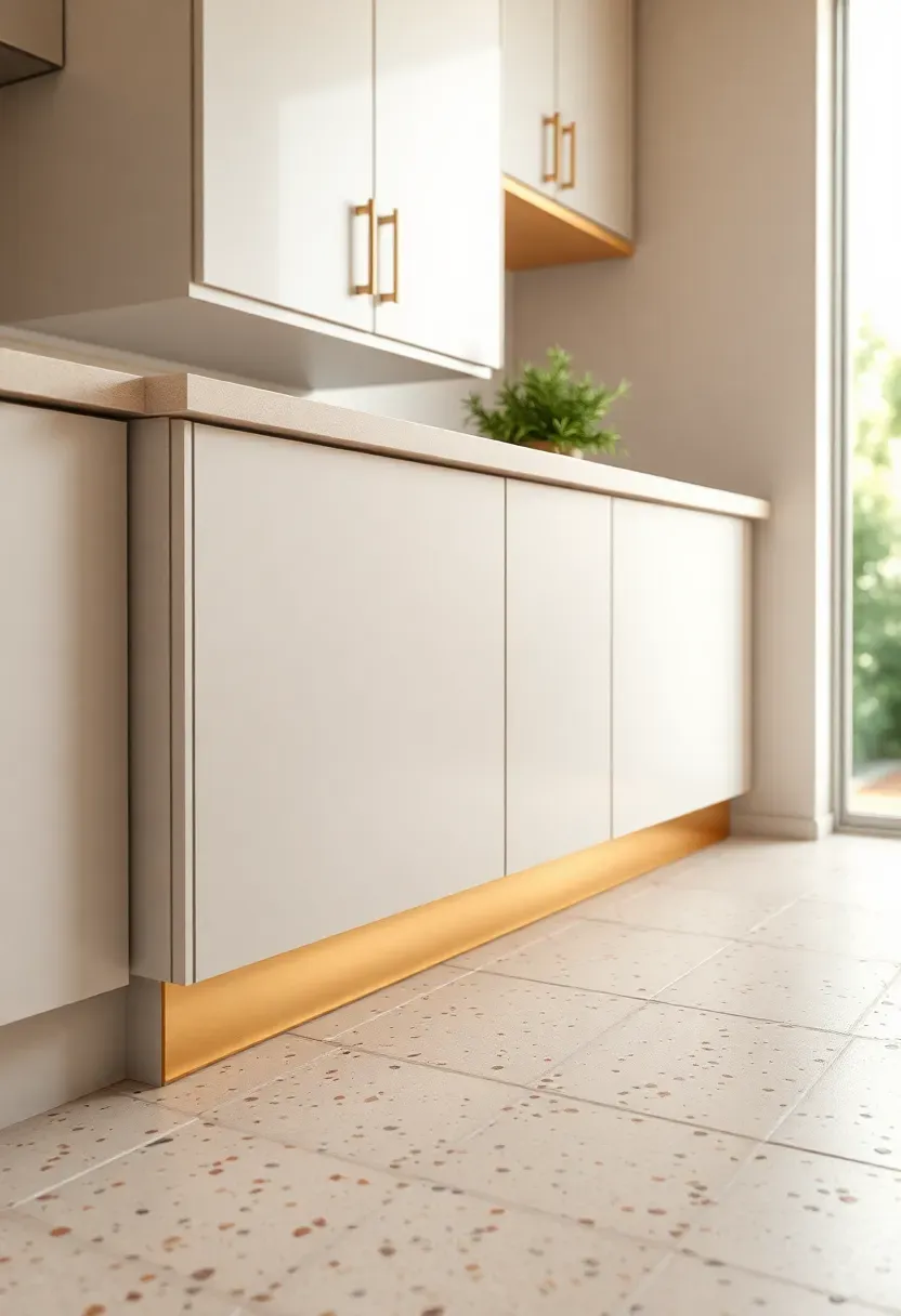
10. Two-Tone Cabinet Color Blocking
The Core Issue
Choosing a single cabinet color for an entire kitchen forces a binary choice: go light and risk sterile, or go dark and risk heavy. Neither option plays to the room's full potential.
The Solution
Two-tone color blocking — dark lowers, light uppers (or the reverse) — allows you to use bold color in the lower zone where it grounds the room, while keeping the upper zone open and airy. The most successful 2026 combinations include charcoal or deep forest green lowers with cream or warm white uppers, and dusty terracotta lowers with off-white or limewash uppers.
Pros and Cons
Pros: Flexibility to introduce color without full commitment, creates architectural dimension, ties together different zones of the kitchen.
Cons: Requires careful paint selection — the two tones must be pulled from the same warm or cool family to avoid visual discord.
Recommended
Items for this idea
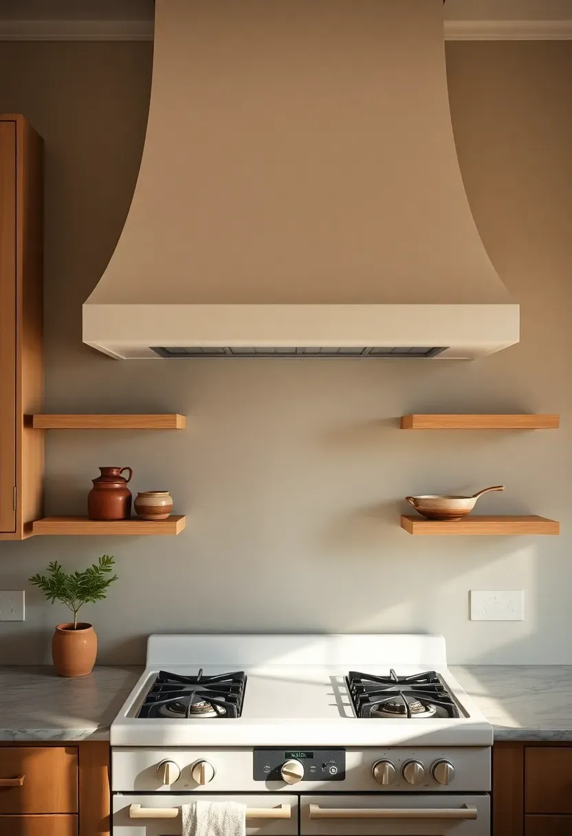
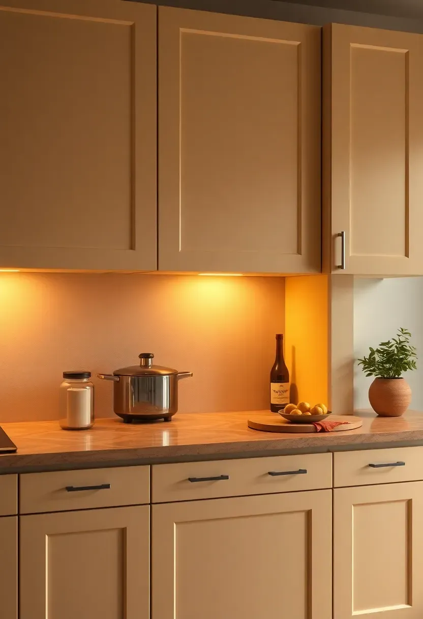
11. Statement Range Hood
How to Turn a Functional Piece into a Design Anchor
The range hood is the largest vertical element in most kitchen designs, yet it's usually treated as an afterthought — a stainless steel box that matches the appliances. The shift in 2026 is treating it as a sculptural focal point.
Step 1: Choose the Material
Plaster hoods (smooth or limewashed) bring a seamless, built-in look. Copper hoods add warmth and patina. Shiplap wood hoods suit farmhouse or coastal styles. Each choice sets the entire kitchen's design register.
Step 2: Scale Up
The most common mistake is installing a hood too narrow for the range. The hood should extend two to four inches beyond each burner on either side.
Step 3: Add Trim or Corbels
Architectural trim around the hood mantel — even simple molding — elevates the piece from functional to finished.
What to Watch Out For
- Ventilation CFM should match your cooking style: high-heat wok cooking needs 600+ CFM, most home cooks are fine with 400–500
- A beautiful hood on a weak fan is a decor choice, not a functional one — don't compromise the fan for the look
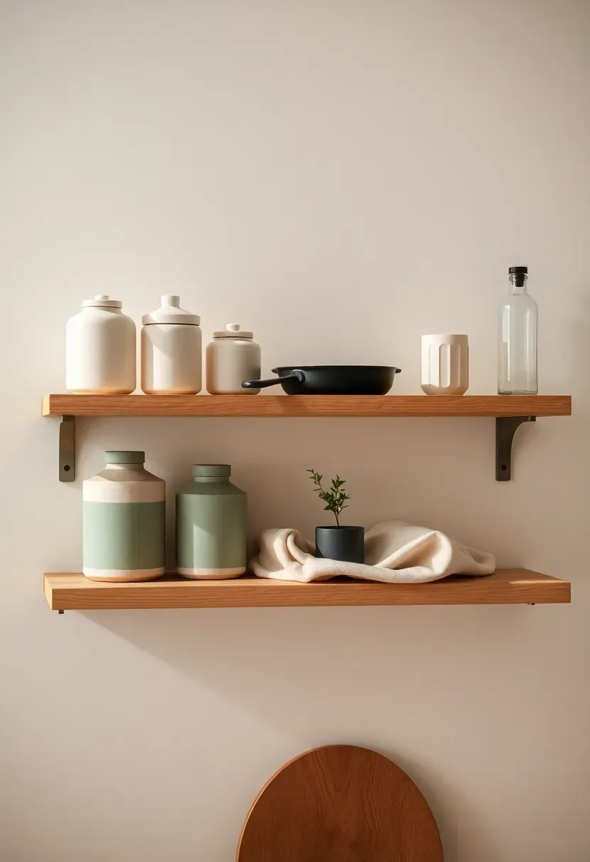
12. Open Timber Shelving with Curated Objects
Ready? Let's dive into the decor move that divides kitchens into two camps: the cluttered and the considered. Open shelving only works when you commit to intentional styling — and in 2026, the styling language is very specific. Natural timber shelves (white oak, walnut, or reclaimed pine) host five to seven objects maximum per shelf, with deliberate spacing between them. The objects themselves follow a rule of mixed heights and mixed textures: a tall ceramic jar next to a small cast iron pan, a bundle of herbs beside a single book. Negative space is not emptiness — it's the breath that lets each object read clearly.
Tips / Practical Recommendations
- Restrain yourself to one color family per shelf — all warm neutrals, or all greens, not both
- Remove anything without aesthetic purpose during a quarterly restyle
- Lighting the shelf from above with a small LED strip transforms evening display completely
Recommended
Items for this idea
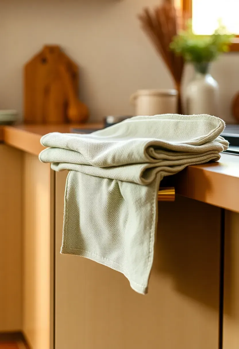
13. Linen Tea Towels as Textile Color
Which element of kitchen decor gets overlooked most consistently? Textiles. Specifically, the tea towels, oven gloves, and window treatments that collectively set the textile palette of the room. In 2026, linen is the material of choice — its slightly coarse weave, natural color variation, and graceful drape make it look intentional rather than utilitarian. Two or three tea towels in coordinated tones — sage green with cream stripe, warm ochre with undyed linen — draped over an oven handle or folded on a shelf add softness that no hard surface can replicate. The total cost is under $40; the visual impact is disproportionately high.
Tips / Practical Recommendations
- Linen softens significantly after the first three to four washes — buy early and wash before display
- Stick to a two-color limit per set: patterned with solid, or two complementary solids
- Replace textiles seasonally as an inexpensive way to shift the kitchen's entire color register
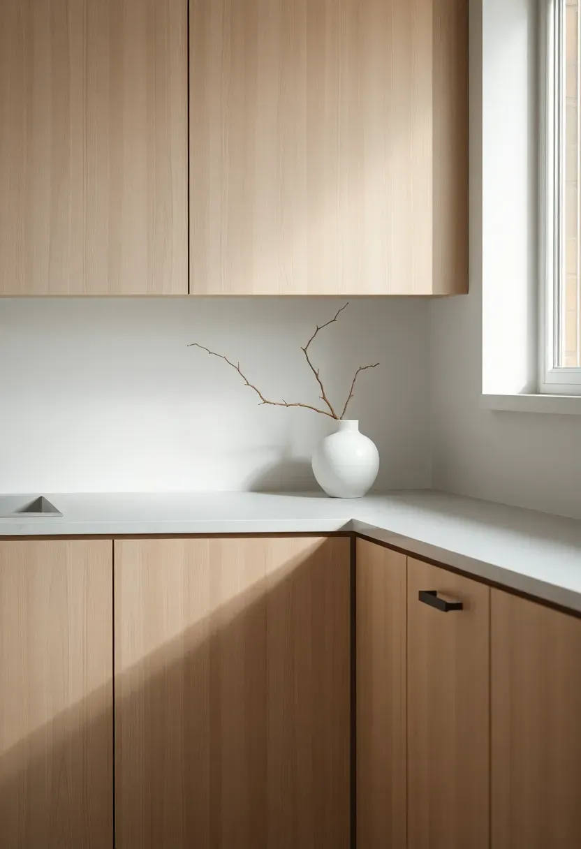
14. Japandi-Inspired Minimalism
Origins / History
Japandi is the design world's most successful portmanteau — a fusion of Japanese wabi-sabi philosophy and Scandinavian functional minimalism that emerged as a mainstream aesthetic around 2020. Both traditions share an instinct for pared-back living, natural materials, and the beauty of imperfection.
Modern Interpretation
In the kitchen, Japandi in 2026 translates to flat-panel cabinetry in natural oak or warm white, stone or concrete countertops, and a deliberate absence of upper cabinets. Every object on the counter earns its place. A single ceramic vase with one dried branch. A handmade mug visible through a cane-insert cabinet door. The restraint is the point — Japandi kitchens feel calm because they refuse visual noise.
How to Apply at Home
- Remove everything from countertops and return only what you use daily and find beautiful
- Replace plastic storage with ceramic or glass containers in matching tones
- Add one live plant or single branch in a textured ceramic vase as the room's natural gesture
- Use warm-toned LED lighting (2700K) to counteract the minimalism from feeling cold
Recommended
Items for this idea
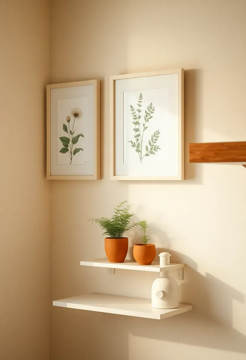
15. Botanical Prints and Framed Kitchen Art
For centuries, kitchens have been treated as purely functional spaces where art has no place — there's steam, splatter, and grease to consider. But 2026 designers are pushing back firmly: kitchens are lived-in rooms deserving of proper art moments. Botanical prints work especially well because their subject matter connects naturally to the food and growth themes of the space. A pair of vintage-style botanical illustrations in simple cream frames, hung on an empty wall section above a counter or shelf, transforms a dead zone into a curated corner. The scale matters: two medium prints (A4 or letter size) side by side read more intentionally than one small print floating alone.
Tips / Practical Recommendations
- Frame behind glass to protect from steam — use frames with sealed backs if near a hob
- Botanical prints in warm sepia or soft watercolor tones age better visually than high-contrast black-and-white
- Align the bottom edge of your frames with a shelf or counter level for a composed, architectural look
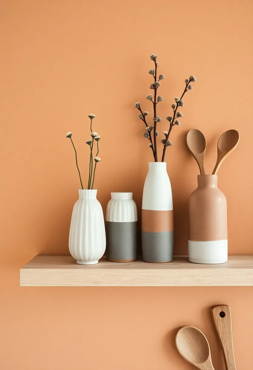
16. Handmade Ceramics on Open Display
Trend / History
The handmade ceramics moment has been building for a decade, driven partly by the global craft revival and partly by a cultural reaction against mass production. In 2026, it's fully mainstream — with good reason. Handmade stoneware pieces in matte glazes carry variation that machine-made objects simply can't replicate: slight thumb impressions in the clay, drips at the foot of a bowl, color shifts across a glaze surface.
Modern Interpretation
On open kitchen shelving, a collection of handmade mugs, small bowls, and ceramic vessels in a tonal palette (cream, sage, warm brown) creates a genuinely artful display. The key is tonal cohesion: buying from one or two makers who share a similar aesthetic gives the collection visual unity.
How to Apply at Home
- Visit local ceramic markets or Etsy for small-batch makers in your preferred palette
- Display by height and group odd numbers — three mugs, five bowls
- Use pieces regularly — handmade ceramics are meant to be touched and used, not kept precious
- Rotate seasonally, bringing forward warmer tones in winter and cooler glazes in summer
Recommended
Items for this idea
17. Terrazzo Accents on Counters or Floors
Terrazzo — that confetti-in-concrete material beloved by mid-century modernists — returned as a design trend around 2018 and has refused to leave. In 2026, it's found its most sophisticated expression yet: smaller chips, more restrained color palettes, and application as accent surfaces rather than full-room statements. A terrazzo floor section under the kitchen island, or a terrazzo-surface trivet and utensil holder on the counter, brings the material in without overwhelming the room. The warmest current combinations use cream terrazzo with coral, sage, or dusty terracotta chips — a palette that bridges the gap between vintage nostalgia and contemporary warmth.
Tips / Practical Recommendations
- Terrazzo tiles are heavy — confirm your floor can handle the load before committing to full coverage
- Seal terrazzo annually to prevent staining, especially near the hob where oil splashes
- Terrazzo accessories (trays, pot stands, soap dishes) offer the look without installation costs
18. Warm White Instead of Bright White
Comparing: Bright White vs. Warm White Kitchens
Introduction: The distinction sounds subtle — a few color temperature units on a paint chip — but in a kitchen the difference between bright white and warm white reads as the difference between clinical and comfortable.
Bright White
Pure or blue-tinted white reflects maximum light and makes surfaces appear crisp and expansive. In north-facing kitchens or under cool fluorescent light, it skews cold and flat.
Warm White
Cream-adjacent whites — those with yellow, pink, or beige undertones — absorb and soften light. They photograph beautifully, pair with every natural material, and feel genuinely welcoming at every hour of the day.
What to Choose
Choose Bright White if: your kitchen gets generous southern sun all day, and you want the airy, maximally light aesthetic.
Choose Warm White if: you want a kitchen that feels equally good at 7am and 8pm, or if you're pairing with any natural wood, brass, or terracotta elements.
Recommendation
In 2026, the design consensus has definitively shifted: warm white is the sophisticated choice, and bright white reads as the default of the previous decade.
Recommended
Items for this idea
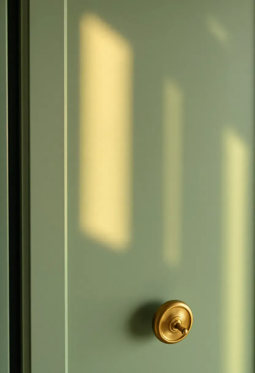
19. Curved Cabinet Door Details
The Core Issue
Flat-panel and shaker-style cabinets have dominated kitchen design for so long that the right angles have started to feel like a design rut — safe, predictable, and slightly impersonal.
The Solution
Curved cabinet door details — whether a subtle arched top to an upper cabinet or gently rounded drawer fronts — introduce a handcrafted quality without requiring custom furniture. The arch shape, in particular, has become 2026's most versatile design detail: it appears on kitchen cabinet valances, range hood mantels, and even cut-out sections in toe kicks. Even one or two arched cabinet doors among a run of standard ones creates enough visual interruption to make the whole kitchen feel considered.
Pros and Cons
Pros: Distinctive character, timeless rather than trend-driven, works across styles from Japandi to Mediterranean.
Cons: Harder to source as standard flat-pack options — may require custom ordering or a carpenter for retrofitting.
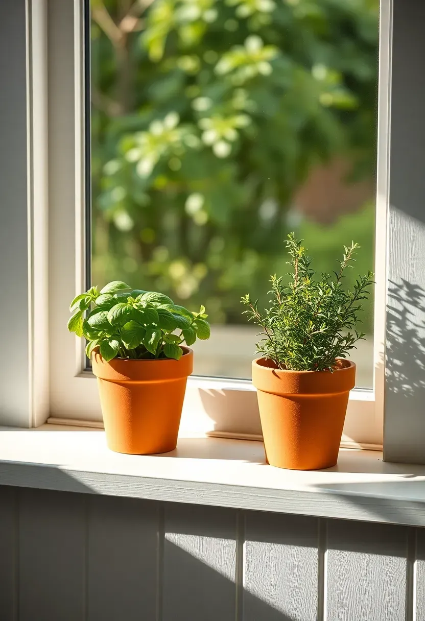
20. Herb Garden on the Window Sill
How to Create a Functional and Beautiful Herb Display
There's something uniquely satisfying about a kitchen that grows its own ingredients. A window sill herb garden in 2026 is more than practical — it's a deliberate decor statement.
Step 1: Choose the Right Pots
Terra cotta pots (the classic unglazed kind) are the 2026 choice: they breathe, they look beautiful against any wall color, and they age in a way that improves the display.
Step 2: Select Three to Five Herbs
Stick to herbs you actually cook with: basil, rosemary, thyme, sage, and flat-leaf parsley are the stalwarts. Grow only what gets used — an herb that's never harvested soon looks neglected.
Step 3: Style with Intention
Vary pot heights using a small wooden riser or a stack of books for the back row. This creates depth and prevents a flat line of identical pots.
What to Watch Out For
- South or east-facing windows give the best light for most culinary herbs
- Water-collecting saucers are essential for windowsills — overwatering kills herbs faster than underwatering
- Replace herbs after they bolt (flower) — it takes ten minutes and restores the display's freshness
Recommended
Items for this idea
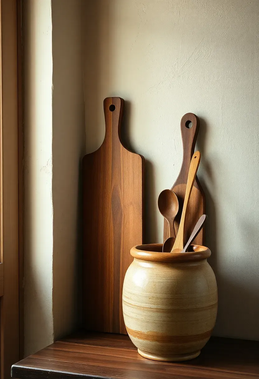
21. Wabi-Sabi Imperfect Finishes
Start with the philosophy: wabi-sabi, the Japanese aesthetic that finds beauty in imperfection and transience, is one of the most compelling design lenses to apply to a kitchen — the most-used, most-worn room in any home. In practice, it translates to embracing finishes and materials that show their age honestly. A limewash plaster wall that's slightly uneven. An unlacquered brass faucet developing its patina. A wooden cutting board worn smooth and stained from years of use. An aged terracotta crock for utensil storage. None of these things are shabby — they're richly lived-in, and they give a kitchen a quality that no showroom surface can fake.
Tips / Practical Recommendations
- Limewash paint is the fastest way to achieve an authentically imperfect wall — one afternoon of application, years of beautiful result
- Don't seal or protect aged brass and copper surfaces — the patina is the point
- Mix wabi-sabi objects with cleaner lines to prevent the overall effect from reading as simply worn-out
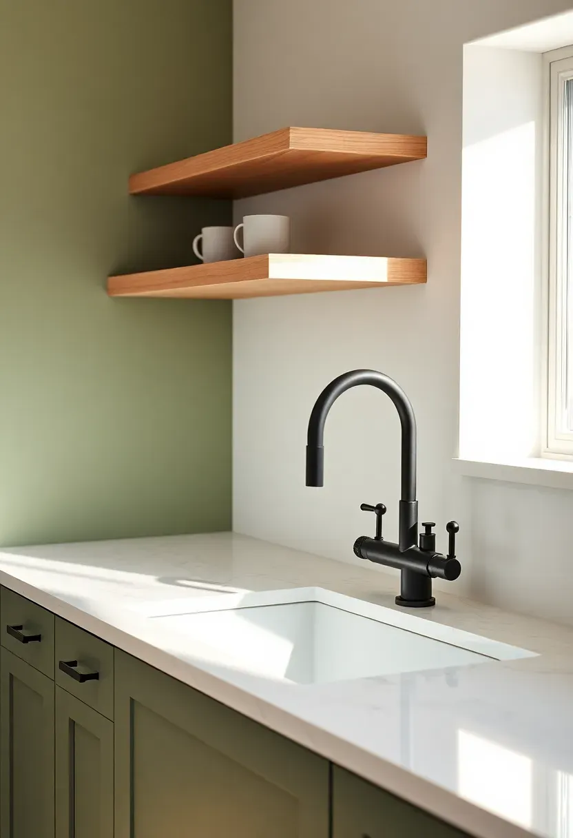
22. Matte Black Fixture Upgrades
Which finish has proven it can go with almost anything without being the safe default that chrome became? Matte black. It's the anchor finish of 2026 kitchen decor: appearing on faucets, cabinet hardware, pendant lamp cords, and appliance trim across everything from Japandi-minimal to warm farmhouse kitchens. The matte texture absorbs rather than reflects light, which means it never competes visually — it defines edges and adds contrast without shouting. The strongest application pairs matte black hardware against a mid-tone background: sage green, warm beige, or dusty olive. Against white it risks feeling too graphic; against dark navy it disappears.
Tips / Practical Recommendations
- Powder-coated matte black hardware is more durable than painted — check specs before buying
- Clean with warm soapy water only — abrasive cleaners strip the matte coating quickly
- Use matte black as the consistent finish across all metal elements in one kitchen zone for visual coherence
Recommended
Items for this idea
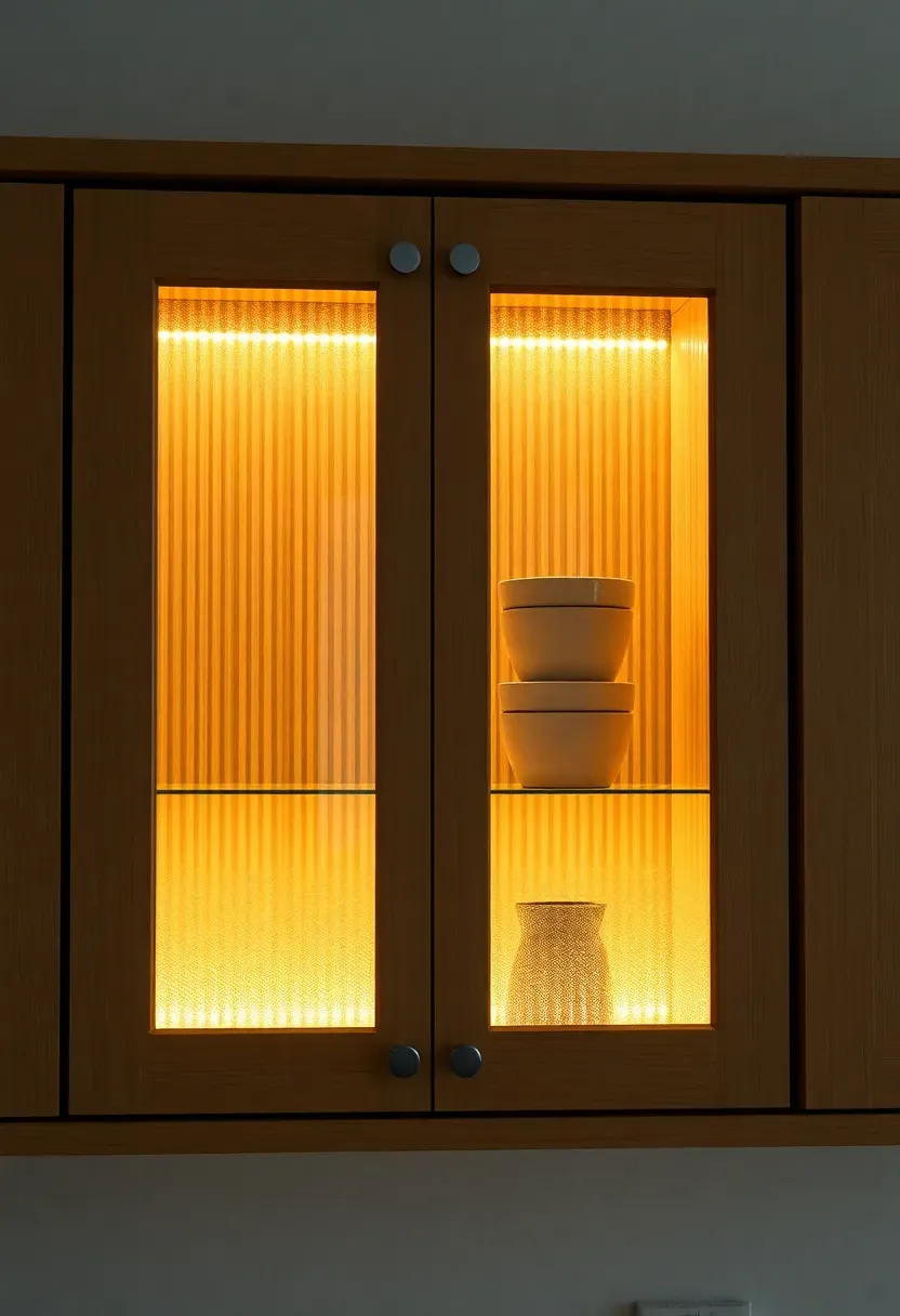
23. Cane and Glass Cabinet Doors
Should upper cabinets be solid, open, or somewhere in between? The cane-and-glass insert door answers that question elegantly. The combination — a solid wood frame with a cane or reeded glass panel — lets you hide everyday clutter while hinting at what's stored inside. The objects behind become softened silhouettes rather than a chaotic display, and the cane texture adds warmth that plain glass can't. In 2026, the most sophisticated version uses ribbed or fluted glass (sometimes called reeded glass) in a warm oak frame, paired with a warm LED strip inside the cabinet so the contents glow softly in the evening.
Tips / Practical Recommendations
- Cane inserts require consistent humidity — in very dry climates they can shrink and gap in the frame
- Ribbed glass offers the same partial concealment as cane with better moisture resistance
- Install a small LED strip inside to make the cabinet an evening lighting feature
24. Textured Plaster Walls or Limewash Paint
Trend / Style Features
Among all the surface treatments available to the 2026 kitchen decorator, limewash and textured plaster stand apart because they do something no other finish can: they make the room feel genuinely old and genuinely handmade at the same time.
Origins / History
Limewash has been applied to interior walls for thousands of years — it's made from slaked lime and was the standard wall finish across the Mediterranean, Middle East, and Europe long before synthetic paint existed. Its contemporary revival is driven by a longing for surfaces that carry history.
Modern Interpretation
In a 2026 kitchen, a limewash accent wall behind open shelving or the cooker creates a focal point with enormous visual texture. As light moves through the day, the uneven pigment depth creates subtle shifts of tone — the wall is never the same twice. Colors that work particularly well include dusty terracotta, aged cream, and faded sage.
How to Apply at Home
- Limewash is a DIY-approachable application — two coats, applied in irregular strokes with a wide brush
- Tone test in at least three different lighting conditions before committing to a full wall
- Seal with a matte clear wax for kitchens where steam or splash is a concern
- Pair with simple flat-panel cabinetry — the plaster texture is the statement, everything else should recede
Recommended
Items for this idea
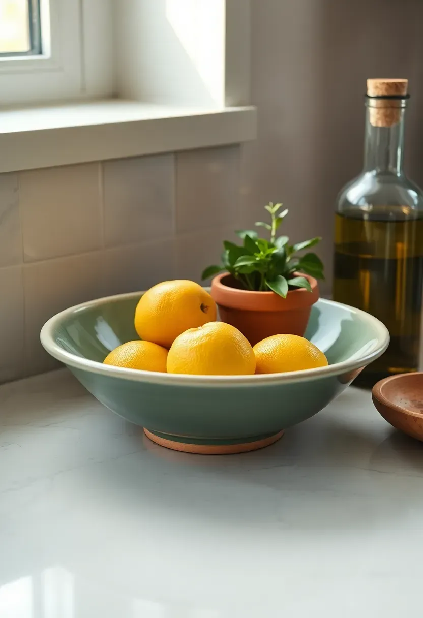
25. Seasonal Styling with a Fruit Bowl Focal Point
Trends come and go, but the bowl of seasonal fruit on a kitchen counter is one decor move that has remained genuinely timeless across every style era. What makes it a 2026 decor idea rather than a cliche is the execution: the bowl itself matters enormously. In 2026, the best versions are handmade ceramic or carved wood bowls — wider and shallower than the traditional fruit bowl, which has the effect of displaying the fruit rather than piling it. A cluster of ripe lemons in a sage-green glazed ceramic bowl, or a pile of blood oranges in warm terracotta, becomes a seasonal color anchor that updates itself every week with zero additional effort.
Tips / Practical Recommendations
- Match the bowl to the kitchen's existing palette — don't introduce a new color at this stage
- Odd numbers of fruit feel more natural: five lemons, seven oranges, nine plums
- Pair with one secondary element — a small potted herb beside the bowl completes the vignette without overcrowding the counter
Quick FAQ
Is terracotta too trendy to commit to in 2026? Terracotta in its earthy, muted form has been a constant in Mediterranean and Southwestern design for centuries — the 2026 version is simply a mainstream acknowledgment of its staying power. Commit to it in accessories rather than permanent surfaces if longevity concerns you, and it will always feel current.
Should I remove upper cabinets for open shelving? Only if you genuinely enjoy curating and maintaining a tidy display. Open shelving looks aspirational in design photos because those images represent a single styled moment. In daily use, open shelves require consistent restraint and periodic restyling. If you want the look without the commitment, start with one small section rather than removing everything at once.
What's the difference between warm white and cream paint for kitchen cabinets? Warm white sits closer to a true white with a slight undertone — it reads as white in most light conditions but doesn't have the blue cast of a pure bright white. Cream is more overtly off-white, with a more visible yellow or beige undertone. Both work beautifully in 2026 kitchens; the distinction is how much of the warmth you want to be perceptible at first glance.
Which hardware finish works with the most cabinet colors? Unlacquered brass is the most versatile warm-toned finish — it pairs with green, navy, cream, terracotta, gray, and even black cabinets. Matte black is the most versatile cool-toned finish, working across virtually every palette. Brushed nickel and chrome are the least versatile because they tend to fight with warm tones.
How often should I restyle kitchen open shelves? A full restyle every three to four months aligns naturally with seasonal transitions and prevents the display from going invisible through familiarity. A lighter weekly tidy — returning items to their correct position, removing anything that's crept in that doesn't belong — is the maintenance routine that keeps styled shelves looking intentional rather than accidental.
The best kitchen is the one that feels genuinely yours — not a showroom recreation, but a space that has accumulated the right objects over time, each chosen with some care. Start with one idea from this list: a new ceramic piece, a change of hardware finish, or a pot of fresh herbs on the windowsill. Let that one thing settle before adding the next. Kitchens built slowly and deliberately almost always outshine ones redesigned in a single weekend.
Pinterest cover for 25 Kitchen Decor Ideas for 2026
About the author
OBCD
CGI visualization and interior design content. We create detailed 3D renders and curate practical design ideas for every room in your home.