23 Kitchen Color Trends for 2026
Walk into a kitchen designed for 2026 and you immediately notice something has shifted. Gone are the stark white walls and cool gray cabinets that dominated the last decade. In their place: rich earthy terracottas, layered greens, quiet blues, and unexpected warm neutrals that make a kitchen feel genuinely lived-in rather than staged. Color is back — but this time it is thoughtful, grounded, and personal. These 23 trends will show you exactly where kitchen color is heading.
Ready? Let us dive in.
Table of Contents
- Warm Terracotta Cabinets
- Sage Green Lower Cabinets
- Butter Yellow Walls
- Deep Forest Green Island
- Dusty Blue Cabinets
- Warm White and Wood Palette
- Charcoal and Brass Combination
- Clay and Cream Two-Tone Cabinets
- Olive Green Accent Wall
- Warm Greige Everything
- Midnight Navy Statement Cabinets
- Rust and Natural Stone
- Pale Blush Cabinets
- Mushroom and Linen Palette
- Cobalt Blue Backsplash Accent
- Warm Black Matte Cabinets
- Celadon Green and White
- Caramel and Walnut Warmth
- Plum and Bronze Combination
- Soft Pistachio Kitchen
- Golden Ochre Accent Color
- Warm Gray with Copper Accents
- Earthy Layered Neutral Palette
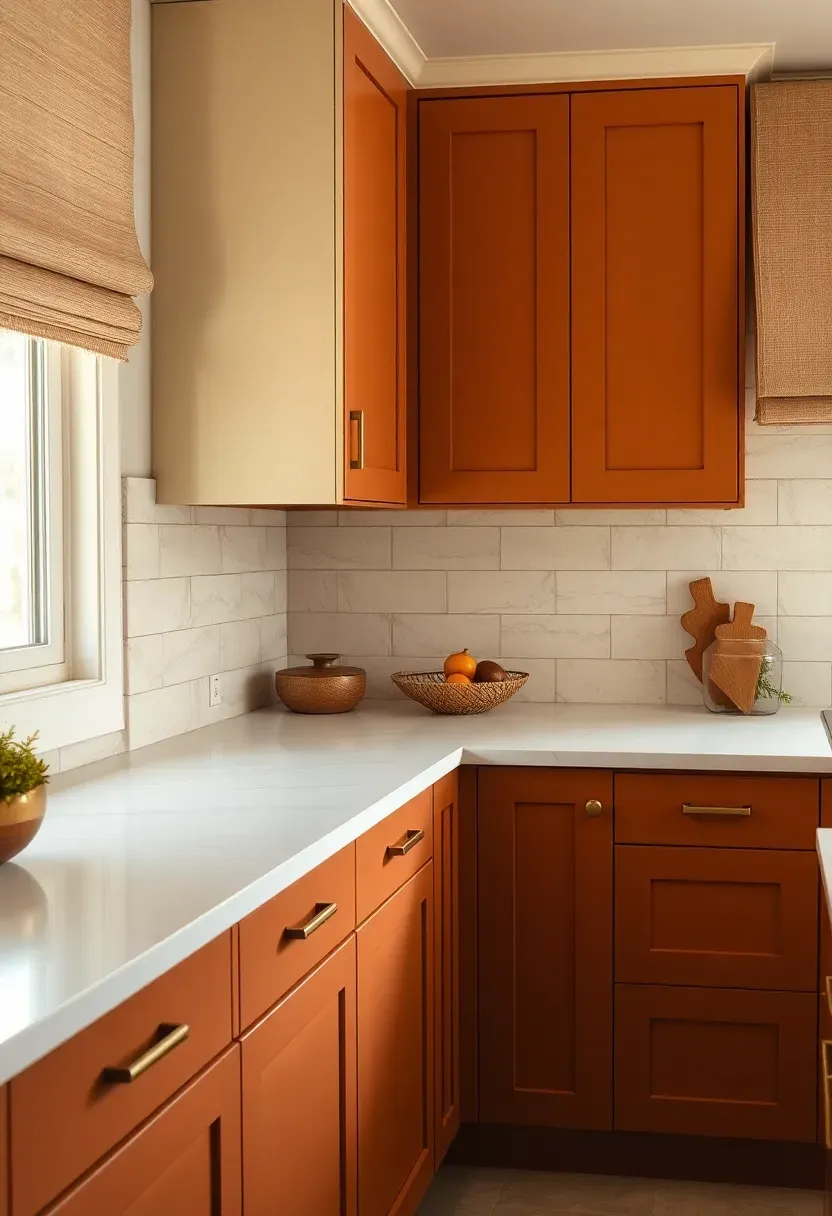
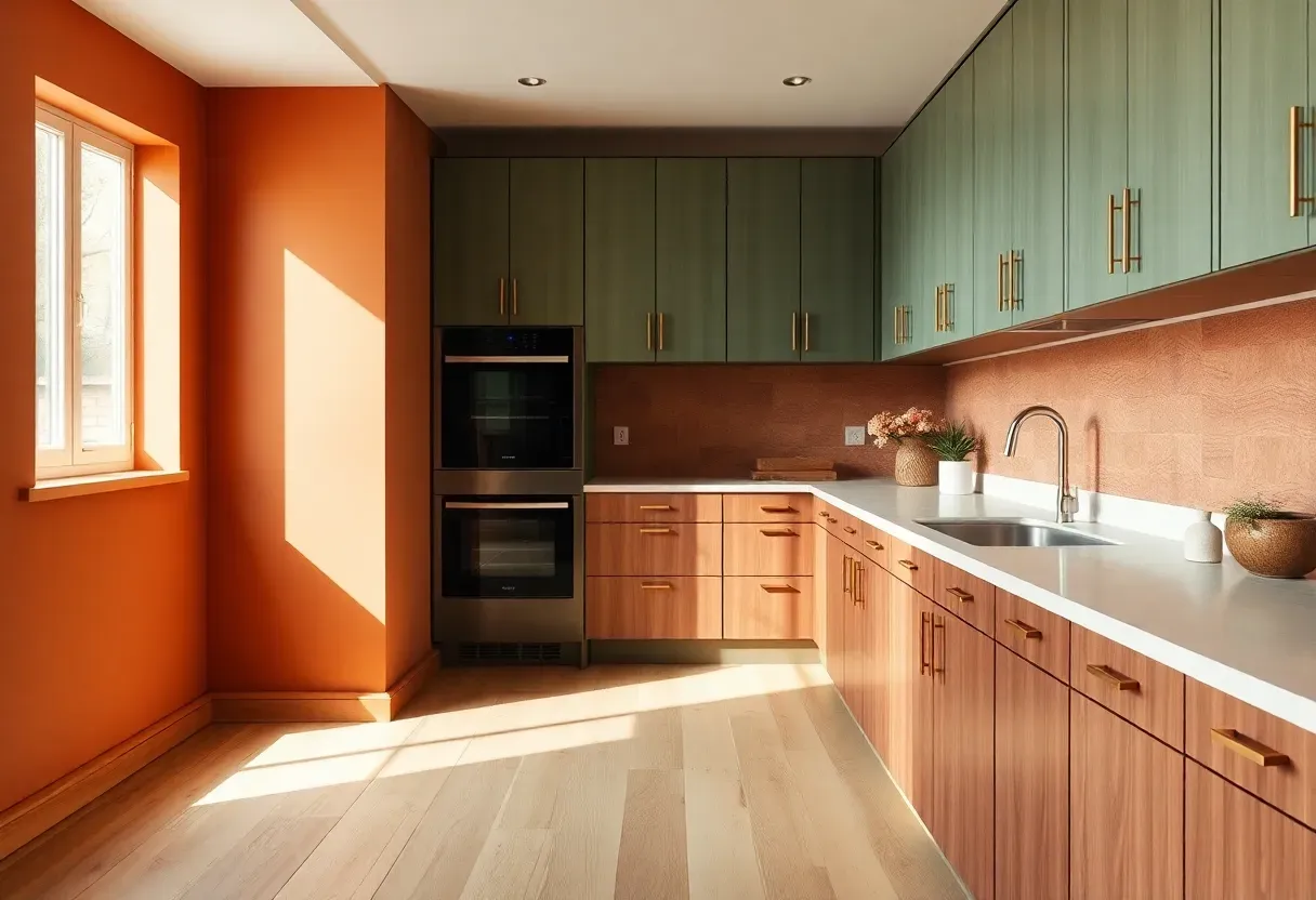
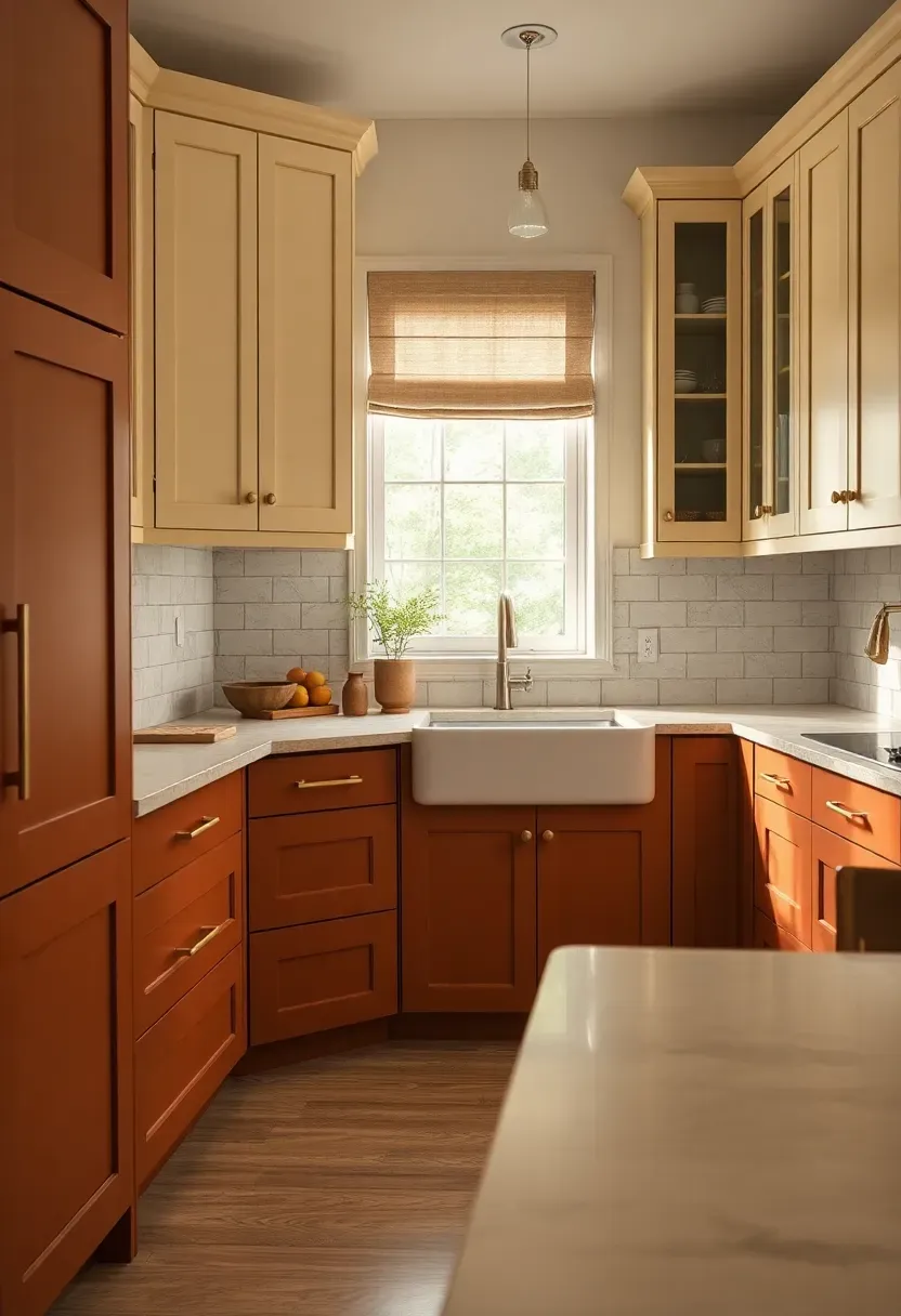
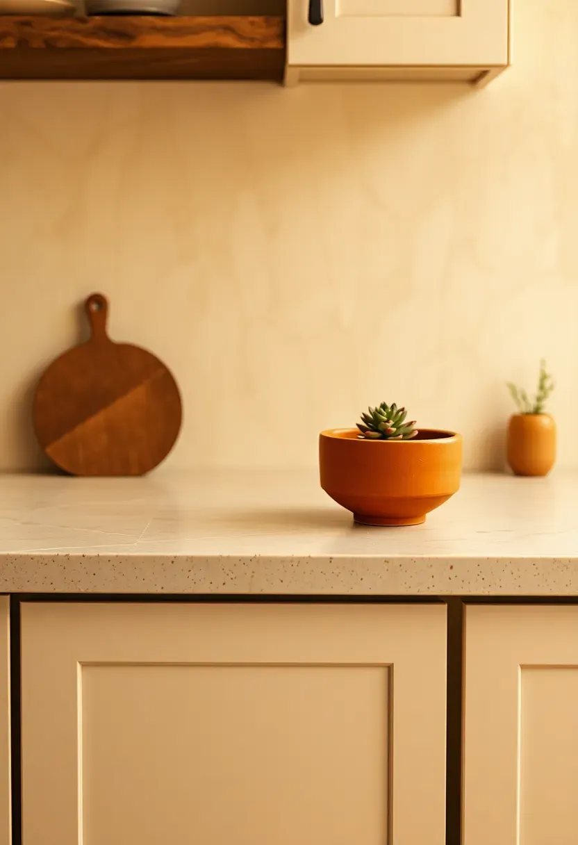
1. Warm Terracotta Cabinets
Imagine the color of sun-dried clay translated into cabinetry — that is exactly what terracotta cabinet fronts deliver in 2026. This warm, red-orange hue brings Mediterranean warmth into the kitchen without feeling theatrical. It pairs beautifully with white countertops, raw linen textiles, and unlacquered brass hardware. The shade works best in kitchens with natural light, where it shifts from burnt sienna in morning light to a deep amber glow by evening.
Why It Works
- Terracotta reads as neutral yet distinctive — a rare balance
- Complements both natural wood floors and polished concrete
- Ages gracefully: minor chips blend into the color rather than standing out
We picked a few things that go well with this idea: Dixie Belle Terracotta Chalk Furniture Paint (16oz) (★4.5), Rust-Oleum Cabinet & Trim Paint Quart (★4.4) and Heirloom Traditions All-in-One Cabinet Paint Quart (★4.4). As an Amazon Associate we earn from qualifying purchases.
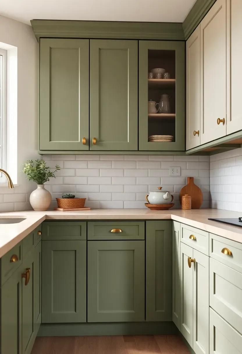
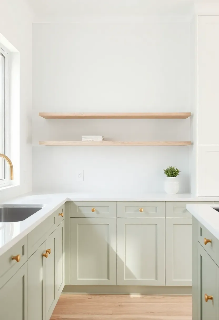
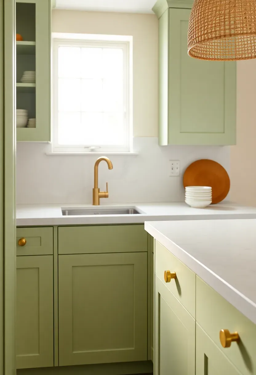
2. Sage Green Lower Cabinets
The Setup
Two-tone kitchens are not new, but the 2026 version favors a specific pairing: sage green on the lowers, crisp white or off-white on the uppers. The contrast reads as intentional and grounded rather than trendy.
Why Sage Green
Sage green occupies a quiet middle ground between green and gray — versatile enough to work with warm woods, cool marbles, and everything between. Lower cabinets get more visual weight in a room, so anchoring them in a muted earthy green creates stability without making the space feel heavy.
Pros and Cons
Pros: timeless quality, flatters many countertop materials, hides fingerprints better than pale tones Cons: can read too cool in north-facing kitchens without warm lighting corrections
We picked a few things that go well with this idea: Richmond Unlacquered Brass Cabinet Pulls (6-inch) (★5.0), QOGRISUN Unlacquered Brass Cabinet Pulls (5-Pack) (★4.5) and Richmond Unlacquered Brass Cabinet Pulls (4-inch) (★5.0). As an Amazon Associate we earn from qualifying purchases.
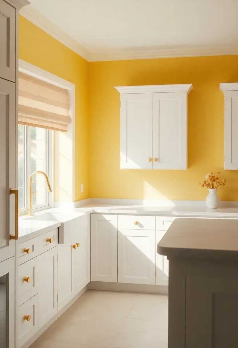
3. Butter Yellow Walls
Butter yellow wall color is having its biggest moment since the 1970s — but this time the shade is far more restrained. Think pale, creamy yellow rather than aggressive lemon. Applied to walls while cabinets stay white or cream, it creates a soft warmth that feels like sunlight even on overcast days.
How to Apply at Home
- Choose a yellow with warm undertones (lean golden, not green-based)
- Test the swatch against your cabinet color in different lighting conditions
- Pair with unlacquered brass fixtures for a cohesive warm finish
- Add white tile backsplash to keep the look fresh rather than retro
We picked a few things that go well with this idea: Smart Tiles Peel-and-Stick Backsplash (5 Sheets) (★4.1), Zellige-Style White Ceramic Subway Tile (38ct) (★3.6) and Malta Zellige Ceramic Subway Tile Cream. As an Amazon Associate we earn from qualifying purchases.
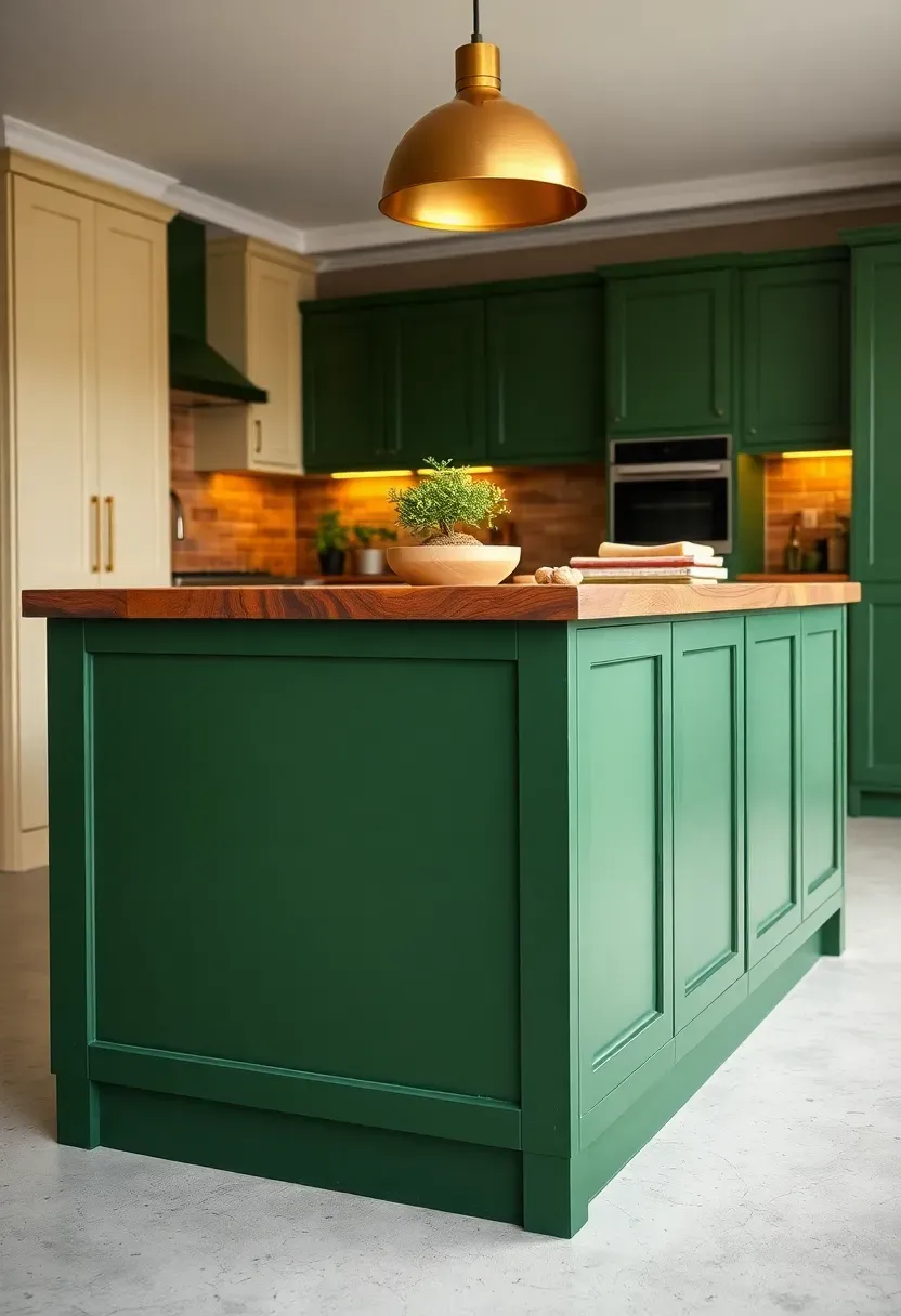
4. Deep Forest Green Island
The Core Idea
A single bold island in deep forest green anchors the kitchen without committing every cabinet to a dark shade. This one-piece strategy lets homeowners experiment with color risk-free — if preferences change, only the island needs repainting.
The Effect
Forest green works like a statement piece of furniture. It grounds the room visually, draws the eye to the center, and provides a natural contrast to lighter perimeter cabinetry. Paired with butcher block or marble countertops on the island surface, the combination feels high-design.
Pros and Cons
Pros: bold impact with limited commitment, easy to repaint, suits both traditional and contemporary kitchens Cons: requires confident color matching with surrounding finishes; too dark a shade can feel cave-like in small kitchens
Recommended
Items for this idea
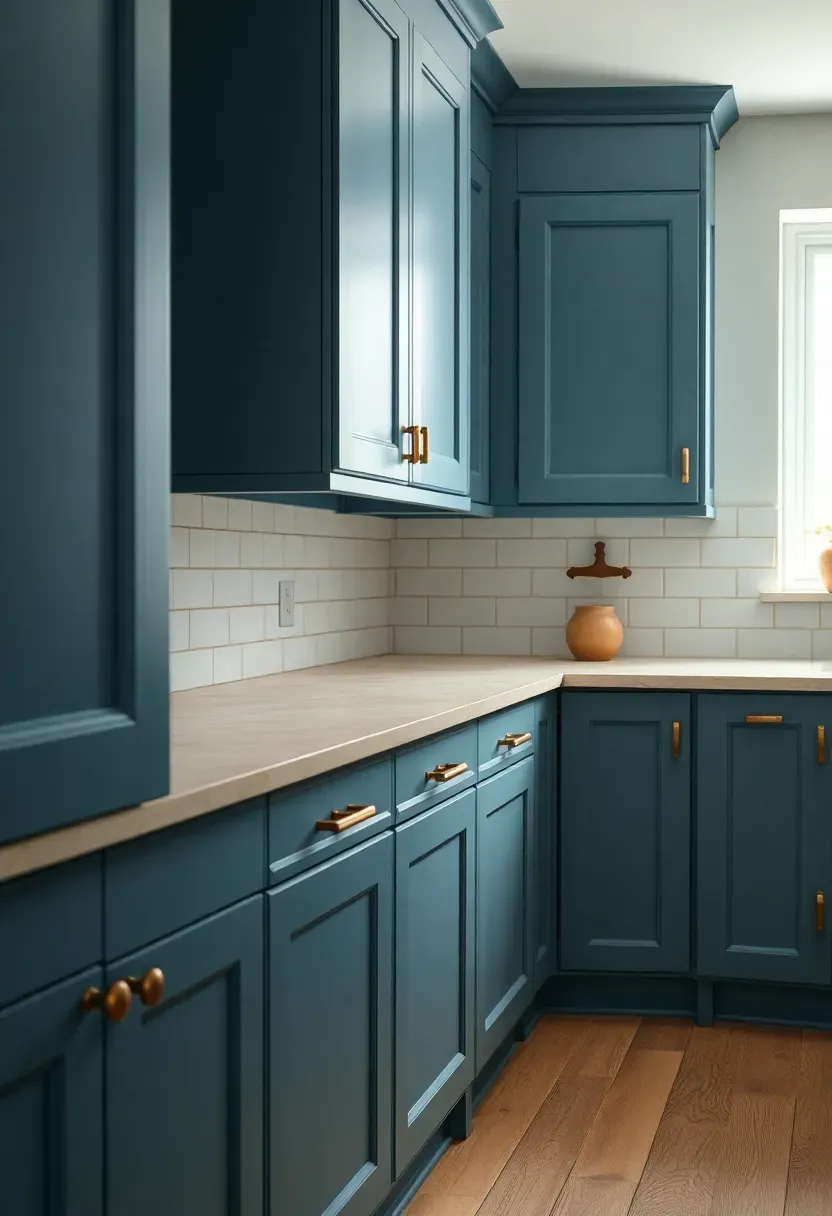
5. Dusty Blue Cabinets
Forget the sharp, saturated blues of years past. The 2026 version is muted, dusty, and soft — closer to the color of faded denim than a clear sky. Dusty blue cabinets pair especially well with warm white walls, aged brass hardware, and natural stone countertops. The slightly chalky finish popular this year adds texture to the color itself, making it read as artisan rather than factory-made.
Tips
- Opt for matte or eggshell finishes — gloss reads as dated with this shade
- Layer with woven textures in the linens and window treatments
- Balance cooler cabinet tone with warm-white lighting (2700K range)
6. Warm White and Wood Palette
Comparing: Cool White vs. Warm White
Introduction: Both read as neutral, but they create fundamentally different kitchen atmospheres. The choice matters more than most people realize.
Cool White
Clean, crisp, clinical. Reflects the most light but can feel sterile without substantial warm accents. Works best in spaces with abundant natural light and wood floors.
Warm White
Creamy, inviting, soft. Reads as white in context but adds a buttery warmth that makes the kitchen feel less like a laboratory. Pairs naturally with any wood tone from pale birch to dark walnut.
What to Choose
Choose cool white if: your kitchen has strong architectural detail, minimal natural light, and you prefer sharp contrast Choose warm white if: you want the kitchen to feel like the heart of the home — a place people linger
Recommendation
For 2026, warm white wins. Pair it with medium-tone wood open shelving, natural fiber pendant shades, and a linen backsplash tile for a look that will outlast a decade of trends.
Recommended
Items for this idea
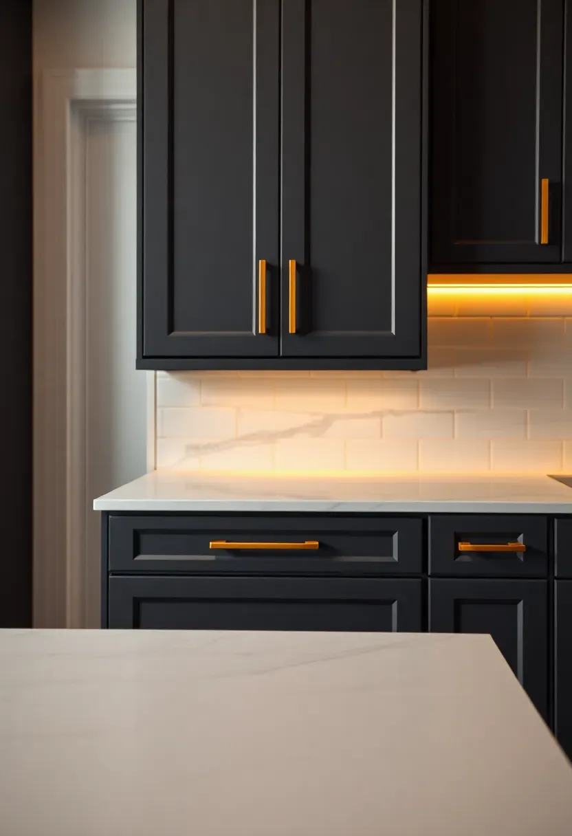
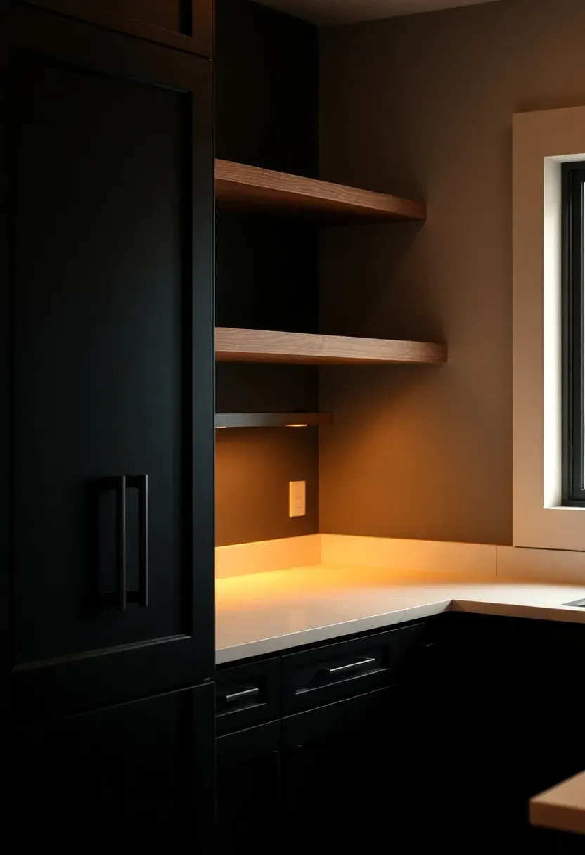
7. Charcoal and Brass Combination
Is there a more reliable pairing in 2026 kitchen design? Charcoal gray — the warmer, soot-tinged version rather than cool slate — provides a moody backdrop that makes brass hardware glow like candlelight. This palette suits transitional kitchens that sit between traditional and contemporary, and it ages well. The trick is keeping the charcoal matte: any sheen flattens the sophistication of the combination.
Practical Recommendations
- Use unlacquered brass (it patinas and develops character over time)
- Keep countertops light — white marble or cream quartzite provides essential contrast
- Add warm under-cabinet lighting to prevent the dark cabinets from feeling heavy
8. Clay and Cream Two-Tone Cabinets
Step-by-Step: Achieving the Clay-Cream Look
Opening: This pairing is deceptively simple. The secret is getting the right shade of each color — both too warm or too cool and the palette reads muddy.
Step 1: Choose Your Clay
Look for a clay with clear warmth — more red-orange than brown. Benjamin Moore's "Autumn Leaf" and Farrow & Ball's "Red Earth" are useful reference points for the right territory.
Step 2: Select the Cream
Cream should have warm, slightly yellow undertones. Pure white will create a jarring contrast; warm cream creates a flowing transition.
Step 3: Assign Upper and Lower
Clay on the lowers, cream on the uppers — this distributes visual weight correctly. The heavier, earthier tone grounds the base while the lighter cream keeps the upper half airy.
What to Watch Out For
- Avoid cool-undertone neutrals near this palette — they clash unexpectedly
- Test both colors in large swatches (at least 12" x 12") before committing
- Natural light changes this palette dramatically throughout the day — check it morning, midday, and evening
Recommended
Items for this idea
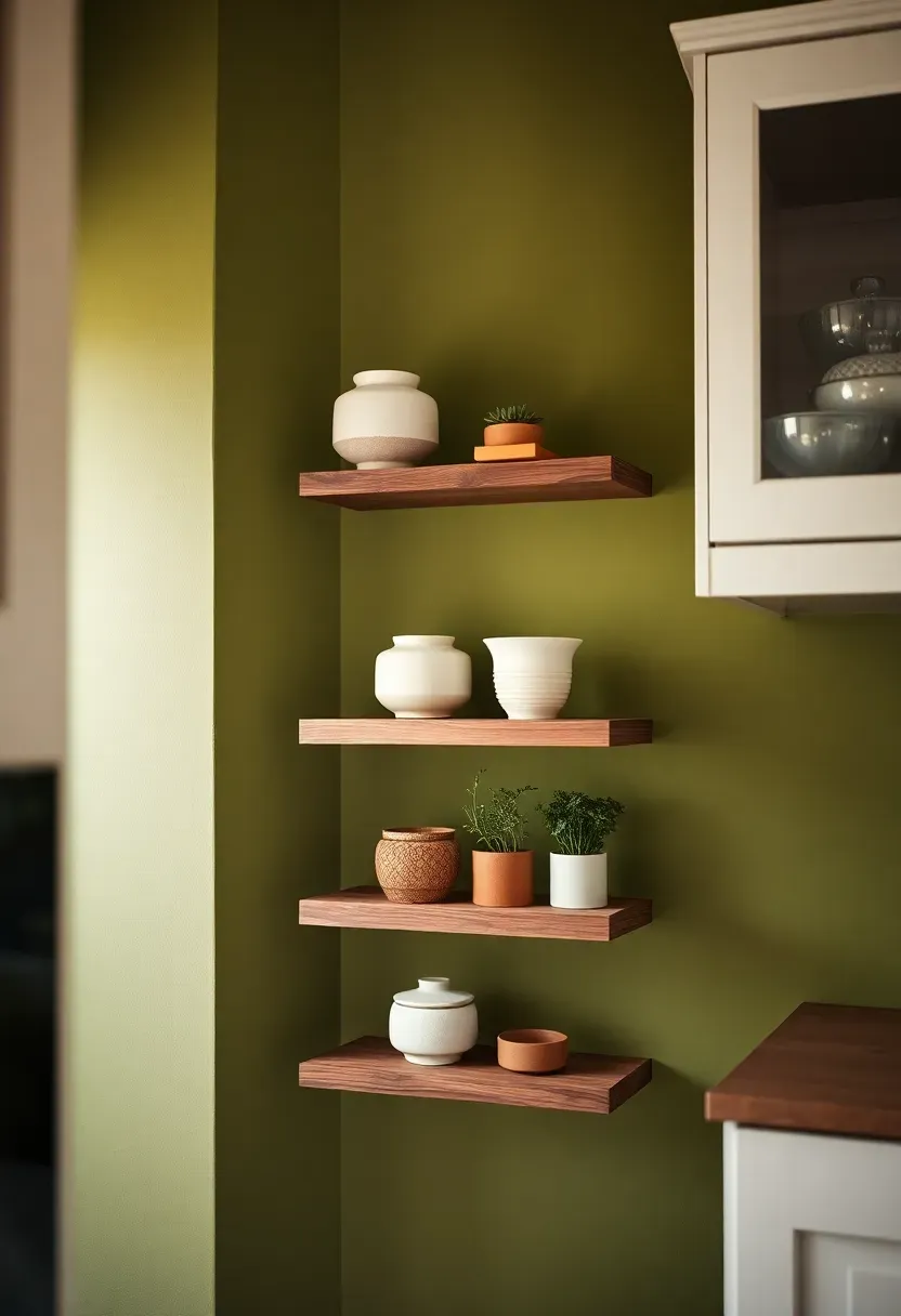
9. Olive Green Accent Wall
For kitchens where a full cabinet repaint feels like too large a commitment, an olive green accent wall behind open shelving offers all the character at a fraction of the investment. Olive is a complex color — it reads as green in some lights, brown in others — and that complexity is exactly what makes it interesting. It works particularly well in galley kitchens where one long wall can carry a statement color without overwhelming the space.
Tips
- Olive paired with terracotta accessories creates a rich, earthy tableau
- Add floating walnut shelves against the olive wall for maximum warmth
- Keep adjacent walls white or cream to let the accent breathe
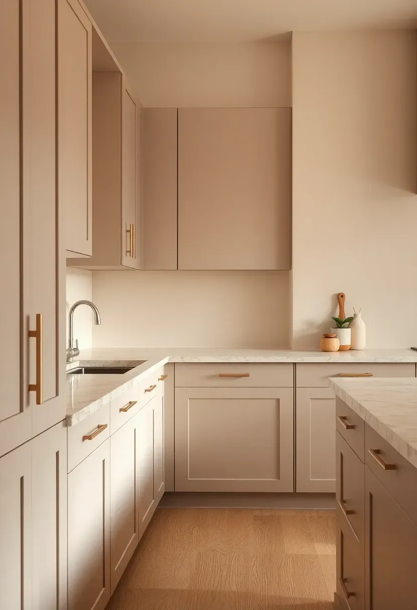
10. Warm Greige Everything
Why [Choosing One Color Throughout] Works
The Core Issue
People worry that using one neutral color everywhere makes a kitchen feel flat or uninteresting. The opposite is true when the neutral is warm greige — a balanced blend of gray and beige that reads differently on walls, cabinets, and trim due to how light hits each surface.
The Solution
A tonal greige kitchen uses one color family across all surfaces but relies on material variation for interest. Matte greige cabinets, a greige wall, warm stone countertops with visible veining, and natural wood accents create a layered, sophisticated look that feels cohesive rather than monotonous. The variation comes from texture and material, not hue — which is far more elegant.
Pros and Cons
Pros: exceptionally cohesive look, easy to accessorize, timeless quality that ages better than trend colors Cons: requires careful material selection — wrong textures can make the look feel bland
Recommended
Items for this idea
11. Midnight Navy Statement Cabinets
Midnight navy is the confident cousin of dusty blue. Where dusty blue whispers, midnight navy speaks plainly. Full navy cabinetry makes a dramatic statement that works best in kitchens with generous natural light and high ceilings. Pair it with white marble countertops and unlacquered brass fixtures for a combination that feels classic in the best possible way — the kind of kitchen that will look as good in twenty years as it does today.
Practical Recommendations
- Reserve full navy for larger kitchens; in small spaces, use it on the island only
- Choose a navy with warm undertones rather than purple-leaning cool navy
- White subway tile or marble-look tile backsplash is essential to prevent the look from going too dark
12. Rust and Natural Stone
Step-by-Step: Building the Rust and Stone Palette
Opening: This earthy, organic combination channels a Southwestern desert warmth that feels distinctive in a 2026 kitchen landscape dominated by muted tones.
Step 1: Ground with Stone
Start with a natural stone countertop — travertine, warm limestone, or a veined quartzite with warm amber tones. The stone establishes the palette anchor.
Step 2: Add Rust as Accent
Rust works brilliantly as an accent rather than a dominant color. Introduce it through lower cabinet paint, a kitchen runner, or ceramic accessories. Even small doses read strongly.
Step 3: Connect with Warm Neutrals
Use creamy off-white or warm linen for walls and upper cabinets to tie the rust and stone together without competing with either.
What to Watch Out For
- Rust can read orange in certain lights — test carefully against your stone
- Avoid cool metals (chrome, stainless) with this palette; warm metals only
- Too much rust makes the kitchen feel heavy — restraint is key
Recommended
Items for this idea
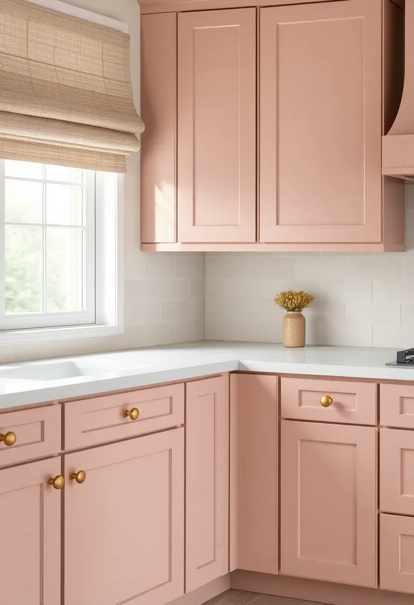
13. Pale Blush Cabinets
Should you paint your kitchen cabinets pink? If the pink in question is pale blush — barely-there, nearly neutral, with a warm dusty rose undertone — the answer in 2026 is a confident yes. Blush cabinets pair unexpectedly well with warm white countertops, aged gold hardware, and natural linen window treatments. The effect is simultaneously feminine and sophisticated, challenging the notion that pink is a frivolous choice.
Tips
- Choose a blush with gray or brown undertones — pure pink reads as childish
- Pair with natural materials (rattan, linen, wood) to ground the palette
- Matte finish only — gloss makes blush look chalky and flat
14. Mushroom and Linen Palette
Comparing: Mushroom vs. Greige
Both are popular 2026 neutral choices that flatter kitchen spaces. Understanding the difference helps you choose the right one.
Mushroom
A complex neutral with brown, gray, and faintly pink undertones — the color of a cremini mushroom in natural light. Reads warmer than greige and carries a slightly organic, earthy quality.
Linen
A warm, pale off-white with yellow and beige undertones. More yellow-forward than cream, linen has a textured, artisanal quality even when used on smooth surfaces.
What to Choose
Choose mushroom if: you want depth and warmth in your main cabinet color Choose linen if: you need a light, airy feeling but want more character than stark white
Recommendation
Use both together: mushroom lower cabinets, linen upper cabinets and walls. It is one of the quietest and most sophisticated combinations available in 2026 kitchen design.
Recommended
Items for this idea
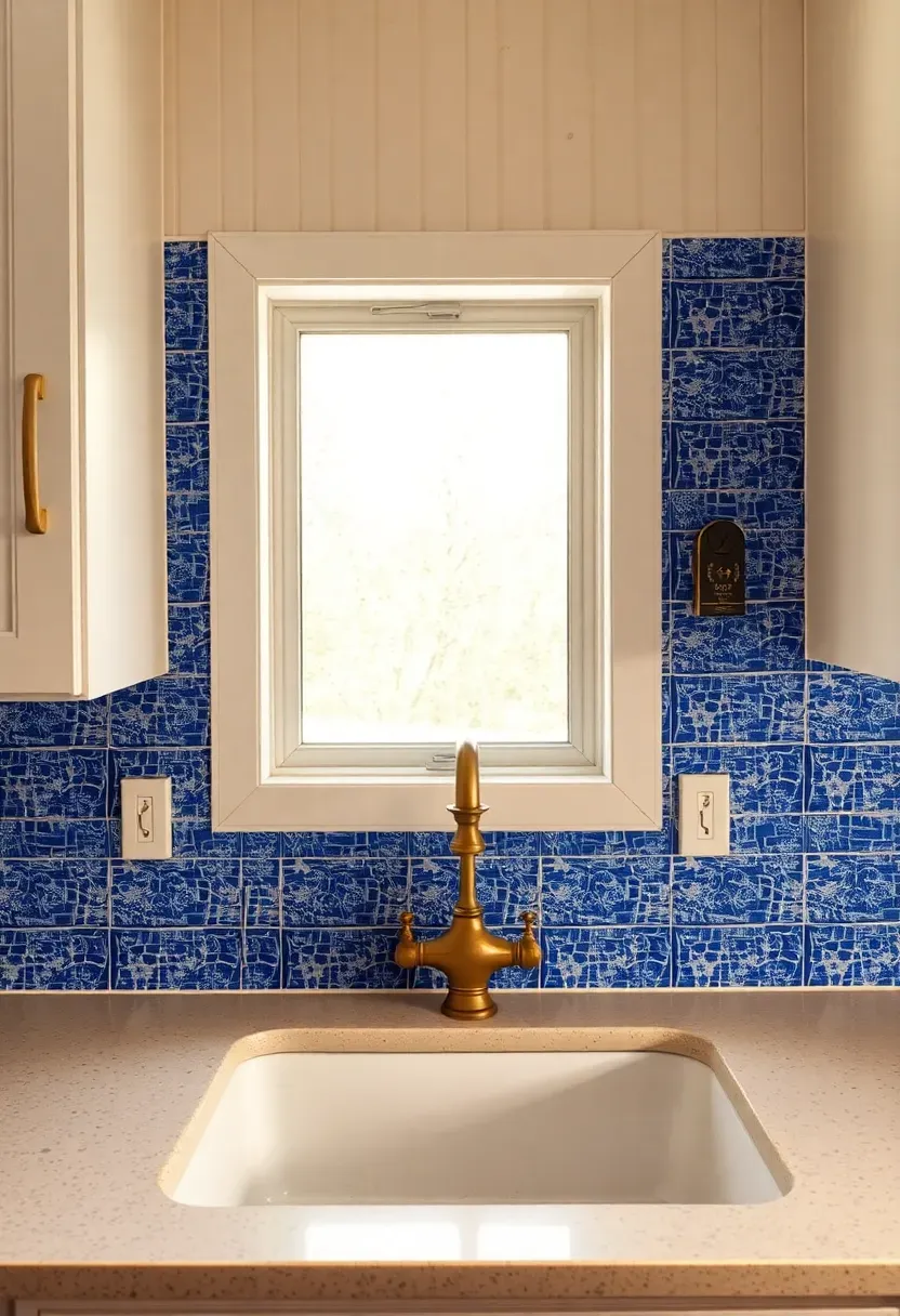
15. Cobalt Blue Backsplash Accent
For kitchens where the homeowner wants bold color without the commitment of painted cabinets, a cobalt blue tile backsplash delivers maximum impact with minimum risk. Cobalt is the one genuinely saturated blue that works in 2026 design — it reads as vintage and artisan rather than trendy, particularly when used in handmade or zellige tile formats. Surround it with white cabinets and warm wood accents to let the color be the star.
Tips
- Zellige tiles (hand-pressed Moroccan clay tiles) add texture that makes cobalt even richer
- Keep countertops simple and neutral — the backsplash is doing the heavy lifting
- Cobalt works with both warm and cool metals, giving you hardware flexibility
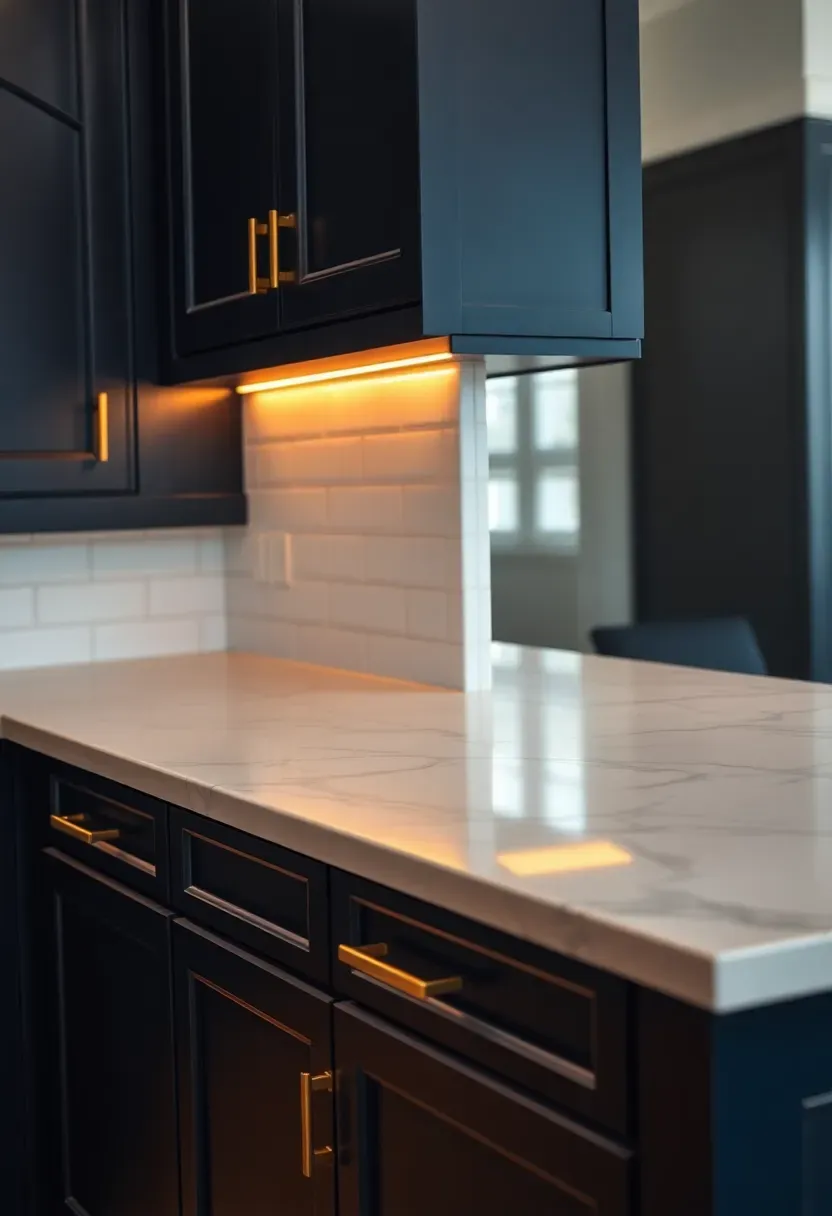
16. Warm Black Matte Cabinets
Why [Cold Black] vs. [Warm Black] Changes Everything
The Core Issue
Kitchens painted in true, cool black can feel dramatic to the point of unwelcoming — more design showroom than home kitchen. The result often dates quickly.
The Solution
Warm black — a black with brown or dark charcoal undertones — reads as deeply sophisticated rather than aggressive. On matte cabinet fronts, it creates a velvety quality that catches light beautifully. Pair with open walnut shelving, warm white walls, and aged bronze hardware. The combination feels like a design decision rather than a statement.
Pros and Cons
Pros: exceptional longevity (warm black reads as classic), dramatic without being cold, hides wear and fingerprints well Cons: requires commitment — going from warm black to light cabinets means full repainting or replacement
Recommended
Items for this idea
17. Celadon Green and White
Celadon is the green the design world has been slowly moving toward for three years, and 2026 is the year it arrives fully formed in kitchen spaces. Derived from the glaze used on ancient Chinese porcelain, celadon green is pale, quiet, and impossibly elegant — closer to a gray-green than any grass-like green. Against white cabinets and countertops, it reads as a refined accent rather than a bold choice, making it ideal for homeowners who want color with plausible deniability.
Practical Recommendations
- Use celadon on an accent wall, island, or lower cabinets
- Pair with white oak or pale ash wood tones — dark woods compete too much
- Matte finish brings out the subtle complexity of the hue
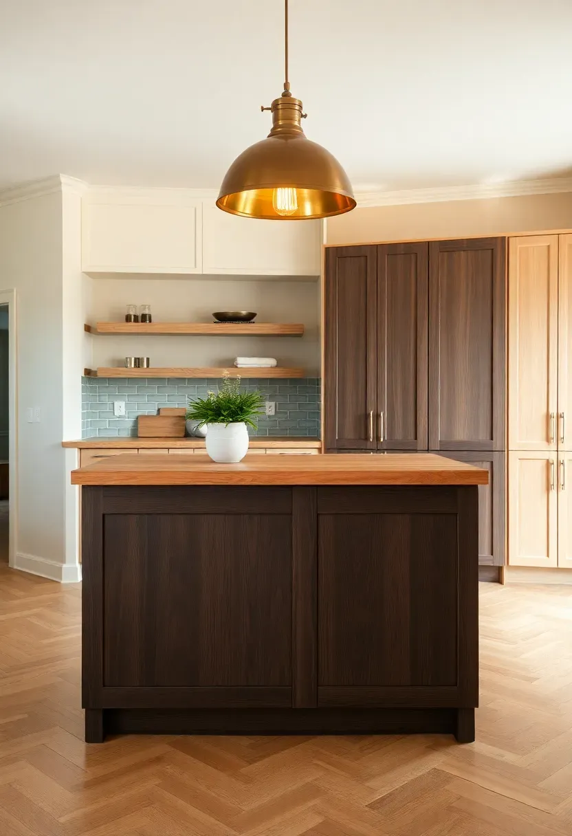
18. Caramel and Walnut Warmth
Step-by-Step: Layering Caramel and Walnut
Opening: This is less a painted color trend and more a material color combination — one that speaks directly to 2026's obsession with warmth and natural materials.
Step 1: Start with Walnut
Introduce walnut through open shelving, cabinet fronts, or a butcher block island surface. Dark walnut provides the depth and grounding for the entire palette.
Step 2: Add Caramel
Caramel enters through lighter wood elements — a pale oak floor, caramel-stained lower cabinet panels, or light rattan pendant shades. The contrast between walnut and caramel creates movement.
Step 3: Anchor with Warm Neutral Walls
Off-white or warm cream walls allow the wood tones to take center stage without visual competition. Avoid gray walls — they cool the palette unnecessarily.
What to Watch Out For
- Too many wood tones without contrast can feel chaotic — keep variety intentional
- Balance the warmth with occasional cool element (white countertop, light linen) to prevent the kitchen from feeling heavy
- Good lighting is essential: warm-toned bulbs (2700K) bring caramel and walnut to life
Recommended
Items for this idea
19. Plum and Bronze Combination
Is a plum kitchen too bold? Only if the plum is paired incorrectly. The 2026 approach to this deep purple-adjacent tone pairs it with bronze hardware and warm caramel wood elements — grounding what could feel theatrical into something warm and intentional. Plum cabinets work best as lower cabinets against cream or white uppers. The result is a kitchen that feels genuinely unique, not just trendy.
Practical Recommendations
- Choose a plum with strong warm (red) undertones rather than cool (blue) tones
- Bronze or oil-rubbed bronze hardware only — gold reads too bright
- Natural stone countertop in warm cream or beige ties the palette together
20. Soft Pistachio Kitchen
Pistachio green sits at the intersection of green, yellow, and white — a pale, almost pastel tone that reads differently depending on surrounding materials. Against warm white walls it leans slightly yellow; against cool white it emphasizes the green. In a 2026 kitchen, pistachio applied to all cabinetry creates a gentle, enveloping warmth that feels closer to Scandinavian design than classic pastels. Pair with unlacquered brass, white stone countertops, and natural fiber textures for a look that is quietly distinctive.
Tips
- Pistachio works in any size kitchen — its lightness prevents it from overwhelming small spaces
- Choose a pistachio leaning green-white rather than yellow-green
- Flat or eggshell finish reads more sophisticated than satin
Recommended
Items for this idea
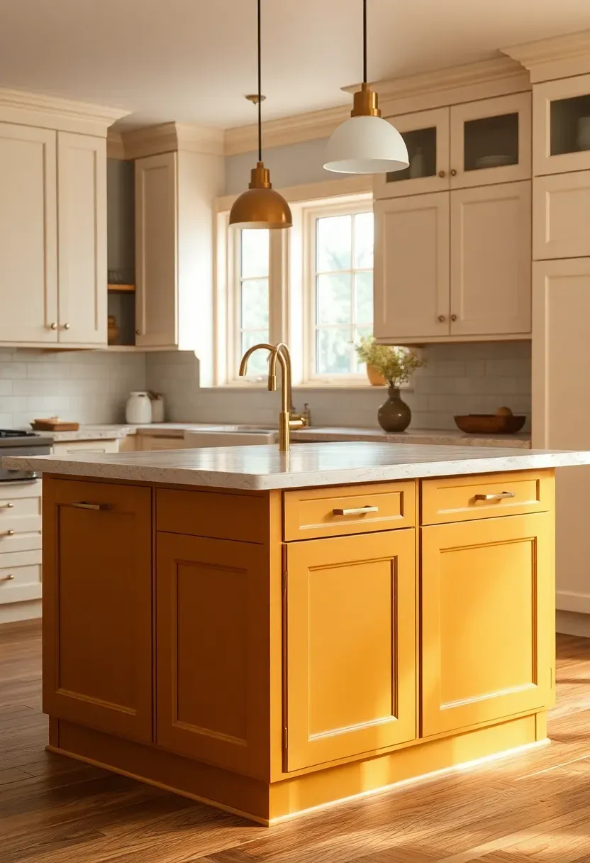
21. Golden Ochre Accent Color
Origins of Ochre in Interior Design
Ochre — a naturally occurring iron oxide pigment — has colored human spaces for at least 75,000 years, from cave paintings to Roman villas to Arts and Crafts interiors. Its current return in kitchen design feels less like a trend and more like a homecoming.
Modern Interpretation
In 2026, golden ochre enters the kitchen as an accent color rather than a dominant tone. A single ochre panel — one run of lower cabinets, a pantry door, or an island — is enough to transform a neutral kitchen into something deeply personal. The color carries the warmth of gold without the precious metal associations, making it feel earthy and approachable.
How to Apply at Home
- Use ochre as a single accent on an island or pantry cabinet rather than throughout
- Pair with terracotta tiles, natural wood, or warm cream for a cohesive earth-tone palette
- Avoid cool metals; stick to aged brass or bronze hardware
- Add woven baskets and ceramic accessories in complementary earth tones
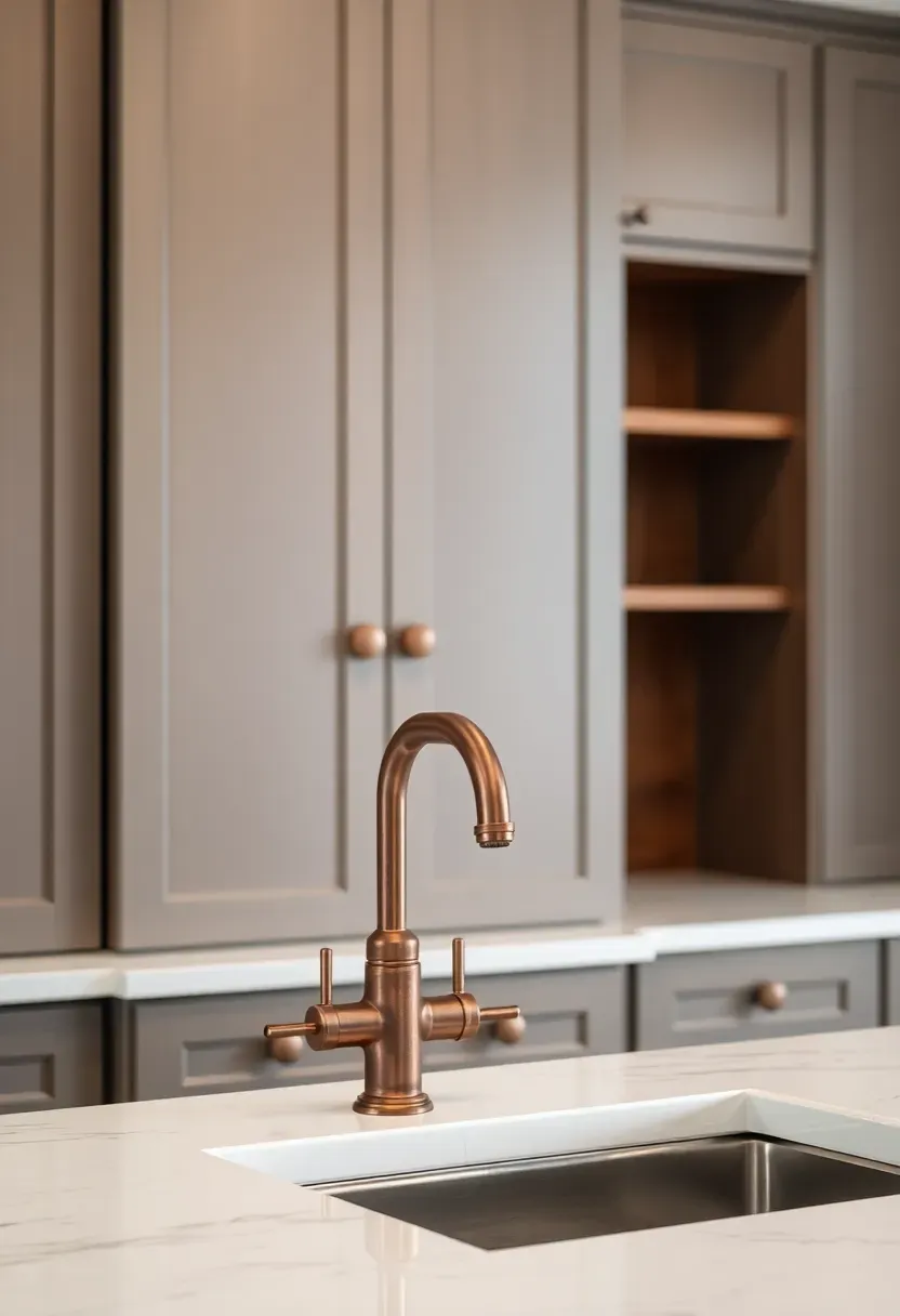
22. Warm Gray with Copper Accents
Cool gray had its decade. Warm gray is the quieter, more considered successor. The difference is in the undertones: where cool gray has blue or green undertones, warm gray sits closer to taupe — a gray with brown warmth behind it. Against copper hardware (not to be confused with brass — copper is distinctly red-orange), warm gray cabinets create a combination that feels both contemporary and rooted. Copper faucets, cabinet pulls, and pendant shades bring the warmth that prevents this palette from ever feeling cold.
Practical Recommendations
- Test warm gray alongside your flooring — wood tones shift the gray's undertone perception
- Real copper (unlacquered) develops a natural patina that only improves with time
- Balance with natural wood elements on open shelving to prevent the palette from reading too metal-heavy
Recommended
Items for this idea
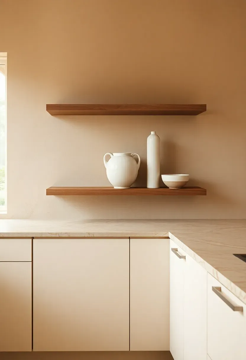
23. Earthy Layered Neutral Palette
Trend: Layered Neutrals as 2026's Defining Kitchen Direction
Opening: If a single idea unifies the kitchen color trends of 2026, it is layering — using multiple warm neutrals together to create depth through tone and texture rather than through contrasting hues.
Origins
The layered neutral approach has roots in Wabi-Sabi design philosophy and Japandi aesthetics — both of which emphasize honest materials, imperfection, and accumulated warmth over time.
Modern Interpretation
A 2026 layered neutral kitchen might combine: cream cabinets, a warm greige wall, a travertine countertop with visible movement, walnut open shelving, and a linen roman shade. Each element adds another layer of warm neutral, and together they create a kitchen that feels assembled over years rather than designed in an afternoon — the highest compliment in current interior design.
How to Apply at Home
- Work with no more than three or four neutral tones at once to prevent the look from becoming chaotic
- Vary the textures significantly — matte, glossy, rough, smooth — to create visual interest within the neutral range
- Warm lighting (2700K–3000K) is non-negotiable: it unifies the layered neutrals and brings out their warmth
- Introduce living elements (herbs on the windowsill, a bowl of citrus) to keep the palette from feeling too curated
Quick FAQ
Is terracotta too bold a choice for kitchen cabinets? Not at all — 2026's terracotta reads warmer and more muted than you might expect. Paired with white countertops and brass hardware, it feels grounded rather than dramatic. It is one of the few trend colors with genuine staying power beyond a single season.
Which cabinet color works best in a small kitchen without making it feel cramped? Pale sage green, soft pistachio, or warm white are your strongest options in small kitchens. These tones reflect light while still adding personality. If you want a deeper color, limit it to the island or lower cabinets and keep uppers light.
Should upper and lower cabinets always match? Definitely not — and 2026 actively favors the two-tone approach. Different tones on uppers and lowers add visual interest and allow you to use a bolder color on the lowers (which take more visual weight) while keeping the uppers light and airy.
What is the difference between dusty blue and midnight navy for kitchen cabinets? Dusty blue is muted, soft, and chalky — it reads quietly and works in spaces of any size. Midnight navy is saturated and dramatic, best suited to larger kitchens with plenty of natural light. Think of dusty blue as a whisper and midnight navy as a confident declaration.
Do warm neutrals require specific lighting to look their best? Yes — and this is the most important practical point of the entire article. Warm neutrals in kitchens need warm-spectrum bulbs (2700K–3000K). Cool LED bulbs (4000K and above) strip the warmth from greige, mushroom, and clay tones, making them look flat and colorless.
Trends come and go, but kitchens that feel genuinely warm and personal outlast every design cycle. Whether you commit to terracotta cabinets or simply swap in copper hardware and add an olive green accent wall, the 2026 color direction gives you permission to move away from the sterile and toward the inviting. Start with one change — and watch the kitchen transform around it.
Pinterest cover for 23 Kitchen Color Trends for 2026
About the author
OBCD
CGI visualization and interior design content. We create detailed 3D renders and curate practical design ideas for every room in your home.