23 Paint Color Trends for 2026 Worth Trying Now
We have all stood in the paint aisle holding up two nearly identical swatches, wondering if the choice even matters. It does. The color you put on your walls is the single fastest way to shift how a room feels — warmer, calmer, bolder, more personal. And 2026 is bringing a color story that breaks away from the safe grays and stark whites of recent years. This year, paint manufacturers and design forecasters are leaning into warmth, saturation, and nature-inspired complexity. Colors have more body, more personality, and more willingness to make a statement without shouting. The beige-everything era is not gone, but it is evolving into something richer.
Below you will find 23 paint colors shaping interiors this year, with practical guidance on where and how to use each one.
Table of Contents
- Warm Cognac
- Forest Bathing Green
- Smoked Mauve
- Burnished Clay
- Midnight Teal
- Oat Milk Cream
- Dusty Sage
- Espresso Brown
- Faded Denim Blue
- Sun-Bleached Apricot
- Charcoal Plum
- Warm Stone Gray
- Deep Olive
- Blushed Terracotta
- Ink Navy
- Wheatfield Gold
- Muted Lavender
- Redwood Accent
- Seafoam Mist
- Warm Putty
- Moody Mushroom
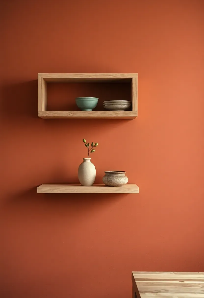
- Paprika Spice
- Horizon Blue
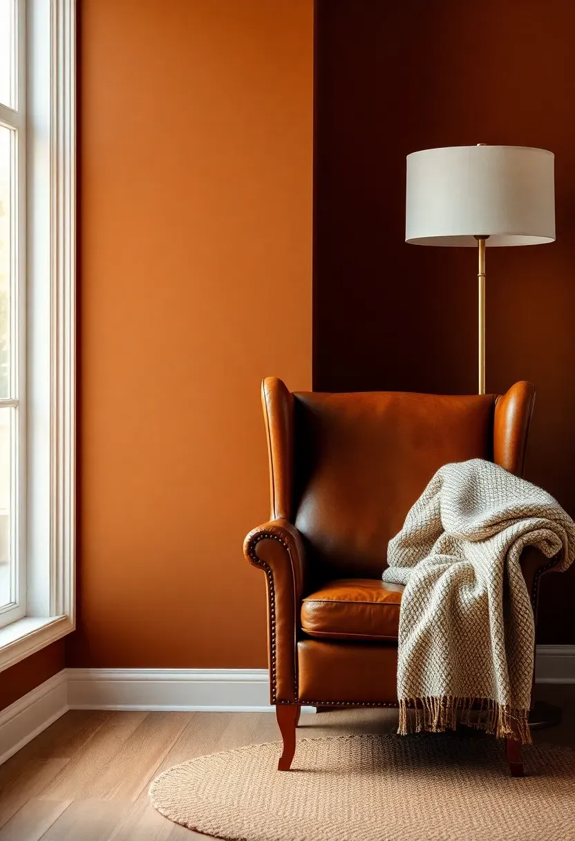
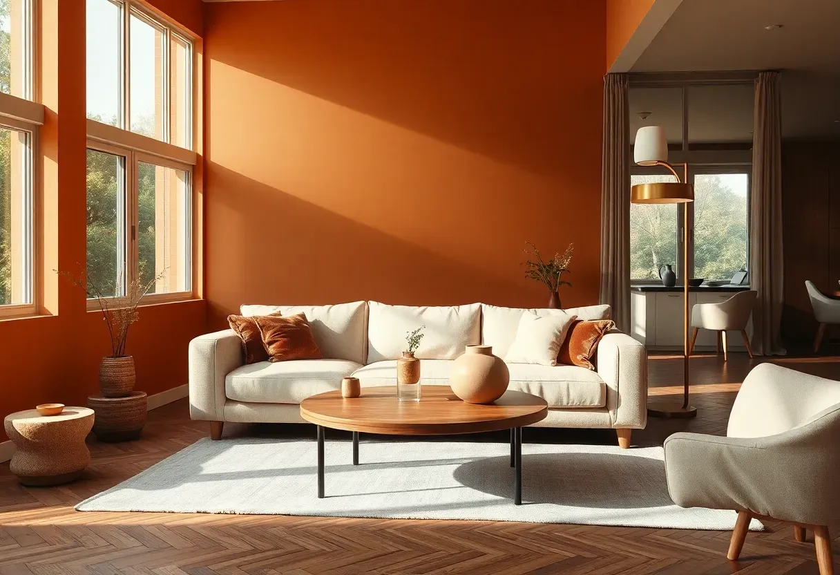
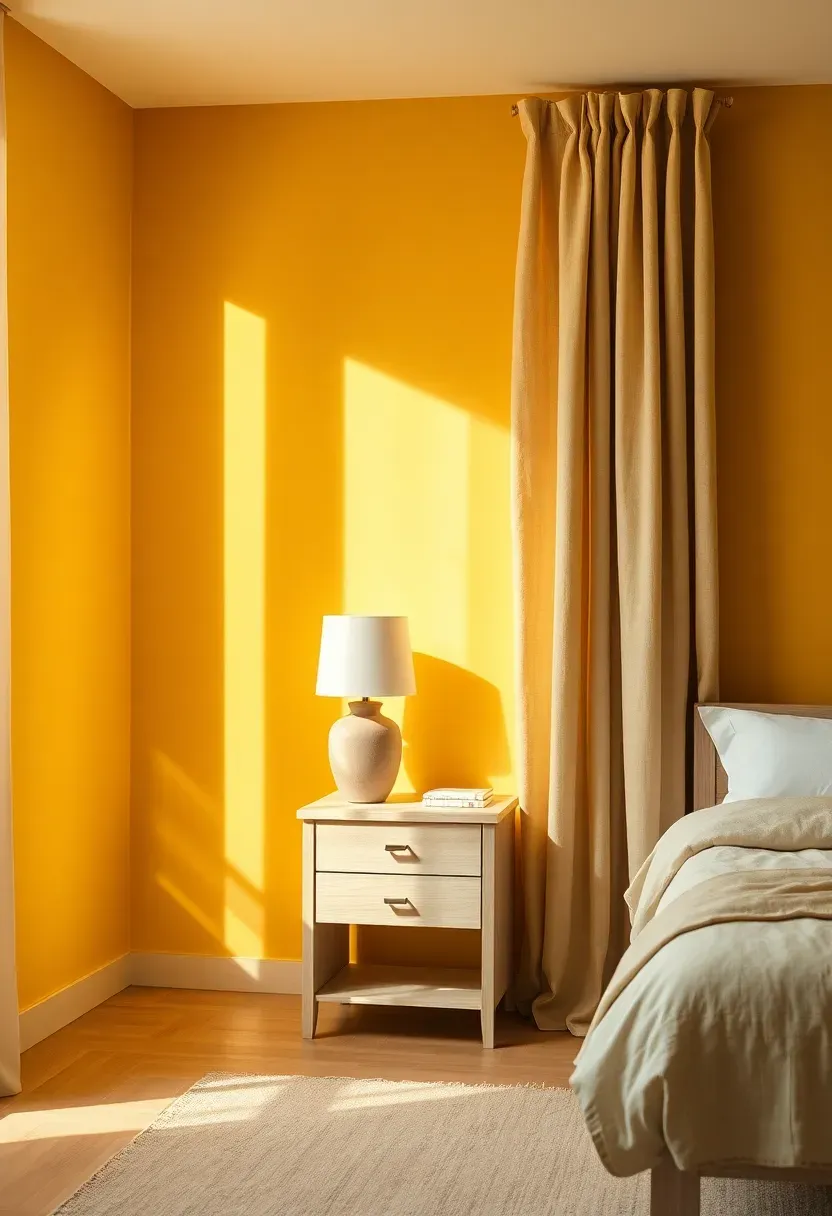
1. Warm Cognac
Cognac sits in the sweet spot between brown and amber, delivering richness without weight. It pulls warmth from the brandy-barrel tones that inspired its name and wraps a room in approachable luxury.
Why Cognac Stands Out in 2026
Cool-toned interiors are retreating. Cognac steps in as the sophisticated alternative to both safe beige and bold rust. It pairs naturally with cream trim, dark walnut wood, and aged brass hardware. On a living room accent wall or in a paneled study, it reads mature without feeling dated.
Tips for Using Cognac
- Apply on a single accent wall behind a sofa or headboard for maximum impact
- Pair with ivory or warm white on adjacent walls to prevent the room from closing in
- Works best in rooms with natural light — in dim spaces, add warm-toned sconces to keep the hue alive
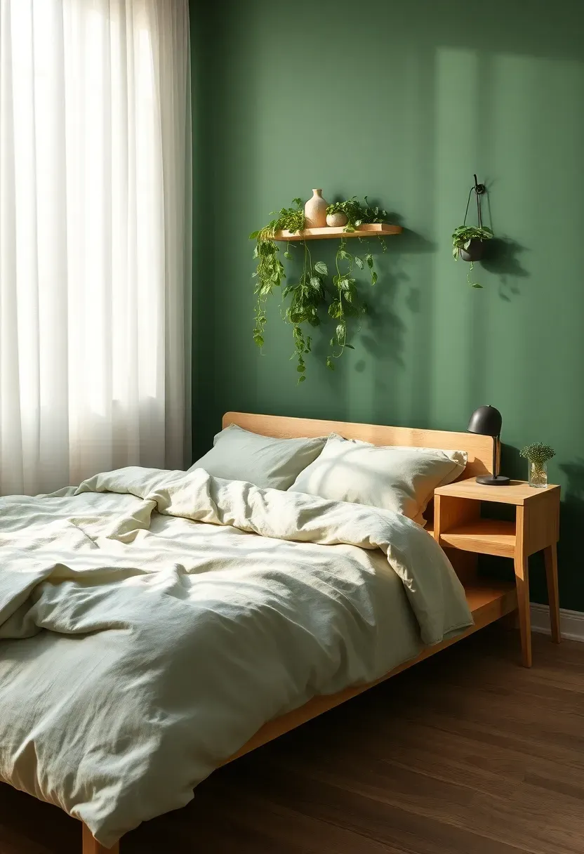
2. Forest Bathing Green
The Core Issue
People crave nature indoors, but houseplants alone cannot deliver the immersive calm of being surrounded by green. White walls with a few potted ferns still feel like an office break room.
The Solution
Forest bathing green — a deep, muted green inspired by old-growth canopies — transforms walls into a backdrop that feels genuinely restorative. Unlike emerald, this shade carries gray and brown undertones that keep it from reading tropical. It belongs in bedrooms, reading nooks, and bathrooms where the goal is quiet immersion. Benjamin Moore's Boreal Forest and Farrow and Ball's Green Smoke both capture this mood.
Pros and Cons
Pros: Calming visual effect backed by color psychology research, pairs with nearly every wood tone, hides scuffs better than light colors Cons: Absorbs light in windowless rooms, requires two coats minimum for even coverage
Recommended
Items for this idea
3. Smoked Mauve
Mauve has re-emerged from its 1980s reputation, but 2026's version is cooler, dustier, and far more refined. Think dried roses, not bubble gum. This shade bridges the gap between gray and pink without committing fully to either.
Where Smoked Mauve Works Best
It excels in rooms that need softness without sweetness. Powder rooms gain unexpected sophistication. Bedrooms feel intimate without the heaviness of deeper jewel tones. Pair it with matte black hardware and light oak furniture for a Scandinavian-meets-vintage effect that photographs beautifully.
Practical Tips
- Test in both natural and artificial light — mauve shifts dramatically between the two
- Matte or eggshell finishes reinforce the smoky quality; avoid high gloss
- Use warm white trim rather than cool white to keep the palette cohesive
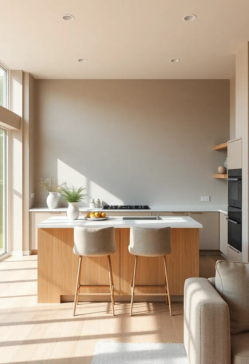
4. Burnished Clay
Step 1: Understand the Shade
Burnished clay is terracotta's quieter sibling. Where terracotta can feel bold and southwestern, burnished clay carries more brown and less orange, making it versatile enough for kitchens, entryways, and dining rooms that serve multiple functions throughout the day.
Step 2: Choose the Right Finish
Eggshell works best in living areas — it is wipeable but does not reflect light harshly. For kitchens and bathrooms, satin finish adds durability without the plastic look of semi-gloss.
Step 3: Build the Palette Around It
Ground burnished clay with cream, warm gray, or pale sage. Dark wood shelving and matte black fixtures anchor the color without competing. Avoid pairing with cool-toned metals like chrome or polished silver.
What to Watch Out For
- Undertones vary wildly between brands — always order peel-and-stick samples before committing
- In very bright rooms, burnished clay can lean toward peach; test during overcast conditions
- Works best as an accent rather than an all-room wrap in spaces under 100 square feet
Recommended
Items for this idea
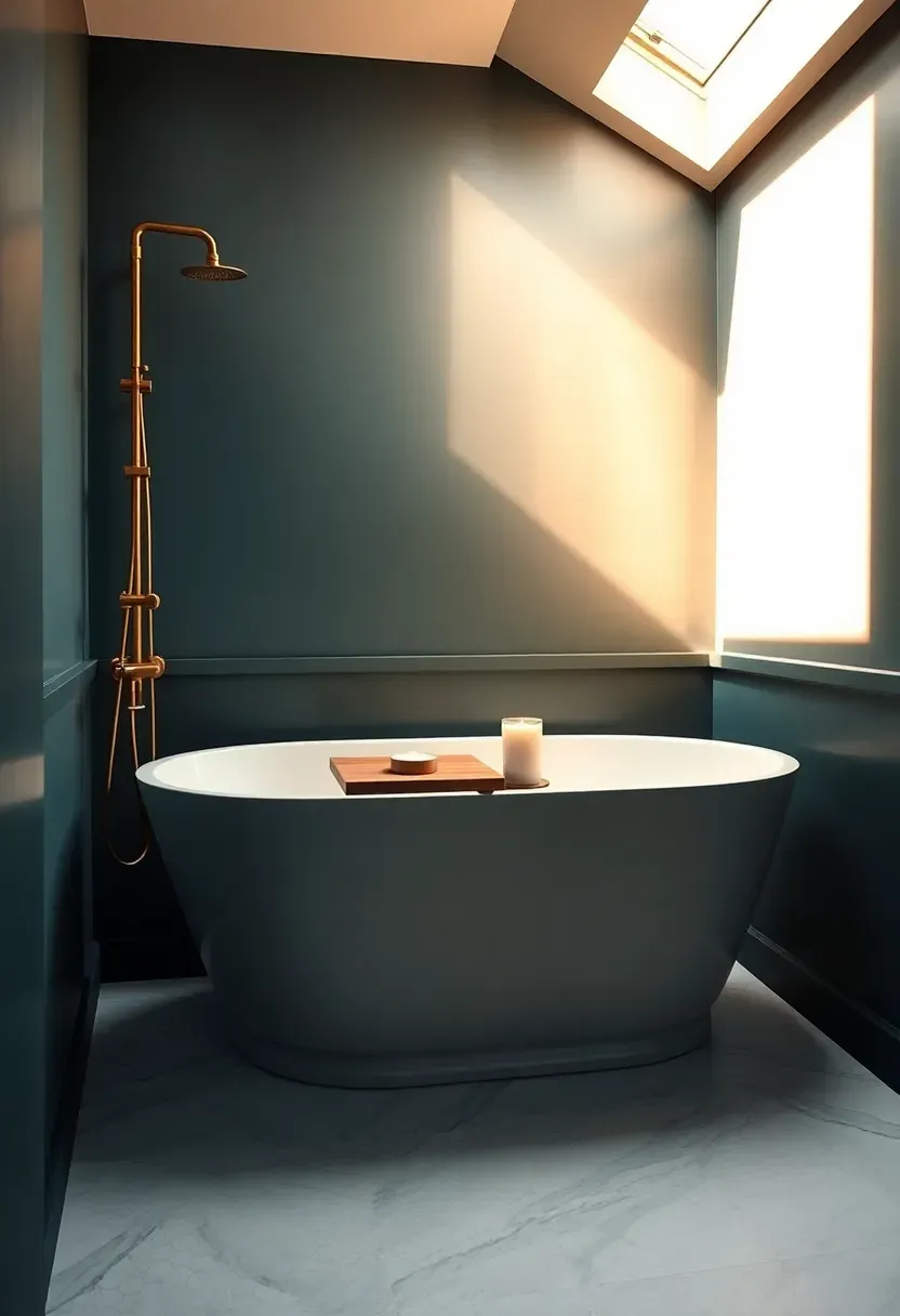
5. Midnight Teal
Teal has been circling design circles for years, but the 2026 interpretation goes darker — almost inky, with enough green to keep it from reading navy. Midnight teal is the color of deep water at dusk, and it brings drama without the committal weight of black.
Origins and Modern Use
Historically, deep teal appeared in Victorian parlors and Art Deco interiors where richness was the point. Today it shows up in bathrooms, home offices, and accent walls in open-concept living areas. The shade creates instant depth, making even modest rooms feel layered and deliberate.
How to Apply at Home
- Use as a full-room color in bathrooms — the small square footage prevents overwhelm, and white fixtures pop against it
- In larger rooms, limit to one wall and carry the tone through accessories like throw pillows and ceramics
- Pair with warm metals exclusively — brushed brass, aged copper, or antique gold
- Keep floors and ceilings light to maintain contrast and prevent the room from feeling cavernous
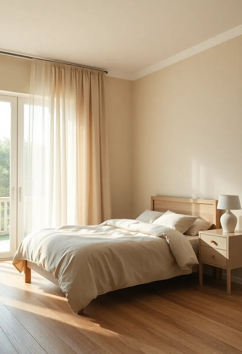
6. Oat Milk Cream
Not white, not beige, not yellow. Oat milk cream occupies the precise middle ground — a warm off-white with the faintest golden undertone that makes everything around it look expensive.
What Makes It Different from Standard Cream
Standard cream paints often carry pink or peach undertones that reveal themselves under warm lighting. Oat milk cream stays reliably neutral-warm regardless of light conditions. It flatters every skin tone in photos and plays nicely with both warm and cool accent colors, which is why staging designers have made it their default for 2026.
Where to Use It
- Whole-house continuity color: halls, living rooms, bedrooms, ceilings
- Pairs beautifully with both stark white trim and wood-stained trim
- The ideal backdrop for homes that rotate artwork or seasonal decor — it never clashes
Recommended
Items for this idea
7. Dusty Sage
Sage has been a favorite for several seasons, but the 2026 update pushes it dustier — more gray, less minty. The result is a color that feels grounded rather than fresh, old-world rather than trendy.
Comparing: Fresh Sage vs Dusty Sage
Fresh Sage reads green-forward, energizing, and slightly coastal. It works in kitchens and nurseries where brightness matters.
Dusty Sage reads muted, sophisticated, and European. It works in dining rooms, primary bedrooms, and home libraries where mood matters more than energy.
What to Choose
Choose Fresh Sage if: your room gets ample natural light and you want a lively, upbeat feel. Choose Dusty Sage if: you want the space to feel like a quiet garden room or a well-loved English cottage.
Recommendation
For 2026, dusty sage aligns better with the broader design shift toward warmth and complexity. It ages gracefully on walls and does not look dated within a year.
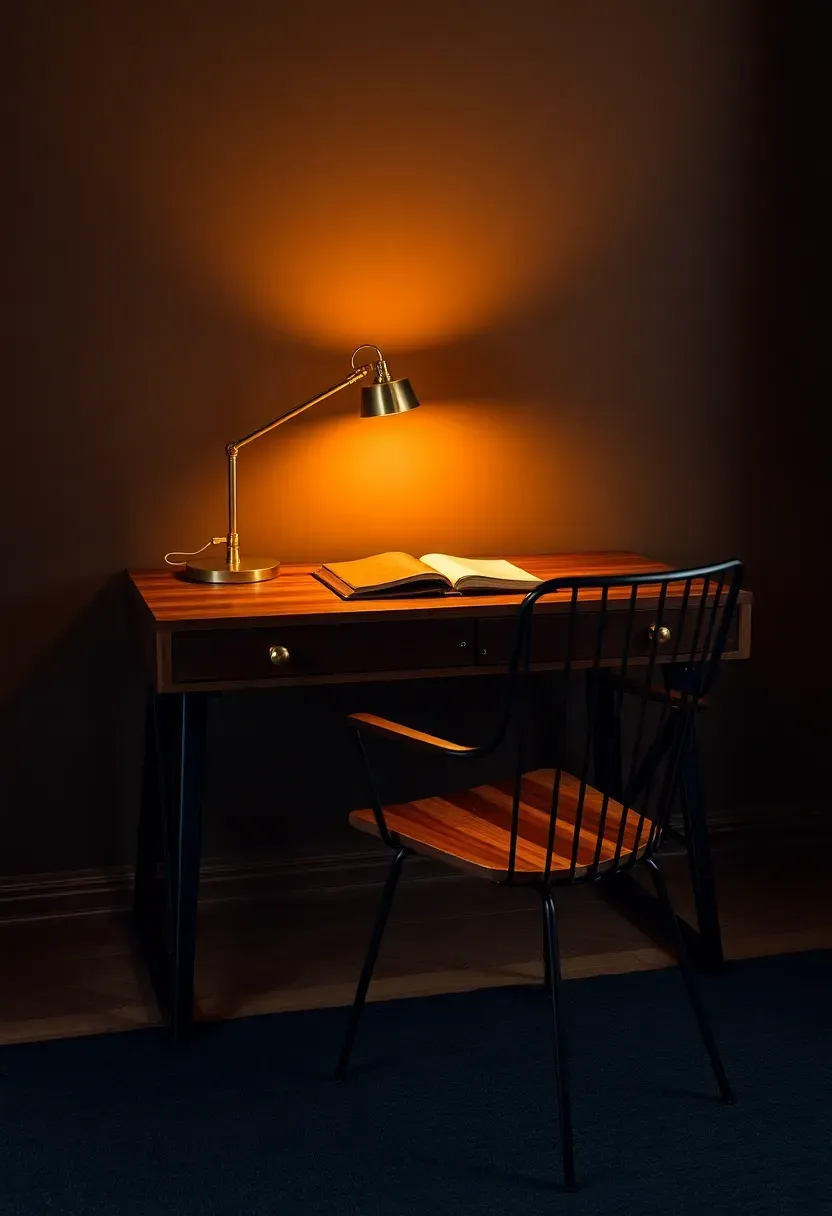
8. Espresso Brown
The Core Issue
Dark paint has a reputation for making rooms feel small. This fear keeps homeowners reaching for light neutrals even when they secretly crave drama and depth.
The Solution
Espresso brown disproves the myth when used correctly. This deep, warm brown absorbs light intentionally, creating a cocoon effect that is actually desirable in bedrooms, libraries, and home offices. The trick is contrast: bright white or cream ceilings, light-toned floors, and ample warm artificial lighting prevent the walls from swallowing the room. The color itself evokes leather-bound books and polished mahogany — a richness that cool dark colors like charcoal simply cannot replicate.
Pros and Cons
Pros: Hides imperfections, feels immediately sophisticated, works year-round without seasonal fatigue Cons: Requires excellent artificial lighting, shows dust on trim more than lighter walls
Recommended
Items for this idea
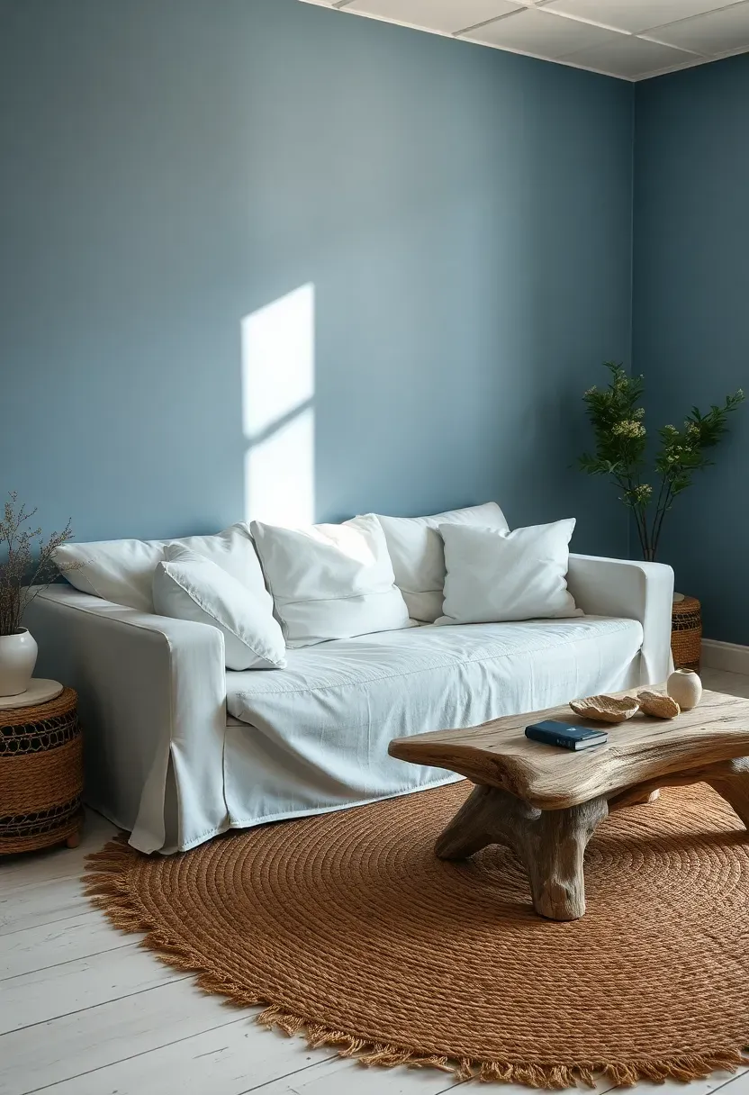
9. Faded Denim Blue
Think of your most comfortable pair of jeans — that soft, washed-out blue that feels lived-in from the start. Faded denim blue brings that same relaxed confidence to walls. It is neither precious nor demanding.
Where It Thrives
This shade was made for family rooms, kids' bedrooms, and coastal-inspired spaces that want to avoid cliches. Unlike navy, it does not overwhelm. Unlike baby blue, it does not feel juvenile. It sits in the middle, comfortable and effortlessly stylish.
Design Pairings
- Crisp white trim and natural rattan furniture for a relaxed coastal look
- Warm wood floors and cream textiles for a farmhouse-meets-modern feel
- Soft black accents — iron curtain rods, dark picture frames — for subtle contrast
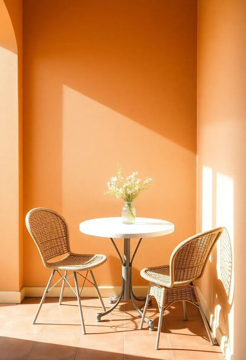
10. Sun-Bleached Apricot
Step 1: Identify the Right Tone
Sun-bleached apricot is not orange. It is a whisper of peach that has been left in the sun until the intensity faded to a soft glow. Look for paint swatches that read warm and rosy without crossing into salmon territory.
Step 2: Place It Strategically
This color sings in rooms with morning or east-facing light. Breakfast nooks, sunrooms, and guest bedrooms benefit most. Avoid north-facing rooms where the lack of warm natural light can make apricot look flat and slightly gray.
Step 3: Coordinate Accents
Pair with natural materials: bleached wood, linen, sisal. Gold-toned hardware reinforces the warmth. Avoid combining with cool-toned blues or grays, which fight the sun-kissed mood.
What to Watch Out For
- Photograph a painted sample board in your room before committing — apricot is sensitive to light direction
- Flat or matte finishes look more natural; satin can give it a plastic quality
- Use it on walls only — painting the ceiling apricot often feels oppressive
Recommended
Items for this idea
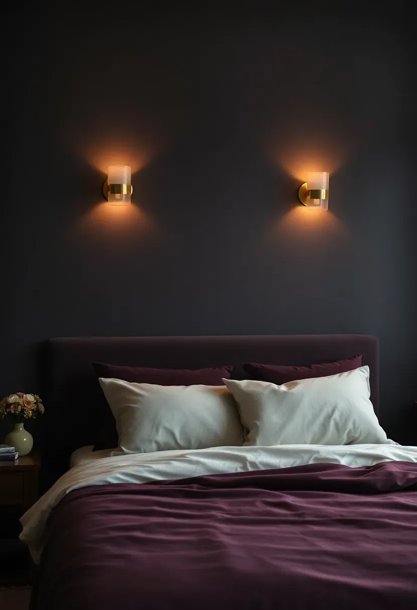
11. Charcoal Plum
Somewhere between eggplant and slate, charcoal plum has the sophistication of black with the emotional depth of purple. It is a color for people who find gray boring but are not ready for full-spectrum jewel tones.
Origins of This Shade
Victorian interiors used deep purples extensively, but those versions leaned red and felt heavy. The 2026 interpretation strips out the red, replaces it with gray, and arrives at a shade that feels contemporary rather than historical. Major paint brands are positioning it as the alternative to navy for accent walls.
Modern Interpretation
Charcoal plum works as a dramatic backdrop in bedrooms and dining rooms. Pair it with warm ivory, aged brass, and blush pink accents for a palette that reads luxurious without being fussy. In smaller bathrooms, it creates an intimate jewel-box effect that guests remember.
How to Apply at Home
- Best on walls that receive indirect light — direct sunlight can wash the purple undertone out
- Always paint a large test patch (at least 2x2 feet) and observe it across a full day
- Complement with textured materials: velvet, brushed metal, raw wood grain
- Avoid pairing with bright white — opt for warm cream or ivory trim instead
12. Warm Stone Gray
Gray is not dead. It just needed a temperature adjustment. Warm stone gray replaces the cool blue-grays of recent years with a shade that carries sand and taupe undertones — like limestone warmed by the sun.
What Sets It Apart
Cool grays made rooms feel modern but often came across as sterile under energy-efficient LED bulbs. Warm stone gray solves this by absorbing those blue light wavelengths rather than reflecting them back. The result is a room that looks equally inviting at 10 AM and 10 PM.
Best Applications
- Open-concept living spaces where one continuous color needs to work across kitchen, dining, and living zones
- Transitional style homes that blend traditional architecture with modern furniture
- Excellent as an exterior paint color for homes with natural stone or brick accents
Recommended
Items for this idea
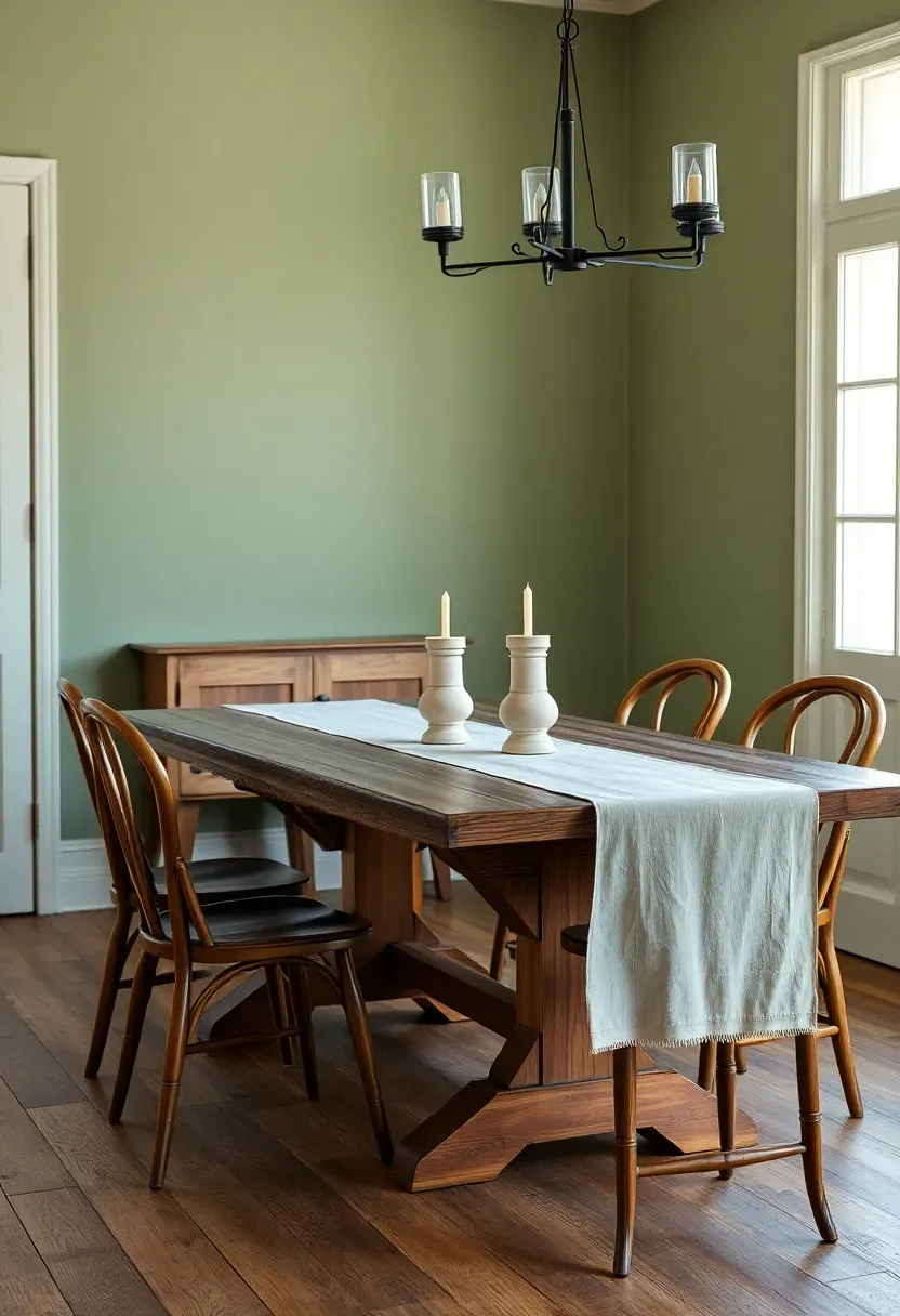
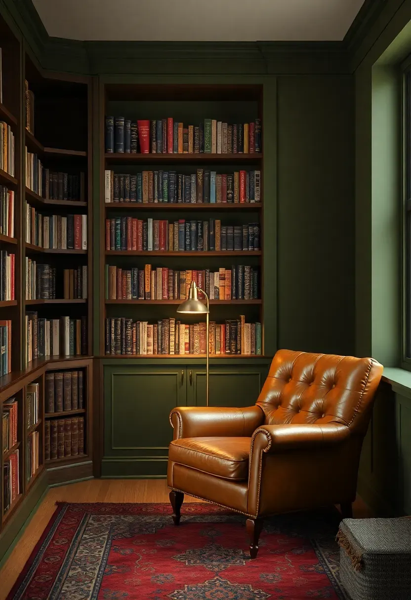
13. Deep Olive
Olive green is having its strongest season since the 1970s, and this time it is staying. The 2026 version is deeper and earthier than its predecessor — less military, more Mediterranean hillside.
Comparing: Deep Olive vs Sage
Deep Olive carries brown and gold undertones. It feels warm, autumnal, and grounded. It suits dark wood furniture and leather accents.
Sage carries gray and blue undertones. It feels cool, serene, and slightly coastal. It suits light wood furniture and linen accents.
What to Choose
Choose Deep Olive if: you want a room that feels like a cozy library or a wine bar — rich, warm, enveloping. Choose Sage if: you want a room that feels like a garden terrace — fresh, airy, calm.
Recommendation
Deep olive pairs brilliantly with the warm-metal trend dominating 2026 hardware. If your home already features brass door handles or aged copper light fixtures, olive walls will amplify that investment.
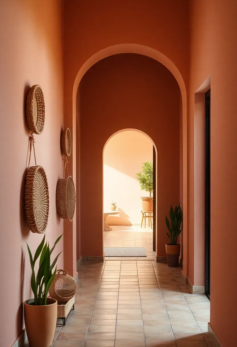
14. Blushed Terracotta
This is not the bold terracotta of southwestern kitchens. Blushed terracotta is softer, pinker, and far more versatile — imagine the inside of an Italian villa where the pigment has mellowed over decades.
Why It Works Right Now
The broader shift toward warm, human-scale interiors puts blushed terracotta in an ideal position. It complements the linen-and-wood aesthetic dominating furniture design without being as predictable as beige. Entryways, hallways, and dining rooms benefit most — these are transitional spaces where the color creates warmth without requiring commitment to an entire living area.
Practical Tips
- Pair with arched doorways or curved mirrors to enhance the Mediterranean feel
- Natural fiber accents — jute, rattan, sisal — reinforce the earthy warmth
- Avoid high-gloss finishes, which make terracotta tones look plastic
Recommended
Items for this idea
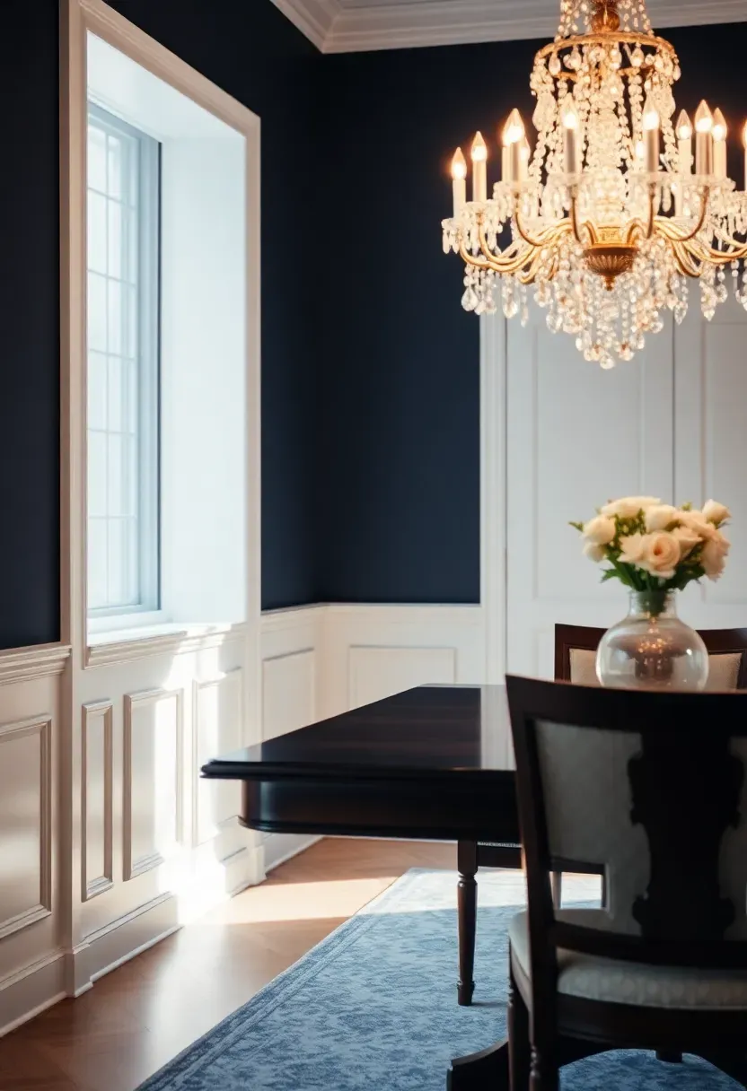
15. Ink Navy
Navy never truly leaves, but 2026 pushes it even darker — into ink territory, where it almost reads black in low light but reveals its blue heart in daylight. This is confidence on a wall.
Step 1: Evaluate Your Room
Ink navy demands rooms with at least moderate natural light or excellent layered artificial lighting. Measure your windows. If the room gets fewer than four hours of direct light, consider using ink navy on just the lower wall below a chair rail.
Step 2: Select the Right Sheen
Matte emphasizes depth and richness but shows every fingerprint. Eggshell balances visual depth with practical wipeability. For high-traffic areas, satin is the safest choice.
Step 3: Anchor with White
Bright white trim, ceiling, and built-in shelving create the architectural contrast ink navy needs to perform. Without white framing, the color can feel like a void rather than a feature.
What to Watch Out For
- Touch-ups are visible with dark colors — always save leftover paint and apply with the same roller type
- Ink navy shows dust and lint more readily than lighter shades
- Two coats are mandatory; three may be needed with cheaper paints
16. Wheatfield Gold
Neither mustard nor butter, wheatfield gold is the color of grain stalks just before harvest — warm, luminous, and quietly energizing. It brings sunshine into a room without the intensity of yellow.
Where Wheatfield Gold Excels
This shade transforms bedrooms, especially those that face north or west and feel perpetually cool. It also works beautifully in mudrooms and laundry rooms where a dose of optimism offsets the mundane. Unlike brighter yellows, wheatfield gold recedes slightly, which means it functions almost as a warm neutral.
Design Pairings
- Charcoal textiles and matte black hardware for modern contrast
- White oak furniture and cream rugs for a tone-on-tone warmth
- Deep green accents — a potted fiddle leaf or olive-toned throw — for natural complementary balance
Recommended
Items for this idea
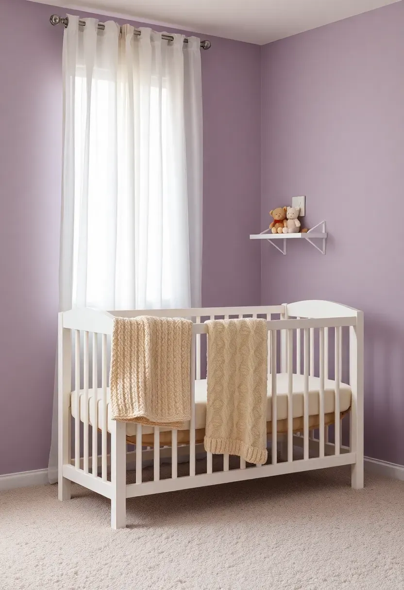
17. Muted Lavender
The Core Issue
Purple often feels too childish for adult spaces or too dramatic for rooms meant for rest. Most people avoid it entirely, defaulting to safer neutrals and missing out on one of the most calming hues on the spectrum.
The Solution
Muted lavender solves the purple problem by graying the pigment until it reads closer to a cool neutral than a statement color. It has the calming effect of blue with the softness of pink — a combination that sleep researchers have linked to faster relaxation. Use it in bedrooms, nurseries, and bathrooms where rest and unwinding are the primary functions. Sherwin-Williams' Potentially Purple and Benjamin Moore's Violet Dusk both capture this balanced tone.
Pros and Cons
Pros: Universally calming, gender-neutral in nurseries, pairs with both warm and cool metals Cons: Can read slightly cold in rooms with only cool LED lighting — add warm bulbs to balance
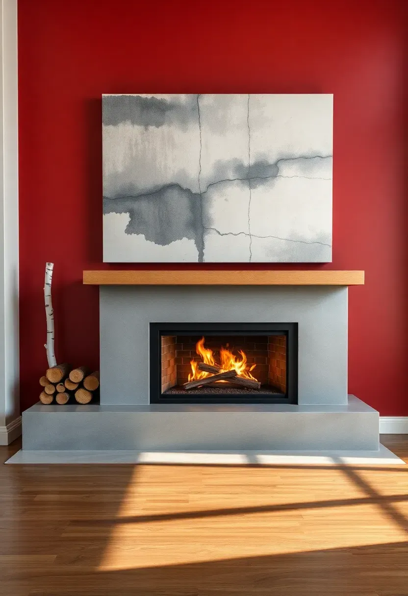
18. Redwood Accent
Redwood is bold without being aggressive. It carries the gravitas of burgundy with the earthiness of rust — a color that feels grounded in nature rather than manufactured for impact.
Where It Belongs
Reserve redwood for accent moments: a fireplace wall, the inside of built-in shelving, a front door, or a single wall in a dining room. Full-room application can overwhelm, but targeted use creates a focal point that anchors the entire space.
Origins and Context
Deep reds have cycled through interior trends roughly every fifteen years. The 2026 version borrows from Japanese lacquerware and Scandinavian cabin interiors — restrained applications where the color serves as a punctuation mark rather than a paragraph.
How to Apply at Home
- Limit to one wall or architectural feature per room
- Pair with warm neutrals — cream, sand, warm gray — on surrounding surfaces
- Matte finish maximizes the earthy quality; satin works for doors and trim
- Natural wood elements (oak, walnut, ash) complement the organic warmth
Recommended
Items for this idea
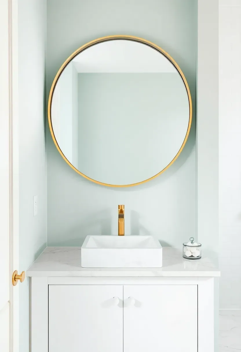
19. Seafoam Mist
Seafoam mist is the lightest color on this list, and it earns its place by doing something remarkable: it makes any room feel cleaner. There is a freshness baked into this pale blue-green that transcends trends.
What Makes It Work
Unlike stark white, seafoam mist has just enough pigment to add warmth and dimension. Unlike brighter turquoise, it is subtle enough to serve as a whole-room color without tiring the eye. Bathrooms are the obvious choice, but it also works beautifully in laundry rooms, covered porches, and guest bedrooms.
Practical Tips
- Pairs with white fixtures, marble, and chrome for a classic spa aesthetic
- Add warmth through natural wood vanities or woven baskets to prevent the room from feeling clinical
- Semi-gloss finish in bathrooms reflects light and handles humidity well
20. Warm Putty
Putty sounds unglamorous until you see it on a wall. This color — a complex blend of beige, gray, and the faintest olive undertone — is the designer secret behind rooms that look effortlessly expensive.
Trend Context
The quiet luxury movement that reshaped fashion in 2024 and 2025 has fully arrived in interiors. Warm putty is its signature wall color. It signals restraint, taste, and confidence in simplicity. Real estate stagers report that homes painted in warm putty variants sell faster than those in standard builder beige.
Modern Application
Use warm putty as a whole-house color for continuity, then introduce personality through furniture, art, and textiles. The beauty of this shade is its neutrality — it supports rather than competes. Swap a painting, change the throw pillows, bring in a new rug, and the walls adapt silently.
How to Apply at Home
- Sample at least three putty variants from different brands — undertones vary significantly
- Use the same color on walls and ceiling (same sheen) for a seamless, enveloping effect
- Matte finish for residential warmth; eggshell for rooms that need wipeability
- Avoid stark contrast — pair with materials and colors within two steps of the same tonal range
Recommended
Items for this idea
21. Moody Mushroom
Mushroom colors have been trending for several seasons, but the 2026 iteration gets moodier — deeper, more saturated, with a hint of taupe that reads almost like a warm charcoal in evening light.
How It Differs from Standard Taupe
Standard taupe stays polite. Moody mushroom takes risks. It darkens enough to create atmosphere while retaining the warmth that charcoal and slate lack. Think of it as the color of a forest floor after rain — layered, complex, and impossible to reduce to a single pigment.
Best Rooms for Moody Mushroom
- Studies and home offices where focus matters more than brightness
- Primary bedrooms where a cocoon effect aids sleep
- Dining rooms where evening candlelight brings out the warm undertones
- Avoid in kitchens and playrooms where brightness supports function
22. Paprika Spice
For those who find terracotta too safe and red too risky, paprika spice splits the difference. It is the color of smoked peppers — warm, deep, and slightly smoky, with enough brown to keep it from reading as a pure red.
Step 1: Commit to the Accent Approach
Paprika spice is a confident color. Use it on a single kitchen accent wall, a powder room ceiling (an underrated move), or the interior of a bookshelf. Full-room application requires careful lighting and dark-toned furniture to balance.
Step 2: Ground with Earthy Neutrals
Surround paprika with creams, warm grays, and natural woods. Dark walnut cabinetry and matte black pulls create a grounded kitchen look. Bright white trim provides necessary breathing room.
Step 3: Layer Textures
Paprika demands texture to avoid looking flat. Pair with woven baskets, rough-hewn wood, hammered copper, and matte ceramic. Smooth, glossy surfaces next to this color feel disconnected.
What to Watch Out For
- Photograph your test swatch at midday and under evening lighting — the shift is dramatic
- Works best in rooms where you want energy: kitchens, dining rooms, entryways
- Avoid in bedrooms where the warmth can feel stimulating rather than restful
Recommended
Items for this idea
23. Horizon Blue
The list closes with a color that captures the line where sky meets water on a calm morning. Horizon blue is pale, slightly warm, and utterly serene — a color that asks nothing of you except to relax.
Why Horizon Blue Ends This List
After 22 colors ranging from moody to bold, horizon blue serves as a reminder that paint does not always need to make a statement. Sometimes the best color is one you barely notice — it simply makes the room feel right. Sunrooms, screened porches, and guest bedrooms are its natural habitat.
Design Pairings
- White wicker and rattan furniture for classic porch style
- Light gray linen upholstery for a modern coastal approach
- Warm wood floors and jute rugs to prevent the palette from feeling too cool
- Avoid heavy dark furniture, which fights the airy mood horizon blue creates
Quick FAQ
Should I follow paint trends if I plan to sell my home soon? Neutral trends like warm putty and oat milk cream appeal to the broadest buyer pool. Bolder colors work best on accent walls you can easily repaint. Staging designers recommend trending neutrals for resale because they photograph well and let buyers imagine their own furniture in the space.
Is it worth paying more for premium paint brands? Yes, in most cases. Premium paints offer better coverage (fewer coats), truer color accuracy, and longer durability. A gallon of high-quality paint at twice the price often costs the same per square foot after factoring in fewer coats and less labor time.
Can I combine multiple trending colors in one open-concept space? Keep the main living area in one cohesive neutral, then introduce a trending accent color in connected but visually distinct spaces — a dining nook, a hallway, or behind built-in shelving. Use no more than three paint colors visible from any single vantage point.
Do dark paint colors really make a room feel smaller? Dark paint changes perception, but smaller is not always the effect. Well-lit dark rooms feel intimate and cozy rather than cramped. The key is contrast — light ceilings, pale floors, and adequate lighting prevent walls from closing in visually.
Which finish works best for living room walls in 2026? Matte and eggshell dominate. Matte creates the richest color depth and hides wall imperfections but is less washable. Eggshell offers a subtle sheen that cleans easily while still looking warm. Reserve satin for kitchens, bathrooms, and kids' rooms where wipeability matters daily.
Paint is the most affordable renovation you can make, and the 2026 palette rewards courage. Start with one wall, one room, one gallon — and let the color do what it does best: change how you feel the moment you walk through the door.
Pinterest cover for 23 Paint Color Trends for 2026 Worth Trying Now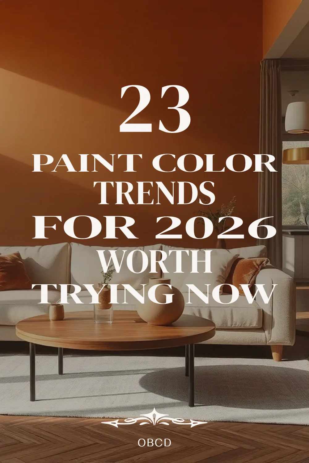
About the author
OBCD
CGI visualization and interior design content. We create detailed 3D renders and curate practical design ideas for every room in your home.