19 Accent Wall Paint Ideas That Make Any Room Stand Out
There is a reason accent walls never go out of fashion. A single painted surface can redirect the energy of an entire room — pulling focus, setting mood, and adding architectural interest where none existed before. The best part is that paint remains the most accessible transformation tool in interior design. No contractor needed, no permit required, just a gallon of the right shade and a weekend afternoon.
What follows are 19 distinct accent wall paint ideas, each chosen for its ability to reshape a space without a full renovation. We cover everything from saturated jewel tones to understated texture techniques, so whether your taste runs bold or restrained, there is something here worth trying.
Table of Contents
- Deep Emerald Drama
- Terracotta Warmth
- Charcoal and Cream Color Block
- Ombre Gradient Fade
- Matte Black Statement
- Dusty Rose Softness
- Navy Blue Sophistication
- Geometric Tape Pattern
- Sage Green Calm
- Half-Wall Two-Tone
- Venetian Plaster Effect
- Burnt Orange Energy
- Sponge-Painted Texture
- Moody Plum Depth
- Vertical Stripes
- Limewash Organic Finish
- Mustard Yellow Punch
- Arched Paint Detail
- Soft Lavender Retreat
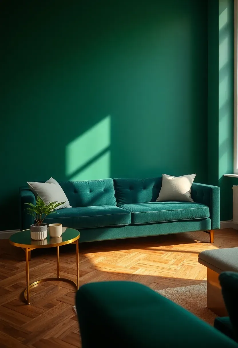
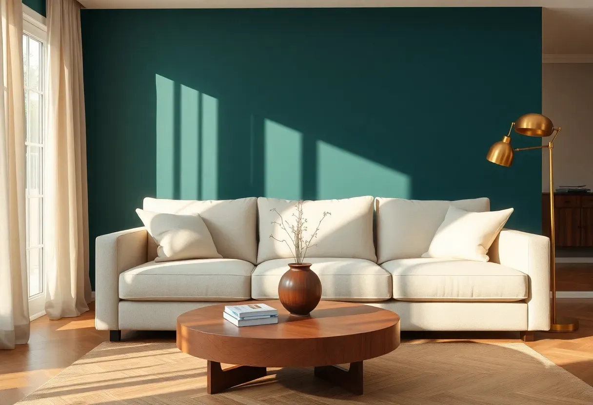
1. Deep Emerald Drama
Emerald green carries a weight that few other colors can match. It reads as both luxurious and grounded, drawing from the depth of old-growth forests and vintage jewel boxes alike. Against neutral furnishings, a single emerald wall becomes the undeniable anchor of the room. The key is choosing a shade with enough blue undertone to avoid looking like a sports field — think hunter or forest rather than kelly. Matte or eggshell finishes absorb light in a way that gives the color genuine dimension.
Tips for Making It Work
- Pair with warm metals like brass or antique gold to amplify the richness
- Keep surrounding walls in a soft white or warm cream to let the green breathe
- Use this behind a bed or sofa where the color can frame your key furniture piece
We picked a few things that go well with this idea: Heirloom Traditions All-in-One Paint (Quart) (★4.4), LM Kreativ Metallic Wall Paint Antique Gold (★4.6) and Rust-Oleum Chalked Ultra Matte Paint Serenity Blue (★4.5). As an Amazon Associate we earn from qualifying purchases.
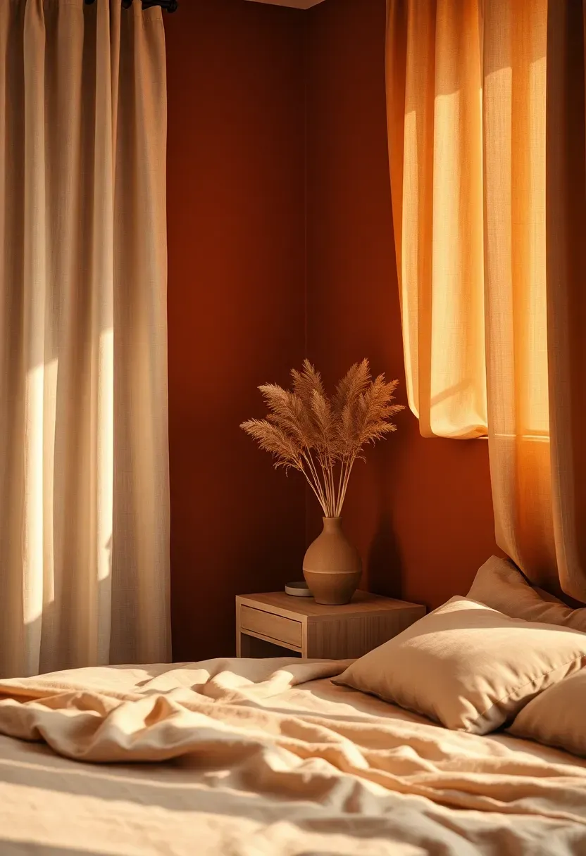
2. Terracotta Warmth
Why Terracotta Keeps Returning
Every few years, designers rediscover what Mediterranean and Southwestern homes have always known: earth-derived colors make a room feel like a warm embrace. Terracotta sits at the intersection of orange, brown, and clay red, producing warmth without the harshness of pure orange.
The Solution
Apply terracotta in a matte finish to the wall that catches the most natural light. Sunlight transforms the shade throughout the day — pale and peachy in the morning, deep and rustic by evening. This dynamic quality means the wall never feels static. Complement with raw linen textiles, unglazed ceramics, and woven baskets to build a layered, tactile palette that feels rooted and intentional rather than trendy.
Pros and Cons
Pros: universally flattering in both warm and cool lighting, pairs naturally with wood tones, ages gracefully Cons: can feel heavy in rooms with limited natural light, requires careful furniture editing to avoid a cluttered adobe look
We picked a few things that go well with this idea: Scotch Delicate Surface Painters Tape (60 yd) (★4.7), FrogTape Delicate Surface Tape with PaintBlock (★4.7) and TAPEBEAR Delicate Surface Masking Tape (6-Roll) (★4.6). As an Amazon Associate we earn from qualifying purchases.
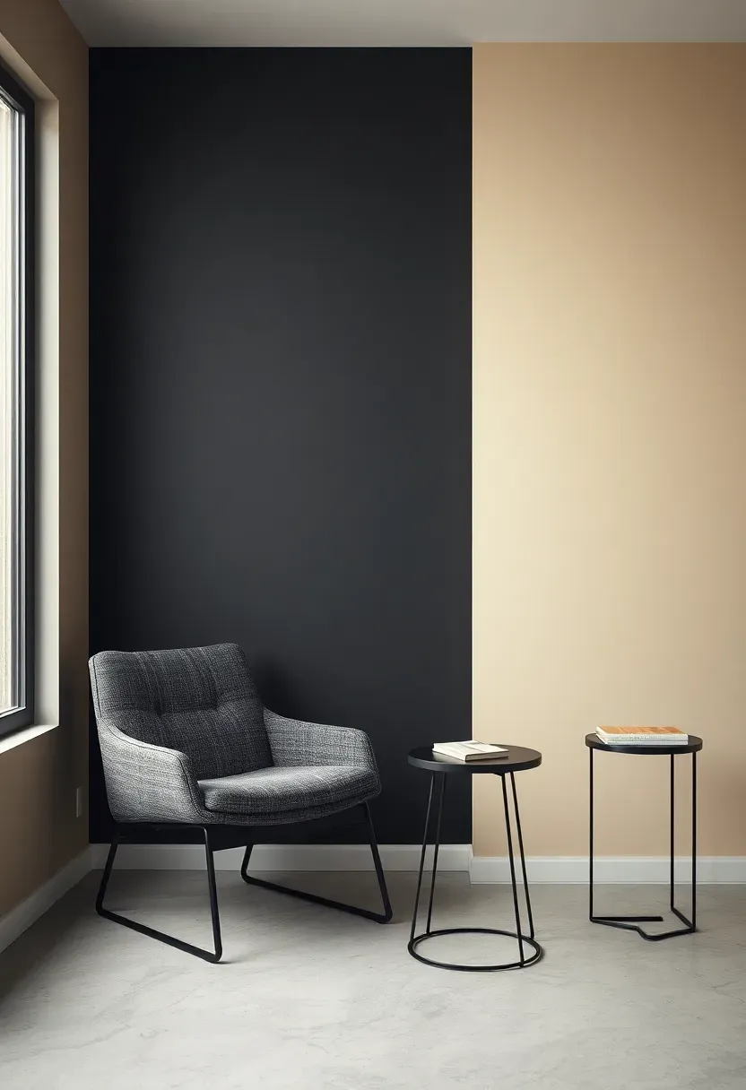
3. Charcoal and Cream Color Block
Color blocking is the fastest way to add architectural interest without installing molding or millwork. Divide the wall at chair rail height — roughly 32 to 36 inches from the floor — and paint the lower portion in rich charcoal while the upper section stays warm cream. The contrast creates a visual datum line that makes ceilings appear taller and grounds heavy furniture. The effect is structured, modern, and surprisingly easy to execute with a level and painter's tape.
Getting the Proportions Right
- The standard one-third / two-thirds split works in most rooms
- In spaces with lower ceilings, bring the dividing line down to one-quarter height to push the eye upward
- Use a semi-gloss on the lower portion for durability where it takes the most contact
We picked a few things that go well with this idea: Modern Masters Venetian Plaster Tint Base (★4.1), Stainless Steel Venetian Plaster Trowel Set (3-Pack) (★5.0) and Hanroy Stainless Steel Plaster Trowel (2-Pack) (★4.2). As an Amazon Associate we earn from qualifying purchases.
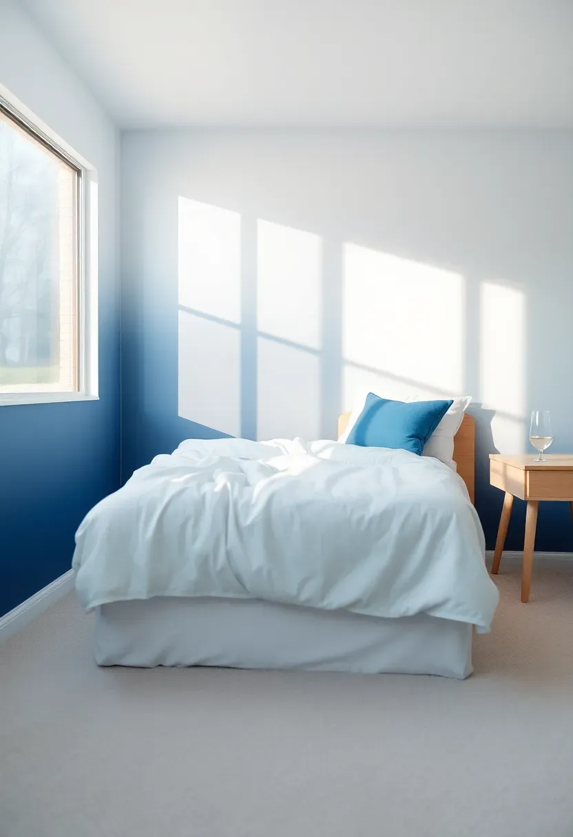
4. Ombre Gradient Fade
How to Create This Effect
An ombre wall transitions from a saturated shade at the base to a lighter version near the ceiling. The technique produces a dreamlike quality that flat color simply cannot achieve.
Start with three paint values of the same hue — dark, medium, and light. Apply horizontal bands and blend them while wet using a wide, damp brush or roller. Work quickly because latex paint dries fast. The imperfection of hand-blending is part of the charm — a too-perfect gradient looks mechanical.
Step 1: Prepare Your Palette
Mix or purchase three tones of one color family. For blue, try navy, cornflower, and ice blue.
Step 2: Apply Base Bands
Roll each shade across its third of the wall, overlapping slightly at the boundaries.
Step 3: Blend the Transitions
Using a large dry brush, feather the overlapping zones with horizontal sweeping strokes until the hard lines dissolve.
What to Watch Out For
- Work in sections no wider than four feet to stay ahead of drying time
- Have a spray bottle of water on hand to mist the surface if paint dries too quickly
- Practice the blending technique on a large piece of cardboard first
Recommended
Items for this idea
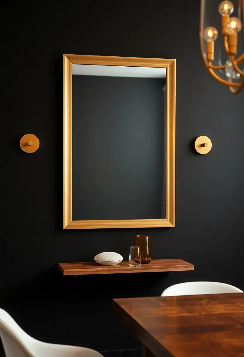
5. Matte Black Statement
Black paint on a wall terrifies most people. The fear is usually that it will shrink the room or feel oppressive. In practice, a well-lit matte black accent wall does the opposite — it creates infinite visual depth, like looking into a void that makes everything in front of it pop. White frames, light wood furniture, and metallic accents practically glow against black. The secret is lighting: supplement with wall sconces or picture lights to keep the surface from flattening into a dark hole.
Tips for Pulling It Off
- Always use true matte finish — any sheen will show every imperfection in the drywall
- One wall only, surrounded by light neutrals, so the room stays balanced
- Add at least two dedicated light sources aimed at or near the black wall
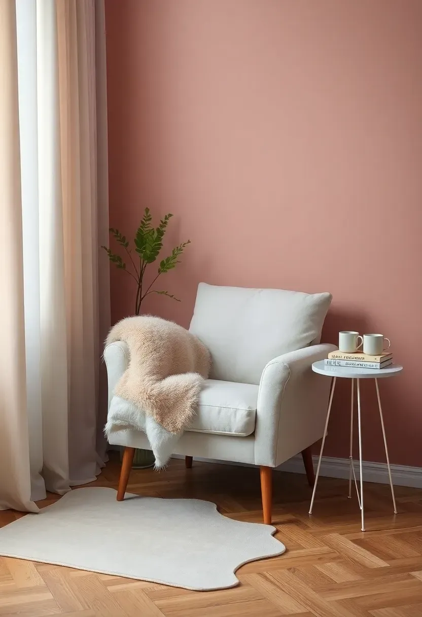
6. Dusty Rose Softness
Origins and Appeal
Dusty rose emerged in the Art Deco period as a sophisticated alternative to baby pink. Unlike its brighter cousin, dusty rose carries gray and mauve undertones that keep it firmly in adult territory, equally at home in a master bedroom and a living room.
Modern Interpretation
Today's dusty rose accent walls lean into the quiet luxury movement. The shade works beautifully with warm greige, olive green accents, and natural wood. It introduces color without demanding attention, making it ideal for spaces where you want warmth and personality but not visual noise. Interior designers frequently recommend it for north-facing rooms where its warmth compensates for cooler natural light.
How to Apply at Home
- Test swatches in both morning and evening light before committing
- Pair with matte brass hardware and warm-toned wood for a cohesive palette
- Use behind open shelving where the blush tone acts as a soft backdrop for objects
- Avoid combining with too many competing pastels or the room loses focus
Recommended
Items for this idea
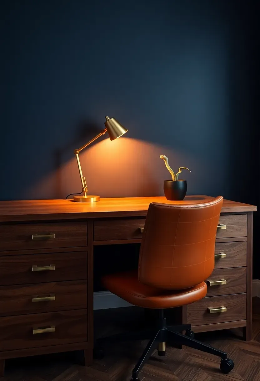
7. Navy Blue Sophistication
Navy sits in that rare category of paint colors that feel simultaneously bold and neutral. It carries the gravitas of black without the drama, reads as classic without feeling outdated, and works in virtually every room from kitchens to bedrooms. A navy accent wall behind a home office desk communicates focus and authority. Behind a bed, it creates a cocoon-like sense of enclosure that supports deep sleep.
Comparing Finishes
Matte navy absorbs light and looks velvety but shows scuff marks easily.
Eggshell navy is slightly more washable and subtly reflects light, which can make a small room feel less closed in.
Choose matte if: your wall sits behind furniture and rarely gets touched. Choose eggshell if: the wall is in a high-traffic area or a smaller room.
8. Geometric Tape Pattern
Painter's tape is the cheapest design tool you own. With nothing more than two or three paint colors and a roll of low-tack tape, you can create diamonds, chevrons, herringbone patterns, or abstract compositions that mimic expensive wallpaper. The appeal lies in precision — sharp lines communicate intentionality, and when someone discovers you did it by hand, the effect doubles.
Step 1: Plan the Pattern
Sketch your design on paper first or use a digital mockup. Simple repeating shapes like triangles or rectangles are the most forgiving for beginners.
Step 2: Tape and Seal
Apply tape firmly, then brush a thin coat of the base color over the tape edges. This seals the boundary and prevents bleed-through on the top coat.
Step 3: Paint and Reveal
Apply your accent colors within the taped sections. Remove the tape while the final coat is still slightly tacky for the cleanest lines.
What to Watch Out For
- Use frogtape or a similar precision-edge product rather than generic masking tape
- Pull tape at a 45-degree angle to avoid lifting dried paint from adjacent sections
- Limit your palette to two or three colors to keep the result sophisticated rather than chaotic
Recommended
Items for this idea
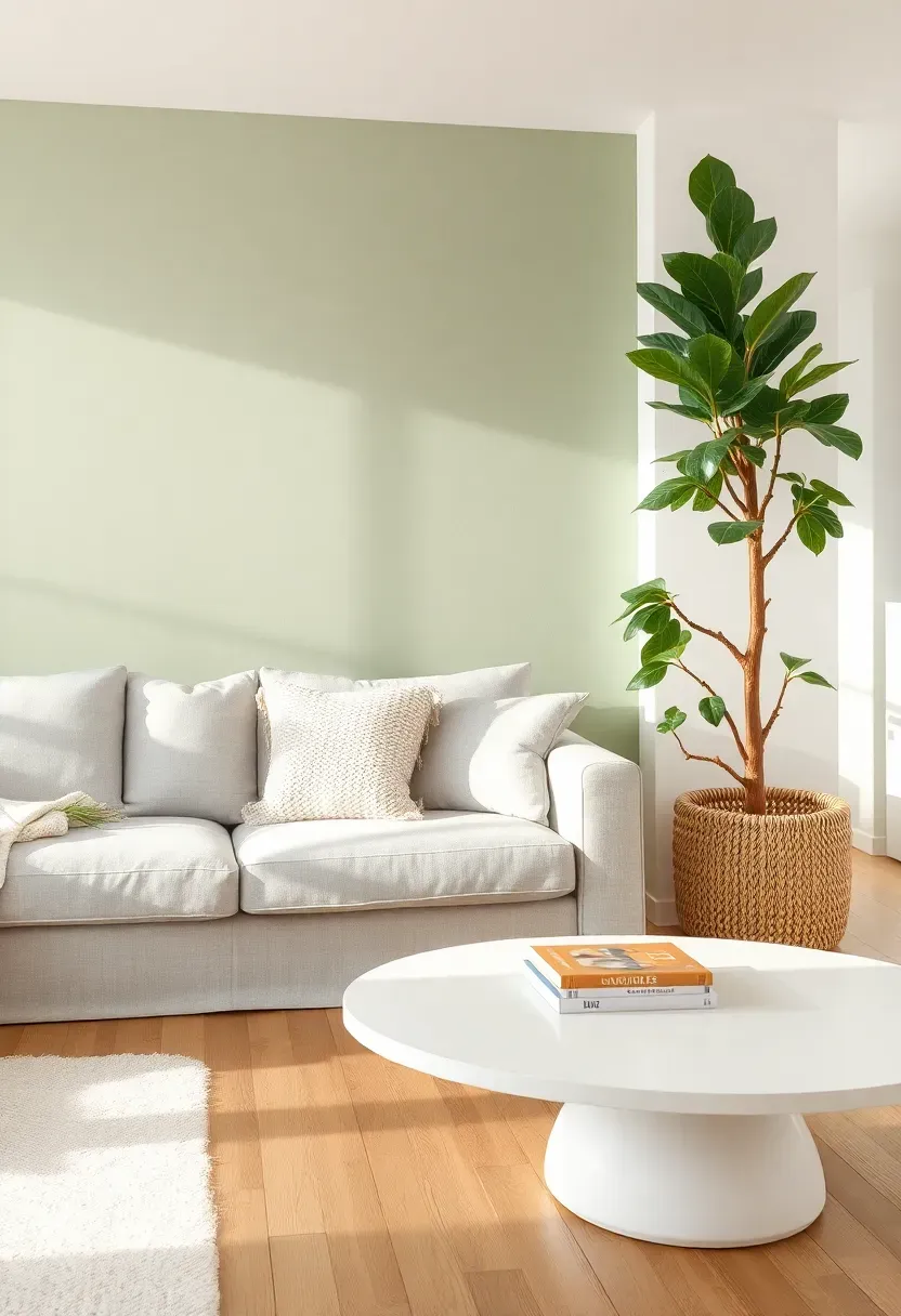
9. Sage Green Calm
Sage green has overtaken gray as the go-to neutral for people who want color without commitment. Its muted, gray-green character lets it function almost like a warm neutral while still delivering that undeniable connection to nature. A sage accent wall behind a light sofa with plenty of indoor plants creates a living space that feels like a greenhouse atrium — airy, fresh, and perpetually relaxing. The shade pairs effortlessly with white, cream, warm wood, and even touches of blush pink.
Tips for the Perfect Sage Wall
- Look for undertones: some sage shades lean yellow, others lean blue — test before committing
- Sage shows best in rooms with abundant natural light where the green reads true
- Complement with woven textures like rattan and jute for an organic, layered look
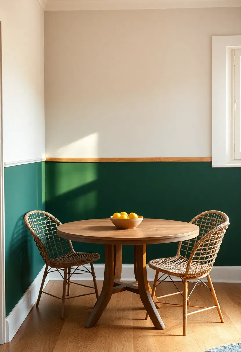
10. Half-Wall Two-Tone
The Core Issue
Painting an entire wall a bold color can feel overwhelming, especially in smaller rooms or open floor plans where you want definition without visual heaviness.
The Solution
Split the wall horizontally and paint only the lower portion in your chosen accent shade. This approach contains color within a manageable zone, grounds the room's proportions, and leaves the upper wall light to maintain a sense of openness. The dividing line itself becomes a design element — you can leave it sharp, add a thin strip of contrasting tape, or install a simple wood batten to formalize the boundary. Deep forest green below warm white above is a classic combination that works in dining rooms, hallways, and bedrooms alike.
Pros and Cons
Pros: uses less paint, less intimidating than a full accent wall, creates a wainscoting effect without woodwork Cons: the horizontal line can visually lower ceilings if placed too high, requires careful leveling across the full width
Recommended
Items for this idea
11. Venetian Plaster Effect
Venetian plaster has been gracing Italian villas since the Renaissance, and a faux version is now within reach of any homeowner willing to learn a new technique. Specialty paints and plaster compounds let you build up thin, burnished layers that catch light at different angles, producing a surface that shifts from matte to subtle sheen depending on where you stand. The result is a wall that looks like it has a century of patina, even when it was finished yesterday.
Step 1: Apply the Base
Spread a thin layer of plaster compound with a flexible steel trowel, covering the wall unevenly on purpose.
Step 2: Build Texture
Once dry, apply a second coat using short, overlapping strokes in random directions to create depth.
Step 3: Burnish
Lightly sand any rough peaks and polish the surface with the flat of the trowel. Seal with a clear wax for protection and a soft luster.
What to Watch Out For
- Work in small sections to maintain control over the texture
- The compound dries quickly, so keep your edges wet to avoid hard lines between sections
- Practice on a sample board until the wrist motion becomes second nature
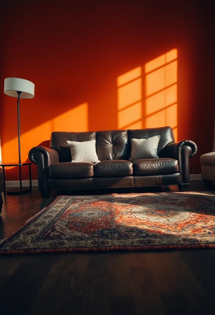
12. Burnt Orange Energy
Burnt orange carries the warmth of terracotta with an added dose of vitality. Where terracotta whispers, burnt orange speaks clearly — confident, creative, and unapologetically alive. This shade belongs in rooms where people gather, talk, cook, and entertain. It stimulates conversation and appetite, which is why it works brilliantly in dining areas and kitchens. Against dark leather furniture and rich wood tones, burnt orange creates a palette that feels both globally inspired and deeply comfortable.
Tips to Keep It Balanced
- Use burnt orange as the sole warm accent; adding red or yellow nearby creates visual heat overload
- Ground the space with plenty of dark neutrals like espresso brown, charcoal, or matte black
- Natural fiber rugs and woven pendants complement the earthy spirit of the color
Recommended
Items for this idea
13. Sponge-Painted Texture
Origins and Modern Revival
Sponge painting peaked in the 1990s and promptly fell out of favor — mostly because it was done badly. Oversaturated colors and heavy-handed application turned it into a decorating cliche. But with a lighter touch and a restrained palette, sponge painting produces a beautiful watercolor-like effect that adds visual softness to flat walls.
Modern Interpretation
The updated approach uses a large natural sea sponge and two or three closely related shades — think light gray, blue-gray, and soft periwinkle layered transparently over a white base. The result resembles cloudy sky or weathered stone, adding organic movement to a surface that would otherwise be flat and boring. Apply with a light dabbing motion and step back frequently to check overall balance.
How to Apply at Home
- Use a natural sea sponge, not a synthetic one, for irregular organic patterns
- Dip lightly and blot excess paint on a paper plate before touching the wall
- Start with the lightest shade and add darker tones sparingly for depth
- Keep your wrist loose and rotate the sponge constantly to avoid repetitive marks
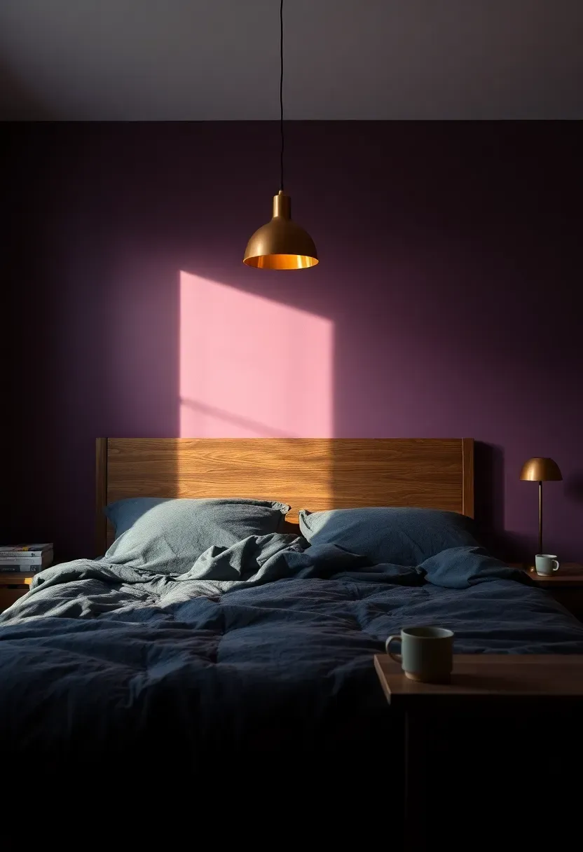
14. Moody Plum Depth
Plum occupies the space between purple and brown, which gives it a richness that neither color achieves alone. A plum accent wall in a bedroom feels enveloping and intimate, like the room itself is wrapping around you at the end of the day. The shade reads differently depending on light — almost burgundy in warm lamplight, closer to eggplant under cooler LED. This chameleon quality makes plum one of the most interesting paint choices for rooms used primarily in the evening.
Pairing Suggestions
- Charcoal velvet bedding and dark wood furniture lean into the moodiness
- Copper or rose gold lighting fixtures create warm contrast without competing
- A single cream throw or rug prevents the palette from becoming too dark for comfort
Recommended
Items for this idea
15. Vertical Stripes
Comparing: Bold Stripes vs Tonal Stripes
Vertical stripes do what few other paint techniques can — they physically alter the perceived height of a room. But the approach splits into two very different directions.
Bold Stripes
Two contrasting colors, such as navy and white or black and cream, create a high-impact wall that reads almost like fabric. Dramatic and playful, best suited for entryways, powder rooms, and accent nooks where the effect can be enjoyed in smaller doses.
Tonal Stripes
The same color in two finishes — matte and satin, for example — produces stripes visible only when light catches them at an angle. Sophisticated and subtle, this approach adds architectural texture without introducing additional color.
What to Choose
Choose bold stripes if: you want a statement feature in a small, defined space. Choose tonal stripes if: you want elegance and texture without the visual intensity of contrasting colors.
Recommendation
Start with tonal stripes if you are new to the technique. They are far more forgiving of imperfect tape lines and always look more expensive than they are.
16. Limewash Organic Finish
Limewash has become one of the most requested finishes in interior design, and for good reason. Made from slaked limestone, true limewash penetrates the wall surface rather than sitting on top of it, creating a depth and translucency that conventional paint cannot replicate. The finish looks different with every passing cloud — chalky in flat light, almost luminous when sun hits it at an angle. Colors tend toward natural earth tones: warm whites, pale terracottas, soft grays, and muted blues.
Tips for Application
- True limewash works best on porous surfaces like raw plaster or unsealed drywall
- Apply with a large bristle brush in crisscross strokes for authentic movement
- Multiple thin coats build richer color variation than one heavy application
- Modern limewash paints from brands like Portola and Romabio simplify the process for DIY use
Recommended
Items for this idea
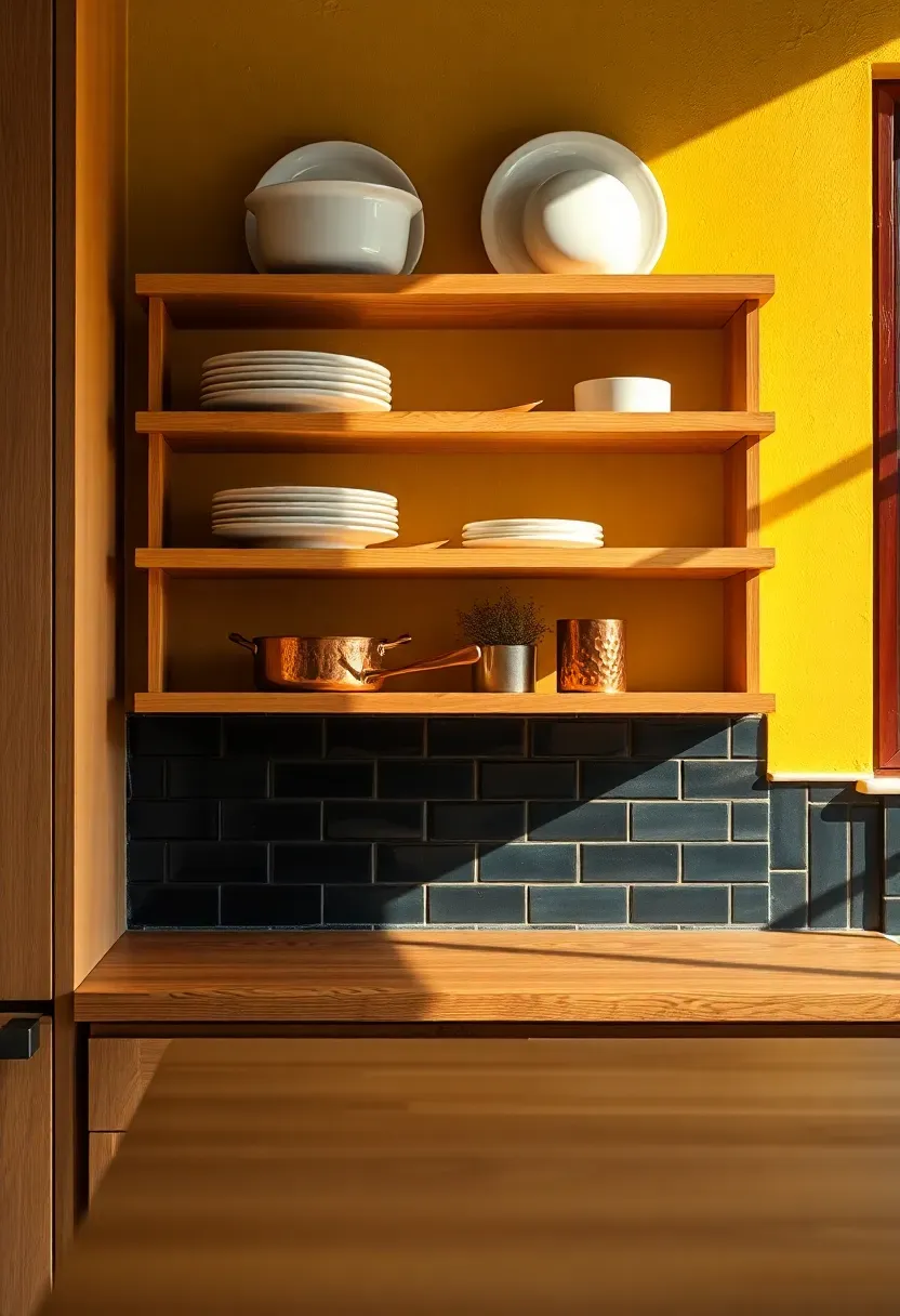
17. Mustard Yellow Punch
Most people shy away from yellow walls because they picture nursery-bright lemon. Mustard exists in a completely different world — earthy, warm, complex, and full of personality. It contains enough brown and gold to ground the brightness, making it sophisticated enough for kitchens, dining rooms, and even home offices. A mustard accent wall behind open shelving stocked with white dishes and copper pots creates a scene that looks straight from a European countryside kitchen.
Making Mustard Work in Your Space
- Test the shade against your lighting: mustard can swing toward green or orange depending on bulb temperature
- Pair with warm neutrals like cream and tan rather than cool grays which fight the yellow undertones
- Dark wood and black iron accents prevent mustard from feeling too casual or whimsical
18. Arched Paint Detail
Painting an arch on a wall — freestanding, no actual architectural element required — has become one of the most popular DIY accent wall treatments. The technique involves tracing a half-circle or elongated arch shape and painting inside it in a contrasting color, creating the illusion of a niche, doorway, or headboard without construction. It works beautifully behind beds, desks, and reading chairs, framing the furniture like a built-in alcove.
Step 1: Mark the Arch
Tie a pencil to a length of string anchored at a central point and swing to trace a consistent curve on the wall.
Step 2: Define the Boundary
Run painter's tape carefully along the pencil line. For a perfect curve, use flexible detailing tape rather than rigid masking tape.
Step 3: Fill and Finish
Paint inside the arch boundary with a roller for an even finish. Remove tape while slightly tacky for the cleanest edge.
What to Watch Out For
- The arch should extend at least 12 inches wider than the furniture it frames
- A single solid color inside reads cleaner than multiple colors or gradients
- Flat and matte finishes hide any minor edge imperfections where the curve meets straight walls
Recommended
Items for this idea
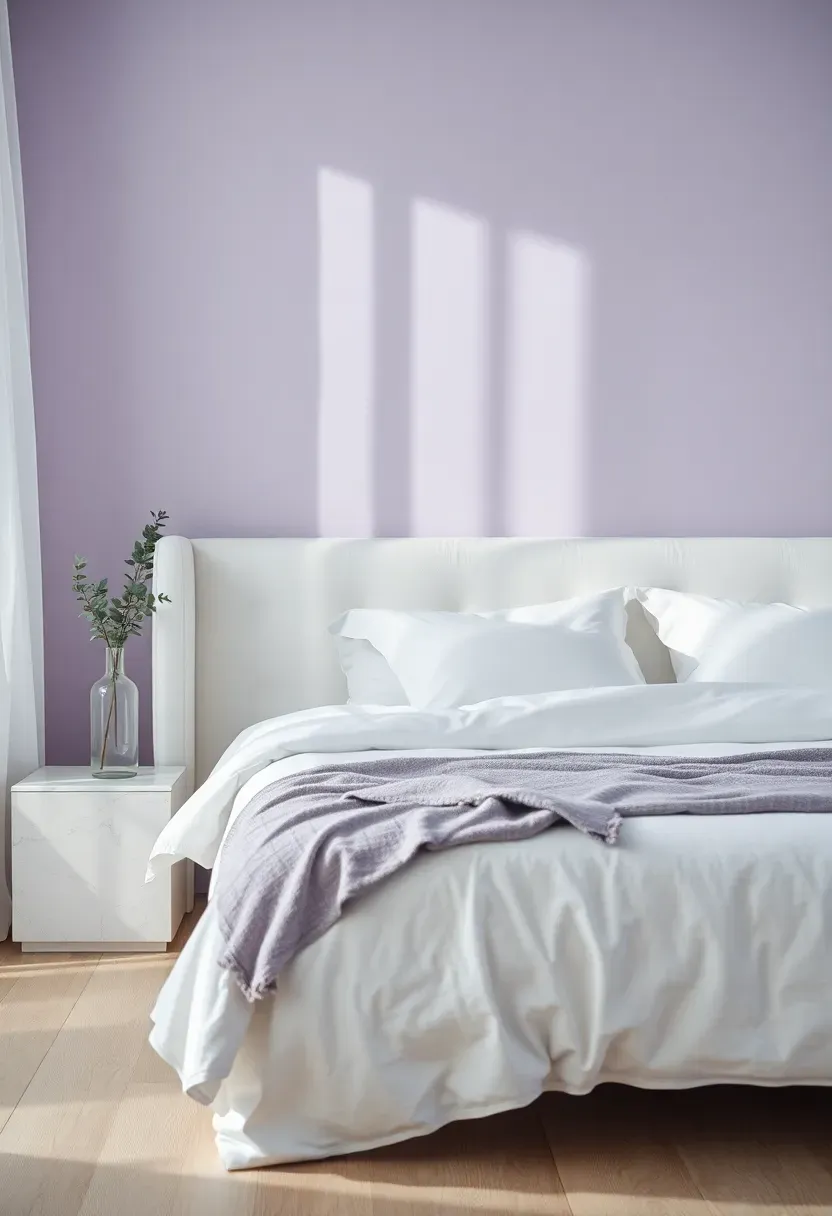
19. Soft Lavender Retreat
Lavender might be the most underrated accent wall color. It carries the calming properties of blue, the warmth of pink, and an inherent association with clean scents and relaxation. A soft lavender accent wall in a bedroom creates an atmosphere that feels restful without coldness. The shade responds beautifully to changing light, shifting from silvery in the morning to warm lilac as lamps turn on at night. For anyone tired of the predictable blue or gray bedroom, lavender offers an unexpected detour that still prioritizes sleep-friendly serenity.
Pairing for Maximum Calm
- White and natural linen bedding keeps the palette serene and uncluttered
- Silver or brushed nickel hardware maintains the cool undertone
- A single green plant — eucalyptus, pothos, or a small olive tree — provides natural contrast that makes the lavender feel more alive
Quick FAQ
Is it possible to paint an accent wall in a rental without losing the deposit? Absolutely. Use a peel-and-stick paint product or negotiate with your landlord by offering to repaint before move-out. Some landlords actually appreciate improvements. Take photos of the original color as documentation and keep enough matching paint to restore the wall later.
Should the accent wall always be the one behind the bed or sofa? Not necessarily. The strongest accent wall is the one your eye naturally lands on when entering the room. Sometimes that is the fireplace wall, the wall visible from the hallway, or even a short end wall in a narrow space. Follow your sight line rather than relying on a formula.
Which paint finish works best for accent walls? Matte and eggshell are the most popular. Matte delivers the richest color depth but shows marks more easily. Eggshell offers a slight sheen that makes cleaning simpler while still looking elegant. Satin works well in kitchens and bathrooms where moisture resistance matters.
What happens if the accent color clashes with my furniture? Buy a sample pot and paint a two-by-two-foot test patch directly on the wall. Live with it for at least two days in varying light conditions before committing. Most clashes become obvious within the first 24 hours when you see the color beside your actual furniture, not just in a store swatch.
Can you use more than one accent wall in a single room? You can, but proceed with caution. Two accent walls in complementary colors can work in large, open-plan spaces where each wall anchors a different zone. In smaller rooms, competing accents cancel each other out and the impact is lost. When in doubt, one wall is almost always enough.
Accent walls succeed because they break monotony without demanding a complete overhaul. Start with the idea that resonated most, grab a sample pot this weekend, and test it directly on the wall in question. The worst outcome is a small patch you paint over — the best is a room that finally feels finished.
Pinterest cover for 19 Accent Wall Paint Ideas That Make Any Room Stand Out
About the author
OBCD
CGI visualization and interior design content. We create detailed 3D renders and curate practical design ideas for every room in your home.