23 For 2026 Paint Color Trends That Set the Tone
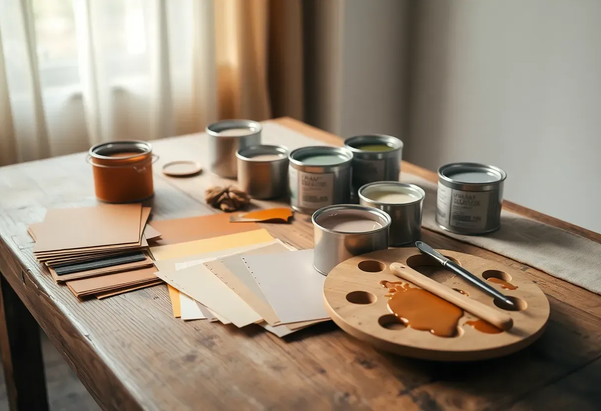
For centuries, the colors inside our homes have signaled who we are before a single word is spoken. A deep oxblood hallway says something different from a pale sky-blue nursery, and both carry weight that goes far beyond aesthetics. The palette emerging for 2026 tells a particular story: people want their walls to feel lived-in, grounded, and deliberately imperfect. Gone is the obsession with sterile precision. Instead, pigments borrowed from clay deposits, lichen-covered stone, aged copper, and twilight skies are reshaping how we think about interior surfaces. These colors do not compete with furniture or artwork. They hold the room together like a quiet conversation.
Here you will find 23 paint color directions gaining serious momentum this year, each paired with guidance on rooms, finishes, and combinations that actually work.
Table of Contents
- Raw Umber Entryway
- Lichen Green for Open Shelving Walls
- Twilight Indigo Bedroom Ceiling
- Sandstone Beige Whole-House Neutral
- Oxidized Copper Dining Room
- Chalk Blush Powder Room
- Peat Moss Dark Accent
- Mineral Gray Kitchen Cabinets
- Dried Lavender Reading Nook
- Amber Glow Breakfast Area
- Volcanic Slate Feature Wall
- Pale Pistachio Bathroom Refresh
- Cardamom Spice Home Office
- River Stone Blue-Gray
- Faded Coral Nursery Walls
- Walnut Shell Wainscoting
- Glacier White with Warm Undertones
- Burnt Ochre Statement Fireplace
- Mist Green Sunroom
- Plum Dusk Accent Alcove
- Toasted Linen Living Room
- Clouded Jade Exterior Door
- Blackened Bronze Trim Detail
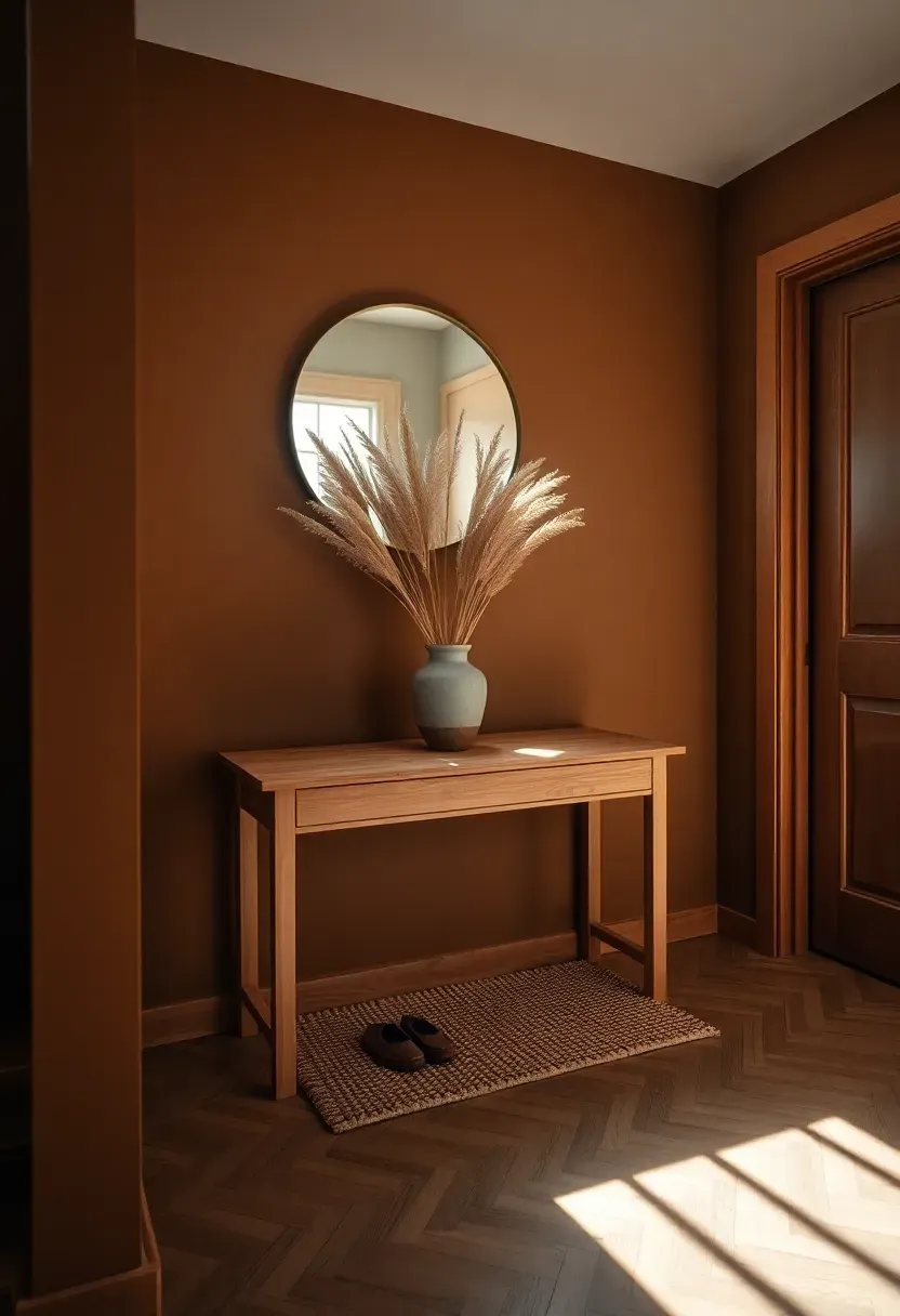
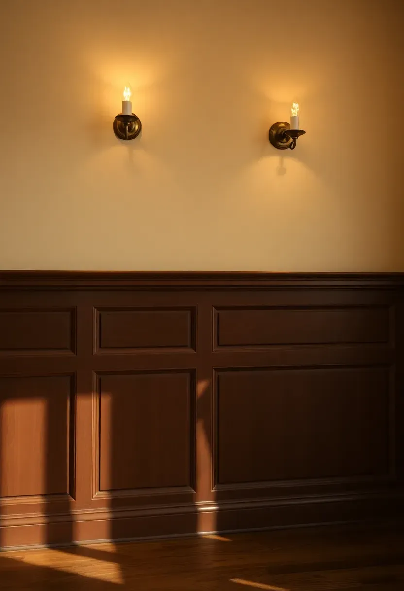
1. Raw Umber Entryway
There is a reason raw umber keeps appearing on designer mood boards for 2026. This pigment, pulled directly from iron-oxide-rich earth, delivers warmth without the sweetness of caramel or the heaviness of chocolate. It grounds an entryway immediately, making guests feel wrapped in something substantial the moment they step inside.
Where It Works Best
Entryways benefit from raw umber because the color absorbs the visual chaos of coats, shoes, and bags. It hides scuffs better than lighter tones and creates a dramatic first impression that transitions naturally into lighter hallways beyond.
Practical Pointers
- Choose an eggshell finish for easy wipe-downs near the door
- Pair with a large round mirror in brushed brass to bounce light
- Keep baseboards in warm off-white to frame the color cleanly
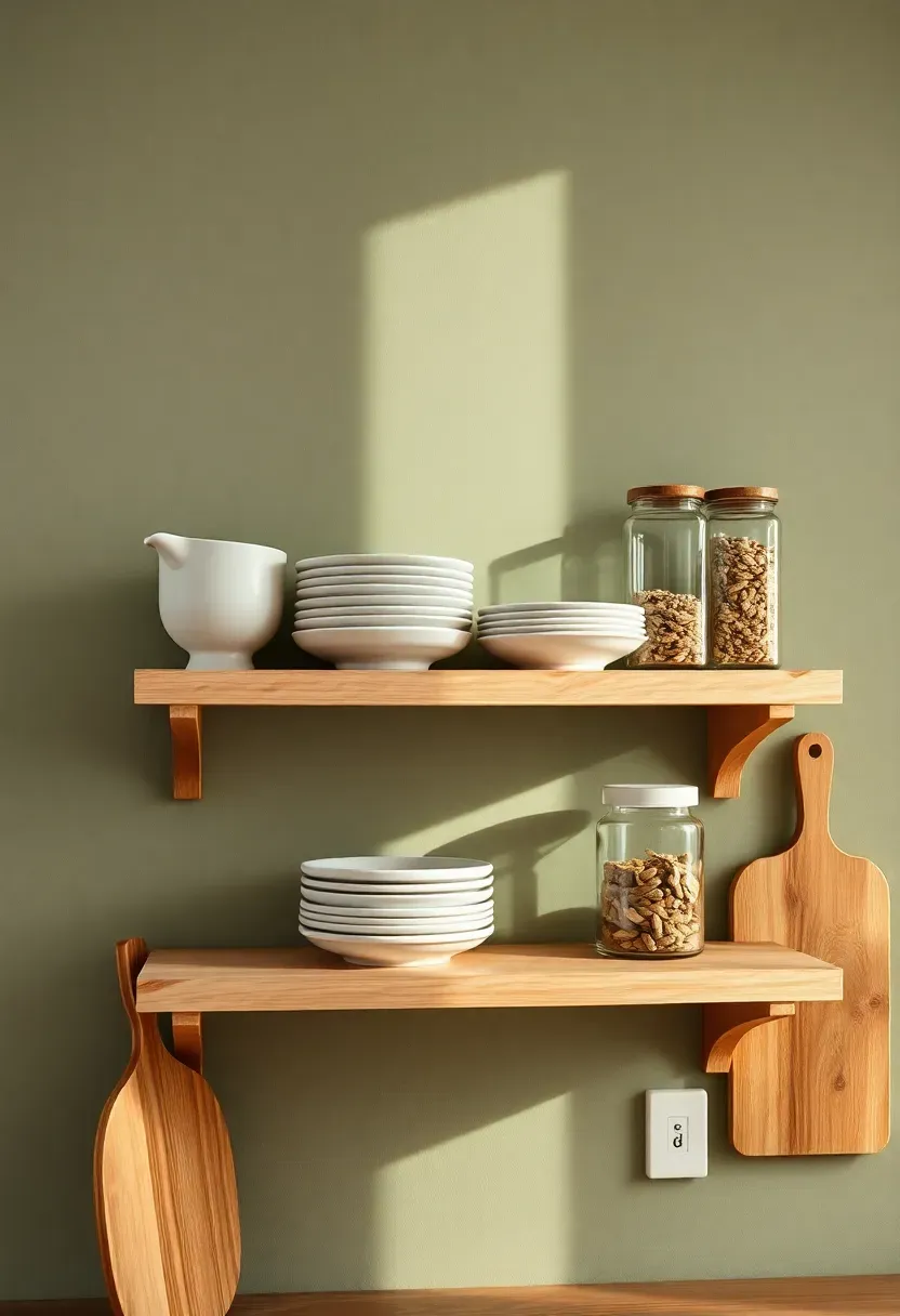
2. Lichen Green for Open Shelving Walls
The Core Issue
Open shelving looks stunning in photos but often falls flat at home because the wall behind it gets ignored. A plain white backdrop makes everyday dishes and pantry items look cluttered rather than curated.
The Solution
Lichen green transforms the wall behind open shelves into a deliberate design choice. This muted, gray-tinged green mimics the organic tones found on forest bark and stone surfaces. Dishes, wooden boards, and glass jars suddenly look intentional against it. The color recedes just enough to let objects stand forward while still adding depth and character that white never could.
Pros and Cons
Pros: Makes ordinary kitchen items look styled, pairs with both warm wood and matte black hardware, ages beautifully as light shifts through the day.
Cons: Can read too dark in north-facing kitchens without supplemental lighting, shows grease splatter more than darker shades.
Recommended
Items for this idea
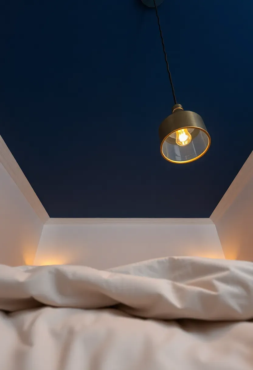
3. Twilight Indigo Bedroom Ceiling
Painting a ceiling has always been the most underused move in residential design. For 2026, twilight indigo on a bedroom ceiling creates the sensation of sleeping beneath a vast evening sky. The walls stay light, the ceiling pulls your gaze upward, and the entire room feels taller and more atmospheric.
Step 1: Prepare the Surface
Sand and prime the ceiling with a tinted primer close to the final shade. Dark colors on ceilings show every roller mark, so a primer layer evens everything out.
Step 2: Apply in Cross Directions
Roll the first coat north to south, the second east to west. This eliminates lap marks that become painfully visible when you lie on your back looking up.
Step 3: Mind the Edges
Use painter's tape where the ceiling meets the walls, but peel it while the paint is still slightly tacky. Waiting until it dries can pull off flakes.
What to Watch Out For
- Low ceilings under 8 feet can feel oppressive with very dark indigo; opt for a softer twilight shade instead
- Matte finish hides imperfections but flat sheens can be hard to clean; satin is a safer bet
- Test the color at night under artificial light since bedrooms are primarily used after dark
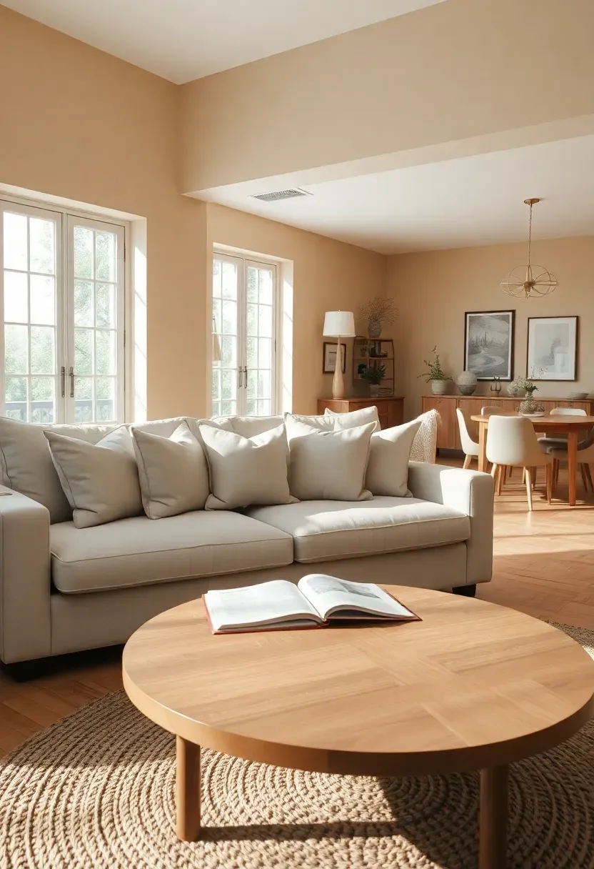
4. Sandstone Beige Whole-House Neutral
Is it possible for a neutral to feel genuinely exciting? Sandstone beige argues yes. Unlike the flat builder-grade beige of the 2010s, this version carries visible warmth from yellow and pink undertones that shift depending on the time of day. At dawn it leans rosy. By afternoon it settles into honey. It functions as a whole-house base that makes every room feel connected without being monotonous.
Why Sandstone Beige Dominates in 2026
The pendulum swing away from cool grays has reached its peak. Homeowners want warmth they can feel immediately, but they also want versatility. Sandstone beige plays well with nearly every accent color, from deep green to burnt orange to navy. It is the rare neutral that flatters both warm and cool-toned furnishings.
Tips for a Whole-House Application
- Vary the sheen by room: flat in bedrooms, eggshell in living areas, satin in kitchens and baths
- Use a shade one step darker on trim for a subtle tonal effect instead of the standard white
- Anchor each room with at least one saturated accent piece to prevent the space from feeling washed out
Recommended
Items for this idea
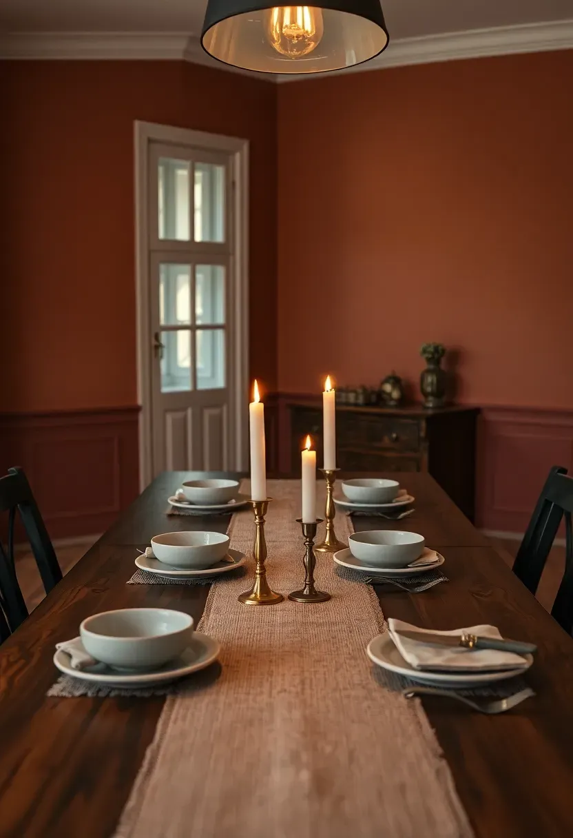
5. Oxidized Copper Dining Room
Origins and Cultural Context
Copper patina has fascinated artisans since the Bronze Age. The verdigris on old rooftops and the ruddy warmth of polished copper cookware both stem from the same metal, and interior designers for 2026 are translating that complex color story onto dining room walls.
Modern Interpretation
Today's oxidized copper paint shade leans toward a muted red-brown with green undertones that surface under warm lighting. In a dining room setting it creates an intimate atmosphere reminiscent of old European wine cellars and candlelit taverns. The color encourages lingering at the table. It flatters skin tones under candlelight, making evening gatherings feel more connected and less rushed. Paired with linen table runners and matte stoneware, it delivers luxury without formality.
How to Apply at Home
- Reserve for the dining room or a dedicated eating nook where you want conversation to slow down
- Use a matte or eggshell finish to emphasize the mineral quality
- Complement with aged brass light fixtures rather than polished chrome
- Add a large-scale botanical print or textured tapestry to break up the wall visually
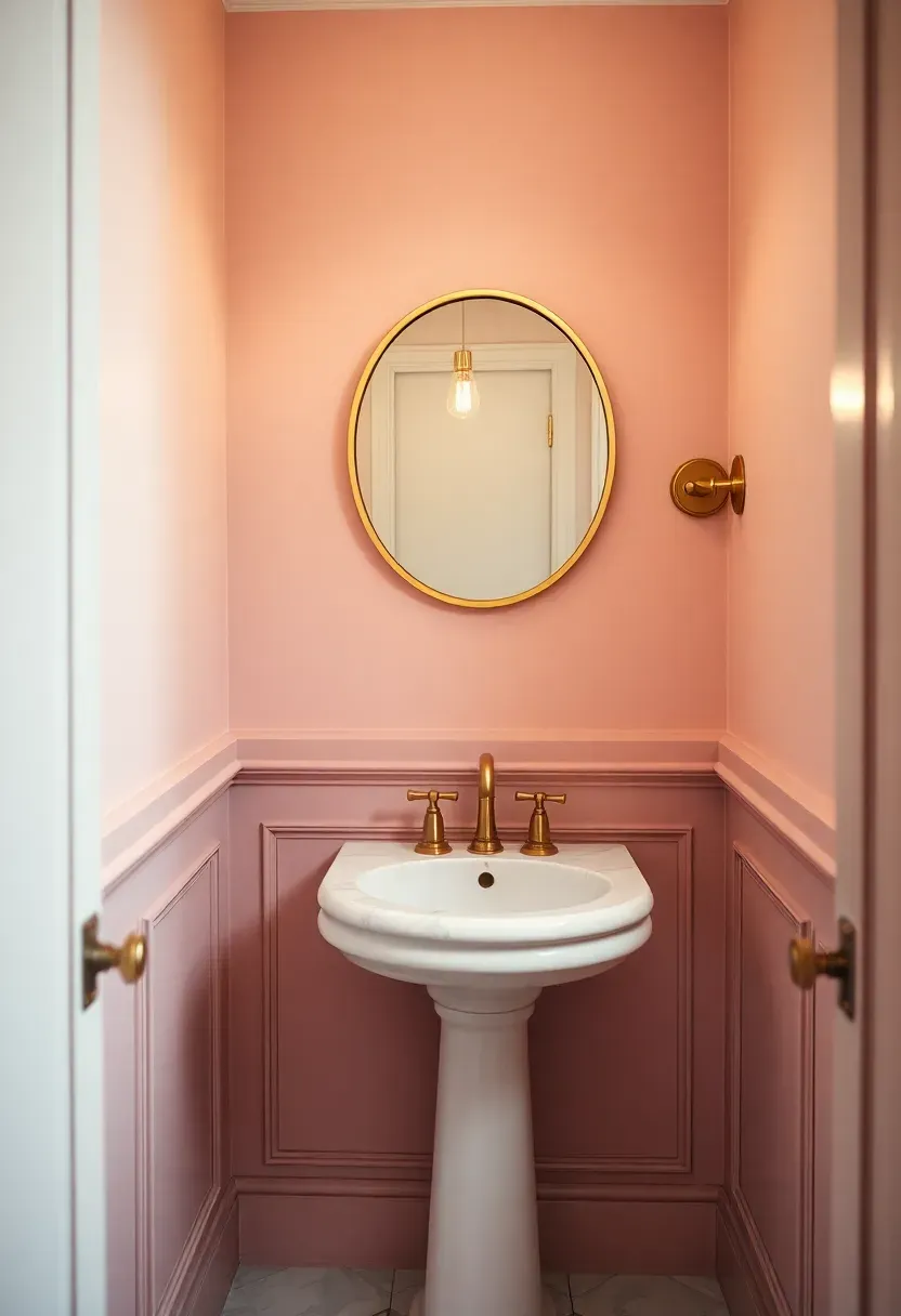
6. Chalk Blush Powder Room
A powder room is a low-risk, high-reward space for testing color bravery. Chalk blush lands between dusty rose and cream, carrying just enough pigment to register as pink without feeling juvenile. In a small half bath, it bounces light gently and makes even basic fixtures look considered.
Why Small Spaces Love This Shade
Small rooms benefit from colors with warm undertones because they feel expansive rather than cramped. Chalk blush avoids the clinical feel of white while staying light enough to keep a tiny room airy. Guests notice it without being overwhelmed.
Practical Pointers
- Satin finish resists moisture and cleans easily in a high-traffic powder room
- Pair with a vintage brass faucet and white marble countertop for a polished look
- A single piece of framed art with complementary tones ties the room together
Recommended
Items for this idea
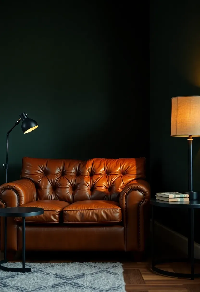
7. Peat Moss Dark Accent
Comparing: Peat Moss Green vs Standard Forest Green
Both colors belong to the green family, but they deliver different moods entirely. Understanding the distinction helps you pick the right shade for your space.
Peat Moss Green
A deeply muted, almost brown-green that reads organic and aged. It has an earthy complexity that shifts under different lighting conditions, sometimes appearing nearly black in dim rooms and revealing olive undertones in direct sun.
Standard Forest Green
Brighter, more saturated, and more obviously green. Forest green makes a cleaner, more vibrant statement and works well in spaces where you want the wall to be a clear focal point.
What to Choose
Choose peat moss if: You want sophistication and mystery, prefer colors that do not announce themselves, or need a dark tone that feels warm rather than cold.
Choose forest green if: You want energy and clarity, are pairing with crisp white trim, or want the room to feel fresh and alive.
Recommendation
For 2026, peat moss aligns more closely with the move toward weathered, nature-derived palettes. It pairs especially well with cognac leather and aged brass.
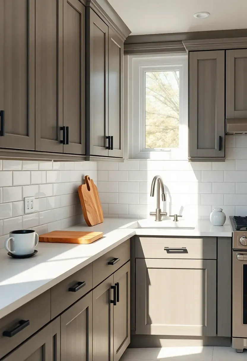
8. Mineral Gray Kitchen Cabinets
The gray kitchen is not dead. It has matured. Mineral gray for 2026 carries warm brown and green undertones that separate it from the cold, blue-tinged grays that dominated the last decade. On kitchen cabinets it reads sophisticated and timeless, bridging the gap between white kitchens and dark moody ones.
Tips for Getting Mineral Gray Right
- Always test the swatch against your countertop and backsplash in both natural and artificial light
- Semi-gloss on cabinet doors resists fingerprints and cleans easily
- Warm up the palette with unlacquered brass pulls or oiled bronze handles
- Keep walls lighter than the cabinets to prevent the room from closing in
Recommended
Items for this idea
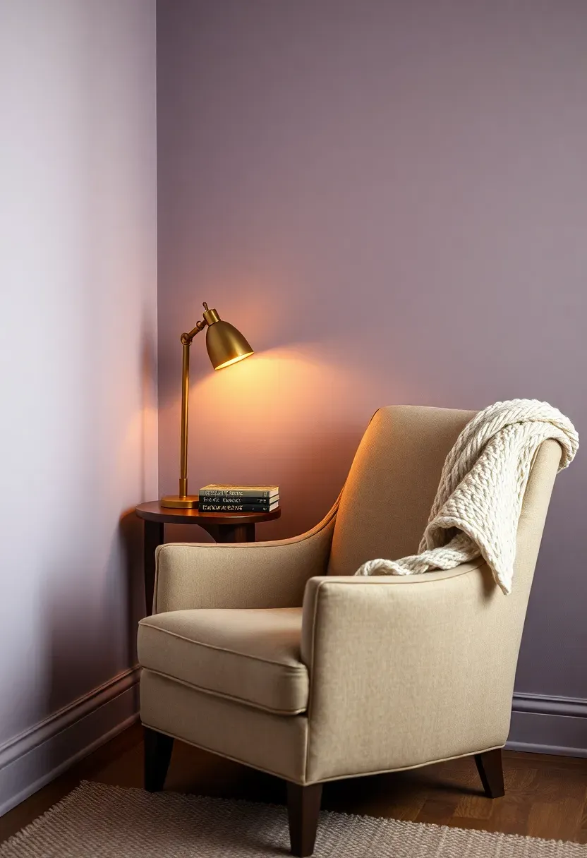
9. Dried Lavender Reading Nook
Imagine curling into a deep armchair surrounded by walls the exact color of lavender left to dry on a sunny windowsill. Dried lavender strips the sweetness from traditional purple and replaces it with dusty gray undertones that feel grown-up and grounding. It works beautifully in small, dedicated reading corners where the goal is retreat rather than display.
Why It Suits Intimate Spaces
Large rooms dilute dried lavender into near-invisibility. Smaller spaces let the color wrap around you, creating a cocoon effect that encourages focus and calm. The gray base keeps it from feeling childish while the purple tint adds just enough personality.
Pairing Suggestions
- Warm cream or oatmeal-toned textiles for the chair and throw
- Dark walnut or espresso-stained bookshelves for contrast
- Soft warm LED lighting at 2700K to prevent the purple from shifting cool
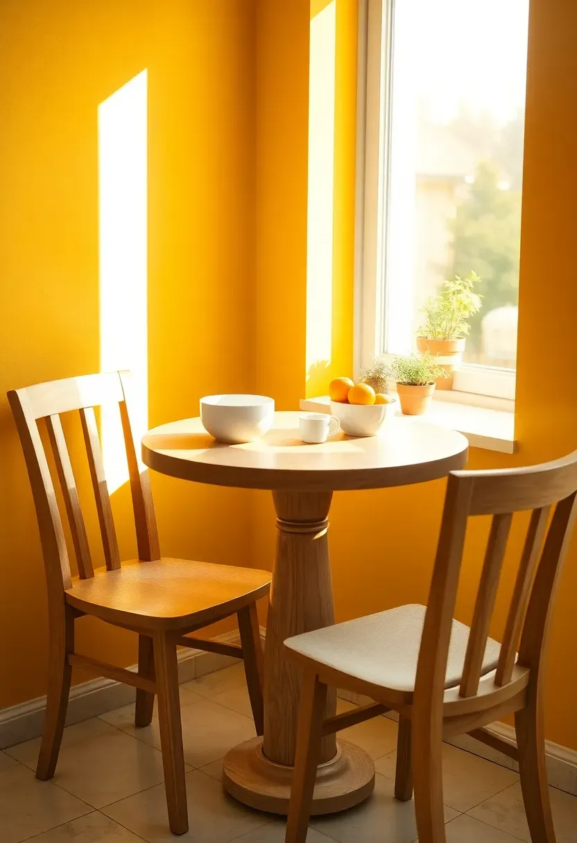
10. Amber Glow Breakfast Area
The Core Issue
Morning kitchens often feel gray and sluggish, especially in homes without east-facing windows. Cool white walls compound the problem, making pre-coffee moments even more uninspiring.
The Solution
Amber glow paint transforms a breakfast nook into a space that simulates the warmth of golden morning light regardless of which direction your windows face. This shade sits between honey and saffron, offering enough saturation to feel joyful without tipping into construction-zone yellow. Paired with natural wood, white dishes, and a few green herbs on the sill, it creates an environment that genuinely encourages sitting down for a meal instead of grabbing coffee on the way out.
Pros and Cons
Pros: Energizing without being loud, flatters food and skin tones, pairs naturally with both white and dark wood furnishings.
Cons: Can clash with cool-toned flooring or blue-gray countertops, requires warm-toned lighting to maintain consistency after sunset.
Recommended
Items for this idea
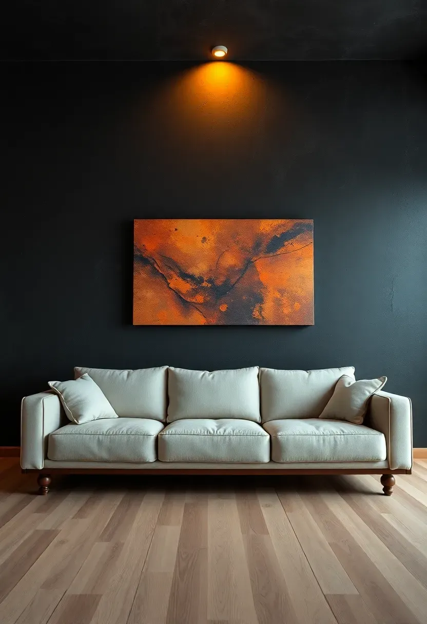
11. Volcanic Slate Feature Wall
Not every trending color whispers. Volcanic slate roars with quiet authority. This near-black shade carries charcoal and deep blue undertones that prevent it from reading flat. On a single feature wall behind a sofa or media console, it adds the kind of depth that makes everything in front of it look sharper and more intentional.
Step 1: Choose the Right Wall
Pick the wall your eye naturally lands on when entering the room. Typically this is the wall opposite the entrance or behind the main seating area.
Step 2: Prep Thoroughly
Dark paints magnify surface imperfections. Fill every nail hole, sand every bump, and apply a gray-tinted primer before the first coat.
Step 3: Plan Your Lighting
Install at least one directional light source that washes the wall with warm illumination. Without this, volcanic slate can make a room feel like a cave.
What to Watch Out For
- Two coats is the minimum; three delivers the richest finish
- Matte absorbs light beautifully but shows every touch mark; go with eggshell for high-traffic rooms
- Balance with lighter furniture and a light-toned rug to avoid a bunker atmosphere
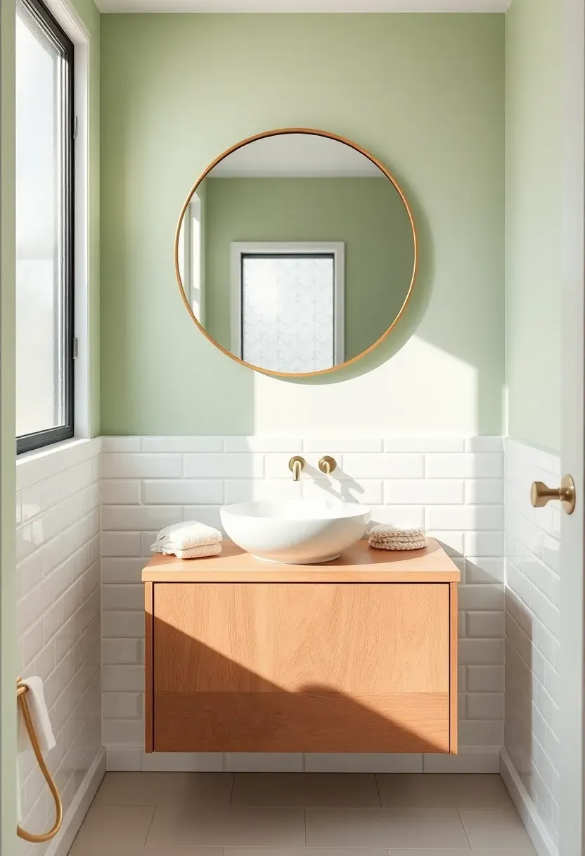
12. Pale Pistachio Bathroom Refresh
Pale pistachio sits at the intersection of green and cream, producing a hue that feels clean without the sterility of white. In bathrooms, where tile and porcelain already dominate, this wall color introduces organic softness. It complements white subway tile, marble countertops, and wooden vanities without competing for attention.
Why Bathrooms Need This Color in 2026
The all-white bathroom has grown tiresome. Pistachio adds life and warmth while maintaining the spa-like cleanliness people expect. It works in bathrooms of every size because its lightness prevents it from shrinking small spaces.
Tips for Application
- Satin or semi-gloss finish is essential in bathrooms for moisture resistance
- Pair with warm-toned wood vanities rather than painted ones for textural contrast
- Use white or cream towels and linens to keep the space feeling fresh
- Add a potted fern or trailing pothos to echo the green and bring the color alive
Recommended
Items for this idea
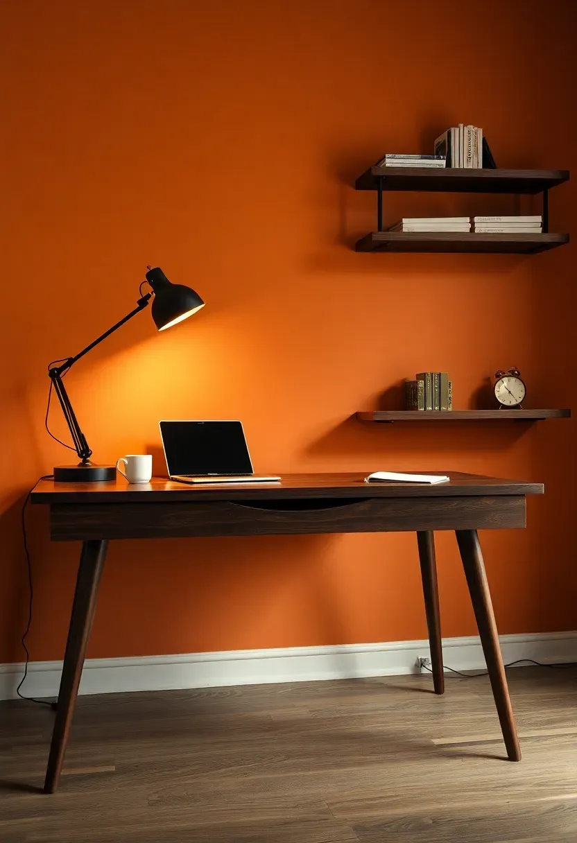
13. Cardamom Spice Home Office
Working from home demands an environment that sustains focus without inducing drowsiness. Cardamom spice delivers a medium-depth brown with warm red-gold undertones that keep the brain alert. It surrounds you with warmth akin to a leather-bound library without the weight of a truly dark color.
Origins and Inspiration
Named after the aromatic seed pod used in chai and Scandinavian baking, cardamom spice reflects 2026's broader fascination with pigments derived from culinary and botanical sources. Designers are reaching beyond the color wheel and into the spice rack.
Modern Application
On home office walls, this shade reduces screen glare compared to white surfaces, eases eye fatigue during long work sessions, and photographs beautifully during video calls. The warm background flatters skin tones and reads as professional without being corporate.
How to Apply at Home
- Use eggshell finish for a subtle sheen that keeps the room feeling alive
- Position your desk so the painted wall appears behind you on camera
- Break up large walls with floating shelves or framed art to add visual rhythm
- Complement with cream, black, and brass accents for a polished study feel
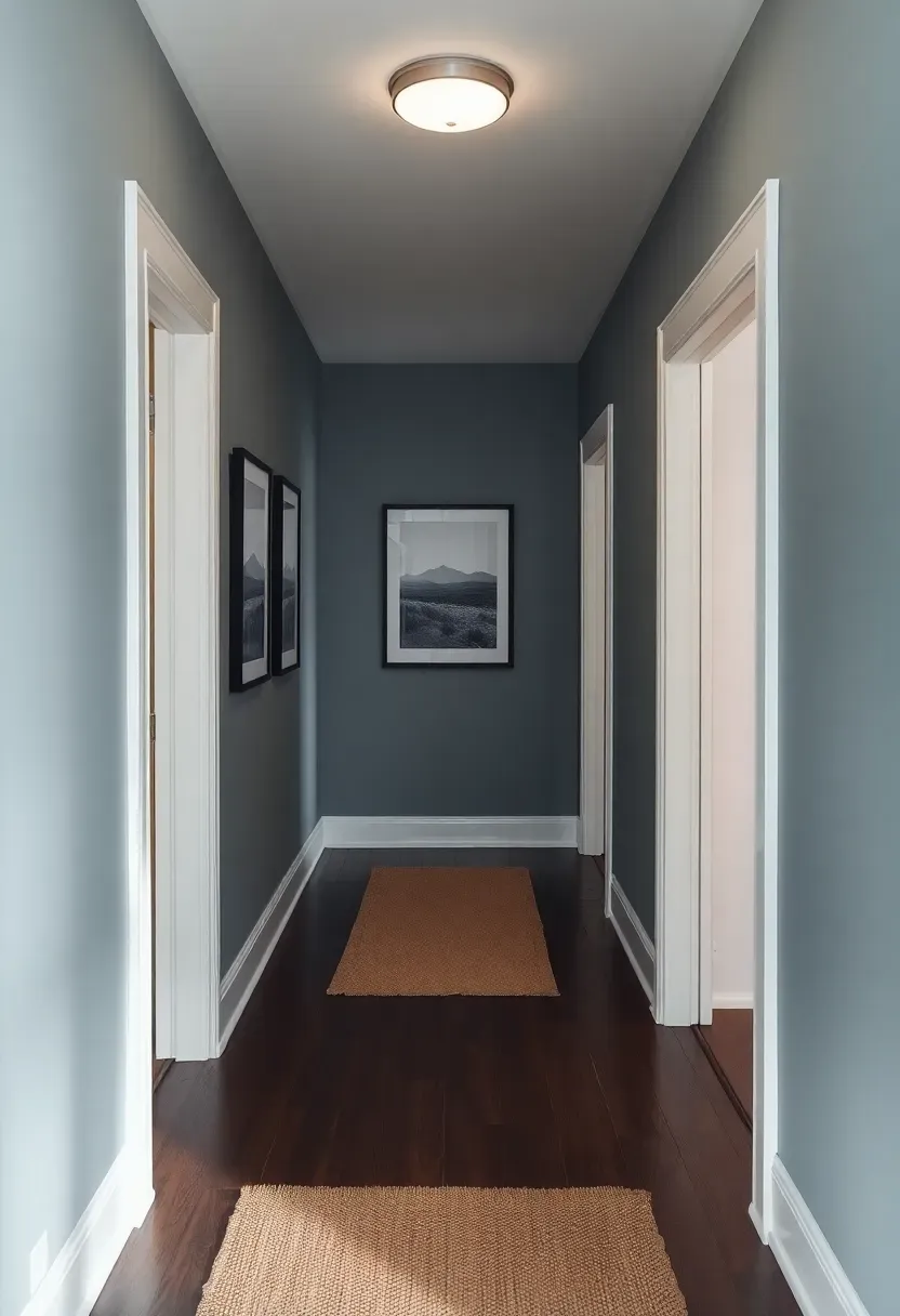
14. River Stone Blue-Gray
Should you choose gray or blue for your hallway? River stone blue-gray says both. This transitional shade mimics the surface of water-smoothed pebbles, carrying cool blue undertones with a grounded, mineral-like body. Hallways, which often lack natural light and serve as connectors between rooms, benefit enormously from a color that feels sophisticated without darkening the passage.
Tips for Hallway Success
- Maintain consistent color through the full hallway length to elongate the space visually
- Use semi-gloss on trim and doors in warm white to create clean contrast
- Hang art at regular intervals to break up long walls and give the eye resting points
Recommended
Items for this idea
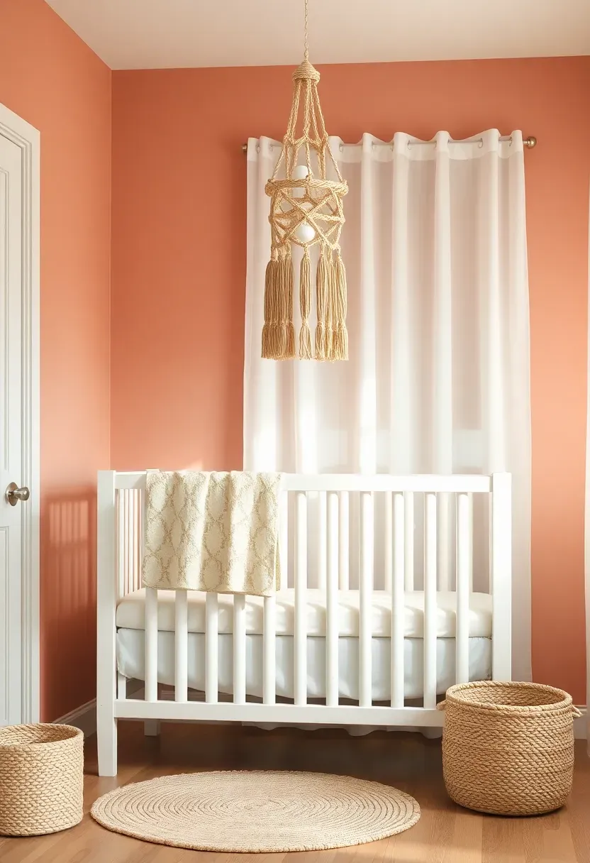
15. Faded Coral Nursery Walls
Nursery color trends for 2026 have moved past pastel pink and baby blue into more nuanced territory. Faded coral borrows from sun-bleached coastal hues, offering a gender-neutral warmth that grows with a child. Unlike bold coral, the faded version sits quietly on walls, providing a rosy glow that works by day and feels soothing under a dim nightlight.
What Makes Faded Coral Different
Standard coral shouts. Faded coral hums. The muted quality comes from added gray and white pigments that soften the saturation, making it feel organic rather than synthetic. It pairs as easily with earthy tones as it does with soft whites.
Pairing Suggestions
- Warm white furniture and natural wood accents
- Woven baskets and soft cotton textiles in cream
- A few touches of muted sage or soft gold for complementary depth
16. Walnut Shell Wainscoting
Wainscoting is enjoying a revival in 2026, and walnut shell brown elevates it from architectural detail to centerpiece. Painting the lower third of a wall in this rich, red-tinged brown while leaving the upper portion in cream creates a stately division that adds height and formality to any room.
Step 1: Determine the Height
Traditional wainscoting sits at 32 to 36 inches. In rooms with higher ceilings, you can push this to 40 inches without the room feeling bottom-heavy.
Step 2: Install and Paint
Whether you use actual panel molding or simply tape a clean line, apply walnut shell in satin finish for a furniture-like quality that contrasts with the matte upper wall.
Step 3: Add a Chair Rail
A slim chair rail molding in the same tone creates a finished transition between the two colors. Paint it the same walnut shade for a seamless look or white for more definition.
What to Watch Out For
- Measure twice and tape once; an uneven line between colors destroys the illusion of quality
- Walnut shell can darken significantly in rooms without good lighting; add wall sconces at wainscoting height
- Works best in dining rooms, hallways, and living rooms; bedrooms may feel too formal
Recommended
Items for this idea
17. Glacier White with Warm Undertones
White paint is never just white. The difference between a cold blue-white and a warm glacier white can transform a room from hospital corridor to Scandinavian retreat. For 2026, the whites gaining traction carry barely perceptible undertones of cream, peach, or taupe that add dimension without announcing color.
How to Choose the Right Warm White
Hold your swatch against a pure white sheet of paper. The undertone reveals itself immediately. Glacier whites with peach undertones suit south-facing rooms, while those with taupe undertones work in cooler, north-lit spaces. The goal is a white that feels alive rather than stark.
Tips for Application
- Use flat or matte finish for walls to maximize the soft, diffused quality
- Pair with natural materials like linen, raw wood, and stone to amplify warmth
- Avoid pairing with cool-toned LED lighting, which will neutralize the warm undertones and defeat the purpose
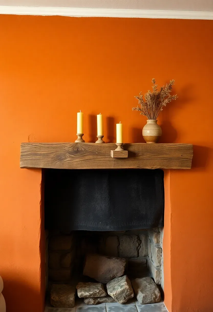
18. Burnt Ochre Statement Fireplace
The Core Issue
Fireplaces naturally draw the eye, but many sit against the same color as every other wall in the room. This wastes the strongest focal point available.
The Solution
Painting the fireplace wall or surround in burnt ochre separates it from the rest of the room and announces it as the anchor it naturally wants to be. Burnt ochre carries the warmth of terracotta with the depth of rust, creating a color that feels connected to fire itself. The result is a living room that finally has a clear visual hierarchy, with the fireplace commanding the space it deserves.
Pros and Cons
Pros: Instantly establishes a focal point, complements both stone and painted mantels, pairs naturally with autumn-toned decor.
Cons: Difficult to pair with cool-toned furniture or blue-dominant rugs, may feel heavy in very small living rooms.
Recommended
Items for this idea
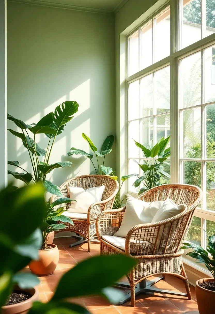
19. Mist Green Sunroom
Sunrooms collect light all day, which means wall color matters more here than in almost any other room. Mist green absorbs harsh midday glare and redistributes it as a soft, leafy glow. This pale green with blue-gray undertones turns a glass-heavy room into something that feels like sitting inside a botanical greenhouse.
Why Sunrooms Suit Green
The abundance of natural light in a sunroom keeps mist green from reading dull or flat. As the sun moves, the color shifts from cool morning sage to warm afternoon chartreuse. It plays with light instead of fighting it, and potted plants against these walls look like natural extensions rather than afterthoughts.
Tips for Sunroom Walls
- Use paint with UV-resistant properties since sunrooms receive intense light exposure
- Flat or matte finish prevents glare on sun-drenched surfaces
- Choose wicker, rattan, or light wood furniture to maintain the airy botanical atmosphere
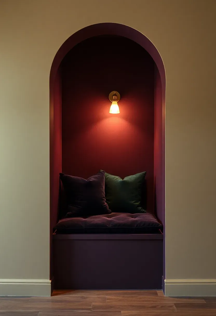
20. Plum Dusk Accent Alcove
Alcoves and built-in niches are perfect canvases for colors too bold for an entire room. Plum dusk lands between eggplant and dusty mauve, offering drama in a contained space. Painting an alcove this shade transforms dead square footage into a moody, jewel-toned moment that draws people in.
Why Alcoves Reward Bold Color
The contained geometry of an alcove limits exposure to the bold shade, preventing overwhelm. The three-sided enclosure intensifies the color experience while the room beyond remains neutral. This contrast creates depth and architectural interest that flat walls cannot deliver.
Pairing Suggestions
- Deep velvet cushions in a complementary tone like midnight blue or forest green
- Warm metallic accents in brass or copper to reflect light into the recessed space
- A small pendant light or sconce to illuminate the alcove from within
Recommended
Items for this idea
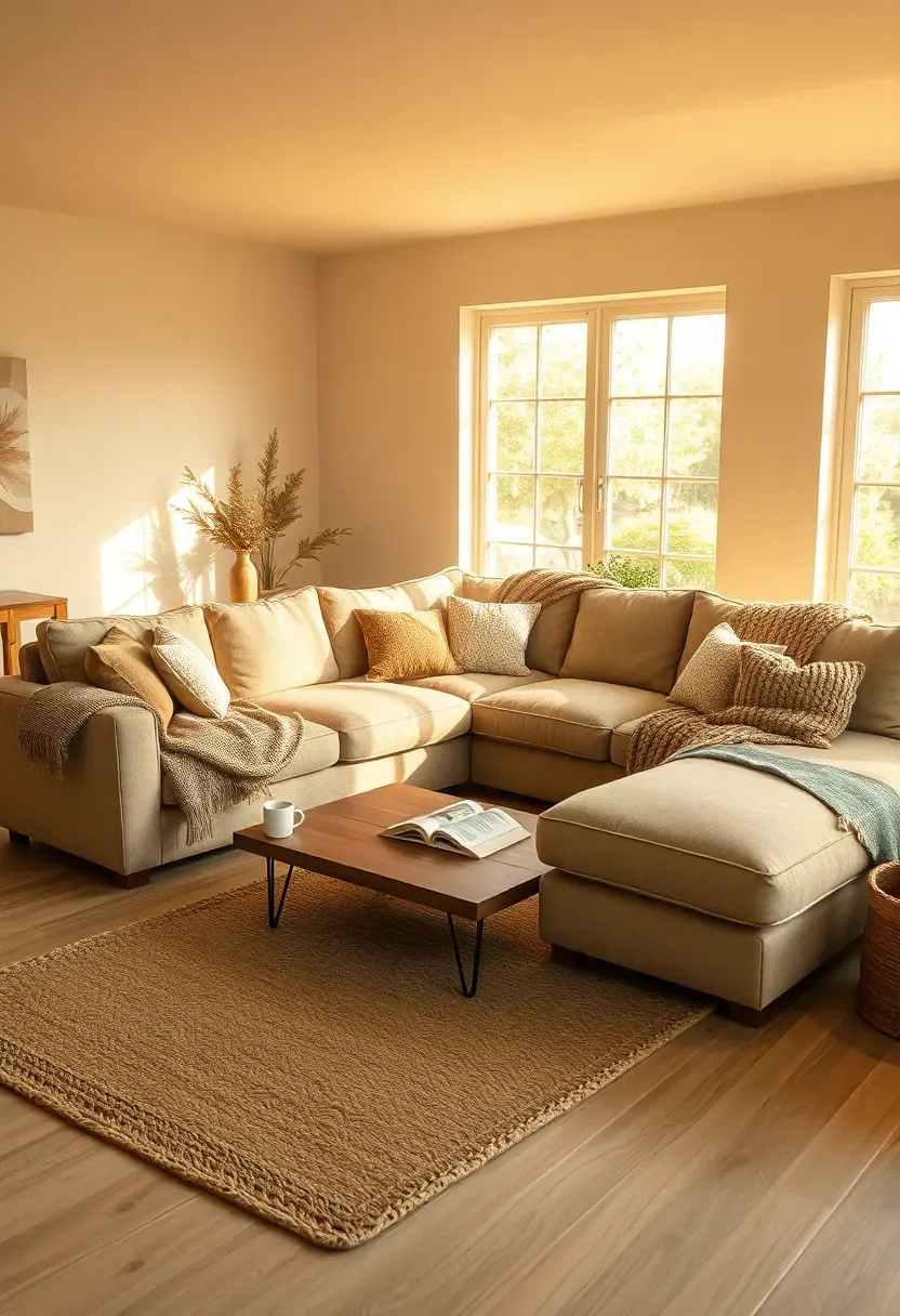
21. Toasted Linen Living Room
Toasted linen is the color of a well-worn canvas bag left in the sun. It is warmer than beige, less yellow than gold, and softer than tan. For living rooms that serve as the home's primary gathering space, this shade provides a backdrop that flatters everything placed against it without drawing attention to itself.
Comparing: Toasted Linen vs Classic Beige
Toasted Linen
Carries visible warmth with pink and amber undertones. It shifts with lighting and feels alive on the wall, creating an envelope of comfort that reads deliberate rather than default.
Classic Beige
Neutral to the point of anonymity. Lacks the dimensional quality of toasted linen and often reads flat under artificial light. It works but does not inspire.
What to Choose
Choose toasted linen if: You want a living room that feels curated and warm, prefer a neutral that contributes to the mood rather than disappearing.
Choose classic beige if: You plan to sell soon and want maximum buyer appeal, or you prefer the wall to be genuinely invisible.
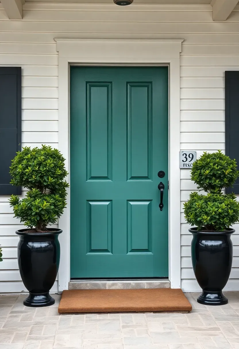
22. Clouded Jade Exterior Door
A front door is the handshake of a house. Clouded jade, a deep green with milky gray tones, delivers confidence without flashiness. It works on colonial, craftsman, and modern exteriors alike, bridging style periods with a color that feels both classic and of the moment.
Step 1: Prep the Door
Sand the existing finish, fill any dents, and apply a bonding primer. Exterior doors face weather stress that interior walls never encounter.
Step 2: Choose the Right Paint
Exterior semi-gloss or high-gloss in a quality brand designed for doors. The sheen protects against moisture and makes the jade color pop against matte siding.
Step 3: Apply with Patience
Two thin coats beat one thick coat. Allow full drying time between coats even if the surface looks ready. Exterior paint needs proper cure time to resist peeling.
What to Watch Out For
- Test the color against your siding, trim, and roof color before committing
- Jade doors look best flanked by potted greenery or dark planters
- Avoid pairing with a red brick facade where the green may clash; it shines against white, gray, or cream siding
Recommended
Items for this idea
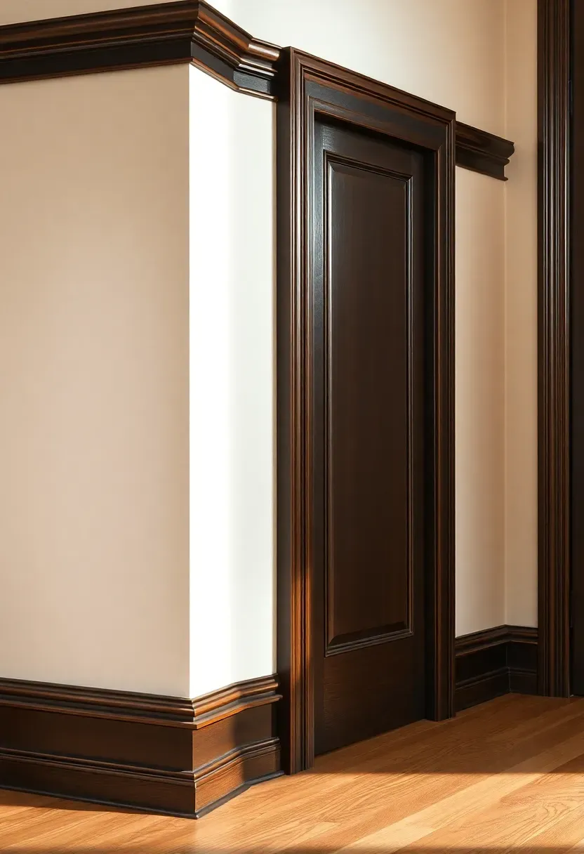
23. Blackened Bronze Trim Detail
Most people paint trim white and never think about it again. For 2026, blackened bronze on trim, molding, and door frames introduces a subtle metallic quality that frames every room like a gallery. This deep brown-black with bronze undertones turns architectural details into features rather than afterthoughts.
Why Dark Trim Is Gaining Ground
White trim has dominated so long it has become invisible. Dark trim reverses the visual logic, making molding, window casings, and baseboards into design elements that define the geometry of a room. It adds instant architectural gravitas, especially in older homes where the existing millwork has real depth and detail worth highlighting.
Tips for Execution
- Semi-gloss or high-gloss finish on trim creates a beautiful contrast against matte walls
- Test on a small section first; dark trim commitment is harder to reverse than a wall color
- Works best in rooms with substantial trim profiles; thin modern casing may look muddy
- Pair with warm white or sandstone walls for the sharpest, most elegant contrast
Quick FAQ
Is it risky to paint an entire room in a dark trending color? Not if you balance it properly. Keep at least one large surface lighter, whether that is the ceiling, floor, or an adjacent wall. Dark rooms with strategic lighting and reflective surfaces actually feel more intimate, not smaller. The key is intention rather than accident.
Which 2026 paint color trend works for rental apartments? Faded coral, chalk blush, and pale pistachio are all light enough to cover easily when you move out. They add personality without requiring three coats of primer to reverse. Some landlords also allow accent walls, making volcanic slate or peat moss viable for a single surface.
Should I follow trending colors or pick what I personally love? Trends offer a useful starting point when you feel paralyzed by choice, but the best wall color is always the one you enjoy seeing every day. Use these 2026 directions as inspiration, then trust your own reaction to the swatch on your actual wall in your actual lighting. No trend report matters more than your gut feeling at 7 AM.
What finish is best for living room walls in 2026? Eggshell remains the most popular for living rooms because it balances durability with a soft, non-reflective appearance. Flat or matte hides imperfections best but marks easily. Satin works well in homes with children or pets where walls get touched frequently.
Can I mix several of these trending colors in one home? Absolutely, and doing so is actually the point. A whole-house neutral like sandstone beige or toasted linen on main walls, paired with bolder choices in individual rooms or on accent features, creates flow with personality. The connecting thread should be consistent undertones — keep everything in the warm family or the cool family, not both.
Trends will always cycle through, but the colors gaining traction for 2026 share something deeper than novelty: they ask walls to participate in a room rather than disappear. Whether you commit to a single burnt ochre fireplace wall or repaint your entire home in sandstone beige, the shift toward warmer, earthier, more complex pigments rewards anyone willing to move beyond safe neutrals. Start with one room. See how it changes the light, the mood, the way you linger. That is what good color does.
Pinterest cover for 23 For 2026 Paint Color Trends That Set the Tone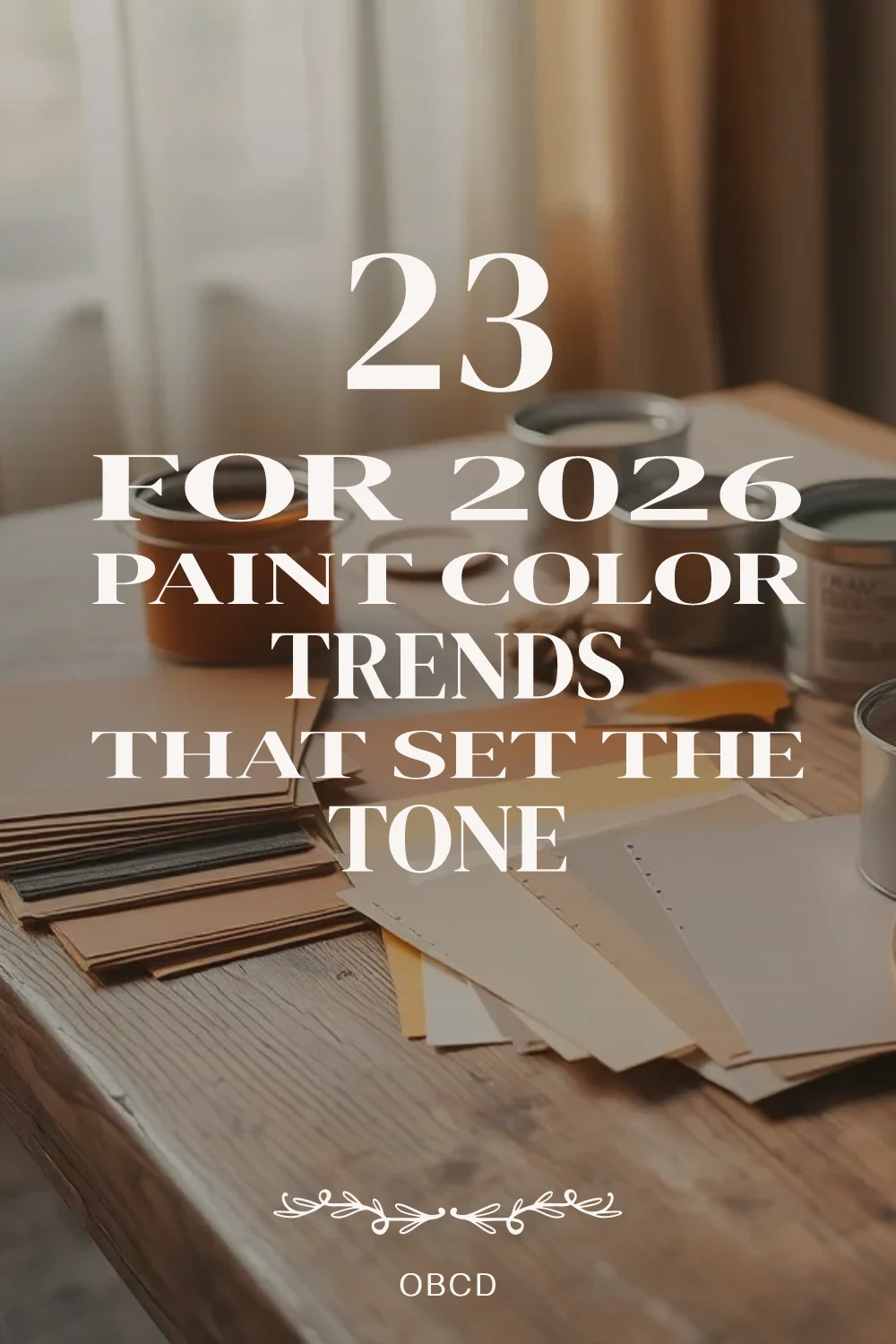
About the author
OBCD
CGI visualization and interior design content. We create detailed 3D renders and curate practical design ideas for every room in your home.