21 Accent Wall Color Ideas That Bring Any Room to Life
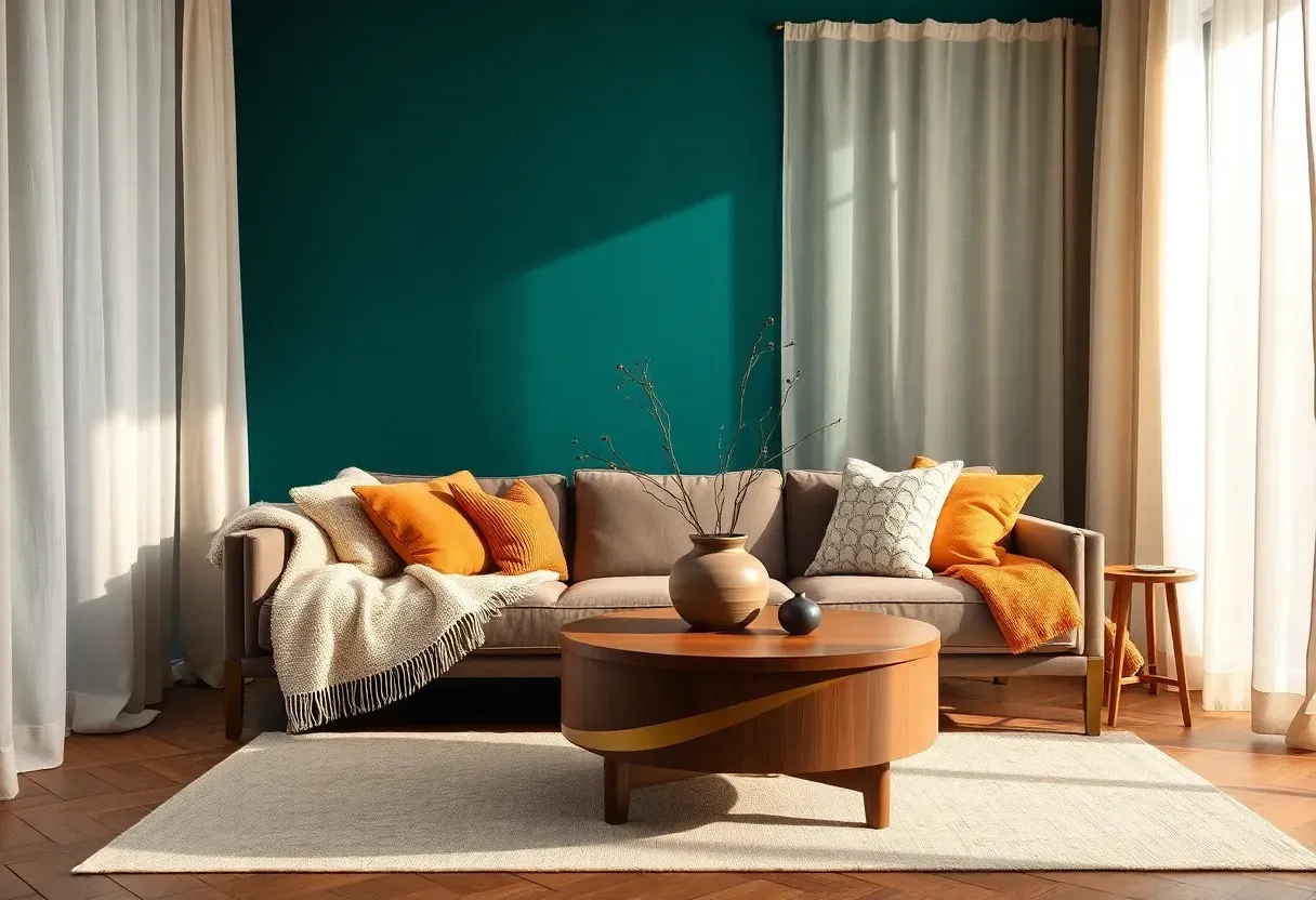
We have all stood in a paint aisle holding two dozen swatches, wondering which color will actually look good once it covers an entire wall. The fear of commitment is real. A full-room repaint feels risky, but a single accent wall changes everything without the overwhelm. One wall in the right shade can anchor furniture, redirect natural light, and make a room feel completely different in a single afternoon. The trick is picking a color that works with what you already own rather than fighting it. That is exactly what this guide is built for.
Below are 21 accent wall color directions organized by mood, from deep and dramatic to soft and grounding. Each one includes the room context where it shines, color pairing guidance, and finish recommendations.
Table of Contents
- Deep Forest Green
- Warm Terracotta
- Navy Blue with Gold Undertones
- Dusty Rose
- Charcoal Gray
- Burnt Sienna
- Sage Green
- Rich Plum
- Mustard Yellow
- Slate Blue
- Creamy Mushroom
- Burgundy Wine
- Pale Lavender
- Warm Caramel
- Teal with Gray Base
- Blush Peach
- Moody Black-Green
- Soft Apricot
- Storm Cloud Blue
- Clay Pink
- Olive Drab
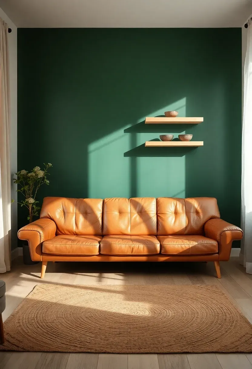
1. Deep Forest Green
Something about deep forest green makes a room feel both grounded and alive. Unlike lighter greens that can read as minty or dated, this saturated shade channels old-growth woodland and library warmth without a trace of stuffiness.
Why This Color Works
Forest green absorbs excess light in south-facing rooms while adding richness to north-facing spaces that might otherwise feel flat. It pairs naturally with tan leather, warm wood tones, and brass hardware, creating depth that white walls simply cannot deliver.
Tips for Getting It Right
- Use a matte or eggshell finish to avoid an overly shiny surface
- Keep adjacent walls in warm white or oatmeal to prevent the room from feeling cave-like
- Add a single brass-framed mirror or sconce to bounce light off the green surface
We picked a few things that go well with this idea: LOAAO Brushed Gold Rounded Rectangle Mirror (24x36) (★4.6), Arched Gold Metal Frame Wall Mirror (24x36) (★4.6) and Gold Asymmetrical Decorative Wall Mirror (20x36) (★4.6). As an Amazon Associate we earn from qualifying purchases.
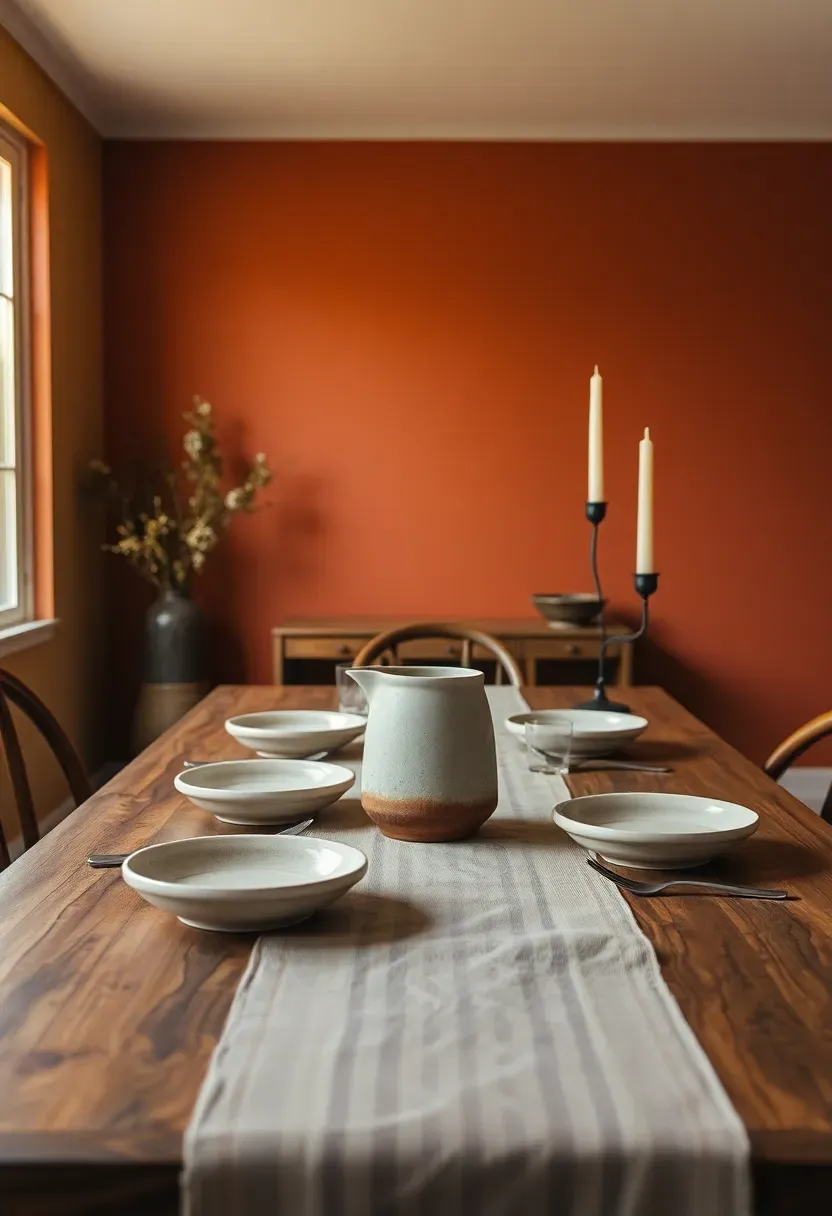
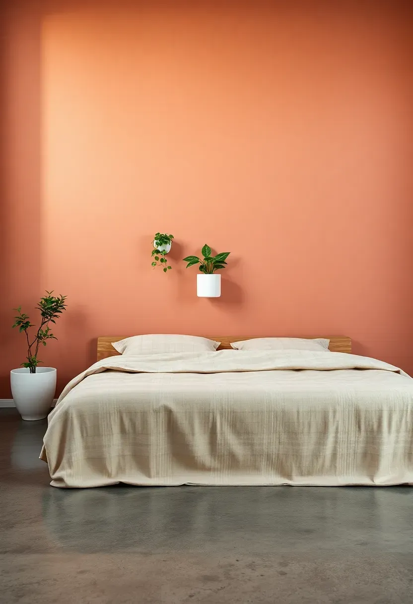
2. Warm Terracotta
The Core Issue
Neutral dining rooms often feel unfinished, like the space is waiting for something to happen. Beige and gray walls can drain energy from a room meant for gathering and conversation.
The Solution
Warm terracotta solves this instantly. The color carries enough red-orange to feel inviting without crossing into neon territory. It reads like sun-baked clay, and it makes wooden furniture, woven placemats, and earthy ceramics look intentional rather than random. A single dining room wall in terracotta transforms the entire meal experience, wrapping the table in color that actually stimulates appetite and conversation.
Pros and Cons
Pros: Universally warm, hides minor imperfections, pairs with nearly every wood tone Cons: Can overwhelm very small rooms, needs cool-toned accessories to balance
We picked a few things that go well with this idea: Foindtower Linen Throw Pillow Covers (2-Pack) (★4.5), Handcrafted Striped Linen Pillow Covers (2-Pack) (★4.6) and Neutral Linen Pillow Covers Coordinated Set (4-Pack) (★4.5). As an Amazon Associate we earn from qualifying purchases.
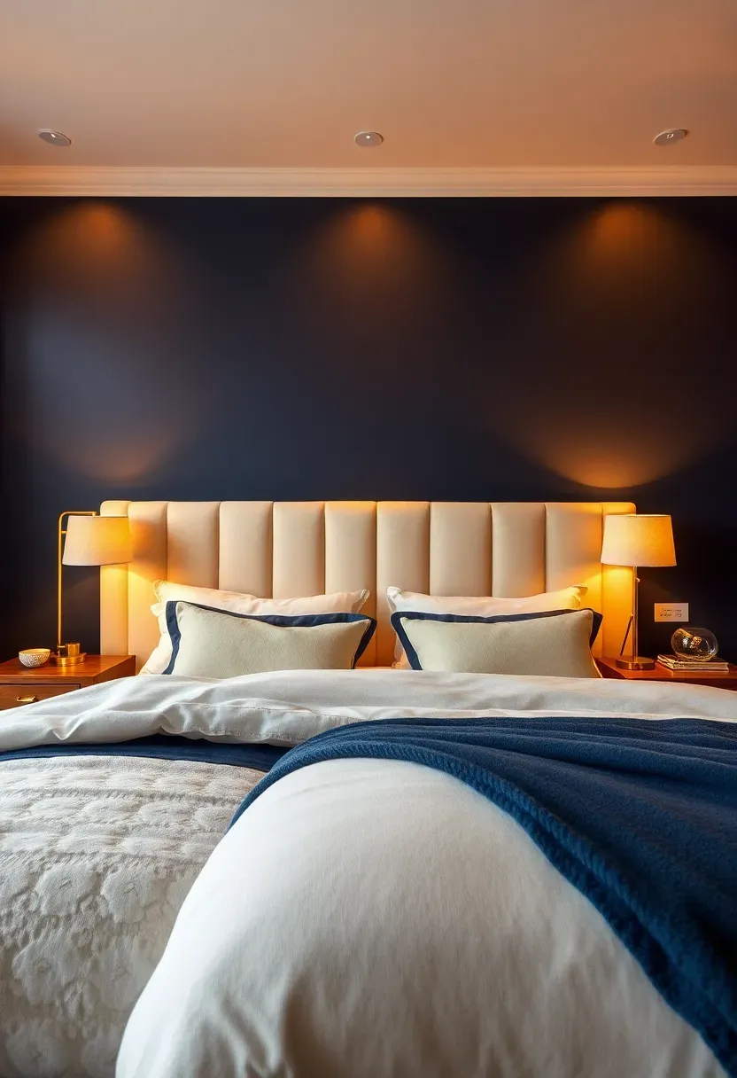
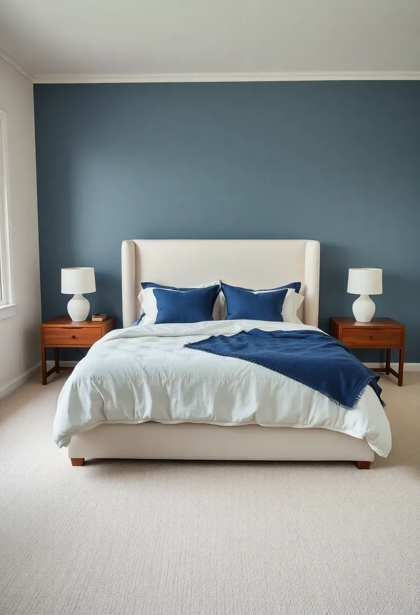
3. Navy Blue with Gold Undertones
Not all navies are equal. The versions that contain subtle gold or amber undertones feel warmer and more approachable than pure blue-blacks. This particular shade works behind a headboard where you want drama without coldness.
Where It Shines
Bedrooms and home offices benefit most. The gold undertone prevents that icy, corporate feel and instead creates a backdrop that reads as rich and slightly vintage. Pair it with cream bedding, cognac leather, or warm-toned art frames for a look that feels collected rather than decorated.
Practical Pointers
- Test a large swatch on the wall before committing; gold undertones shift dramatically under different lighting
- Satin finish adds subtle glow without full gloss
- White crown molding sharpens the contrast beautifully
We picked a few things that go well with this idea: KILZ TRIBUTE Interior Paint Sample Northern Sky (★4.5), KILZ TRIBUTE Interior Paint Sample Art Museum (★4.5) and Interior White Wall Touch Up Paint with Roller (★4.0). As an Amazon Associate we earn from qualifying purchases.
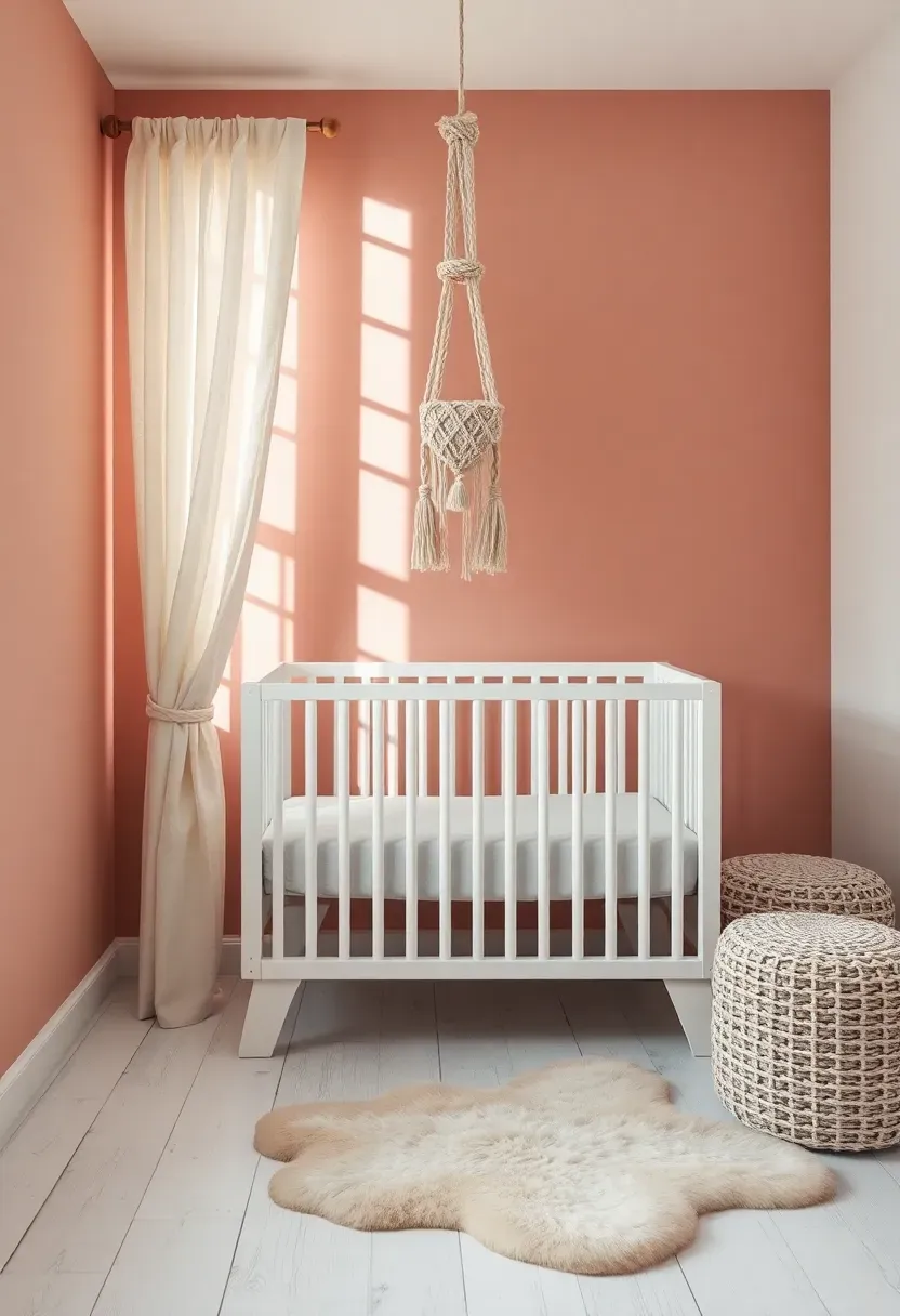
4. Dusty Rose
Origins and Modern Appeal
Dusty rose has roots in Victorian interiors where muted pinks lined parlor walls and upholstered settees. Today it returns stripped of fussiness, landing somewhere between blush and mauve. The muted quality keeps it from reading as childish while retaining a softness that pure white cannot match.
Modern Interpretation
Contemporary dusty rose accent walls pair beautifully with black metal frames, natural wood furniture, and even concrete accents. The contrast between the soft wall color and harder materials creates visual tension that keeps the room interesting. It works in nurseries, guest bedrooms, and powder rooms where you want warmth without weight.
How to Apply at Home
- Choose a shade with gray undertones to keep it sophisticated
- Use matte finish for a chalky, textured appearance
- Balance with charcoal or black accessories to prevent the room from feeling too sweet
- Layer different textures in similar tones for depth
Recommended
Items for this idea
5. Charcoal Gray
Charcoal gray is the accent wall color for people who want boldness without committing to a hue. It sits between medium gray and black, dark enough to anchor a room but light enough to avoid the weight of true black.
Step 1: Assess Your Lighting
Charcoal needs at least one good light source on or near the accent wall. A floor lamp, picture light, or wall sconce prevents the surface from absorbing all available light and turning into a void.
Step 2: Choose Your White
The white on adjacent walls matters enormously. Pair charcoal with a warm off-white rather than stark bright white, which can create too harsh a contrast and make the room feel disjointed.
Step 3: Add Texture
A charcoal wall sings when you add textured elements in front of it. Think woven baskets, a chunky knit throw on a nearby chair, or a piece of art with visible brushstrokes. Flat surfaces against flat dark paint can feel sterile.
What to Watch Out For
- Avoid charcoal in rooms smaller than ten by ten feet unless ceilings are tall
- Fingerprints show on dark matte finishes, consider eggshell in high-traffic areas
- Metallic accents in copper or brass read better against charcoal than silver or chrome
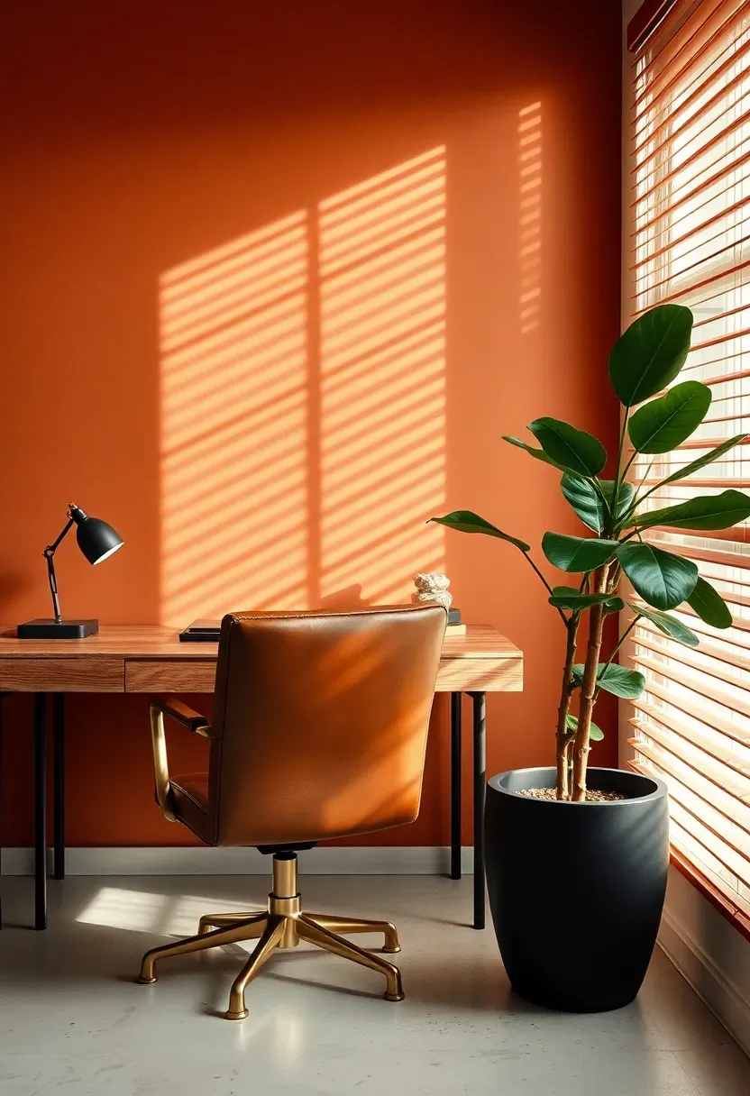
6. Burnt Sienna
Burnt sienna carries the warmth of terracotta but pushes deeper into brown territory. The result is a color that feels like aged brick or autumn soil, perfect for a home office where you spend long hours and need the wall behind your screen to feel warm rather than sterile.
Why People Overlook It
Most homeowners skip burnt sienna because they associate it with 1990s Tuscan trends. The modern version uses less orange and more brown, reading as sophisticated earth tone rather than themed restaurant. Applied to a single wall with the rest of the room in warm neutrals, it feels current and grounded.
Best Pairings
- Dark walnut or teak furniture
- Black iron light fixtures
- Cream or linen textiles with subtle pattern
- Green plants that pop against the warm backdrop
Recommended
Items for this idea
7. Sage Green
Comparing: Sage Green vs Mint Green
Both are popular greens for accent walls, but they serve very different moods.
Sage Green
Sage carries gray and brown undertones that keep it calm, mature, and versatile. It reads like dried herbs and works in nearly every room without feeling trendy or loud. Bathrooms, bedrooms, and kitchens all benefit from its quiet presence.
Mint Green
Mint leans cool and bright, carrying blue undertones that can feel retro or childish in certain lighting. It works in specific contexts like a playroom or coastal kitchen but can feel out of place in formal rooms.
What to Choose
Choose sage if: you want a color that ages well, pairs with warm materials, and feels restful Choose mint if: you want energy, coastal vibes, or a retro-inspired space
Recommendation
For most accent walls, sage wins on longevity and versatility. It adapts to changing decor far better than mint.
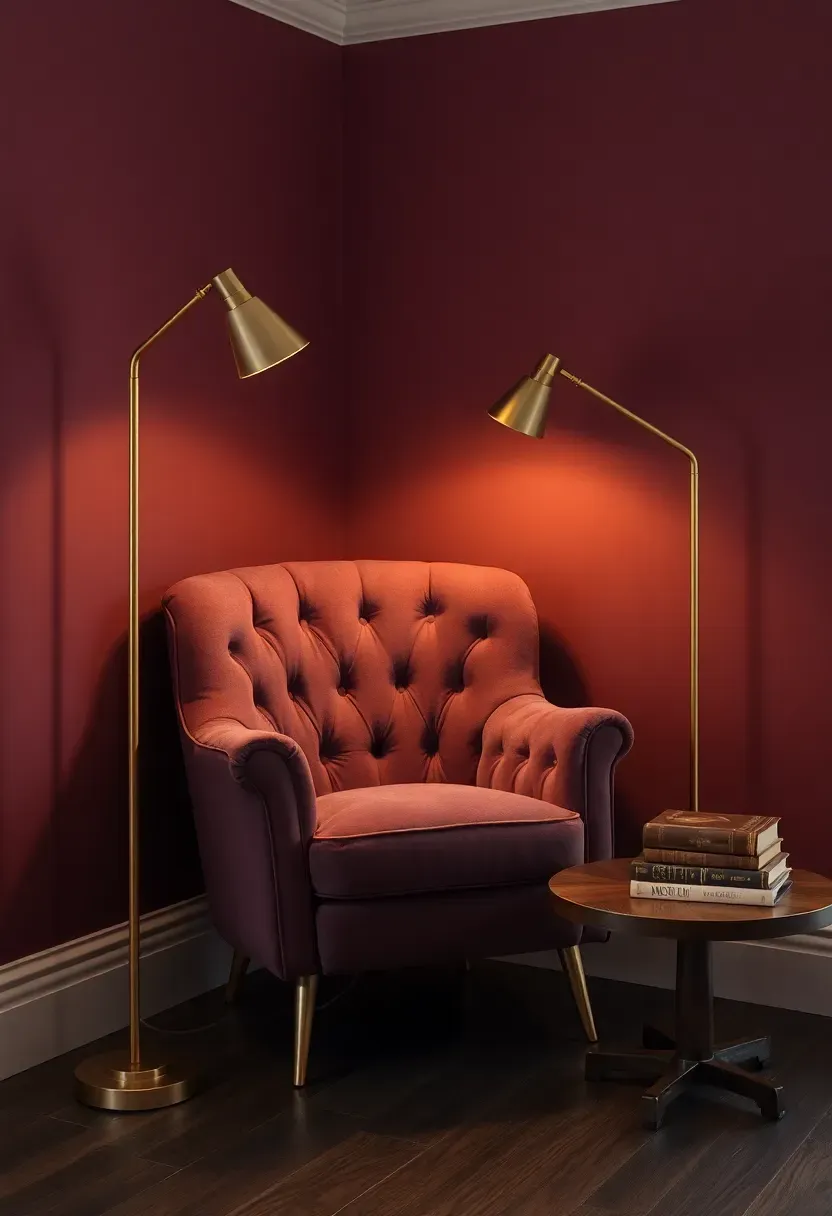
8. Rich Plum
There is a specific confidence required to paint a wall plum, and the payoff matches the courage. This deep purple-red reads as luxurious without needing a single expensive object in the room. A velvet chair, a brass lamp, and a stack of books against a plum wall creates a reading nook that feels like it belongs in a boutique hotel.
Where It Works Best
Reading nooks, dining rooms, and primary bedrooms. Avoid plum in kitchens or bathrooms where the darkness can feel oppressive in already utilitarian spaces.
Tips for Getting It Right
- Pair with warm metallics exclusively: brass, gold, copper
- Use cream rather than white for adjacent surfaces
- Add one light-colored textile, a throw or pillow, to prevent the corner from becoming too heavy
- Eggshell finish lets the color glow without reflecting overhead lights
Recommended
Items for this idea
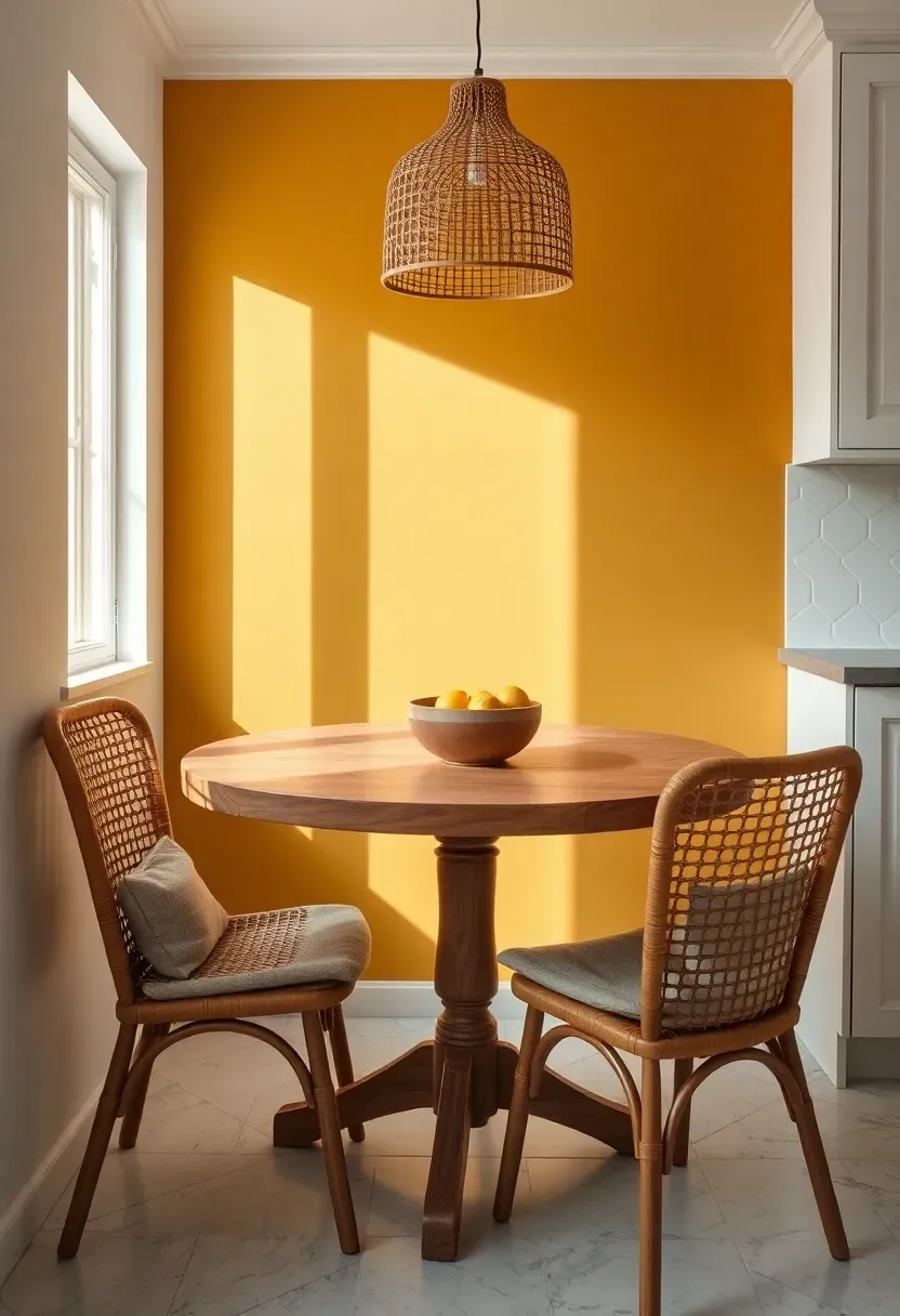
9. Mustard Yellow
The Core Issue
Kitchens need energy, especially breakfast areas where morning light competes with groggy moods. White walls do nothing to help the situation, and gray can feel outright depressing at six in the morning.
The Solution
Mustard yellow injects warmth and optimism without the screaming intensity of lemon or canary yellow. It sits in the golden-amber range, closer to honey than highlighter. Behind a small breakfast table, it creates a sun-drenched pocket that feels cheerful even on cloudy days. The trick is selecting a mustard with enough brown in the mix to stay sophisticated.
Pros and Cons
Pros: Energizing without being aggressive, pairs with black hardware and natural wood, photographs beautifully Cons: Can clash with cool-toned countertops, requires careful balancing in rooms with abundant warm light
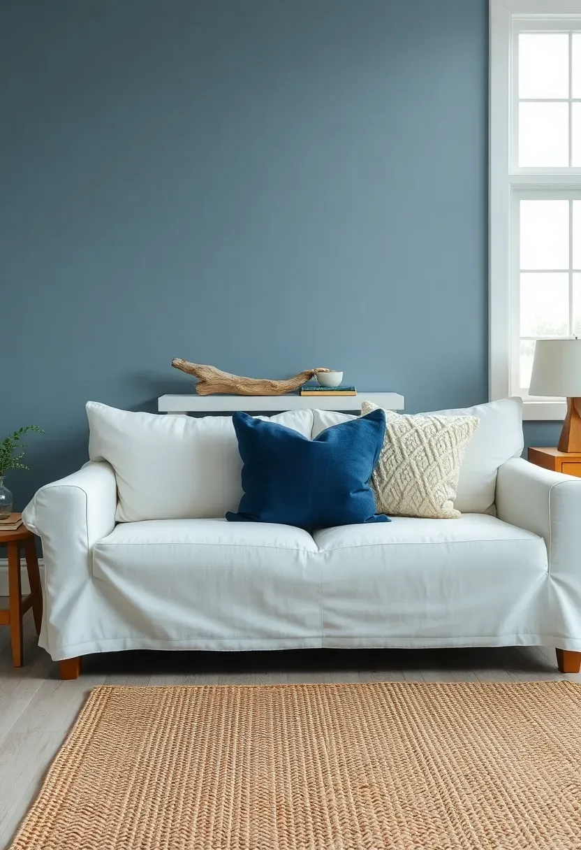
10. Slate Blue
Slate blue occupies a perfect middle ground between blue and gray, offering the calm of both without the coldness of either. It reads differently throughout the day: cooler in morning light, warmer as afternoon sun hits it, and almost charcoal in evening lamplight.
How to Make It Work
This color belongs behind beds, sofas, and built-in shelving. The key is treating it as a neutral rather than a color statement. Pile on textures in cream, navy, and natural linen, and let the slate blue wall hold everything together without demanding attention.
Practical Pointers
- Works equally well in matte and eggshell finishes
- Pair with warm wood flooring to counteract any remaining coolness
- White or cream trim sharpens the edges without adding harshness
Recommended
Items for this idea
11. Creamy Mushroom
Not every accent wall needs to shout. Creamy mushroom barely whispers, but the whisper is enough to separate it from the surrounding whites and create depth that feels effortless. This color belongs to the category of accent walls people notice without being able to explain why the room feels so good.
Where It Works Best
Open-concept living rooms, hallways, and bedrooms where you want subtle distinction between zones. Mushroom reads as warm beige with a hint of pink or lavender depending on the brand, and it pairs with absolutely everything from black to blush.
Practical Pointers
- Choose the version with the slightest pink undertone for warmth
- Flat or matte finish enhances the soft, powdery quality
- Layer multiple neutral textures in front of it: linen, bouclé, jute, cotton
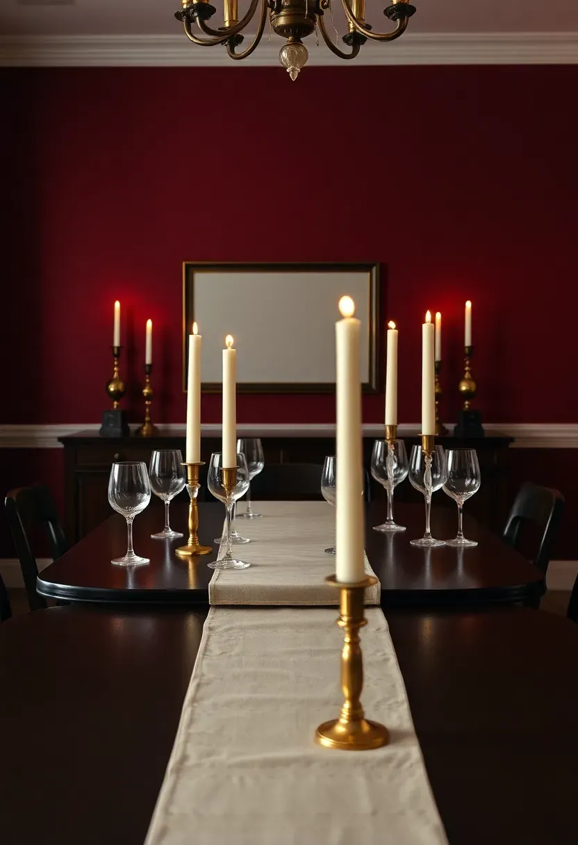
12. Burgundy Wine
Trend Roots and Cultural Context
Burgundy has cycled through interior design for centuries, from Baroque-era drawing rooms to 1980s executive offices to today's moody maximalist dining rooms. Its staying power comes from the fact that it feels inherently luxurious. The color carries associations with aged wine, velvet theater curtains, and old-world libraries.
Modern Interpretation
Today's burgundy accent walls lean less theatrical and more refined. Pair the wall with simple modern furniture in black or natural wood to ground the color in the present. Avoid matching burgundy upholstery, which tips the balance toward costume rather than design. Instead, let the wall stand alone as the single rich element in an otherwise restrained palette of cream, charcoal, and warm brown.
How to Apply at Home
- Reserve for rooms with at least nine-foot ceilings
- Use satin finish for a subtle sheen that catches candlelight
- Hang art with cream mats to create breathing room against the dark surface
- Keep the floor light, pale wood or a natural fiber rug, to prevent the room from sinking
Recommended
Items for this idea
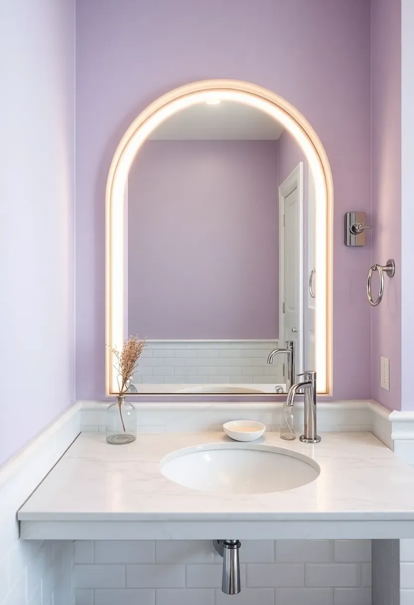
13. Pale Lavender
Pale lavender lives in the space between purple and gray, and that ambiguity is exactly its strength. In a bathroom, it reads as fresh and calming without the clinical feel of blue or the warmth of pink. It suggests luxury quietly, like a high-end soap or freshly laundered sheets.
Step 1: Pick the Right Undertone
Lavender can lean blue, pink, or gray. For accent walls, go gray-lavender. It ages better and adapts to both warm and cool light without shifting dramatically.
Step 2: Match Your Fixtures
Chrome and polished nickel complement cool lavender. If your lavender runs warmer, switch to brushed gold or brass fixtures.
Step 3: Keep Surroundings Simple
Let the lavender be the only color statement. White tile, white towels, minimal accessories. The accent wall does the heavy lifting.
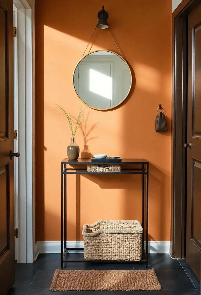
14. Warm Caramel
Warm caramel is the accent wall color that makes everyone feel welcome the moment they walk through the door. It carries the comfort of brown without the darkness, sitting in a sweet spot between honey and toffee. Entryways, mudrooms, and hallways benefit enormously from this shade because it masks daily wear while radiating warmth.
Best Pairings
- Dark bronze or oil-rubbed hardware
- Natural coir or jute rugs
- Cream upholstery with woven textures
- Terra cotta pottery and dried grasses
What to Watch Out For
- Avoid pairing with yellow-toned lighting that can push caramel into orange territory
- Test swatches in both daylight and evening light before committing
- Semi-gloss finish in entryways for easy cleaning
Recommended
Items for this idea
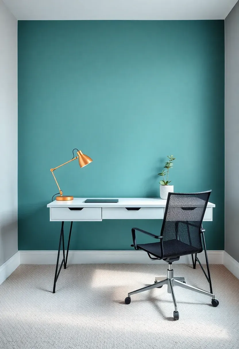
15. Teal with Gray Base
Standard teal can feel overwhelming, even garish, when covering a full accent wall. But teal with a gray base softens the intensity while retaining the blue-green depth that makes the color so appealing. The gray tempers the brightness without killing the personality.
Why It Works in Home Offices
Long hours staring at screens need a wall color behind the monitor that reduces eye strain. Teal with gray base is dark enough to minimize glare reflections but colorful enough to prevent the room from feeling bland. It sits in a comfortable visual zone that supports focus without distraction.
Tips for Getting It Right
- Matte finish reduces glare on the wall surface
- Pair with a white or light wood desk for maximum contrast
- Add one warm accent, a copper desk lamp or leather mousepad, to break the coolness
- Keep shelving on adjacent walls, not on the teal wall, to let it breathe
16. Blush Peach
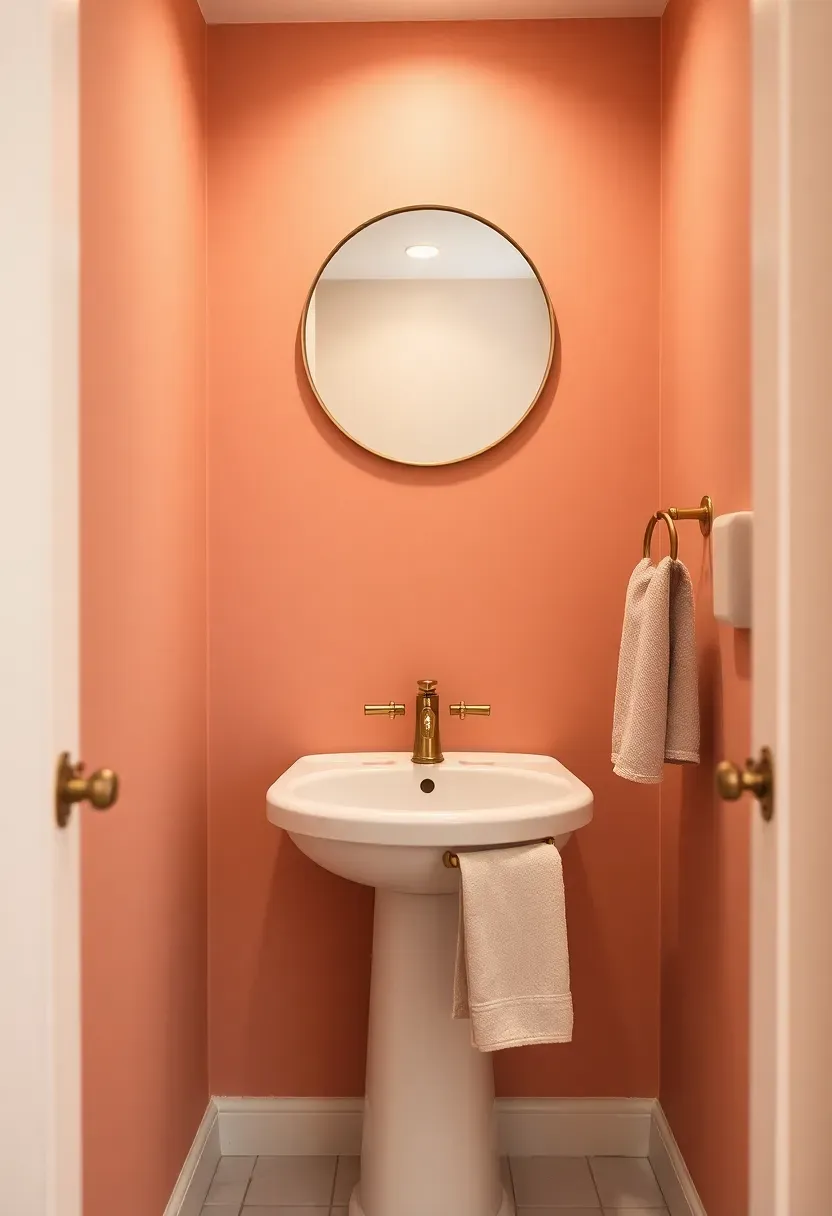
Blush peach splits the difference between pink and orange, landing in a zone that feels warm, soft, and unexpectedly modern. Powder rooms are its natural habitat: small enough that the color wraps the space without overwhelming, and private enough that you can take a risk without worrying about it dominating your main living areas.
The Core Issue
Powder rooms are the forgotten rooms. They get white paint, a basic mirror, and zero personality. Guests use them for thirty seconds and forget they exist.
The Solution
A single blush peach wall behind the mirror turns the powder room into a moment. The color flatters skin tones in mirror reflections, adds warmth to small windowless spaces, and pairs beautifully with brass hardware and white fixtures. Two hours of painting transforms the most overlooked room in the house.
Recommended
Items for this idea
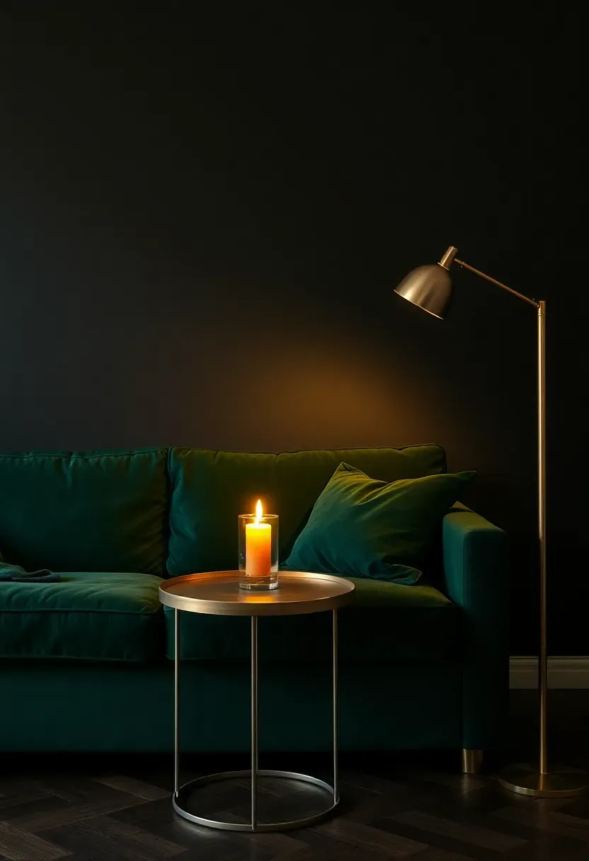
17. Moody Black-Green
Black-green is for the person who considered black but wanted a sliver of life in the darkness. This color reads as near-black in low light and reveals its green heart when sunlight crosses the surface. It creates atmosphere without explanation, turning ordinary rooms into spaces that feel deliberately styled.
Where It Works Best
Living rooms with tall ceilings, dining rooms lit by candles, and bedrooms where drama is the point. Avoid it in rooms smaller than twelve by twelve feet or in spaces with no natural light, where it will read as pure black and lose its magic.
Practical Pointers
- Satin finish reveals the green shift better than flat matte
- Stage a single light source to graze the wall, like a picture light or uplighter
- Pair with warm metals and natural materials to prevent the room from feeling cold
- Keep one large piece of light-toned art on the wall for visual relief
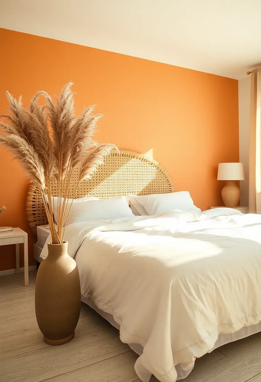
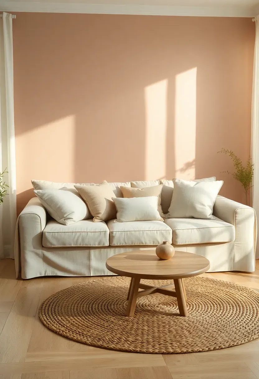
18. Soft Apricot
Soft apricot captures the last fifteen minutes of a summer sunset and holds it on your wall permanently. It is warmer than peach, less aggressive than orange, and gentler than coral. Bedrooms facing east catch morning light that turns apricot walls into glowing panels, starting the day with natural warmth before the coffee is even brewed.
How to Make It Work
This shade needs restraint everywhere else. White bedding, natural wood furniture, and minimal accessories let the wall do its job without competition. Dried pampas grass or eucalyptus adds organic texture that complements the soft warmth without introducing competing colors.
What to Watch Out For
- Apricot can shift dramatically under fluorescent lighting, always test with your actual bulbs
- Pair with cool-toned grays or greens for balance in rooms with excessive warm light
- Matte finish preserves the chalky softness that makes this color special
Recommended
Items for this idea
19. Storm Cloud Blue
Comparing: Storm Cloud Blue vs Baby Blue
These sit on opposite ends of the blue spectrum, and choosing wrong can ruin the intended mood entirely.
Storm Cloud Blue
Deep, brooding, and complex. Storm cloud blue carries gray and purple undertones that shift throughout the day. It reads as sophisticated and slightly moody, perfect for living rooms and bedrooms where you want depth without true darkness.
Baby Blue
Light, airy, and uncomplicated. Baby blue opens spaces visually but can read as dated or juvenile in adult rooms. It works in nurseries and coastal bathrooms but struggles to feel serious elsewhere.
What to Choose
Choose storm cloud if: you want a wall that changes mood with the light and pairs with rich textures Choose baby blue if: you want brightness, airiness, and a beachy casual feel
20. Clay Pink
Clay pink is what happens when pink grows up. It trades the sweetness of blush for the earthiness of fired ceramic, resulting in a color that feels warm, grounded, and distinctly adult. Unlike trendy millennial pink, clay pink has enough brown and gray in its mix to feel timeless rather than of-the-moment.
Where It Works Best
Minimalist bedrooms and meditation spaces where the wall should feel soft but not frivolous. Clay pink works with raw concrete, pale wood, and white linen without ever feeling like a design cliché.
Tips for Getting It Right
- Select a version with visible brown or terracotta undertones
- Flat matte finish enhances the earthy, clay-like quality
- Keep the palette tight: clay pink, white, natural wood, and one dark accent
- Avoid mixing with bright pinks or reds that will expose the pink side too aggressively
Recommended
Items for this idea
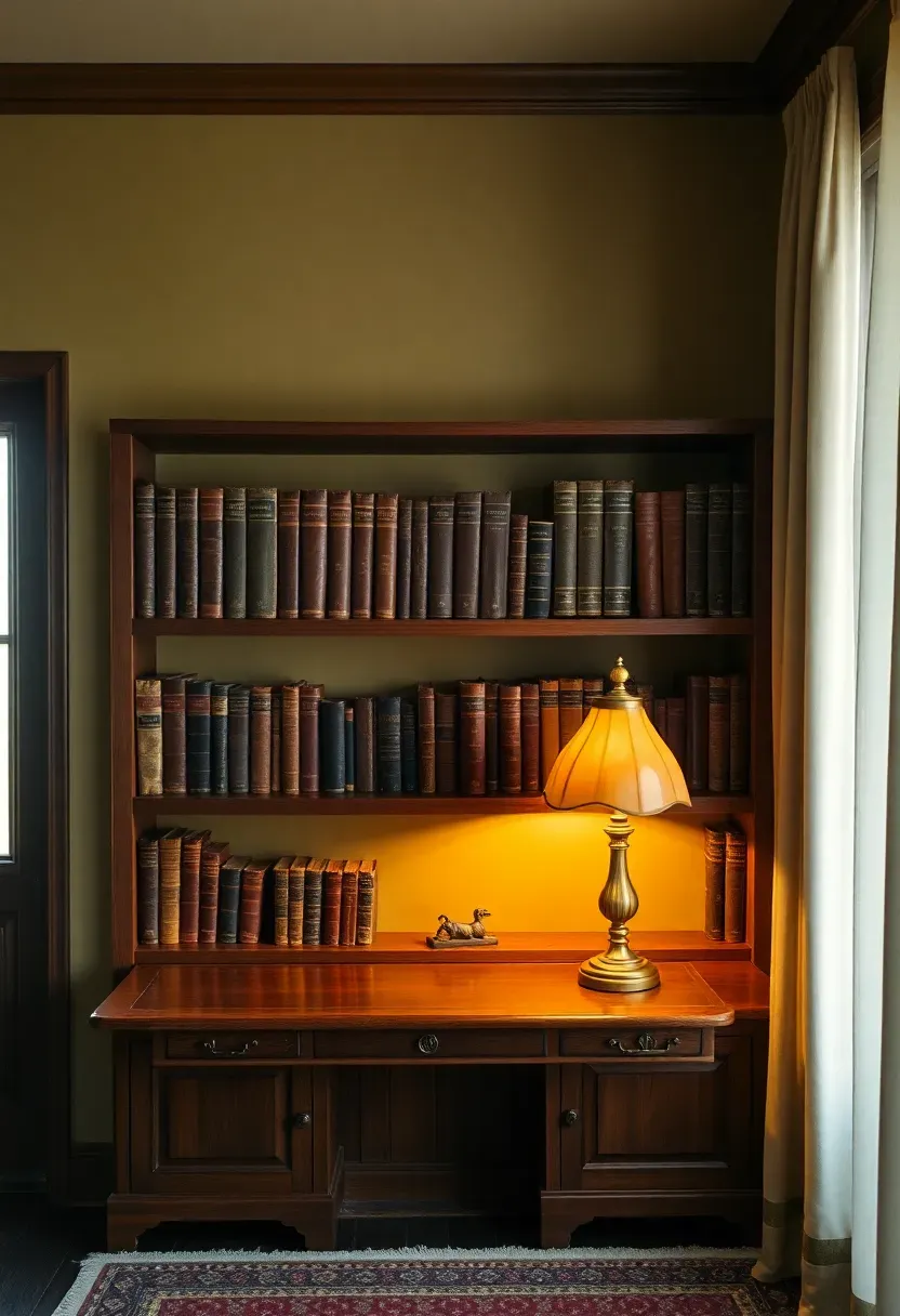
21. Olive Drab
Olive drab borrows from military surplus and aged canvas, carrying a green so muted it nearly reads as brown. This color is for rooms that need gravitas without the formality of dark blue or the moodiness of charcoal. Studies, libraries, and dens benefit most from its quiet authority.
Why People Love It
Olive drab flatters wood. Every kind. Oak shelving, walnut desks, pine floors, teak side tables. The green-brown base harmonizes with wood grain in a way that pure green or pure brown cannot, because it already contains both. The wall becomes a backdrop that makes everything in front of it look better.
Practical Pointers
- Eggshell or satin finish works best, matte can look too flat in dark rooms
- Pair with black iron hardware and warm brass reading lamps
- White or cream ceiling is essential to prevent the room from feeling like a bunker
- Add leather accessories, a chair, a desk pad, a bookend, for warmth
Quick FAQ
Should I paint the accent wall lighter or darker than the rest of the room? Most effective accent walls are two to four shades darker than surrounding surfaces. Lighter accent walls can work in specific situations, like a pale lavender in an all-white bathroom, but darker tones create more visual impact and define the wall as a deliberate focal point.
Is it possible to use two different accent wall colors in one room? Technically yes, but proceed with extreme caution. Two accent walls competing for attention usually cancel each other out. If you must, place them on non-adjacent walls and ensure both colors share an undertone, such as two different greens with gray bases.
Which finish works best for accent walls? Eggshell offers the most versatile result. It provides enough sheen to reflect light gently without the glare of semi-gloss. Save matte for bedrooms and reading nooks where the chalky texture adds to the mood. Reserve satin for darker colors that benefit from subtle light play.
Can the same accent wall color work in both warm and cool lighting? Colors with mixed undertones, like slate blue, sage green, and mushroom, adapt well to both warm and cool light. Pure colors like canary yellow or true red shift dramatically under different bulbs and should be tested extensively before committing.
What colors should I avoid for a north-facing accent wall? Skip cool blues and grays in north-facing rooms. The already limited warm light makes these colors feel depressing and flat. Lean toward warm tones: terracotta, caramel, soft apricot, or olive drab. These colors create the warmth that the light itself cannot provide.
Picking an accent wall color comes down to understanding your room's light, your existing furnishings, and how brave you want to be. Start with a single gallon and a large swatch on the actual wall. Live with it for forty-eight hours through morning light, afternoon glare, and evening lamplight before deciding. The right color does not just change a wall. It changes how the entire room makes you feel when you walk through the door.
Pinterest cover for 21 Accent Wall Color Ideas That Bring Any Room to Life
About the author
OBCD
CGI visualization and interior design content. We create detailed 3D renders and curate practical design ideas for every room in your home.