25 AI Entryway Makeover Ideas
Walk through any front door and you have roughly three seconds before a visitor forms an opinion about your entire home. That narrow stretch of floor between the threshold and the living space carries an outsized burden — it needs to store coats, corral keys, absorb muddy shoes, and still look like you planned every detail on purpose. Most people treat the entryway as leftover square footage, a hallway to rush through rather than a room worth designing. AI visualization tools have changed that equation completely, letting homeowners test wallpaper patterns, bench configurations, and lighting fixtures in photorealistic renders before spending a cent.
In this article you will find 25 AI-generated entryway concepts spanning everything from grand two-story foyers to apartment-sized nooks barely wider than a doormat. Each one tackles a different mood, storage challenge, or architectural constraint.
Table of Contents
- Grand Arched Foyer
- Scandinavian Minimalist Entry
- Moody Dark Hallway
- Farmhouse Mudroom Combo
- Mid-Century Console Vignette
- Statement Wallpaper Alcove
- Japanese Genkan-Inspired Entry
- Coastal Whitewash Foyer
- Industrial Loft Entryway
- Art Gallery Corridor
- Rustic Stone and Timber Entry
- Narrow Apartment Nook
- Mediterranean Tile Entry
- Floating Shelf Wall System
- Glamorous Mirror Wall
- Wainscoting and Bench Seat
- Biophilic Green Entry
- Modern Mudroom with Lockers
- Victorian Vestibule Revival
- Desert Warm Tones Entry
- Split-Level Landing Makeover
- Japandi Hybrid Foyer
- Bold Color Block Entry
- Reclaimed Wood Accent Wall
- Smart Storage Hidden Entry
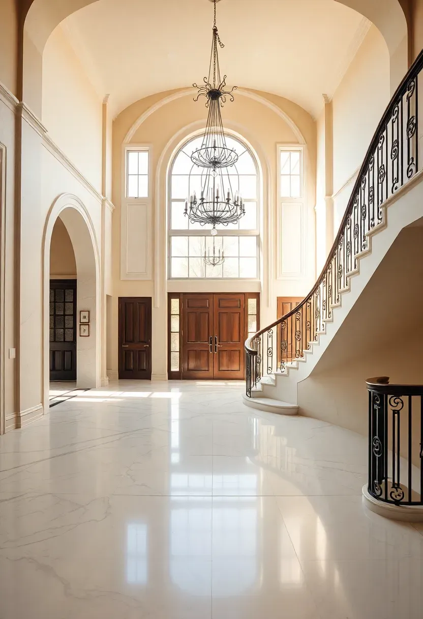
1. Grand Arched Foyer
The Core Issue
Large entryways with high ceilings often feel cavernous and cold rather than welcoming. Without the right scale of furniture and lighting, a generous foyer reads as empty instead of elegant.
The Solution
AI rendering helped scale every element to the architecture. A wrought-iron chandelier hangs at the precise height where it commands attention without overwhelming the space. A round pedestal table centered beneath it anchors the eye on entry. Polished marble flooring reflects light upward, amplifying the natural glow from sidelights flanking the arched door. A runner rug in muted tones softens footsteps and defines the path toward the staircase.
Pros and Cons
Pros: immediately impressive, sets a formal tone, maximizes vertical drama Cons: high ceilings make chandelier bulb changes difficult, marble requires sealing, furniture must match the grand scale
We picked a few things that go well with this idea: HOOBRO Narrow Entryway Console Table (★4.4), SUPERJARE Narrow Console Table with Outlet (★4.4) and SUPERJARE Extra-Long Console Table with Storage (★4.5). As an Amazon Associate we earn from qualifying purchases.
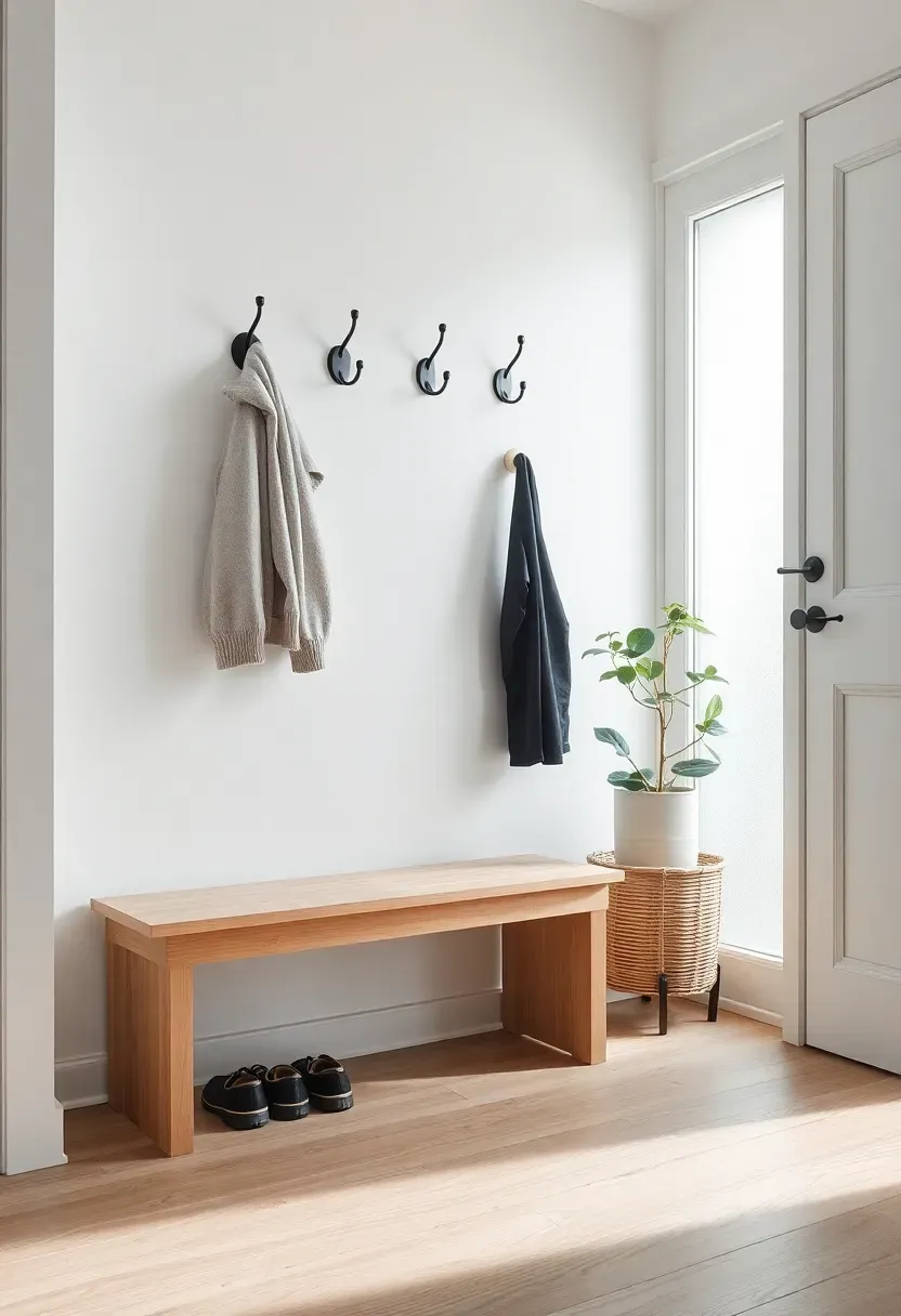
2. Scandinavian Minimalist Entry
Scandinavian design philosophy strips the entryway down to essentials and lets each piece breathe. This AI concept pairs a light oak bench with a slim row of matte-black wall hooks mounted at staggered heights. A woven basket beneath the bench hides scarves and gloves without visual clutter. The palette stays within white, pale wood, and charcoal gray — colors that make even a dim north-facing hallway feel open.
Tips for Getting It Right
- Choose a bench with an open base so shoes remain visible but organized
- Limit wall art to one piece; negative space is the design statement
- Use a single oversized plant rather than several small ones to avoid clutter
- Add a slim felt tray on the bench surface for keys and sunglasses
We picked a few things that go well with this idea: PERFNIQUE Gold Asymmetrical Wall Mirror (32x24) (★4.8), Fabuday Black Round Wall Mirror (20 inch) (★4.6) and BEAUTYPEAK Gold Arch Wall Mirror (20x30) (★4.7). As an Amazon Associate we earn from qualifying purchases.
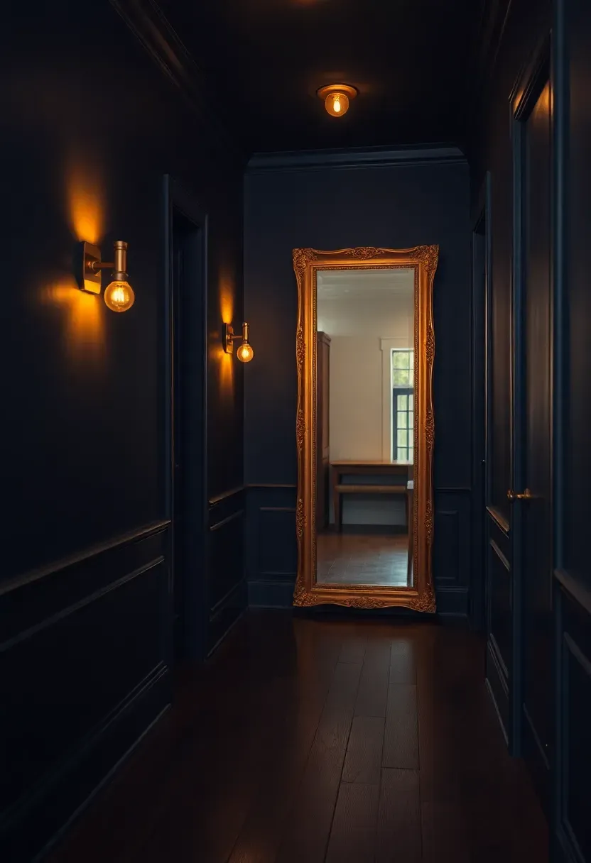
3. Moody Dark Hallway
Origins
The moody interior trend traces back to Victorian parlors where deep jewel tones signaled sophistication. Modern designers rediscovered that dark walls actually make narrow spaces feel deeper rather than tighter, contradicting the old advice to always paint small rooms white.
Modern Interpretation
This AI render wraps the hallway in deep navy paint from baseboard to ceiling, including the trim. Brass wall sconces cast warm pools of light at intervals, preventing the corridor from feeling like a tunnel. A vintage gilt mirror at the far end doubles the perceived depth. The dark hardwood floor merges seamlessly with the walls, creating an enveloping cocoon effect that makes stepping inside feel like entering a different world entirely.
How to Apply at Home
- Test navy, forest green, or charcoal — avoid pure black which absorbs too much light
- Install sconces every four to five feet to create rhythmic light pools
- Use satin or eggshell finish paint so walls subtly reflect rather than absorb
- Position a mirror at the hallway terminus to bounce light back toward the door
We picked a few things that go well with this idea: Homode Wood Coat Rack Shelf (5 Hooks) (★4.5), Evermagin 4-in-1 Coat Rack with Mail Holder (★4.5) and Tatub Rustic Coat Rack Wall Mount with Shelf (★4.7). As an Amazon Associate we earn from qualifying purchases.
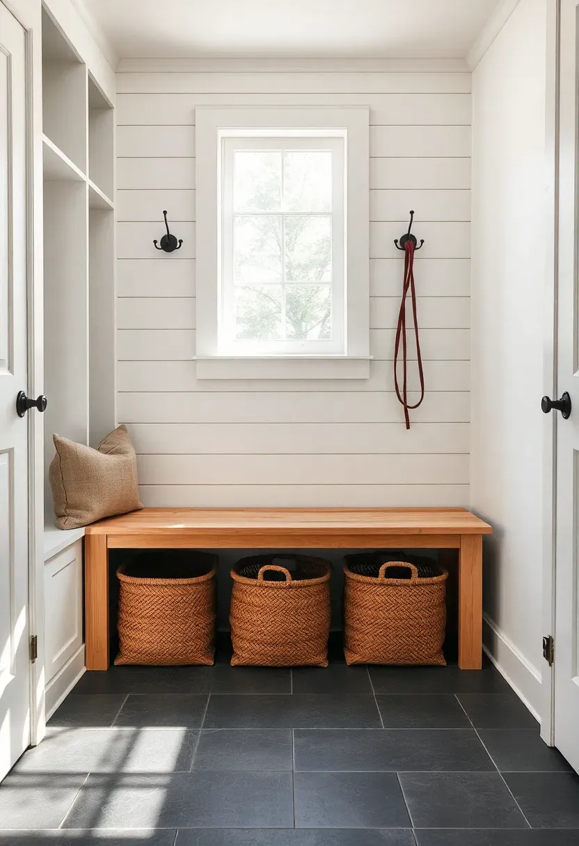
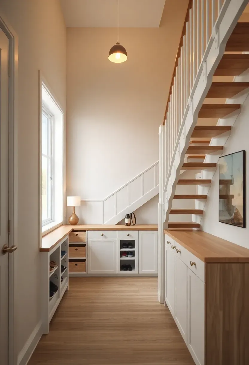
4. Farmhouse Mudroom Combo
How to Build a Functional Mudroom Entry
When the entryway doubles as a mudroom, every inch needs to earn its place. This AI design merges farmhouse charm with rigorous organization.
Step 1: Install the Cubby Wall
Built-in cubbies with shiplap backing give each family member a designated drop zone. One cubby per person — coat hook on top, shelf for bags, basket below for shoes.
Step 2: Add the Bench
A sturdy wooden bench runs the full width of the cubby wall. It provides a seat for removing boots and hides a row of pull-out storage baskets underneath.
Step 3: Choose Durable Finishes
Shiplap gets a semi-gloss paint coat that wipes clean. The bench surface is sealed butcher block. Floor tile in a slate gray handles wet boots without staining.
What to Watch Out For
- Cubbies narrower than 14 inches feel cramped for adult coats
- Add a boot tray inside each lower basket to contain dripping snow
- Include one empty cubby for guest coats — do not assign every slot
Recommended
Items for this idea
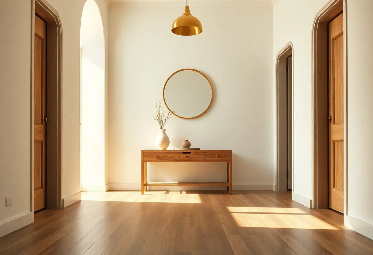
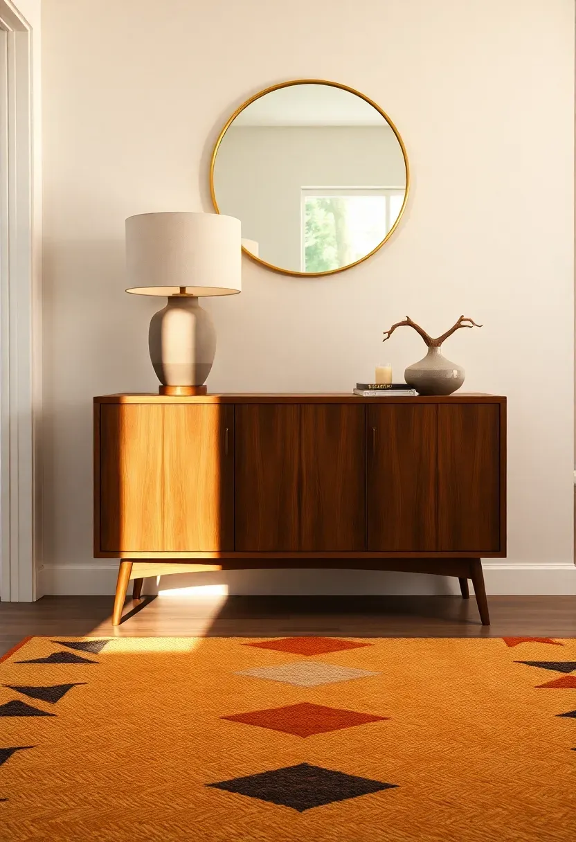
5. Mid-Century Console Vignette
The mid-century approach to entryway design treats the console table as a stage. This AI-generated scene positions a low walnut credenza against a warm white wall, topped with a ceramic cylinder lamp, a small tray for mail, and a single stem in a bud vase. A round brass-framed mirror hangs above at eye level. The geometric area rug below introduces pattern without competing with the furniture.
What makes this approach work is restraint. Every object on the credenza serves a function or provides visual balance — nothing sits there by default. The credenza's closed storage conceals umbrellas, dog leashes, and reusable bags behind clean cabinet doors.
Tips for the Mid-Century Look
- Stick to tapered, angled legs on furniture for authentic period silhouette
- Limit the console top to three to five objects arranged asymmetrically
- Choose warm wood tones like walnut or teak over cool-toned oak
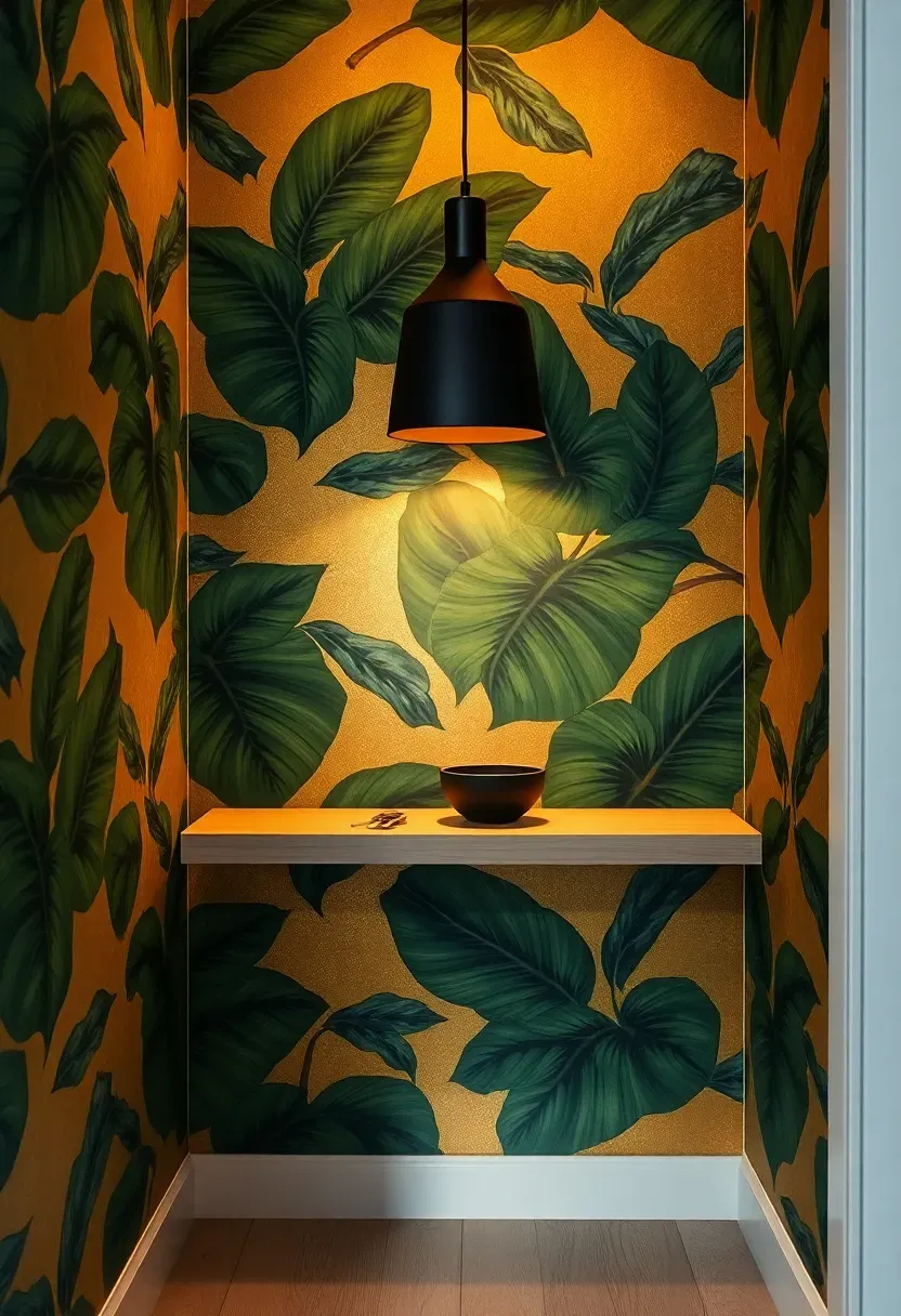
6. Statement Wallpaper Alcove
Why Wallpaper Works in Small Entries
Small entryways benefit from bold pattern precisely because visitors spend so little time in them. A design that might overwhelm a living room becomes a brief, memorable moment in a hallway. AI rendering lets you preview exactly how the pattern repeat aligns with your wall dimensions before ordering a single roll.
The Solution
This concept applies an oversized botanical print — deep green leaves on a gold ground — to the alcove wall only, treating it as an accent surface. The adjacent walls stay neutral. A narrow floating shelf provides a landing spot without interrupting the pattern. A single pendant light draws the eye upward and illuminates the paper's detail.
Pros and Cons
Pros: transforms a forgettable space into a conversation starter, relatively low cost, easy to change seasonally with peel-and-stick options Cons: busy patterns can clash with nearby room decor, requires careful alignment at seams, not suitable for very damp entryways
Recommended
Items for this idea
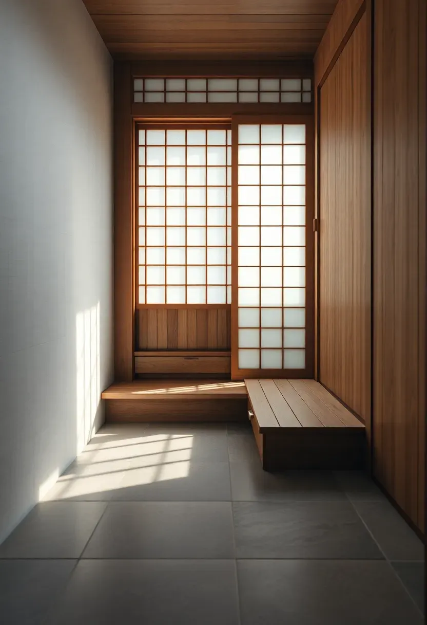
7. Japanese Genkan-Inspired Entry
The genkan is the traditional Japanese entryway where shoes are removed before stepping up into the home. A slight elevation change — even two or three inches — creates a psychological boundary between outside and inside that no doormat can replicate.
AI modeling calculated the ideal step height and cabinet dimensions for this render. A recessed floor area finished in natural stone receives shoes. A slim wooden shoe cabinet with tilting drawers stores footwear out of sight. The step up to the main floor uses a single wide timber plank, warm underfoot. A translucent shoji-style sliding screen separates the genkan from the hallway beyond, filtering light while maintaining privacy.
Tips for Western Homes
- Even a painted line on the floor with a slight ramp can evoke the genkan concept
- Use a low, narrow shoe cabinet rather than a tall closet to preserve the open feel
- Place a small bench or stool for seated shoe removal — essential for accessibility
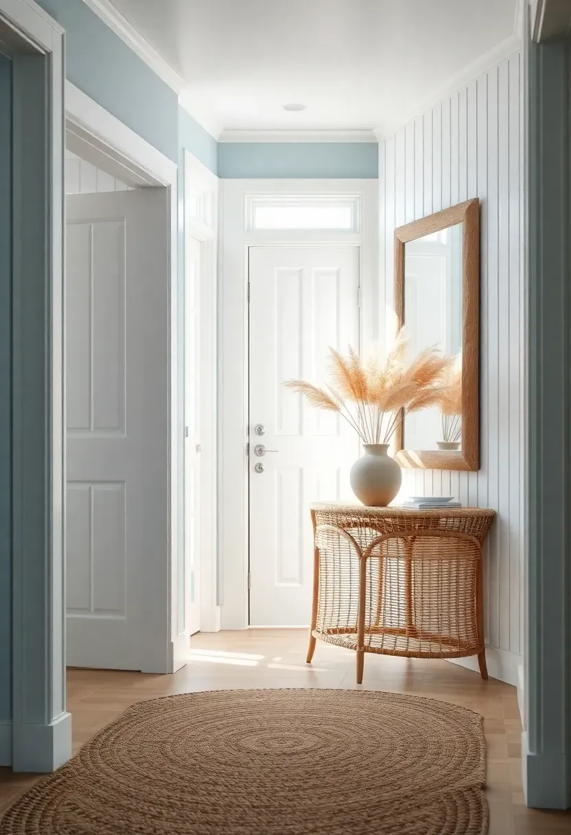
8. Coastal Whitewash Foyer
Origins
Coastal interior design emerged from the practical choices of seaside living — light colors to reflect heat, natural fibers that handle sand and salt, and an overall airiness that mirrors the feeling of open water.
Modern Interpretation
This AI concept captures that spirit without drifting into cliche seashell territory. Whitewashed vertical wood paneling covers the walls to chair-rail height. Above that, a soft sea-glass blue paint warms the upper walls. A driftwood-framed mirror serves as the focal point. Below it, a rattan console holds a ceramic vase with dried pampas grass. A braided jute rug defines the entry zone and hides sand tracked in from outside.
How to Apply at Home
- Use actual whitewash or a heavily thinned paint to let wood grain show through
- Limit blue accents to one or two elements — too many reads as themed rather than styled
- Choose natural textures like jute, linen, and rattan over synthetic coastal reproductions
- Skip anything with anchors, starfish, or nautical rope — let materials tell the story
Recommended
Items for this idea
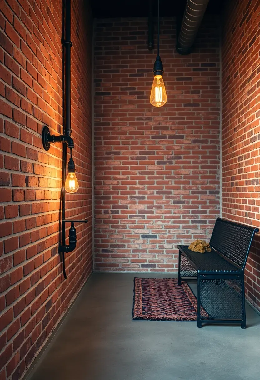
9. Industrial Loft Entryway
Exposed brick, raw concrete, and visible steel framing form the bones of this AI-rendered entryway. Rather than softening these materials, the design leans into their roughness. A wall-mounted coat rack built from black steel pipe holds jackets at varying heights. Below it, a perforated metal bench doubles as a shoe shelf. An Edison-filament pendant hangs from a conduit-style ceiling mount, casting warm amber light across the brick texture.
The trick to industrial entryways is temperature balance. Without warm elements, the space feels like a loading dock. A vintage kilim runner on the concrete floor and a single potted fern on the bench inject just enough organic warmth to make the entry inviting.
Tips for Getting It Right
- Seal brick and concrete to prevent dust — matte sealant preserves the raw look
- Soften acoustics with a textile element since hard surfaces amplify every footstep
- Mix metal finishes: matte black pipe with brushed brass hardware prevents monotony
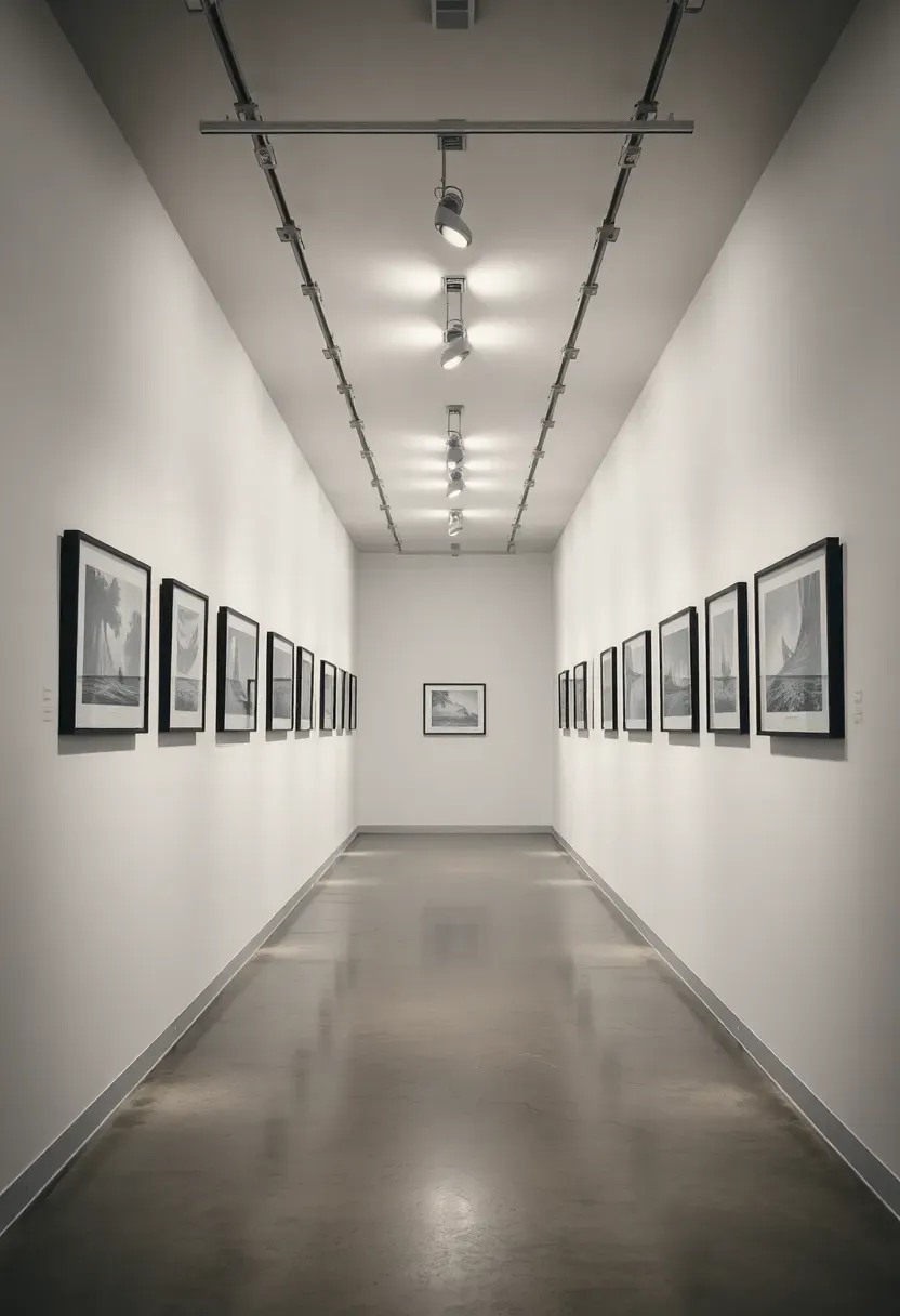
10. Art Gallery Corridor
Why It Works for Narrow Hallways
Long, narrow entryways frustrate most designers. You cannot widen the walls, and furniture placement risks blocking the path. The gallery corridor concept reframes the limitation as an advantage — treating each wall as exhibition space.
The Solution
AI arranged framed artwork at precise intervals along both walls, each piece lit by an adjustable track light overhead. The frames share a consistent profile — slim black metal — while the artwork itself varies in size and subject. A polished concrete floor reflects the lighting and keeps the visual focus on the walls. At the far end, a small floating shelf holds a sculptural object that serves as a visual terminus.
Pros and Cons
Pros: turns a pass-through space into a destination, works with any art style, scales easily by adding or removing pieces Cons: track lighting installation adds cost, requires regular dusting of frames, needs enough wall length to feel intentional
Recommended
Items for this idea
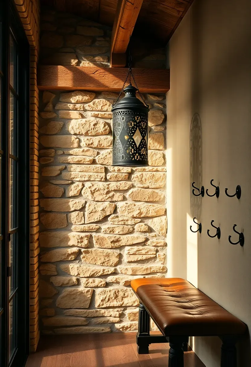
11. Rustic Stone and Timber Entry
Natural materials carry weight — both literal and visual. This AI design pairs a stacked stone accent wall with a single reclaimed timber beam running across the ceiling. A wrought-iron lantern pendant hangs from the beam, casting patterned shadows through its perforated metalwork. A chunky wooden bench with a leather cushion top offers seating, while iron hooks above it handle coats and bags.
The palette sticks to earth tones: sandstone, aged oak, iron black, and saddle leather. Nothing is painted or lacquered. The beauty comes from texture variation — smooth leather against rough stone, weathered wood against forged iron.
Tips for the Rustic Look
- Source stone veneer panels for the accent wall if full stone is too heavy for the structure
- One reclaimed beam is enough — multiple beams can overwhelm a standard ceiling height
- Use real leather or quality faux leather for the bench pad; vinyl looks cheap in this context
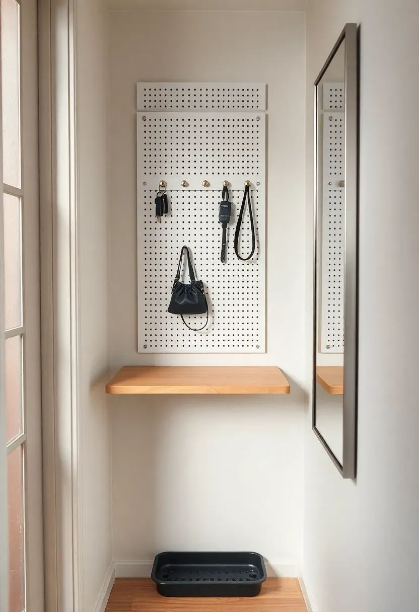
12. Narrow Apartment Nook
The Core Issue
Apartment entryways often measure less than three feet wide and offer no closet. Residents dump keys on the nearest surface, stack shoes against the wall, and hang coats on the doorknob. The space feels chaotic before anyone even takes off their jacket.
The Solution
This AI concept solves the width problem by going vertical and foldable. A wall-mounted drop-leaf shelf folds flat against the wall when not in use, extending only when you need a surface for sorting mail or setting down groceries. Above it, a pegboard organizer with moveable hooks adapts to seasonal needs — more hooks in winter, fewer in summer. A narrow full-length mirror makes the nook feel twice its actual width. Below the shelf, a slim boot tray catches drips.
Pros and Cons
Pros: works in spaces as narrow as 24 inches, entirely renter-friendly with removable hardware, costs under $150 total Cons: drop-leaf shelf has limited weight capacity, pegboard aesthetic is not for everyone, requires disciplined daily use to stay tidy
Recommended
Items for this idea
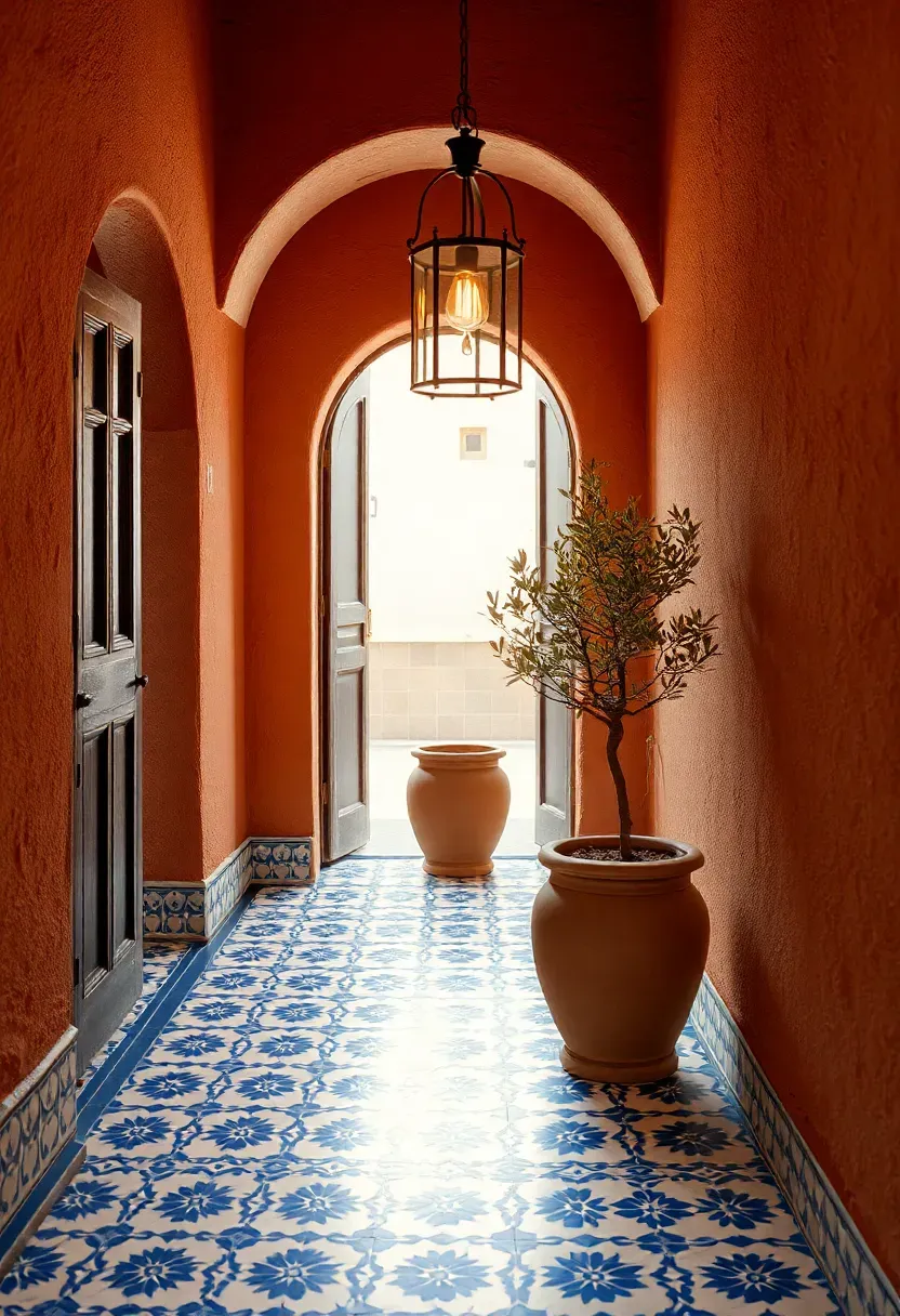
13. Mediterranean Tile Entry
Encaustic tile floors have graced Mediterranean entryways for centuries, and AI rendering brings their geometric patterns to life in a contemporary setting. This concept lays blue-and-white patterned tiles across the entry floor, framed by terracotta-toned plaster walls. An arched interior doorway echoes the exterior door shape. A hanging wrought-iron lantern provides warm downlighting, and a small potted olive tree in a terracotta urn anchors the corner.
The tile pattern does the heavy lifting — it is the color, the texture, and the personality of the space all in one material. Everything else stays deliberately understated to let the floor speak.
Tips for Encaustic Tile
- Seal tiles thoroughly before grouting and again after — they are porous
- Choose a pattern scale proportional to the floor area; small rooms need smaller repeats
- Pair with simple white or terracotta grout to avoid competing visual noise
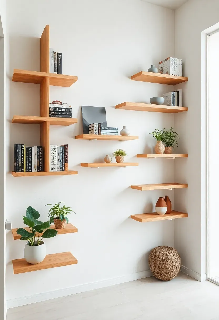
14. Floating Shelf Wall System
When floor space is limited but wall space is generous, a floating shelf system turns the entryway into a vertical display. AI calculated the spacing and depth of each shelf to accommodate different object sizes while maintaining visual rhythm. Lower shelves at 12 inches deep hold bags and a small bowl for keys. Mid-height shelves at 8 inches deep display framed photos and small plants. Upper shelves at 6 inches deep hold books and decorative objects.
The key is varying both depth and spacing rather than creating a uniform grid. Uniform grids feel like retail shelving. Staggered, asymmetric placement looks intentional and curated.
What to Watch Out For
- Use heavy-duty concealed brackets rated for at least 30 pounds per shelf
- Leave at least one shelf intentionally empty — negative space prevents the wall from feeling cluttered
- Group objects in odd numbers on each shelf for natural visual balance
Recommended
Items for this idea
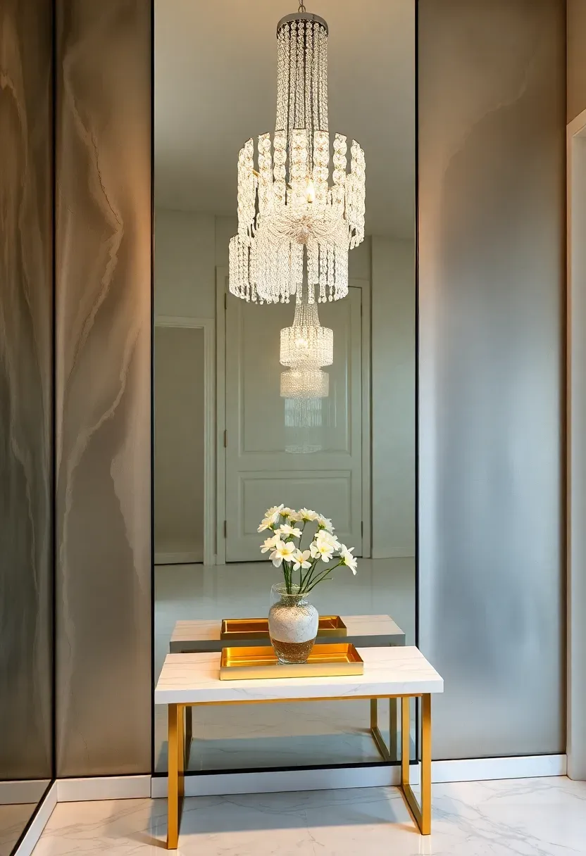
15. Glamorous Mirror Wall
Origins
The mirror wall originated in 18th-century French chateaux where mercury-backed glass panels lined grand hallways to amplify candlelight. The concept democratized through Art Deco hotels in the 1920s and 1930s, where mirrored lobbies became symbols of urban glamour.
Modern Interpretation
This AI render updates the tradition with an antiqued mirror panel covering one full wall of the foyer. The intentional distressing — smoky patches, foxed edges — prevents the mirror from reading as a gym wall. A crystal pendant chandelier reflects infinitely in the glass, multiplying its sparkle. A slim marble console table sits against the adjacent wall, topped with a gold-framed tray and fresh flowers. The floor is white marble tile with a subtle vein pattern.
How to Apply at Home
- Use antiqued or smoked mirror panels rather than clear mirror to avoid a commercial look
- Position the mirror wall opposite a window to double natural light
- Frame the mirror edges with trim molding for a built-in, architectural feel
- Keep furniture minimal — the mirror is the statement
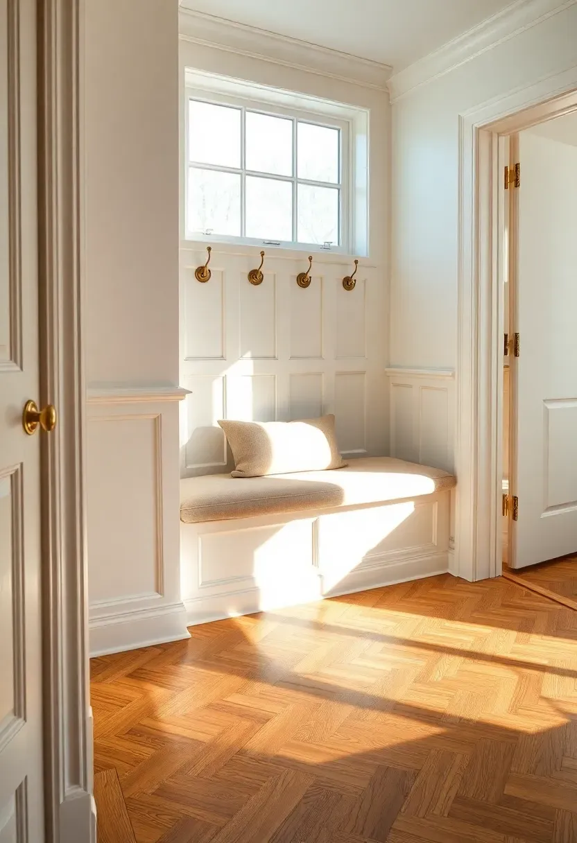
16. Wainscoting and Bench Seat
Wainscoting protects walls from the abuse entryways endure — scuffed shoes, dragged backpacks, leaned-on shoulders — while adding architectural depth that flat drywall cannot provide. This AI concept runs raised-panel wainscoting to 36 inches, topped with a continuous cap rail. A built-in bench seat fills the space between two panels, upholstered in a durable linen-cotton blend. Brass coat hooks march along the wall above the bench at regular intervals.
The herringbone wood floor introduces diagonal energy that offsets the vertical panels. Together, the two patterns create visual richness without requiring any additional decoration on the walls.
Tips for Wainscoting Success
- Standard wainscoting height is one-third of the wall — adjust for ceilings above or below 9 feet
- Paint wainscoting and upper wall the same color for a monochromatic modern look, or two-tone for traditional contrast
- Use MDF panels rather than solid wood for budget-friendly installation with identical visual impact
Recommended
Items for this idea
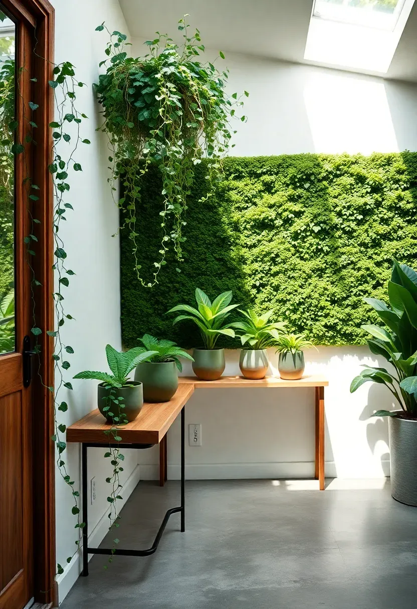
17. Biophilic Green Entry
Biophilic design connects interior spaces to the natural world through living materials, natural light, and organic forms. This AI concept turns the entryway into a miniature greenhouse. A preserved moss wall panel covers the area above a slim wooden console. Trailing pothos cascades from a high shelf. Ferns in ceramic pots cluster on the console surface. A skylight — or light tube in homes without roof access — pours natural light directly onto the greenery.
The effect is immediate and visceral. Visitors step through the door and inhale the faint earthiness of living plants before they register any furniture or color choice. It reframes the entryway as a transitional space between outdoor nature and indoor comfort.
Tips for Plant-Heavy Entries
- Choose low-light tolerant species if the entry lacks direct sun: pothos, ZZ plant, snake plant
- Use a preserved moss panel rather than live moss — it requires zero maintenance and no watering
- Add a waterproof tray beneath every pot to protect flooring from drips
- Rotate plants quarterly so they receive even light exposure
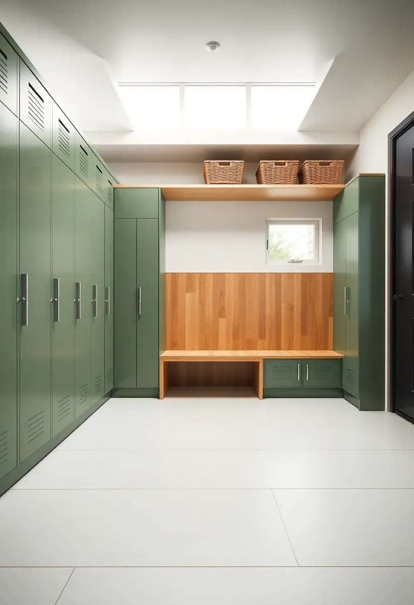
18. Modern Mudroom with Lockers
Comparing: Open Cubbies vs Closed Lockers
Both solve the same organizational problem, but the visual outcome differs dramatically.
Open Cubbies
Cubbies show everything. They rely on consistent basket use and tidy habits to look presentable. Great for families who stay on top of clutter daily. Cost less to build and allow quicker grab-and-go access.
Closed Lockers
Lockers hide everything behind a door. One swing and the mess disappears. This AI render uses slim metal lockers in sage green, each with an interior hook, shelf, and bin. The exterior stays clean and uniform.
What to Choose
Choose cubbies if: you have a consistent organizing routine, you want to display baskets and hooks decoratively, or you have young children who need to see their belongings Choose lockers if: you want a perpetually tidy entryway regardless of what is inside, you have teenagers or multiple adults sharing the space, or the mudroom is visible from the main living area
Recommended
Items for this idea
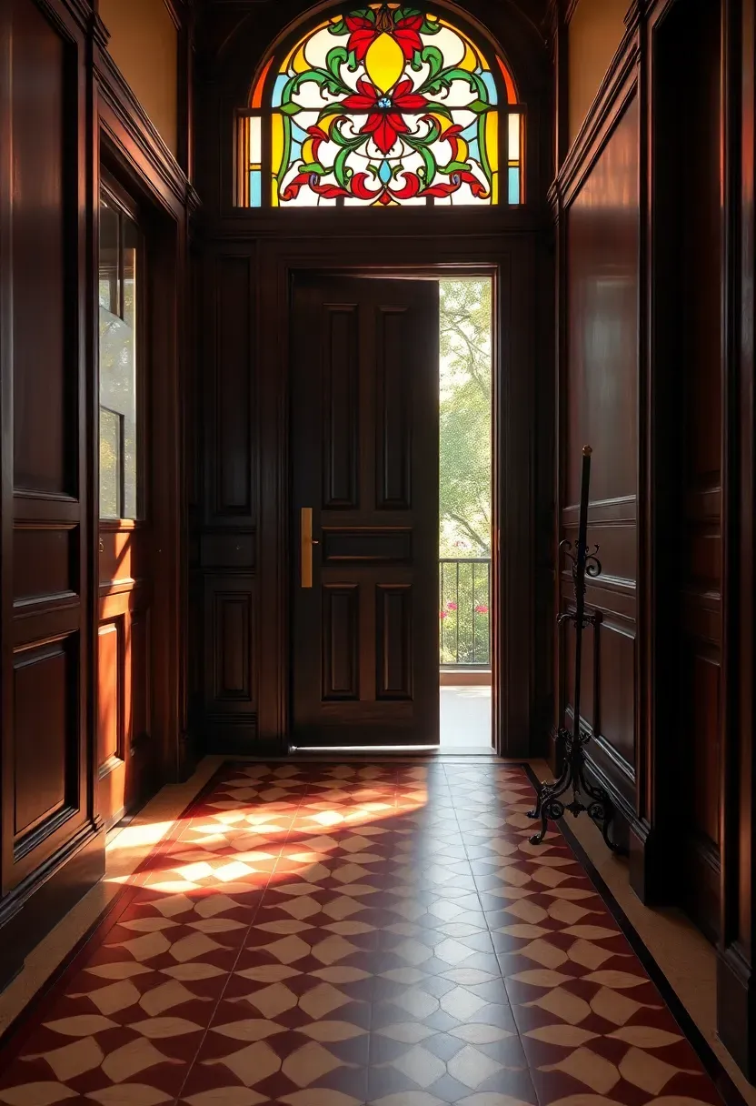
19. Victorian Vestibule Revival
Origins
Victorian vestibules served as airlocks — small enclosed rooms between the front door and the main hallway that trapped cold drafts, gave servants time to announce visitors, and displayed the household's social standing through ornate tile, glass, and woodwork.
Modern Interpretation
This AI render preserves the period character while updating it for contemporary living. An encaustic tile floor in deep red and cream geometric patterns anchors the space historically. Dark wood paneling rises to dado height. Above it, a stained glass transom window filters afternoon light into colored pools on the tile. Brass hardware — door handle, letter slot, coat hooks — adds warmth against the dark wood. A cast-iron umbrella stand tucks into the corner.
How to Apply at Home
- Even one period element — an encaustic tile inset or a stained glass panel — evokes the Victorian feel
- Reproduction transom panels in tempered glass are widely available and more affordable than custom
- Dark wood paint (not necessarily actual wood paneling) achieves the look at a fraction of the cost
- Add a door curtain or portiere for the draft-blocking function of the original vestibule

20. Desert Warm Tones Entry
Terracotta, ochre, sand, and sun-bleached clay form the palette of this AI-generated entry. The walls use a lime plaster finish that shows subtle trowel marks, giving the surface a handmade quality no roller-applied paint can match. An arched niche — a simple drywall build-out — holds a collection of clay pots in varying heights. Dried pampas grass and preserved eucalyptus branches fill the tallest vessel. A woven wall hanging adds textile softness to the opposite wall.
The warmth here is literal as well as visual. Earth tones absorb and re-radiate ambient light in a way that cool grays and whites never do, making the space feel sun-warmed even on overcast days.
Tips for Desert Palette
- Lime wash or Roman clay finishes create authentic texture at an accessible price point
- Layer three to four shades within the same warm family rather than matching a single tone everywhere
- Avoid glossy finishes — matte and chalky textures reinforce the organic desert aesthetic
Recommended
Items for this idea
21. Split-Level Landing Makeover
Split-level homes present a unique entryway challenge: you open the front door to a small landing with stairs going up and down, leaving almost no usable floor space. Most owners ignore this landing entirely, but AI design reveals its hidden potential.
This render tucks a narrow console table against the railing wall — just 8 inches deep, enough for a tray and lamp. The space beneath the ascending staircase becomes a pull-out shoe cabinet with slim drawers. A single pendant light hangs at the landing level, establishing it as a defined room rather than a transitional platform. The railing itself gets an upgrade from builder-grade spindles to a clean cable rail system.
What to Watch Out For
- Measure twice — split-level landings vary wildly in dimension and clearance
- Pendant lights must hang high enough that ascending traffic clears them comfortably
- Under-stair storage depth is limited by the stair angle; pull-out drawers maximize access
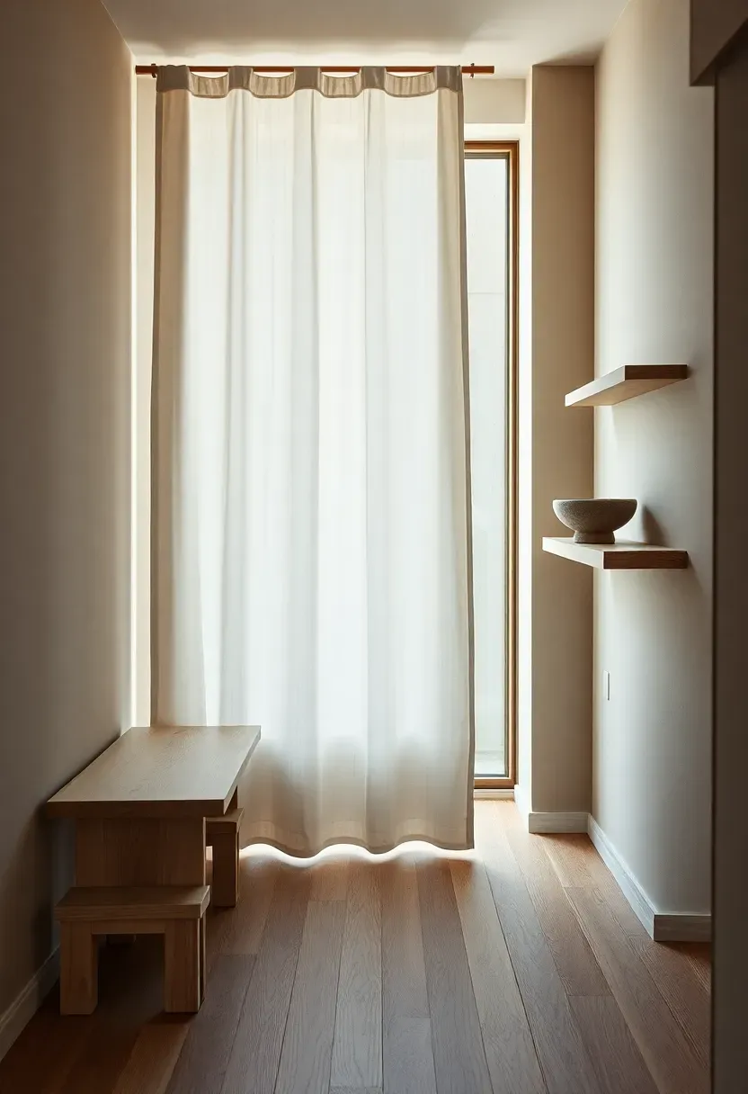
22. Japandi Hybrid Foyer
Japandi merges Japanese wabi-sabi imperfection with Scandinavian functional simplicity. The result is an entryway that feels both serene and practical — no excess, no austerity. This AI concept uses a pale ash wood bench with visible joinery. A linen curtain panel, hung from a slim wooden rod, softens the transition to the next room without the formality of a door. A single stone bowl on a wall-mounted shelf holds keys. The palette stays within cream, ash, warm gray, and undyed linen.
Every surface shows its material honestly. Wood grain is visible, linen is unbleached, stone is unpolished. The beauty is in the restraint and the quality of each individual element.
Tips for the Japandi Blend
- Choose furniture with visible joinery — mortise-and-tenon, dowel pins, finger joints
- Limit each surface to one or two objects maximum
- Use textiles in undyed, unbleached natural fibers for authentic texture
- Avoid symmetry — off-center placement is central to wabi-sabi philosophy
Recommended
Items for this idea
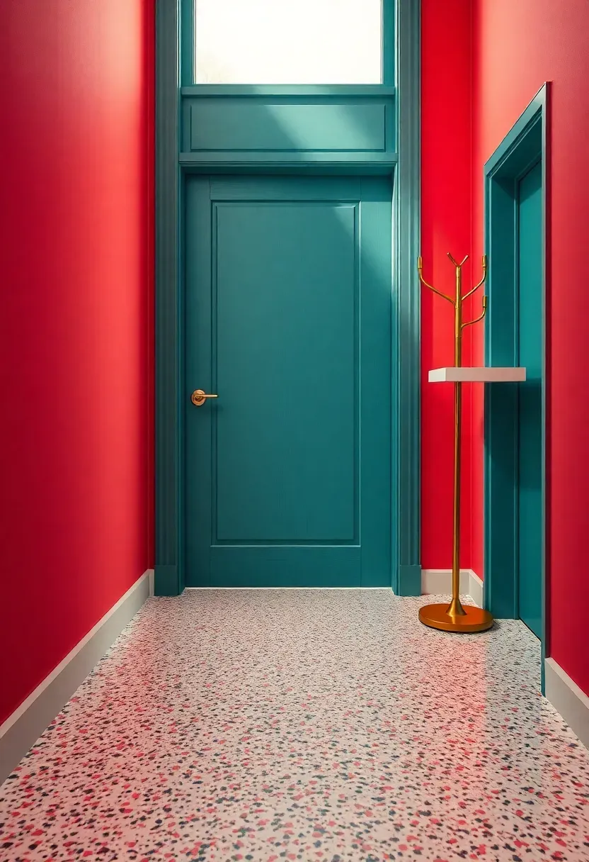
23. Bold Color Block Entry
Why Color Works in Entryways
Most rooms demand color restraint because you spend hours in them. Entryways get a pass — you are in and out in seconds, which means saturated, daring color choices feel energizing rather than exhausting.
The Solution
This AI render pairs a saturated coral wall with a teal-painted door, creating a complementary color vibration that hits immediately on entry. The terrazzo floor introduces confetti-like speckles that bridge the two bold tones. A modern brass coat tree and a slim floating shelf keep the space functionally minimal so the color can be the star. No art on the walls — the color is the art.
Pros and Cons
Pros: costs almost nothing beyond paint, instantly memorable, easy to change when you tire of it Cons: color choices must complement adjacent room palettes, demands confidence, may not appeal to resale-focused homeowners
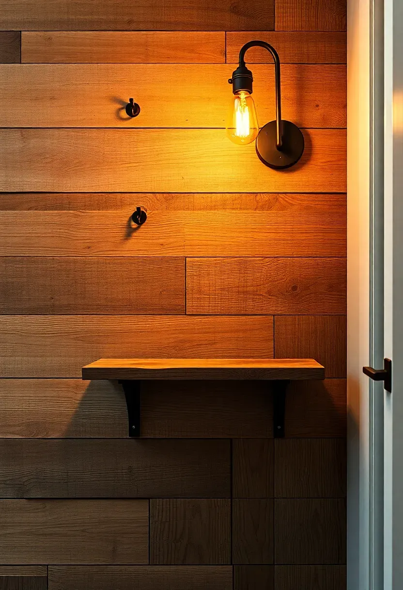
24. Reclaimed Wood Accent Wall
Reclaimed wood carries a history that new lumber simply cannot fake — nail holes, saw marks, weathered grain, and color variations from decades of sun and rain exposure. This AI design arranges mixed-width planks horizontally across one entryway wall, creating a textured backdrop that shifts in tone from honey to gray across its surface.
Iron hooks driven directly into the planks hold coats and bags. A single reclaimed timber shelf — cut from the same batch — runs at eye level for display. An Edison bulb sconce mounted near the shelf casts warm sidelight that accentuates every ridge and groove in the wood grain.
Tips for Reclaimed Wood Walls
- Source planks from a single salvage lot to ensure consistent age and character
- Sand lightly to remove splinters but preserve patina — do not over-finish
- Attach planks to a plywood backer mounted on the wall rather than directly to drywall
- Check for and remove any embedded nails or hardware before installation
Recommended
Items for this idea
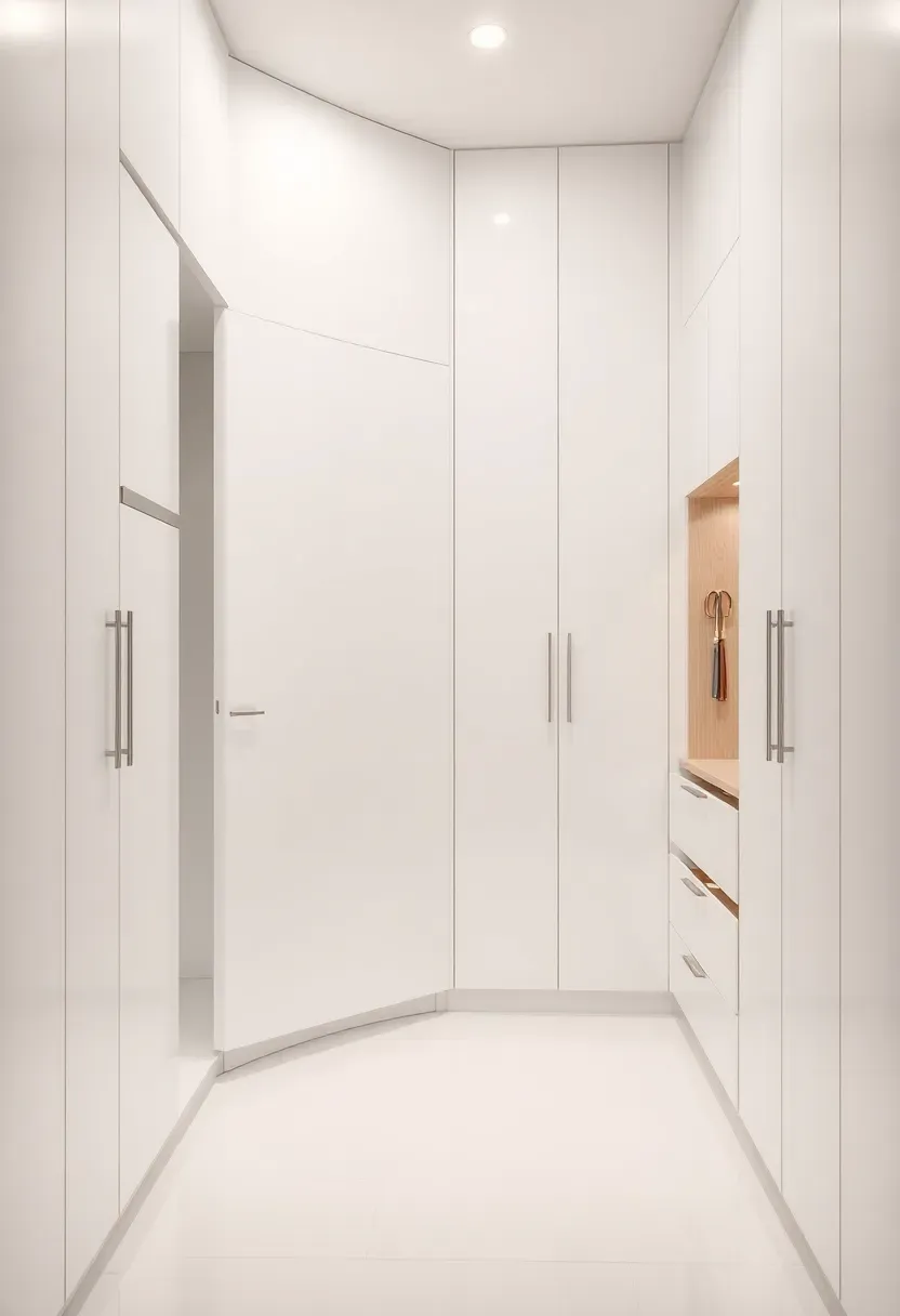
25. Smart Storage Hidden Entry
The Core Issue
Storage is the entryway's primary job, yet most storage solutions — hooks, open shelves, shoe racks — put clutter on permanent display. For homeowners who want a clean, almost gallery-like entry, visible storage defeats the purpose.
The Solution
This AI concept lines one full wall with floor-to-ceiling built-in cabinets using push-to-open doors — no handles, no hardware, just smooth panels that blend into the wall. Behind them: hooks for coats, pull-out shoe drawers, a charging shelf for devices, and even a narrow vertical niche sized for umbrellas. When everything is closed, the entryway reads as a pristine white corridor. When opened, every item has a designated home.
Pros and Cons
Pros: maximum storage capacity per square foot, perpetually tidy appearance, custom-fit to your family's exact needs Cons: requires professional carpentry or high-quality flat-pack cabinetry, push-to-open mechanisms need periodic adjustment, inaccessible for quick grab-and-go moments
Quick FAQ
Is it worth hiring a professional to design my entryway, or can AI tools handle it? AI visualization tools generate impressive photorealistic mockups and help you test ideas rapidly, but they cannot assess structural load, electrical wiring locations, or building code requirements. Use AI for concept exploration, then consult a contractor for anything involving construction, electrical, or plumbing changes.
Which entryway style works best for small apartments? The narrow apartment nook concept (idea 12), the floating shelf wall (idea 14), and the Japandi hybrid (idea 22) all prioritize vertical storage and minimal floor footprint. Foldable and wall-mounted elements are your best allies when floor space is under 20 square feet.
Should I match my entryway style to the rest of the house? Not necessarily. Because entryways are transitional spaces, they can handle a stronger design statement than your main living areas. The key is ensuring the color palette does not clash violently with the first room visible from the entry. A tonal bridge — one shared color or material — creates enough connection.
Do dark walls really work in narrow entryways? Counterintuitively, yes. Dark saturated colors recede visually, making walls feel farther apart. The trick is providing adequate lighting — wall sconces or a pendant — so the dark paint reads as rich rather than gloomy. Idea 3 demonstrates this effect.
What is the single most impactful entryway upgrade for under $100? A large mirror and a fresh coat of paint. The mirror doubles perceived space and reflects light. New paint — especially a bold or unexpected color — instantly redefines the mood. Together, they cost well under $100 and take a single weekend.
Your entryway is the opening sentence of your home's story. It tells guests whether the rest of the book is worth reading. Whether you commit to a full built-in mudroom overhaul or simply hang a mirror and paint one wall a daring shade of coral, the goal is the same: make those first three seconds count. Pick one idea from this list, feed your entry dimensions into an AI design tool, and see what it looks like before you pick up a paintbrush. The gap between vision and reality has never been smaller.
Pinterest cover for 25 AI Entryway Makeover Ideas
About the author
OBCD
CGI visualization and interior design content. We create detailed 3D renders and curate practical design ideas for every room in your home.