21 Backsplash Ideas for Dark Cabinets and Light Countertops
Dark cabinets paired with light countertops create one of those reliable contrasts that just works. The counter brightens the room, the cabinets ground it, and whatever you put on the wall between them does most of the talking. That backsplash zone — usually 15 to 20 inches of vertical real estate — sets the entire mood of the kitchen. Get it right and the room feels deliberate. Get it wrong and you end up with a wall that looks like an afterthought.
The options below cover different materials, price points, and levels of visual risk. Some play it safe. A few push things further. All of them have been matched specifically to the dark-light cabinet-countertop contrast.
Table of Contents
- White Marble Slab
- Matte Black Subway Tile
- Handmade Zellige in Warm White
- Hexagonal Carrara Mosaic
- Vertical Stacked White Subway
- Brass and Antique Mirror Accent
- Cement Tile with Geometric Pattern
- White Penny Round Mosaic
- Natural Quartzite Full Slab
- Sage Green Ceramic Field Tile
- Fluted Glass Panel
- Moroccan Fish Scale in Ivory
- Dark Veined Porcelain Large Format
- Beaded White Ceramic Tile
- Exposed Brick with Clear Seal
- Terrazzo Look Tile in Neutral Tones
- Elongated Picket Tile in Cream
- Soapstone Slab Backsplash
- Blue and White Patterned Ceramic
- Limestone Field Tile
- Smoked Glass Mosaic
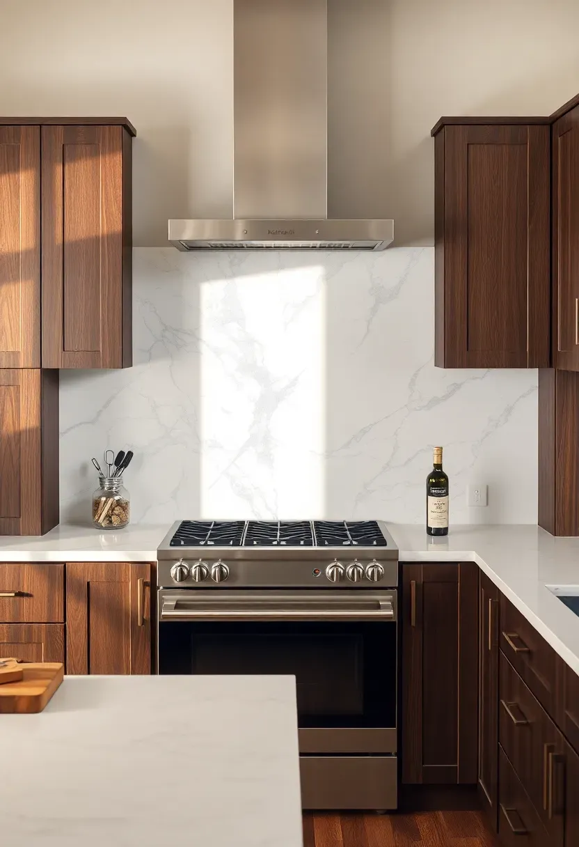
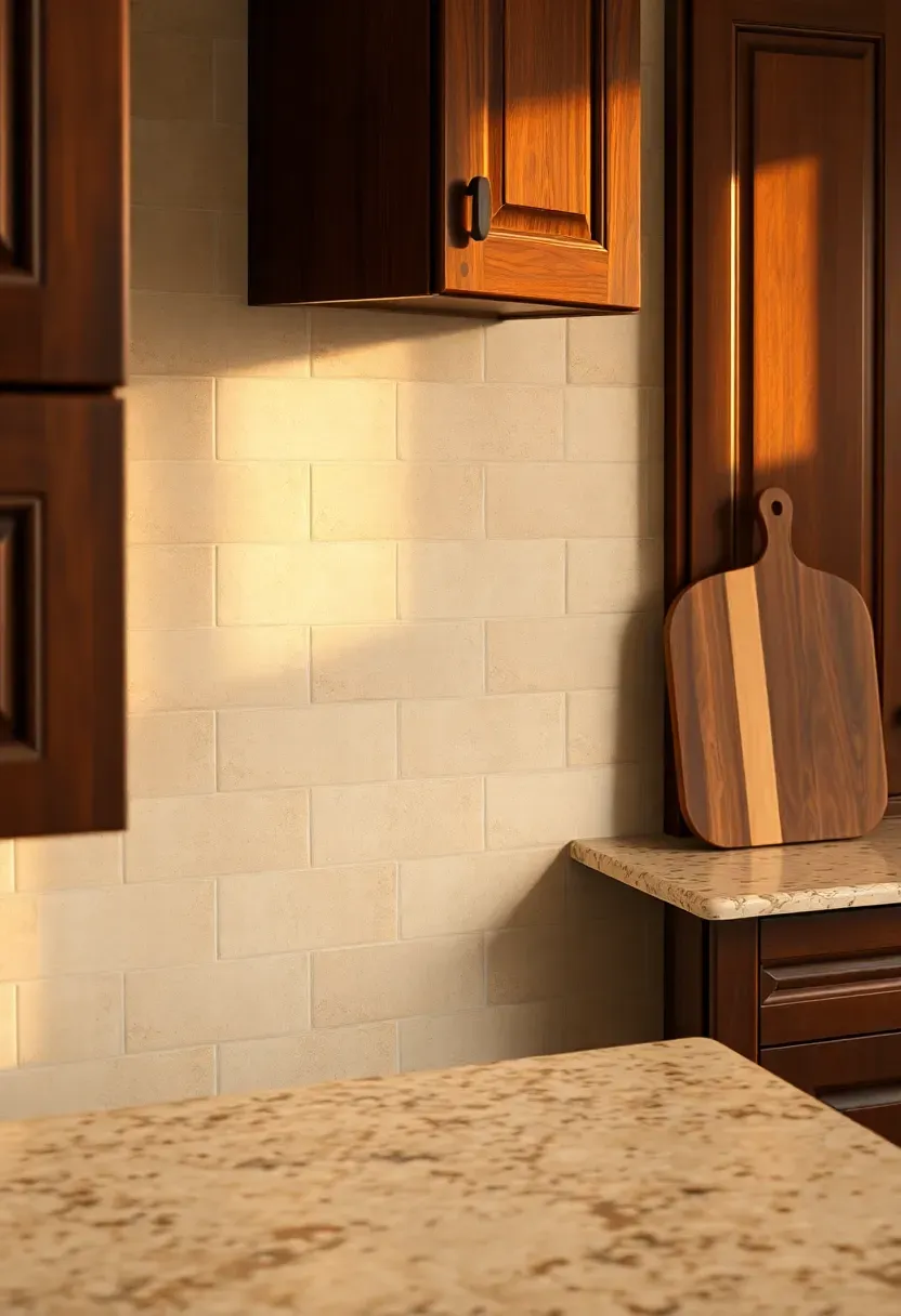
1. White Marble Slab
A full marble slab behind the range makes the backsplash disappear into the countertop when both are in the same white-gray family. With dark cabinets framing the stone on either side, the veining gets all the attention. No grout lines, no pattern breaks — just continuous stone. Calacatta with bold gray veins reads dramatic; Bianco Dolomiti with finer lines keeps things quieter.
Tips
- Seal marble every 6-12 months in a kitchen — it stains from oil and citrus
- Book-matched slabs cost more but create a mirror effect that is worth it behind the stove
- Honed finish hides water spots better than polished
We picked a few things that go well with this idea: STICKGOO Peel and Stick Backsplash (10 Sheets) (★4.4), STICKGOO White Subway Peel and Stick Tile (10 Sheets) (★4.2) and Smart Tiles 3D Peel and Stick Backsplash (5 Sheets) (★4.2). As an Amazon Associate we earn from qualifying purchases.
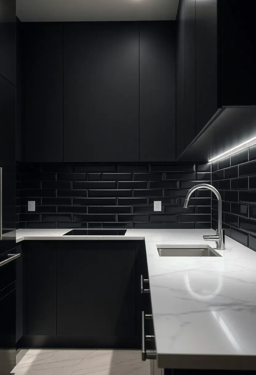
2. Matte Black Subway Tile
This one takes confidence. Black tile against dark cabinets could easily swallow the room, but the light countertop and right grout choice prevent that. Use a contrasting grout — medium gray or even white — so the individual tiles read as a pattern rather than a solid dark wall. The matte finish absorbs light instead of bouncing it, which gives the kitchen a softer, more grounded feel than gloss would.
Where it works best
Behind the range as a focal wall, not wrapped across every surface. Pair with open shelving on either side to break up the dark field. Under-cabinet lighting is not optional here — you need it to keep the workspace from feeling like a cave.
Pros and cons
Bold, easy to clean, inexpensive per square foot. But the dark-on-dark look requires enough natural light or strong task lighting. Small kitchens may feel closed in.
We picked a few things that go well with this idea: StyloVue White Marble Peel and Stick Tile (20 Sheets) (★4.6), STICKGOO Dolomite Mosaic Marble Look Tile (10 Sheets) (★4.5) and Vamos Tile Hexagon White Marble Mosaic (10 Sheets) (★4.4). As an Amazon Associate we earn from qualifying purchases.
3. Handmade Zellige in Warm White
Zellige tile has slight color variations and uneven surfaces baked into each piece — literally. That irregularity catches light differently throughout the day, which gives a warm white backsplash far more depth than factory-made tile. Against dark cabinets, it reads as creamy and organic rather than sterile.
Step-by-step selection
Step 1: Order samples from at least three suppliers. Zellige quality varies wildly and photos online never capture the texture accurately.
Step 2: Lay samples against your actual cabinet door and countertop. Warm whites shift toward yellow under incandescent bulbs — check in both natural and artificial light.
Step 3: Budget for 20% overage. These tiles chip during cutting and some arrive with imperfections too extreme to use.
Watch out
Zellige is porous. It needs sealing in a kitchen, and even sealed, it is less stain-resistant than glazed ceramic. Avoid placing it directly behind the stove without a proper seal coat.
We picked a few things that go well with this idea: Maasechs White Ceramic Bullnose Trim (10-Pack) (★5.0), Tenedos White Glossy Ceramic Bullnose Trim (5-Pack) (★4.0) and SUNWINGS Carrara Marble Pencil Liner Trim (10-Pack) (★4.3). As an Amazon Associate we earn from qualifying purchases.
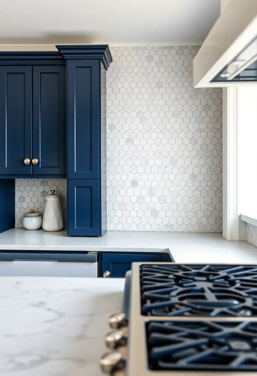
4. Hexagonal Carrara Mosaic
Small hexagon tiles in Carrara marble bring a bathroom-classic pattern into the kitchen, and against dark cabinets it looks surprisingly sophisticated rather than expected. The gray veining in each hex picks up any gray undertones in the cabinet finish. The scale is busy enough to add visual interest without competing with larger elements.
Tips
- 2-inch hexes work better than 1-inch for kitchen backsplashes — less grout, easier cleaning
- Use medium gray grout to define the pattern rather than white, which shows every splatter
- Pair with simple hardware so the wall texture stays the focal point
Recommended
Items for this idea
5. Vertical Stacked White Subway
Turning standard subway tile 90 degrees and stacking it vertically rather than in a running bond changes the entire feel. Vertical lines draw the eye upward and make ceilings feel taller. Against dark cabinets, the white columns of tile create strong visual rhythm. The contrast is crisp, almost architectural.
Why vertical over horizontal
Horizontal subway tile is everywhere. It reads as default. Vertical stacking uses the same material at the same price but looks intentional. The straight vertical grout lines also collect less kitchen grease than horizontal ones, since drips follow the joints rather than pooling in them.
Tips
- Take the tile to the ceiling if your layout allows — stopping at the cabinet line wastes the vertical effect
- Beveled subway tiles add shadow lines that make the pattern more dramatic
- Use unsanded grout in a color close to the tile for clean lines
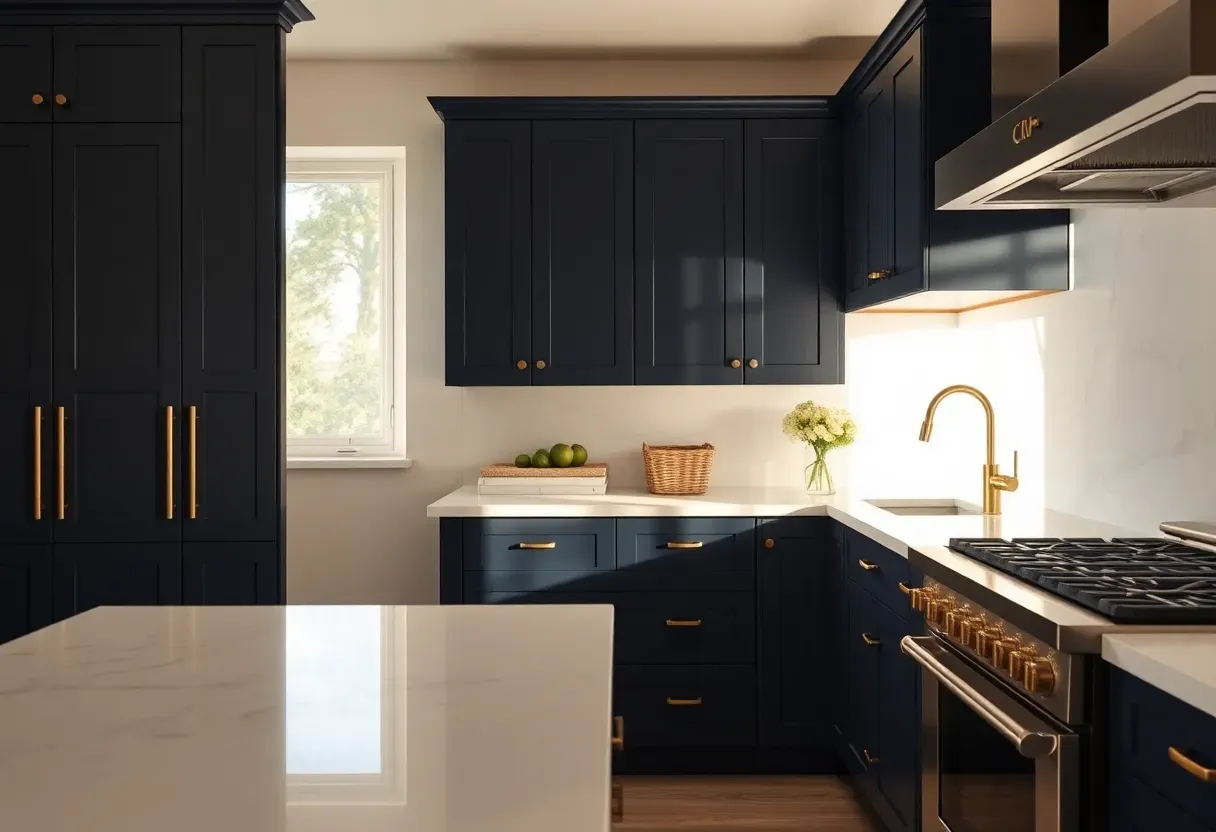
6. Brass and Antique Mirror Accent
Antique mirror glass panels combined with brass trim create a backsplash that belongs in a cocktail lounge — in the best way. The mirrored surface doubles the reflected light in the room, which counteracts the heaviness of dark cabinets. The antiquing (a chemical process that gives the mirror a clouded, aged look) prevents it from reading as a gym mirror.
How it works
Install the mirror panels behind the range with a brass or unlacquered brass frame. The warmth of brass ties in with light countertops that have warm undertones. For cooler counters (blue-veined marble, pure white quartz), switch to polished nickel trim.
Pros and cons
Dramatic, excellent at bouncing light, unique. But mirrors behind stoves need frequent cleaning. The antiqued finish hides some splatter but not all.
Recommended
Items for this idea
7. Cement Tile with Geometric Pattern
Patterned cement tile is where you introduce personality into a kitchen that already has strong contrast between dark cabinets and light counters. The trick: keep the pattern's color palette within the tones already present. Black-and-white geometric designs bridge the dark and light without adding a third color that might clash.
Choosing the right pattern
Star and cross patterns read as traditional and work with transitional kitchens. Linear geometric designs lean modern. Encaustic florals suit Mediterranean or eclectic spaces. The scale of the pattern matters — 8x8 inch tiles give you enough detail, while smaller formats can look fussy at backsplash height.
Tips
- Cement tile must be sealed before grouting and again after installation
- These tiles are thicker than ceramic, so plan for a thicker mortar bed
- Matte finish only — cement tile cannot be polished
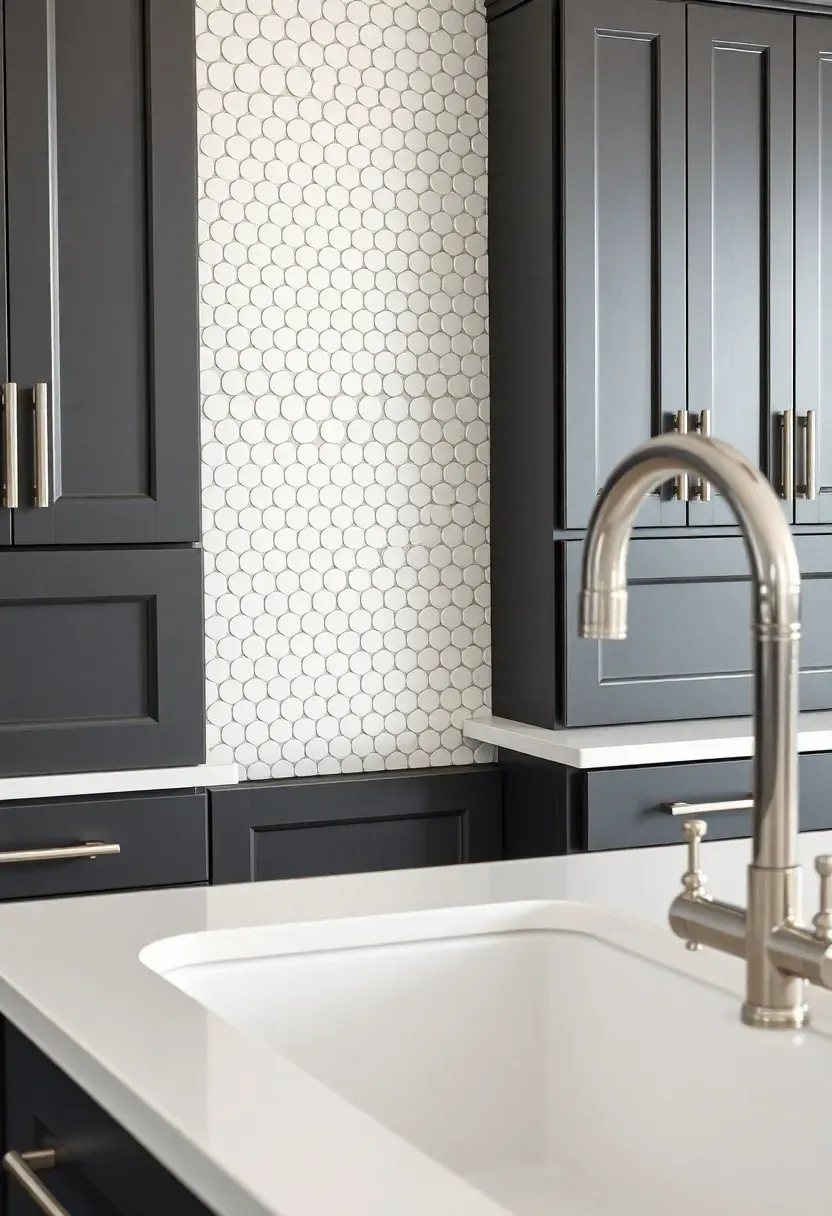
8. White Penny Round Mosaic
Penny rounds are small enough that the individual tiles almost disappear and what you see instead is texture. Lots of it. Against dark cabinets, a white penny round backsplash feels vintage and slightly playful without being loud. The round shape softens a kitchen that might otherwise feel too angular if the cabinet doors are flat-panel.
Tips
- Porcelain penny rounds outperform ceramic in kitchens — denser, less porous
- Dark grout turns this into a completely different look — polka dot rather than texture
- Sheet-mounted mosaic speeds up installation but check for alignment between sheets
Recommended
Items for this idea
9. Natural Quartzite Full Slab
Quartzite brings the veined look of marble with roughly twice the durability. A full slab backsplash in Taj Mahal or White Macaubas quartzite against dark wood cabinets creates a genuine stone gallery effect. The movement in the slab does the design work — no tile pattern needed, no color choices to agonize over. Just stone and contrast.
Quartzite vs. marble for backsplash
Quartzite resists heat better, scratches less, and handles acidic splashes without etching. It costs more upfront but you skip the ongoing sealing schedule that marble demands. For a backsplash behind a gas range where heat and grease hit the wall daily, quartzite is the more practical stone.
Choose quartzite if
- You cook frequently and hate maintenance
- Your countertop is already quartzite and you want a seamless stone look
- You want veining drama without marble anxiety
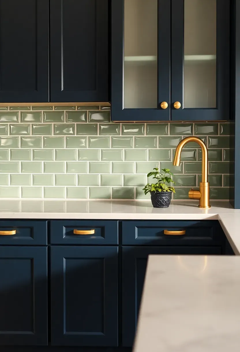
10. Sage Green Ceramic Field Tile
Green is the color that actually works in kitchens with dark cabinets when you want to add warmth without going neutral. Sage specifically — not emerald, not mint — sits in the muted middle ground that pairs with both warm and cool dark cabinet finishes. Against light countertops, it reads fresh and grounded.
Why sage and not other greens
Emerald competes with dark cabinets for attention. Mint looks dated. Hunter green on dark cabinets is too much darkness. Sage has enough gray in it to feel sophisticated and enough green to register as an actual color choice rather than a near-neutral.
Tips
- Glossy sage reflects more light and brightens the kitchen
- Matte sage feels earthier, better with natural wood or matte black cabinets
- Pair with brass or gold hardware to warm up the green
Recommended
Items for this idea
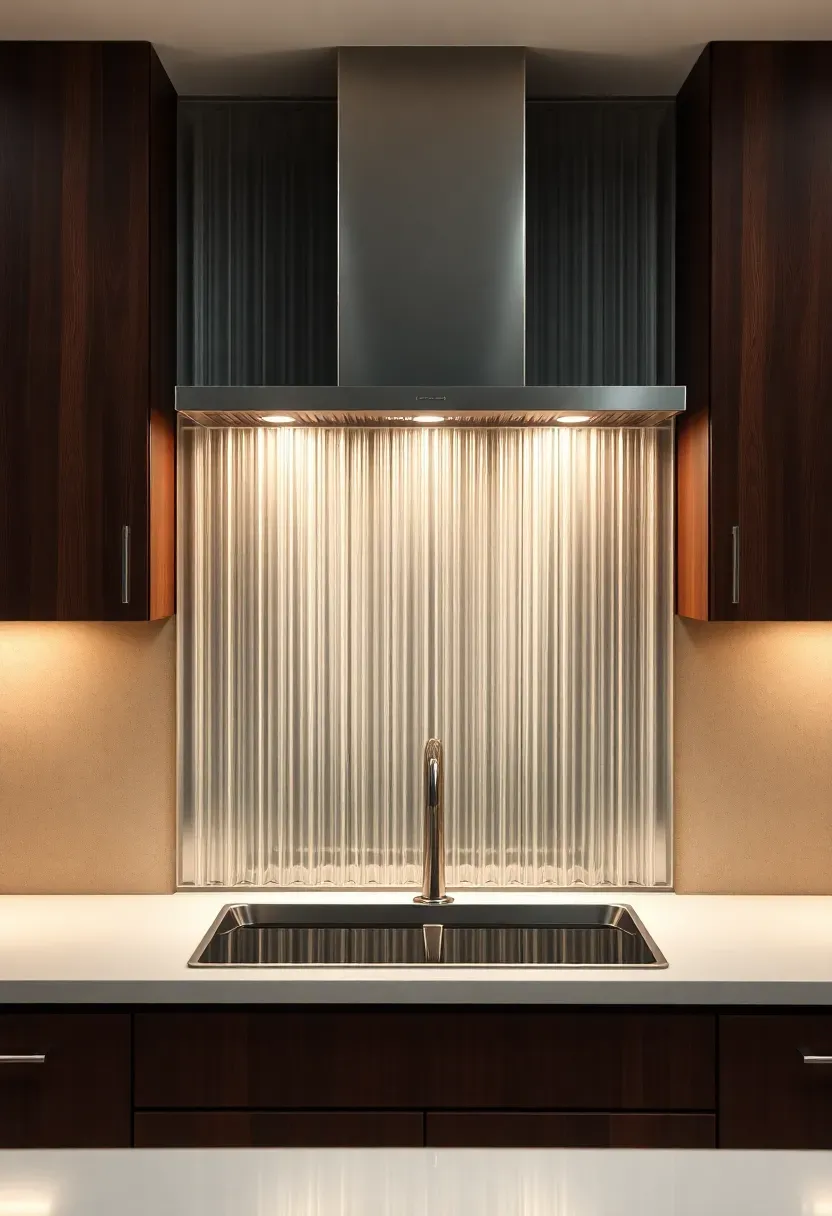
11. Fluted Glass Panel
Reeded or fluted glass installed as a backsplash panel creates vertical lines and light refraction that standard tile cannot match. The ridges catch overhead and under-cabinet lighting differently throughout the day. Against dark cabinets, fluted glass adds brightness and movement without introducing pattern or color.
Installation considerations
Step 1: Measure the backsplash area precisely — glass panels are cut to order and cannot be trimmed on site.
Step 2: Choose between back-painted glass (which adds solid color behind the ridges) and clear glass over a painted wall. Clear over white is the safest combination with dark cabinets.
Step 3: Install with construction adhesive and mechanical clips. Glass panels are heavy and need proper support behind them.
Watch out
Fluted glass shows fingerprints and grease more than tile. Budget for a daily wipe-down if it is near the stove. Also, it is not DIY-friendly — hire a glass installer.
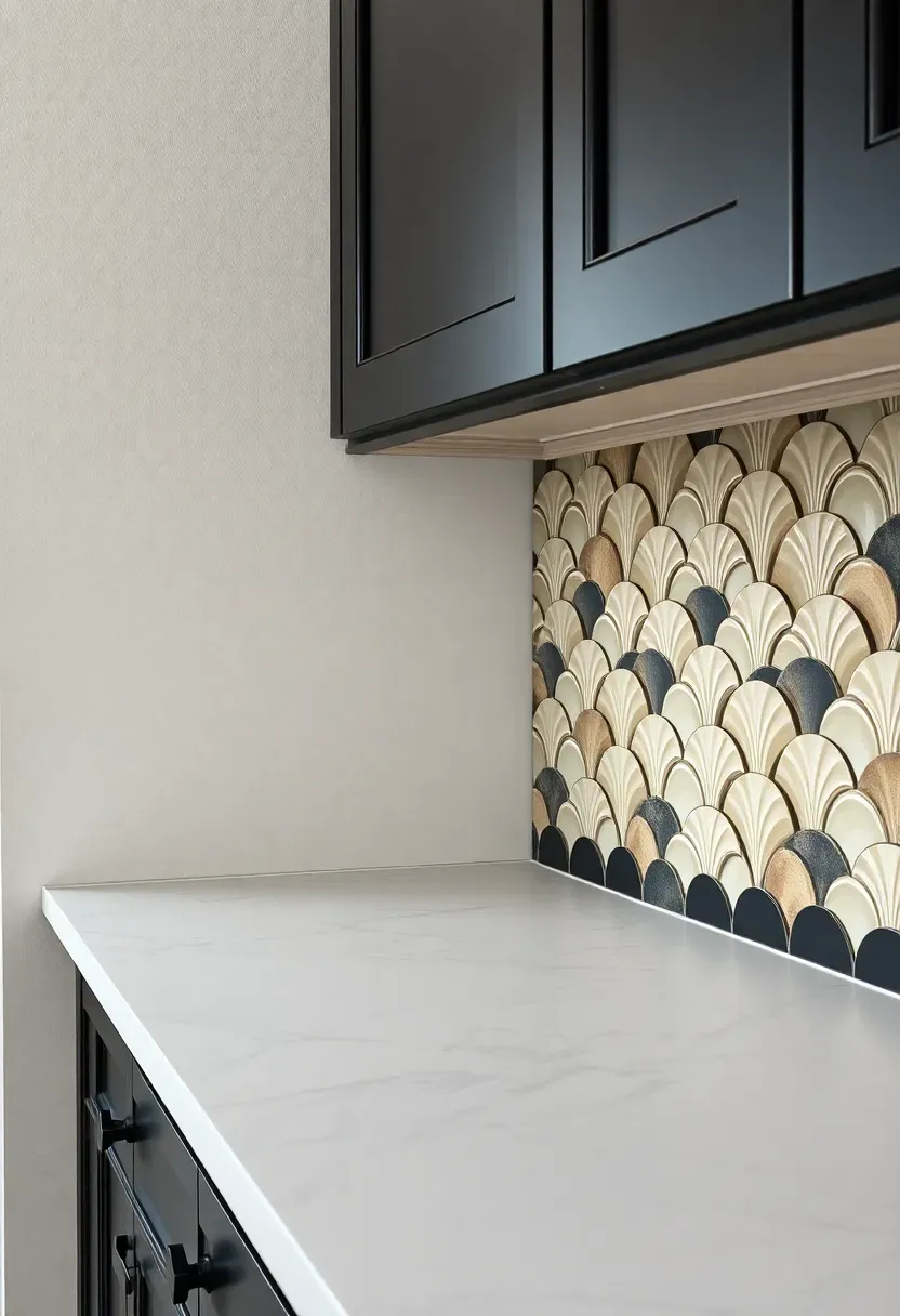
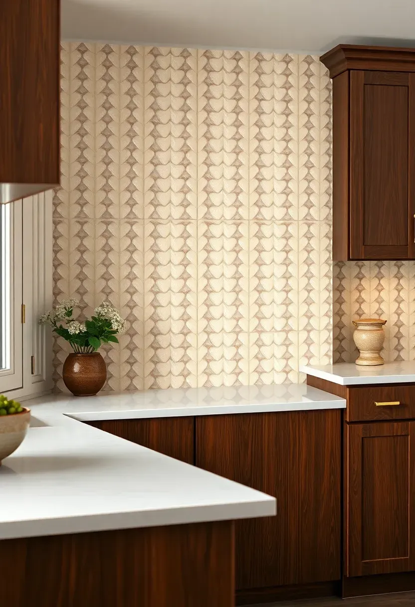
12. Moroccan Fish Scale in Ivory
Fan-shaped tiles arranged in overlapping rows create a scalloped pattern that reads as decorative without being busy. In ivory, the color stays neutral enough for dark cabinets while the shape does the visual work. Each tile catches light at a slightly different angle, which gives the wall depth that flat rectangular tiles lack.
Tips
- Fish scale tile has more grout lines per square foot than subway — choose grout color carefully
- Ivory with ivory grout creates a monolithic texture; ivory with gray grout emphasizes each scale
- The curved edges make corner installations tricky, so factor in extra labor cost
These pair particularly well with dark green, navy, or charcoal cabinets. Avoid pairing with black cabinets that have a purple undertone — the warm ivory may clash.
Recommended
Items for this idea
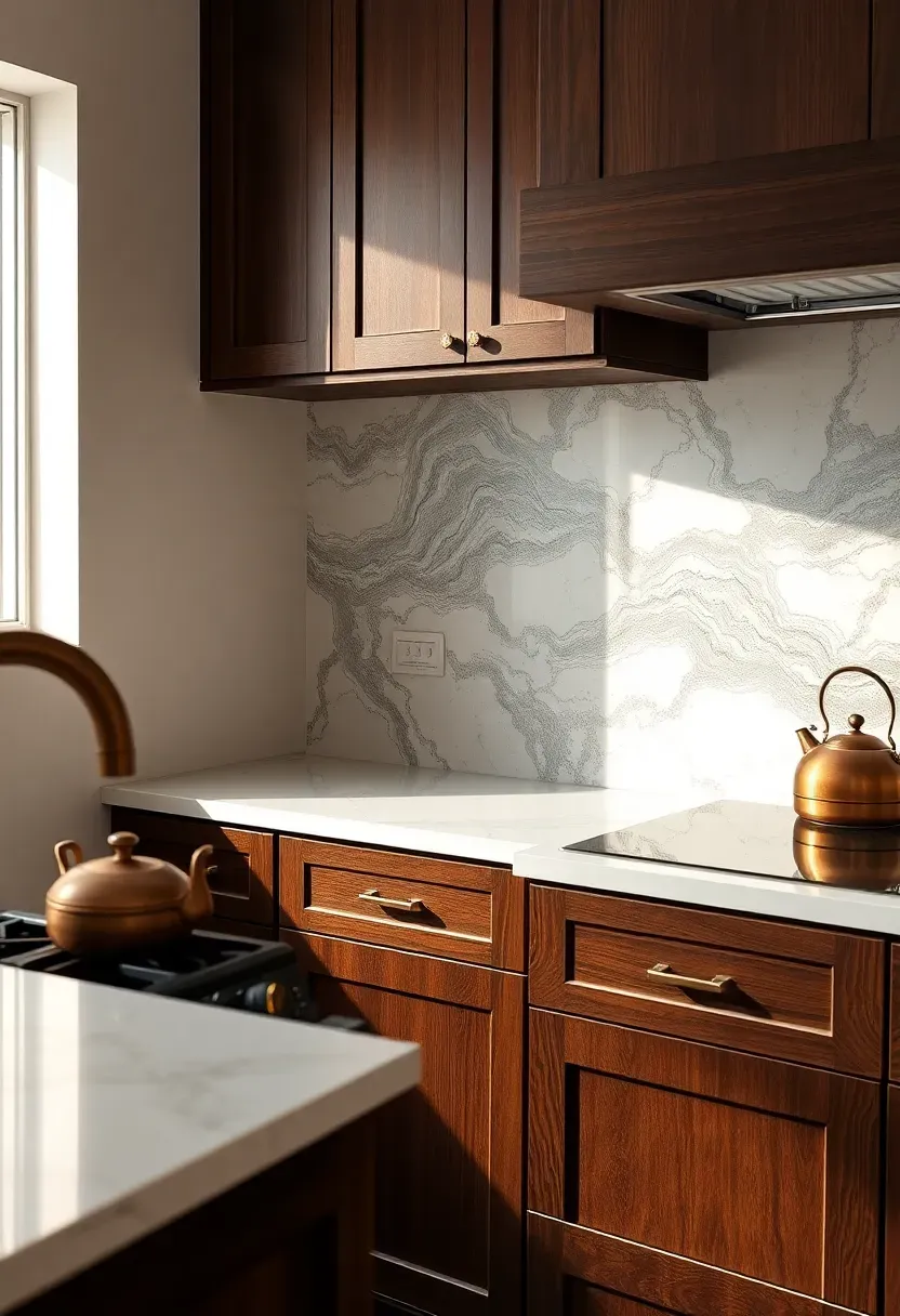
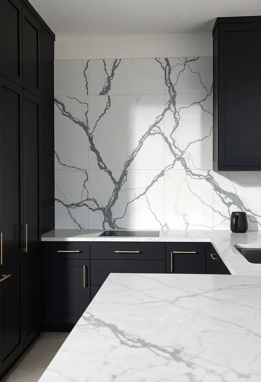
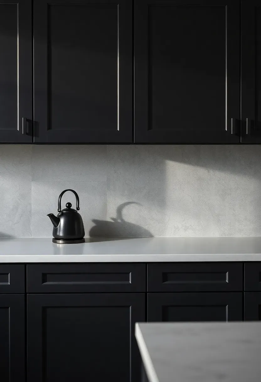
13. Dark Veined Porcelain Large Format
Large-format porcelain tiles (24x48 or larger) with dark gray veining split the difference between matching the dark cabinets and matching the light counter. The white or light gray base connects to the countertop. The dark veins echo the cabinet tone. One material does double duty.
Dark veined vs. light veined
Light veining on a white base is safer and brighter. Dark veining is more dramatic and ties the upper and lower zones of the kitchen together visually. In a kitchen with limited natural light, lean toward lighter veining. In a well-lit space, dark veining adds the depth that lighter options miss.
Recommendation
Go dark-veined if your cabinets are charcoal, navy, or black. If your cabinets are dark brown or dark green, lighter veining prevents the room from feeling too heavy.
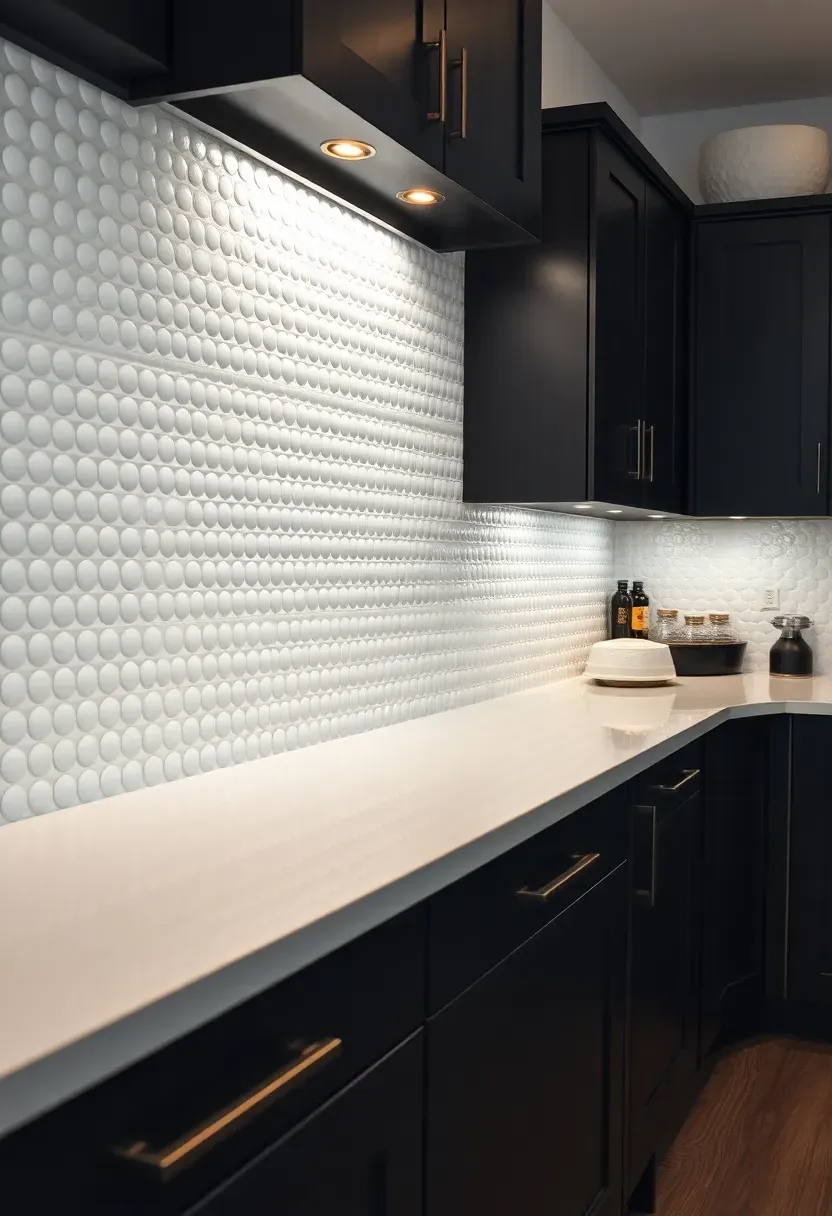
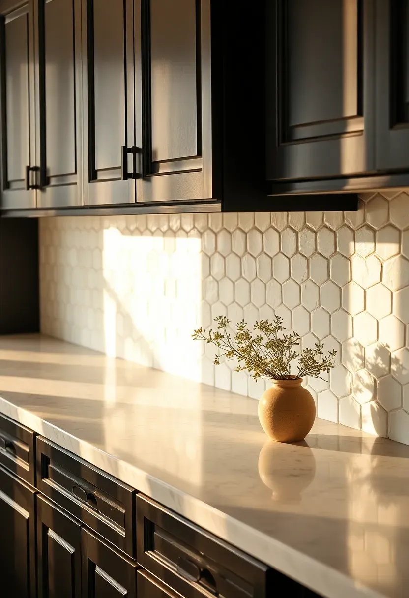
14. Beaded White Ceramic Tile
Beaded or dotted ceramic tile has small raised bumps across the surface that create shadow and texture under kitchen lighting. It is white tile that refuses to be boring. Against dark cabinets, the texture catches light and adds visual weight to the backsplash without color or pattern.
Tips
- The raised surface collects grease faster than flat tile — plan for more frequent cleaning near the stove
- Works best as a full backsplash rather than a small accent strip
- LED under-cabinet lights angled toward the wall maximize the shadow effect from the beading
Recommended
Items for this idea
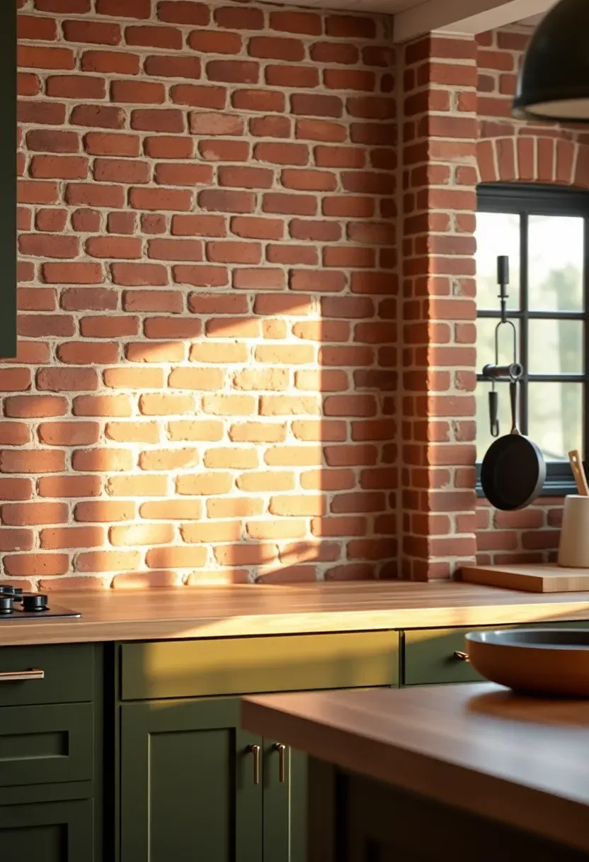
15. Exposed Brick with Clear Seal
If your kitchen has actual brick behind the drywall — and many pre-war apartments and older homes do — exposing it creates a backsplash with a texture that no tile can replicate. The warm red and brown tones of brick sit comfortably between dark cabinets and light counters, bridging the contrast naturally. Seal with a clear matte polyurethane to protect against grease and moisture.
The process
Removing drywall to expose brick takes a weekend. The brick underneath may need repointing (filling crumbling mortar joints) and a thorough cleaning before sealing. Budget $15-25 per square foot for professional restoration if the brick is in rough shape.
Pros and cons
Authentic, unique, adds warmth and character. But brick is porous even when sealed, the surface is uneven (harder to clean), and you cannot undo it without re-drywalling. Make sure you actually like the brick before committing.
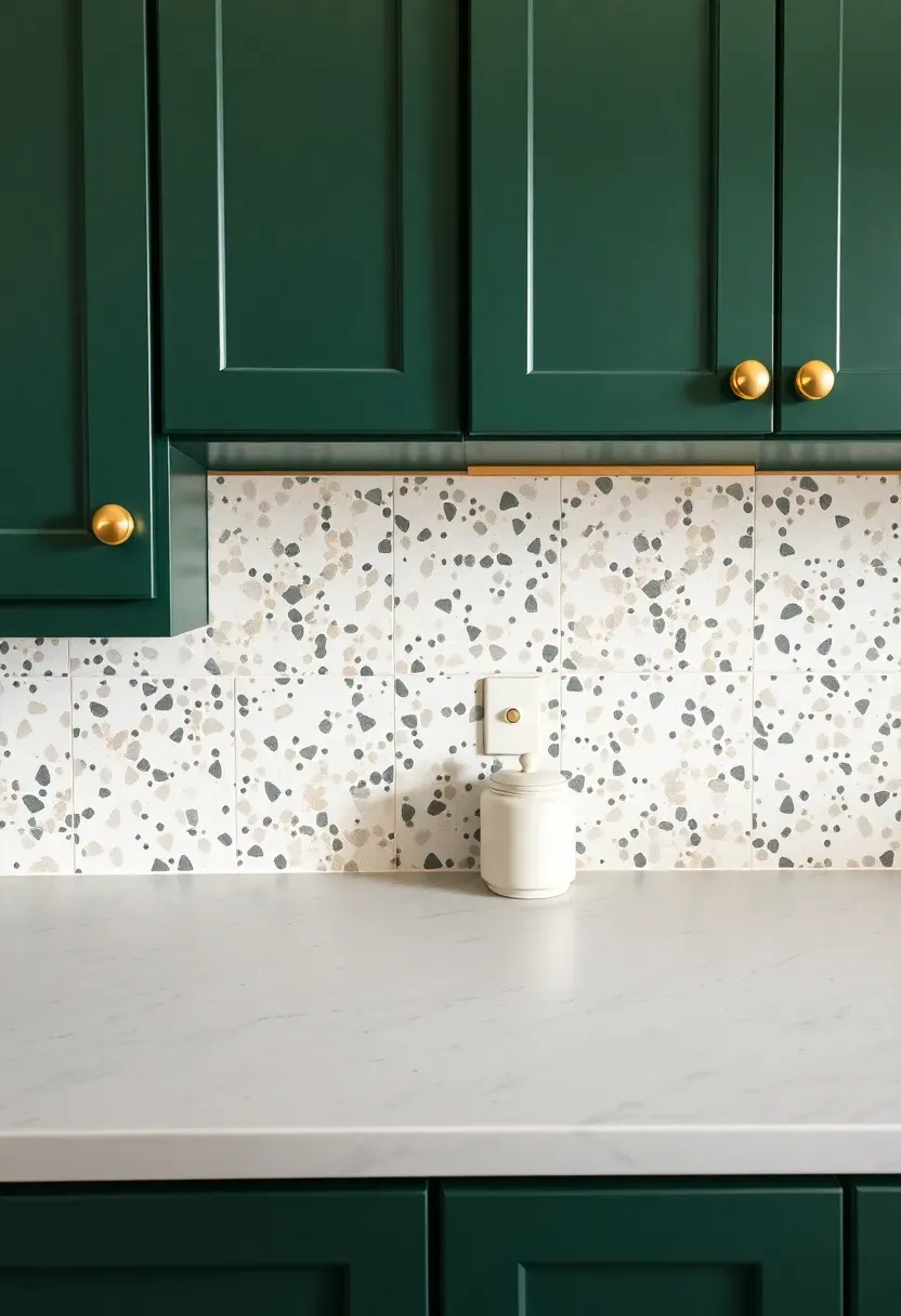
16. Terrazzo Look Tile in Neutral Tones
Terrazzo-style tiles bring speckled texture that reads as playful and modern. The scattered chips of color — usually in gray, cream, blush, and charcoal — create a surface that hides minor splatter while adding visual interest. Against dark cabinets, the light base brightens the backsplash zone while the colored chips tie in different tones from around the kitchen.
Tips
- Large-format terrazzo tiles (12x24 or bigger) look more contemporary than small squares
- Match at least one chip color to your cabinet finish for a cohesive look
- Rectified edges allow tight grout joints that keep the speckled pattern flowing across tiles
Recommended
Items for this idea
17. Elongated Picket Tile in Cream
Picket-shaped tile — the pointed-end version of subway — installed vertically creates a woven, almost textile-like pattern on the wall. In cream, it adds warmth without going full yellow. The elongated shape and pointed tips make this more visually interesting than standard rectangles, and the cream tone sits perfectly between dark cabinets and a light stone counter.
Cream vs. white
White picket tile reads crisp and modern. Cream reads warmer and slightly more relaxed. With dark cabinets, cream softens the contrast just enough to prevent the kitchen from looking like a tuxedo. If your countertop has warm undertones (cream marble, warm white quartz), cream picket is the better match.
Tips
- Vertical installation emphasizes height; horizontal creates width
- The pointed joints collect grout irregularly — use a skilled tile setter
- Glossy cream reflects more light and brightens dark cabinet kitchens
18. Soapstone Slab Backsplash
Soapstone has a matte, chalky surface and a gray-green color that darkens naturally over time with mineral oil application. As a backsplash slab behind dark cabinets, it introduces a third tonal layer between the dark lower zone and the light counter. The stone is naturally non-porous, so it handles kitchen splatter without sealing.
How soapstone compares
| Feature | Soapstone | Marble | Granite |
|---|---|---|---|
| Sealing needed | No | Yes, regularly | Yes, annually |
| Heat resistance | Excellent | Fair | Good |
| Stain resistance | High | Low | Medium |
| Cost per sq ft | $70-120 | $40-180 | $35-100 |
Choose soapstone if
- You want a natural stone that requires minimal maintenance
- Your kitchen leans industrial, farmhouse, or Scandinavian
- You like the idea of a surface that develops patina over years
Recommended
Items for this idea
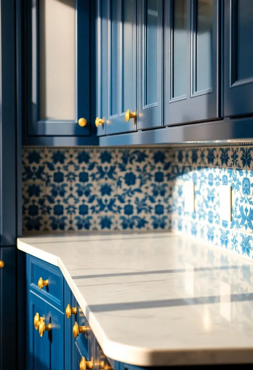
19. Blue and White Patterned Ceramic
Hand-painted or digitally printed blue-and-white ceramic tiles bring a Mediterranean or Delft influence that pairs surprisingly well with dark cabinets. The white base keeps the backsplash bright. The blue pattern adds personality without introducing a jarring color — blue reads as a near-neutral in most kitchens.
Selecting the right pattern
Smaller, denser patterns look busy at close range but blend into texture from across the room. Larger motifs read as individual tiles and work better in open kitchens where the backsplash is visible from a distance. Mix pattern tiles with solid white spacer tiles if you want the look without overwhelming the wall.
Tips
- Pair with brass or copper hardware for warmth against the cool blue
- Navy cabinets plus blue-and-white tile works only if the blues are different enough in tone
- Matte-finish tiles hide fingerprints better than glossy
20. Limestone Field Tile
Limestone has a soft, matte texture and warm beige-to-cream coloring that sits quietly between dark cabinets and light counters. It doesn't call attention to itself, which is sometimes exactly what a kitchen needs. The stone surface has subtle fossil marks and natural variation that give it character without pattern.
Step-by-step care
Step 1: Seal limestone before grouting — the stone absorbs moisture and grout pigment if left unprotected.
Step 2: Clean with pH-neutral stone cleaner only. Acidic cleaners (vinegar, lemon-based products) etch the surface permanently.
Step 3: Reseal every 12-18 months, or sooner if water stops beading on the surface.
Watch out
Limestone scratches more easily than granite or quartzite. In a backsplash zone (where contact is minimal), this is rarely an issue. But avoid placing it behind a knife block or anywhere it might get bumped regularly.
Recommended
Items for this idea
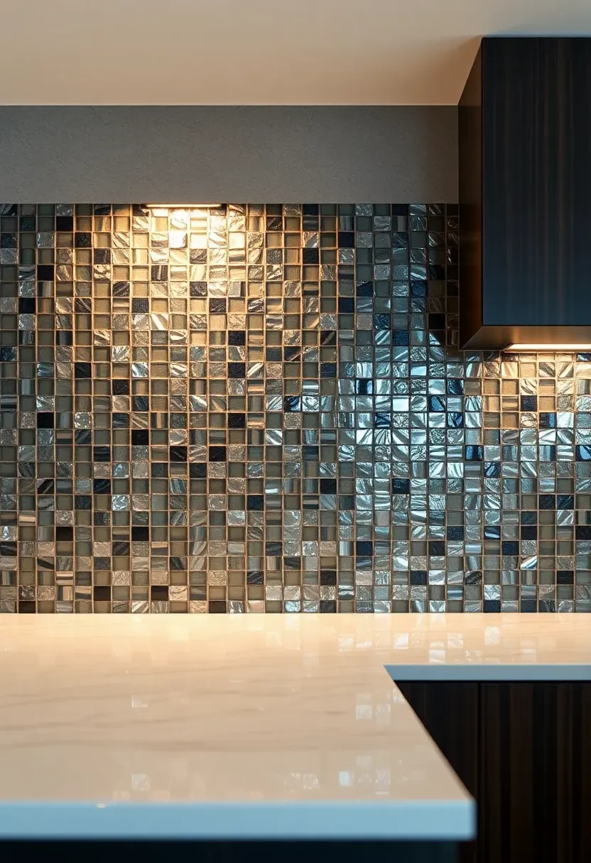
21. Smoked Glass Mosaic
Smoked glass tile in mixed charcoal, silver, and clear tones creates a shimmering backsplash that shifts with the light. The transparency of glass means the wall color behind it affects the final look — paint the wall white before tiling for maximum brightness. Against dark cabinets, the reflective surface bounces light around the kitchen and prevents the dark tones from feeling heavy.
Tips
- Glass tile requires a white thin-set adhesive; gray mortar shows through translucent tiles
- Smaller mosaic pieces (1x1 or 2x2 inch) create more light refraction than larger formats
- Mix clear, frosted, and smoked pieces in the same sheet for depth
Glass mosaic cleans easily and resists staining, making it one of the most practical options on this list alongside one of the most visually dynamic.
Quick FAQ
Which backsplash color works best with dark cabinets and light countertops? White and cream are the safest choices because they extend the brightness of the countertop upward and let the dark cabinets frame the room. But sage green, soft blue, and warm gray all work when you want more personality — just keep the tone muted enough that it does not compete with the existing contrast.
Should the backsplash match the countertop or the cabinets? Neither perfectly. The best backsplashes bridge the two — picking up a secondary tone from the countertop or echoing the cabinet color at a lighter value. Matching the counter exactly looks flat. Matching the cabinets makes the room too dark in the middle zone.
How do I prevent a kitchen with dark cabinets from feeling too dark? The backsplash does a lot of the heavy lifting here. Choose a light-colored or reflective material (glass, glossy tile, polished stone) and install strong under-cabinet LED lighting aimed at the wall. The reflected light from the backsplash brightens the entire work surface.
Is subway tile too basic for dark cabinets? Subway tile only reads as basic in the standard white, horizontal, running bond layout. Change the orientation (vertical stack), the color (sage, cream, black), or the finish (handmade, beveled, crackle glaze) and it becomes a different material entirely.
Do I need to take a backsplash sample home before deciding? Always. Photos and showroom lighting distort color. Hold the sample against your actual cabinet door and countertop at different times of day. What looks perfect under showroom LEDs may shift warm or cool under your kitchen's specific light conditions.
Dark cabinets and light countertops give you a built-in framework — the contrast is already there, which means the backsplash can either amplify it, soften it, or add a new layer. The material you choose says something about how you use the kitchen and how you want it to feel. Marble is for someone who does not mind maintenance in exchange for beauty. Cement tile is for someone who wants their kitchen to have a point of view. Penny rounds are for someone who likes texture more than pattern. Pick the one that matches how you actually cook and live, not just how it photographs.
Pinterest cover for 21 Backsplash Ideas for Dark Cabinets and Light Countertops
About the author
OBCD
CGI visualization and interior design content. We create detailed 3D renders and curate practical design ideas for every room in your home.