21 Backsplash Ideas for White Cabinets
White cabinets are essentially a blank check for the backsplash. No color clash to worry about, no undertone conflict to manage. That freedom is the problem, actually — with everything on the table, choosing gets harder, not easier. I have seen people spend months picking a backsplash for white cabinets because nothing feels wrong enough to eliminate. The best approach is to decide what job you want the backsplash to do. Should it add warmth? Introduce color? Create texture you can feel from across the room? Once you answer that, the material list shrinks fast.
Here are 21 options organized by material and visual impact, from quiet neutrals to backsplashes that take over the room on purpose.
Table of Contents
- Emerald Green Glazed Ceramic
- Honed Carrara Marble Slab
- Terracotta Square Tile
- Navy Blue Subway Tile
- Chevron Marble Mosaic
- Handmade Zellige in Sage
- Stainless Steel Sheet
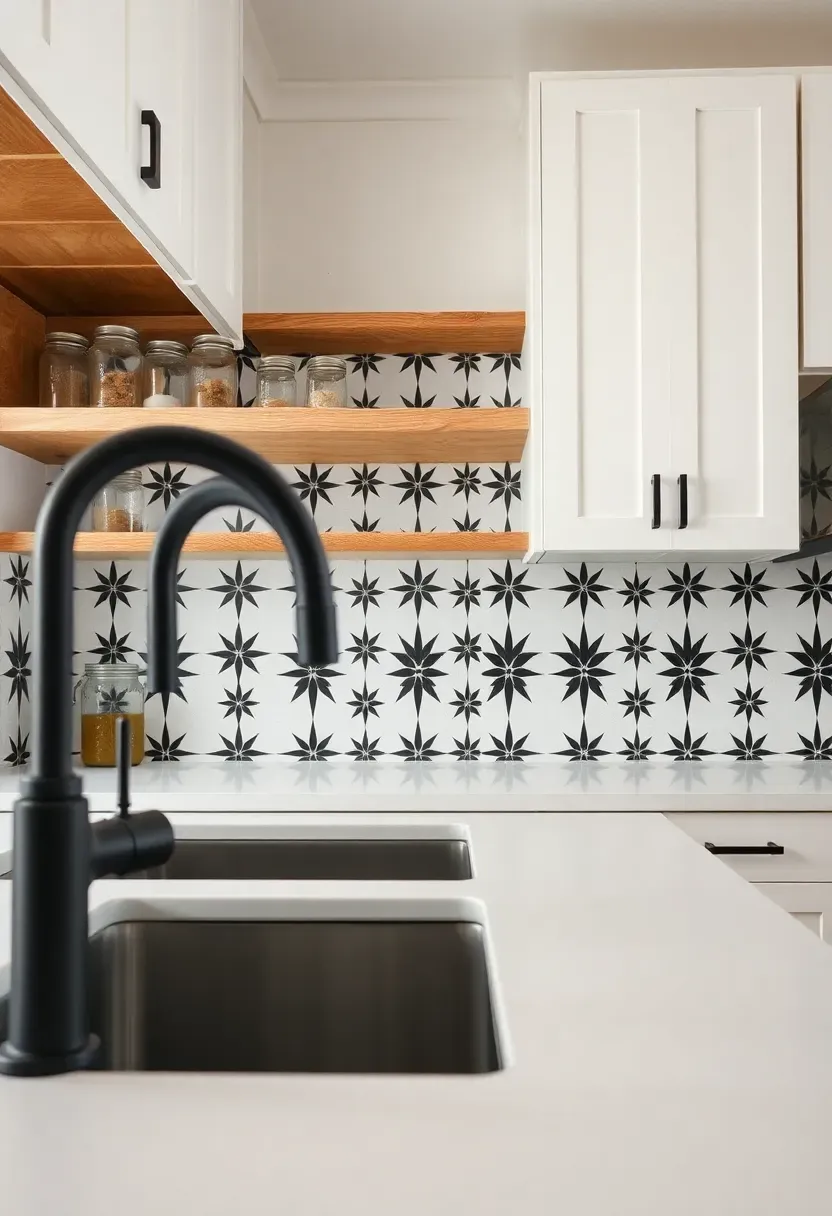
- Black and White Encaustic Cement
- Basketweave Marble Mosaic
- Textured White Brick Veneer
- Warm Wood-Look Porcelain Plank
- Arabesque Lantern Tile in Dusty Rose
- Polished Brass Metal Tile
- Tumbled Limestone in Honey
- Vertical Ribbed Porcelain Panel
- Glass Tile in Smoky Gray
- Patterned Portuguese Azulejo
- Slate Ledger Panel
- Penny Round in Matte Black
- Concrete-Effect Large Format Tile
- Reclaimed Wood Plank
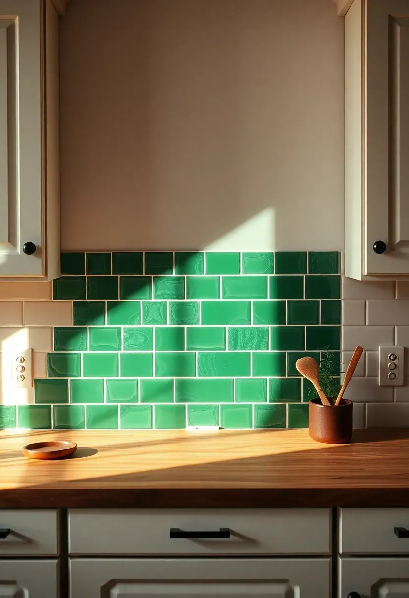
1. Emerald Green Glazed Ceramic
Green against white is one of those combinations that looks richer in person than in photos. The glaze on these tiles catches overhead light and creates depth that flat paint never could. Emerald specifically — not mint, not sage — brings enough saturation to read as intentional without veering into theme-restaurant territory. Pair it with warm countertops like butcher block or walnut and the kitchen feels grounded and alive rather than sterile.
Tips
- Look for tiles with slight glaze variation between pieces — the pooling effect adds character
- White grout keeps the look fresh; dark grout makes each tile pop individually
- Limit green to the backsplash zone only — extending it to the full wall dilutes the impact
We picked a few things that go well with this idea: STICKGOO Peel and Stick Backsplash Tile (10-Sheet) (★4.4), STICKGOO White Subway Peel and Stick Tile (10-Sheet) (★4.2) and Art3d Glossy White Subway Tile (102-Piece) (★4.4). As an Amazon Associate we earn from qualifying purchases.
2. Honed Carrara Marble Slab
A single slab of Carrara behind the range makes the backsplash feel like a piece of the geology rather than a decorating choice. The honed (matte) finish absorbs light softly instead of reflecting every under-cabinet LED. Against white cabinets, the gray veining provides enough contrast to keep things from looking washed out, while still maintaining that all-white kitchen atmosphere.
Why honed over polished
Polished marble shows every water droplet, fingerprint, and grease splatter within seconds. Honed marble hides these marks until your next scheduled wipe-down. In a working kitchen — especially behind a stove — that difference matters daily. The tradeoff is that honed marble absorbs stains slightly faster, so sealing twice a year is non-negotiable.
Pros and cons
Timeless, seamless, no grout lines to scrub. But marble etches from acidic foods, requires regular sealing, and costs $40-80 per square foot installed depending on your region.
We picked a few things that go well with this idea: Art3d Smoothing Tool Kit for Backsplash (★4.6), WRAPXPERT Smoothing Tool Kit for Tile (★4.6) and Storystore Tile Leveling System (800-Piece) (★4.5). As an Amazon Associate we earn from qualifying purchases.
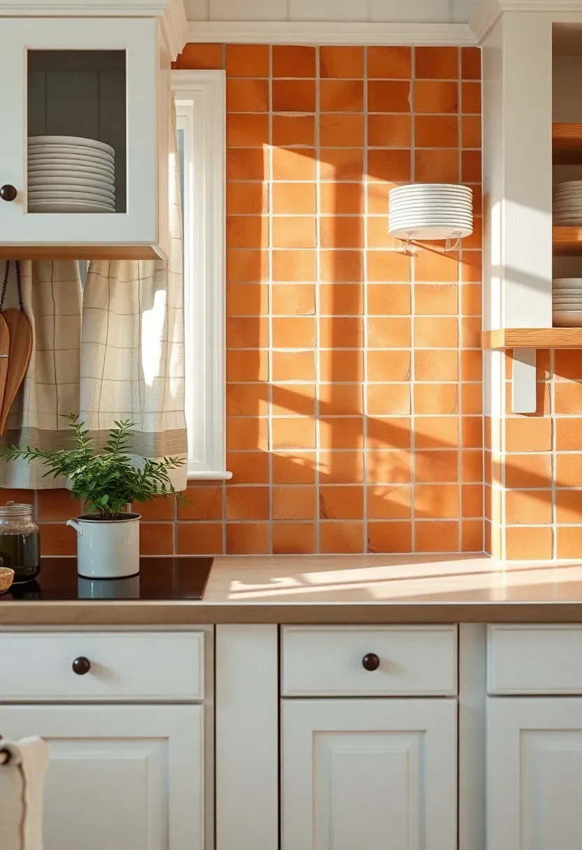
3. Terracotta Square Tile
Terracotta pulls a white kitchen away from the clinical end of the spectrum and pushes it somewhere warmer and more lived-in. The material has been used in Mediterranean kitchens for centuries, and it carries that association whether you want it to or not — which is mostly a good thing. Each tile varies slightly in color from pale peach to deep rust, so the wall develops a natural patchwork effect.
Step-by-step selection
Step 1: Decide between sealed and unsealed. Sealed terracotta is easier to maintain but loses some of the matte, chalky texture that makes the material appealing.
Step 2: Choose your format. 4x4 squares are traditional. 6x6 squares read slightly more modern. Anything larger starts looking like floor tile on the wall.
Step 3: Test a sample against your actual white cabinets. Terracotta with yellow-toned whites looks cohesive. With blue-toned whites, the clash can feel awkward.
Watch out
Unsealed terracotta absorbs oil and water like a sponge. Behind a stovetop, staining is guaranteed without sealant. Apply a penetrating sealer before installation and re-coat annually.
We picked a few things that go well with this idea: Weiman Granite Stone Sealer Spray (24oz) (★4.5), Miracle Sealants 511 Penetrating Sealer (Pint) (★4.5) and Granite Gold Water-Based Sealer Spray (24oz) (★4.5). As an Amazon Associate we earn from qualifying purchases.
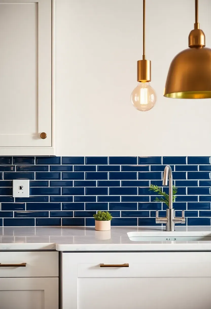
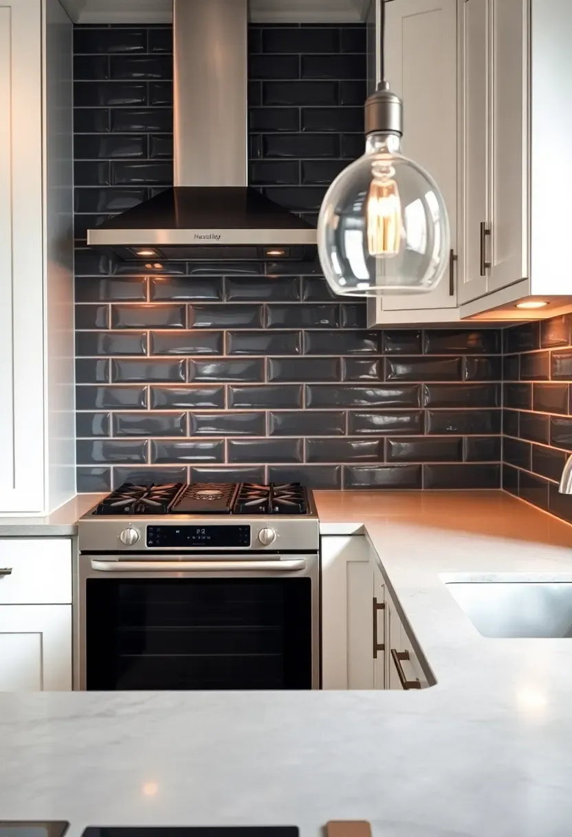
4. Navy Blue Subway Tile
Navy reads almost as a neutral against white, which is why this combination shows up in coastal homes, traditional kitchens, and modern apartments equally. The standard 3x6 subway format keeps installation costs reasonable and means any tile setter can handle the job without specialty cuts. White grout between navy tiles creates a crisp grid pattern that has a preppy, clean-lined quality.
Tips
- Glossy navy reflects more light and feels brighter; matte navy absorbs light and feels moodier
- Run the tile all the way to the ceiling for maximum impact in galley kitchens
- Brass or gold hardware warms up the navy-and-white palette; chrome keeps it cooler
Recommended
Items for this idea
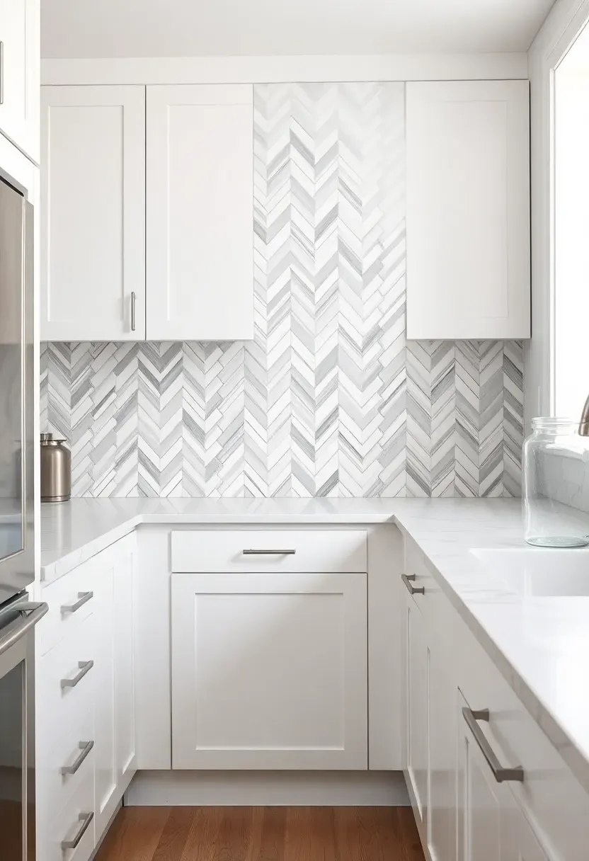
5. Chevron Marble Mosaic
Chevron patterns create directional movement on the wall — the V-shapes draw the eye upward or toward a focal point depending on orientation. In marble, the pattern gets additional complexity because the veining in each piece runs at an angle to the cut. Against white cabinets, a white-and-gray chevron mosaic adds visual interest without introducing any new color. It is busy enough to be interesting but tonal enough to stay calm.
Chevron vs. herringbone
People mix these up constantly. Chevron tiles are cut at an angle so the zigzag forms a clean point. Herringbone uses rectangular tiles arranged in a staggered V — the ends are blunt. Chevron is slightly more refined. Herringbone is slightly more forgiving during installation.
Tips
- Smaller chevron tiles (1x3 inches) create a more delicate pattern suited to small kitchens
- Match your grout color to the lightest stone in the mosaic for a seamless look
- Pre-mounted mesh sheets make installation manageable for a skilled DIYer
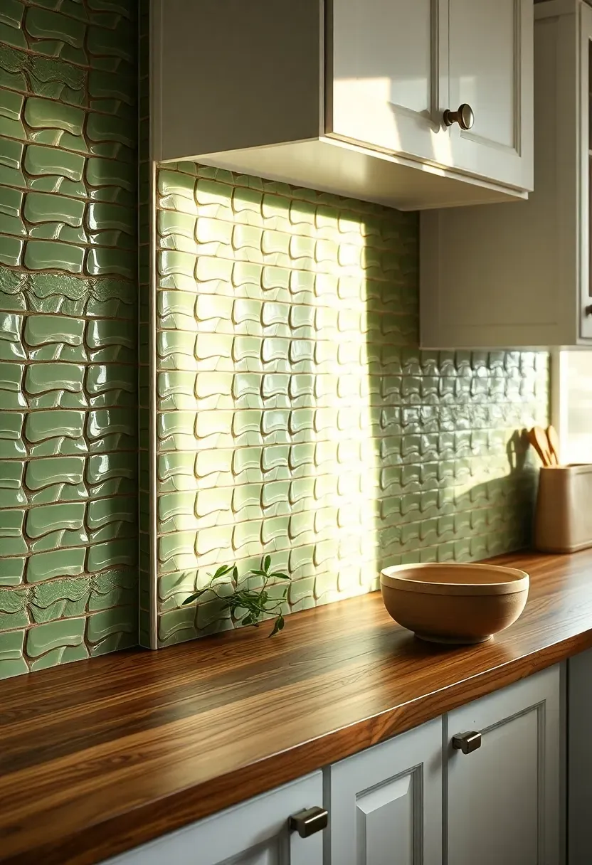
6. Handmade Zellige in Sage
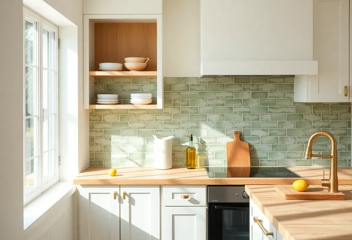
Zellige tile from Morocco has surface irregularities baked into every piece — ripples, color shifts, uneven glaze pooling. That is the point. In sage green against white cabinets, these imperfections read as organic and calming rather than sloppy. The color sits between green and gray, so it complements both warm and cool whites without committing fully to either direction.
Why handmade matters here
Factory-made tile in a similar sage color would look flat. The handmade variation means the backsplash changes character throughout the day as light moves across it. Morning sun picks up the lighter tiles. Evening light deepens the green. You get a wall that genuinely shifts, which is rare in a kitchen.
Pros and cons
Beautiful texture, unique character, conversation-starting. But zellige is porous, chips easily during cutting, and costs $15-30 per square foot before installation. Order 20% extra.
Recommended
Items for this idea
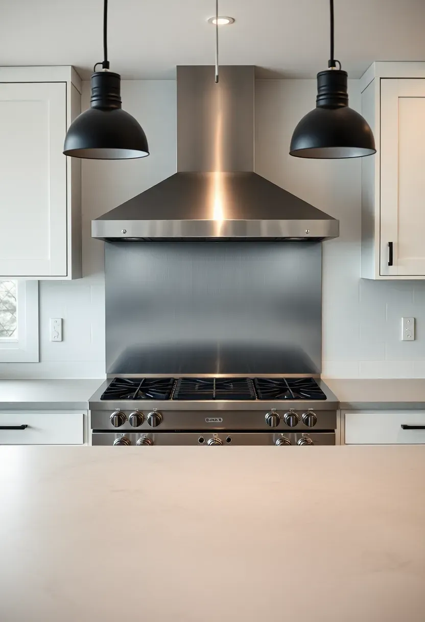
7. Stainless Steel Sheet
A single sheet of stainless steel behind the range is what professional kitchens use, and bringing that into a residential kitchen with white cabinets gives the space an industrial edge without a full renovation. No grout lines means no scrubbing grout. Grease wipes off with a damp cloth. The reflective surface bounces light around the room, which helps in kitchens with limited natural light.
Tips
- Brushed finish hides fingerprints and scratches better than mirror-polished
- Have the sheet custom-cut to fit your exact backsplash dimensions — seams look cheap
- Magnetic stainless lets you hang utensils, timers, or recipe cards directly on the backsplash
8. Black and White Encaustic Cement
Encaustic cement tiles use colored pigment pressed into the tile body rather than applied as a surface glaze. The result is a pattern that goes all the way through — it does not wear off. Black and white geometric designs against white cabinets create a focal wall that feels European and collected. The matte surface absorbs light instead of bouncing it, which keeps the pattern from overwhelming the room.
Choosing the right pattern
Star-and-cross designs read traditional. Simple linear geometry leans modern. Floral encaustics feel Mediterranean. For white cabinets, stick to patterns where white dominates — a mostly-black tile against white cabinets creates too much contrast in small kitchens.
Watch out
Cement tile is thicker than ceramic (usually 5/8 inch), so your installer needs to account for the extra depth. It requires sealing before grouting and again after installation. Not suitable for behind-range applications without heat-resistant sealant.
Recommended
Items for this idea
9. Basketweave Marble Mosaic
Basketweave is a pattern you see in old hotel lobbies and prewar apartment bathrooms. Bringing it into the kitchen backsplash space feels slightly unexpected, which is the appeal. The woven-look pattern creates visual texture without strong directional lines. In white-and-gray marble against white cabinets, it adds just enough pattern to prevent the kitchen from reading as flat.
Tips
- White Thassos marble with gray Bardiglio dots is the classic basketweave combination
- Honed finish is easier to maintain than polished in a kitchen setting
- Keep the rest of the kitchen simple — basketweave does enough visual work on its own
10. Textured White Brick Veneer
Thin brick veneer applied to the backsplash wall gives a white kitchen the rough-edged character of exposed brick without the structural commitment. Painted or lime-washed white, it creates a tone-on-tone effect with white cabinets that is interesting because of texture rather than color contrast. You feel the wall more than you see it as a separate element.
How it works
Brick veneer tiles are typically 1/2 inch thick and install over a scratch coat of thinset, similar to standard tile. They can be left in their natural red-brown state and painted, or purchased pre-finished in white. Lime wash gives a softer, more weathered result than paint.
Pros and cons
Adds texture and warmth, reasonably affordable, works with farmhouse and industrial styles. But the rough surface collects grease and dust more than smooth tile. Cleaning requires a stiff brush rather than a simple wipe.
Recommended
Items for this idea
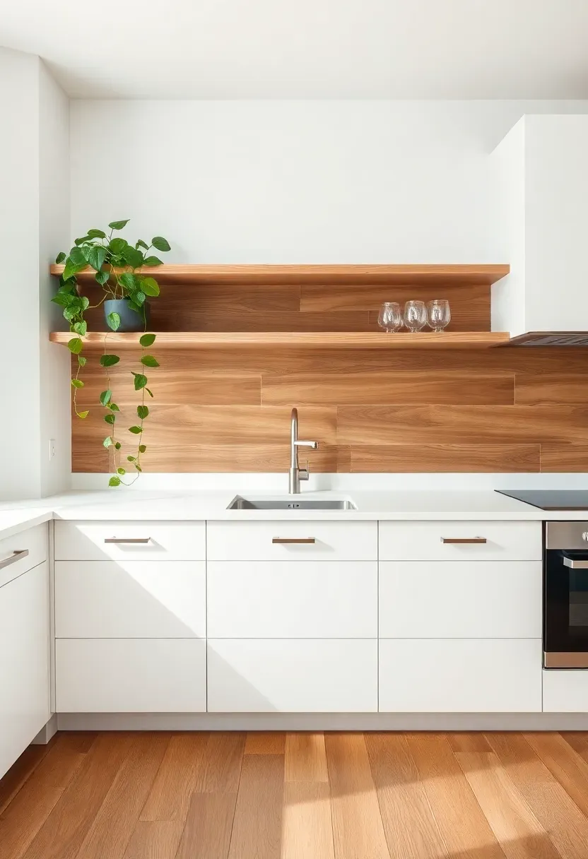
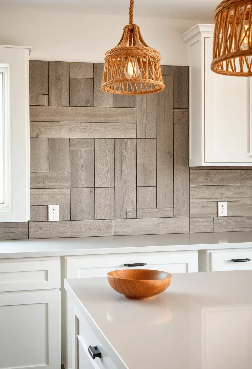
11. Warm Wood-Look Porcelain Plank
Real wood behind a stove is risky. Porcelain tile that mimics wood grain gives you the same warmth without the fire and moisture concerns. Against white cabinets, a walnut- or oak-toned porcelain plank backsplash introduces warmth that the rest of the kitchen lacks. The planks can run horizontally for a shiplap feel or vertically for a more contemporary look.
Tips
- Choose planks with varied tones within each tile — single-color wood-look tiles read obviously fake
- Rectified edges allow tighter grout joints, which makes the planks look more like actual wood
- Match the wood tone to other elements — flooring, open shelving, or a wooden range hood surround
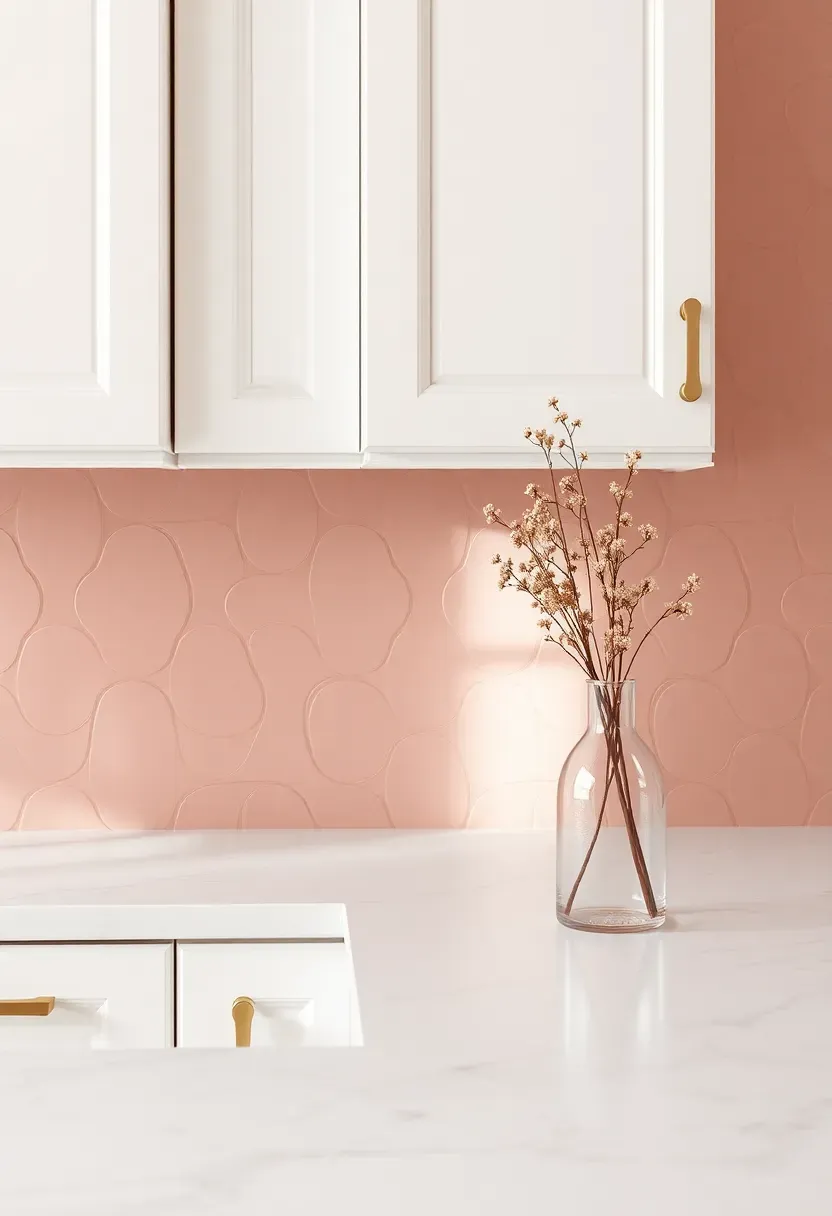
12. Arabesque Lantern Tile in Dusty Rose
The lantern shape (also called arabesque) has curved edges that break the grid pattern most kitchens rely on. In dusty rose — a muted pink that leans toward mauve — these tiles add a warmth and softness that white kitchens often lack. Against white cabinets, the color reads subtle rather than bold. It is pink enough to notice but not pink enough to dominate.
Step-by-step installation plan
Step 1: Start layout from the center of the most visible wall and work outward. Arabesque shapes do not tile evenly to edges, so cuts along the perimeter need to be balanced.
Step 2: Use matching pink or light gray grout. White grout creates too much visual separation between the curved shapes.
Step 3: Apply to the backsplash zone only. Wrapping arabesque tile around corners or onto adjacent walls overcomplicates the pattern.
Watch out
The curved edges mean more grout surface area than rectangular tile. Expect slightly more cleaning effort in the grout lines.
Recommended
Items for this idea
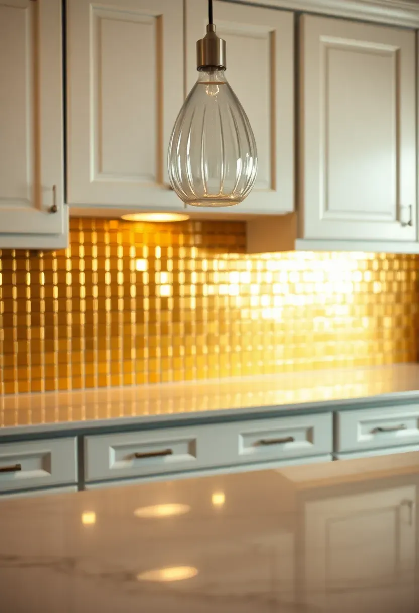
13. Polished Brass Metal Tile
Metal tile in brass finish turns the backsplash into a reflective accent wall. Against white cabinets, brass reads warm and slightly glamorous — more art deco than farmhouse. Small-format squares or stacked rectangles work best. The reflective surface bounces light in unexpected directions, which makes the kitchen feel larger and more dynamic.
Tips
- Real brass tiles develop a patina over time, which some people love and others hate — decide before committing
- Lacquered brass tiles maintain their polished look but cannot be re-patinated if you change your mind
- Pair with restrained hardware in the same brass tone — mixing metals is fine but keep proportions intentional
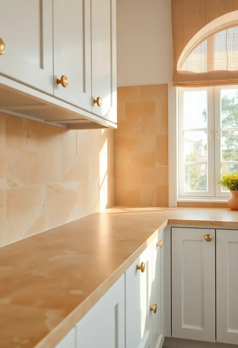
14. Tumbled Limestone in Honey
Tumbled limestone has softened edges and a chalky matte surface that gives it an ancient quality. In honey tones — warm gold with occasional fossil marks and natural pitting — it pulls a white kitchen toward a Provençal or Tuscan direction. The warmth of the stone prevents the all-white scheme from feeling cold, especially in kitchens with northern exposure or limited natural light.
Limestone vs. travertine
Both are calcium-based stones, but travertine has visible holes (which get filled during processing) while limestone has a tighter grain. Tumbled limestone is slightly smoother to the touch. For a backsplash, limestone is easier to clean because it has fewer surface voids where grease can collect.
Pros and cons
Warm, natural, ages gracefully. But limestone is soft, scratches easily, and etches from citric acid. Seal it religiously and keep lemon juice away from the wall.
Recommended
Items for this idea
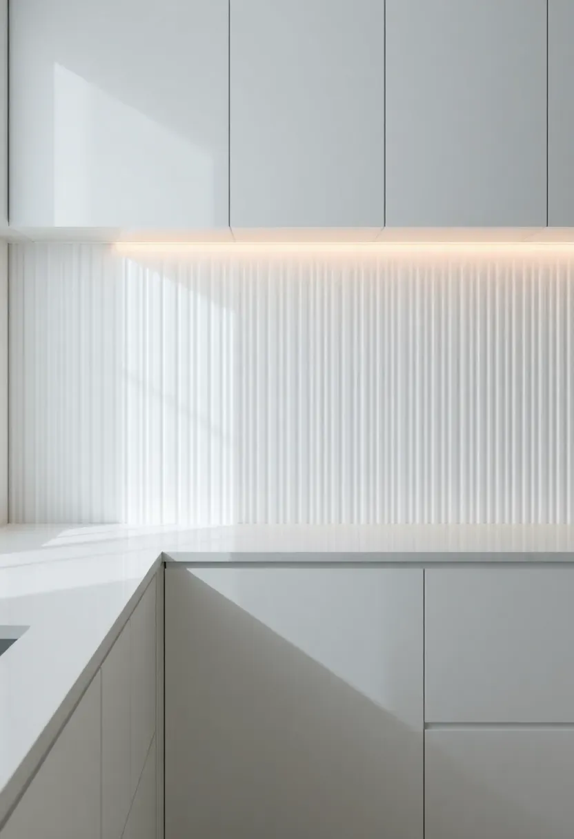
15. Vertical Ribbed Porcelain Panel
Large-format porcelain panels with a ribbed or fluted surface create backsplash texture through shadow lines rather than color or pattern. In white against white cabinets, the effect is architectural — the ridges catch light from different angles and create subtle stripes that shift throughout the day. It is one of the quietest backsplash choices that still reads as intentional and designed.
Tips
- Panels come in sizes up to 10 feet long, which means the backsplash can be a single piece with no seams
- Vertical ribs draw the eye up and make standard 8-foot ceilings feel taller
- Pair with under-cabinet lighting positioned to cast light across the ribs for maximum shadow effect
16. Glass Tile in Smoky Gray
Glass tile has a depth to it that ceramic cannot match — light passes into the material rather than just bouncing off the surface. In smoky gray, that translucency creates a moody, slightly mysterious quality against white cabinets. The gray darkens when wet and lightens as it dries, so the backsplash actually changes tone when you splash water on it while cooking.
Why glass works in kitchens
Glass is non-porous. Nothing soaks in — no stains, no odors, no bacteria. Cleaning is a glass cleaner and a paper towel. The material resists heat, though direct flame contact should still be avoided.
Tips
- Subway format in glass gives a familiar shape with an unfamiliar material
- Avoid clear glass tile — it shows the adhesive behind it
- Glass tile requires a white thinset mortar; gray thinset shows through and changes the color
Recommended
Items for this idea
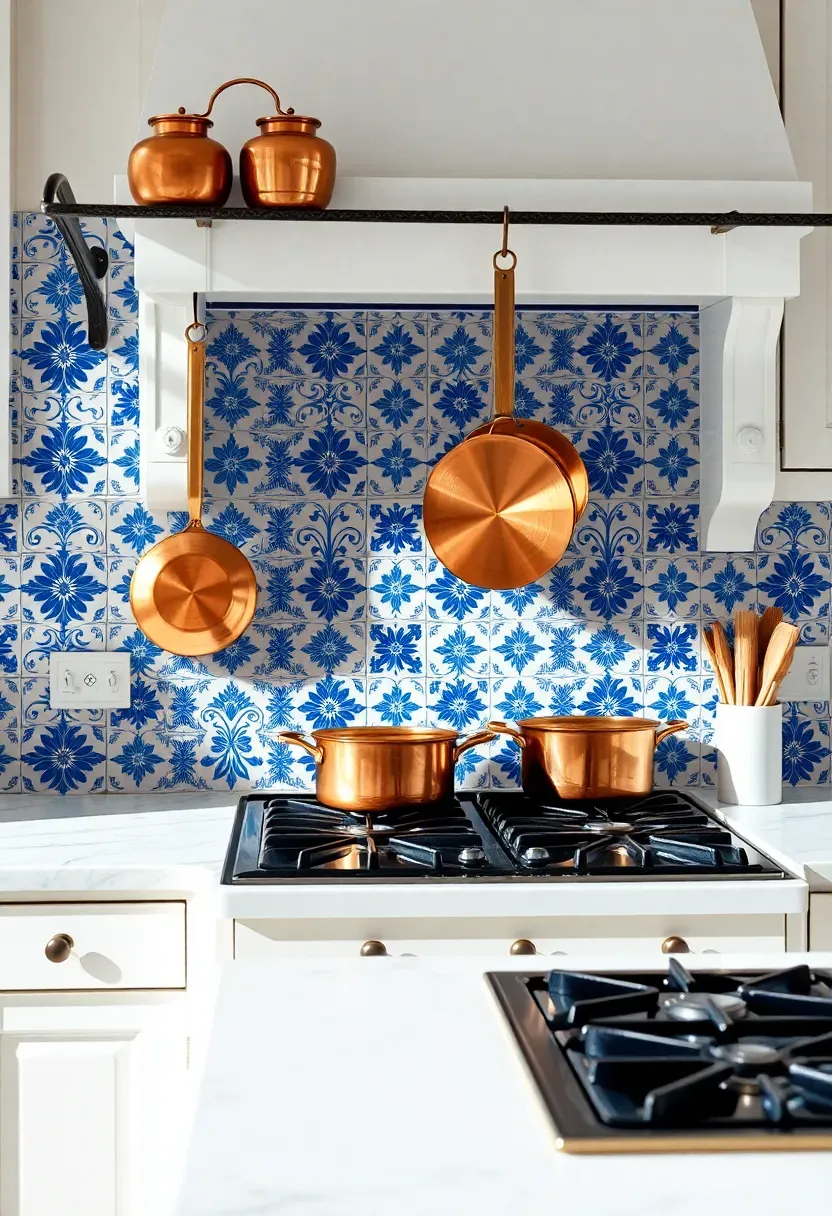
17. Patterned Portuguese Azulejo
Azulejo tiles have been made in Portugal since the 15th century. The hand-painted blue-and-white patterns range from simple geometric repeats to elaborate scenes with figures and landscapes. Behind white cabinets, even a busy azulejo pattern stays grounded because the blue-and-white palette ties directly into the cabinet color. It looks collected and intentional, like you brought the tiles back from a trip to Lisbon.
Choosing authentic vs. reproduction
Original antique azulejo tiles are available through salvage dealers but are expensive and irregular in thickness. Modern reproductions from Portuguese manufacturers like Viuva Lamego or Cortico & Netos maintain traditional techniques at a fraction of the cost. Screen-printed imitations from big-box stores are cheaper still but lack the slight imperfections that make azulejo tiles worth using.
Watch out
Hand-painted tiles may not be food-safe for surfaces that contact food directly. Behind a range is fine. As a countertop, check the glaze specification first.
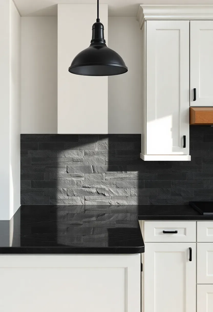
18. Slate Ledger Panel
Split-face slate ledger panels bring raw, geological texture to a white kitchen. The stone surface is genuinely rough — you can run your hand across it and feel the ridges. That tactile quality is exactly what most white kitchens lack. The dark gray and charcoal tones of natural slate create strong contrast with white cabinets without introducing color beyond the neutral spectrum.
Pros and cons
Dramatic texture, natural material, hides minor wall imperfections behind it. But the rough surface is nearly impossible to clean behind a cooktop. Grease gets into every crevice. Install slate ledger on side walls or above open shelving, and use a smooth, cleanable material directly behind the range.

Recommended
Items for this idea
19. Penny Round in Matte Black
Black penny rounds against white cabinets create a graphic, high-contrast look that feels more intentional than basic black subway tile. The round shape softens the contrast — something about circles reads friendlier than rectangles. Matte black absorbs light, so the backsplash recedes slightly rather than competing with everything else in the room.
Step-by-step approach
Step 1: Order mesh-mounted sheets for faster installation. Individual penny rounds are impractical for backsplash work.
Step 2: Use charcoal grout — not white. White grout with black penny rounds creates a polka-dot effect that looks playful in a bathroom but juvenile in a kitchen.
Step 3: Test the sheet layout dry before applying thinset. Alignment between mesh sheets is where most installation problems show up.
Watch out
The many grout lines mean more maintenance. A grout sealer applied after installation reduces staining and makes regular cleaning easier.
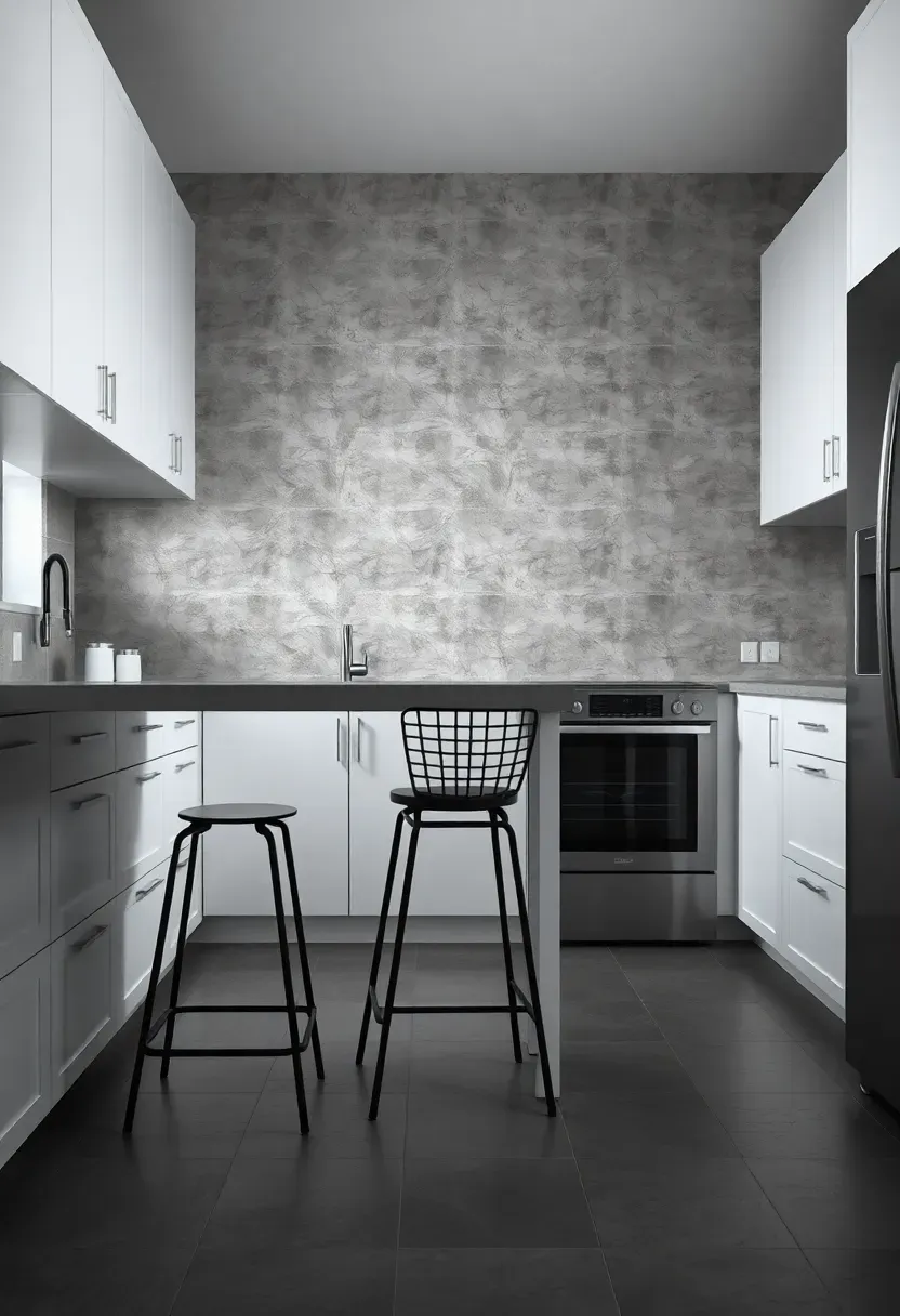
20. Concrete-Effect Large Format Tile
Large format porcelain tiles (24x48 inches or bigger) that mimic poured concrete give white kitchens an industrial backbone without the hassle of actual concrete. The minimal grout lines — sometimes just two or three across the entire backsplash — create a nearly seamless surface. The gray concrete look against white cabinets is a contrast that feels urban and contemporary.
Tips
- Larger tiles require flatter walls — check for level before installation and skim-coat if needed
- Matte finish looks more like real concrete than satin or polished
- Pair with stainless or black hardware; brass hardware against concrete-look tile can feel like a style conflict
Recommended
Items for this idea
21. Reclaimed Wood Plank
Reclaimed wood planks — barn board, old fencing, salvaged flooring — mounted as a backsplash bring warmth, history, and imperfection to a white kitchen. The weathered gray and brown tones of aged wood create contrast that feels organic rather than designed. Each plank has its own nail holes, saw marks, and color variations, so the wall develops a collage effect naturally.
How to make it practical
Raw reclaimed wood behind a stove is a fire and moisture risk. Solve both problems: apply a clear polyurethane sealant rated for kitchen use, and install a tempered glass panel over the wood section directly behind burners. The glass protects the wood while keeping the visual effect intact. Alternatively, limit the wood to wall sections away from the range and use a complementary tile behind the cooktop.
Pros and cons
Unique character, environmentally friendly, conversation piece. But sourcing quality reclaimed wood takes effort, boards need to be kiln-dried to kill insects, and the sealed surface still requires more care than ceramic tile.
Quick FAQ
Which backsplash color works best with pure white cabinets? Almost anything works, which is both the advantage and the challenge. Soft greens, navy, warm grays, and natural stone tones are the most reliable choices. Avoid colors that are close to white but slightly off — cream tile against bright white cabinets can look like a mistake rather than a choice.
Do I need to match the backsplash to my countertop? Not necessarily. The backsplash can complement or contrast the countertop. What matters more is that the backsplash, countertop, and cabinet white all work within the same temperature family — warm whites together, cool whites together. Mixing warm and cool tones is where combinations start looking disjointed.
How far up the wall should a backsplash go? Standard height is from the countertop to the bottom of the upper cabinets — usually 15 to 18 inches. Taking tile to the ceiling creates a more dramatic effect and is worth considering if you have open shelving or no upper cabinets on a wall. Going halfway up a wall with no cabinet above it looks unfinished.
Is peel-and-stick backsplash tile worth considering? For renters or as a temporary fix while saving for a permanent backsplash, yes. The quality of peel-and-stick tile has improved significantly. It will not fool anyone up close, but from a few feet away, the better products look reasonable. Expect to replace it every 2-3 years as the adhesive weakens from heat and moisture.
Can I mix two different backsplash materials in one kitchen? You can, but keep it to two materials maximum and give each a clear zone. A common approach: decorative tile behind the range as a focal point, and a simpler tile on the remaining backsplash walls. Using the same grout color across both materials helps unify the look.
White cabinets give you permission to take risks on the backsplash that darker kitchens cannot absorb. The safest path is a white-on-white combination with texture doing the work, but the more interesting kitchens tend to be the ones where someone picked a color or material that made them slightly nervous. Trust that instinct. A backsplash covers a small area relative to the whole room — even a bold choice stays proportional when the cabinets, counters, and floor are already neutral.
Pinterest cover for 21 Backsplash Ideas for White Cabinets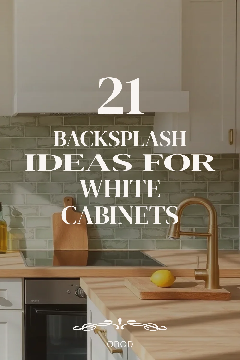
About the author
OBCD
CGI visualization and interior design content. We create detailed 3D renders and curate practical design ideas for every room in your home.