29 Minimalist Pastel Living Room Ideas That Feel Calm and Modern
Looking for minimalist pastel living room ideas that actually work in a rental apartment? A pastel living room combines the calming essence of soft hues with the intentional simplicity of minimalist design, creating spaces that feel both serene and sophisticated. Gentle colors like blush pink, sage green, powder blue, lavender, and warm cream can transform even a small living room into a tranquil retreat without sacrificing modern style or functionality.
The beauty of pastel minimalism lies in its versatility and renter friendliness: these muted tones provide warmth and character while maintaining the airy, uncluttered aesthetic that defines minimalist interiors. Whether you're working with a compact apartment or a spacious open-concept living area, soft pastel color schemes can expand visual space, soften architectural edges, and create cohesion through thoughtful color blocking or monochromatic layering.
What makes this calming pastel living room approach particularly appealing is its balance between visual interest and restraint. Unlike bold color schemes that dominate, pastels work subtly to enhance natural light, highlight architectural details, and create an atmosphere of effortless calm. Below, we share 29 minimalist pastel living room ideas covering every color from sage to lavender, with tips on undertones, saturation, and materials so you can confidently pick the right palette for your space.
Quick FAQ
What pastel colors work best in a minimalist living room?
Sage green, dusty rose, powder blue, lavender, and warm cream are ideal choices. These soft tones provide visual interest without overwhelming the space, and they pair beautifully with white walls and natural wood accents for a balanced, serene look.
How do I prevent a pastel living room from feeling childish?
Focus on sophisticated undertones and pair pastels with mature materials like natural wood, linen, brushed brass, or matte black accents. Keep furniture silhouettes clean and modern, and avoid mixing too many different pastel hues—stick to 2-3 colors for a refined, intentional aesthetic.
Can I mix multiple pastel colors in one minimalist living room?
Yes, but limit yourself to three pastel shades maximum. Distribute them unevenly—one dominant, one secondary, one as accent—to maintain visual hierarchy. Alternatively, choose a single pastel color and use varying saturation levels for depth without chaos.
What materials complement pastel minimalist interiors?
Natural materials work beautifully: light oak or walnut wood, linen upholstery, wool rugs, matte ceramics, and brass or black metal hardware. These elements add warmth and texture, grounding the soft colors and preventing the space from feeling too sweet or insubstantial.
How do pastel colors affect the perceived size of a living room?
Light pastels reflect natural light and can make rooms feel more spacious and airy. Using the same pastel tone on walls and large furniture pieces creates visual continuity, while darker furniture or accents can anchor the space and prevent it from feeling washed out.
Should I choose warm or cool pastel tones for my living room?
Consider your natural light and orientation. North-facing rooms benefit from warm pastels like blush, peach, or cream to counteract cool light. South-facing spaces can handle cooler tones like blue, lavender, or mint without feeling chilly. Test samples at different times of day to see how the color shifts.
As an Amazon Associate I earn from qualifying purchases.
Table of Contents
- 1. Soft Sage and Cream Monochromatic Scheme
- 2. Blush Pink Minimalist with Natural Wood
- 3. Powder Blue and White Serene Living Space
- 4. Lavender Gray Pastel Modern Living Room
- 5. Mint Green Minimalist with Brass Accents
- 6. Warm Peach and Neutral Beige Living Area
- 7. Buttermilk Yellow Soft Minimalist Space
- 8. Dusty Rose and Charcoal Pastel Contrast
- 9. Sky Blue Pastel with Light Oak Furniture
- 10. Soft Coral and White Minimalist Design
- 11. Pale Lilac with Warm Gray Undertones
- 12. Aqua Pastel Accent Wall with White Surround
- 13. Cream and Soft Gray Pastel Foundation
- 14. Pale Terracotta with Minimalist White
- 15. Soft Teal and Natural Wood Balance
- 16. Butter Yellow with Linen Texture Focus
- 17. Pale Mauve with Oak and Black Accents
- 18. Soft Mint with White Furniture Contrast
- 19. Dusty Blue and Beige Calm Living Room
- 20. Pale Apricot with Gray Modern Elements
- 21. Soft Celery Green Minimalist Scheme
- 22. Blush Nude with Warm Wood Tones
- 23. Periwinkle Pastel with Cream Neutrals
- 24. Pale Vanilla with Soft Gray Layers
- 25. Soft Peach and Sage Green Combination
- 26. Lavender and Dusty Rose Pastel Harmony
- 27. Powder Blue and Warm Cream Contrast
- 28. Soft Coral with Natural Material Focus
- 29. Monochromatic Pastel Blue Serene Space
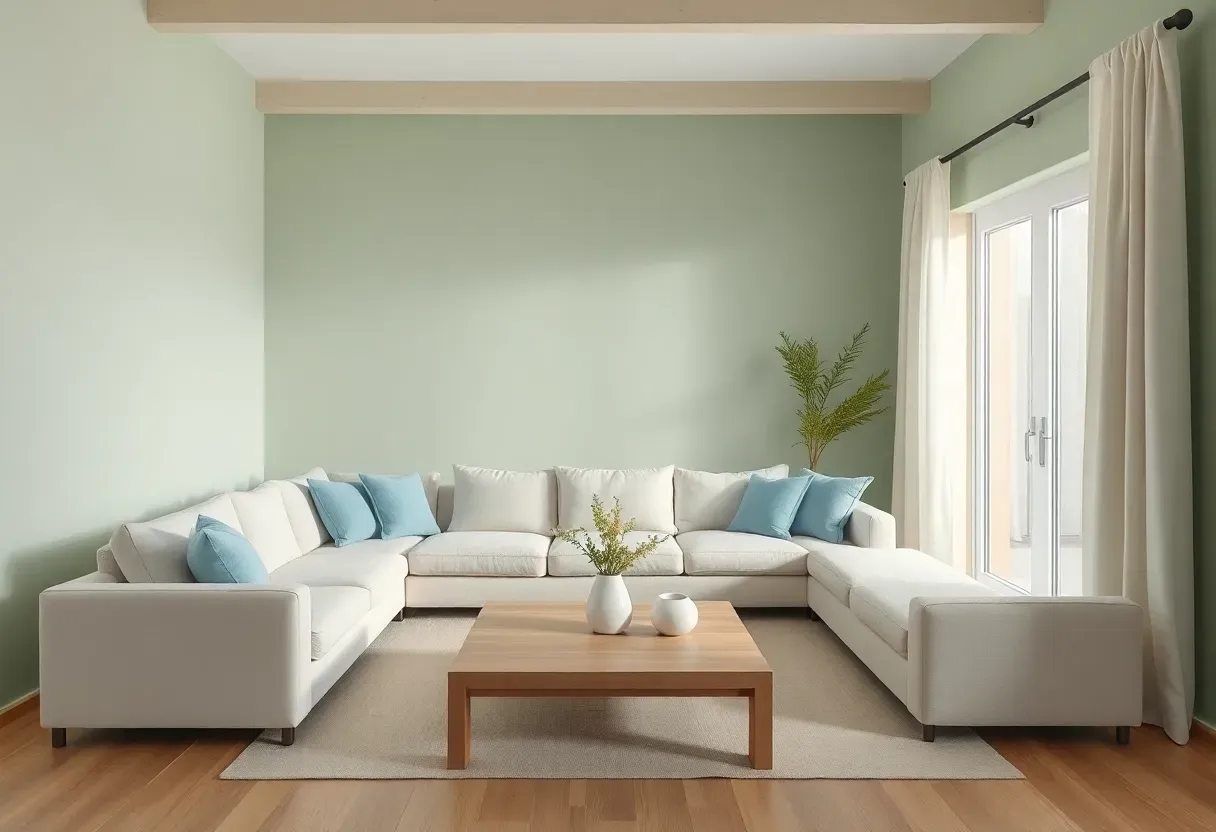
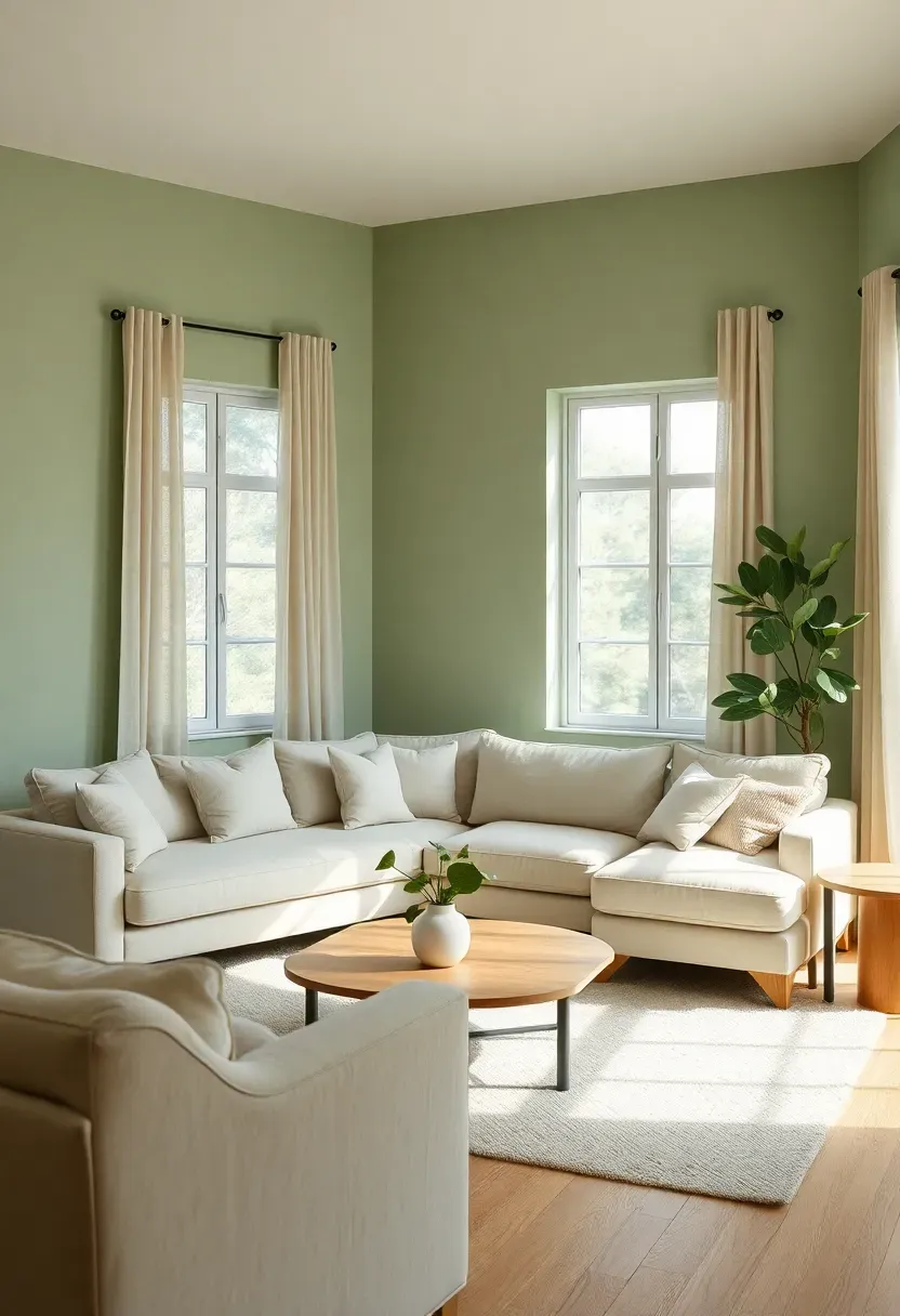
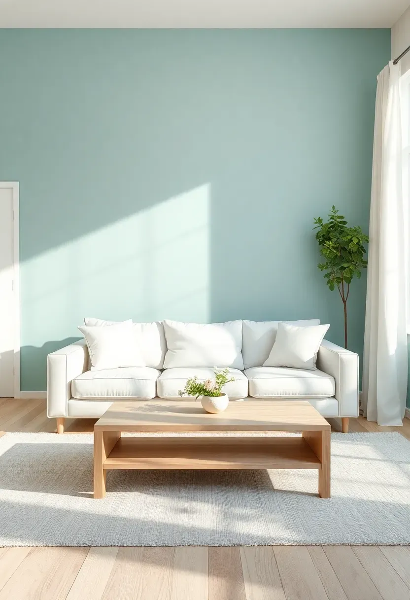
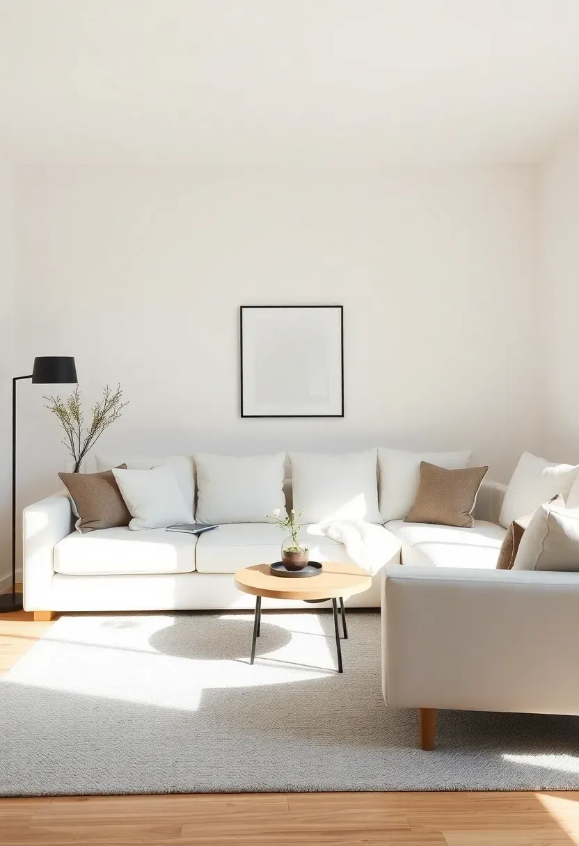
1. Soft Sage and Cream Monochromatic Scheme
A monochromatic sage and cream palette creates depth without disruption, using varying saturation levels of the same green undertone across walls, upholstery, and accessories. This minimalist pastel living room approach relies on texture variation—linen sofa, velvet accent pillows, wool rug, matte ceramic vases—to distinguish surfaces while maintaining visual cohesion. The cream elements (area rug, curtains, throw blankets) provide contrast and brightness, preventing the sage from feeling too heavy or monotonous.
Tips
- Do layer sage in three intensities: pale sage on walls (60-70% saturation), mid-tone sage on large furniture (40-50%), and deep sage accents (20-30%) in pillows or throws
- Don't introduce competing greens—stick to the sage undertone family (gray-green, not yellow-green or blue-green)
- If the room feels too flat, add warm wood tones (oak, walnut) or black metal accents for grounding contrast
Best for: north-facing living rooms where warm sage counteracts cool natural light
What this gives you: a serene, cohesive living space that feels larger and more tranquil through monochromatic harmony
We picked a few things that go well with this idea: Foindtower Linen Throw Pillow Covers (2-Pack) (★4.5), MIULEE Neutral Linen Pillow Covers (4-Pack) (★4.5) and Tweed Linen Textured Pillow Cover Pastel Pink (★5.0). As an Amazon Associate we earn from qualifying purchases.
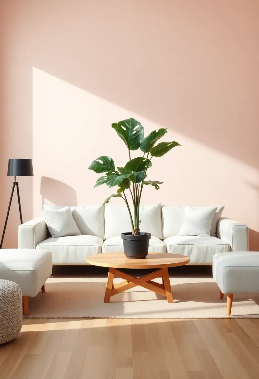
2. Blush Pink Minimalist with Natural Wood
Blush pink walls create warmth and softness without overwhelming the minimalist aesthetic when paired with natural wood furniture and white accents. The key to sophistication lies in selecting blush with brown or gray undertones rather than orange-based peach tones—this ensures the pink reads as elegant rather than juvenile. A white sectional or cream sofa keeps the space feeling fresh, while light oak or walnut coffee table, media console, and floating shelves add organic warmth that grounds the ethereal blush walls.
Tips
- Do test blush samples at different times of day—pink shifts dramatically under warm evening light versus cool midday sun
- Don't overdo pink: limit it to walls plus one or two accents (pillows, art) rather than furniture upholstery
- If blush feels too sweet, add black elements (floor lamp, frame, hardware) for instant sophistication
Budget/Time: blush paint costs the same as any paint; transformation achievable in one weekend
What this gives you: a warm, inviting living room that feels unexpectedly modern and refined through soft pink's calming presence
We picked a few things that go well with this idea: Honyee Modern Oval Oak Coffee Table (★4.6), 2-Tier Minimalist Coffee Table with Storage (48") (★4.7) and Oak Coffee Table with Rattan Drawer (★4.5). As an Amazon Associate we earn from qualifying purchases.
3. Powder Blue and White Serene Living Space
Powder blue walls paired with white furniture create a coastal-inspired minimalist living room that feels both refreshing and tranquil, perfect for spaces that receive abundant southern or western light. The blue should lean toward gray rather than green—a dusty, muted powder blue that reads as sophisticated rather than nursery-like. White upholstery (sofa, armchair) keeps the room feeling airy, while blue accents in throw pillows, a lightweight area rug, and ceramic objects tie the palette together without overwhelming the senses.
Tips
- Do choose powder blue with gray undertones to avoid a childish or overly energetic feel
- Don't mix multiple blues—stick to one powder blue shade and vary it only in saturation for depth
- If the room feels too cool, add warm wood tones or a jute rug to ground the space
Placement note: ideal for south-facing rooms where powder blue softens harsh afternoon sun
What this gives you: a refreshing, serene living room that mimics the calming effect of coastal skies
We picked a few things that go well with this idea: Minimalist Ceramic Bud Vases Set Pastel (★4.7), Matte Yellow Ceramic Vase Minimalist (7.7") (★4.7) and CUCUMI Ceramic Vase Set Neutral Tones (5-Pack) (★4.8). As an Amazon Associate we earn from qualifying purchases.
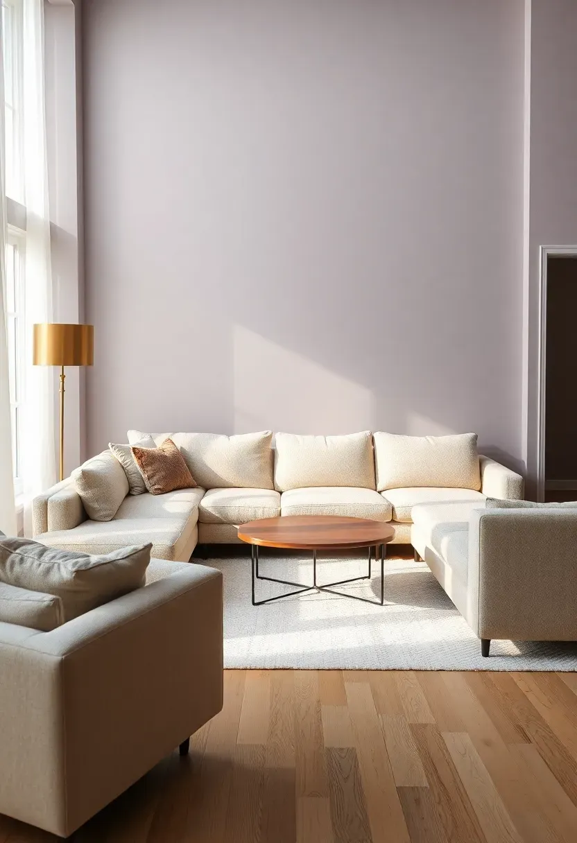
4. Lavender Gray Pastel Modern Living Room
Lavender gray (sometimes called "aged lavender" or "dusty lilac") combines the softness of purple with the sophistication of gray, creating a minimalist pastel living room that feels both modern and unexpectedly soothing. This complex neutral works beautifully on all four walls or as a single accent wall behind a white sofa or media console. Pair it with light wood floors, white or cream upholstery, and brushed brass or black metal accents for a refined palette that avoids the feminine associations of brighter purples.
Recommended
Items for this idea
Tips
- Do lean toward gray-heavy lavender (70% gray, 30% purple) for a sophisticated, neutral-leaning result
- Don't pair lavender gray with other purples—keep it as the sole purple-based element in the palette
- If lavender feels too cool, incorporate warm tones through wood, cream textiles, or brass accents
Best for: open-concept living spaces where lavender gray provides subtle color definition without overwhelming adjacent areas
What this gives you: a uniquely calming living room that benefits from lavender's association with relaxation and stress reduction
5. Mint Green Minimalist with Brass Accents
A soft mint green palette brings freshness and energy to a minimalist living room while maintaining the calm, uncluttered aesthetic essential to this design style. Mint works particularly well in smaller living rooms or apartments because its reflective qualities amplify natural light, making the space feel larger and more open. Pair mint walls or a mint accent wall with white furniture, light wood tones, and brass or gold accents for a sophisticated contrast that prevents the space from feeling too sweet or casual.
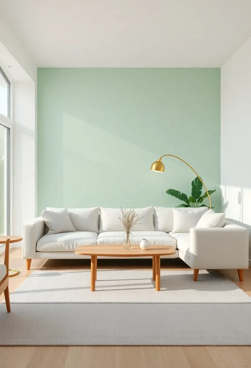
Tips
- Do choose mint with gray undertones rather than yellow-leaning green to avoid a dated feel
- Don't use mint on all four walls in small rooms—it can feel overwhelming; one accent wall is often sufficient
- If mint feels too energetic, balance it with substantial neutral elements (large gray rug, wood furniture)
Lighting tip: mint reflects both natural and artificial light beautifully, reducing need for excessive lamps
What this gives you: an energizing yet calming living room that feels connected to nature through mint's organic, revitalizing qualities
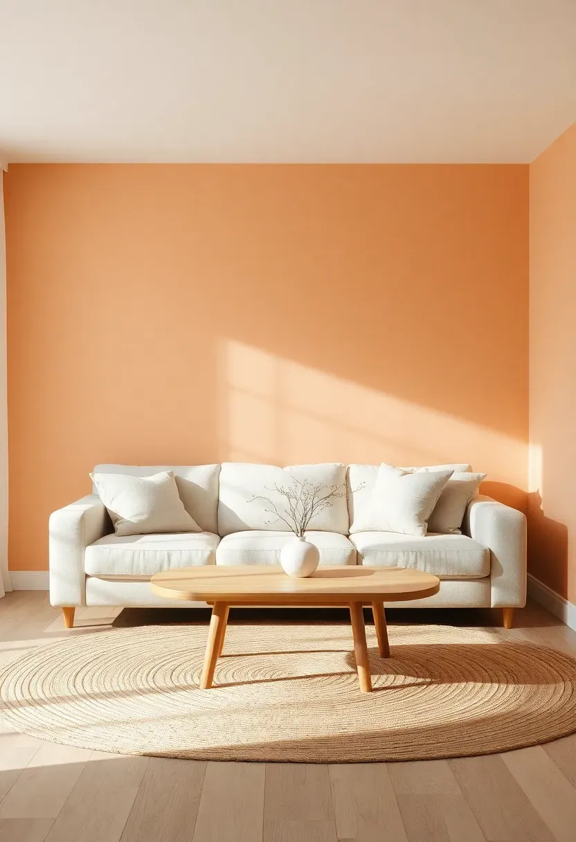
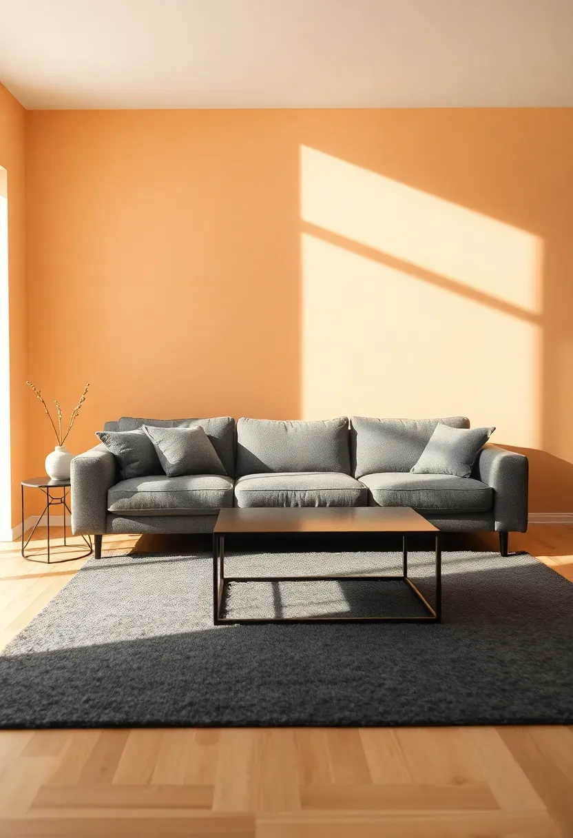
6. Warm Peach and Neutral Beige Living Area
Warm peach walls create a cozy, inviting minimalist living room that feels particularly welcoming in spaces with limited natural light or northern exposure. Unlike bright orange-based coral, sophisticated peach leans toward nude and blush undertones, resulting in a pastel that reads as warm neutral rather than bold color. Pair peach walls with beige or cream upholstery (sofa, armchair), a jute or sisal rug for texture, and light wood or rattan accents for an organic, layered aesthetic that feels both minimalist and comfortably lived-in.
Recommended
Items for this idea
Tips
- Do select peach with brown or blush undertones rather than orange to maintain sophistication
- Don't overwhelm the space with peach—walls plus one or two accents (pillows, throws) is sufficient
- If peach feels too warm, contrast with cool elements: gray rug, black metal accents, or white trim
Best for: north-facing living rooms where peach's warmth counteracts cool blue-tinted natural light
What this gives you: a cozy, welcoming living room that feels warm and intimate without sacrificing minimalist airiness
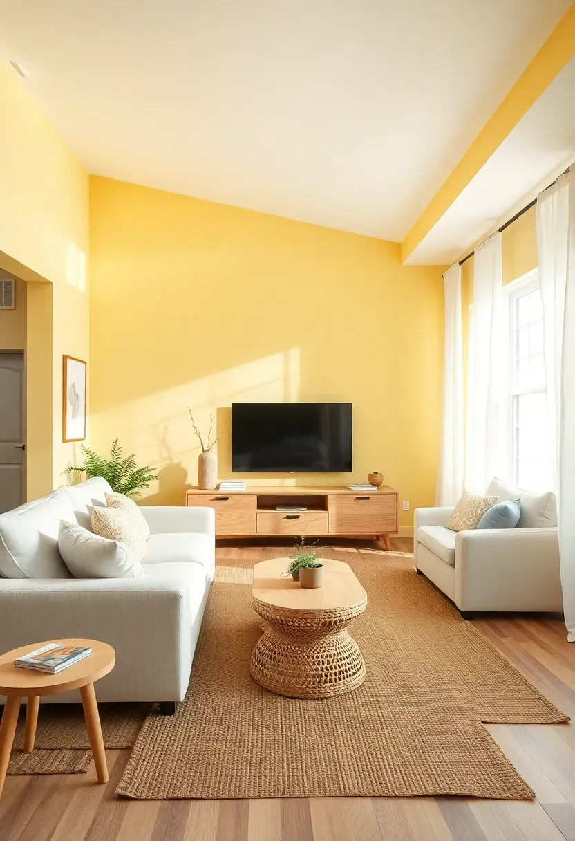
7. Buttermilk Yellow Soft Minimalist Space
Buttermilk yellow—a soft, creamy pastel with subtle green undertones—brings warmth and cheerfulness to a minimalist living room without the energy of brighter yellows. This gentle yellow works beautifully on walls or as an accent color behind a white sofa or media console, creating a space that feels uplifting and serene rather than stimulating. Pair buttermilk with white upholstery, light wood furniture, and natural textures (jute, linen, wool) for a cohesive palette that feels both sunny and sophisticated.
Tips
- Do choose buttermilk with green undertones rather than orange for a fresher, more modern appearance
- Don't mix multiple yellows—stick to one buttermilk shade and vary only in saturation for depth
- If buttermilk feels too warm, balance with cool gray accents or black metal fixtures
Placement note: ideal for east-facing living rooms where buttermilk enhances gentle morning light
What this gives you: a cheerful, uplifting living space that feels energizing without disrupting the calm minimalist aesthetic
8. Dusty Rose and Charcoal Pastel Contrast
Dusty rose walls paired with charcoal gray furniture or accents create a sophisticated minimalist living room with dramatic contrast and modern edge. The deep charcoal grounds the ethereal dusty rose, preventing the pastel from feeling too sweet or insubstantial, while the rose softens the charcoal's severity for a balanced, harmonious palette. This combination works particularly well in urban apartments or contemporary homes where the contrast between soft and strong elements feels intentional and design-forward.
Recommended
Items for this idea
Tips
- Do use dusty rose on walls and charcoal on large furniture for the most sophisticated balance
- Don't introduce additional colors—this palette relies on the dusty rose/charcoal contrast for impact
- If the room feels too dark, add white elements (rug, curtains, pillows) to reflect light and brighten
Best for: modern urban living rooms where the dusty rose/charcoal contrast creates contemporary edge
What this gives you: a sophisticated, visually dynamic living room that balances softness with strength through strategic contrast
9. Sky Blue Pastel with Light Oak Furniture
Sky blue walls combined with light oak furniture create a minimalist living room that feels both expansive and grounded, perfect for spaces where you want to maximize the sense of airiness while maintaining warmth. The key to sophistication lies in selecting sky blue with subtle gray undertones—a muted, dusty sky blue rather than a bright, saturated baby blue. Light oak coffee table, media console, and end tables add organic warmth that prevents the blue from feeling cold, while white or cream upholstery keeps the palette feeling fresh and uncluttered.
Tips
- Do choose sky blue with visible gray undertones for a sophisticated, modern result
- Don't pair sky blue with other blues—keep it as the sole blue-based element for clarity
- If sky blue feels too cool, incorporate warm tones through oak wood, cream textiles, or brass accents
Lighting tip: sky blue reflects and amplifies natural light, reducing need for artificial lighting during daytime
What this gives you: an expansive, serene living room that feels connected to the sky and natural world
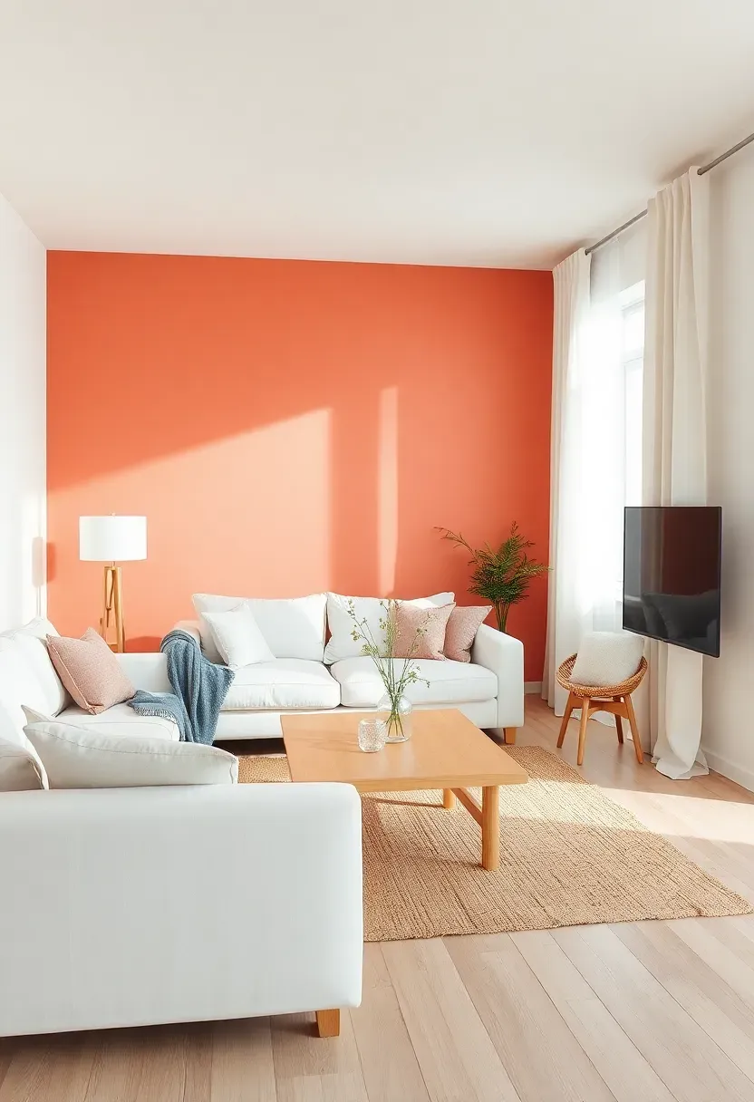
10. Soft Coral and White Minimalist Design
Soft coral walls or an accent wall create a warm, inviting minimalist living room that feels both energetic and serene—a difficult balance that coral achieves through its unique blend of pink, orange, and red undertones. Unlike brighter coral shades that dominate, soft coral (sometimes called "dusty coral" or "coral blush") works as a sophisticated pastel that provides warmth without overwhelming the space. Pair it with white furniture, light wood accents, and natural textures for a balanced palette that feels lively yet restrained.
Recommended
Items for this idea
Tips
- Do select coral with brown or gray undertones for a more sophisticated, less tropical appearance
- Don't use coral on all four walls in small rooms—an accent wall behind the sofa creates impact without overwhelm
- If coral feels too energetic, balance with substantial neutral elements (large gray rug, white furniture)
Best for: east or southeast-facing living rooms where coral enhances morning and early afternoon light
What this gives you: a warm, energizing living room that feels welcoming without disrupting minimalist calm
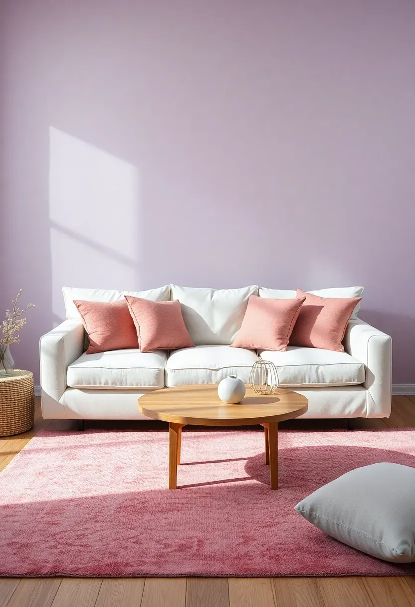
11. Pale Lilac with Warm Gray Undertones
Pale lilac walls with warm gray undertones create a minimalist living room that feels both ethereal and grounded, combining purple's calming properties with gray's sophistication. This complex pastel works beautifully in spaces where you want subtle color without the sweetness of brighter purples or the severity of pure gray. Pair pale lilac walls with warm gray upholstery (sofa, armchair), light wood furniture, and white or cream accents for a cohesive palette that feels tranquil, modern, and unexpectedly versatile.
Tips
- Do choose lilac with visible gray undertones (60% gray, 40% purple) for sophistication
- Don't pair pale lilac with other purples—keep it as the sole purple-based element
- If lilac feels too cool, incorporate warm tones through wood, cream textiles, or brass accents
Placement note: ideal for bedrooms or quiet living spaces where lilac's calming properties enhance relaxation
What this gives you: a uniquely tranquil living room that benefits from purple's association with stress relief and serenity
12. Aqua Pastel Accent Wall with White Surround
A soft aqua accent wall creates a focal point in a minimalist living room while maintaining the airy, uncluttered aesthetic essential to this style. Aqua—a pastel blend of blue and green with subtle gray undertones—feels both refreshing and calming, making it ideal for living rooms where you want a connection to water and coastal serenity. By limiting aqua to one wall and keeping the remaining walls white, you create visual interest without overwhelm, allowing the pastel to serve as an artistic backdrop for white furniture, light wood accents, and natural textures.
Recommended
Items for this idea
Tips
- Do select aqua with gray undertones rather than bright teal for a sophisticated, modern result
- Don't paint accent walls randomly—choose the wall behind the sofa or media console for intentional impact
- If aqua feels too cool, balance with warm wood tones, cream textiles, or brass accents
Best for: small living rooms where one accent wall adds color without reducing perceived space
What this gives you: a refreshing, serene focal point that evokes coastal calm without committing to full-room color
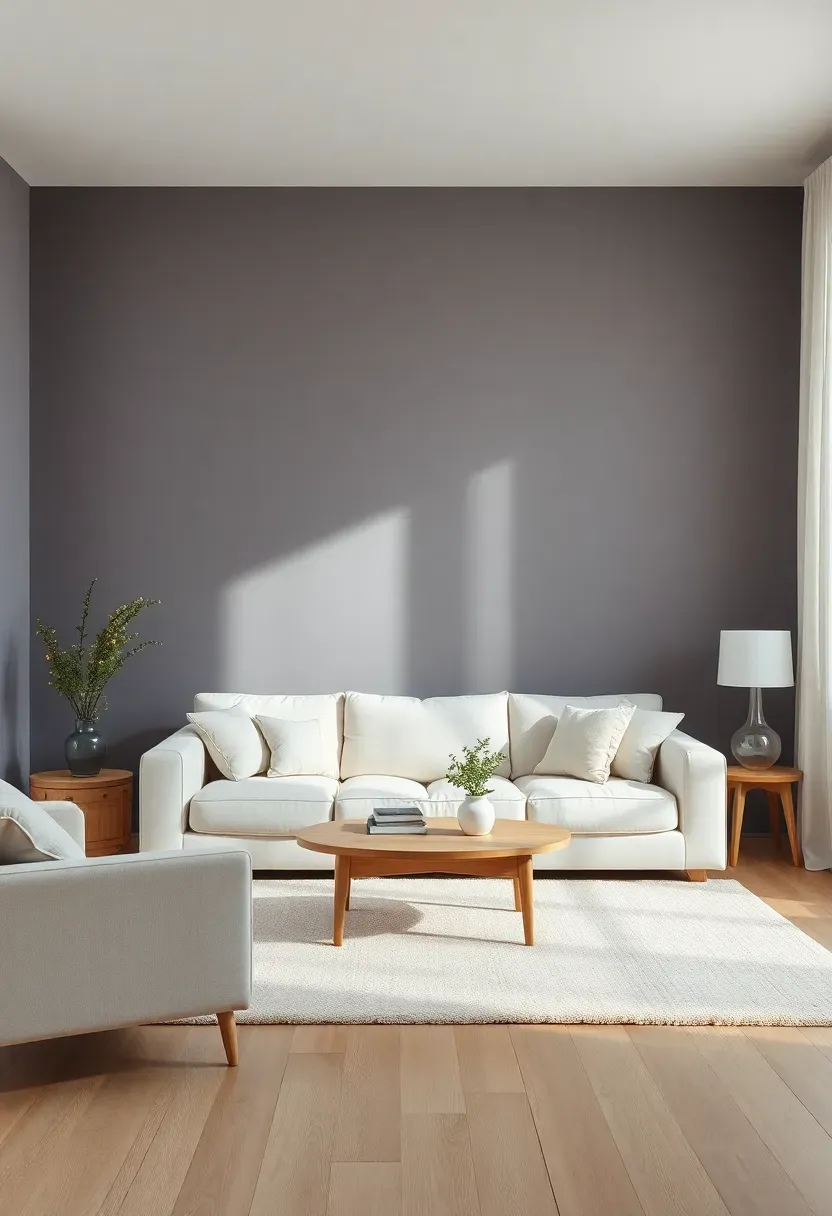
13. Cream and Soft Gray Pastel Foundation
A cream and soft gray palette creates a minimalist pastel living room that functions as a sophisticated neutral foundation while still offering visual warmth and depth. Unlike stark white and charcoal combinations, cream (with subtle yellow undertones) and soft gray (with subtle blue or purple undertones) create a more welcoming, livable aesthetic that feels neither too cold nor too warm. Use cream for walls and larger upholstery pieces, and soft gray for accents like throw pillows, area rug, and media console for a balanced, harmonious space that serves as a versatile backdrop for any decor style.
Tips
- Do choose cream with subtle yellow undertones and gray with visible blue/purple undertones for sophistication
- Don't introduce a third neutral color—cream and gray create sufficient depth on their own
- If the room feels too neutral, add one accent color (sage, blush, or blue) in small doses
Versatile foundation: cream and gray work with any accent color you add later
What this gives you: a warm, sophisticated neutral living room that feels welcoming without sacrificing minimalist restraint
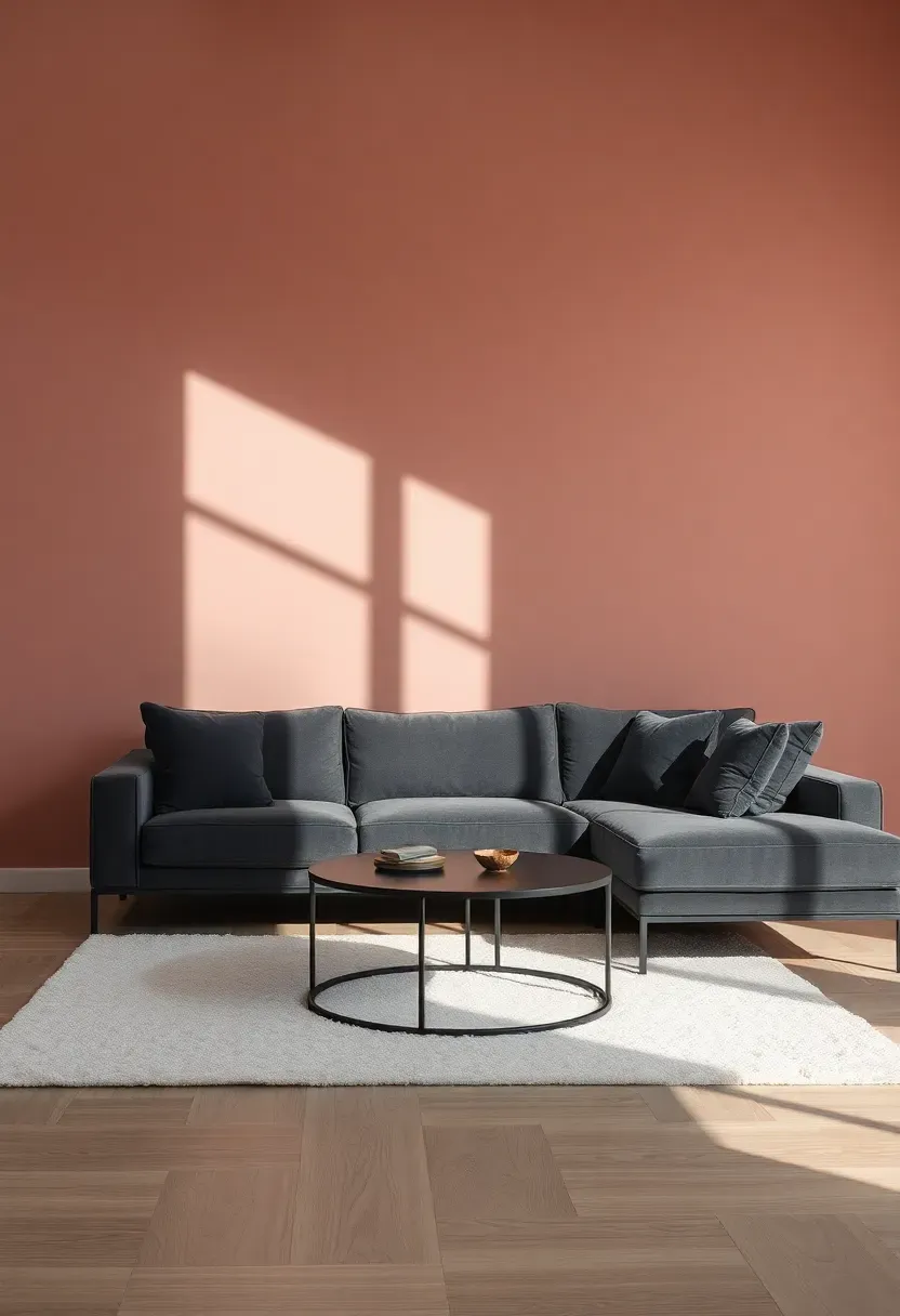
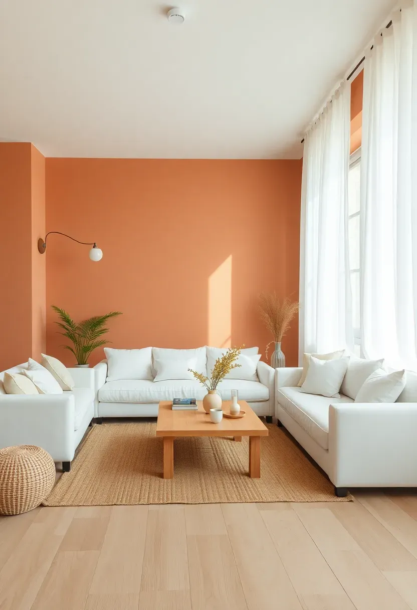
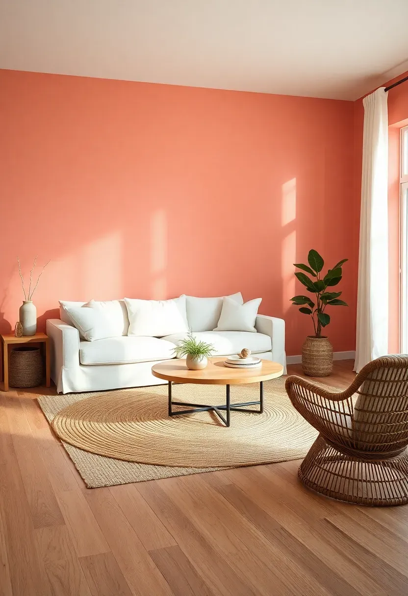
14. Pale Terracotta with Minimalist White
Pale terracotta walls create a warm, earthy minimalist living room that feels connected to nature while maintaining the clean, uncluttered aesthetic essential to this style. Unlike bright orange or rust, pale terracotta (sometimes called "dusty coral" or "blush terracotta") is a softened pastel version of the classic clay color, providing warmth without overwhelming energy. Pair pale terracotta walls with white furniture (sofa, armchair), light wood accents, and natural textures (jute, linen) for a balanced palette that feels both organic and refined.
Recommended
Items for this idea
Tips
- Do select terracotta with brown or gray undertones for sophistication rather than bright orange
- Don't overwhelm with terracotta—walls plus one or two accents (pillows, ceramics) is sufficient
- If terracotta feels too warm, contrast with cool gray or black elements for balance
Best for: north-facing living rooms where terracotta's warmth counteracts cool natural light
What this gives you: a warm, earthy living room that feels grounded and connected to natural materials
15. Soft Teal and Natural Wood Balance
Soft teal walls combined with natural wood furniture create a minimalist living room that feels both calming and grounded, perfect for spaces where you want color without compromising tranquility. Soft teal—a pastel blend of blue and green with gray undertones—provides visual interest while maintaining serenity, making it ideal for living rooms used for relaxation and unwinding. Pair teal walls with light oak or walnut furniture, white or cream upholstery, and natural textures for a cohesive palette that feels both sophisticated and invitingly organic.
Tips
- Do choose teal with visible gray undertones for sophistication rather than bright blue-green
- Don't pair teal with other greens or blues—keep it as the sole blue-green element
- If teal feels too cool, incorporate warm tones through walnut wood, cream textiles, or brass accents
Lighting tip: teal reflects both natural and artificial light beautifully, creating a moody, atmospheric glow in the evening
What this gives you: a calming, sophisticated living room that feels connected to nature through teal's organic, water-inspired qualities
16. Butter Yellow with Linen Texture Focus
Butter yellow walls create a warm, cheerful minimalist living room that feels sunny and inviting without the energy of brighter yellows. This soft pastel yellow works beautifully in spaces that receive limited natural light or in cooler climates where its warmth provides visual comfort. The key to sophistication lies in embracing linen textures throughout—upholstery, curtains, throw pillows, and area rug—which add depth and tactile interest while reinforcing the creamy, natural quality of the butter yellow palette.
Recommended
Items for this idea
Tips
- Do choose butter yellow with subtle green undertones rather than orange for a fresher appearance
- Don't introduce other yellows—stick to one butter yellow shade and vary only in saturation
- If butter yellow feels too warm, balance with cool gray accents or white linen for freshness
Best for: north-facing or naturally dark living rooms where butter yellow adds warmth and cheerfulness
What this gives you: a warm, uplifting living room that feels sunny and welcoming regardless of natural light conditions
17. Pale Mauve with Oak and Black Accents
Pale mauve walls paired with oak furniture and black metal accents create a sophisticated minimalist living room that balances softness with strength. Pale mauve—a purple-based pastel with warm gray and brown undertones—provides subtle color without feeling feminine or sweet, especially when grounded by substantial oak elements and crisp black metal fixtures. This combination works particularly well in modern or contemporary homes where the contrast between soft mauve, warm oak, and stark black creates intentional visual tension and design-forward sophistication.
Tips
- Do select mauve with visible gray and brown undertones for sophistication (70% neutral, 30% purple)
- Don't pair mauve with other purples—keep it as the sole purple-based element for clarity
- If mauve feels too soft, black metal accents provide instant grounding and modern edge
Modern edge: black metal fixtures (floor lamp, picture frames, hardware) prevent mauve from feeling too soft
What this gives you: a sophisticated, balanced living room that demonstrates how soft pastels can feel modern and design-forward
18. Soft Mint with White Furniture Contrast
Soft mint walls combined with white furniture create a refreshing, spring-like minimalist living room that feels both energizing and serene. Soft mint—a pastel green with subtle blue and gray undertones—brings the revitalizing quality of nature indoors without overwhelming the senses with vibrant green. By pairing mint walls with crisp white furniture (sofa, armchair, media console), you create a bright, airy palette that feels connected to gardens and natural growth while maintaining the clean, uncluttered aesthetic essential to minimalist design.
Recommended
Items for this idea
Tips
- Do choose mint with blue-gray undertones rather than yellow-green for a more modern, sophisticated result
- Don't use mint on all four walls in very small rooms—one or two walls may be sufficient
- If mint feels too cool, incorporate warm tones through oak wood, cream textiles, or brass accents
Best for: spring and summer living rooms where mint's freshness enhances the season's natural energy
What this gives you: a refreshing, revitalizing living room that feels connected to nature's growth and renewal
19. Dusty Blue and Beige Calm Living Room
Dusty blue walls paired with beige upholstery and accents create a minimalist living room that feels both calming and warmly inviting. Dusty blue—a pastel blue with visible gray and brown undertones—provides the serenity of blue without the coolness of purer blues, making it ideal for living rooms where you want a tranquil atmosphere that still feels cozy and livable. Beige elements (sofa, area rug, throw pillows) add warmth and texture, preventing the space from feeling too cool or sterile, while white trim and wood tones maintain brightness and visual clarity.
Tips
- Do select dusty blue with visible gray and brown undertones for warmth and sophistication
- Don't pair dusty blue with other blues—keep it as the sole blue-based element
- If dusty blue feels too cool, beige elements (sofa, rug, pillows) provide essential warmth
Versatile palette: dusty blue and beige work with both warm and cool accent colors
What this gives you: a tranquil, cozy living room that balances blue's serenity with beige's warmth
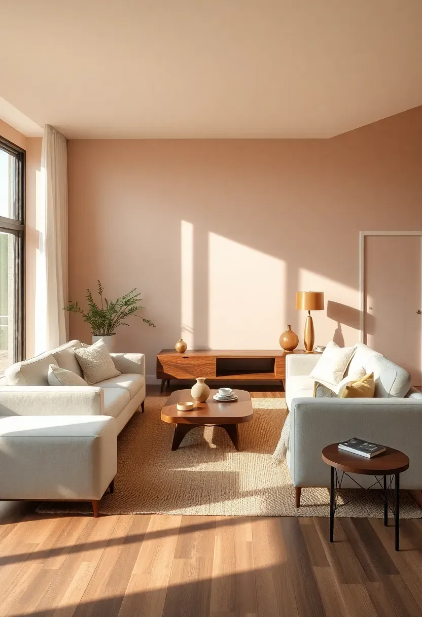
20. Pale Apricot with Gray Modern Elements
Pale apricot walls combined with gray furniture and accents create a minimalist living room that feels both warmly inviting and distinctly modern. Pale apricot—a soft pastel orange with brown and pink undertones—provides warmth and energy without the overwhelming intensity of brighter orange or coral tones. Gray elements (sofa, area rug, media console) ground the ethereal apricot, preventing the space from feeling too sweet or energetic, while black or brass accents add crisp definition and modern sophistication.
Recommended
Items for this idea
Tips
- Do choose apricot with brown and pink undertones rather than bright orange for sophistication
- Don't overwhelm with apricot—walls plus one or two accents (pillows, ceramics) is sufficient
- If apricot feels too warm, gray elements and black metal provide cooling contrast
Best for: modern apartments and contemporary homes where apricot/gray contrast creates design-forward sophistication
What this gives you: a warm, modern living room that balances apricot's energy with gray's restraint
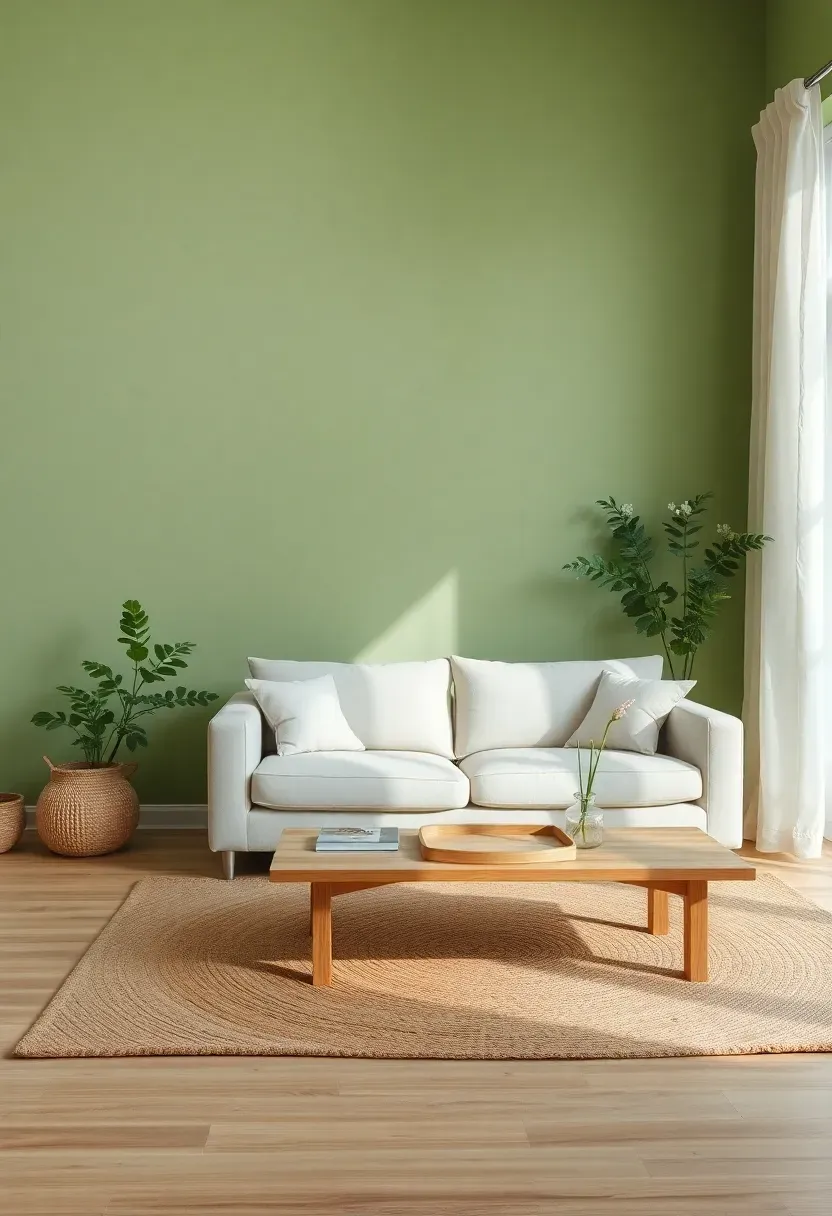
21. Soft Celery Green Minimalist Scheme
Soft celery green walls create a minimalist living room that feels connected to nature while maintaining the clean, uncluttered aesthetic essential to this style. Soft celery—a pastel green with subtle yellow and gray undertones—brings the revitalizing energy of fresh growth indoors without overwhelming the senses with vibrant green. Pair celery walls with white or cream furniture, light wood accents, and natural textures (linen, jute, wool) for a cohesive palette that feels both organic and refined, perfect for spaces where you want a connection to gardens and natural renewal.
Tips
- Do choose celery with gray undertones rather than bright yellow-green for sophistication
- Don't pair celery with other greens—keep it as the sole green-based element
- If celery feels too energizing, balance with substantial neutral elements (large gray rug, white furniture)
Seasonal flexibility: celery works beautifully in spring and summer but remains cozy year-round
What this gives you: a fresh, organic living room that feels connected to nature's growth and renewal
22. Blush Nude with Warm Wood Tones
Blush nude walls paired with warm wood furniture create a minimalist living room that feels both sophisticated and warmly inviting. Blush nude—a pastel pink with substantial brown and beige undertones—functions as a warm neutral rather than a bold color, providing subtle warmth and sophistication without feeling pink or feminine. Pair blush nude walls with walnut or cherry wood furniture (coffee table, media console, end tables), cream or beige upholstery, and natural textures for a cohesive palette that feels elegant, organic, and unexpectedly versatile.
Recommended
Items for this idea
Tips
- Do select blush nude with visible brown undertones (70% neutral, 30% pink) for sophistication
- Don't pair blush nude with other pinks—keep it as the sole pink-based element
- If blush nude feels too warm, contrast with cool gray or black accents for balance
Neutral alternative: blush nude functions as a warm neutral that pairs with any accent color
What this gives you: a sophisticated, warm living room that demonstrates how pink-based pastels can feel elegant and neutral
23. Periwinkle Pastel with Cream Neutrals
Periwinkle walls combined with cream neutrals create a minimalist living room that feels both serene and visually sophisticated. Periwinkle—a pastel blend of blue and purple with subtle gray undertones—provides the calming properties of both colors while maintaining a soft, ethereal quality that feels neither too blue nor too purple. Pair periwinkle walls with cream upholstery (sofa, armchair), light wood furniture, and white or cream accents for a cohesive palette that feels tranquil, modern, and unexpectedly calming—ideal for living rooms used for relaxation and unwinding.
Tips
- Do choose periwinkle with visible gray undertones (60% gray-blue-purple, 40% saturated color)
- Don't pair periwinkle with other blues or purples—keep it as the sole blue-purple element
- If periwinkle feels too cool, cream elements and light wood provide essential warmth
Calming properties: periwinkle combines the relaxation of blue and the stress relief of purple
What this gives you: a uniquely tranquil living room that benefits from periwinkle's dual calming influences
24. Pale Vanilla with Soft Gray Layers
Pale vanilla walls combined with soft gray accents create a minimalist living room that functions as a sophisticated neutral foundation while offering more warmth and depth than stark white. Pale vanilla—a cream pastel with subtle yellow undertones—provides warmth and brightness without the starkness of pure white, while soft gray elements (area rug, throw pillows, media console) add depth and visual interest. This combination works beautifully as a versatile backdrop that feels welcoming and livable while maintaining the clean, uncluttered aesthetic essential to minimalist design.
Recommended
Items for this idea
Tips
- Do choose vanilla with subtle yellow undertones rather than orange for a fresher appearance
- Don't introduce a third neutral color—vanilla and gray create sufficient depth on their own
- If the room feels too neutral, add one accent color (sage, blush, or blue) in small doses
Versatile foundation: vanilla and gray work with any accent color or style evolution
What this gives you: a warm, sophisticated neutral living room that feels welcoming without sacrificing minimalist clarity
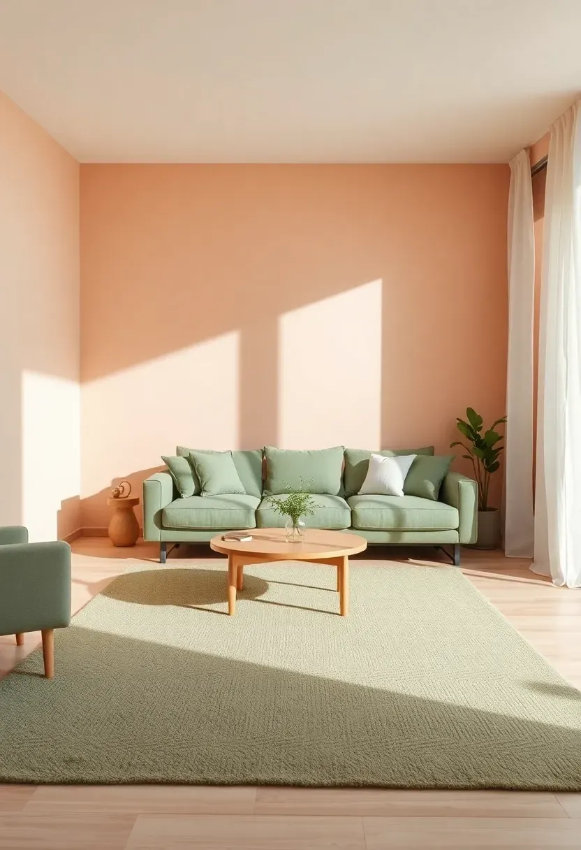
25. Soft Peach and Sage Green Combination
Soft peach walls paired with sage green accents create a minimalist living room that feels both warmly inviting and connected to nature. This two-pastel combination works because peach (a warm pastel with pink and orange undertones) and sage (a cool pastel with green and gray undertones) balance each other—the warmth of peach prevents sage from feeling too cool, while the freshness of sage prevents peach from feeling too sweet. Use peach for walls and sage for larger accents (area rug, upholstery, curtains) for a balanced, harmonious palette that feels both sophisticated and unexpectedly versatile.
Tips
- Do use peach as the dominant wall color (60-70%) and sage as the secondary accent (30-40%)
- Don't introduce a third pastel—peach and sage create sufficient interest and balance on their own
- If the room feels too pastel, add substantial neutral elements (large white rug, oak furniture)
Perfect balance: peach's warmth and sage's freshness create ideal equilibrium
What this gives you: a balanced, harmonious living room that demonstrates how two pastels can work together without overwhelming
26. Lavender and Dusty Rose Pastel Harmony
Lavender walls paired with dusty rose accents create a minimalist living room that feels both serene and warmly sophisticated. This two-pastel combination works because lavender (a cool pastel with purple and gray undertones) and dusty rose (a warm pastel with pink and brown undertones) complement each other without competing—the cool serenity of lavender balances the warm intimacy of dusty rose. Use lavender for walls and dusty rose for accents (throw pillows, area rug, curtains) for a harmonious palette that feels tranquil, romantic, and unexpectedly refined.
Recommended
Items for this idea
Tips
- Do use lavender as the dominant wall color and dusty rose as the secondary accent
- Don't introduce a third pastel—lavender and dusty rose create sufficient sophistication on their own
- If the room feels too feminine, add black or charcoal elements for modern edge
Double calming: lavender's relaxation + dusty rose's warmth = uniquely tranquil atmosphere
What this gives you: a serene, sophisticated living room that demonstrates how two pink-purple pastels can create harmony
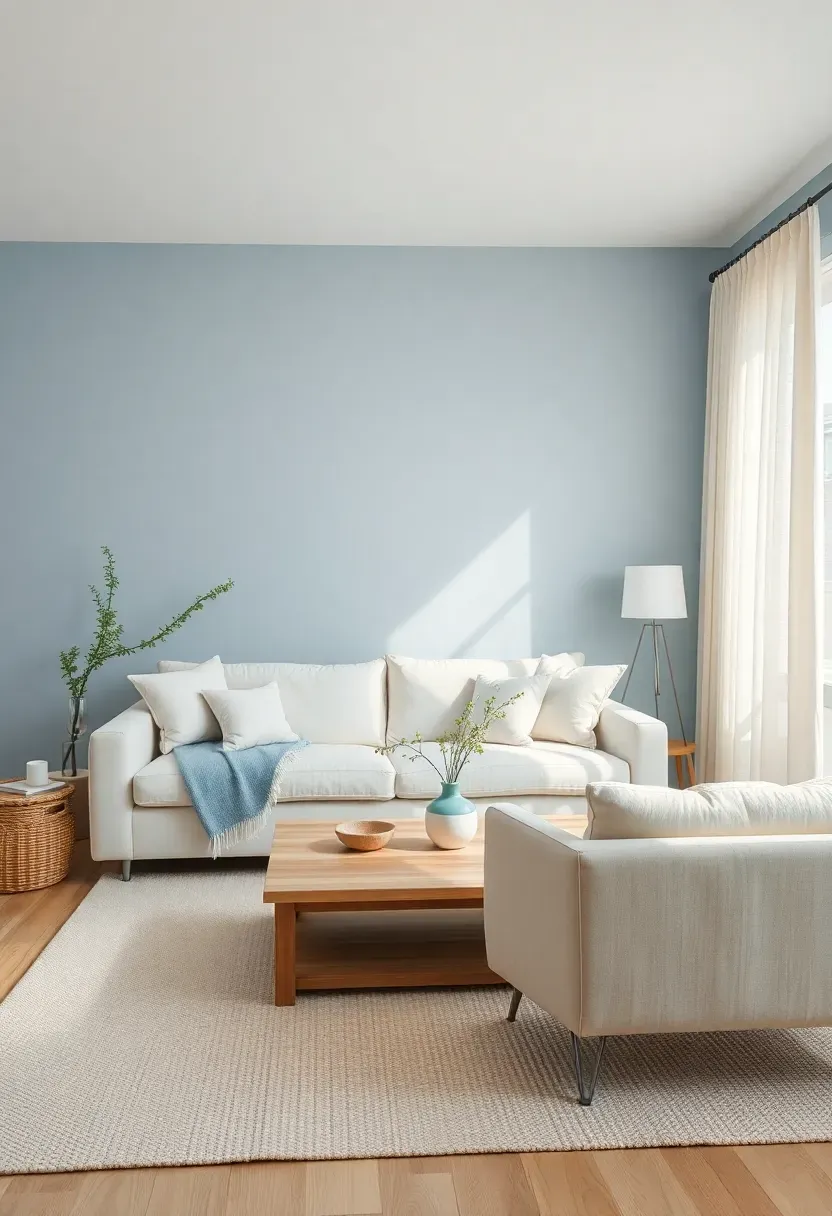
27. Powder Blue and Warm Cream Contrast
Powder blue walls combined with warm cream accents create a minimalist living room that feels both refreshing and cozily inviting. Powder blue—a pastel blue with subtle gray undertones—provides the serenity and freshness of blue without feeling cold or stark, especially when balanced by warm cream elements (sofa, area rug, curtains). This combination works beautifully in living rooms that receive abundant natural light, as the powder blue softens harsh sunlight while the cream reflects warmth, creating a balanced, harmonious atmosphere that feels both airy and comfortably lived-in.
Tips
- Do choose powder blue with gray undertones rather than bright blue for sophistication
- Don't introduce other blues—keep powder blue as the sole blue-based element
- If powder blue feels too cool, cream elements and light wood provide essential warmth
Best for: south-facing living rooms where powder blue softens harsh afternoon sun
What this gives you: a refreshing, cozy living room that balances blue's serenity with cream's warmth
28. Soft Coral with Natural Material Focus
Soft coral walls paired with natural materials (jute, linen, rattan, light wood) create a minimalist living room that feels both warmly inviting and connected to organic textures. Soft coral—a pastel orange with pink and brown undertones—provides warmth and energy without overwhelming the senses, especially when grounded by substantial natural materials that add tactile interest and visual weight. Pair coral walls with a jute rug, linen sofa, rattan accent chair, and light oak coffee table for a cohesive palette that feels both sophisticated and comfortably casual.
Recommended
Items for this idea
Tips
- Do choose coral with brown and pink undertones rather than bright orange for sophistication
- Don't overwhelm with coral—walls plus one or two accents (pillows, ceramics) is sufficient
- If coral feels too warm, jute and linen provide cooling texture and visual weight
Texture focus: natural materials (jute, linen, rattan) ground coral's warmth with tactile substance
What this gives you: a warm, organic living room that balances coral's energy with natural materials' grounding presence
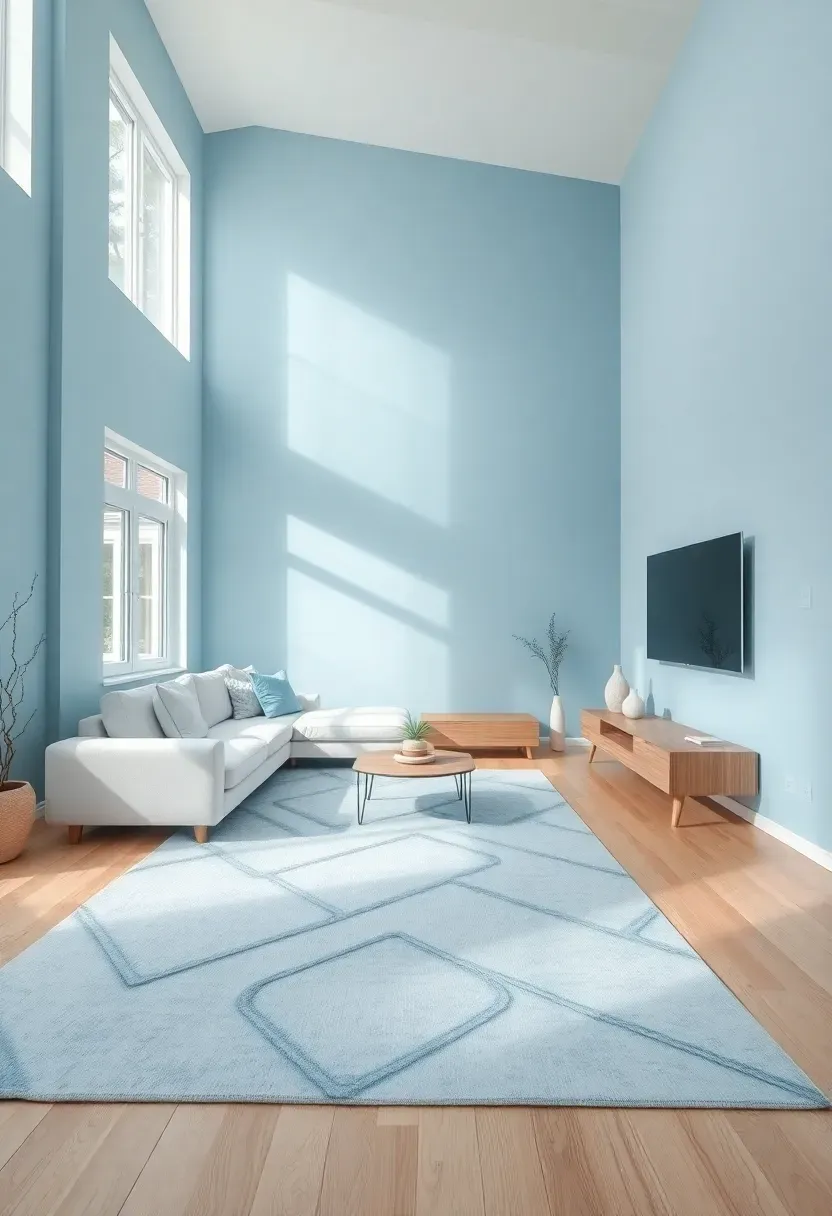
29. Monochromatic Pastel Blue Serene Space
A monochromatic pastel blue palette creates a minimalist living room of exceptional serenity and visual sophistication, using varying saturation levels of blue to create depth without disruption. This approach relies on the same blue undertone across all elements—pale powder blue on walls, mid-tone blue on the sofa, deeper blue on the area rug and accents—with white or cream elements providing necessary contrast and brightness. The result is a living room that feels expansive, tranquil, and unexpectedly sophisticated, proving that monochromatic pastel palettes can feel both minimal and richly layered.
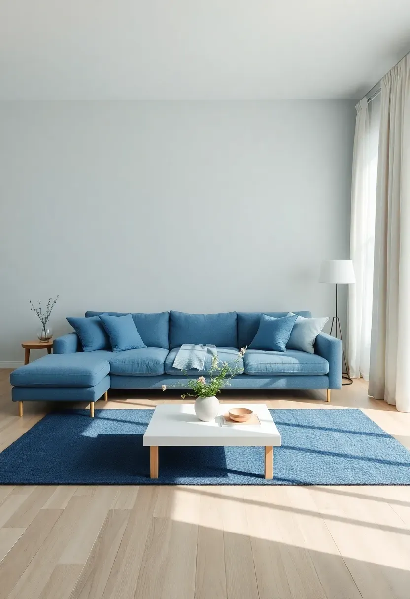
Tips
- Do layer blue in three intensities: pale blue on walls (60-70% saturation), mid-blue on sofa (40-50%), deep blue accents (20-30%)
- Don't introduce competing colors—stick to one blue undertone family for cohesion
- If monochromatic blue feels too cool, cream or white elements provide warmth and contrast
Maximum serenity: monochromatic blue creates the most tranquil minimalist living room possible
What this gives you: an exceptionally serene living room that demonstrates monochromatic pastel design's sophisticated potential
These 29 minimalist pastel living room ideas show how soft colors can transform any space -- including a small rental apartment -- from stark and impersonal to warm, inviting, and uniquely serene. The key to success lies in selecting pastels with sophisticated undertones (gray, brown, or beige rather than pure bright colors) and balancing them with substantial neutrals, natural materials, and intentional texture variation. Whether you choose a single pastel as an accent wall, a monochromatic pastel palette for exceptional serenity, or a carefully balanced two-pastel combination, the result is a living room that feels both calming and visually sophisticated. Minimalism and pastels are not mutually exclusive but rather complementary approaches to creating peaceful, beautiful spaces that work in any home.
About the author
OBCD
CGI visualization and interior design content. We create detailed 3D renders and curate practical design ideas for every room in your home.